What is Emergency Triage Board?
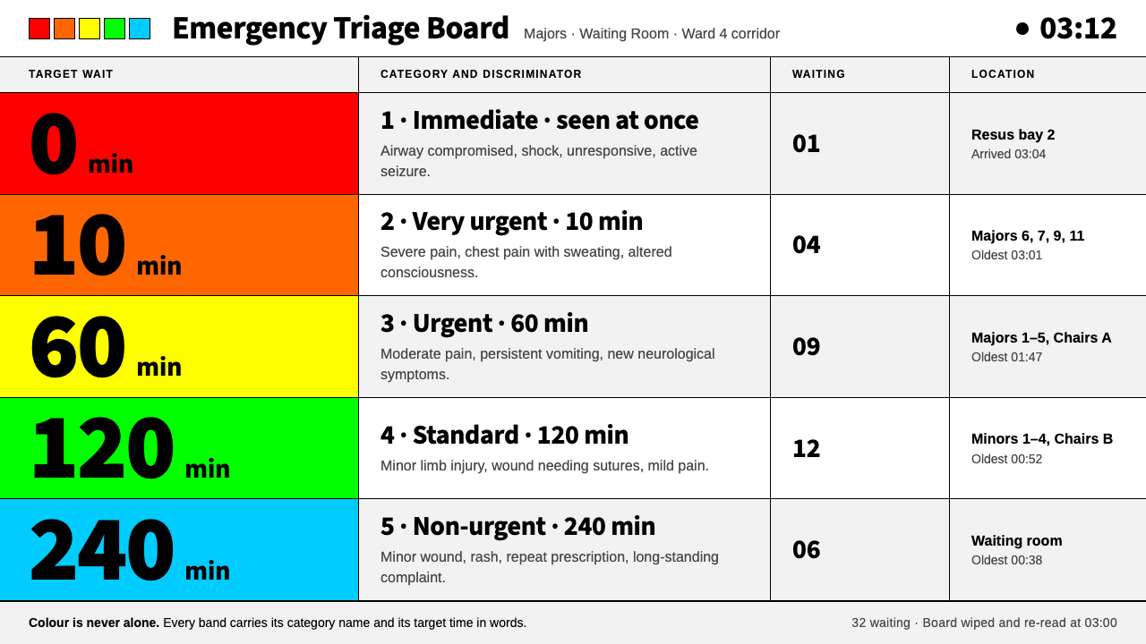
The Emergency Triage Board is a style where colour never speaks alone: five flat priority bands on white, set in plain signage type and always paired with a name and a time.
Emergency Triage Board in brief
The Emergency Triage Board is drawn from the walls of a British hospital emergency department: the laminated flowcharts of the Manchester Triage System, its five-colour mark, and the white tracking board on which every waiting patient is listed. The palette is paper white, signage black and five flat priority colours: red, orange, yellow, green and blue. Everything is set in a plain, upright sans-serif of the kind seen on hospital corridors, and everything is divided by thin black rules. There are no shadows, no rounded corners and no ornament.
Its governing rule is that colour never speaks alone. Each band is printed together with its category name and its target time, so the meaning survives poor lighting, tired eyes, colour-vision differences and black-and-white photocopies. Colour is the fast signal, text is the guarantee, and the two are bound together. The result is a visual language built for the moment of misreading, assuming a reader who is stressed, busy and glancing across a room.
That makes it unusual among design styles. It is not trying to be attractive, expressive or even memorable; it is trying to be unmistakable. Its beauty is that of a good instrument panel, in which every item has one job, a clear position and no competition. It suits products where an error is expensive and a decision must be made quickly, and anywhere that trust is earned through plainness.

Where does Emergency Triage Board come from?
The word triage comes from the French trier, to sort, and the practice of sorting casualties by urgency has long been associated with military medicine, notably in the Napoleonic period. In civilian hospitals it became necessary when demand in emergency departments outgrew capacity and someone had to decide who would be seen first. In British departments before the 1990s that decision was often made informally, and different nurses and doctors could assign very different priorities to the same patient. A system of sorting is only as good as its consistency, and the aim was a shared standard.
In 1994 a group of emergency doctors and nurses in Manchester set out to create one. Their work, completed by 1996, defined five categories of urgency, a common vocabulary for them, and a method for assigning them. The assessor chooses a flowchart for the patient's presenting complaint, such as chest pain or a head injury, and works through the key questions, called discriminators, until one of them places the patient in a category. The five categories were immediate, very urgent, urgent, standard and non-urgent, each with a colour of its own, red, orange, yellow, green and blue, and a maximum target time to be seen: immediately, ten minutes, one hour, two hours and four hours. The system was set out in the book Emergency Triage, edited by Kevin Mackway-Jones with Janet Marsden and Jill Windle, and published in 1997. It was later adopted in many other countries.
The look of the system came from the need to be read quickly, repeatedly and by many different people. The protocol was printed on laminated sheets because departments are wet, busy places where paper does not last. Patient lists took the form of white tracking boards, hand-ruled into fixed columns for name, complaint, category, location and time, and filled in with black marker because it remained legible from across the room. The colour of the priority column, the only colour on the whole board, was the quick signal. All of this sat within the wider British habit of clear hospital signage: plain sans-serif lettering, black on white, direct arrows, no decoration.
As a design system, the Emergency Triage Board translates that environment into screens. White ground, black type and thin black rules carry the structure. Five flat bands, always labelled, carry the urgency. Tables have fixed columns that line up, and everything of importance is large enough to be read across a corridor. The style borrows the look of triage, not its authority: it is a visual language drawn from a clinical protocol, and it should be used where its qualities, clarity under pressure and meaning that survives misreading, are needed.
What defines the Emergency Triage Board look?
Five Priority Bands
Red, orange, yellow, green and blue are the system's only chromatic colours, and they mean one thing: urgency, ordered from most to least. Each is flat and fully saturated enough to be read at a glance, with no gradient, no tint and no decoration. They are never used for brand identity, mood or illustration. A band that is not carrying a priority has no business being coloured.
Colour Never Alone
Every colour is printed beside a category name and a target time, such as Urgent and one hour. Meaning therefore survives when colour fails, whether through poor lighting, a monochrome print or a reader who cannot tell red from green. The rule is simple and absolute: no colour appears alone.
Paper and Ink
The ground is paper or whiteboard white, and text is signage black. There are no tinted backgrounds, no coloured panels and no decorative neutrals. Because the page has no other colour, the priority bands are the only colour in the room, and they carry maximum weight. The contrast is the highest the medium can offer.
Signage Sans
Type is a plain, upright sans-serif of the kind used on hospital corridors, with open letterforms, generous spacing and sturdy weights. Category names are set in capitals or bold; everything else in sentence case. There are no italics for emphasis, no display faces and no personality beyond clarity. The aim is for letters never to be mistaken for one another, even at a distance.
Rules and Tables
Structure is made of thin black rules and fixed-width columns, drawn like a hand-ruled board. Rows align, numbers line up in their columns, and headers are plainly different from data. Nothing is boxed in a card. A table is the style's native container, since it lets many items be compared in a single sweep of the eye.
No Depth
There are no shadows, no rounded corners, no gradients and no overlap. Elements sit side by side on one plane, like items written on a board. Depth would imply hierarchy of a kind the protocol does not have: the only hierarchy that matters is the priority of the patient, and that is carried by colour and label.
Readable at a Distance
The most important information is the largest: category and time first, then the item itself, then detail. Contrast is high and nothing is small in places that matter. Everything is tested against the corridor test, whether it can be read correctly by someone who has not slept, from several metres away, in imperfect light.

Who shaped Emergency Triage Board?
An emergency medicine doctor in Manchester and the first-named editor of Emergency Triage, the 1997 book that set out the Manchester Triage System. His name is attached to the idea that urgency can be assigned by a transparent, repeatable method instead of individual judgement alone. For designers, the lesson is that a shared visual standard begins with a shared vocabulary.
A clinician and co-editor of Emergency Triage who worked on the system with the Manchester group. Her contribution belongs to a collective effort: doctors and nurses agreeing on categories, wording and flowcharts so that a patient would be placed in the same category whoever assessed them.
A clinician and co-editor of Emergency Triage, also part of the Manchester group. Her name appears with the others on the book that turned an agreed method into a tool departments could adopt. Collaboration of this kind is the background of the style: a visual language that exists because many people needed the same thing to be read the same way.
How do you use Emergency Triage Board today?
The Emergency Triage Board is best used where status must be read quickly and correctly: operations dashboards, incident response, support queues, logistics, monitoring, public-service information, training materials and any product in which the cost of misreading is high. It is a style for people who are busy, and it rewards a designer who is willing to let the content, not the screen, be the star.
For presentations, a cover can be a white page with the title in heavy black type and a thin five-band bar beneath it. Content slides work as ruled tables with a coloured category column, and decisions as simple flowcharts with plain boxes and straight lines. Data slides should colour only what the priority scale means: a bar chart can use the five bands for five levels, but each bar must carry its label and value, and the chart should still read when photocopied in black and white.
For web interfaces it suits boards, queues and status pages. Build the screen as a table of rows, each with a band cell at the left, a name for the category and a time. Priority tags are always text and colour together, never colour alone, and they are sorted by urgency. Pricing and plan pages can borrow the form as a plain comparison table with a single coloured label per tier. Avoid cards, shadows and rounded buttons; use outlined rectangles and underlined links instead.
For editorial and marketing work, the style is excellent for guides, manuals, reports for public services, explainers about decision processes and anything that benefits from a flowchart. A page can be built from a strong heading, a short paragraph, a ruled table and one band of colour. It prints well in black and white because it was designed to, and a laminated A4 sheet is its natural habitat.
The most common mistake is to use the five colours as a rainbow palette, for branding or mood, which empties them of meaning. A second mistake is to drop the labels because the colour seems obvious; once colour is alone, the style has lost its key rule. A third is to soften the system with shadows and rounded corners, which adds a decoration the original deliberately refuses. Finally, do not use the look to imply clinical authority for a product that makes no clinical claim.

Emergency Triage Board — FAQ
Is this a medical tool?
No. It is a visual style drawn from the look of a clinical protocol and a hospital board. It does not assess patients, and it should not be used to imply that a product makes medical decisions. Real triage must follow the official protocol, applied by trained staff. The style borrows the clarity of the original, not its clinical function.
Why exactly five colours?
Because the underlying system has five levels of urgency, and the number matters. The colours form an ordered scale from most to least urgent, so adding a sixth would mean inventing a new level, and removing one would mean losing a distinction the protocol makes. If a product needs fewer levels, use the top ones and keep their order; if it needs more, use text or position rather than another colour.
How does the style work for colour-blind users?
That is the reason for its main rule. Red and green are hard to tell apart for a significant share of people, so the style never lets colour carry meaning alone: each band has a name and a time beside it, and bands appear in a fixed order. Position and text do the work colour cannot, which is why the style remains usable in monochrome.
Can it be used on a dark background?
It can, for screens in dimly lit rooms such as control centres, but the original is firmly paper-white and black. On dark grounds the bands must remain flat and labelled, text must be set in a light tone with the same plain spacing, and the rules become light lines. Resist glow effects. The aim is still clarity, not atmosphere.
Where does the style struggle?
It struggles wherever mood, warmth or brand personality matter more than speed of reading: lifestyle products, luxury goods, entertainment, storytelling. It is also poor at expressing many categories at once, because the five-colour logic breaks if overloaded. Its honesty is its strength, and it cannot be dressed up without becoming something else.
Related design styles
 FedExDirections, not decoration. Purple authority and one orange bar organize a fl…
 Airport Wayfinding GeometricLegibility becomes command. Signal yellow, black sans, and green route bands…
 Brazilian Paulista ConcreteStructure made visible. Weathered béton-brut greys, hard cast shadows, conden…
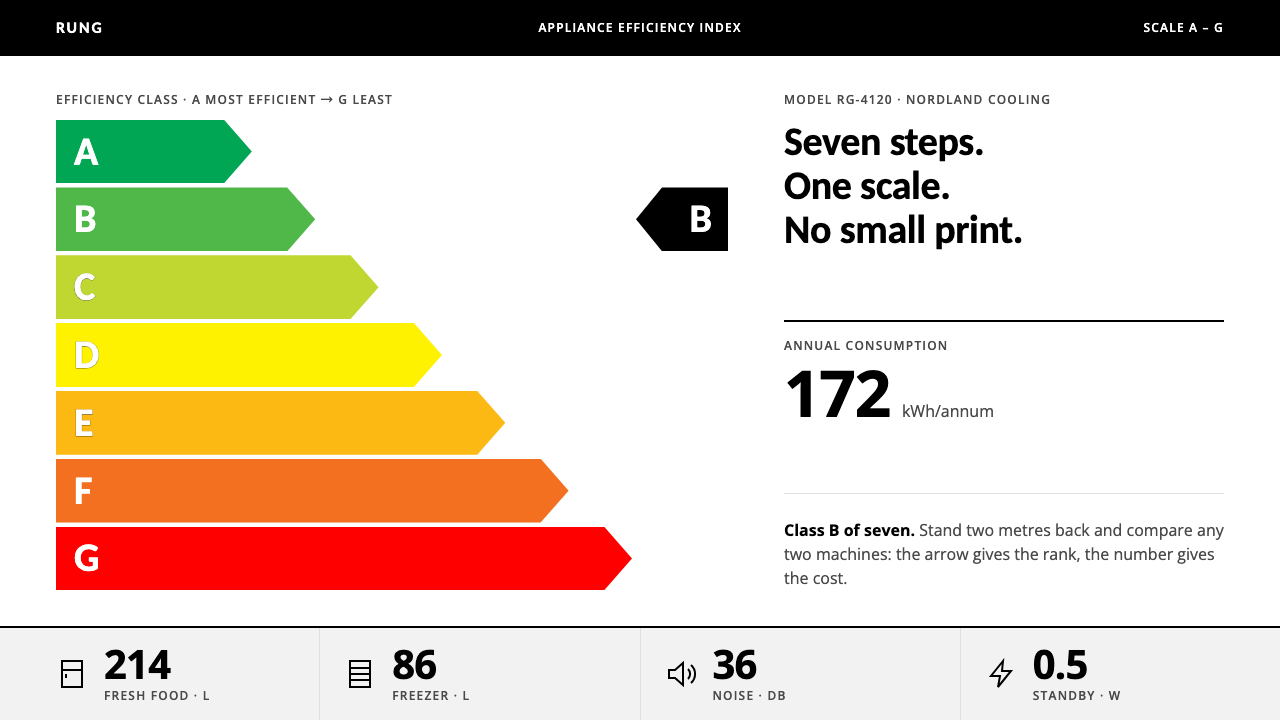 EU Energy LabelRank first, decorate never. Seven stepped arrows, green to red, on white with…
 Gdynia Port ModernismAuthority without ornament. Naval blue rules cross lime plaster above a black…
 Helsinki Metro OrangeOne orange does the work. Archivo signage cuts across an 8px concrete tile gr…