What is EU Energy Label?
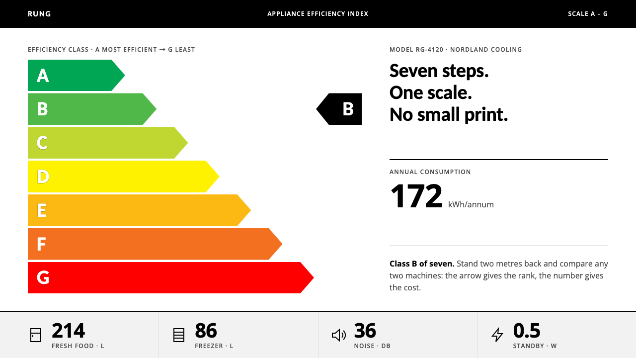
The EU Energy Label is a graphic so regulated that every millimetre, every colour mix and both typefaces are written into law, and so clear that a shopper can rank two machines from two metres away.
EU Energy Label in brief
The EU Energy Label is the white adhesive rectangle stuck to the front of fridges, washing machines, televisions and many other appliances sold across Europe. Seven arrows step in length and colour from a dark green A to a red G, the product’s own class sits in a black pointer beside the scale, and one bold number below states how many kilowatt-hours the machine uses in a year. It is among the most widely seen pieces of regulated information design in the world.
It is a legal document first and a graphic design second. Its dimensions are specified to the millimetre, its colours are given as printing values, and even the typefaces are chosen by the regulation, which names Verdana and Calibri. Its entire logic fits in a single sentence: let a customer standing two metres away compare two machines and tell which is better. Everything that does not serve that comparison has been removed.
Visually, the label is white stock with sharp corners and no shadow, one comparable scale, and numbers instead of sentences. Colour appears only where it encodes rank. The result is a design whose purpose is to be read in seconds by anyone, in any of Europe’s languages, without trusting a word of persuasion. Its motto could be rank first, decorate never.

Where does EU Energy Label come from?
The label has its roots in Brussels and in European law. Directive 92/75/EEC, adopted by the Council of the European Communities in 1992, required household appliances to carry standardised information about their energy use at the point of sale. The first labels appeared in shops in 1994 and 1995. From the outset the label was a policy instrument as much as a graphic: its job was to make a technical difference between two products legible to ordinary buyers, and so to nudge the market toward lower consumption.
The framework was rewritten in 2017 by Regulation (EU) 2017/1369, which sets the rules under which the European Commission, and in particular its energy directorate, maintains the label, and under which national market-surveillance authorities in each member state check that what is shown in a shop is accurate. The people behind the label are therefore mostly institutions: legislators who set the principle, regulators who write the detailed specification, and inspectors who check that a product is not wearing a class it has not earned.
In 2021 the label was rescaled to a plain A to G. Over the years the scale had grown extra classes at the top, marked A+, A++ and A+++, as products improved, until most appliances on sale clustered under a crowded upper end where the difference between the rungs was hard to explain. The redesign dropped the pluses and restored a single seven-step ladder, with room left at the top for future improvement. It is a rare example of a public graphic being reset because the scale itself had become the problem.
Three traditions meet in its design, all named in the sources. It is regulated information design, in which the graphic is a specification as much as an image. It is comparative consumer labelling, the family of nutrition panels, tyre labels and appliance ratings designed to let people compare before they buy. And it belongs to eco-design policy, the effort to use information rather than prohibition to change what is sold. Each of the three favours directness, consistency and the same layout across every product category, and each can be seen in the label’s unadorned form.
What defines the EU Energy Label look?
The Seven-Step Scale
Seven horizontal arrows stack from A at the top to G at the bottom, each shorter or longer than the next in a regular step, coloured from dark green through light green and yellow to orange and red. The arrows are the core of the label. They turn a technical measure into a position in a ranking, and because the scale is the same on every product, a shopper learns it once and reads it everywhere.
The Class Pointer
Beside the scale sits a black pointer, shaped like an arrow, that carries the product’s own class letter. It is the label’s only black element of weight, and it tells you instantly where this machine stands on the ladder. Black, not a colour, is used so that the pointer reads as a mark placed on top of the scale rather than a further rung.
The One Bold Number
Below the scale, a single large figure states annual energy consumption in kilowatt-hours. It is the loudest typographic element on the label and the only one that is not a letter. Because the same quantity is stated on every label, two machines can be compared even when their classes are the same, and the number lets a buyer convert the class into running cost.
White Stock, Sharp Corners
The label is printed on white, with square corners and no shadow, gradient or outline decoration. White is the neutral in which the coloured scale can be read accurately, and straight corners make the sheet look like what it is, a piece of regulated information. The restraint is also practical: the label must reproduce identically on adhesive stock from many printers.
Two Specified Typefaces
The regulation names Verdana and Calibri. Both were designed with on-screen reading in mind, and both stay legible at small sizes. Neither is a typeface with a personality of its own, which is the point: the label should be read as information, not as a brand. Using fixed typefaces also means a label looks the same in every country.
Colour as Data
Colour appears only on the scale, and there it encodes rank. Green means efficient and red means wasteful, with a graduated sequence between them. Nowhere else on the label does colour decorate. This makes the green-to-red ramp one of the most widely understood colour scales in daily life, and it makes the label immediately readable even to those who cannot read the letters.
Numbers Over Sentences
Wherever a quantity can be given as a number, the label gives it as a number, in a stated unit. Wherever a sentence would be needed, the label uses a pictogram or a short fixed phrase. This keeps the sheet independent of language, reduces the chance of misreading, and gives the page the compact, dense feel that marks it as an instrument rather than a brochure.

Who shaped EU Energy Label?
The body that maintains the label’s specification and writes the detailed rules for each product group. Its energy directorate is, in effect, the label’s art director: it decides how many classes there are, where the boundaries fall, and which typefaces and colours are used. That the design of a mass-market graphic is set by a regulator rather than a studio explains its restraint and its uniformity.
The institution that adopted Directive 92/75/EEC in 1992, the legal act from which the label descends. The Directive set the principle that household appliances should carry standardised information about energy consumption, leaving the graphic details to be settled in later implementing rules. The decision to put information on the product, instead of banning the least efficient models outright, is the policy idea behind the design.
The national bodies that check, shop by shop, that the labels displayed are accurate and correctly applied. Their role is invisible in the graphic but essential to it: a comparison scale only works if no one can claim a better rung than the product has earned. Design and enforcement are two halves of the same system, and the label’s plainness is part of what makes it checkable.
How do you use EU Energy Label today?
The EU Energy Label style is a ranking-and-comparison system. It suits any subject in which a person has to choose between like items using a shared measure, and it asks the designer to be disciplined about what is measured, what is ranked and what is left unsaid. Applying it correctly means choosing one scale, committing to white, and making numbers do the talking.
For presentation slides, the style works well for benchmarks, product comparisons and any deck whose main argument is a ranking. A cover can pair a seven-step arrow scale with a short title on a white field. Content slides should hold one comparison each: a ladder of rungs on one side, a pointer or number on the other. Data slides become the label’s natural home, with bars ordered by rank, a single bold figure for the headline value and colour used only along the ranking axis.
For web interfaces, it suits comparison tables, product listings, rating panels, sustainability dashboards and any screen where a user must pick between several options. Use a white page, sharp corners and an unambiguous scale with a consistent direction. Show the rank as a letter and the underlying value as a number. Pricing pages can borrow the idea by laying plans out as steps on one ladder, though the colours should not imply a quality judgement that you are not prepared to defend.
For editorial and marketing work, the style supports explainers, reports and infographics that need to rank things quickly: energy, cost, risk, speed. A feature article can open with a scale, with each section expanding one rung. Because the design is directly associated with efficiency and regulation, it lends campaigns about sustainability and consumer choice an air of authority. Keep copy short and give quantities in numbers with units.
The most common mistake is to use the arrows as decoration. A seven-step scale in green and red tells readers that something is being ranked, and if nothing is, the design misleads. A second mistake is to apply the official-looking format to a product to imply a real energy rating it has not received, which can be a legal problem as well as a design one. A third is to use gradients, shadows or rounded corners, which soften the very precision the label depends on. Finally, never rely on colour alone: always state the class letter and the number.

EU Energy Label — FAQ
Is this the official EU Energy Label?
No. It is a design system that reads the label as a visual language: white stock, sharp corners, a seven-step green-to-red scale, a black pointer and one bold number. The real label is a regulated document with legally defined dimensions, colours and content, issued for specific product groups. Do not use this style to imply an energy rating that a product has not been assigned.
Why does the regulation specify Verdana and Calibri?
Fixed typefaces keep labels identical across manufacturers, printers and countries, and both faces stay legible at small sizes. Neither carries a strong brand personality, so the label reads as neutral information. In practice, designers adopting the style should choose a clean, open sans-serif and apply it consistently, using weight and size rather than extra typefaces for hierarchy.
Why seven classes from A to G?
The 2021 rescale returned the label to a plain A to G after earlier versions had accumulated extra plus classes at the top. Seven steps are enough to separate good from poor performance, few enough to remember, and long enough to leave room for products to improve. For other uses of the style, the lesson is to keep a scale short, ordered and stable, so that every position has a clear meaning.
Can the style be used on a dark background?
The label depends on white stock to make its colours read accurately and to look like a printed regulatory sheet, so a dark variant changes its character. If you need one, keep the ranking colours unchanged, use a single flat dark ground without gradients, and check that the green and red steps are still distinct and that the pointer and numbers remain high-contrast. The result will feel like a dashboard rather than a label.
What kinds of subjects does it suit, and where does it fail?
It suits comparison, benchmarking, compliance, sustainability, procurement and any product or service that can be ranked on a shared scale. It fails where meaning lies in feeling, story or craft, because a style built from rank and number has no vocabulary for warmth. It also fails when the underlying data cannot honestly be placed on a single scale, since the design implies a rigour that the content must actually have.
Related design styles
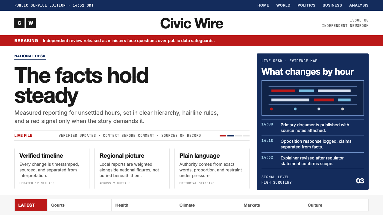 BBC NewsPublic trust, stripped bare. Red alerts, deep navy and hairline grids make ur…
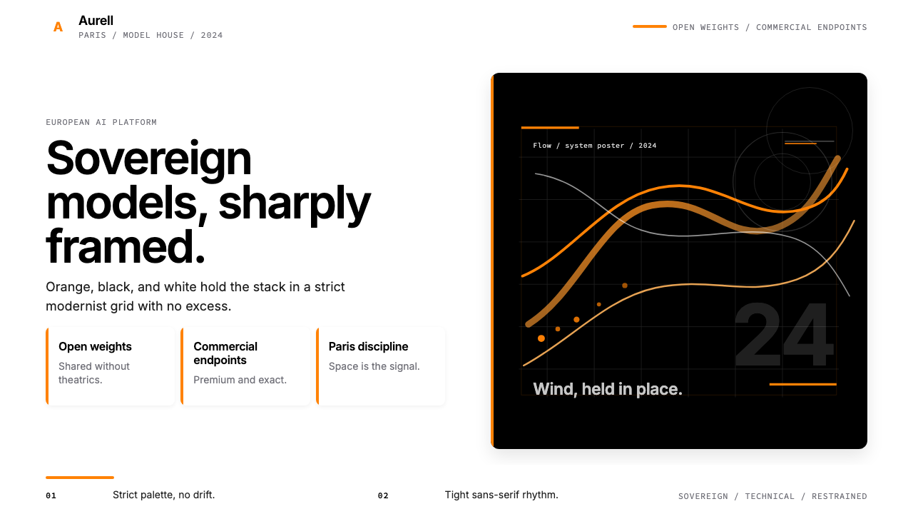 Mistral AI OrangeSovereign AI with restraint. Orange, black, and white lock the grid.
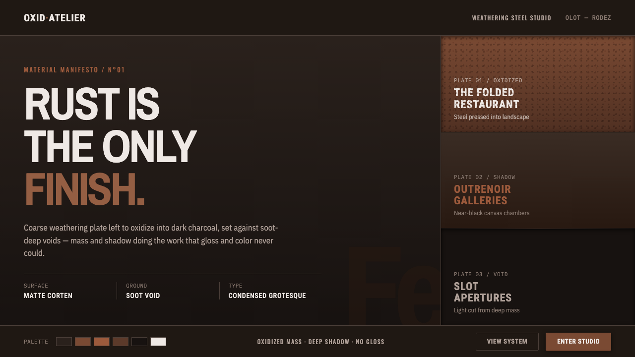 RCR Weathering SteelRust is the only finish. Matte weathering steel emerges from soot-dark voids…
 Buenos Aires Branding StudioRigour with nerve. Black grotesque on warm grey, pierced by one vermillion ma…
 CircleCI Pipeline-GreenConfidence goes green. Emerald status lines cut through terminal-black pipeli…
 COS Gallery MinimalSilence has structure. Cool gallery white, Archivo uppercase, and concrete-gr…