What is Gdynia Port Modernism?
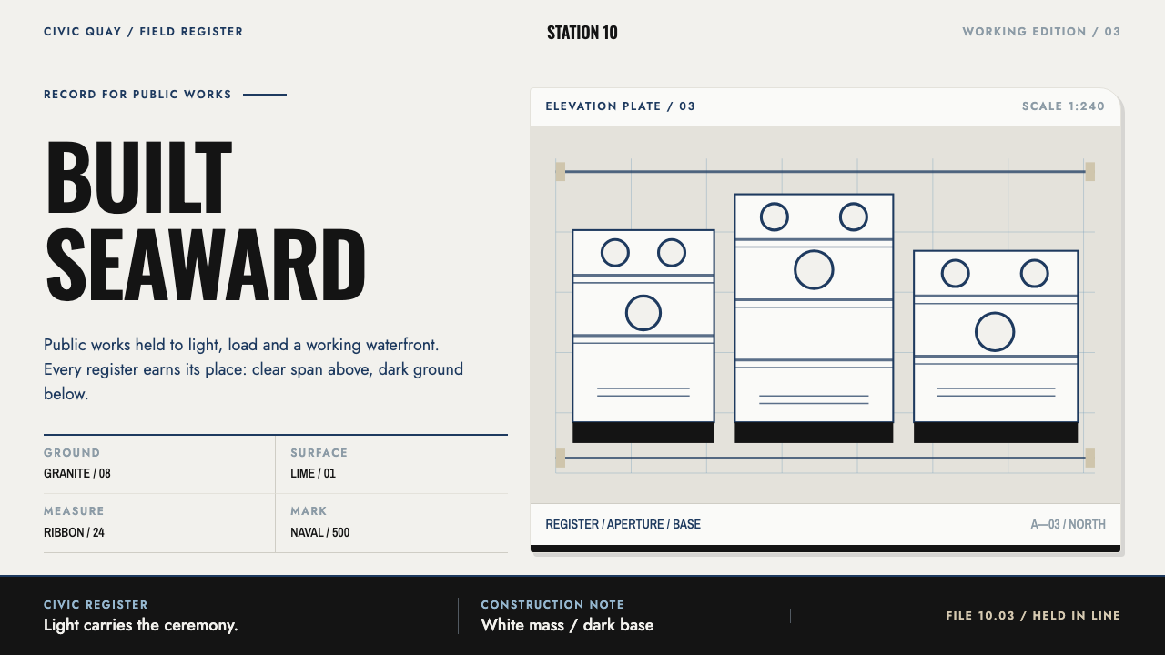
Gdynia's modernism is authority without ornament: white plaster blocks standing on black granite, ruled by naval blue, with only light and shade left to do the decorating.
Gdynia Port Modernism in brief
Gdynia port modernism is the architectural language of a Baltic city built from almost nothing in the years between the two world wars. Its buildings are streamlined white blocks of lime plaster standing on dark granite bases, with long ribbon balconies, rounded corners, porthole windows and slender railings. Taken together they read like ocean liners moored along a street. As a design style, it translates that language into a page: a near-white plaster ground, naval blue for every mark that carries meaning, a heavy dark base under each surface, and shadows that are hard-edged and used as the only depth.
The style rests on a clear hierarchy of materials and meanings. The plaster is pale and matte, a ground that never competes with the content. The blue is reserved for the things a reader needs to find: headings, buttons, dividing lines. The dark base grounds each panel the way granite grounds a building. Shape is limited to a few recurring ideas: the long horizontal band, the rounded corner, the circle of a porthole, the pair of thin rails. Everything else is left plain, and the plainness is a statement of confidence.
What gives the style its character is the way it handles authority. It is not loud, ornamental or nostalgic. It looks like an institution that expects to be taken seriously and does not need to prove it. The result is orderly, calm and archival: well suited to interfaces that need a sense of record and structure, and poorly suited to anything that depends on playfulness or visual noise.

Where does Gdynia Port Modernism come from?
Gdynia's story begins with a geographical problem. In the early 1920s Poland had almost no outlet to the sea, and the decision was made to build a new port on empty ground rather than rely on an existing one. The place chosen was a small fishing village on the Baltic coast. From 1926 it was transformed with remarkable speed, and within roughly a decade it had become a city, with harbours, a commercial centre and housing blocks laid out along new streets. The speed matters for the style: a place built in a single push is built in a single idiom.
That idiom was a modernism specific to its time and place. Gdynia's buildings are white, flat-roofed and streamlined. Their ground floors are faced in dark granite, their corners are turned in curves, their balconies run in long continuous bands, and their openings include round windows and fine railings that echo the details of ships. Architects working in the city did not need to invent a style from scratch; they adapted the functionalism then current across Europe to a maritime national project, and the result was neither a copy of a foreign manner nor a revival of a local one. The reference material places the construction boom between 1926 and 1939, in the Second Polish Republic.
Three currents overlap in the look. Polish interwar modernism supplies the underlying logic of plain geometric volumes, flat roofs and honest planning. Streamline moderne supplies the curves: the rounded corner, the horizontal speed line, the sense that a static building is moving. Maritime functionalism supplies the metaphor and the details, with the liner as the model of an efficient, self-contained, well-ordered object. The street called 10 Lutego is the place the style's own introduction points to as its model, the street where light and shade did the work of decoration that ornament would have done elsewhere.
The architectural heritage has since been recognised on an international level, and the reference material records a UNESCO World Heritage inscription in 2026. That recognition confirms what the visual system already implies: that the plainness of Gdynia's interwar architecture was a considered achievement and not a limitation. For designers, it is a reminder that a restrained style built on a few repeated materials and shapes can be both rigorous and distinctive, and that a city can be a design system.
What defines the Gdynia Port Modernism look?
Plaster Ground
The page is a near-white, matte, slightly grey-leaning surface that recalls lime plaster. It is cool enough to look clean and warm enough not to look clinical, and it carries no texture or pattern. Its job is to be a calm field that lets structure show. The absence of tint variation is deliberate: just as a plastered wall reads as one continuous plane, the page should read as one plane, with differences expressed through edges and bases rather than through changes in the ground itself.
Naval Blue for Meaning
A single deep naval blue carries every mark that needs to be read: headings, buttons, links, dividing rules. It is never spread across large surfaces as a wash or a background. The restraint creates a clear rule for a reader: if something is blue, it is a decision, a label or a boundary. Because the blue is dark and desaturated, the page stays composed even when many blue marks are present, and the effect is official rather than playful.
Black Granite Base
Each surface, whether a card, a panel or a section, rests on a heavy dark base, the visual equivalent of the black granite that faces the ground floor of a Gdynia building. The base grounds the lighter body above it and gives every component a clear bottom edge. This is the main way the system expresses weight and stability. Without it, plaster-white panels would float; with it, they stand.
Horizontal Ribbons
Long horizontal lines and bands cross the page the way ribbon balconies cross a façade. Naval blue rules run edge to edge or span a full column, dividing sections and giving the eye a sense of speed and direction. The horizontal emphasis suits wide screens and landscape slides, and it creates a rhythm of repeated lines that reads as order. Vertical elements are minimal, limited mostly to the slender railing motif.
Rounded Corners and Portholes
Curves are used sparingly and always with a nautical logic. A rounded corner on a block recalls a streamlined ship's superstructure, and a circle recalls a porthole. These are the only organic shapes in an otherwise rectilinear system, and they appear in a few places only, such as the corner of a card, an avatar, a status indicator, or a single circular detail on a cover. Overused, they would turn the style into something soft; used sparingly, they give it its distinctive profile.
Hard-Edged Shadow
Depth comes from shadow, and only from shadow. It is cast as a hard, clearly bounded shape at a consistent angle, like the line that noon sun draws across a white wall. There is no blur, no glow and no soft diffusion. The shadow behaves like part of the structure: another plane on the page, defined by its edge. This is how the style gets relief without ornament, and it is why the introduction says that light and shade do the work.
Paired Slender Rails
A pair of thin parallel lines recalls the paired railings of a balcony or a ship's deck. Along with the ribbon band, the porthole circle and the rounded corner, it belongs to the small repertoire of motifs the system permits. The motifs are structural, not decorative: they appear where something needs to be divided, bordered or marked, and they are drawn in the same blue as the other meaningful marks. There is no pattern beyond these few repeated forms.

Who shaped Gdynia Port Modernism?
Stanisław Ziołowski is listed first among the key figures in the reference material for this style. The name belongs to the generation of designers who worked in Gdynia during the construction boom, when a city was being laid out and built almost at the same moment. Individual attributions of particular buildings are best checked in architectural histories. What matters for a design system is the collective achievement: a coherent vocabulary applied consistently across a whole city.
Zbigniew Kupiec is another of the names the reference material gives for Gdynia's interwar modernism. Naming several figures rather than one is itself informative: this was not a style invented by a single author but one shared by a group of people working in the same city at the same time. The lesson for design is that consistency across many hands is made possible by a small, clearly defined set of rules, such as the plaster, the granite, the ribbon and the curve.
Tadeusz Kossak appears in the reference material alongside the other figures of the city's building generation. The way to read this name is as part of the cohort that translated international functionalism into a local maritime idiom. The reference material does not reduce the style to a single building or a single hand, and neither should a designer: the system is the repeated pattern of plaster, base, band and curve, not any single example.
Adam Półtawski is the last of the four names the reference material lists for the style. Together they point to a design culture in which the building was understood as part of a larger programme, a port city with a clear identity. For anyone borrowing the visual language, that suggests treating each page as a component of a coherent whole, with the same ground, the same blue and the same base appearing everywhere, rather than as an isolated composition.
How do you use Gdynia Port Modernism today?
Gdynia port modernism suits work that needs to feel official, ordered and trustworthy without being cold or decorative. Its core discipline is simple: pale ground, one blue for meaning, a dark base under every surface, and hard shadows as the only depth. Applied with that discipline, it gives a project the quiet authority of a well-run institution.
On presentation slides, a cover works well as a pale field with a long naval blue rule across the page and the title above it, with a dark band along the bottom edge acting as the granite base. Content slides can use the same structure: a heading in blue, text in dark neutral type, a horizontal rule beneath each section and a dark base under any boxed content. Data slides take naturally to horizontal bars and ruled tables, with blue reserved for the figure that matters and a hard-edged shadow used to lift a key panel.
For web interfaces, the style suits archives, document libraries, administrative tools, reporting dashboards, public-sector and institutional sites, logistics and maritime products, and anything that needs a sense of record. Cards sit on a dark base with a clean top surface; buttons are blue with sharp or slightly rounded corners; section dividers are full-width blue rules. A pricing page can lay tiers out as aligned panels on dark bases, with the recommended tier distinguished by a stronger shadow and a blue heading rather than by colour fills.
In editorial and marketing work, the style gives reports, annual reviews, white papers and institutional publications a calm and serious character. Articles can use a wide column with blue headings and long horizontal rules between sections, and the porthole circle can serve as a single graphic accent for a cover or an author portrait. Marketing pages for places, architecture, transport, finance or civic projects can lean on the style's links to the sea and to modern construction without resorting to nautical clichés.
The most common mistake is to treat the nautical theme as costume: adding anchors, ropes, waves or stripes in the manner of sailor clothing. The reference is modern architecture, not maritime decoration, and the style works because nothing is added. A second mistake is to flood the page with blue, which breaks the rule that blue means something. A third is to soften the shadows or use gradients, and a fourth is to omit the dark base so that the panels lose their weight. Order and restraint are what the style sells.

Gdynia Port Modernism — FAQ
Is this the same as Art Deco?
No, although they share some of the same curves. Art Deco is generally ornamental, with rich materials, geometric patterns and decorative flourishes. Gdynia's modernism, by contrast, is defined by the absence of ornament, with plain plaster, simple volumes and a small set of structural details. The reference material places it within Polish interwar modernism, streamline moderne and maritime functionalism, which are all families of restraint. If a design is full of patterns and gilding, it is not this style.
Why is blue limited to meaningful marks?
Because the colour is a signal. The pale ground is intentionally neutral, so anything in naval blue reads immediately as a heading, a control or a boundary. If blue is also used as a background wash or a decorative band, the signal is lost and the page becomes a blue page. This rule also makes the style easy to apply consistently: when in doubt about whether something should be blue, ask whether it carries meaning.
What is the role of the dark base?
It gives every surface weight. In Gdynia's buildings, dark granite at street level grounds a pale upper body, and the style reproduces that relationship in each panel: a light surface resting on a heavy dark edge. It also gives components a clear bottom boundary, which helps scanning in lists and grids. Treat the base as a structural part of the component, not as a shadow or a border added afterwards.
Can the style work as a dark theme?
The source system is a light one, and the pale plaster ground is central to how it works, since the shadows, the blue marks and the dark bases all depend on a light field to be seen. A dark version would reverse the relationships and lose the contrast between plaster and granite that gives the style its identity. If a dark mode is needed, it is better to preserve the logic, with one colour for meaning, hard shadows and strong bases, than to invert the palette mechanically.
What kinds of project should avoid it?
It is a poor fit for playful consumer brands, children's products, food and lifestyle content, and any context where warmth, texture or visual abundance is part of the appeal. Its austerity can read as cold or bureaucratic if the content is emotional. It performs best for institutions, records, infrastructure, architecture and professional tools, where order is itself the message.
Related design styles
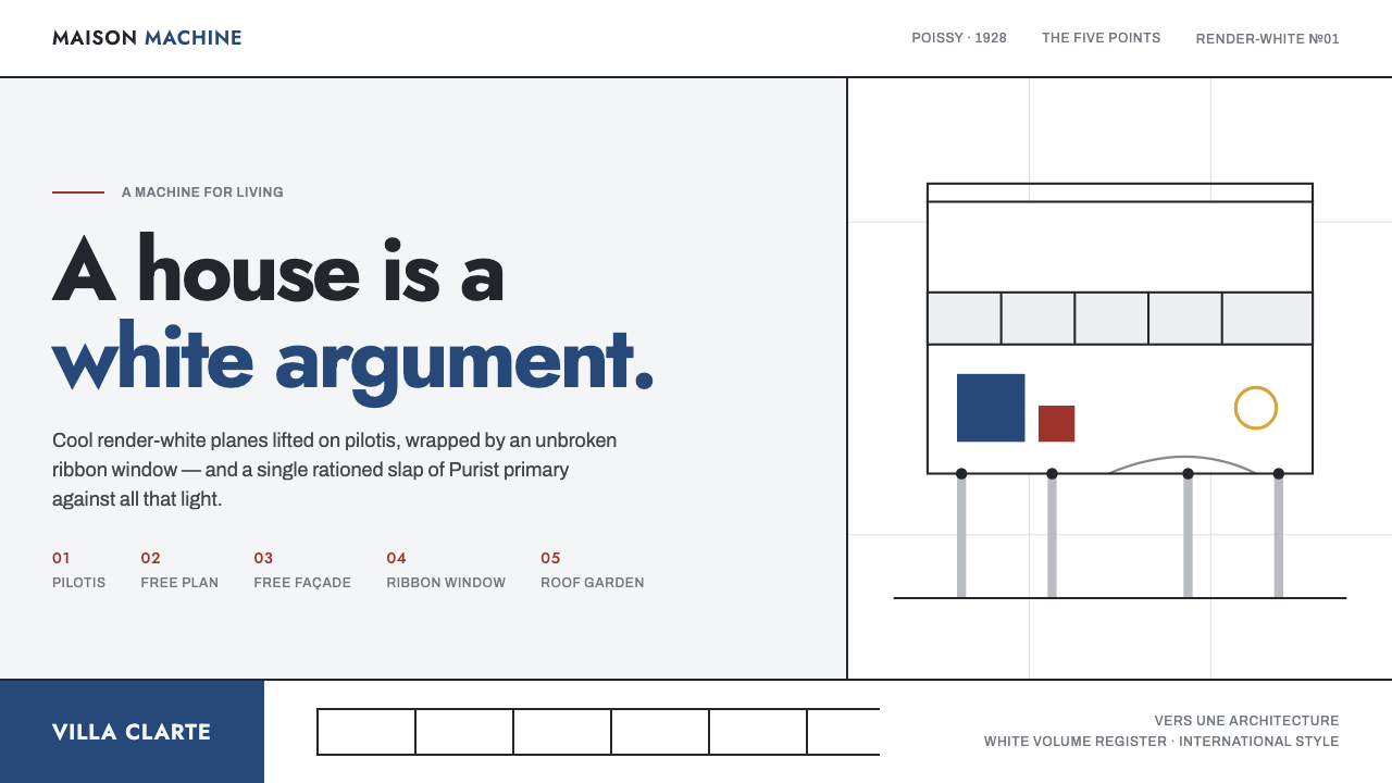 Le Corbusier Purist WhiteA house is a white argument: render-white planes, ribbon windows, one slap of…
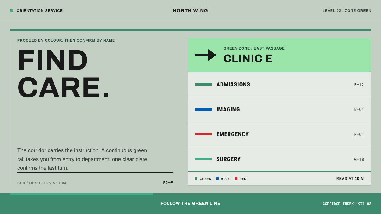 Hospital Wayfinding 1970Colour removes hesitation. Enamel green rails and open grotesque plates lead…
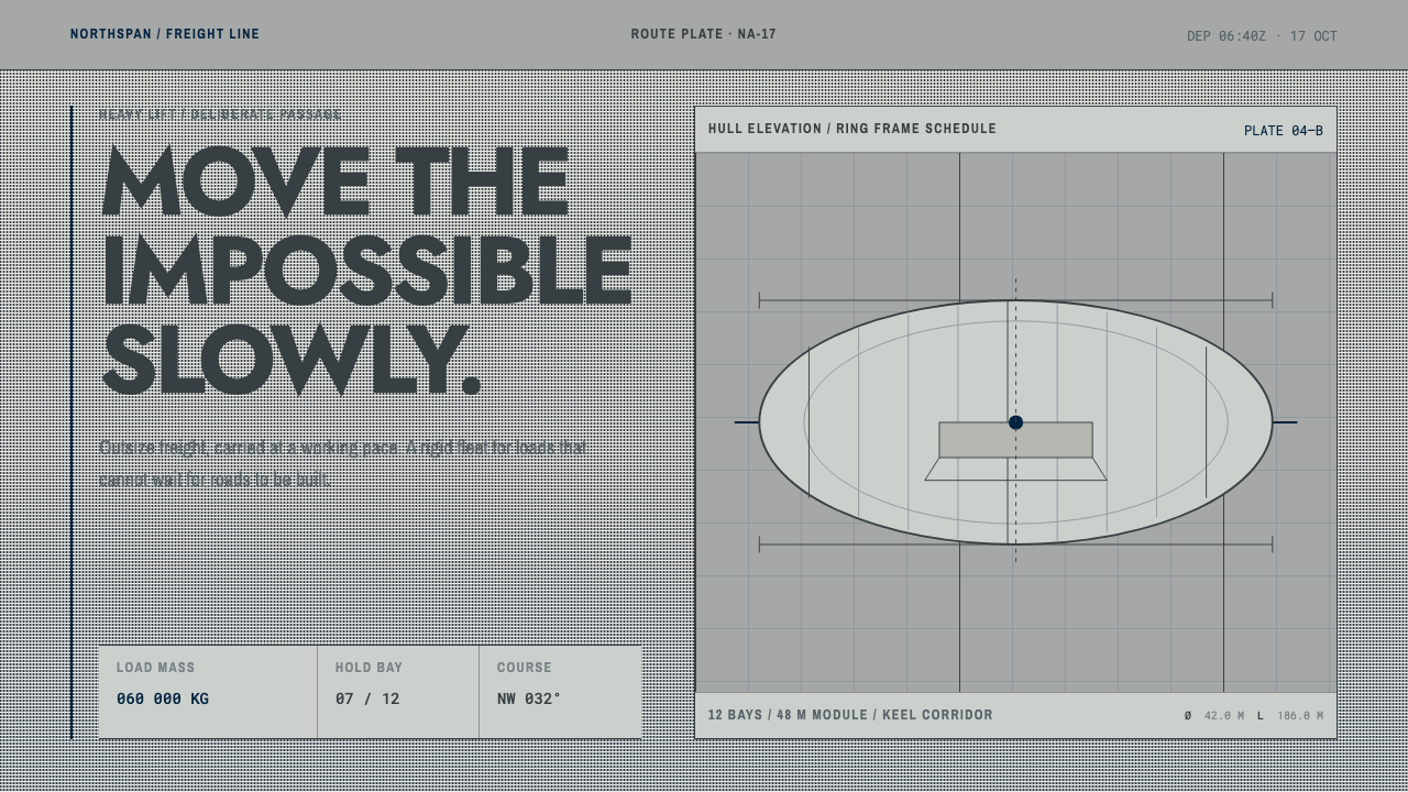 Hydrogen Airship FreightSlow freight is a capability. Matte aluminium grey, DIN grids, and a measured…
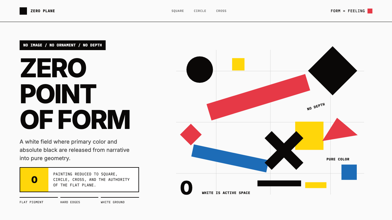 Malevich SuprematismGeometry declares zero. Red, yellow, blue and black blocks float on active wh…
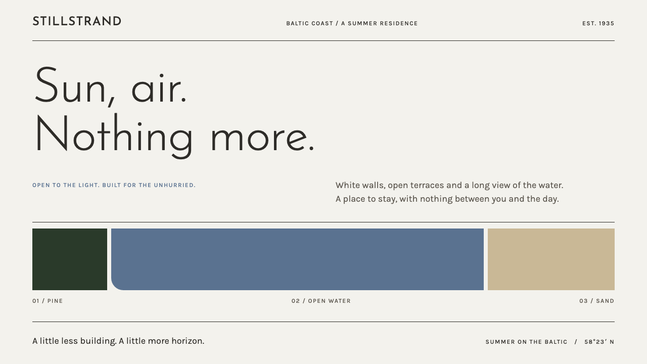 Pärnu Resort FunctionalismNothing ornamental. Light geometric type and Baltic-blue bands stretch across…
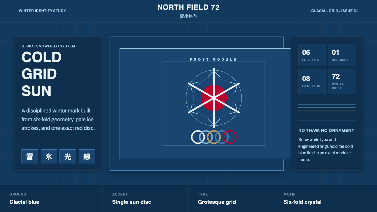 Sapporo Winter 1972Icy order, exact and calm. Glacial blue grid, snow-white type, one red sun di…