What is Wau Bulan Moon Kite?
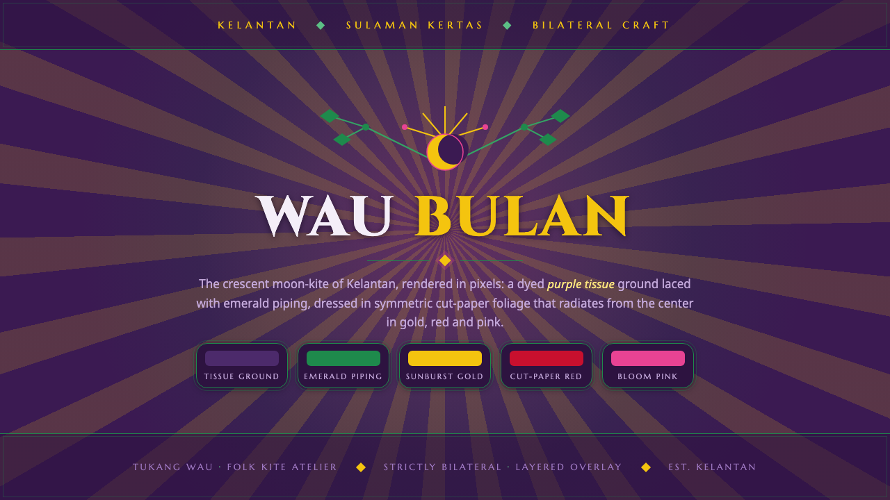
Wau Bulan turns the crescent kite into a ceremonial visual system — deep purple ground, emerald piping, and gold-and-pink foliage radiating in exact symmetry.
Wau Bulan Moon Kite in brief
Wau Bulan is the crescent moon-kite craft of Kelantan, Malaysia, on the east-coast peninsula. Its physical form combines a bamboo frame, colored tissue, and lacy cut-paper overlays arranged across the kite’s wings. The result is both an object and an ornamented surface: a dark, disciplined ground carrying dense floral and foliate decoration.
The visual language is immediately defined by contrast and symmetry. Deep purple establishes a solemn field; emerald piping traces and contains the silhouette; green, red, gold, and pink foliage gathers into mirrored scrolls and sunburst arrangements. The ornament is not scattered decoration. It climbs, curls, and radiates from a center, creating a sense of controlled expansion.
As a digital design system, Wau Bulan translates this craft logic into layered interfaces and compositions. The background remains deep and atmospheric, the border acts as a visible frame, and ornament is concentrated around axes, edges, or focal points. The mood is formal, opulent, and handmade without becoming loose: every flourish belongs to a larger symmetrical structure.
Where does Wau Bulan Moon Kite come from?
The source places Wau Bulan in Kelantan, Malaysia, and identifies it as a living folk craft whose peak documentation era runs from 1950 to 1990. Its setting is the east-coast peninsula, while its visual identity is tied to the crescent moon-kite rather than to a general decorative style. The craft belongs to Malay folk kite-making and remains legible through its distinctive silhouette and surface treatment.
The construction begins with a bamboo frame skinned in colored tissue. That paper ground provides the field on which the decorative system is built. Over it, artisans apply cut-paper elements described as sulaman kertas: lace-like floral and vine overlays that transform the plain surface into a dense ornamental skin. The material sequence matters. Structure comes first, color establishes the ground, and paper ornament follows the frame.
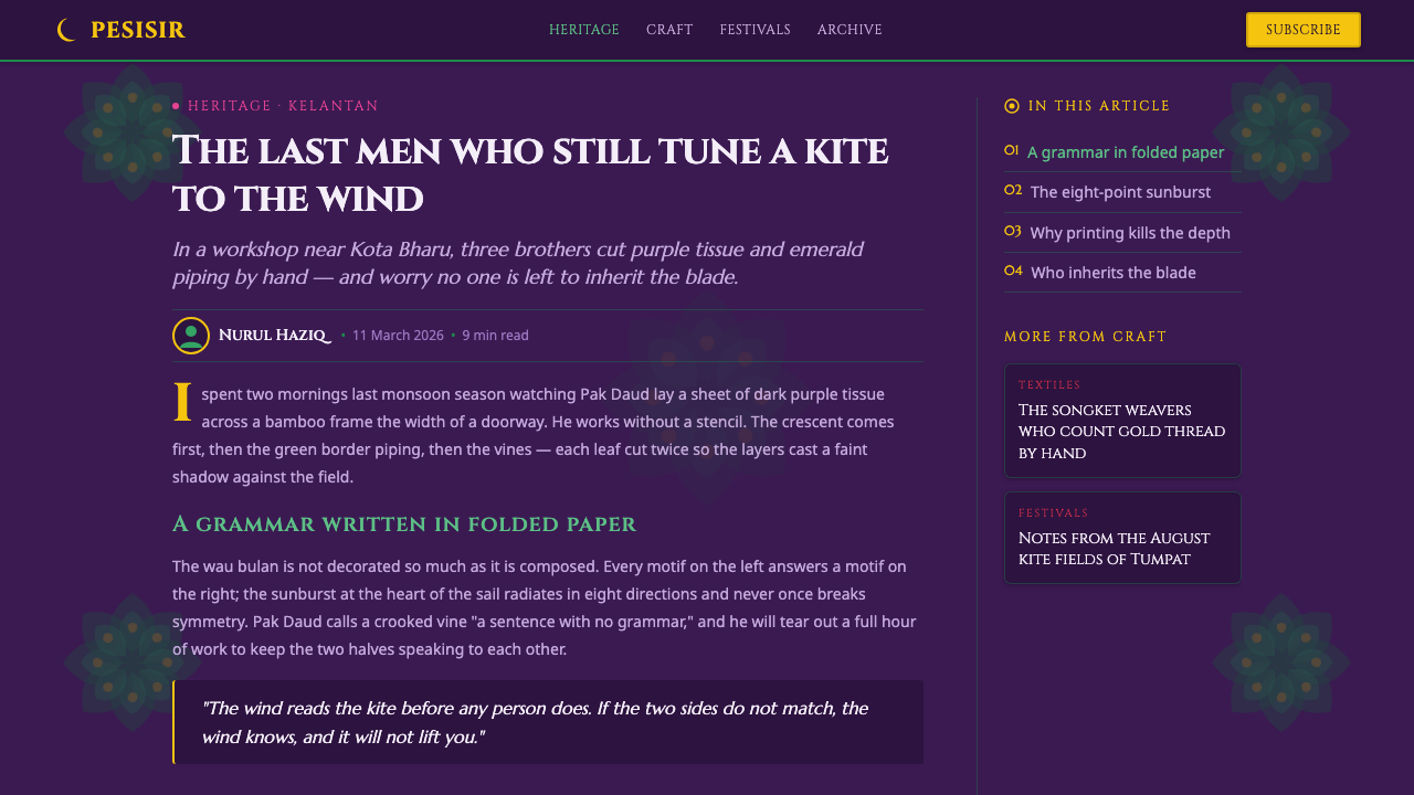
Museum pieces show a characteristic combination of dark purple tissue, green piping, symmetric leaf scrollwork, and sunburst foliage. Green, red, gold, and pink work together across the wings, but the palette is held in order by mirrored placement and a clear center. The impression is not of random richness; it is of abundance disciplined by craft, outline, and repetition.
The digital style system distills these observed qualities rather than replacing them with unrelated decoration. Deep purple becomes the field, emerald becomes the enclosing piping, and layered foliage becomes a system of repeated accents that radiate from a central axis. The result treats Wau Bulan as a compositional method: frame the surface, establish symmetry, then let ornament grow outward in controlled layers.
What defines the Wau Bulan Moon Kite look?
Deep Purple Ground
The ground is dark purple, giving the system its nocturnal, ceremonial weight. It is not merely a background color; it is the paper field that makes every brighter layer visible. Emerald, red, gold, and pink appear more precious against it, while pale text and open space gain a calm contrast. Keep the field broad and uninterrupted so that ornament reads as applied craft rather than as a collection of unrelated badges.
Emerald Piping
Green piping defines the perimeter and gives the composition a finished edge. Its role is closer to binding or embroidery than to a casual outline: it holds the dark field together and announces the silhouette before the interior ornament is read. Use it to frame panels, cards, titles, or major visual zones, but keep its presence continuous enough to feel structural.
Radial Symmetry
Symmetry is the governing discipline. Foliage, scrolls, and accents should mirror across a central axis or unfold from a clear center, echoing the way decoration climbs the two wings of the kite. This does not require every element to be identical. Variation can occur inside the mirrored structure, but the overall balance must remain unmistakable and ceremonial.
Cut-Paper Layering
The decorative language should feel assembled from overlapping cut-paper pieces. Leaves sit beside curls, petals interrupt borders, and small accents build density around larger forms. Layering creates richness without relying on gradients or simulated material effects. The key is visible adjacency: each shape should appear placed, attached, or nested within another, as though the surface has been built by hand.
Floral and Vine Ornament
The ornament is botanical in vocabulary but formal in behavior. Leaves, vines, and sunburst foliage are repeated, mirrored, and directed along the composition instead of rendered as naturalistic illustration. Their curves soften the strict frame while their repetition preserves order. The effect is dense and decorative, yet still readable as a designed system because every motif has a path and a relationship to the center.
Jewel-Tone Accents
Emerald, red, gold, and pink provide the bright ornamental register against the purple field. Gold and pink are especially effective when reserved for foliage highlights, ceremonial marks, or focal details, while green can connect the piping to the interior pattern. Red should feel intentional rather than widespread. The palette gains authority when each color has a recognizable role within the symmetry.
Crafted Formality
Wau Bulan balances richness with restraint. The surface may be densely ornamented, but the silhouette, center, border, and color roles remain controlled. This gives the style a particular kind of formality: it is celebratory without being chaotic, handmade without appearing accidental, and decorative without losing hierarchy. Digital applications should preserve that tension instead of flattening the style into generic floral pattern.
Who shaped Wau Bulan Moon Kite?
The source identifies Kelantanese kite masters as the central makers within the Wau Bulan tradition. Their role is represented in the design system through structural discipline: the bamboo frame, the colored tissue ground, the defined silhouette, and the symmetrical organization of the wings. In a digital interpretation, their presence is felt whenever ornament remains subordinate to the kite’s overall construction.
Cut-paper artisans give the surface its lace-like density. The source associates their work with sulaman kertas, the decorative practice of applying floral and vine cut-paper overlays. Their contribution is translated through visible layering, repeated foliage, mirrored scrollwork, and the careful placement of gold and pink accents. They are not treated as providers of random embellishment; they establish the system’s ornamental vocabulary.
Wau Bulan itself functions as the defining figure of the system: a crescent moon-kite whose bamboo structure and decorated tissue surface operate together. Its form joins silhouette and ornament, frame and paper, center and wings. The digital style follows that unity. A panel is not simply colored purple and decorated afterward; its field, piping, symmetry, and foliage must read as one constructed object.
How do you use Wau Bulan Moon Kite today?
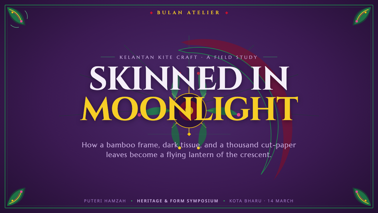
For presentation slides, use the Wau Bulan system most strongly on the cover and section dividers: a deep purple field, an emerald perimeter, and a central crescent-inspired or foliate arrangement can establish the visual identity immediately. Content slides should quiet the ornament and keep the main reading area open, using piping or a small mirrored foliage mark to connect pages. Data slides can turn charts into framed craft panels, with color assigned consistently and symmetry used to compare opposing values or categories.
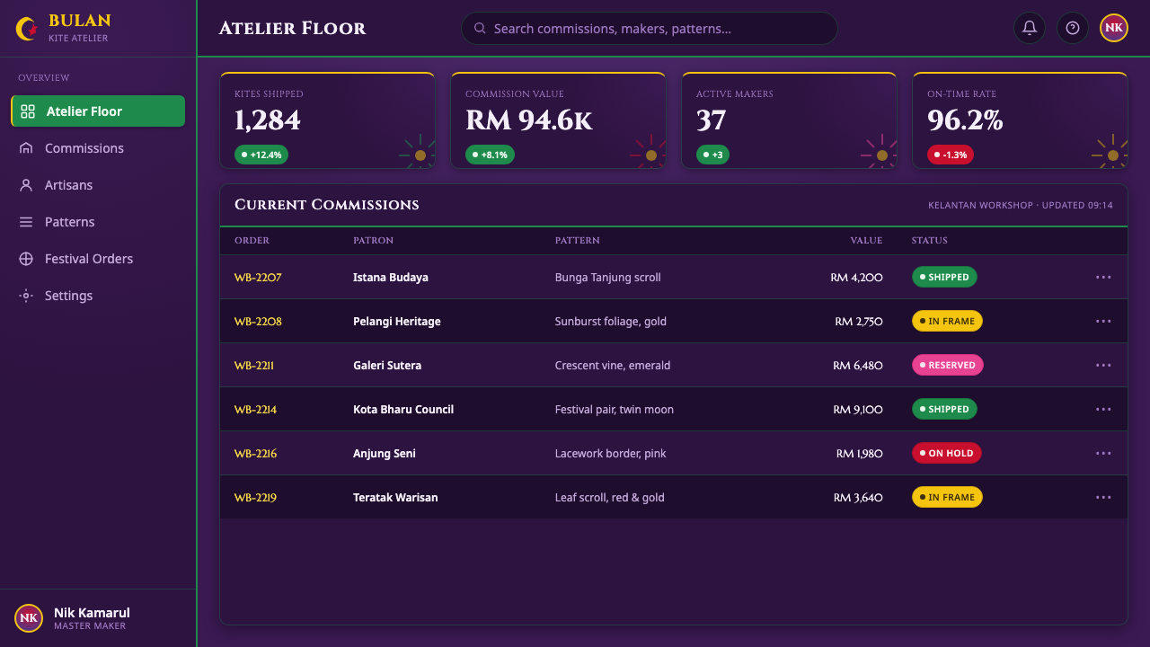
For web interfaces, the style suits dashboards and pricing pages that need a strong branded atmosphere rather than anonymous utility. Deep purple can establish the application field, emerald can separate navigation or card boundaries, and gold, pink, red, and green can distinguish states or tiers. Ornament should gather around headers, empty states, or key summaries, while dense tables and controls remain calm. The interface should feel like a constructed kite surface, not a floral wallpaper applied behind generic components.
For editorial and marketing work, Wau Bulan supports covers, invitations, cultural features, product stories, and campaigns that need ceremonial richness. A headline can sit in a broad purple field while symmetrical foliage frames the page or grows from a central mark. Marketing sections can alternate between open dark space and dense ornamental moments, allowing the cut-paper language to function as punctuation. Keep photography, if present, subordinate to the frame and pattern so the composition remains cohesive.
For data communication, symmetry can become an organizing device rather than a purely decorative gesture. Mirrored panels can compare two offers, regions, or stages; a central summary can anchor supporting information that radiates outward; and repeated foliage motifs can mark related groups. Gold or pink should signal emphasis, not fill every available surface. The system is strongest when the viewer can sense both the information structure and the hand-built richness of the craft.
The common mistake is to treat Wau Bulan as a purple background with many ornamental stickers. That approach keeps the palette but loses the craft logic. Avoid scattering motifs without a center, mixing unrelated border treatments, or giving every accent equal prominence. Establish the silhouette or frame first, define a clear axis, assign each bright color a role, and let ornament build in layers. Density should feel intentional, with enough open purple space for the pattern to breathe.
Wau Bulan Moon Kite — FAQ
Is Wau Bulan just a purple and green color palette?
No. Purple and emerald establish the primary atmosphere, but the identity depends on how color, frame, symmetry, and cut-paper layering work together. A purple surface with scattered floral decoration may borrow the palette while missing the system. Authentic application requires a visible center or axis, a contained perimeter, and ornament that appears to grow outward in related layers.
Why is symmetry so important to the style?
The source describes foliage and scrollwork as symmetric and radiating across the kite’s wings. Symmetry therefore connects the digital system to the object it interprets. It also gives dense ornament a readable order: the viewer can understand where the composition begins, how it expands, and what its focal point is. Asymmetry can appear in small details, but it should not obscure the governing balance.
How can dense ornament remain usable in an interface?
Treat ornament as a framing and grouping device rather than as continuous content. Concentrate it around headers, summaries, edges, or selected focal moments, and leave practical controls and long-form information quieter. Use the piping to clarify boundaries and reserve the brighter accents for meaningful states or distinctions. The contrast between dense craft and open field is what keeps the interface legible.
Can the system be adapted beyond kite-shaped compositions?
Yes, provided the underlying relationships remain intact. The system can frame a slide, card, editorial page, dashboard, or campaign panel through a dark field, a visible perimeter, and foliage that mirrors or radiates from a center. The shape does not need to imitate a literal kite. What must remain is the sense that the surface has been constructed around a balanced frame and an ornamental axis.
What is the biggest mistake when using Wau Bulan?
The biggest mistake is confusing ornament density with ornament logic. Adding more leaves, curls, and bright colors does not automatically create the style. Without a center, mirrored relationships, a contained border, and clear color roles, the result becomes noisy. Wau Bulan works when richness is organized: every layer should support the silhouette, the axis, or the hierarchy of the composition.
Related design styles
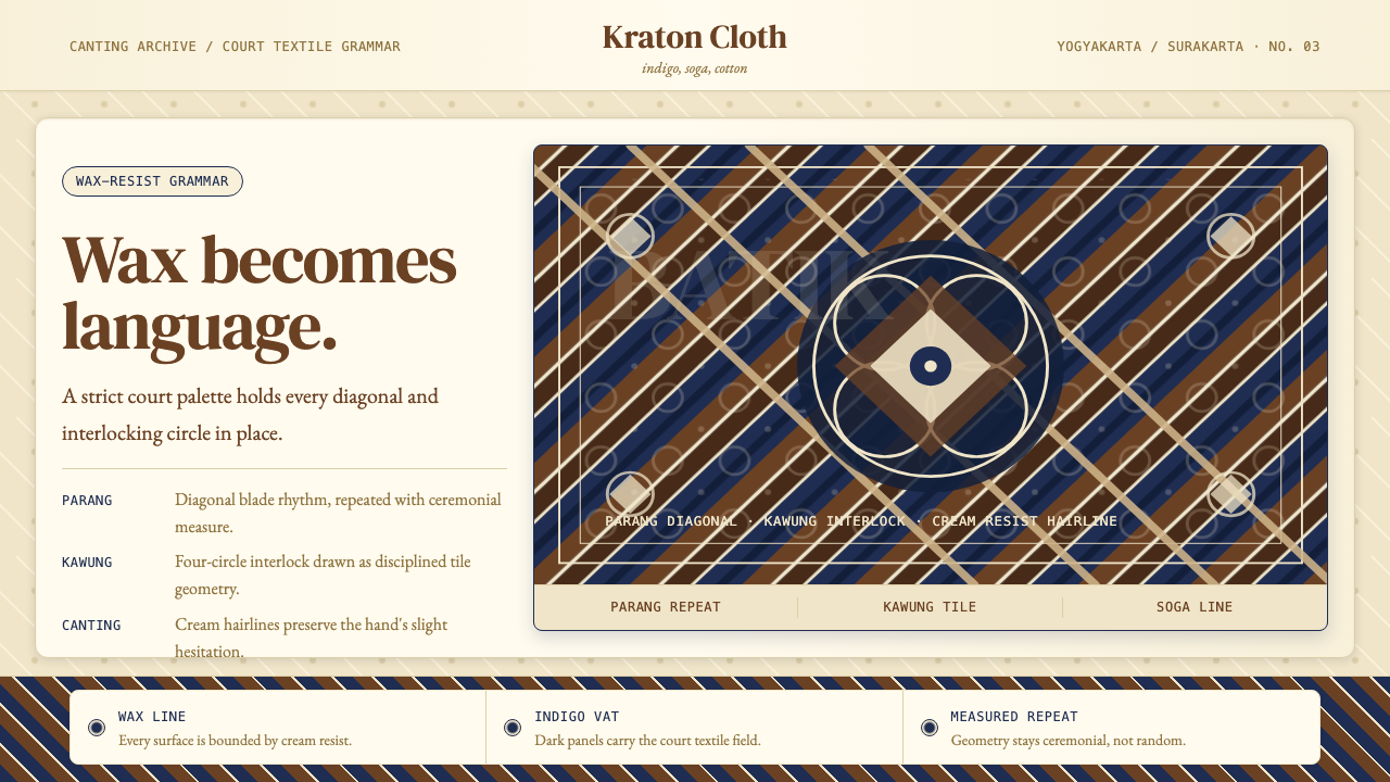 Javanese BatikCeremonial repetition. Indigo, soga, and cream frame a tiled canting motif.
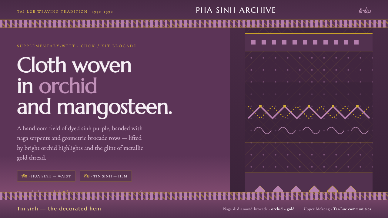 Lao Orchid Mauve TextileHandwoven sinh silk made digital. Orchid-mangosteen ground banded with naga b…
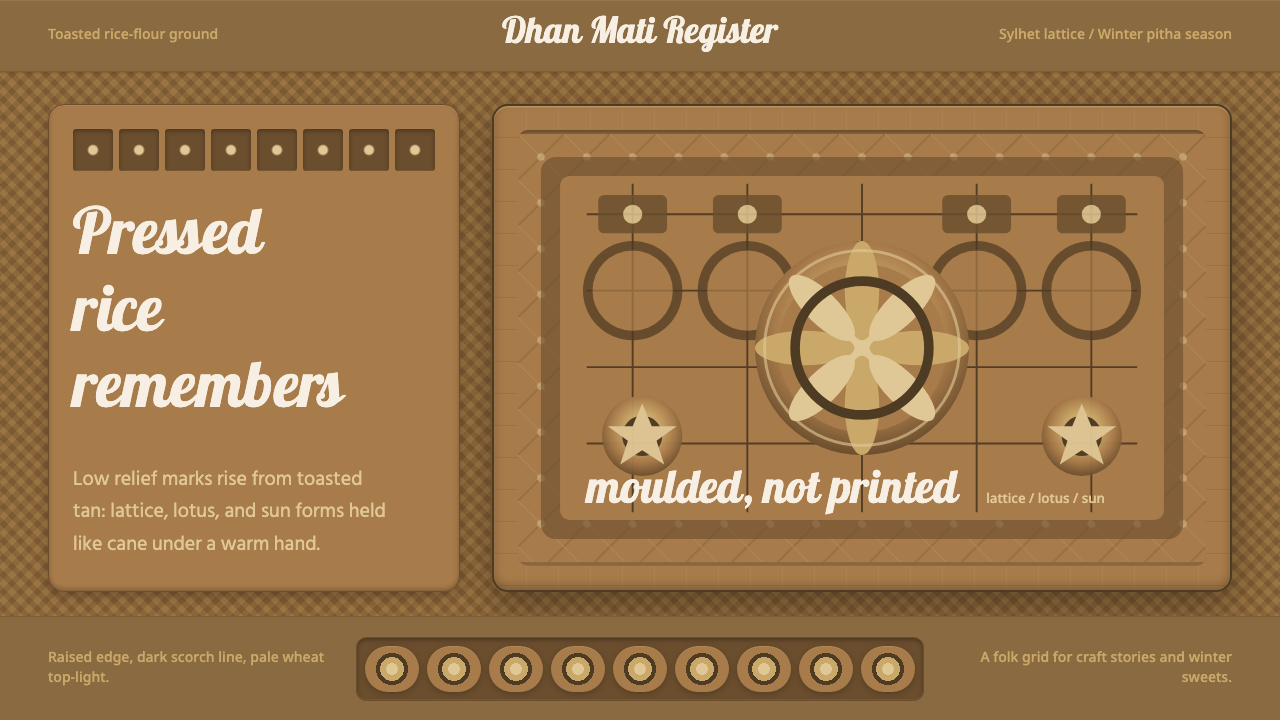 Bangladeshi Nakshi Pitha MotifsWarm relief, never print. Galada type and tan lattice press rice-flour craft…
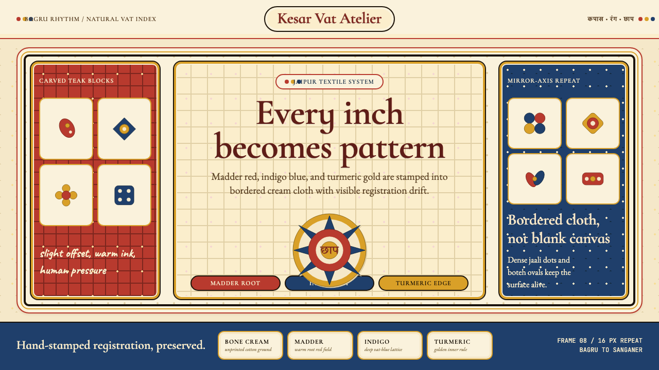 Indian Block PrintPattern claims every inch. Madder, indigo and turmeric stamp dense bordered c…
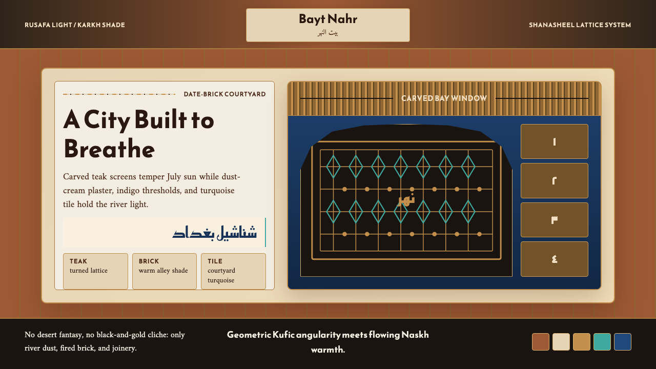 Iraqi Baghdad Shanasheel HouseBreathes through ornament. Date-brick ground, teak lattice, and turquoise til…
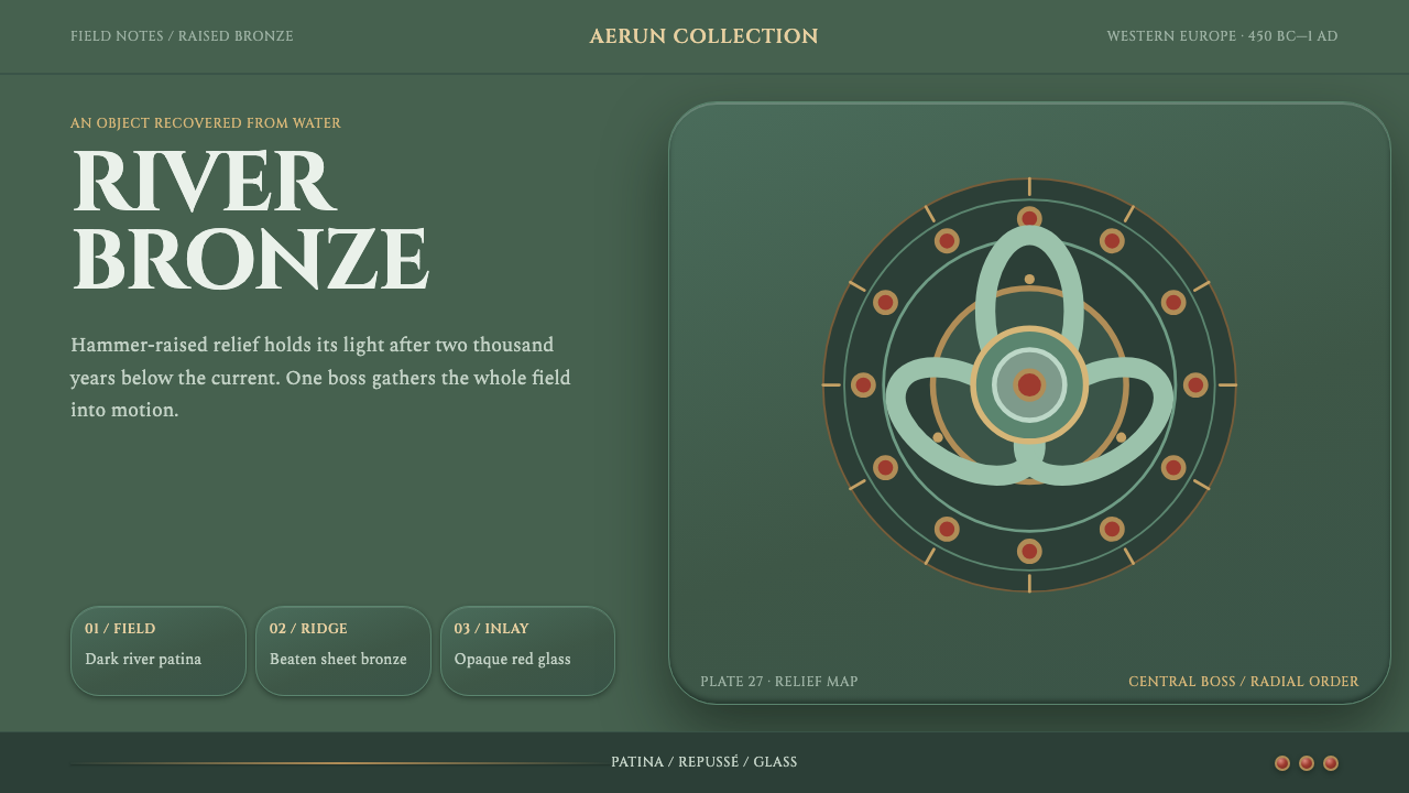 La Tène Celtic MetalworkMetalwork that still moves. Patina-green relief radiates from a bronze boss,…