What is Gule Wamkulu Mask?
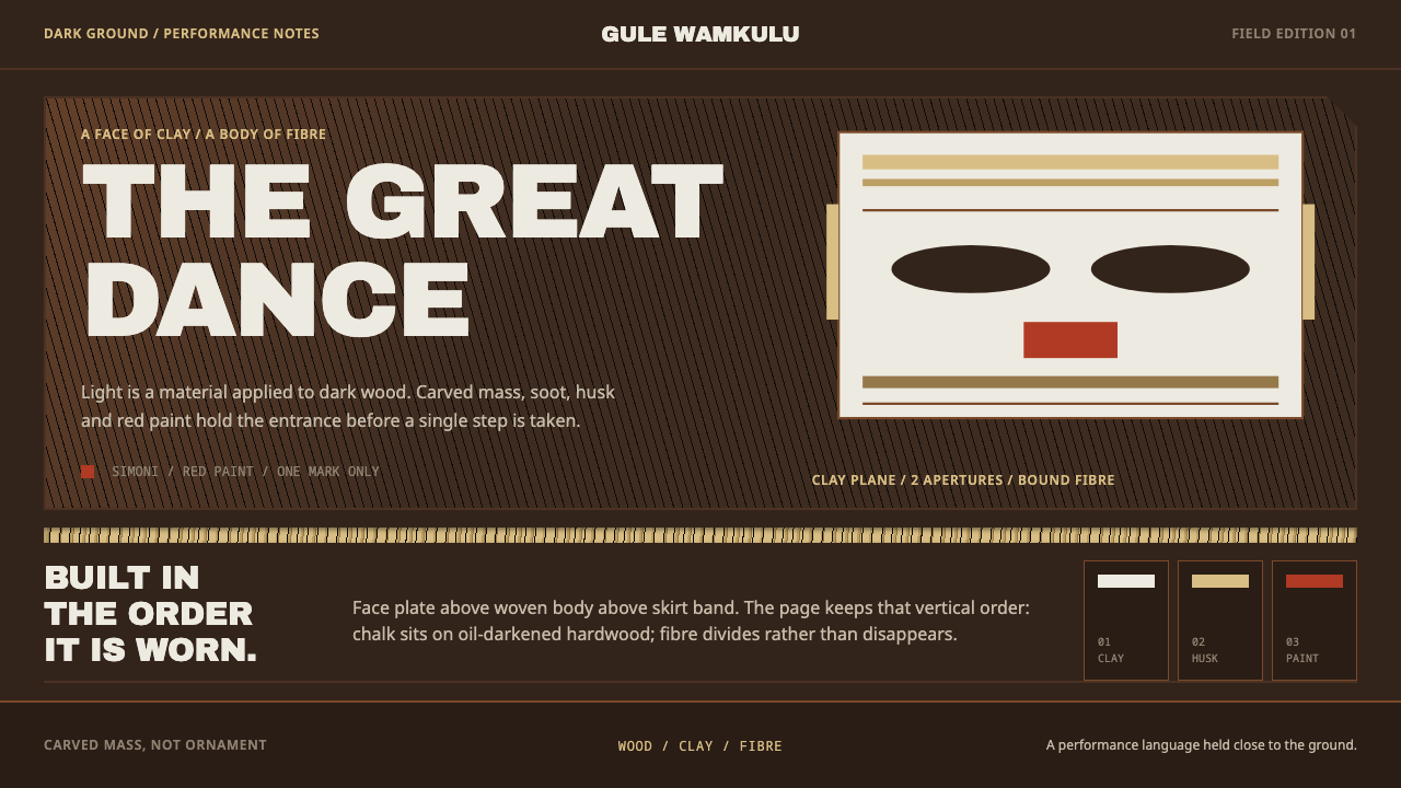
Gule Wamkulu takes the Chewa Nyau mask as its blueprint: clay-white and husk-buff laid over soot-darkened wood, so that light is always a substance applied to dark.
Gule Wamkulu Mask in brief
Gule Wamkulu is the Great Dance of the Chewa Nyau brotherhood, performed in Malawi, eastern Zambia and western Mozambique. Masked spirit characters arrive at initiations, funerals and the installations of chiefs. The style takes its name and its logic from the central object of that dance: a carved hardwood face, cut from dense, oily timber, darkened over the years by hearth soot and whitened with clay. Beneath the face the body is built from dried maize husks and woven grass.
The design system inherits that order exactly. The ground is wood: dark, heavy and warm. Everything legible sits on top of it as chalk, husk-buff or red paint, which is to say as applied substances rather than as light emitted from a screen. Type carries carved mass instead of costume, dividing rules are bands of woven fibre rather than hairlines, and surfaces keep the marks of the adze that shaped them.
It is a dark style, but not a night-mode style. Light never becomes the page. It remains a substance laid onto dark, with weight, grain and an uneven edge. That reversal of the usual digital default, in which dark is merely the absence of a bright page, is what gives the style its gravity.
Where does Gule Wamkulu Mask come from?
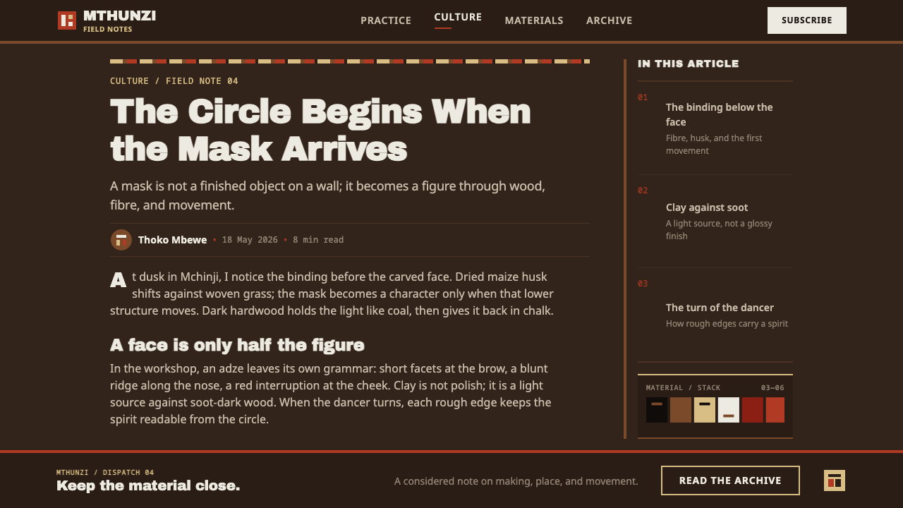
Nyau is the masquerade society of the Chewa people, a tradition of Central Africa whose origins the style's references place before 1900 and which is still performed today. Its public face is Gule Wamkulu, the Great Dance, in which members of the brotherhood appear in masks and costumes as spirit characters. These figures are understood as visitors from the spirit world rather than as the men beneath, and they appear at the thresholds of community life: the initiation of the young, the burial of the dead and the installation of a chief. In 2005 UNESCO recognised the dance as intangible cultural heritage.
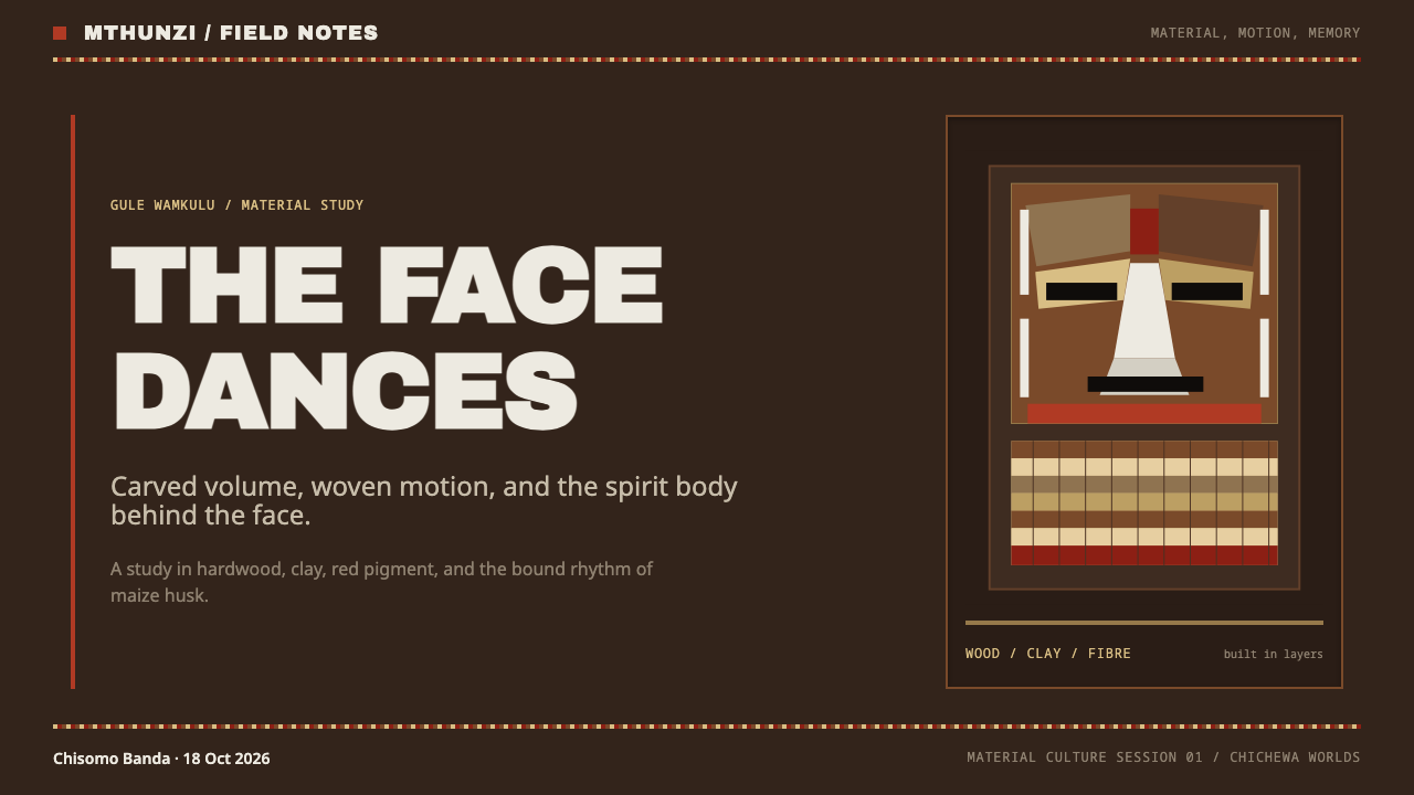
The mask is the centre of the craft. It is carved in dense hardwood that is naturally oily, a timber chosen for weight as much as for workability. Years beside the hearth darken the surface with soot, and the character's face is then whitened with clay so that the pale mask stands out against a dark body of wood and fibre. The body of the character is not wood at all but dried maize husks and woven grass, a costume made from the leftovers of the harvest, bundled and bound. The material palette is therefore almost fixed by the landscape: dark carved wood, chalky clay, straw-buff fibre and a few painted accents.
Beyond the brotherhood itself, the style's references point to the wider Maravi carved-mask traditions of the region and to Chewa initiation ritual more broadly. Two named characters are cited: Simoni, whose red paint gives the system its single saturated accent, and Kasiyamaliro, another figure of the Nyau repertoire. The system does not reproduce their imagery. It borrows their materials and their order.
That is an important design decision. Sacred masks are not decoration, and the style deliberately avoids turning them into surface pattern, mask icons or tribal motifs. What it takes from Gule Wamkulu is a hierarchy of substance: wood below, clay above, fibre between, paint as accent. A designer who uses the style respects the tradition by keeping that order and by treating the mask as an object with its own context, not as a pattern to repeat.
What defines the Gule Wamkulu Mask look?
Soot-dark ground
The ground is a deep, warm brown-black, the colour of hardwood darkened by years of hearth smoke. It is not the empty black of a switched-off screen; it has body and a faint grain, like a surface that has been handled. Every other element is defined by how it sits on this wood.
Clay-white as substance
Whites are chalky and matte, slightly uneven, never a pure screen white. They behave like clay rubbed onto wood: opaque, dry, a little rough at the edge. Headlines and key shapes in clay-white feel handled and applied, not emitted, which is what keeps the dark ground from feeling like a dark mode.
Husk-buff
A warm straw-buff, the colour of dried maize husk and woven grass, sits between the chalk and the dark. It is the working colour for secondary text, bands and fills, softer than the clay-white and warmer than any grey. It gives the palette its organic mid-tone without introducing a new hue family.
One painted red
The only saturated accent is a flat red, taken from the paint of the character Simoni. It is used rarely and opaquely, like a daub of pigment on carved wood, for the one thing on a page that must be seen first. Spread across a layout it would stop being paint and start being decoration.
Carved-mass type
Display type uses heavy, condensed grotesque faces whose letters read as blocks of carved relief rather than as outlines. Headlines are dense and compact, with the weight of cut wood. Type carries the mass that costume carries in the dance, while body text stays in a plainer, sturdy sans-serif.
Woven fibre rules
Dividers are not hairlines but bands that look plaited from fibre, the kind of binding used on the husk body of the costume. Sections feel tied together rather than separated, and borders carry texture and a hint of irregularity, as if made by hand with the grass that was nearest.
Adze marks
Surfaces keep the evidence of tools. Subtle grain, uneven fill, faint cut marks and edges that are slightly off true give panels the character of carved wood. There are no glossy gradients and no perfect vector smoothness; the finish is dry, worked and deliberately imperfect.
Who shaped Gule Wamkulu Mask?
The Chewa masquerade society that performs Gule Wamkulu and is the custodian of its masks and its spirit characters. The brotherhood is the source of the style's entire logic: the carved face, the husk body, the three occasions of initiation, funeral and installation. A design that borrows from the mask is borrowing from a living institution, which is why context and respect matter.
A named character of the Nyau repertoire, cited in the style's source as the origin of its red paint. In the design system Simoni's red is the single saturated accent, applied flat and sparingly over the dark wood. The reference is to a colour treatment and a role in the order of materials, not to an image to be reproduced.
Another named character of the Nyau repertoire, cited alongside Simoni among the style's reference points. Like Simoni, it is present as a source for the way material and substance are ordered, not as imagery to copy. Its inclusion signals that the style is anchored in specific named figures of the tradition rather than in a generic idea of African masks.
The United Nations cultural body that recognised Gule Wamkulu as intangible cultural heritage in 2005. Its recognition is part of why the style can be built on firm ground: the dance is documented, publicly acknowledged and still alive. For a designer it is a reminder that the source belongs to a community, not to a stock library.
How do you use Gule Wamkulu Mask today?
Gule Wamkulu suits products that want weight, ritual and a sense of material truth: cultural institutions, heritage storytelling, music and performance, crafts, galleries, books and anything that trades on origin and depth. Applying it well means keeping the order of substances, wood below and clay above, rather than copying the look of a mask.
On slides, the cover should be a field of dark wood with a single large headline in clay-white, set in dense condensed type and pushed hard against one edge. Content slides use husk-buff for secondary text and fibre bands as dividers between sections. Data slides work best with few series: draw bars as flat clay-white blocks, use husk-buff for comparison and reserve the red for the one mark that matters.
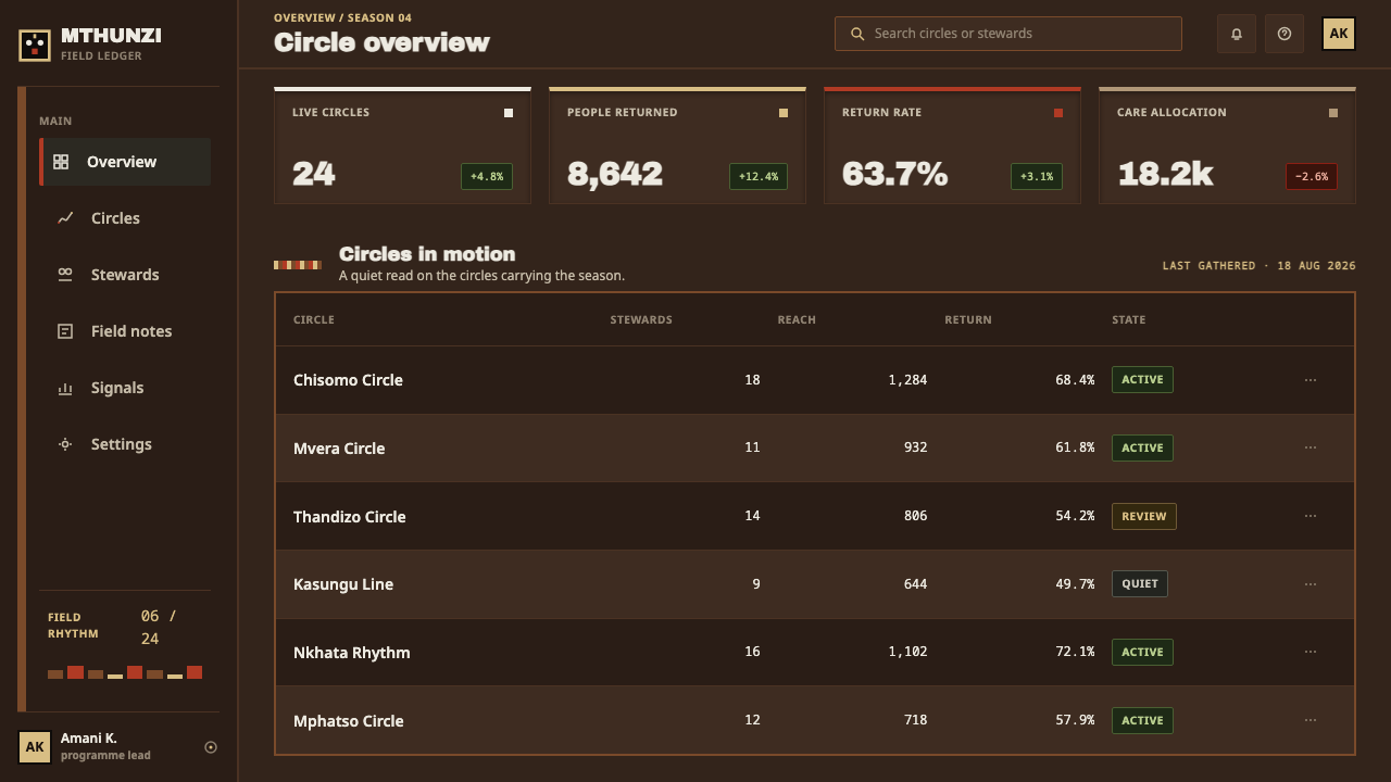
For web interfaces, the style suits ticketing and event pages, archives, long-form storytelling, music platforms and dark dashboards that need warmth. Cards are dark panels with a faint grain, buttons are flat chalk blocks with firm edges, and navigation is set in heavy condensed type. Pricing pages should read as a few solid blocks, each a single clay-white slab on the dark, instead of a row of glowing tiers.
In editorial and marketing work, give the page room to be heavy. Large headlines, short lines, wide dark margins and photography with strong contrast and grain work well. Show real objects and real context, with credit given, rather than ornamental African-themed illustration. Where a mask appears at all, it should appear as a documented object with its place and community named.
The most common mistakes are cultural and tonal. Using mask silhouettes, patterns or icons as decoration turns a sacred object into wallpaper, and the style is built to avoid exactly that. A pure white page or pure black void destroys the material logic. Spreading the red across headings and buttons removes its power as paint, and adding glows or glossy gradients makes the wood look like plastic.
Gule Wamkulu Mask — FAQ
Is Gule Wamkulu just a dark mode?
No. A dark mode inverts a light design, so dark is the absence of a bright page. Here the dark wood is the ground itself, and light is a substance applied to it: chalk, husk-buff, a daub of red paint. The palette also has its own hierarchy, with clay on top, fibre in between and wood below, which an inverted light theme would not have.
Can I put mask imagery in my design?
The style does not need it and is built to work without it. Gule Wamkulu masks belong to a living ritual tradition, and using their silhouettes as decoration strips them of context. If you want to show one, present it as a documented object, credit the community and source, and let the style's materials carry the rest of the page.
Why heavy condensed type?
Because the object at the centre of the style is a carved block, and type is the part of a layout that carries mass. Heavy condensed letters read as cut relief with real weight, which suits the dark wood ground. Light or wide faces would feel like costume rather than carving, and would lose the sense that the lettering is made of the same material as the mask.
How should the red be used?
As paint: flat, opaque and rare. Use it for the single element that must be seen first, such as a primary action, a key number or a marker on a chart. If red begins to appear on every heading, link and icon, it stops being a daub of pigment on wood and becomes just another bright interface colour.
Where does the style struggle?
It struggles where the product needs to feel light, clinical, playful or airy: healthcare reports, children's apps, bright consumer utilities. Its weight and warmth read as serious and earthy, and a layout that depends on long, delicate text on dark can become tiring. It is strongest where depth, ritual and material honesty are the point.
Related design styles
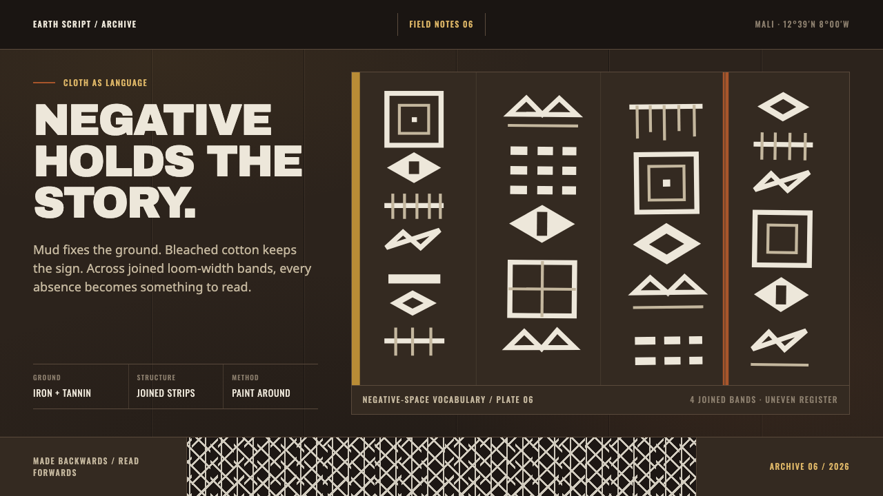 Bogolanfini MudclothAbsence becomes language. Warm iron-black bands hold uneven bleached-cotton s…
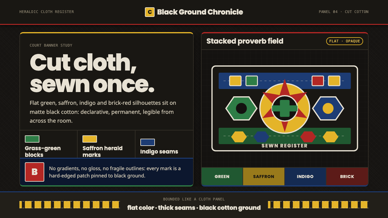 Fon Applique Banner AbomeyRoyal cloth speaks plainly. Flat saffron, green and indigo silhouettes on bla…
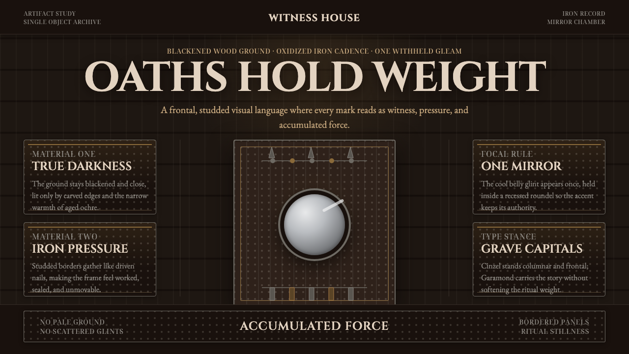 Kongo Nkisi Nkondi FigurePower accumulates in darkness. Black wood, iron studs, and one mirror glint h…
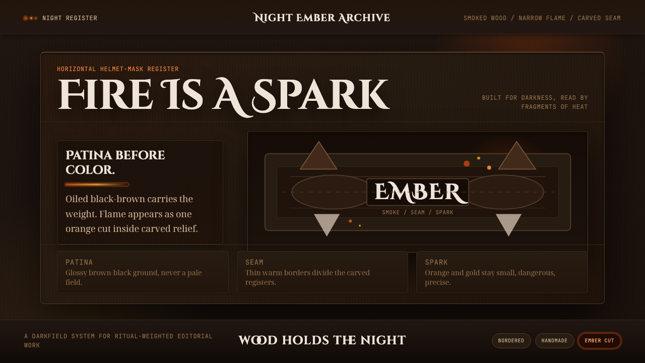 Senufo Firespitter MaskRitual darkness has heat. Smoked wood tones hold back tiny orange-gold sparks.
 Yoruba Orisha ShrineThe colour code of the gods. Shango-red beadwork and cowrie white glow on dar…
 Acehnese Rencong MotifA blade that reads as a word. Flat kerawang red, white, green and yellow lock…