What is Madoka Magica?
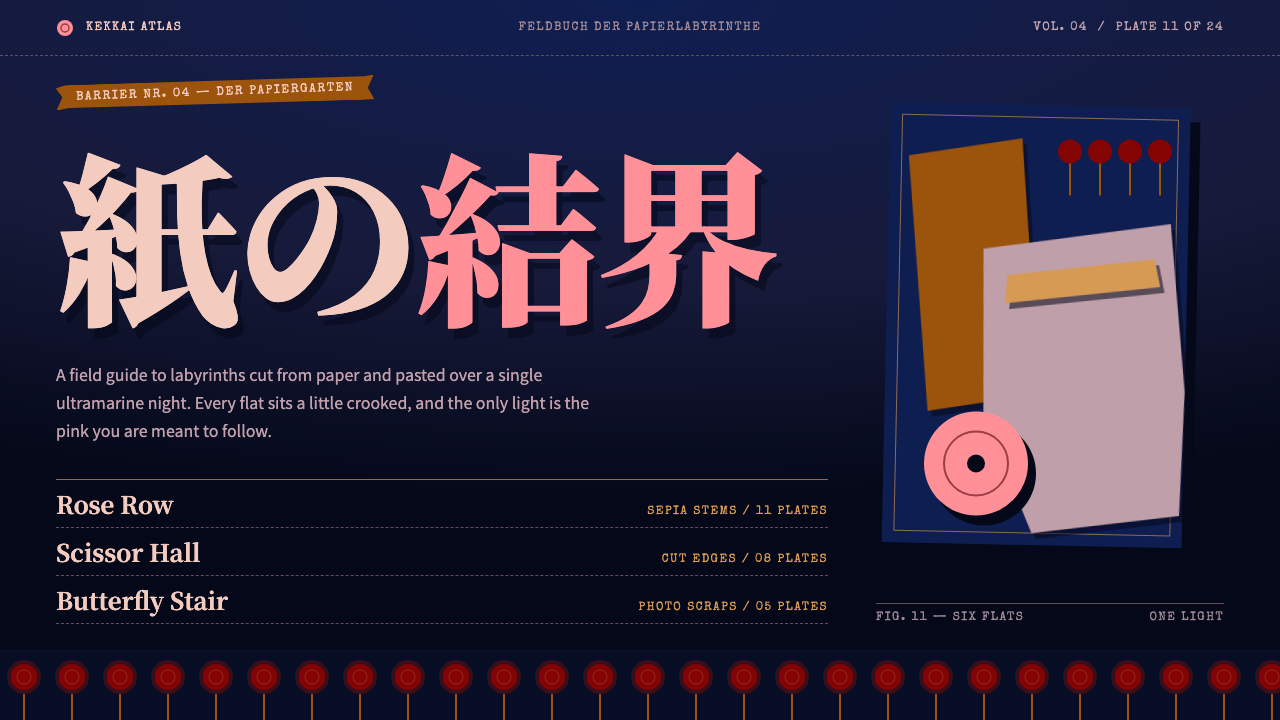
Madoka Magica's witch labyrinths become an interface: a paper theatre in the dark, cut-out flats with hard shadows on an ultramarine night, lit by a single pink.
Madoka Magica in brief
The Madoka Magica style is a dark interface built from the witches' labyrinths in Puella Magi Madoka Magica, the 2011 anime produced by Shaft. In the series, the labyrinths are the strange, collapsing worlds where witches live, and they are rendered as collages: sepia photographs, roses, butterflies and scissors, all cut out of paper and layered over a deep ultramarine night. The design system takes that collage logic and turns it into a way of arranging content.
The mood is theatrical rather than technical. Cards look like paper flats on a stage, with edges that appear cut by scissors and frames that sit very slightly off square. Hard shadows lift each layer from the one behind it, so that the page has depth without any glossy realism. Madoka's pink is the single bright note in the darkness, marking headings and actions the way a spotlight picks out an actor.
Text follows the same logic of staged strangeness. Body copy is set in a pale paper pink, secondary information in a greyish violet, and small captions in typewriter type imitate the invented witch-rune writing of the labyrinths. The overall impression is of a paper theatre rather than a grid, a place where layout is composed, not computed.

Where does Madoka Magica come from?
Puella Magi Madoka Magica aired on television between January and April of 2011, produced by the studio Shaft, and was followed by the film Rebellion in 2013. It belongs to the tradition of the magical-girl genre, known in Japanese as mahō shōjo, but it is best remembered as a dark reinterpretation of that genre. Its witch labyrinths are the part of the series that most strongly shaped its visual identity.
The labyrinths were staged by the art collective Gekidan Inu Curry. Instead of building the worlds in conventional painted backgrounds, they used paper cut-out collage animation: photographs, flowers, insects and household objects, cut and layered into dense, unsettling scenes. The labyrinth of the witch Gertrud in the first episode is the classic example, and it set the pattern for the series. Sepia photographs, roses, butterflies and scissors recur across these scenes as a visual vocabulary.
Around the labyrinths sits Shaft's own stylised staging, associated with director Akiyuki Shinbo, in which compositions are deliberately tilted, abrupt and theatrical. The writer Gen Urobuchi shaped the story's dark turn, while Ume Aoki is the name associated with the original character design that gives the series its soft, sweet surface. That tension between a gentle surface and a disturbing world is the essential character of the look.
In the design system, the collage becomes a layout principle. The ultramarine night becomes the background, paper-cut cards become the content containers, the pink of the protagonist becomes the accent for headings and actions, and typewriter captions stand in for witch script. It is a stylistic homage rather than a literal reproduction, aimed at capturing the feeling of staged, handmade darkness.
What defines the Madoka Magica look?
Ultramarine night ground
The base is a deep ultramarine fading toward ink black, like a night sky seen from inside a theatre. It is rich rather than flat, with enough depth that the pale paper cards on top of it feel lit from within. The darkness is never empty; it is the stage on which everything is arranged.
Madoka pink as the single light
A clear pink marks headings, links and key actions. It is the only strong warm colour in the darkness, which means the eye always knows where to go. Using it on anything beyond headings and actions would dilute the effect of a single spotlight.
Scissor-cut paper cards
Cards look like paper that has been cut by hand: edges are slightly irregular, corners are not perfectly regular, and each piece appears to lie on top of another. Hard shadows with no blur separate the layers, so depth is made of stacked flats instead of soft glows.
Slightly off-square frames
Frames and panels are tilted a little, never enough to look like an error but enough to break the rigid grid. This gentle skew is borrowed from the staging of the series, where composition is theatrical and a little unstable. It tells the viewer that the page is composed by hand.
Paper pink and greyish violet text
Main text is a pale paper pink that reads comfortably against the dark ground, and secondary text is a muted greyish violet. This two-step system gives a clear hierarchy without introducing new hues, and it keeps the page cohesive and dreamlike.
Witch-rune typewriter captions
Small captions are set in a typewriter face and phrased like invented witch-rune labels. They annotate cards, images and sections in a quiet, mysterious voice. Used lightly, they give the interface a sense of narrative; used heavily, they become noise.
Collage imagery
Decorative imagery follows the labyrinths: sepia photographs, roses, butterflies and scissors, cut out and layered. Images should look clipped rather than neatly framed, and they work best when they overlap card edges slightly, as though they were pasted onto the stage.

Who shaped Madoka Magica?
Shinbo is the director associated with Shaft's stylised staging, in which angles are tilted, cuts are abrupt and compositions feel like theatre. His approach to framing is the origin of the slightly off-square panels used in this design system.
Urobuchi is the writer who shaped the dark turn of the story. His narrative explains why the interface treats beauty and unease together: the surface is delicate and decorative, but the world beneath it is cold and dramatic.
Aoki is the name associated with the original character design of the series. The soft, sweet look of the characters is what makes the contrast with the labyrinths so effective, and it lies behind the gentle pink that carries the interface's accents.
Gekidan Inu Curry staged the witch labyrinths using paper cut-out collage, including the labyrinth of Gertrud in the first episode. Their layered photographs, roses, butterflies and scissors are the direct visual source of the design system's cut-paper cards and collage imagery.
How do you use Madoka Magica today?
On slides, the Madoka Magica style works best for narrative, character-led and fandom presentations: story analyses, anime studies, game or media pitches and creative portfolios. A cover can place a large cut-paper card on the ultramarine night with a pink title and a small typewriter caption. Content slides should use two or three overlapping paper cards, each with a short text, and one collage image at a time. For data slides, keep charts simple and place them on a pale card so that the numbers stay legible.
On the web, the style is well suited to character galleries, episode catalogues, fan projects, interactive fiction and entertainment landing pages. A character index can present each entry as a paper card with a clipped portrait and a typewriter caption. A navigation bar can stay quiet, with pink marking only the active item. The style is poorly suited to rigid, table-heavy admin tools, where the staged layout would work against clarity.
In editorial and marketing work, the style gives posters, event pages, album and game announcements and feature stories a distinctive theatrical look. Photography is best handled as sepia cut-outs, pasted over the dark ground with hard shadows. Titles can be set large in pink, while supporting text remains in pale paper pink to keep the mood coherent.
To keep the result readable, treat the paper cards as the main reading surface. Make sure body text has plenty of contrast against the dark ground, keep decorative butterflies and roses at the margins, and let only one or two collage elements overlap the content at a time. The strangeness should live in the edges, not in the text.
The most common mistake is to drown the page in decoration, filling every gap with roses, butterflies and scissors until the pink loses its role as the single light. Another is to make the shadows soft and glossy, which turns the paper theatre into an ordinary dark mode. A third is to straighten every frame perfectly, which removes the hand-made staging and leaves a generic card layout.

Madoka Magica — FAQ
What is the Madoka Magica witch labyrinth style?
It is a dark interface style drawn from the witch labyrinths in Puella Magi Madoka Magica. Cut-out cards with hard shadows are layered over a deep ultramarine night, a single pink marks headings and actions, and typewriter captions imitate witch-rune writing. The overall effect is of a paper theatre rather than a grid.
Who created the labyrinth imagery?
The labyrinths were staged by Gekidan Inu Curry for the 2011 series produced by Shaft. They used paper cut-out collage with sepia photographs, roses, butterflies and scissors. The labyrinth of Gertrud in the first episode is a defining example.
What products suit this style?
Character galleries, episode catalogues, fan projects, interactive fiction, entertainment pages and creative portfolios. Anything that benefits from layering and narrative atmosphere is a good match. It is a poor fit for strict data tables and routine admin interfaces.
How do I use the pink correctly?
Treat it as the single light in the dark. Use it for headings, links and key actions only, and keep body text in pale paper pink and secondary text in greyish violet. If pink spreads to decoration, the hierarchy collapses.
What should I avoid?
Avoid over-decorating, soft blurry shadows and perfectly straight frames. The style relies on hard shadows, scissor-cut edges and slightly off-square panels, and it needs readable text on the paper cards.
Related design styles
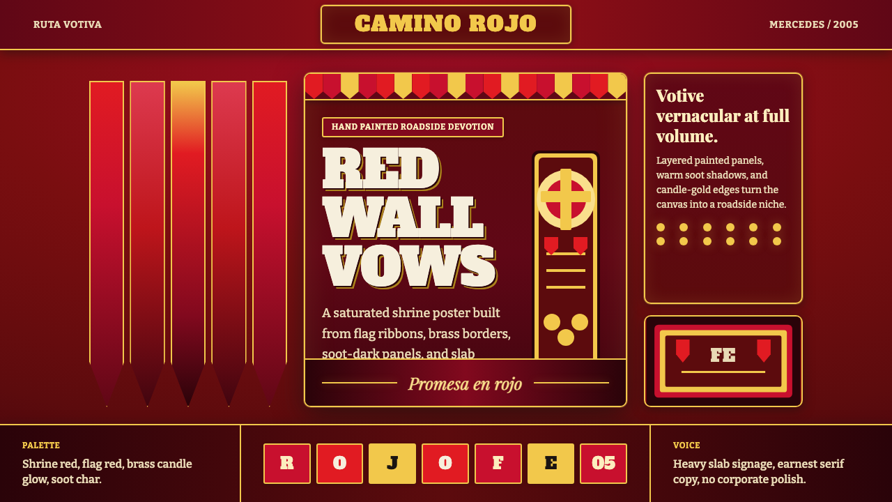 Gauchito Gil ShrineDevotion burns red. Flag ribbons, brass borders, and slab signage glow on soo…
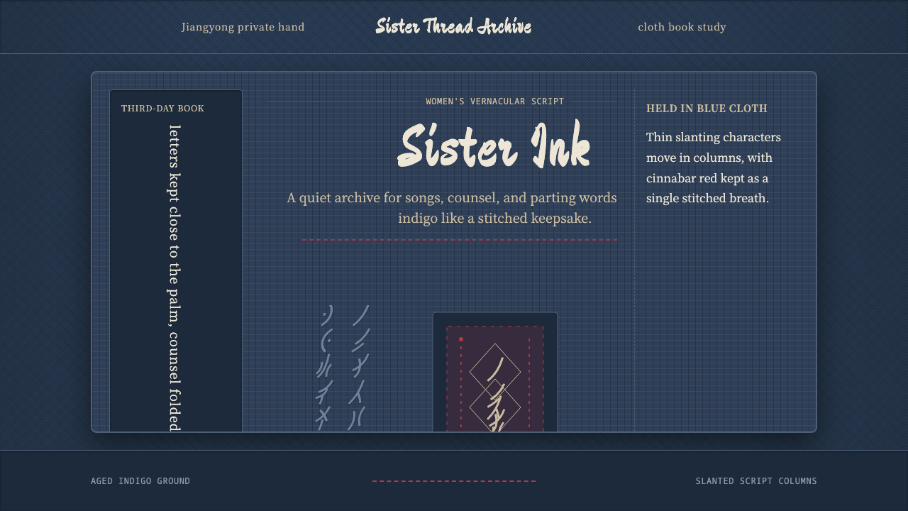 Nüshu 女书Private script, cloth-soft. Indigo weave, slanted columns, and one red thread…
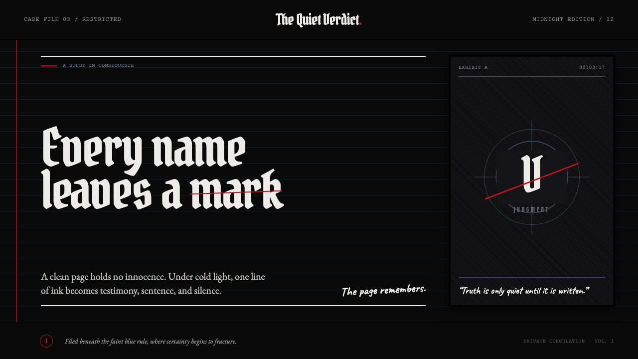 Death Note (2003)Silence becomes judgment. Bone-white blackletter and blue rules break under o…
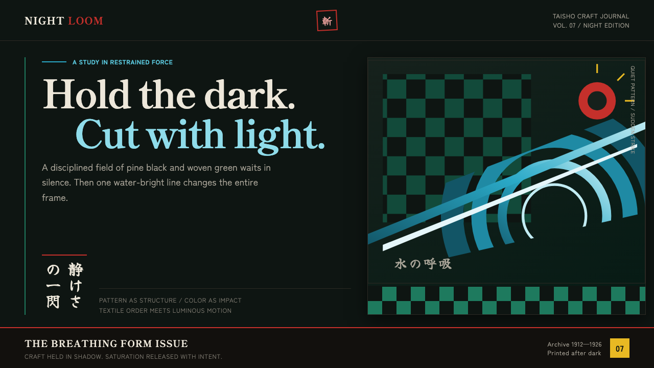 Demon Slayer (2019)Quiet craft, sudden force. Pine-black checks split beneath a water-teal strik…
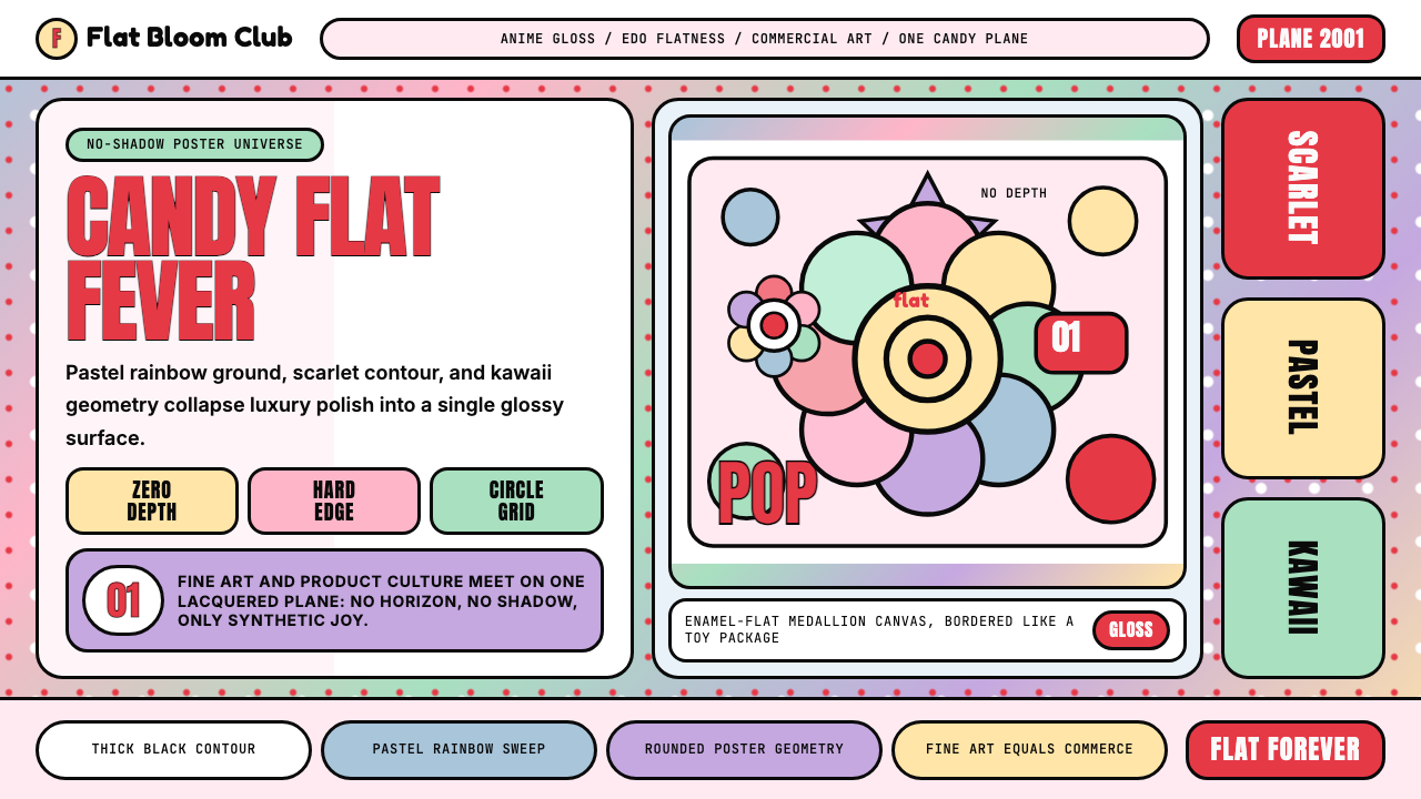 Takashi Murakami SuperflatJoy has no depth. Pastel rainbow, scarlet accents, and black contours flatten…
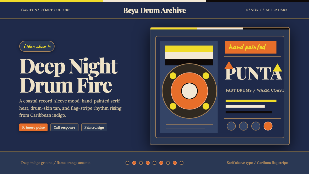 Belizean Garifuna PuntaNight rhythm burns. Indigo fields, flame-orange serif type, and flag stripes…