What is Lucknow Chikankari?
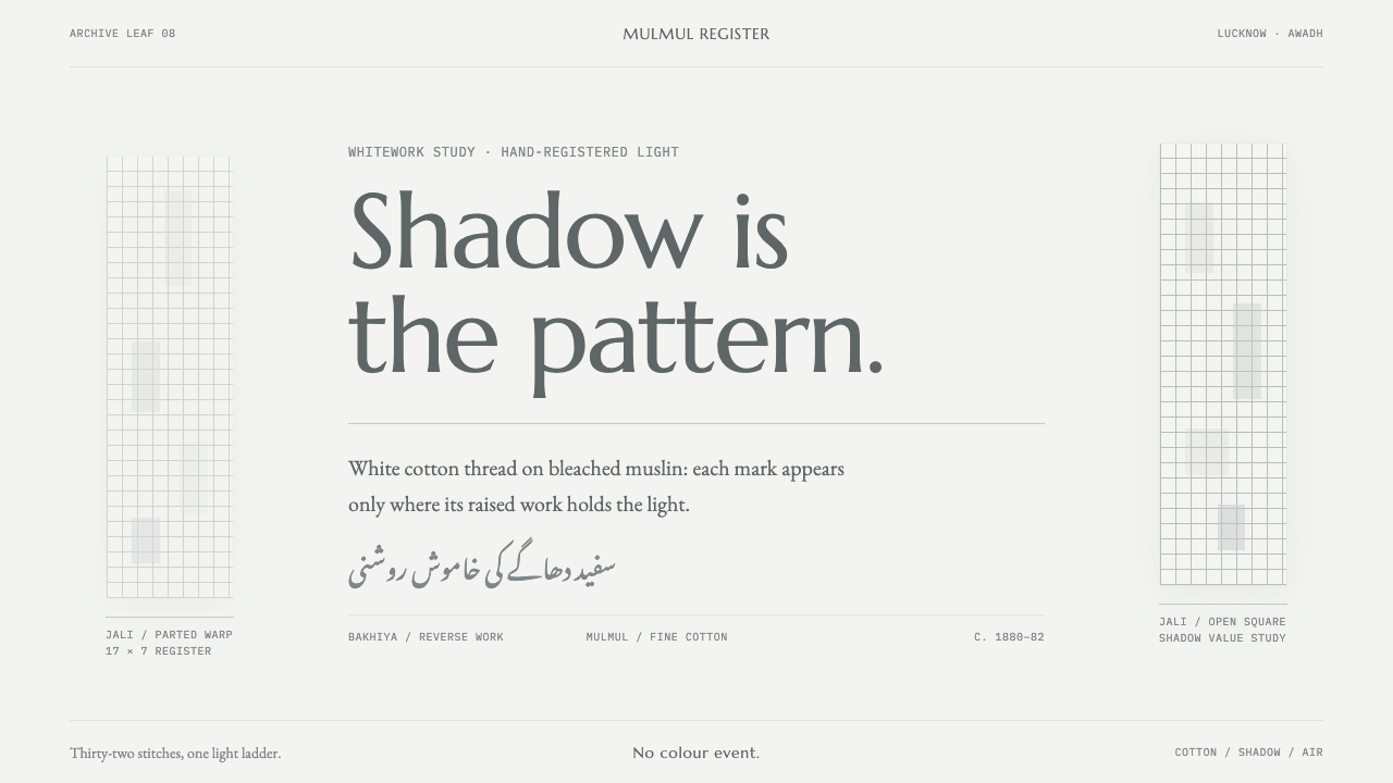
Chikankari is embroidery you cannot see head-on: white thread on white muslin, where the pattern exists only as raised nap, translucency and cast shadow.
Lucknow Chikankari in brief
Lucknow Chikankari is a design style drawn from the whitework embroidery of Lucknow, the old centre of Awadh in north India. In the original craft, white cotton thread is worked on bleached muslin, so ground and figure are exactly the same colour. A motif can only be seen as a slight rise in the nap, a patch of translucency, or the faint shadow it throws on the cloth beneath. Roughly thirty-two named stitches do the work that a palette does in other traditions.
The design system takes that constraint literally. There is no hue event anywhere in it: the whole range from the page to the deepest text is a single ladder of light, from bleached muslin down to the darkest fold of the cloth. Depth is never drawn as crisp interface elevation. It is cast softly and widely, the way fabric casts it. The empty muslin between motifs is not leftover space; it is the composition.
The result is a style of unusual quiet that is nevertheless full of detail. Ornament is built from texture, grid and shadow instead of from colour or outline, which makes it rare among decorative traditions and valuable for interfaces that want richness without noise.
Where does Lucknow Chikankari come from?
Chikankari belongs to Lucknow and the Awadh region, and the style's reference material places its roots in the Awadh court tradition before 1900. It descends from the older Mughal whitework embroidery, a tradition that prizes the refinement of the needlework over colour. The cloth is Indian handloom muslin, known as mulmul, which is thin enough to let light and shadow do part of the drawing. That choice of ground is the first design decision of the craft: the fabric is not a canvas for the embroidery but half of the image.
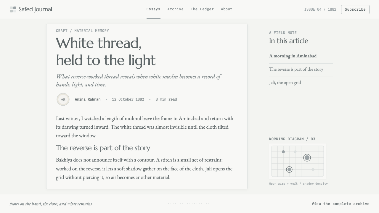
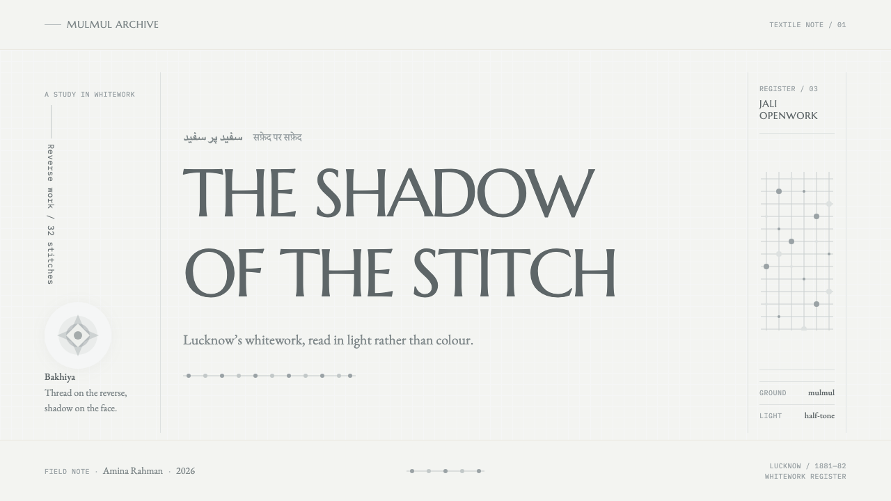
The craft is a chain of specialists rather than one maker's art. In the Lucknow workshop system, block-printers known as chhapa makers stamp the pattern onto the cloth as a guide, and the embroiderers, called karigars, work in the techniques they have mastered. The style's source material singles out two groups, the bakhiya karigars and the jali karigars. Bakhiya, the signature shadow-work stitch, is worked on the reverse of the cloth, so its floating threads show through the thin fabric as a soft grey bloom on the front. Jali parts the warp and weft into small openings without piercing the cloth, leaving a net of half-tone holes.
Museum collections record the tradition in its mature form. The Victoria and Albert Museum holds Lucknow whitework from around 1880 to 1882, and these pieces are among the style's visual referents: they show the vocabulary of the craft achieved in a single colour. In December 2008 chikankari received Geographical Indication status, which ties the name to Lucknow and its surrounding region and recognises the craft as heritage bound to a place and to the hands that make it.
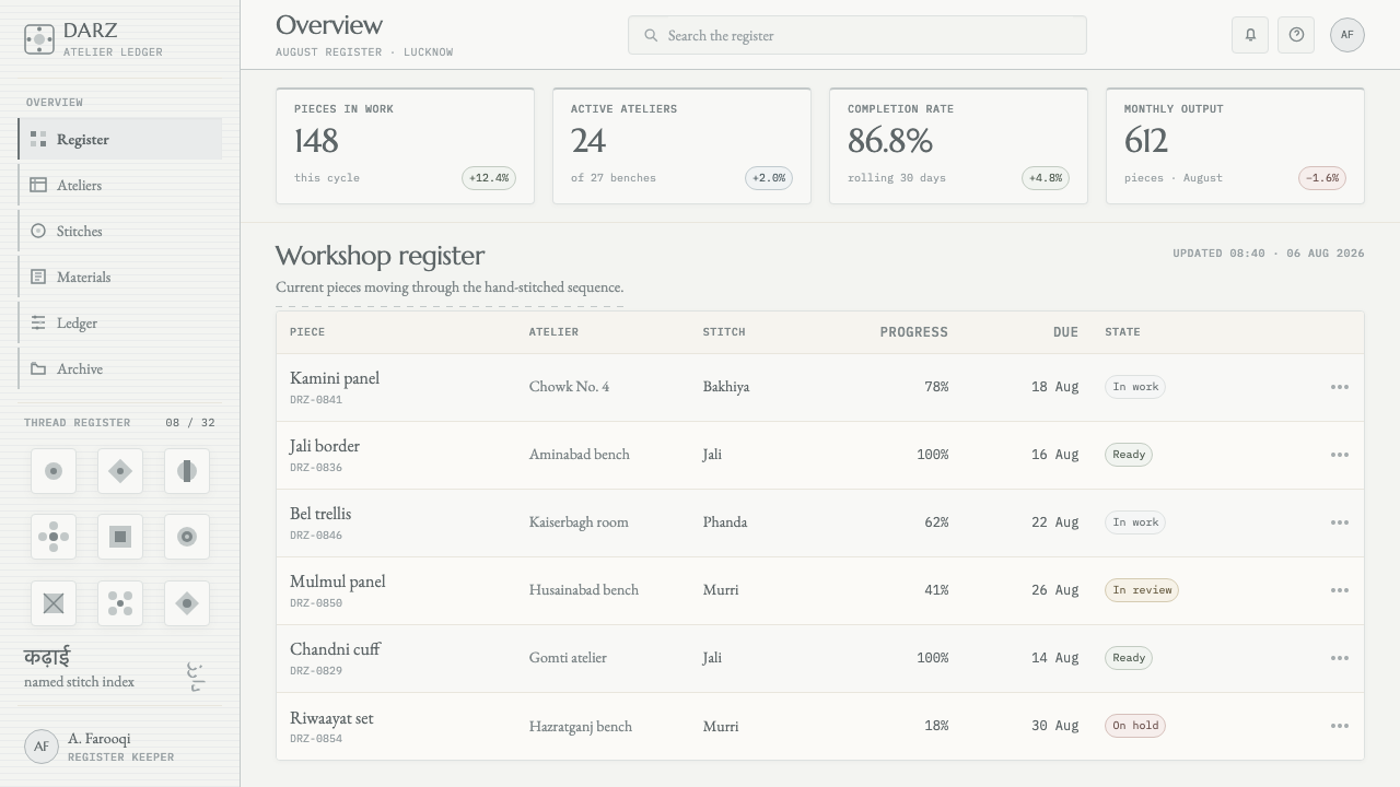
Translating this into an interface is the work of the style. Its designers treated the physical facts of the craft as design rules. The bleached muslin becomes the page colour. The deepest fold of the cloth becomes the colour of text. The steps in between are the layers of thread built up in the same spot, so lightness is earned by density rather than chosen from a palette. Shadow is allowed only in the broad, soft form that cloth would cast. It is a rare case in which a craft's central constraint, one colour, is carried into a digital system intact.
What defines the Lucknow Chikankari look?
One ladder of light
There is no hue anywhere. The page is the off-white of bleached muslin, text is the darkest fold of the cloth, and every step between them differs only in lightness. Hierarchy is built by moving along this single ladder, which is how thread on cloth behaves: more layers, more shadow, deeper tone.
Shadow as ornament
Bakhiya is worked from the reverse, so the pattern appears on the front only as a grey bloom seen through thin cloth. The interface learns the same lesson: ornament arrives as soft tonal masses and blurred shapes, not as outlines or fills. The drawing is made by the shadow, and the thread stays out of sight.
Jali grids
Jali parts the weave into a net of small openings without cutting the cloth. In the system this becomes a quiet, perforated grid used as texture, divider or background pattern, with a half-tone feeling rather than a hard outline. It supplies pattern without adding a single colour.
Cloth-cast diffusion
Depth is soft, wide and low in contrast, as if cast by fabric rather than by a hard object. Cards do not lift off the page with crisp elevation; they rest on it like a fold of muslin. The effect is gentler than any standard interface shadow and keeps every surface feeling made of cloth.
Empty muslin as composition
The blank cloth between motifs is the work, not leftover space. Motifs are small relative to their field, spacing is unforced and generous, and elements are placed with the patience of embroidery. A layout in this style should feel as if each element was stitched in one at a time.
Thirty-two stitches, one vocabulary
With colour removed, variety has to come from texture: density, direction and openness of the marks. The style uses many small differences in weight and grain to separate elements, so hierarchy is felt by touch rather than by hue. The names of the stitches are the real palette.
Who shaped Lucknow Chikankari?
The printers who stamp the design onto the cloth with carved blocks before any thread is placed. Their work is the invisible first layer of chikankari: they decide where the motifs sit, so that the embroiderers can concentrate on the stitch. In the style, this stage corresponds to the underlying grid that organises the page before ornament appears.
Embroiderers who work the shadow stitch from the back of the cloth, letting floating threads show through the muslin as a grey tone. They are the source of the style's central idea, that a shadow can be an ornament, and their method explains why the interface treats tonal blooms as the primary decoration.
Embroiderers who pull the warp and weft apart into small holes without piercing the fabric. Their openwork gives chikankari its lattice-like passages, a half-tone grid in the middle of solid cloth. The style turns that move into perforated, net-like texture that adds pattern while holding to a single colour.
The London museum whose collection includes Lucknow whitework dating from around 1880 to 1882. These pieces are cited among the style's referents, and they matter because they preserve the craft's full vocabulary in a single colour, giving the design a documented historical benchmark rather than a guess.
How do you use Lucknow Chikankari today?
Lucknow Chikankari is a gift to any product that wants to feel handmade, refined and quiet without becoming rustic. It works wherever softness and craft are the selling point: textiles, fashion, wedding and stationery brands, boutique hospitality, wellness, fine food and cultural institutions. Applying it correctly means keeping the single-colour discipline, because the style stops being itself the moment a second hue appears.
On slides, the cover should be mostly empty muslin: an off-white field, a title set in the deepest tone of the ladder, and one soft tonal bloom or a small perforated grid to hold the corner. Content slides use quiet panels separated by changes in lightness, not lines. Data slides need discipline. Express categories through tone, weight and texture, using a lighter fill for secondary series and a heavier mark for the series that matters, and let the empty space around a chart do the framing.
For web interfaces, the style suits lookbooks, boutique shops, booking and reservation flows, portfolios and long reading pages. Cards are barely there, with wide, soft shadows and no hard border; the selected item is the deepest value on the ladder; disabled items sink toward the lightest. Pricing pages should be calm lists with generous space around each tier, where emphasis is made by tone and size, never by a colour badge.
In editorial and marketing work, let photographs of cloth, hands and thread carry the colour, and keep the layout itself monochrome. Wide margins, slow rhythm and small, patient captions let the page behave like a folded garment. Because the style depends on subtle tonal difference, it needs good contrast checks: the darkest step must stay comfortably legible against the lightest.
The most common mistake is to add a bright accent for buttons or alerts, which breaks the single-ladder logic and makes the whole page look like a pastel template. The second is to use crisp, short, high-contrast drop shadows, which are the exact opposite of cloth-cast diffusion. The third is to fill the empty space because it feels unfinished; in this style the unembroidered cloth is part of the finished work.
Lucknow Chikankari — FAQ
If there is no colour, how do I show states like selected, disabled or error?
Use tone, weight, texture and wording. A selected item takes the deepest value on the ladder, a disabled one drops toward the lightest, and an error is described plainly in words and marked with a heavier line or perforated pattern. Products with strict regulatory needs for alert colours should add the minimum necessary and keep it clearly separate from the system's own language.
How is this different from ordinary minimal white design?
Minimalism removes. Chikankari removes only colour and then builds richness back through texture, grid and shadow, so the page is full of tonal detail even though it never uses a hue. The empty space is also active: it is the unembroidered cloth that gives the motifs their meaning. A flat white template has the emptiness without the thread.
Is it only suitable for fashion and textile brands?
No. Fashion and textiles are the obvious fit, but the underlying idea, that depth and ornament can come from tone and shadow alone, suits any quiet, premium or reflective product. It struggles where fast, high-energy scanning matters, such as trading dashboards or alert-heavy tools, because the lack of colour coding slows quick decisions.
Why are the shadows so wide and soft?
Because they imitate what cloth does. Muslin is thin and translucent, so the shadow of a raised thread spreads and fades rather than cutting a sharp edge. A crisp elevation shadow belongs to a rigid card floating over a screen, which is the opposite image. Wide, soft diffusion keeps every surface reading as fabric laid over fabric.
Can I use it in a dark layout?
The style is a light-ground system. Its logic is that of translucent muslin, where light passes through thin cloth and the thread throws a shadow. Inverting the ladder to a dark ground loses that translucency, and the result reads as a different craft altogether. If a dark variant is needed, treat it as a new design rather than a reversal.
Related design styles
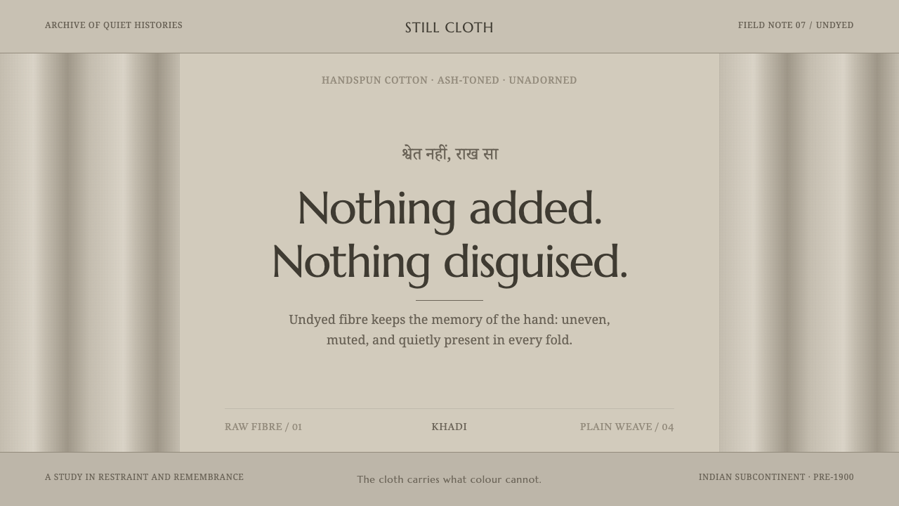 Hindu Widow White SariRestraint carries the weight. Ash-toned khadi, quiet serif type, and vertical…
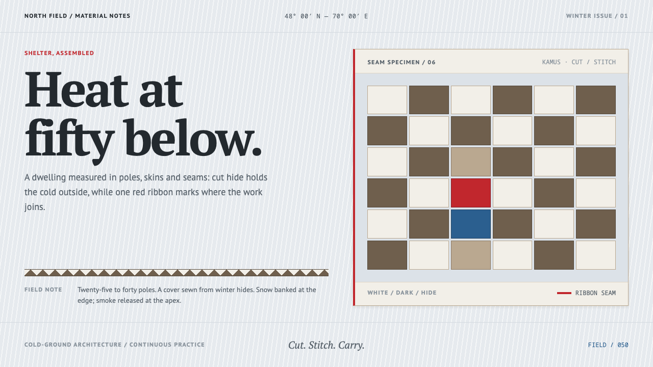 Nenets ChumWarmth without excess. Snow-grey hide panels meet a precise red seam and cut-…
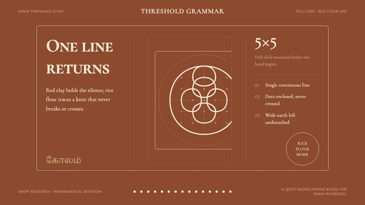 Tamil Kolam (Rice Flour Threshold)Mathematics becomes devotion. Rice-white knots breathe on red-clay negative s…
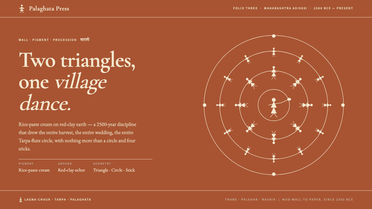 Warli Tribal PaintingTwo triangles make a human. Rice-paste cream on red-clay ochre, dancers proce…
 Basque LauburuMemory cut into stone. Warm grey planes and four measured turns build depth f…
 Beni Ourain Berber CarpetRestraint feels tactile. Greige wool field, Oswald type, and a loose charcoal…