What is Louvre Abu Dhabi?
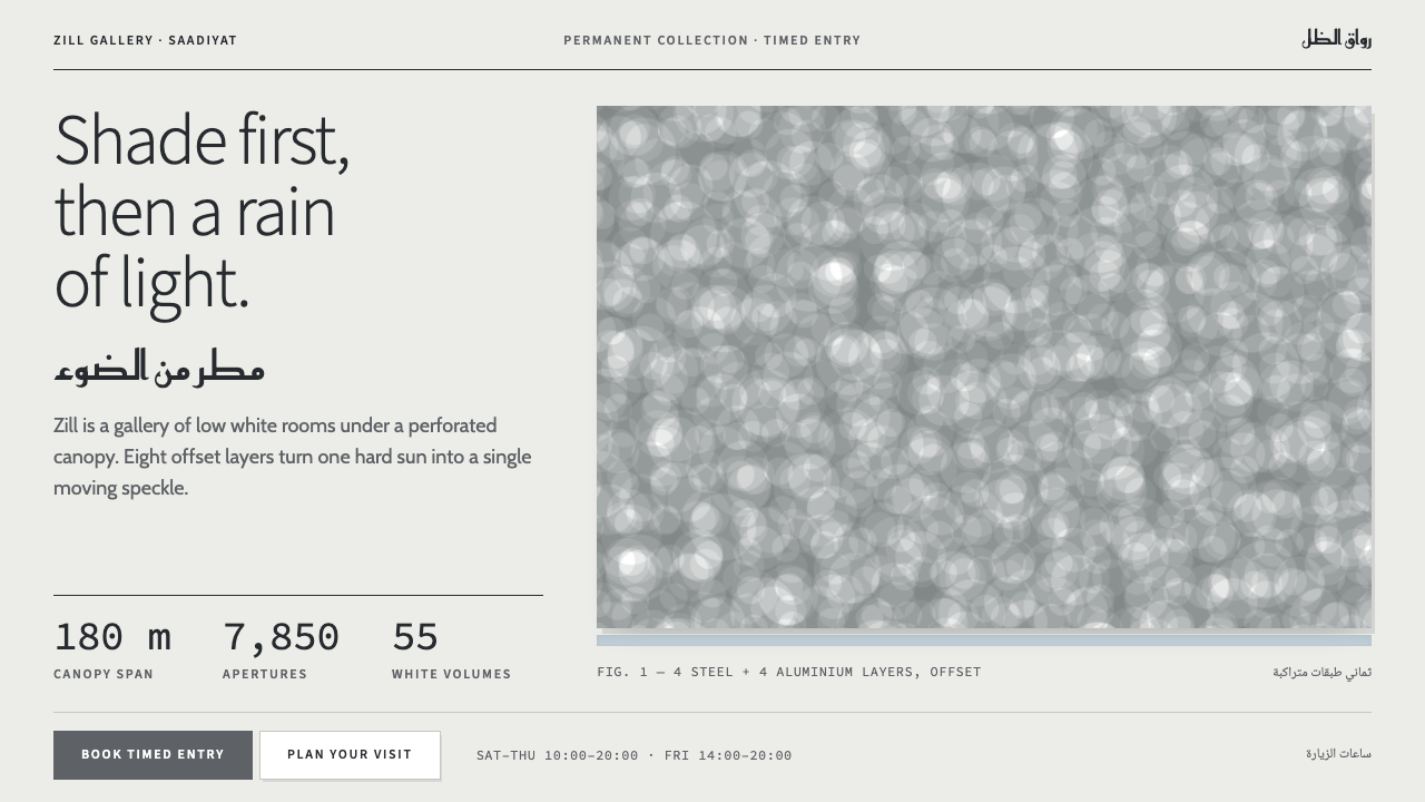
Louvre Abu Dhabi is a style of shade before light: pale square volumes under a grey canopy, where the only ornament permitted is sunlight falling through a perforated sky.
Louvre Abu Dhabi in brief
Louvre Abu Dhabi, as a visual style, is distilled from the museum Jean Nouvel designed on Saadiyat Island, off the coast of Abu Dhabi, which opened to the public in November 2017. It is a language of pale, flat, rectilinear volumes standing in shade beneath a single grey canopy that filters the sun into a shifting pattern of small points. Its palette is borrowed from the building itself: the white of shaded concrete, the grey of the dome's underside, the dark silhouette of the steel lattice, and one faint note of sky and sea. Its type pairs a humanist Latin sans with Arabic at equal rank.
The governing idea is that shade comes first and light comes second. In a hot, bright climate the first duty of architecture is to protect and cool, and only then to admit the sun, a little at a time. Translated into a design system, this means that surfaces are calm, matte and unlit, separated from one another by shadow rather than by borders or colour fills, and that the one thing allowed to move or sparkle is a field of light. Nothing glows from within. Nothing is decorated for its own sake.
The style is easy to recognise and hard to fake. It has none of the gilded vocabulary that is often assumed for cultural institutions in the Gulf: no gold, no arabesque filigree, no pastiche of domes and arches. What it has instead is discipline. Square forms, wide margins, a quiet grey sky, and the sense that every element sits in the shade of something else. The effect is closer to walking through a cool, narrow street at noon than to standing in a gallery, and it suits subjects that want composed authority rather than spectacle.

Where does Louvre Abu Dhabi come from?
The museum exists because of an unusual diplomatic and cultural bargain. In 2007 France and the United Arab Emirates signed an agreement under which a new museum on Saadiyat Island, the cultural district planned off the coast of Abu Dhabi, would carry the Louvre name, draw on loans from French institutions, and be conceived as a 'universal museum'. Rather than sorting its collection by nation or by civilisation, it was to place works from different cultures side by side in a chronological sequence, so that a visitor could compare how very distant societies answered similar questions about faith, power and the body. That curatorial idea needed a building that felt neutral, shared and rooted in its own climate, rather than a box imported from Paris.
Jean Nouvel, the French architect who would receive the Pritzker Prize in 2008, answered with what he treated less as a single building than as a small city. Fifty-five low white volumes of varying size are gathered in an irregular cluster that recalls a traditional Arab medina, with narrow shaded passages and small plazas between them, and the whole group stands in seawater so that the sea becomes part of the circulation and a source of cooling. Above the cluster, held up by a few widely spaced supports, floats a dome about one hundred and eighty metres across. Nouvel described its effect as a 'rain of light': sunlight passes through it and is broken into countless points, in the way it passes through palm fronds or a woven roof.
The dome is built from eight layers of perforated steel and aluminium, each patterned with star-like geometric openings and set at a different angle from the next. Seen from directly below, no single layer is legible. What you see is the interference between them, a pattern that slides slowly across floors and walls as the sun moves. The geometry draws on the mashrabiya, the carved or latticed screen of traditional Arab architecture that admits air and filtered light while protecting privacy, here scaled up from a window to a sky. Turning that idea into something buildable required close work between Nouvel's studio and structural engineers such as Buro Happold. Delays pushed the opening well past the first plans, and the museum finally welcomed the public in November 2017.
The graphic identity followed the architecture. Around 2014 the French graphic designer Philippe Apeloig built the museum's visual identity on a bilingual principle: Latin and Arabic letters are given equal rank and set side by side as a pair, not as a title and its translation. Type, in other words, carries the same message as the building, that two traditions can share a roof without one becoming the footnote of the other. As a design system, the style joins the two lines of thought. From the architecture it takes flat pale planes, shadow seams and a grey canopy; from the identity it takes calm, well-spaced bilingual lettering. What it refuses is anything that would turn that calm into ornament.
What defines the Louvre Abu Dhabi look?
Colour
The palette is the building's own and is deliberately close to colourless. A shaded white, like concrete that never meets direct sun, forms the main surface. A canopy grey sits above it and recurs in rules, captions and secondary text. A dark steel tone is reserved for silhouettes and the heaviest type. One pale note of sky and sea appears sparingly, as a hint of the water the buildings stand in rather than as an accent colour. Warm, saturated hues are absent.
Shade as Structure
Surfaces are separated by shadow, not by outlines. Two white planes meet at a narrow dark seam; a card stands apart from its neighbour because a band of shade lies between them. This borrows directly from the architecture, where walls are distinguished less by colour than by how much shade falls on them. Shadows in the style are cool and fall in one consistent direction, never glows and never coloured halos.
Square Volumes
Everything is rectilinear. Cards, panels, buttons and images are crisp-cornered boxes of differing proportions, arranged like the museum's low volumes: loosely aligned rather than locked to a rigid module, with generous air between them. Rounded corners, pills and circles almost never appear. The page reads as a cluster of rooms rather than a stack of rows.
Perforated Light
The one decorative motif is the dome's pattern of openings, reinterpreted as a field of small points or stars with light passing through. It works as texture only where it belongs: on a cover, a hero area or an empty state, where it can drift slowly. Repeated as wallpaper on every surface, it would destroy the principle that light is rare and moving.
Bilingual Typography
Latin text is set in a humanist sans with open, readable shapes and moderate contrast; Arabic sits beside it at the same rank and visual weight. Neither is the subtitle of the other. Layouts are built to mirror cleanly from left-to-right to right-to-left, with alignment, icons and reading order that survive the flip. Headings are calm and set with generous spacing rather than shouted in capitals.
Quiet Hierarchy
Hierarchy comes from space, scale and the depth of shade, not from colour. A title is large because it has room, not because it is bright. Secondary text steps down into canopy grey, and only a very few items in any view are allowed the darkest tone. The restraint gives the style the authority of a museum label, in which the object is the loudest thing in the room.
Slow Motion
Where movement exists it is slow and continuous, modelled on the way a patch of sun crosses a floor over an afternoon. Bouncy hover effects, springy transitions and attention-seeking animation are out of character. The system's only permitted spectacle is the light, and it should change at the pace of a day rather than the pace of a click.

Who shaped Louvre Abu Dhabi?
Nouvel is the French architect behind the museum's concept: a small city of low white volumes standing in seawater beneath a perforated dome. He received the Pritzker Prize in 2008, and his work often treats light as a primary building material, which is exactly what this style inherits. For designers, his central lesson is that a limited set of forms can feel inexhaustible when light, rather than ornament, is allowed to do the varying.
Apeloig is a French graphic designer known for expressive typographic posters and for identities for cultural institutions. His bilingual identity for the museum, developed around 2014, sets Latin and Arabic letters side by side at equal rank. It is the reason the style treats typography as a statement of principle and not merely a means of labelling.
An international engineering consultancy involved in the dome's structure, helping to turn Nouvel's concept of layered, offset perforated skins into a roof that could actually be built in steel and aluminium. It stands here as a reminder that the style's apparent weightlessness is the product of rigorous structure: the freedom of the pattern depends on a very exact frame.
How do you use Louvre Abu Dhabi today?
Louvre Abu Dhabi is best used when a subject deserves composure: culture, heritage, institutions, research, high-end hospitality, anything meant to feel public, shared and unhurried. What it offers a designer is a ready logic of calm, and that logic is about withholding rather than adding.
For presentations, a cover can place a single pale rectangle on a quiet grey ground, with the title in dark steel and a faint scatter of light points drifting across one corner as the only image. Content slides work as a few square panels divided by shadow seams, with air around each. If the audience reads Arabic, offer the mirrored version as a complete slide set rather than a translation line beneath the English. Data slides should keep charts in greys and steel, with the pale blue reserved for the one series that matters; gridlines stay faint and labels stand apart from the plot.
For web interfaces it suits dashboards, archives, booking flows and membership pages where trust and calm matter. Build the page from separate square cards on a pale ground, divide them with shadow rather than borders, and keep one dark colour for primary actions and headings. Navigation should be typographic and spacious. Pricing pages benefit because the style removes the urgency usually carried by saturated colour: tiers differ by position, size and the weight of dark type, not by loud badges. Reserve the moving-light pattern for a hero area or an empty state.
In editorial and marketing work, the style gives exhibition catalogues, institutional reports, annual reviews and travel features a composed voice. Generous margins, short lines, large quiet photographs of architecture or objects, and captions in canopy grey create the feel of a museum label. A bilingual publication can run both languages in parallel columns of equal width, which is the style's most distinctive and most honest move.
The most common mistake is to read 'Abu Dhabi' as a cue for Gulf luxury and add gold, arabesques or faux-Islamic ornament; the system's whole argument is that ornament is replaced by light and shade. A second mistake is to apply the perforation pattern to every surface as wallpaper, turning a rare, moving effect into noise. A third is to treat Arabic as a translated afterthought. If the Arabic is smaller, lighter or merely an add-on, the central principle has been abandoned.

Louvre Abu Dhabi — FAQ
Is this the same as generic Islamic geometric design?
No. The dome borrows the logic of the mashrabiya, the latticed screen of traditional architecture, but the style does not reproduce arabesques, tiling or calligraphic ornament. It uses geometry as a filter for light at architectural scale and keeps the rest of the layout plain. A page can be entirely faithful to the style with no geometric pattern on it at all.
How does it differ from a typical white-cube museum look?
The white-cube gallery aims at neutrality: bright, even light and nothing casting shadow. Louvre Abu Dhabi does the opposite. It is built from shade, and its surfaces are modelled by darkness and by moving light, which makes it cooler, more atmospheric and more tied to place. In interface terms, the white cube is a flat white page with thin borders; this style is a pale page whose cards are divided by real shade and whose single decoration is a slow field of light.
Can it be used with only one language?
Yes. The bilingual structure is an expression of the style, not a requirement of it. A single-language product still benefits from the wide spacing, the shadow seams and the grey canopy. Even so, it is worth building the layout so that it could flip direction, avoiding directional assumptions such as decorative arrows that only make sense when reading left to right.
Does it work as a dark theme?
The style is built on shade, not on night. A dark version is possible but it changes the logic: pale volumes become dark ones and the moving light becomes the only bright element, which can look theatrical rather than composed. The style is at its best as a daylight design, pale, cool and slightly overcast, with darkness used only in the seams between surfaces.
Where does the style struggle?
It struggles where a product needs urgency, play or intense conversion pressure: promotional campaigns, games, children's content, or retail pages that rely on bright colour to push action. It also needs space, and on dense, information-packed screens its quiet hierarchy can feel thin. Because it rewards patience, it should be paired with content that justifies the calm.
Related design styles
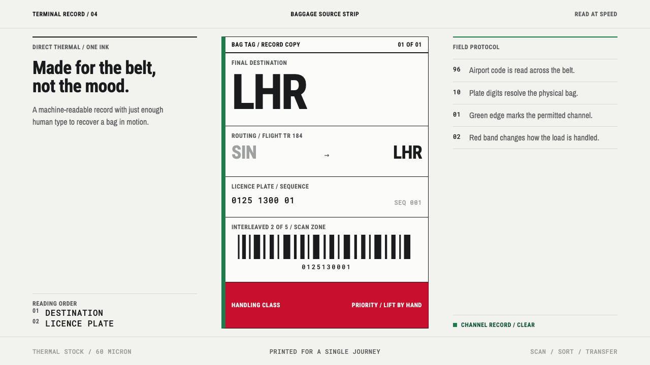 Airport Baggage TagBuilt to be read in motion. Burned-black codes, hard rules and functional cha…
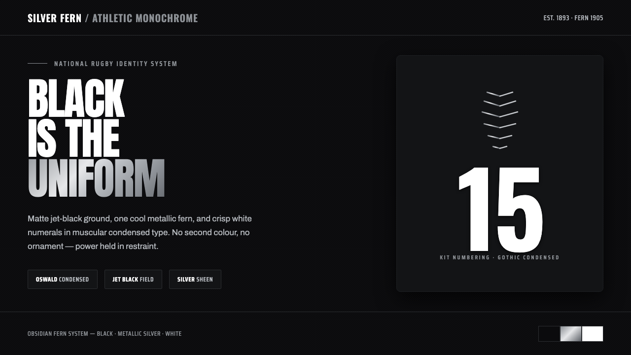 All Blacks Silver FernOne colour, total force. Jet-black field, a single metallic-silver fern, whit…
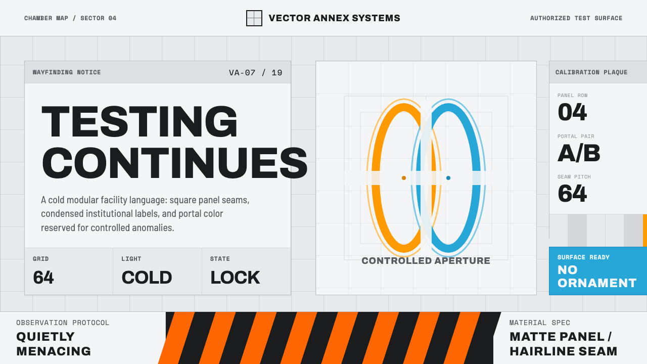 Aperture ScienceSterile authority. Cool panel seams, Archivo signage, and sparse orange-blue…
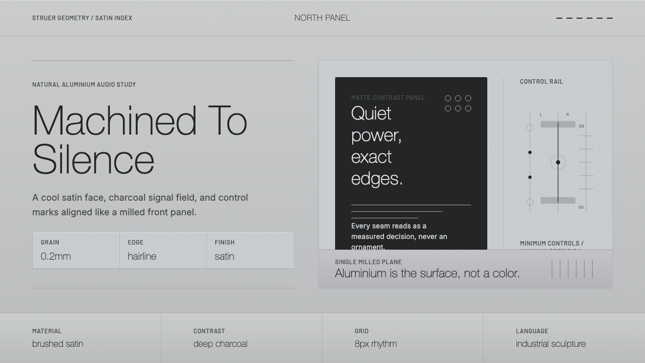 Bang & Olufsen AluminiumQuiet luxury, machined flat. Satin aluminium grain, hairlines, thin charcoal…
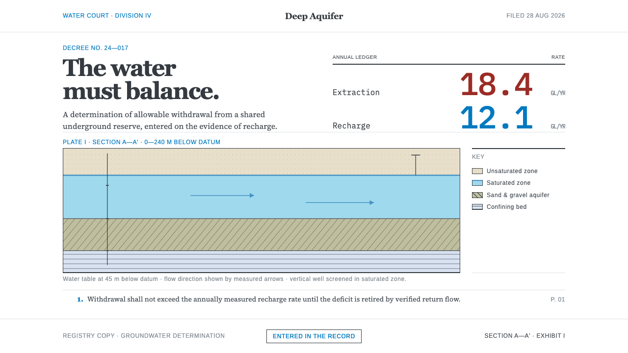 Deep Aquifer Water CourtRestraint makes the deficit undeniable. White bond, book serif, and a keyed a…
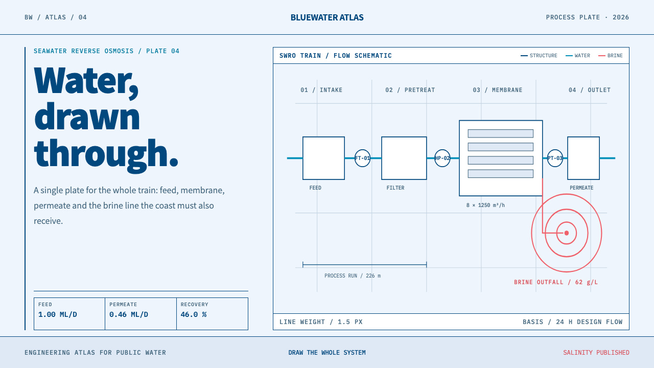 Desalination MegaplantInfrastructure made legible. Navy process lines map cyan water flow and coral…