What is The Long Now Foundation?
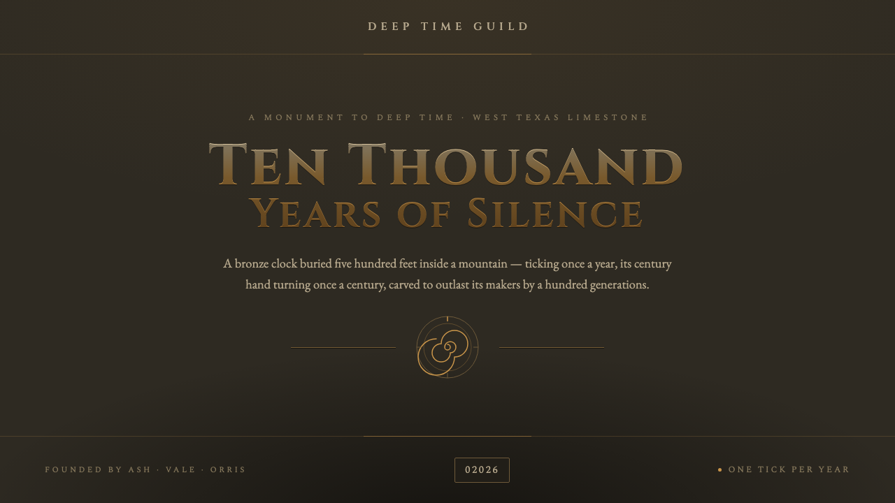
The Long Now turns interface into monument: patinated bronze, deep-time stone, and a five-digit year that makes the present feel temporary.
The Long Now Foundation in brief
The Long Now Foundation aesthetic is built around deep time rather than immediacy. Its defining image is the 10,000-Year Clock, a mechanical clock buried in a 500-foot shaft inside a West Texas limestone mountain. Weathered bronze cams meet pale, dry stone at geological scale, producing a visual language that feels excavated, durable, and deliberately older than the people who encounter it.
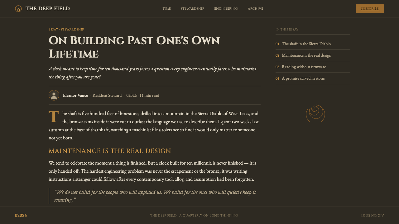
The design system translates that buried-monument atmosphere into a dark interface language. Deep-time stone provides the ground; patinated bronze-gold supplies the engraved emphasis; spiral motifs suggest recurrence and duration; and Cinzel capitals give headings the authority of carved inscriptions. The result is restrained rather than luxurious. Its richness comes from material suggestion, spacing, and age—not from ornament or brightness.
Time is represented typographically as well as symbolically. The five-digit year notation, written as 02026, refuses the assumption that the current century is the natural scale of experience. It makes room for years before and after the familiar four-digit frame, turning a date into a philosophical gesture. Every visual decision therefore supports the same idea: build for continuity, and let the present occupy only one place in a much longer record.
Where does The Long Now Foundation come from?
The Long Now Foundation belongs to the period 2010–now, while the project was conceived during the 1995–2000s. Its setting is North America, specifically West Texas in the United States. This origin matters because the aesthetic is not an abstract exercise in antique styling. It is rooted in a physical monument, a dry limestone mountain, and a mechanical object intended to be encountered across an immense span of time.
The 10,000-Year Clock is the foundation's central visual and conceptual source. Buried inside the mountain, the clock replaces the familiar idea of a public monument with something partly hidden and slowly discovered. Its weathered bronze cams stand against stone rather than against a polished architectural interior. That opposition—metal shaped by mechanism and rock shaped by geological time—gives the system its basic material grammar.
The foundation's associated movements are Long-termism, deep-time thinking, and the Clock of the Long Now. Together they establish a different relationship to progress and novelty. The design does not celebrate speed, constant refresh, or technological gloss. It treats durability, recurrence, patience, and the ability to outlast its makers as primary values. A visual system derived from those values must feel settled, grounded, and resistant to fashion.
The project is connected with Danny Hillis, Stewart Brand, Brian Eno, and The Long Now Foundation. The source material presents these names as its key figures and institutional anchor. Their inclusion signals that the design language is not merely a decorative theme applied to an unrelated product; it is a translation of a specific cultural project whose monument, vocabulary, and sense of scale all point toward a longer view of human making.
What defines the The Long Now Foundation look?
Deep-Time Ground
The foundation is dark and geological, evoking stone inside a mountain rather than a neutral digital canvas. Its darkness should feel dense and mineral, with enough visual quiet for engraved bronze elements to register clearly. Pale dry stone may appear as a secondary material reference, but cream, ivory, and pure white are outside the system's emotional center.
Patinated Bronze
Bronze-gold is the system's principal accent, but it should read as patinated and weathered rather than freshly polished. It carries the feeling of a mechanism exposed to age: warm, muted, and slightly imperfect. Use it for engraved headings, rules, markers, and essential signals so that emphasis feels cast or carved into the stone.
Epigraphic Typography
Cinzel capitals provide the clearest typographic signature. Headings are monumental, spaced, and inscription-like, with restraint doing as much work as scale. The letterforms should feel placed for permanence, not tuned for speed reading. Supporting text can remain quieter, allowing the capitalized display language to function as a marker of importance and ceremonial threshold.
Five-Digit Time
Dates use five digits, as in 02026, to enlarge the mental frame around the present. The leading zero is not a technical flourish; it is a visual reminder that the current moment belongs to a much longer sequence. Dates can therefore act as structural objects in the layout, carrying meaning through their unfamiliar length and deliberate spacing.
Spiral Recurrence
Spiral motifs express duration as return rather than as a straight line. They suggest cycles, winding mechanisms, geological formation, and thought that keeps unfolding without reaching a final decorative endpoint. The motif works best when used sparingly—as a seal, diagram, orbital guide, or quiet background trace—so recurrence remains legible instead of becoming pattern noise.
Monumental Restraint
The system gains authority by leaving space around its signals. Few materials, few accents, and a clear hierarchy create the impression of an artifact meant to remain intelligible after its makers are gone. Ornament should never compete with the sense of weight. The visual goal is not antique decoration but durable orientation: every mark should feel purposeful, legible, and capable of aging well.
Who shaped The Long Now Foundation?
Danny Hillis is listed as a key figure associated with the Long Now Foundation and the 10,000-Year Clock project. Within this design language, his name belongs to the human origin story behind the monument: a project that treats mechanical time, buried architecture, and long-term construction as cultural material rather than as mere engineering detail.
Stewart Brand is named among the foundation's key figures. His association places the visual system within a broader project of long-term thinking, where the present is understood as one interval in a much larger continuum. The resulting design should therefore communicate patience and continuity before it communicates novelty or immediate conversion.
Brian Eno appears in the source material as a key figure connected with The Long Now Foundation. In the article's visual vocabulary, that connection reinforces the importance of atmosphere: the system is not only a set of colors and type choices, but an encounter with duration, quiet, material presence, and the feeling that meaning can unfold slowly.
The Long Now Foundation is the institutional anchor of the system. Its 10,000-Year Clock supplies the central image, while Long-termism, deep-time thinking, and the Clock of the Long Now supply the conceptual frame. The design remains coherent when both sides are preserved: monument-like material expression and an explicit commitment to thinking beyond the immediate present.
How do you use The Long Now Foundation today?
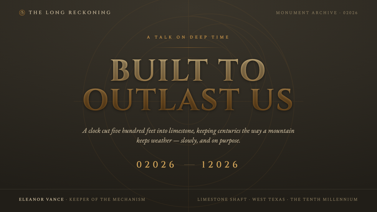
For presentation slides, use the deep-time ground as a continuous stage across the deck. A cover can carry a single monumental title in spaced Cinzel capitals, one bronze-gold spiral or engraved marker, and a large field of darkness around it. Content slides should reduce the material vocabulary further: one clear heading, quiet supporting text, and rules or markers that feel carved rather than decorative. Data slides can make five-digit dates and cyclical diagrams the primary visual objects, allowing time itself to organize the information.
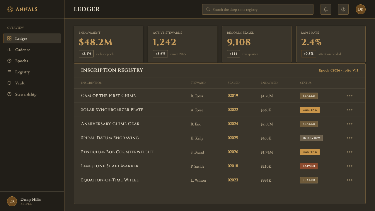
For web interfaces, the style suits dashboards, archives, observatories, and pricing pages that want to communicate endurance and considered judgment. Keep navigation subdued and let bronze-gold identify the active path, selected state, or essential action. Cards should feel like plaques or stone panels, with generous breathing room and a restrained hierarchy. On pricing pages, the five-digit year can frame plans as long-term commitments, while spiral or orbital cues distinguish continuity from short-lived urgency.
For editorial and marketing work, build pages as if they were fragments of a field guide or an inscription discovered in a monument. Long-form articles benefit from dark stone grounds, narrow reading measures, widely spaced section titles, and dates treated as meaningful metadata. Marketing pages can alternate between quiet explanatory passages and strong bronze-gold statements, using the material contrast to make the product feel durable without relying on conventional luxury signals.
For brand storytelling, the system works best when the narrative itself has temporal depth. Introduce an origin, a mechanism, a cycle, or a future horizon rather than presenting isolated benefits. A launch page might pair a five-digit year with a statement about what should remain after the makers are gone. The visual language is strongest when the copy, imagery, and interface all make the same promise of continuity.
The common mistake is treating the theme as a generic dark luxury style. Glossy gold, bright black surfaces, excessive ornament, and dense decorative spirals replace the source material's weathered restraint with spectacle. Another mistake is using 02026 as a novelty badge while keeping every other decision contemporary and disposable. The five-digit year, dark stone, patinated bronze, and epigraphic typography must work together as one argument about time.
The Long Now Foundation — FAQ
Is this simply a bronze-and-black luxury style?
No. Luxury styling usually emphasizes polish, rarity, and immediate visual impact. The Long Now system emphasizes weathering, geological weight, patience, and the ability to outlast its makers. Bronze should feel patinated rather than glossy, and the dark ground should feel like deep-time stone rather than a fashionable black backdrop. Its authority comes from restraint and material memory, not from ornament or shine.
Why does the year begin with a zero in 02026?
The leading zero expands the frame of reference. A familiar four-digit year makes the present feel like the default center of history; 02026 makes it visibly one point in a longer sequence. It is therefore both a date and a philosophical device. Use it where time matters structurally—archives, milestones, plans, schedules, or statements about what should endure.
Can the Long Now aesthetic use a light background?
The source system is explicitly dark and is grounded in deep-time stone. Pale dry stone can appear as a supporting reference, especially when it echoes the West Texas limestone mountain, but cream, ivory, and pure white do not belong to the system's core palette. A light treatment would therefore be an adaptation rather than a faithful application, and it should preserve the weathered bronze, epigraphic restraint, and sense of geological weight.
Are spiral motifs required in every composition?
No. The spiral is a useful expression of recurrence and duration, but the system depends more fundamentally on its material ground, bronze emphasis, five-digit time notation, and epigraphic restraint. A spiral should appear only when it supports the idea of cycles, mechanisms, or unfolding time. Repeating it everywhere turns a meaningful motif into surface pattern and weakens the monument-like quiet.
Related design styles
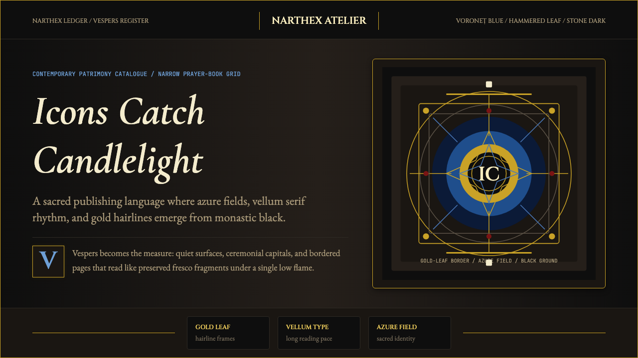 Romanian Orthodox Modern RevivalSacred dark refuses sparkle. Voroneț blue halos and gold hairlines rise from…
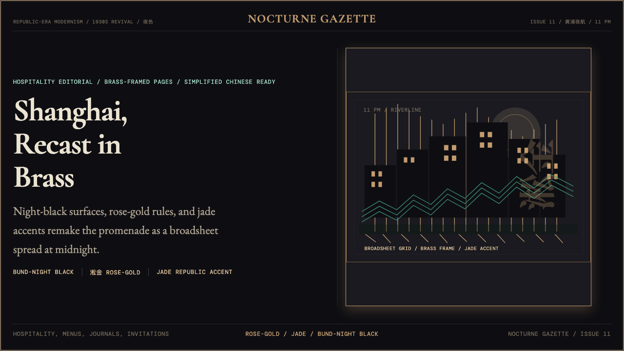 Shanghai Bund Art Deco RevivalNight-black Deco luxury. Rose-gold lines, jade accents, and broadsheet type s…
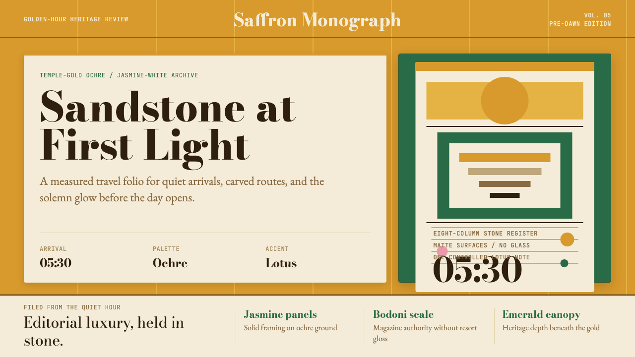 Cambodian Angkor Tourism ModernQuiet authority at dawn. Ochre ground, Bodoni serif, jasmine panels, one lotu…
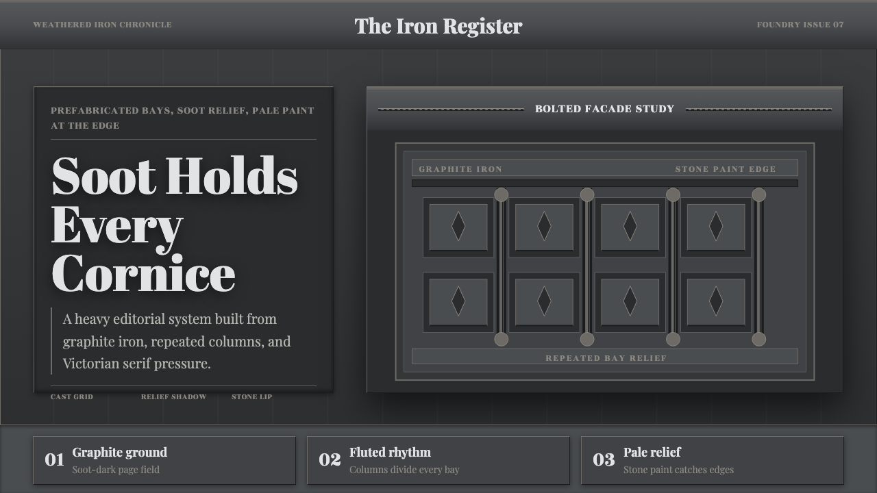 Cast Iron SoHo FacadesIron remembers the city. Graphite bays, Didone type, and pale stone-paint edg…
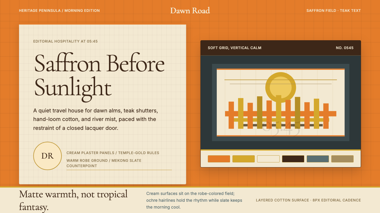 Luang Prabang Temple TourismReverent dawn luxury. Saffron field, cream panels, and teak serif type carry…
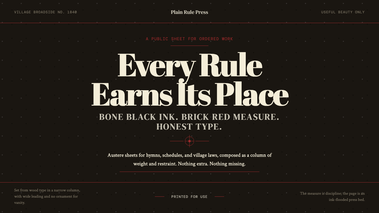 Shaker Broadside PrintAustere by conviction. Bone-black ground, brick rules, and wood-type hierarch…