What is Lonely Planet?
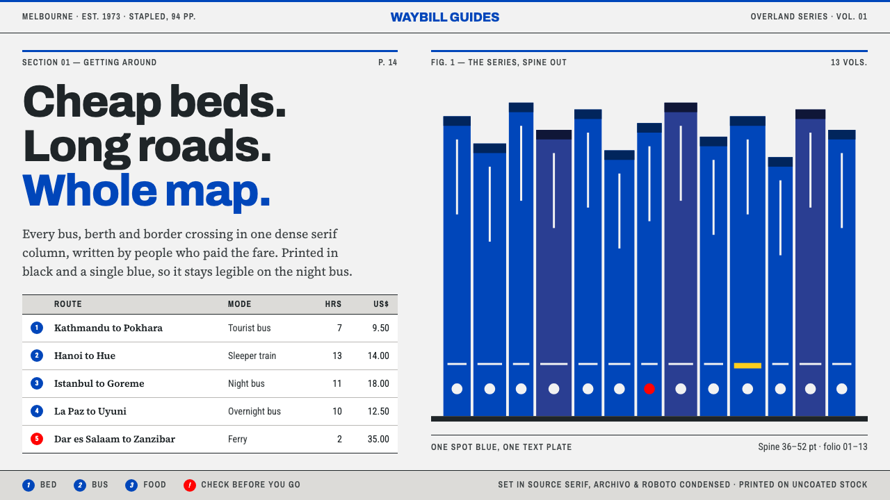
Lonely Planet's guidebook page was a working document — two inks, tight serif columns, ruled fare tables and a single blue spine, built to be read on a long bus ride.
Lonely Planet in brief
The Lonely Planet guidebook style takes its look from a stapled pamphlet run off in Melbourne in 1973 and from the blue-spined series that grew out of it. Its visual identity is the identity of a tool. The paper is thin and uncoated, grey-white rather than bright. Ink is black plus one spot blue. Text is set in dense serif columns tight enough to fit a whole country on a few pages, and listings are divided by hairline rules. There are no photographs.
It belongs to three overlapping traditions: independent travel publishing, the budget-guidebook format, and practical cartography and information design. Independent travel publishing supplied the voice, a publisher outside the large houses, writing for travellers on a tight budget. The budget guidebook supplied the structure, with fares, opening hours and places to sleep set out for quick reference. Practical cartography supplied the visual grammar of maps crowded with numbered dots that are keyed to a list beside them.
What results is a style of density with discipline. Different typefaces do different jobs: a serif for reading, a narrow sans for map labels and spines, a condensed sans for fares and opening hours. Blue is used sparingly, on the spine, on heading rules, on map water and on the brand. Everything else is black on grey-white paper. The page invites you to scan, cross-reference and decide, not to linger over an image.

Where does Lonely Planet come from?
The story starts with a couple and a stapled booklet. In 1973 Tony Wheeler and Maureen Wheeler produced and printed a pamphlet in Melbourne, Australia, called Across Asia on the Cheap. It was short, hand-mapped and put together by the authors themselves, and its purpose was practical: to tell other overland travellers how to get from place to place without spending much. That origin explains nearly everything about the later visual style. The page had to carry the most information in the least space at the lowest cost, so it looked like what it was, a working document rather than a showpiece.
From that booklet the company grew into a series of guidebooks whose blue spines lined the backpacks of a generation of travellers, a presence that stretched from the 1980s to the 2010s. The consistent spine made the series recognisable from across a hostel dormitory or a bookshop shelf, while the interior pages stayed true to the original working-document logic. Cheap paper kept the price down; black plus one spot colour kept the printing simple; and a tight serif measure allowed an entire country, with its timetables, fares and accommodation, to be fitted into two columns.
Maps were central to the experience. Lonely Planet's city maps were crowded with narrow small type and numbered dots, and the reader matched each dot with an entry in the list beside it. This is practical cartography in its purest form: the map is not a picture of a place but an index to a list. The visual language that follows, narrow labels, small numerals and a single colour for water or highlight, is dense but readable because it is organised, and organisation is the style's real subject.
Around the 2023 fiftieth anniversary the series was redesigned, a reminder that the look has always been a living working format rather than a heritage artefact. What carries across the decades is the stance: independent travel publishing, written for people who read their guidebook in transit, with a page that rewards scanning. The style as it is used now keeps the grey-white paper, the dense serif, the hairline tables and the blue accent, which are the elements that tell a reader at a glance that this is a book made to be used.
What defines the Lonely Planet look?
Two Inks
The colour system is black plus one spot blue. The restriction came from the economics of printing, yet it became a visual identity of its own. Blue is reserved for the spine, heading rules, map water and the brand, and nothing else. Because there is only one colour to choose from, the blue always means something, and the page never needs a legend to explain a rainbow of categories.
Uncoated Grey-White Stock
The ground is a soft grey-white, the colour of thin uncoated paper, not the bright white of art stock. It is lower in contrast than a pure white and easier on the eye over a long read. In a digital layout this means a slightly off-white background with near-black text, paired with the absence of gloss, shadow or texture. The page should look printed on cheap paper by someone who cares about the content.
Dense Serif Columns
Reading text is set in a serif, in narrow columns, at a small size with close line spacing. The measure is tight enough to hold a great deal of information without losing legibility. The serif is chosen for sustained reading, with the sturdiness to survive poor paper and poor light. In an interface the same logic produces compact, multi-column or narrow-column text blocks that value coverage over airiness.
Narrow Labels for Maps and Spines
Maps and spines use a narrow sans in small sizes. Narrow letterforms fit more characters into a tight space, which is exactly what a crowded city map or a thin spine needs. The sans contrasts with the serif of the main text and tells the reader they are looking at a label, a name or a marker, not a paragraph.
Condensed Type for Practical Data
Fares, opening hours, timetables and prices are set in a condensed sans, a third voice in the system. Condensed figures line up neatly in columns and take little room, which suits the information that travellers need to scan and compare. This is the typographic equivalent of a table: the data looks like data and does not pretend to be prose.
Hairline Rules and Ruled Tables
Every listing is divided from the next by a hairline rule, and fare tables are built from rules rather than from filled cells. The rules do the work of structure at almost no cost in space or ink. They also keep a dense page orderly: even when the type is small and the columns are narrow, the eye can see where one entry ends and the next begins.
Text First, No Photographs
The style is defined partly by what it leaves out. There are no photographs, no mood imagery and no decorative illustration, because pictures use space that could hold information. Where visual content appears at all, it is functional: a hand-drawn-style map, a numbered plan or a small icon. This text-first stance gives the page a particular authority, the sense that the content is the point.

Who shaped Lonely Planet?
Tony Wheeler is the co-founder who, with Maureen Wheeler, produced the 1973 pamphlet Across Asia on the Cheap in Melbourne. His role in the story is that of a traveller turned publisher, and the practical, information-first tone of the guidebook page reflects the needs of travellers on a tight budget.
Maureen Wheeler is the other half of the founding partnership. The venture began as a couple's self-published booklet and grew into a publishing house, and her name is inseparable from the company's origin as an independent, hands-on operation. The ethos of the page, useful, low-cost and made by people who had made the journey, belongs to both founders.
Not a single person but a collective that belongs in any account of the style. The series was made by researchers and mapmakers working in the tradition of practical cartography and information design, and the numbered-dot maps, ruled tables and condensed data lines are their craft. The visual identity is the product of this shared, anonymous discipline as much as of any founder's vision.
How do you use Lonely Planet today?
The Lonely Planet guidebook style is best for content that people consult rather than admire: directories, listings, timetables, documentation and reference works. It rewards completeness and rewards a reader who is in a hurry. Applying it well means treating the page as a working document, letting density be a virtue, and relying on typographic roles and hairline structure rather than imagery to organise what is there.
For presentation slides, build text-led pages with strong structure. A cover can be a grey-white slide with a title in serif, a small narrow-sans label, and a single band of blue at one edge. Content slides use two or three narrow columns, hairline rules between entries and numbers in a condensed face. Data slides lean on ruled tables, where fares, dates or metrics sit in tidy columns. Avoid image-led backgrounds and large charts that waste space the information could use.
For web interfaces, the style suits directories, travel and local-information sites, documentation portals and knowledge bases. Use a grey-white background, serif body text, a narrow sans for labels and a condensed sans for tabular data. Divide listings with hairlines, never with cards, and keep blue for links, headings rules and the single primary action. Maps can use numbered markers keyed to a list. Responsive layouts should keep the density on larger screens and collapse to a single column on small ones without losing the rules.
For editorial and marketing work, the style supports practical, trustworthy writing: itineraries, how-to guides, price lists and city notes. Copy should be compact and specific, with names, numbers and times rather than adjectives. Print and PDF outputs can embrace the two-ink constraint literally, with black type and a single blue accent. Because there are no photographs, the writing itself must carry the page, and it should read like advice from someone who has done the trip.
A common mistake is to treat the grey-white and blue as a retro filter and add faux paper textures, sepia photographs or hand-lettered flourishes. The original is a working format, not a heritage look. Another mistake is to let blue spread across backgrounds, buttons and icons until it stops meaning anything. A third is to open up the density with generous padding, large type and card layouts, which removes the very quality that makes the style useful. If the page looks relaxed, it is not Lonely Planet.

Lonely Planet — FAQ
Why does the style use no photographs?
Because the original was a working document printed cheaply, and every inch of a page had to earn its place with information. Photographs take space, cost money to reproduce and say little about fares and timetables. Leaving them out kept the book light and affordable and made the text the main event. In a modern layout the same choice signals seriousness and utility: the page is for finding things out, not for browsing images.
How do I use the single blue accent?
Use it sparingly and consistently. In the original it appears on the spine, on heading rules, on map water and on the brand. In a digital layout, reserve it for links, the rule under a heading, a map's water or highlights, and the one primary action on a screen. Resist the temptation to tint backgrounds or colour-code categories with it. The strength of a single spot colour is that it always means the same thing.
Is it a vintage or retro look?
Only superficially. The grey-white paper and the ink restrictions can look vintage to a modern eye, but they arose from economics and function, and the series has been redesigned along the way, including around the 2023 fiftieth anniversary. The right way to use the style is as a living information format, with crisp type, accurate content and the same density of purpose, not as a nostalgia effect.
Can the style work on mobile screens?
Yes, and in some ways it is a natural fit, since it was designed for readers on the move. Collapse the columns to a single one, keep the hairline rules between entries and keep the condensed face for fares and times, which saves horizontal space. The density can be eased slightly for touch, with comfortable tap areas, but the typographic roles and the rules should stay. A listing that can be scanned with one thumb is faithful to the original purpose.
What kinds of products suit it best?
Anything built around lookup and comparison: travel and local guides, directories, documentation, price and schedule pages, reference libraries and internal knowledge bases. It works for products whose users want to find an answer quickly and move on. It is a poor fit for brands that depend on atmosphere, imagery or emotional persuasion, since the style gives up those tools on purpose in exchange for clarity and trust.
Related design styles
 Orbital Solar RelayEngineering, not spectacle. Archivo and typewriter copy map a measured yellow…
 Par Avion Air MailPostal lightness made strict. Onionskin blue, Oswald caps, and red-blue edge…
 MICR Cheque FontTwo readers, one document. Engraved blue serif above an uncompromising magnet…
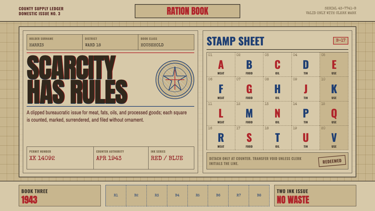 Wartime Ration CouponScarcity made visible. Buff card, red-blue overprint, and perforated grids do…
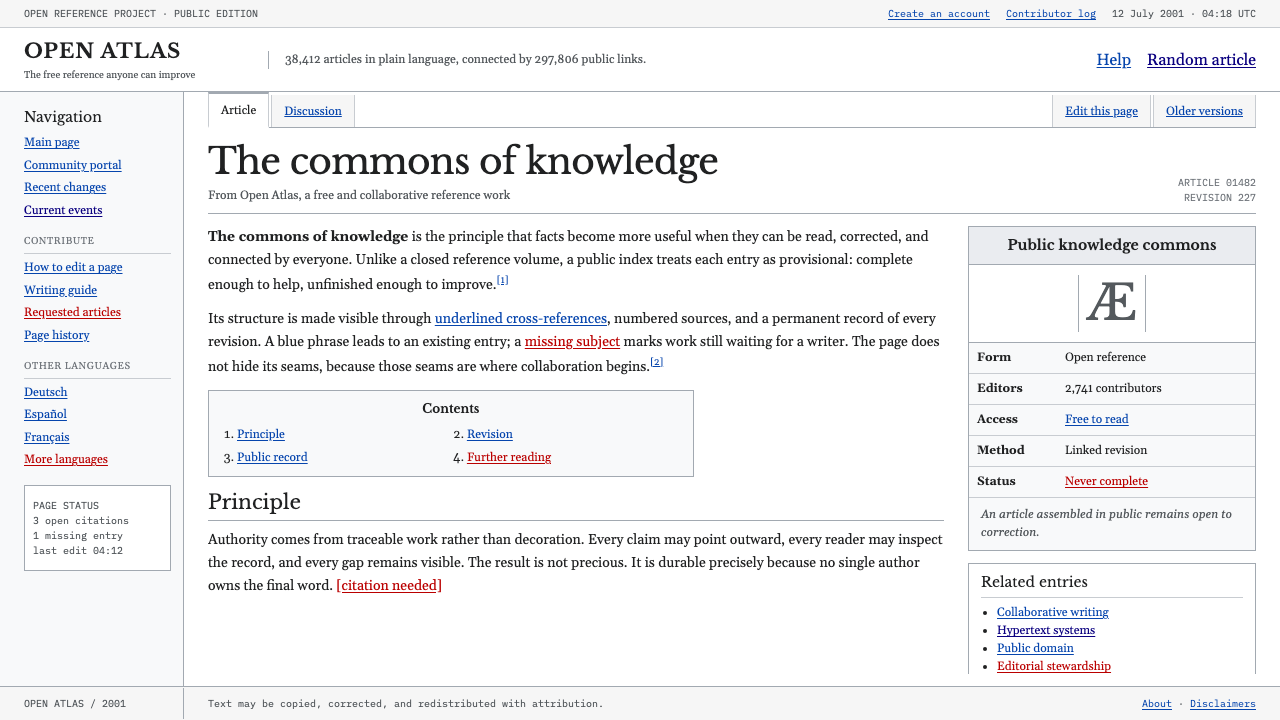 Wikipedia (2001)Content needs no ornament. Black serif text, gray hairlines, and blue links e…
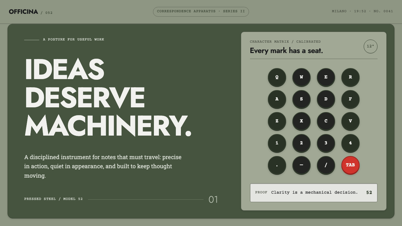 Olivetti LetteraEngineered, never styled. Grey-green enamel, precise type blocks and one red…