What is Łódź Textile Factory?
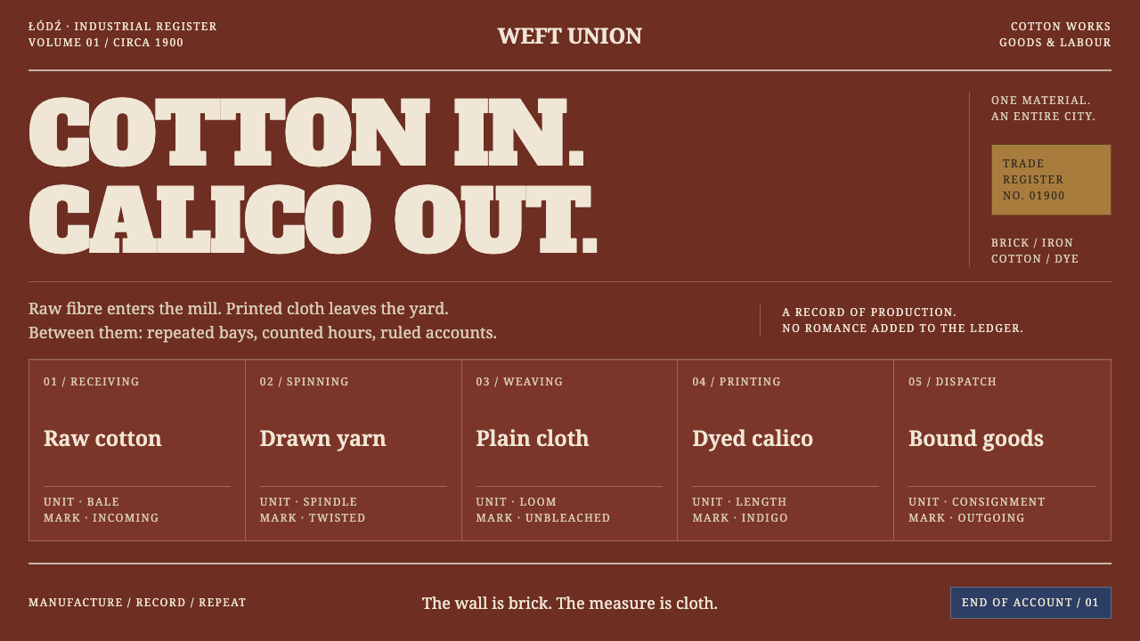
Łódź Textile Factory sets fat slab type and ledger rules on soot-dark brick: industrial weight with no nostalgia, drawn from a company town built of a single material.
Łódź Textile Factory in brief
Łódź Textile Factory takes its cue from Ogrodowa Street in Łódź, Poland, around 1900. There, ninety thousand square metres of hard-fired brick were laid into weaving halls, workers' tenements, a hospital, a school and an owner's palace: one company town, one material, one skyline of chimneys. Cotton arrived as raw bales and left as printed calico.
The visual system draws its colour from that fabric. Soot-dark brick is the page, the lit face of the brick is the primary colour, and the beige-grey of mortar and the off-white of unbleached calico let the layout breathe. Indigo from the dye vats and brass from the nameplates serve as accents. Headlines are set in fat-face slab type that shouts the way trademark labels on bale stamps and hand-painted lettering on factory walls do, and tables follow the ruled lines of goods ledgers.
The style is dense, repetitive and unromantic. Its blurb says industrial weight without nostalgia, and that is the discipline: the system neither mourns the factory as a lost romance nor tidies it into loft chic. It shows a working place as it was, with the soot still on it.

Where does Łódź Textile Factory come from?
The style belongs to the years from the 1870s to 1939, with mill output at its peak around 1900. Łódź then lay in Congress Poland, part of the Russian Empire, and after the First World War in the Second Polish Republic. The city grew as a textile centre on the strength of cotton mills like the one on Ogrodowa Street, and the style is anchored to the moment when that industry was at its height, not to its later decline or its later conversion into something else.
The central object is the Poznański works. Izrael Poznański's complex on Ogrodowa Street was a company town in the literal sense: weaving halls, workers' tenements known as famuły, a hospital, a school and the owner's palace stood together, all built of hard-fired brick. The social order is written in the material. The owner's palace and the workers' housing are made of the same stuff, and the difference between them is a matter of ornament and scale, which is why the style keeps one colour family and varies only weight and finish.
Three traditions feed the look. Backsteinarchitektur is the north-European tradition of building in exposed brick, and the source places Łódź's mills inside it: walls whose structure and surface are the same thing, with decoration made from the brick itself. Russian-Empire commercial trademark printing supplies the loud labels, bale stamps and fat-faced lettering used to mark goods for market. And Art Nouveau facade ornament appears at the edges of the buildings, a brief and restrained softness inside a hard industrial language.
The place has also been described in literature and film. The writer Władysław Reymont called it a promised land, and the director Andrzej Wajda later shot his film within the works. Both treat the city as a place where fortunes were made and lives were consumed, and the design system keeps that double view. It does not romanticise the mill, but it does not diminish its scale either. The result is a visual language that is heavy because the subject was heavy.
What defines the Łódź Textile Factory look?
Soot-Dark Brick Ground
The page itself is brick in shadow, dark, warm and slightly dirty, as if the chimneys had been at work on it for decades. It is a dark style, and the darkness is a material rather than a mood: the surface should feel solid, not glossy or atmospheric. Nothing glows against it, and the contrast comes from the lit parts of the brick, not from artificial effects.
Lit Brick, Mortar and Calico
Colour has clear roles. The lit face of the brick is the primary colour, a strong earthy red. The beige-grey of mortar and the off-white of unbleached calico are the light tones, used for text, rules and breathing space. Everything is drawn from the factory's actual materials, which is why the palette feels coherent without being decorative.
Indigo and Brass Accents
Two small accents come from the working processes of the mill: the blue of indigo from the dye vats and the dull yellow of brass nameplates. They are used sparingly, to mark a status, a label or a single call to action, and never as large fills. The brass in particular should look stamped and worn, not polished.
Fat-Face Slab Type
Headlines are set in heavy, wide, fat-face serif letterforms with thick slab-like strokes, like the lettering on trademark labels and the hand-painted signs on factory walls. The type is made to be read from across a yard and to be impossible to ignore. It shouts, which is the point, and it is balanced by plain, sturdy text for everything below the headline.
Ledger Rules
Tables and lists follow the ruled lines of goods ledgers: horizontal rules across the page, narrow columns for quantities, and clear gaps between entries. Information is set out as a record, row after row, rather than as cards or tiles. The result is dense but orderly, and a reader can scan a column of figures at once.
No Soft Edges
Corner radii are close to zero. Brick, iron and stamped brass plates have no soft edges, and the interface does not invent any. Buttons are blocks, panels are rectangles, and rules are hard. The honesty of the shapes is what stops the dark ground from turning into atmosphere and keeps the whole system feeling like built things.
Density and Repetition
Rows of windows, rows of bays and rows of ledger entries repeat across the surface. The style likes modules that recur with small variations, and it does not fear fullness. A page can be packed with information and still feel ordered, as long as the grid is strong and the same module returns again and again.

Who shaped Łódź Textile Factory?
Poznański was the owner of the cotton works on Ogrodowa Street, and his complex of weaving halls, tenements, hospital, school and palace is the model of the company town that the style depicts. His name stands for the scale of the enterprise, one man's name on a whole district built of brick.
Majewski is the architect whose name is attached to the Poznański works. The restrained, repetitive logic of the buildings, with surface and structure made from the same brick, is the architectural source for the system's rules of modules and exposed material.
Scheibler is another leading name of Łódź's cotton industry, and his inclusion alongside Poznański signals that the city's character was shaped by competing mill-owners, each building a brick domain. The competition explains the density of the city: many works, one language of brick and chimney.
Reymont is the writer who called Łódź a promised land. The phrase reads as promise and as warning at once, and it supplies the style's emotional temperature: confident about the scale of industry, unsentimental about what it cost.
Wajda is the film director who shot his picture within the factory district. His film is how many viewers meet the place: the dark brick, the long rows of sheds and the heavy daylight. It is a visual record that the design system takes as a reference for atmosphere without turning it into nostalgia.
How do you use Łódź Textile Factory today?
Łódź Textile Factory is a dark, heavy, information-rich style, and it suits subjects with weight: industry, logistics, trade, labour, manufacturing and anything built on volume and record. Applying it well means holding to the disciplines it sets: brick-dark ground, a lit-brick primary, ledger rules for data, fat-face slab type for headlines, and hard edges.
For presentation slides, the cover can be a single massive slab headline on the dark ground, with a thin rule and a small brass-coloured stamp for the date or the number of the report. Content slides work like ledger pages: a headline, a ruled table below, and a short line of text. Data slides are the style's strongest suit, since rows of figures set between horizontal rules read at once and need no decoration.
For web interfaces, the style fits dashboards, order and inventory systems, accounting and back-office tools, logistics and shipping products, and pricing pages that are essentially tables. Keep the ground dark and solid, keep corners square, and use the lit-brick colour for the primary action. Reserve indigo and brass for status and badges so they stay meaningful.
In editorial and marketing work, the style suits industrial heritage features, labour history, trade publications, annual reports for manufacturers, and brand material for companies that make things in volume. Its trademark-label energy is also well suited to packaging and posters for goods sold by weight or by the bale, as long as the type is big and the layout is blunt.
The most common mistake is to treat it as vintage nostalgia: sepia filters, distressed textures, thin elegant type or rounded corners that soften the effect. Another is to apply it as exposed-brick wallpaper with a polished, loft-style interior mood, which is precisely the romance the style refuses. A third is to use every accent at once; indigo and brass should each appear in small, meaningful doses, so that the brick stays in charge.

Łódź Textile Factory — FAQ
What place and period is the style based on?
It is based on the Poznański cotton works on Ogrodowa Street in Łódź, Poland, around 1900, when mill output was at its peak. The wider period runs from the 1870s to 1939, when Łódź lay in Congress Poland under the Russian Empire and later in the Second Polish Republic. The complex there combined weaving halls, workers' tenements, a hospital, a school and the owner's palace, all in hard-fired brick.
Why does the system use fat-face slab type for headlines?
Because that is how the place spoke. Trademark labels on bale stamps and hand-painted lettering on factory walls used heavy, wide letters designed to be read from a distance and to stand out among many competing marks. The headline type carries that same voice. It is balanced by sturdy, plain text below, so the shouting stays at the top of the hierarchy and does not leak through the whole page.
Why are corners square rather than rounded?
Because nothing in the source material has a soft edge. Brick, iron and stamped brass plates are all hard, and the system holds that line: radii stay close to zero across buttons, panels and tags. It is a constraint that gives the style honesty. Rounded corners would make the interface friendlier, but they would also drift toward a consumer-app mood that this style is meant to avoid.
Is this a nostalgic or retro style?
No. The blurb says industrial weight without nostalgia, and that is the intention. The style borrows materials, lettering and ledger structure from a historic place, but it does not use age as a filter. There are no sepia tones, no faux wear and no sentimental framing. The look comes from the clarity of the original logic, brick, record and trademark, rather than from an effort to feel old.
Can it be used for products that are not industrial?
Yes, wherever the subject is volume, record or reliability. Software for operations, finance and logistics, data-heavy dashboards, trade publications and brands that want to sound solid all fit. It becomes awkward for products that depend on lightness or play, such as wellness, children's goods or fashion-forward consumer brands, because the dark ground, hard edges and loud type will fight the message.
Related design styles
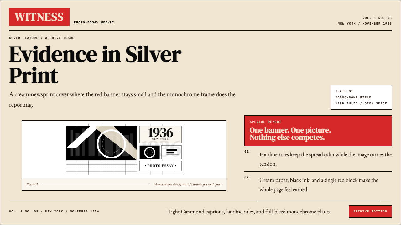 LIFE Magazine (Red-Banner)Photojournalism stripped bare. One red banner, cream newsprint, stark black p…
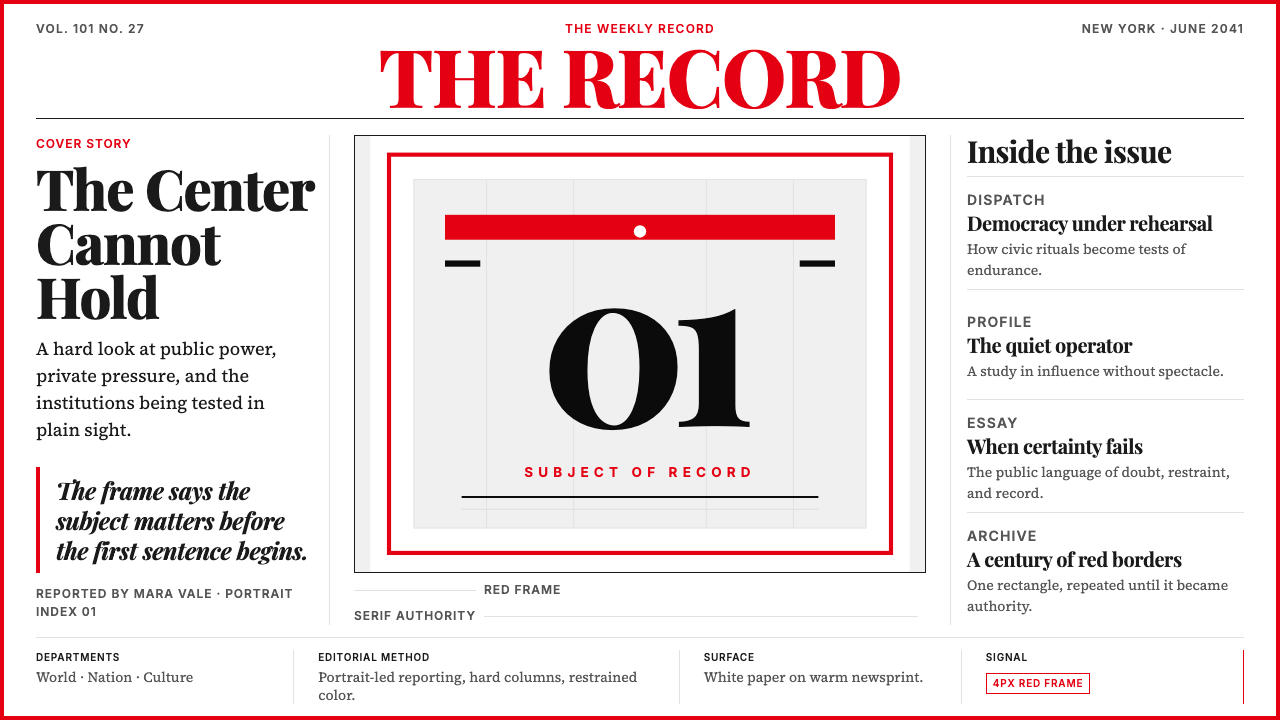 TIME MagazineAuthority in a red rectangle. Didone masthead, black-white columns, and a 4px…
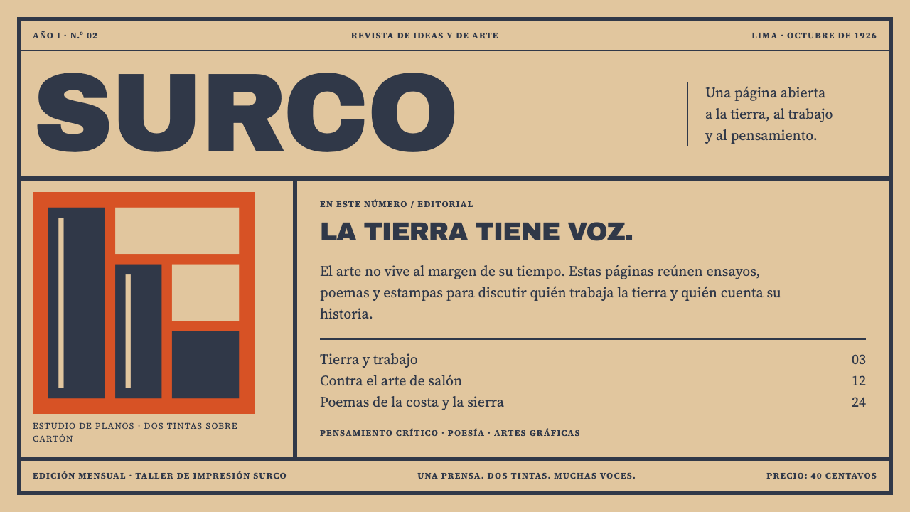 Amauta MagazinePrint with conviction. Vermilion blocks and heavy slate-navy type bite into b…
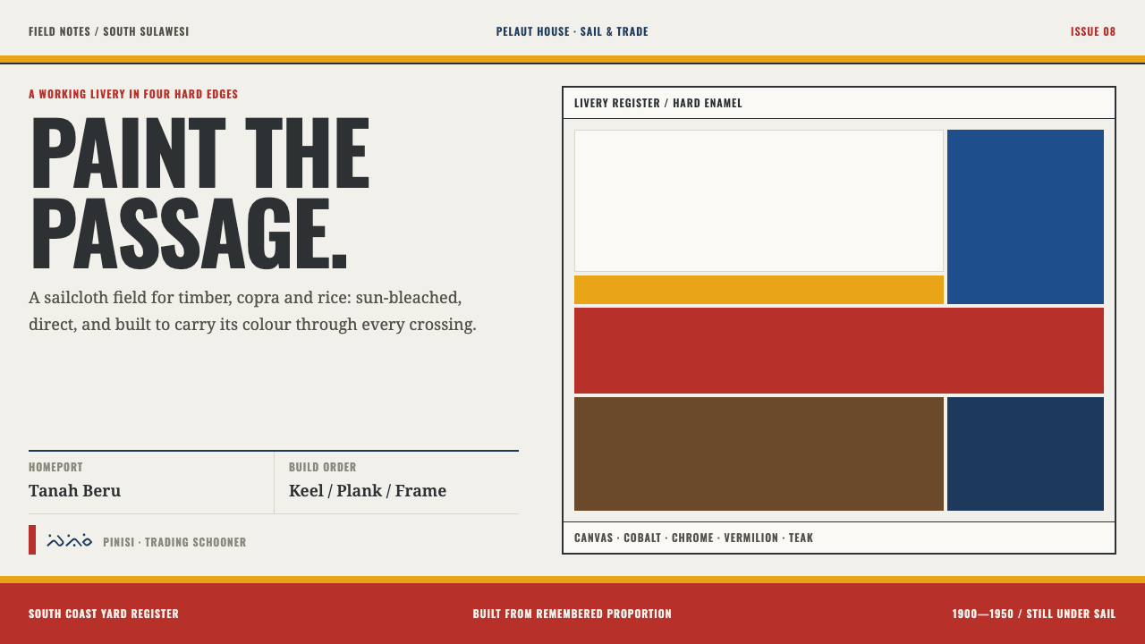 Bugis PinisiSailcloth made resolute. Vermilion, chrome and cobalt bands cut a warm white…
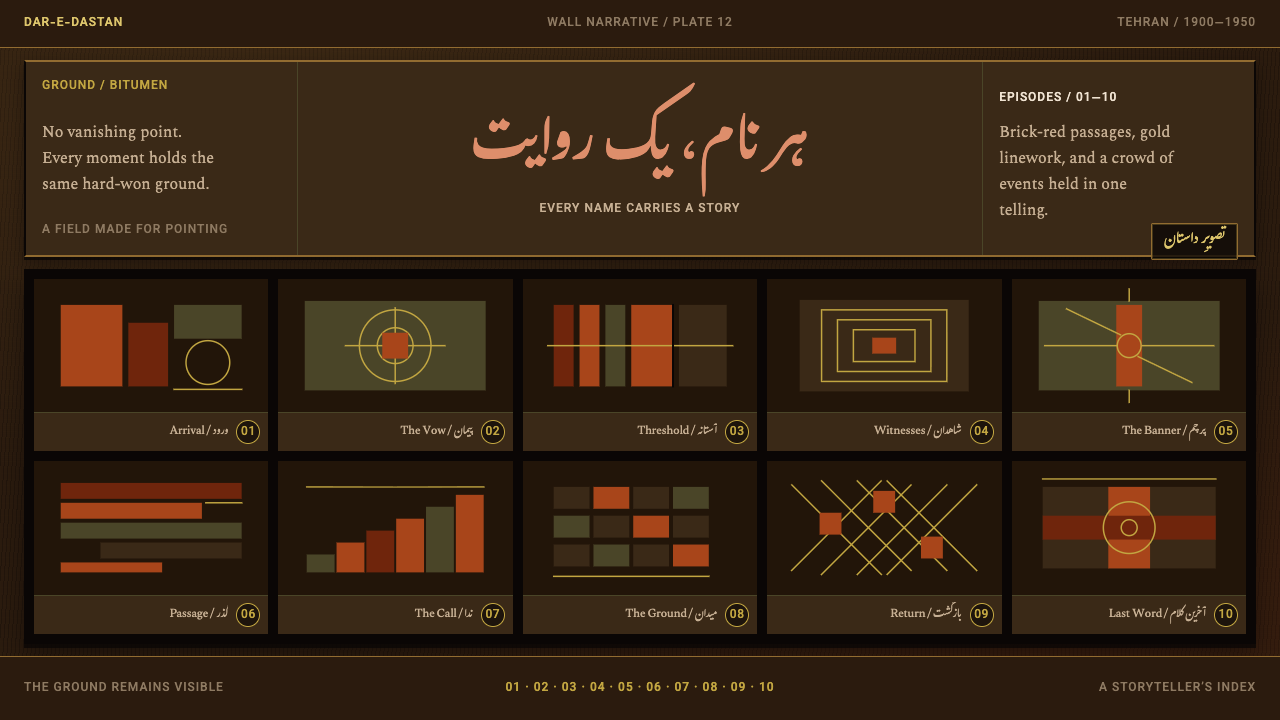 Coffee-House PaintingA story refuses one scene. Bitumen ground, brick-red panels, and gold numbere…
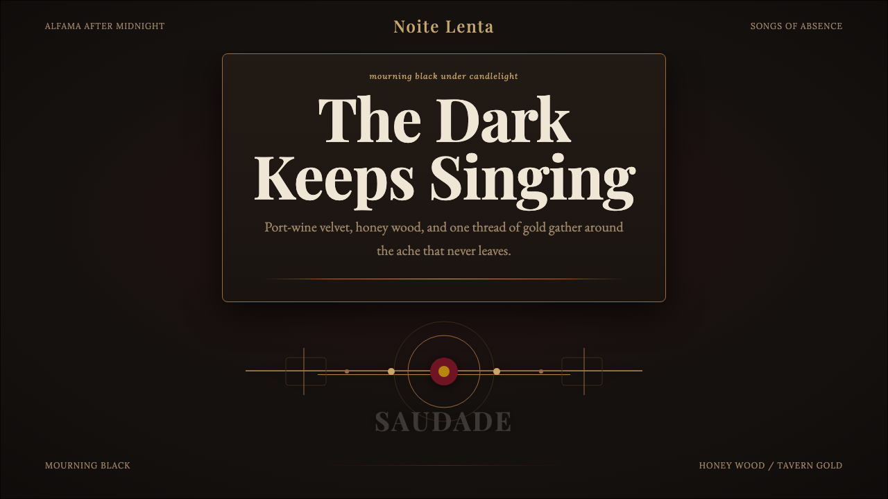 Fado SaudadeSaudade in shadow. Mourning black holds wine red, honey wood, and one gold li…