What is The Little Mermaid (Andersen, 1837)?
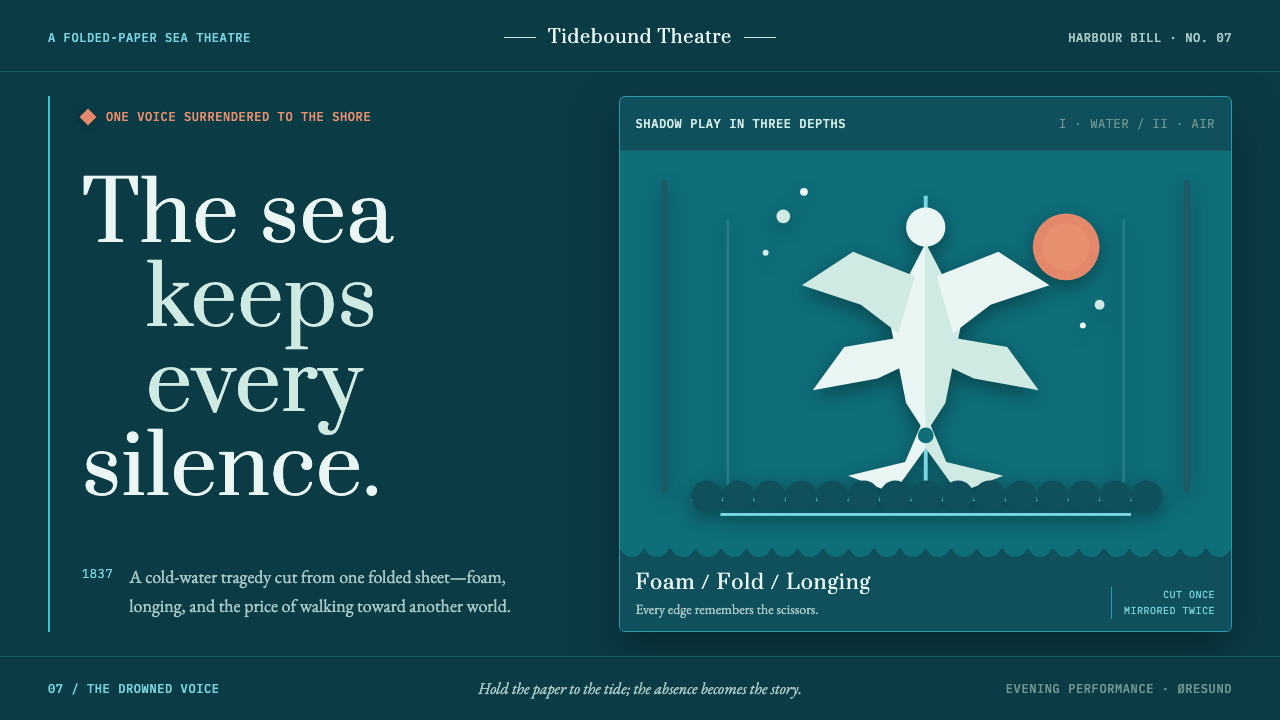
Cold longing, cut clean: The Little Mermaid turns Andersen’s sea-tragedy into a paper theatre of harbour water, foam, and one coral wound.
The Little Mermaid (Andersen, 1837) in brief
The Little Mermaid is a dark Scandinavian storybook style rooted in Hans Christian Andersen’s 1837 fairy tale and its long visual afterlife in Danish illustration, silhouette craft, and shadow theatre. Its central image is not an underwater world rendered with painterly depth, but a folded sheet opened into a stage: flat figures float over deep Øresund water, their contours defined by the crisp absence left by scissors. The mermaid, the harbour, the seaweed, and the distant spires appear less like illustrated objects than like paper actors suspended before a coloured backdrop.
The emotional register is controlled, cold, and tragic. Harbour teal, surf cyan, and foam white establish a northern maritime atmosphere, while a single coral accent carries the visual burden of longing, pain, sunset, or an impossible wish. This warm interruption should feel rare enough to matter. Rather than making the scene cheerful or decorative, the contrast gives the composition its ache: pale forms drift through dark water while the one warm note suggests what cannot be spoken.
Visually, the system translates Andersen’s compulsive papercutting into a practical grammar. Silhouettes remain flat, interiors stay clean, and every edge should read as a deliberate cut. Wave scallops, kelp fringes, fish-tail curls, swans, castles, dancers, and dissolving foam can all become recurring motifs, but they belong to one theatrical world. The effect is intimate rather than monumental: a shadow-theatre bill pinned to a wet dock, beautiful because it is precise, fragile, and slightly mournful.
Where does The Little Mermaid (Andersen, 1837) come from?
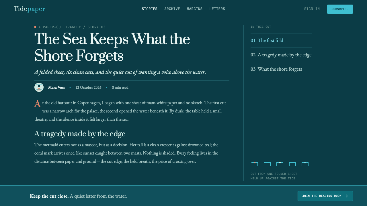
The style begins with The Little Mermaid, first published by Hans Christian Andersen in 1837 in Eventyr, fortalte for Børn. Its imaginative geography belongs to Denmark: Copenhagen and Odense, with the Øresund strait providing the cold maritime horizon. That setting matters because the visual language is not a generic fantasy ocean. It is harbour water, distant masonry, marine weather, and a northern coastline where dark teal can feel more immediate than open blue.
Andersen’s own papercutting supplies the most literal origin for the design system. He was known for cutting paper while telling stories aloud, producing forms such as swans, castles, and dancers. That act of making offers more than a decorative reference. It establishes the governing rule that images should be understood as cut shapes. A mermaid may emerge from a single curve, a wave from repeated scallops, and a tower from a pale vertical silhouette, but none of them need painterly modelling to become legible.
The broader source tradition joins Danish Golden Age culture with Romantic fairy-tale illustration, Scandinavian klippekunst, and shadow theatre. Together, these traditions make room for tenderness without softness. Romantic storytelling contributes longing and metamorphosis; silhouette craft contributes economy and profile; shadow theatre contributes staging, contrast, and the feeling that every figure is performing before a screen. The system keeps these sources visible through compositional discipline rather than historical costume.
The illustration tradition associated with the tale extends from 1849 to 1913, linking Andersen’s text to later image-makers including Vilhelm Pedersen and Lorenz Frølich. Edvard Eriksen also belongs to the tale’s key visual constellation. Their presence gives the style a lineage beyond one written story: it is a Danish cultural image-world with repeated concerns of water, figure, transformation, and public memory. A contemporary application should therefore preserve the tale’s emotional restraint instead of turning it into a generic cute-mermaid theme.
What defines the The Little Mermaid (Andersen, 1837) look?
Paper Silhouette
Every principal motif should read as a flat cut form placed against water or sky. The defining detail is the negative edge: a clean contour that suggests folded paper, scissors, and a single decisive gesture. Avoid interior modelling, realistic texture, or decorative shading inside the figure. A silhouette becomes expressive through profile, gesture, and the relationship between its empty edge and the dark field behind it.
Cold Harbour Palette
The dominant field is deep harbour teal, supported by surf cyan and sea-foam white. These colours should feel maritime, northern, and slightly weathered rather than tropical or jewel-like. The palette creates distance and cold clarity: dark water holds the scene, cyan describes movement or exposed surface, and white delivers the fragile brightness of foam, moonlit spray, paper, or a disappearing body.
The Coral Wound
A single warm coral accent interrupts the cold system. It can stand for the mermaid’s mute longing, the sun above the spires, a small emblem, or a focal gesture, but it should never become a second dominant atmosphere. Its power comes from scarcity. Used as a bruise rather than a celebration, coral makes the composition feel emotionally charged without sacrificing the restraint that gives the style its tragic force.
Scallop and Kelp Rhythm
Borders and separators borrow their movement from scalloped waves, kelp fringes, and fish-tail curls. These repeated forms are not ornamental filler. They establish a tidal rhythm around the composition, framing content as though it were seen through water or staged behind a paper proscenium. Keep the repetition visibly hand-cut and slightly irregular in spirit, while maintaining enough order that the border supports rather than distracts from the story.
Shadow-Theatre Depth
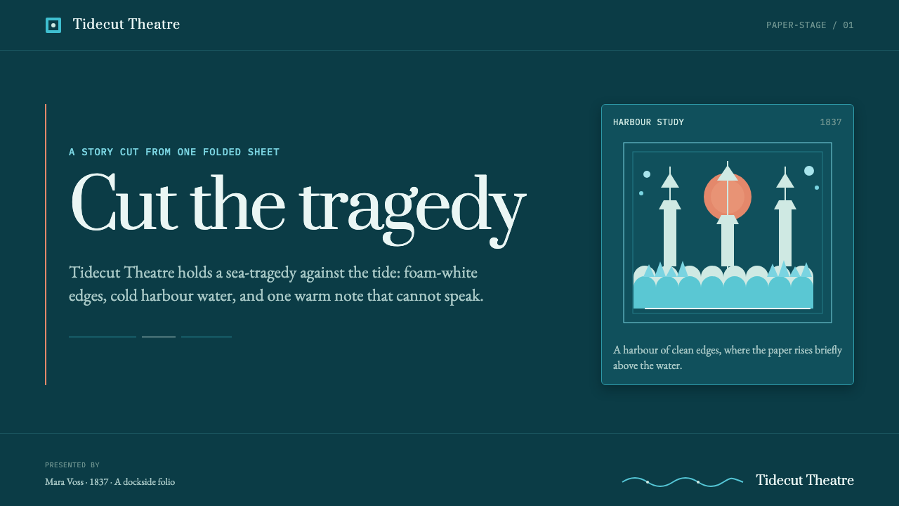
Depth is created through layers, overlap, and contrast rather than through naturalistic light. A pale mermaid can sit near the upper edge, darker water can recede behind it, and a coral sun can appear beyond a line of spires. The viewer reads a stage with foreground, curtain, and distant backdrop, yet each layer remains visibly flat. This tension between flat craft and theatrical space is the style’s central visual pleasure.
Foam and Dissolution
Foam is both material and narrative device. It can soften a transition between water and figure, break the upper edge of a composition, or show a mermaid dissolving rather than simply ending. Because the system avoids gradients within silhouettes, dissolution should be expressed by fragments, scallops, cut voids, and increasingly open space. The result is poignant precisely because it remains graphic: loss appears as a shape becoming less complete.

Who shaped The Little Mermaid (Andersen, 1837)?
Andersen is the author of The Little Mermaid, first published in 1837, and the central source for this style’s emotional and material logic. His sea-tragedy provides the themes of longing, transformation, silence, and dissolution, while his habit of cutting paper during storytelling gives the system its literal visual grammar. In this design language, papercutting is not an accessory to the tale; it is the method through which the tale becomes visible.
Vilhelm Pedersen belongs to the illustration tradition surrounding Andersen’s tale. His inclusion places the style within the nineteenth-century development of fairy-tale imagery rather than treating it as a purely contemporary fantasy aesthetic. For designers, that lineage is a reminder to give narrative forms room to remain strange, quiet, and emblematic instead of over-explaining every scene.
Lorenz Frølich is another key figure in the visual tradition connected to The Little Mermaid. Alongside the tale’s later illustration history, his name supports an approach in which line, figure, and imagined setting carry literary atmosphere. The style draws from that tradition not by reproducing an archival illustration, but by retaining its commitment to silhouette, narrative gesture, and the charged relationship between a lone figure and an expansive world.
Edvard Eriksen belongs to the tale’s wider Danish visual constellation. His presence signals that The Little Mermaid has moved beyond the page into durable public image and cultural memory. Within this design system, that broader recognition should be handled indirectly: use the tail curl, the profile, the foam edge, or the harbour horizon as suggestive forms, allowing the visual language to evoke the story without reducing it to a single familiar emblem.
How do you use The Little Mermaid (Andersen, 1837) today?
For presentation covers, use the style as a compact theatre poster. Let a deep harbour field establish the atmosphere, then place one large foam-white silhouette against it: a tail curl, a mermaid profile, a castle-like shore, or a wave cutout. The title should feel calm and legible rather than exuberant, with the coral accent reserved for one phrase, emblem, or distant sun. On content slides, treat the page as a sequence of layered paper planes. Keep body copy in a stable pale field, use wave or kelp forms as structural dividers, and leave ample dark water around key ideas so the narrative mood never overwhelms readability.
For data slides, the style works when information is translated into the same cut-paper logic. Bars can become pale vertical silhouettes rising from a dark sea, proportional forms can sit like paper islands, and a coral marker can identify the one decision or shift that deserves attention. Avoid decorative sea creatures around every chart. The chart should remain immediately readable, with the maritime vocabulary used to establish hierarchy, framing, and emotional context rather than to disguise the data.
For web interfaces, this style suits editorial dashboards, cultural collections, storytelling products, and considered pricing pages where a memorable atmosphere helps organize rather than obscure information. Use the dark harbour field for navigation or featured areas, then allow foam-white reading surfaces to hold dense content. Cards can appear as layered paper pieces with clear cut contours. A dashboard benefits from restrained wave separators and coral signals for one high-priority state, while a pricing page can use silhouette panels and tidal borders to make plan differences feel composed rather than merely boxed.
For editorial and marketing work, build a rhythm between large quiet fields and small narrative interventions. An article can open with a dissolving mermaid at the top edge, use a kelp-fringed rule between sections, and reserve coral for a pull quote or final invitation. Campaign pages should emphasize atmosphere, clarity, and a single emotional image rather than filling every surface with waves. The common mistake is to mistake the style for nautical decoration: adding shells, bubbles, gradients, and many warm accents makes it cheerful and busy. Its force comes from flat silhouettes, cold space, and one wound of warmth.
The Little Mermaid (Andersen, 1837) — FAQ
Is this style simply a nautical theme?
No. The sea is its setting, but the governing idea is Andersen’s tale rebuilt through papercutting and shadow theatre. Nautical motifs matter only when they support cold longing, transformation, harbour atmosphere, or staged silhouette. A generic ocean treatment filled with decorative shells, friendly fish, and bright holiday colour loses the story’s emotional restraint and no longer feels connected to The Little Mermaid.
Why should silhouettes remain flat?
Flatness comes directly from the papercut premise. The image should appear to have been cut from a sheet and placed over water, with the contour carrying the expressive work. Naturalistic shading would shift attention from the scissors-like edge to simulated volume. Layering is still welcome, but each layer should remain visibly separate, as in a shadow theatre where depth comes from placement rather than painted realism.
How should the coral accent be used?
Use it as a singular emotional event. It may identify longing, a distant sun, a decisive call to action, or one key data point, but it should remain surrounded by cold harbour colours and foam-white forms. When coral appears everywhere, it becomes decoration and weakens the system. When it appears once with intention, it reads as the small human ache within an otherwise cold and expansive world.
Can the style support dense information?
Yes, provided the theatrical vocabulary is used to organize rather than decorate. Foam-white reading areas can carry long-form text, stable type hierarchy can keep tables and charts legible, and wave or kelp motifs can mark transitions between sections. Reserve the strongest silhouettes for entry points, summaries, and featured states. If every panel contains a dramatic mermaid, the system becomes repetitive and the information loses its necessary quiet space.
Related design styles
 Akuaba Akan Fertility DollDarkness becomes sculpture. Near-black wood, ringed geometry, and one gold be…
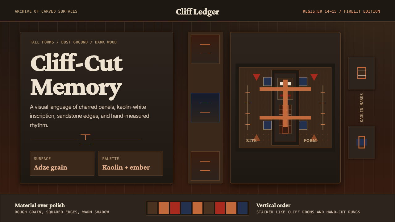 Dogon Bandiagara Cliff MaskHand-hewn gravity. Charred wood, kaolin type, and sandstone geometry stack li…
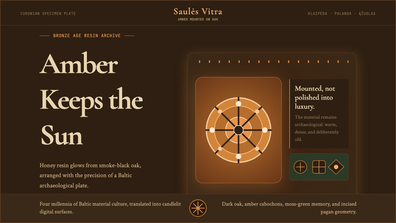 Lithuanian Amber (Baltic Pagan)Ancient amber glows. Honey resin on smoked oak, framed by saulė geometry.
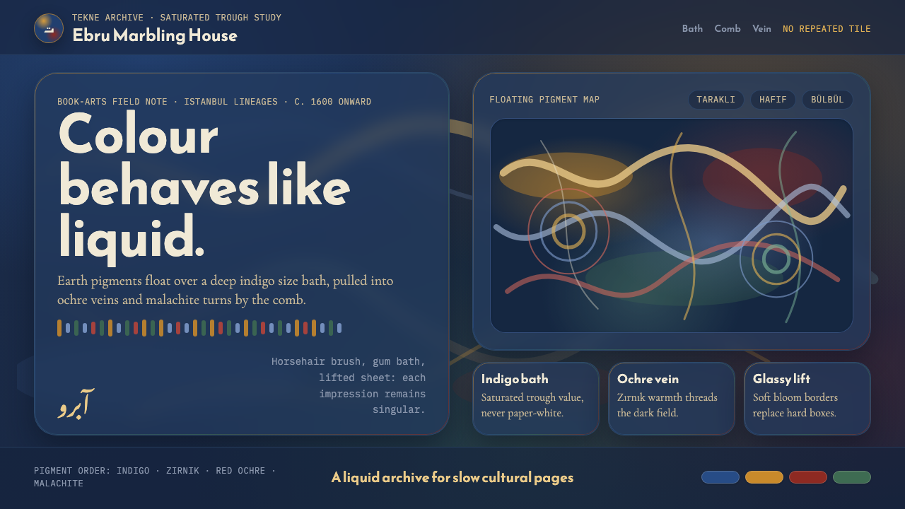 Ottoman Ebru MarblingLiquid, never tiled. Indigo bath, ochre veins, and glassy bloom edges carry t…
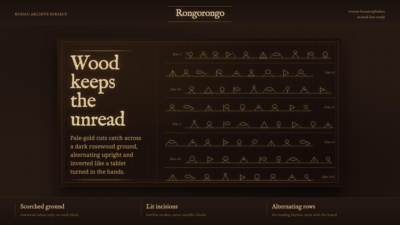 Rapa Nui Rongorongo GlyphThe unread glows. Pale-gold incisions alternate across scorched rosewood rows.
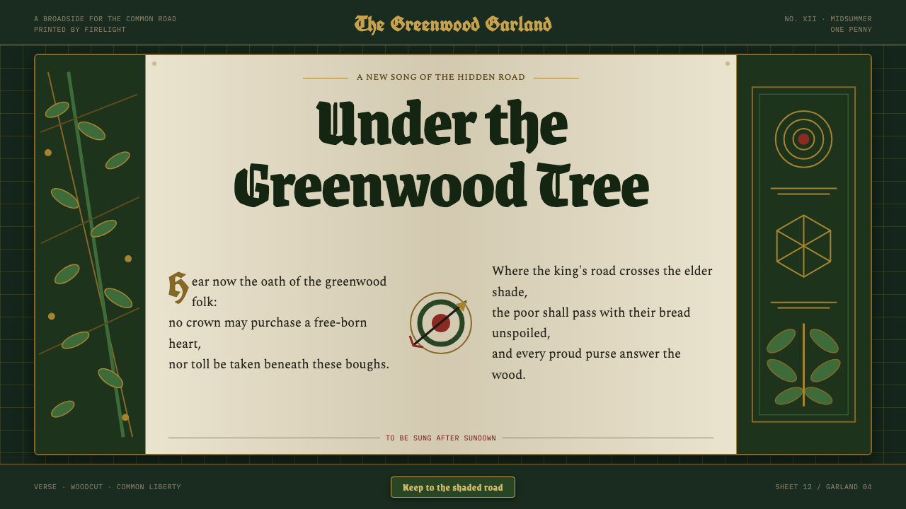 Robin Hood (Sherwood ballad)The greenwood sings in print. Black-letter, Lincoln green, and gilt borders f…