What is Lippan Kaam?
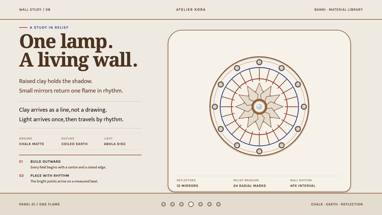
Lippan kaam is built, not drawn: coiled clay relief finished in chalk-matte white, with small mirrors set on a rhythm to catch a single lamp flame.
Lippan Kaam in brief
Lippan kaam is a mud-relief and mirror-work tradition of Kutch, in Gujarat, western India. Rabari, Mutwa and Meghwal women roll clay and dung into ropes and coil them into peacocks, camels, trees and lattice on the curved inner walls of a bhunga, the round mud house of the region. Ground and relief are then finished together in white clay, so that the whole room reads as one chalk-matte skin.
While the clay is still wet, small round mirrors called abhla are pressed into it. A windowless room lit by a single oil lamp comes alive through them: each mirror catches the flame and throws it back across the room. Light is not an effect added afterward. It is built into the wall.
The design language that follows from this is the same logic. Every shape has a raised outline, compositions radiate from a centre, and bright discs are placed on a measured rhythm instead of being scattered. The wall is renewed each year, so its surface is uneven and its edges slightly crooked, and the style treats these irregularities not as defects but as character. It is a light, warm-white, tactile style, in which depth comes from relief and not from rendering.

Where does Lippan Kaam come from?
Lippan kaam is a living vernacular tradition, documented for well over a century and still practised today. It belongs to Kutch, the Gujarat region of salt flats and seasonal grassland, and in particular to the Banni grasslands and the villages around Bhuj. It is women's work: the source names Rabari, Mutwa and Meghwal women of Banni as its makers, and no single author or workshop is credited, because the wall belongs to a household and a community.
The setting is the bhunga, a circular mud house whose curved inner walls are the canvas. The building method shapes the aesthetic. A curved earthen wall cannot be drawn on with ink, so forms are made from rope-like coils of clay and dung that stand proud of the surface, and then finished in white clay so that the whole wall is one material. Because the room has no windows, a single oil lamp lights the interior, and the mirrors pressed into the wet clay turn that one flame into a room full of light.
The work also sits inside a wider family of Kutchi crafts. The source lists Kutchi vernacular architecture, Indian mud-relief and mirror-work craft, and Banni embroidery among its movements. Mirror-work appears in embroidery as well as on walls, and the same vocabulary of radiating centres, repeated discs and bold outlines moves between materials. The wall renewal that happens every year keeps the skills circulating: each season is another chance to make the pattern again, and to pass the method to the next generation by doing it.
For design, the lesson of this origin is that the visual logic comes from the making. Raised outlines exist because the shapes were built from coils. Radiating compositions exist because a coil naturally turns around a centre. Discs sit on a rhythm because a mirror pressed into wet clay has to be placed deliberately and cannot be moved afterward. The style is less a set of motifs to copy than a way of working that happens to look the way it does.
What defines the Lippan Kaam look?
Chalk-Matte White
Ground and relief share one finishing coat of white clay, so the whole surface reads as a single chalky, matte skin. The white is warm and slightly dusty, not the cold brilliance of printer paper. Because nothing is glossy, the only bright thing in the composition is the mirror discs, and they therefore carry all of the sparkle.
Raised Outlines
Every shape is rimmed by a ridge of clay. Outlines are therefore relief, not stroke: they catch light along one side and fall into soft shade on the other, which is how the shape becomes legible against the white. In a flat medium, this is expressed by confident edges and restrained shading that clearly belongs to the outline, not to a lit three-dimensional object.
Radiating Centres
Compositions grow outward from a centre: a rosette, a peacock's fan, a tree with spreading branches. The centre is the anchor and the rest of the pattern organises itself around it by repetition. This gives the style a calm, ritual order, closer to a mandala than to a free-form illustration.
Mirror Discs on a Rhythm
The small round mirrors are set at measured intervals, around centres and along outlines, never scattered at random. They are the style's only bright accents, so their placement is the main compositional decision. Their spacing creates a beat that the eye follows through the pattern, and an irregular, confetti-like spread would break that beat.
One Lamp, One Flame
The whole logic of the surface is lit by a single small flame. The result is a warm, low, concentrated light rather than evenly bright illumination. In a design, this suggests one clear light direction, warm highlights on the discs, and soft falloff, not a field of competing glows.
Hand-Built Irregularity
Because the wall is made by hand and renewed every year, surfaces are uneven, outlines wobble slightly and edges are a little crooked. None of this is corrected. It is the visible trace of hands and seasons, and it is what prevents the pattern from reading as a machine-made repeat. Perfect symmetry would be a mistake here.
Animals, Trees and Lattice
The motifs come from the household world: peacocks, camels, trees of life and geometric lattice. They are stylised and bold, built from simple coiled shapes with no naturalistic shading. This keeps the pattern readable at a distance, in a dim room, which is the condition the original was made for.

Who shaped Lippan Kaam?
The Rabari are widely known in this region as livestock-keeping pastoralists, and Rabari women are among the makers named for lippan kaam in Banni. They roll the clay and dung ropes, coil them into animals, trees and lattice, and finish the wall. Their work is the first reason the style is built from outlines and coils.
Mutwa women of Banni are the second community named in the source as makers of the mud-and-mirror walls. Like the others, they work in a shared domestic tradition in which clay relief, mirror setting and embroidery are related skills, and in which the result belongs to the household, not to a signed author.
Meghwal women of Banni complete the three communities named for the craft. That several communities share one wall-making language is part of the point: the style is a regional vocabulary, held in common, with slight differences in how each hand coils a peacock or spaces its mirrors.
How do you use Lippan Kaam today?
Lippan Kaam is a light, warm, tactile style for subjects that value craft, calm and warmth. It works best when the content has a clear centre and a supporting rhythm, and when the audience is meant to feel that the surface has been built by hand. Applying it well means holding to its logic: raised outlines, radiating compositions, measured bright discs, and a chalk-matte ground that carries everything.
For presentation slides, the cover can be a single radiating motif in raised outline on a warm-white field, with a ring of mirror discs marking the centre and the title set quietly below. Content slides can use outlined panels with generous empty ground between them, so that each block feels placed rather than packed. Data slides suit dot-based charts, where the mirror disc becomes the data mark and its spacing carries the rhythm.
For web interfaces, the style fits craft, home and interiors, wellness, hospitality, cultural and educational products, and any brand that wants to feel calm and made. Cards can have soft, raised edges instead of hard borders, and small round indicators can borrow the mirror disc. Keep the ground warm and matte, keep the number of bright accents low, and let the discs be the only things that sparkle.
In editorial and marketing work, the style suits craft documentation, interior and architecture features, heritage storytelling, product pages for handmade goods, and long-form pieces about place and community. Photography of real walls, with the lamp-lit mirrors visible, is stronger than any illustration, and the pattern is most convincing when it is given to the people who make it, with credit.
The most common mistake is to treat it as generic mirror-ball glitter: bright sparkles scattered across every surface, high-gloss highlights on the white, or neon colours added to feel festive. Another is to make the pattern perfectly symmetrical and mathematically even, which strips out the hand. A third is to use the motifs as wallpaper without understanding the logic behind them. The style works because it is restrained: a matte white field, one family of motifs, and a few bright discs.

Lippan Kaam — FAQ
What is lippan kaam?
Lippan kaam is a mud-relief and mirror-work tradition of Kutch, in Gujarat, India. Rabari, Mutwa and Meghwal women of Banni roll clay and dung into ropes and coil them into peacocks, camels, trees and lattice on the curved inner walls of round mud houses called bhunga. The wall is then finished in white clay, and small round mirrors called abhla are pressed into the wet surface. It is a living tradition, documented for well over a century.
Why are the mirrors pressed into wet clay?
Because the wet clay still takes an impression, and the mirror can be seated firmly and given a rim of raised clay around it. There is a lighting reason as well. The rooms have no windows and are lit by a single oil lamp, and the mirrors catch that flame and send it back across the room. The mirrors are part of the way the room is lit, not decoration applied afterward.
Why is the surface white and matte?
Ground and relief are finished together in white clay, so the whole room reads as one chalk-matte skin. The matte finish does two jobs. It lets the raised outlines show through gentle light and shade instead of reflection, and it leaves the mirrors as the only bright elements, so that each one counts. A glossy white would flatten that contrast and make the mirrors look like part of a sparkle effect.
Why is imperfection treated as part of the style?
Because the wall is made by hand and renewed every year, so surfaces are uneven and edges slightly crooked. These are the visible marks of the people who made it and of the seasons it has passed through. A perfectly regular, mathematically symmetrical version would look machine-made and would lose the thing that gives the original its warmth. Small wobble in outlines and spacing is the right amount of imperfection.
Can I use colour with this style, or is it only white?
The defining condition is a chalk-matte white field, and the bright accents are the mirror discs. That makes it a light, low-colour style. You can add a small amount of warm tone to the white or a warm cast to the light, but strong saturated colours will fight the discs for attention and break the logic. If a project needs colour, give it to one small element, and let the white and the mirrors stay in charge.
Related design styles
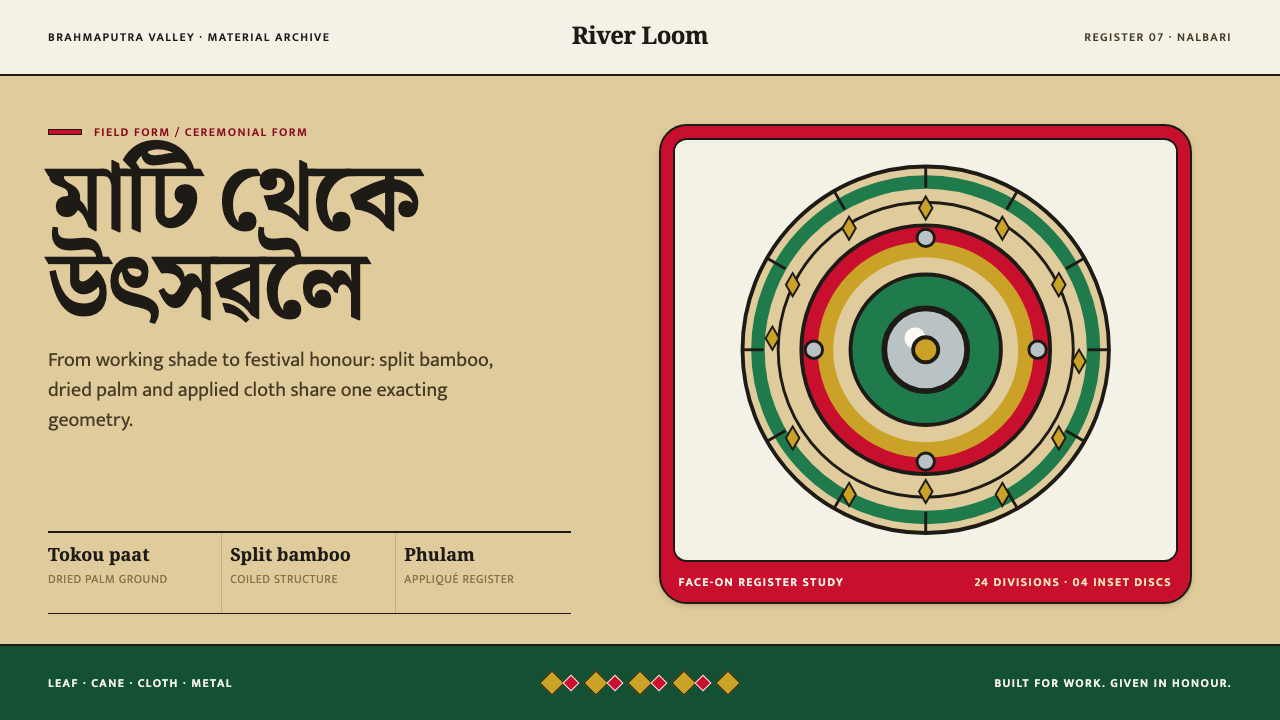 Assamese JapiWork becomes ceremony. Straw-gold rings carry green appliqué, festival red an…
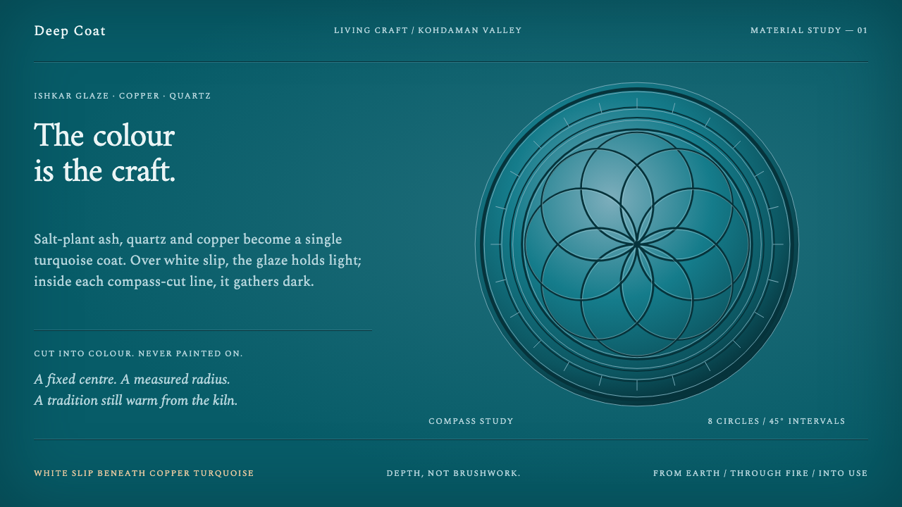 Istalif PotteryColour has depth. Copper-turquoise fields pool dark around compass-cut circle…
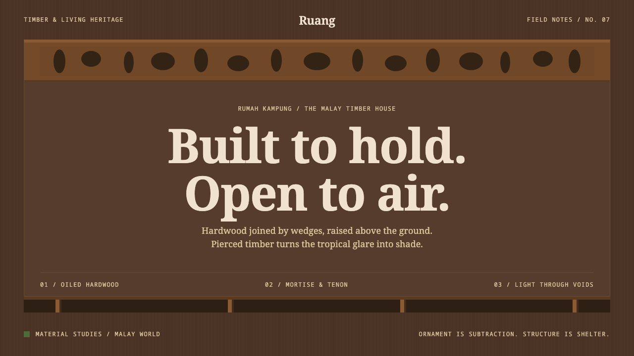 Malay Kampung HouseOrnament is subtraction. Oiled timber tones, pierced voids and serif type res…
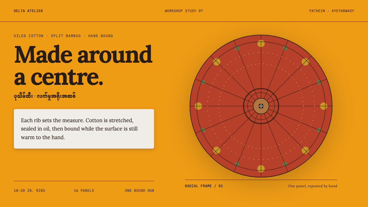 Pathein ParasolCraft radiates from the centre. Saffron cotton, lacquer red and bamboo ribs s…
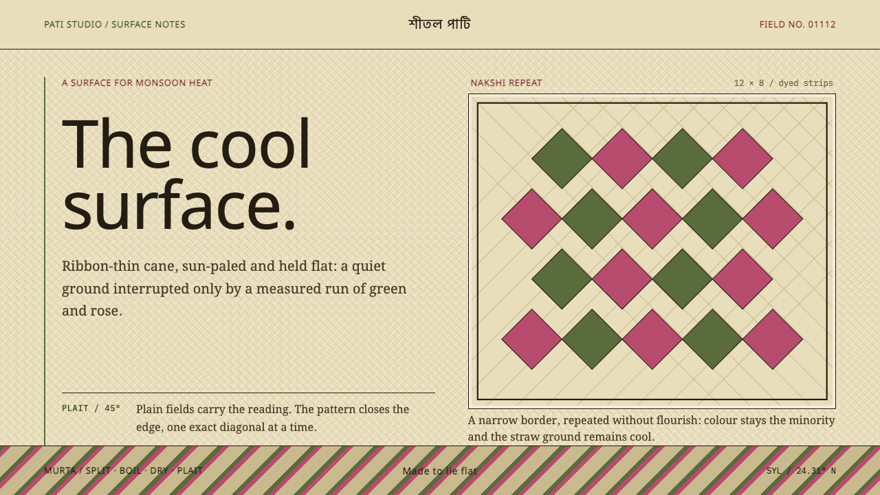 Sylheti Shital PatiCoolness lies flat. Pale straw fields hold cane-green and rose diamond repeat…
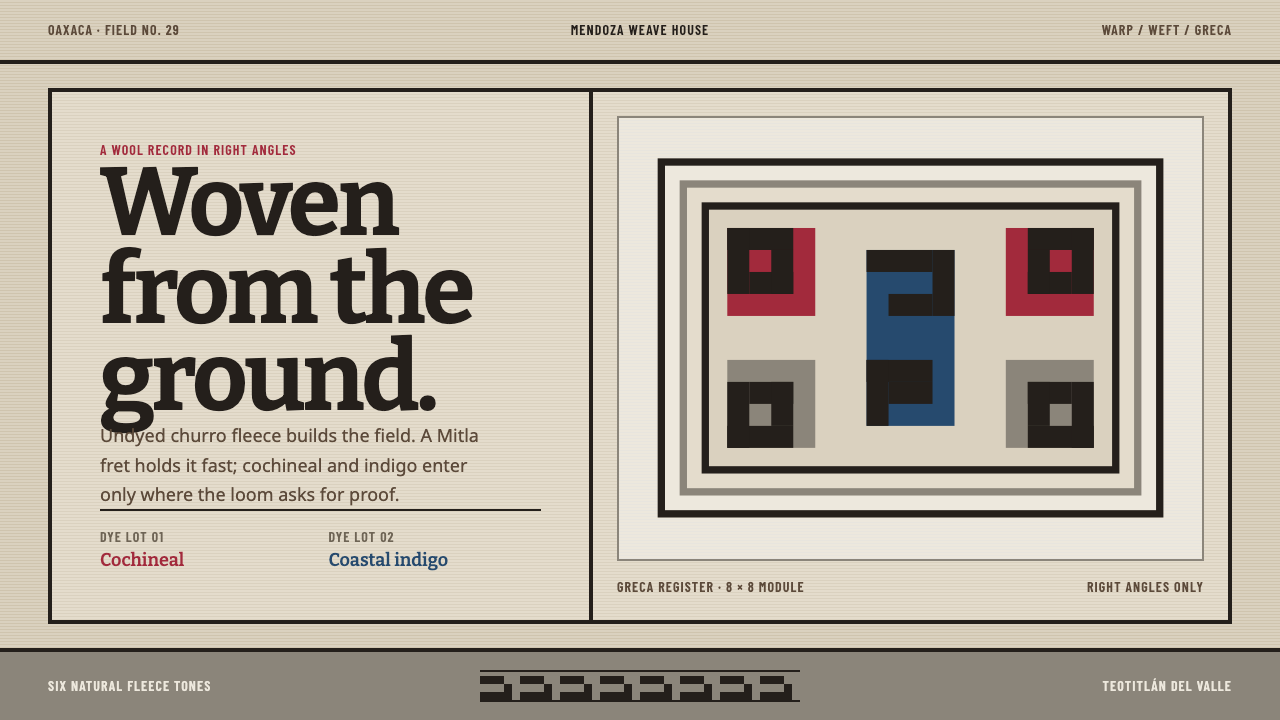 Teotitlán Wool RugCraft is structural. Raw fleece, Bitter slabs, and a hard-edged Mitla fret ho…