What is Sylheti Shital Pati?
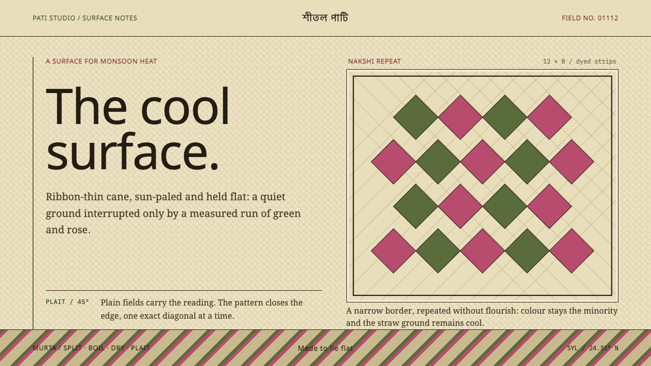
Shital pati turns a cool floor mat into a design lesson: a pale straw ground, cane green and rose in diamond repeats, and the rule that nothing should ever lift off the surface.
Sylheti Shital Pati in brief
Sylheti Shital Pati is a design style drawn from the cool mat of Sylhet, a patterned floor mat woven by hand from murta cane in the wetlands of north-eastern Bangladesh. The craft is a village tradition that predates 1900 and has continued without a break into the present, and in 2017 it was inscribed by UNESCO on its Representative List of the Intangible Cultural Heritage of Humanity. 'Shital pati' means, quite literally, the cool mat: in monsoon weather the woven surface really is cool against the skin.
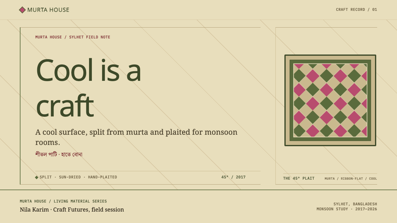
The material process defines the look. Murta cane is split into strips as thin as ribbon, boiled with tamarind and kaupata leaf, and dried in the sun until it takes on a silky, pale straw glow. The strips are then plaited. Some are bleached, some are dyed rose or deep maroon, and the weaver alternates them to build diamond checkerboards and running zigzag bands on the natural beige ground. Colour and pattern are not printed onto the mat; they are the structure of the mat.
As a design system the style borrows that logic exactly. The bleached strip is the page, cane green is the primary colour, and every line lands on a diagonal plaited grid. Wide plain fields carry the reading, and narrow patterned borders close them, the way a mat's quiet centre is framed by a woven band at its edge. Nothing lifts off the surface. A mat lies flat on the floor, so cards do not float and heavy shadows stay out. The effect is calm, domestic and precise, a pattern language with the patience of handwork.
Where does Sylheti Shital Pati come from?
Sylhet is a division in the north-east of Bangladesh, and the source material ties the craft to four of its districts: Sylhet, Moulvibazar, Habiganj and Sunamganj. That corner of the country is wetland, and murta, a cane that grows in wet ground, is the plant on which the whole tradition is built. This shapes the craft's character. It belongs to the family of wetland cane crafts, in which the plant, the water and the season decide what can be made and when, and the finished object carries something of that landscape in its colour and its coolness.
The making is slow and bodily. The cane is split into ribbon-thin strips, boiled with tamarind and kaupata, and sun-dried until the surface turns silky and pale. Each strip is then handled again in plaiting, over and under, building the mat row by row. The source material names the Patikar weaving communities as the keepers of this craft, and notes that the makers are mostly women. That matters for how the style should be understood: its geometry is not abstract theory but the accumulated judgement of hands, where a diamond is a decision about which strip goes over which.
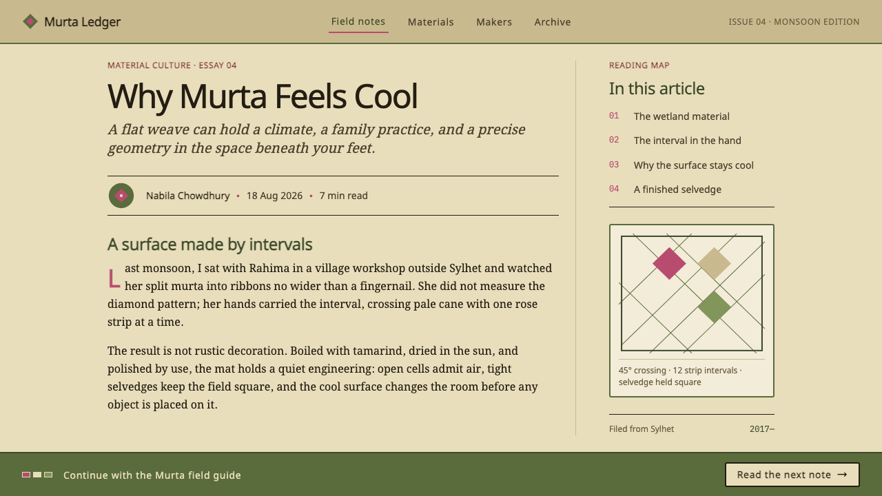
Within the wider Bengali tradition the mats belong to nakshi pati, the patterned-mat tradition. Nakshi is the Bengali word for decorated or patterned work, the same word that names the embroidered nakshi kantha quilts. The vocabulary is compact. Diamond checkerboards and running zigzags are built from alternating bleached, rose and maroon strips on a natural beige ground, so the pattern is made of the material rather than laid over it. The plain centre and patterned border structure follows naturally: the centre is where a person sits, the border is where the weaver closes the work.
The craft is recorded as a pre-1900 village tradition that has run continuously to the present, and its recognition came with the 2017 inscription on UNESCO's Representative List, which the source material refers to by its inscription number, 01112. The same material lists Sylheti Nagri literary culture among the movements around the style, a reminder that Sylhet's craft identity sits inside a wider regional culture with its own literary life. Read together, the mat is not an isolated folk object but one expression of a place that makes, writes and remembers in its own way.
What defines the Sylheti Shital Pati look?
Straw Ground
The page is bleached strip: a pale, silky straw, a little warmer than white and a little lighter than beige. It has the soft glow of sun-dried cane rather than the flat brightness of a screen. Large areas of this ground are left deliberately empty, and that emptiness is part of the design, because a mat's centre is where nothing needs to happen.
Cane Green Primary
Cane green is the primary colour: a calm, natural green, closer to freshly cut stem than to a bright signal. It carries structure and emphasis, appearing in headings, key actions, rules and the main bands of pattern. Because the ground is pale and warm, the green reads clearly without needing to be loud, and it keeps the whole page in the register of a living material.
Rose and Maroon Strips
The second voice in the palette is the dyed strip: rose and deep maroon. These colours appear in the same way they appear in the mat, as alternating strips inside a pattern, not as free-floating accents. They give the diamonds their contrast and the zigzags their rhythm. Used inside borders and dividers they feel woven; scattered across the page as highlights they feel arbitrary.
Diamonds and Zigzags
The pattern vocabulary is small and strict: diamond checkerboards and running zigzag bands. Both come straight from plaiting, where alternating strips over and under create stepped diagonals. Repetition is the point. A diamond is repeated until it reads as a texture, then closed by a border that tells the eye the pattern has ended.
The Diagonal Plait Grid
Every line lands on the diagonal weave. Shapes resolve into diamonds, triangles and steps rather than free curves, and edges move in small, even increments as a woven edge does. This is the structural rule of the system: if something sits off the grid, it does not belong to the mat. The diagonal also gives the layout its quiet energy, since a page of strictly horizontal text acquires movement from the pattern bands that frame it.
Plain Field, Patterned Border
Wide plain fields carry the reading, and narrow patterned borders close them. Pattern is a boundary device, never the background of the text. This arrangement tracks the mat's own use, a quiet surface to sit on and a decorated band at the edge, and it keeps long text readable while still letting the page announce its identity at the margins.
Lying Flat
A mat lies on the floor, so nothing lifts off. Panels are flat, edges are defined by weave or thin rules, and shadows are absent or barely perceptible. Depth comes from the thickness of a border or the contrast between plain and patterned areas, never from a simulated light source. The surface feels like something you could put your hand on and find cool.
Who shaped Sylheti Shital Pati?
The households and communities of weavers named in the source material as the keepers of shital pati in Sylhet, Moulvibazar, Habiganj and Sunamganj. Their practice of splitting, boiling, sun-drying, dyeing and plaiting is the real design system; every pattern the style borrows was decided by their hands, strip by strip.
The source material notes that the makers of shital pati are mostly women. The craft is therefore also a record of women's skill, passed on through practice, and any design that borrows its patterns should acknowledge that the geometry comes from people, not from an anonymous folk past.
The 2017 inscription of the craft on UNESCO's Representative List of the Intangible Cultural Heritage of Humanity, identified in the source material by its number, 01112. It recognises shital pati weaving as a living practice rather than a museum object, which is a useful guide to how the style should be used: as a tradition in active use, treated with the care that implies.
A regional literary culture listed in the source material among the movements around the style. It places the mat inside a wider Sylheti cultural world with its own written and literary life, and it is a reminder that a design borrowing from Sylhet should draw on that world respectfully rather than reducing it to a single pattern.
How do you use Sylheti Shital Pati today?
Sylheti Shital Pati works best where a design wants to feel calm, natural, domestic and handmade without becoming rustic or costume-like. It suits wellness, home goods, food, education, cultural and heritage projects, and any tool whose users benefit from a quiet, low-pressure surface. Its strength is restraint: the plain field is the main event, and pattern appears only where it earns a place.
For presentation slides, the cover is the place to show the mat. Use the pale straw ground, set the title in the plain field with generous margins, and run one narrow patterned border of cane green and rose diamonds along an edge. Content slides should stay largely plain: a single column of text, a clear heading, a simple zigzag band as the divider between sections. Data slides translate well because a bar chart already resembles a row of strips. Draw bars in cane green, reserve rose or maroon for the single series that needs attention, and keep axes and gridlines to thin, quiet lines.
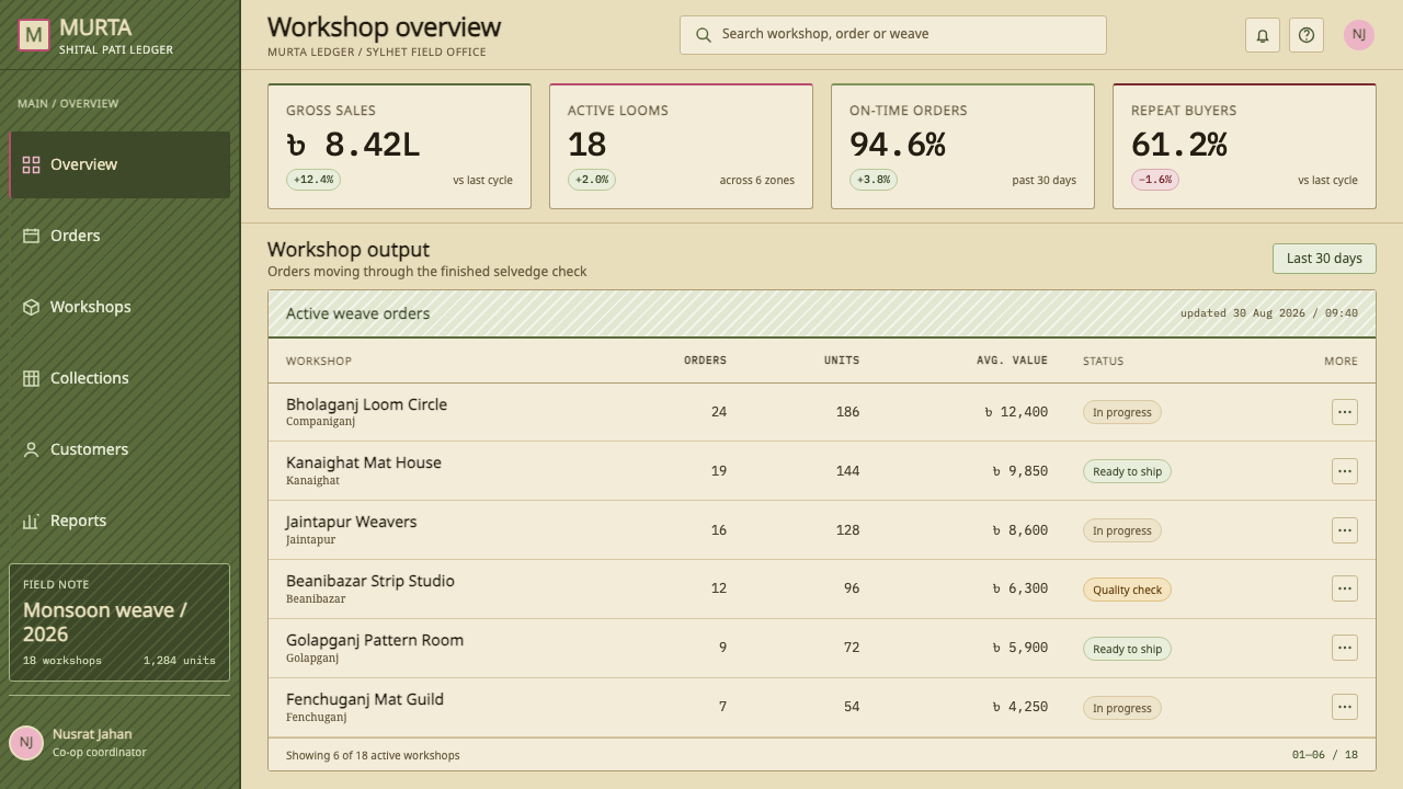
On the web, dashboards benefit from the style's calm. Panels are flat, separated by thin rules or by a narrow patterned divider, and states are shown by a change of tone rather than a lift. Pricing pages can treat each tier as a mat: a plain field holding the name and price, a narrow patterned border across the top, and cane green for the main action. Navigation should be plain text with a green underline for the current section. Hover and focus states shift colour or weight; they do not float.
For editorial and marketing work, the style is naturally suited to stories about craft, materials, food, place and people. Pattern bands make good chapter openers and section dividers, and a diamond motif can sit beside a pull quote. Photography should favour natural light and natural materials, cropped close, and body copy should have a generous measure with plenty of straw-coloured space around it. Product pages for handmade goods gain credibility when the page itself shows the same discipline as the object.
The most common mistake is to use the pattern as wallpaper. A diamond repeat behind body text destroys readability and turns a structural border into noise; on a mat the plain centre is where the reader sits. Other errors include letting rose become the dominant colour, rotating the pattern off the diagonal grid, adding floating cards and drop shadows, and reaching for a generic 'ethnic' look. The style is specific to one craft in one place, so keep the structure, credit the source, and let the pattern stay at the edges.
Sylheti Shital Pati — FAQ
What does 'shital pati' mean and how is the mat made?
Shital pati means the cool mat. Murta cane is split into ribbon-thin strips, boiled with tamarind and kaupata, dried in the sun to a silky pale straw, and then plaited. Some strips are bleached and some are dyed rose or maroon, and the weaver alternates them to form diamonds and zigzags. The colour and pattern are part of the weave, not printed on top.
Why is pattern kept to the borders?
Because that is how the mat is organised. A plain field carries the main surface, and a narrow patterned band closes it at the edge. In a layout this translates into readable text in the centre and identity at the margins. Placing pattern behind body text breaks the logic of the source and the readability of the page.
Can it work on a dark background?
The style is built on a pale straw ground, and the whole palette of cane green and rose depends on contrast against that light field. A dark inversion loses the sense of sun-dried cane and tends to make the greens muddy. If a dark mode is required, keep the pale ground for content surfaces and use darkness only for the surrounding frame.
How is it different from a generic ethnic pattern style?
A generic ethnic look borrows surface motifs from many places. This style takes one craft in one region and borrows its logic: the material, the diagonal weave, the plain centre and patterned edge. The decoration is a consequence of the structure. That specificity is what keeps it credible, and it is also why the source and the weaving communities should be credited when it is used.
Is it suitable for data-heavy dashboards?
Yes, within limits. Bars read naturally as strips, flat panels keep the surface calm, and a single cane green with rose or maroon for emphasis gives a clear hierarchy. It is less suited to dense multi-colour charts that need many distinguishable hues, because the palette is intentionally small. For heavy analytics, keep the palette discipline and vary shape, label and position instead of adding colours.
Related design styles
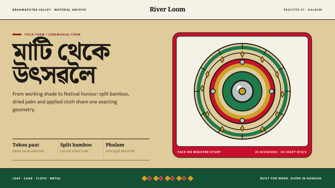 Assamese JapiWork becomes ceremony. Straw-gold rings carry green appliqué, festival red an…
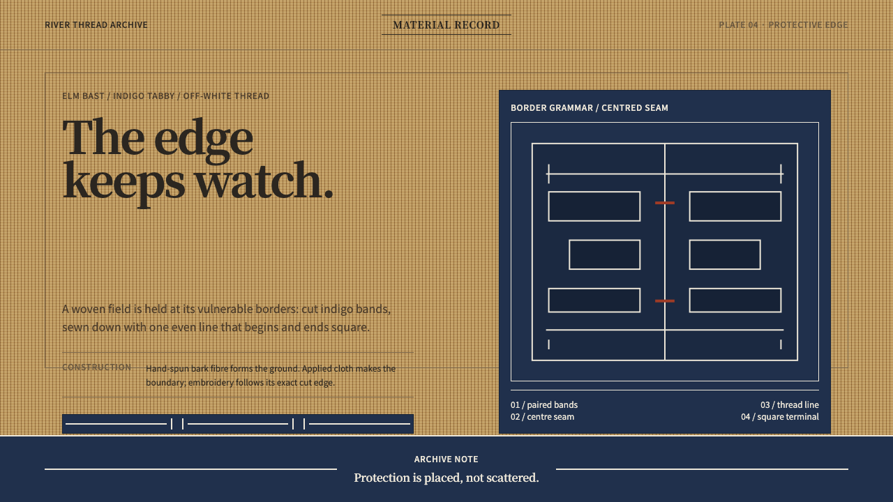 Ainu Attus RobeProtection is cut, not painted. Indigo bands and square-ended thread hold elm…
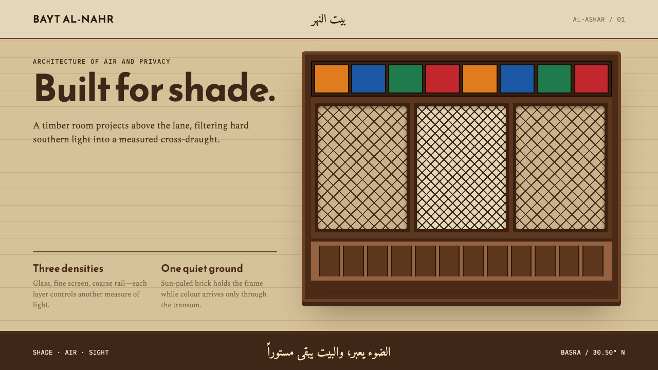 Basra ShanasheelClimate craft becomes ornament. Dark timber lattice projects over sun-paled I…
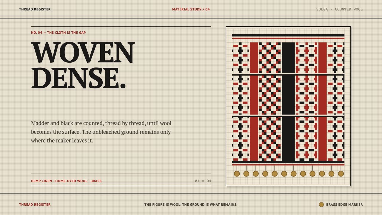 Erzya PangaDensity is the ornament. Madder and black stepped stitches crowd unbleached l…
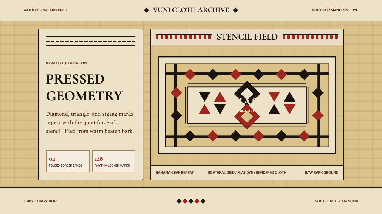 Fijian Masi Tapa StencilGeometry keeps ceremony. Soot-black diamonds repeat on bark beige with rust-r…
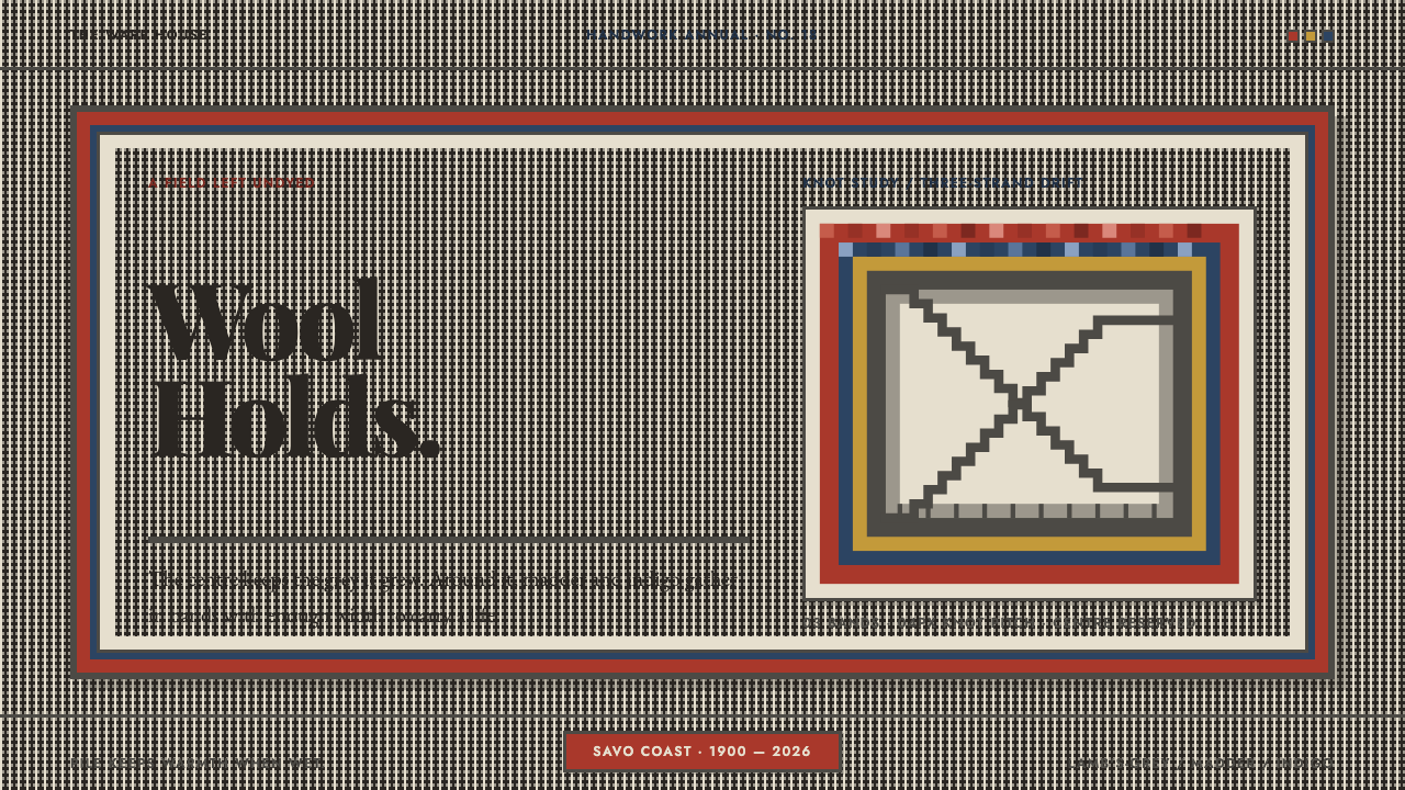 Finnish RyijyWool holds its ground. Lamb's-grey centres meet stepped madder and indigo ban…