What is Istalif Pottery?
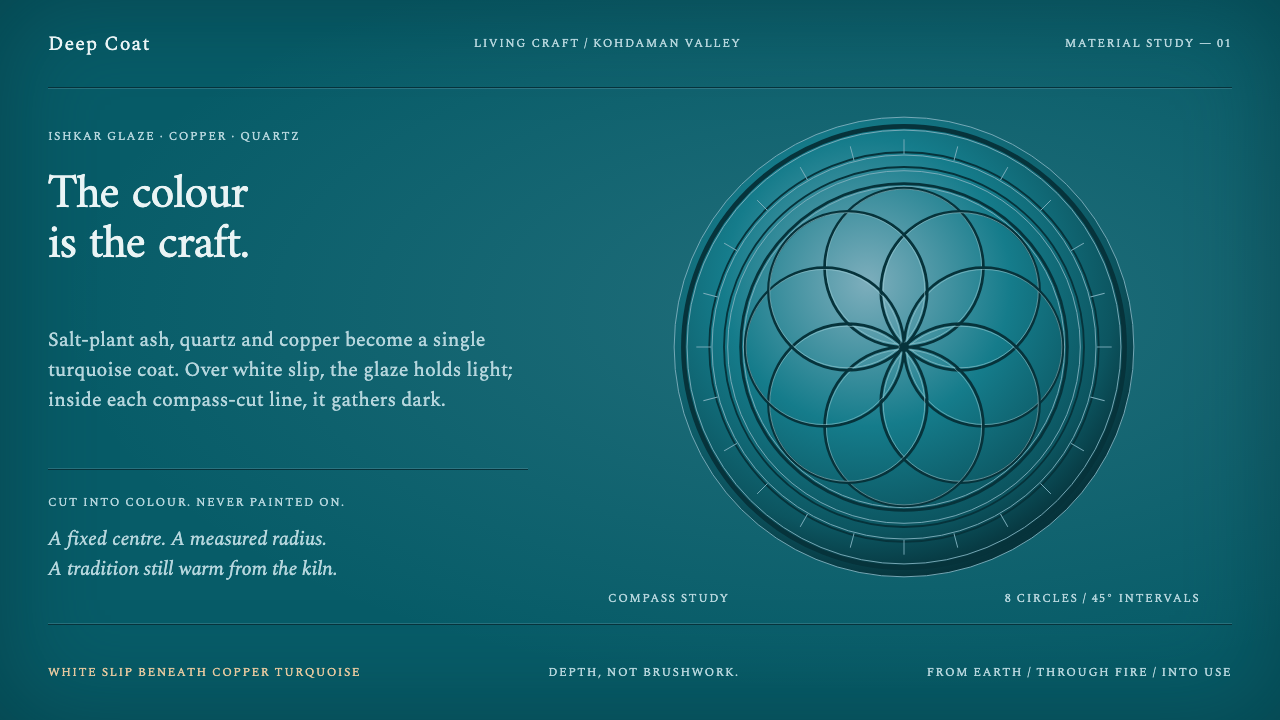
Istalif pottery draws with depth rather than line: a turquoise glaze that pools dark where a needle has cut it and runs pale where it thins over white clay.
Istalif Pottery in brief
Istalif Pottery is a design style based on the glazed earthenware of Istalif, a village in the Kohdaman valley north of Kabul in Afghanistan. Its signature is a copper-turquoise glaze that is cooked by the potters themselves and flooded over a white slip. The pattern is not painted on top. It is cut through the glaze with a compass and a needle, so that the drawing is made of thickness: dark where the glaze pools in the incision, pale where it thins over the slip below.
That method gives the look its core idea, which is that colour has depth. A turquoise field is never a flat fill. It drifts from lighter to deeper, gathers darker at its edges and in its cuts, and lets the white ground show through where the layer is thin. The ornament is geometric and exact, struck from fixed centres at fixed radii, but the colour that carries it is alive and uneven. The contrast between those two kinds of order is what makes a bowl hold the eye.
As a design system, the style treats the glaze as the page itself. Backgrounds are glaze rather than paper, dividers are cuts rather than drawn lines, and a card behaves like a glazed vessel: darker at its rim, lighter where the light passes through. The surface is rich, warm and tactile without any of the devices that digital design usually uses for richness, such as heavy shadows or ornamental illustration.

Where does Istalif Pottery come from?
Istalif lies in the Kohdaman valley, in Parwan province just north of Kabul, and the project record describes a village pottery tradition that predates 1900 and has continued for hundreds of years. It belongs to a wider family of Central Asian ishkar-glazed earthenware and to the Persianate traditions of copper-turquoise and cobalt glaze, in which clay vessels are covered with a shining blue-green or deep blue surface. What distinguishes Istalif within that family is its consistent glaze, its white slip, and the incised geometry that turns the glaze into drawing.
The glaze is cooked, not bought. Istalif potters make it from ishkar, the ash of a salt-plant, together with crushed quartz, copper oxide and sunflower seed, and flood it over a white Ghorband slip. Plant ash gives the glaze an alkaline character, and alkaline glazes turn copper into turquoise rather than green. That chemistry is why the colour has its particular brightness, and it is also why it looks different from a manufactured glaze: the colour comes from local ingredients and from firing, and no two vessels are identical.
The decoration is a kind of sgraffito, incising through a coat to reveal what lies beneath. With a compass and a needle, the potter cuts flower centres of six and eight petals, concentric arcs, and fans of hatched lines. Because the cuts hold more glaze, they fire darker; because the glaze thins over the surface of a bowl's centre, the white slip shows through and lightens it. The picture is therefore made of thickness, not of brushwork, which is the reason these vessels look so luminous from the inside.
The tradition has not been continuous without interruption. The project record notes that the village's kilns were destroyed in 1998 and revived from 2002. The Malikzada potter families, among them Ustad Matin Malikzada, and the Turquoise Mountain Foundation appear in the record as part of that revival. That history gives the style its human weight: every bowl made after the revival continues a firing that was, for a time, stopped.
What defines the Istalif Pottery look?
Glaze as ground
The page is the glaze. Its colour is a copper-turquoise that moves across a field rather than sitting still, running from lighter in the open areas to deeper around the edges. There is no flat card colour and no neutral grey. Where a conventional design would use a background and then place panels on it, this style makes the background itself a surface with thickness, and lets structure come from variations in that thickness.
Edges that pool
Glaze gathers where a surface turns, so edges, rims and recesses go darker than the open field. In an interface this becomes the way elements are bounded: a card or panel deepens at its border and relaxes toward the middle, rather than being outlined or lifted on a shadow. The effect makes objects look formed instead of placed, and it replaces the usual separation tools of thin borders and drop shadows.
Cut, not drawn
Lines in this style are incisions. A rule is a cut through the glaze that shows the layer beneath, so it reads as a slightly different tone of the same surface rather than a stroke laid on top. Dividers, outlines and ornaments are therefore thin, deliberate and slightly recessed. They have the quality of a mark made with a needle: clear, uniform in width, and always cutting into the field instead of sitting over it.
Compass geometry
Every ornament is struck from a fixed centre and a fixed radius. Rosettes of six and eight petals, concentric arcs and hatched fans are all built the way a compass builds them, with exact repetition around a single point. This gives layouts a quiet mathematical backbone. Circles, arcs and radial repeats are the natural motifs, and rectangles are softened by the same logic: corners and fields feel as though a circle governs them.
White slip beneath
Below the glaze is a white slip, and it is the source of light in the style. Where the glaze is thin, at the centre of a bowl or on a high point, the white shows through and lightens the colour. Light therefore comes from below the surface, not from a lamp above it. Text and highlights borrow this pale, chalky tone rather than pure white, so that they appear to be part of the vessel and not applied over it.
Exact geometry, living colour
The style holds two kinds of order in balance. The geometry is exact and repeatable, while the colour is uneven and slightly unpredictable, as glaze is. Neither side is allowed to dominate: perfectly flat colour would turn the pattern into wallpaper, and loose geometry would turn the colour into a stain. Type and ornament stay secondary, plain and pale, the way an inscription would be incised into the glaze, so that the surface itself remains the subject.

Who shaped Istalif Pottery?
Ustad is an honorific for a master craftsman, and Matin Malikzada is the potter the project record names as a key figure of the Istalif tradition. His place in the story is as a representative of the Malikzada families who hold the craft: the person whose hands make the glaze, cut the compass patterns and control the firing, which is where this style's depth of colour actually comes from.
The record names the Malikzada families collectively, and that is the point. Istalif pottery is a family and village craft in which methods are passed from one generation to the next, and the knowledge of how the glaze behaves in a particular kiln is held in practice, not in documents. A design system that borrows from this tradition borrows from a community of makers, and should treat them as its source.
A foundation known for working with traditional crafts in Afghanistan, named in the project record alongside the potters in connection with the revival that followed the destruction of the kilns in 1998. Its presence in the story is a reminder that a craft tradition can be interrupted, and that bringing it back takes institutions as well as makers.
How do you use Istalif Pottery today?
Istalif Pottery suits subjects that benefit from warmth, craft and a sense of material depth, and it is especially good at making a dark interface feel handmade. The principle to carry across is that colour has depth: surfaces should feel like layers with thickness, not like flat fills. Applying the style well means treating the glaze, the cut and the compass as three separate, consistent ideas.
For presentation slides, the cover can be a field of drifting turquoise with a single compass-built rosette as the focal point and a title in pale, chalky type below it. Content slides keep the glaze ground, with section dividers drawn as fine incised lines and key statements set inside a panel that deepens at its border. Data slides work best when charts are built from circular and radial forms, with segments separated by cut lines, and with values shown in pale type.
For web interfaces, the style fits craft commerce, cultural organisations, cafes and restaurants, heritage and travel brands, and calm dashboards with a handmade character. Cards deepen at their borders instead of casting shadows, inputs are outlined by an incised line, and buttons are filled with a deeper pool of the same colour. Pricing tiers can sit as vessels of the same shape, differing in the number of petals in their rosette. Navigation stays quiet and typographic.
For editorial and marketing work, it supports stories about makers, materials and places. Photography of pottery pairs naturally with the colour field, and a circular crop echoes the vessel's rim. Section breaks can be a short run of concentric arcs or hatched fan lines, used sparingly. The voice is warm and specific, speaking about clay, ash and firing, and naming the village and the families rather than using a generic label such as Middle Eastern.
A common mistake is to treat the turquoise as a flat brand colour and then sprinkle geometric patterns over it, which removes the depth and leaves a wallpaper. Another is to draw the ornament as bright outline strokes instead of cuts, or to fill the page with rosettes until the field has no calm area left. Heavy drop shadows, glassy highlights and neon accents also work against the material. The best versions are restrained: one hue family, a few precise cuts, and a lot of quiet glaze.

Istalif Pottery — FAQ
What is sgraffito, and how does it translate to an interface?
Sgraffito means cutting through a surface layer to reveal a different layer beneath. In Istalif pottery, a needle cuts through the glaze to show the paler slip or to let the glaze pool deeper in the incision. In an interface, it translates to dividers, outlines and ornaments that read as cuts into the surface rather than strokes on top: slightly recessed, a tone different from the field, and fine and consistent in width.
Why turquoise and not green?
Copper gives different colours depending on the glaze that carries it. In an alkaline glaze such as one made with plant ash, copper fires turquoise, while in other glaze types it tends toward green. Istalif potters use ishkar, the ash of a salt-plant, so the alkaline base produces the bright blue-green the village is known for. In design terms, keep the hue on the blue side of green and let depth, not hue shifts, supply the variation.
How do I build the compass geometry in a layout?
Start from a single centre and one radius, then derive everything from them. Place a rosette by repeating a petal six or eight times around the centre, add concentric arcs at regular steps outward, and build hatched fans by sweeping a set of lines through a fixed angle. Keep the same centre-and-radius logic across a page, so that corners, avatars, icons and decorative bands all feel related. Avoid mixing arbitrary curves in with the compass work.
Can the style work on a light background?
Yes, though the dark version is the closer match for the reference. A light version can follow the inside of a bowl, where the glaze thins and the white slip shows: a pale, chalky ground with turquoise cut lines and deeper pools concentrated at the borders. Keep the single hue family and the cut logic. Do not turn the ground to pure white, which removes the warmth, or switch to flat blocks of turquoise, which removes the depth.
How should a design handle the cultural origin of this style?
Treat it as a living craft from a specific place. Istalif pottery comes from a village in Afghanistan, was interrupted when its kilns were destroyed in 1998, and has been revived by named families and supporters since 2002. Where the style is used commercially, say where it comes from, avoid vague labels, and prefer contexts that respect craft and makers. The aim is to borrow a way of seeing colour and depth, not to dress something up as an exotic backdrop.
Related design styles
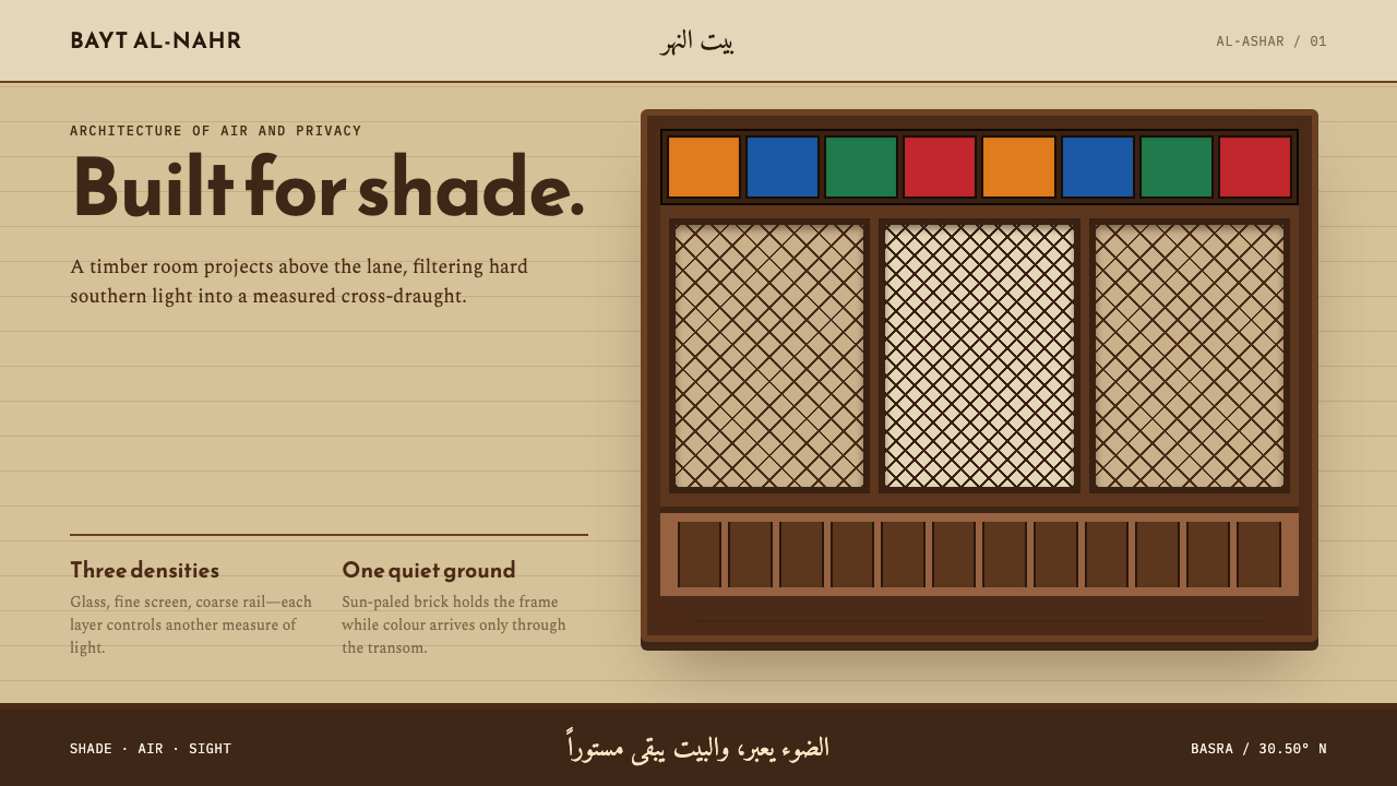 Basra ShanasheelClimate craft becomes ornament. Dark timber lattice projects over sun-paled I…
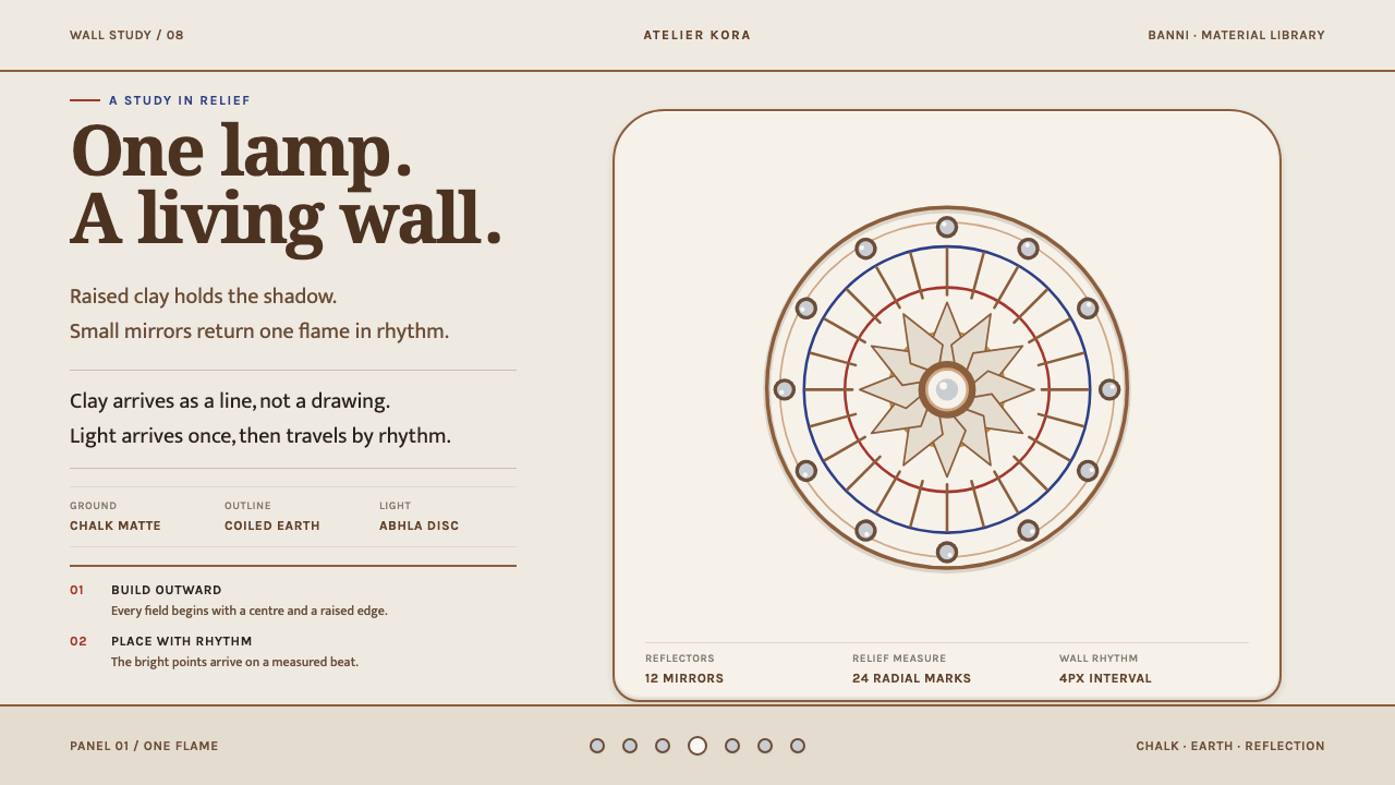 Lippan KaamLight is built into the wall. Chalk-matte relief and measured mirror discs re…
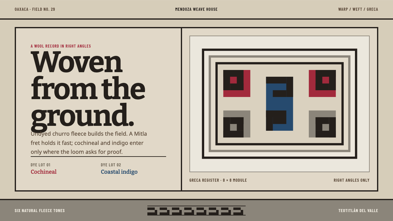 Teotitlán Wool RugCraft is structural. Raw fleece, Bitter slabs, and a hard-edged Mitla fret ho…
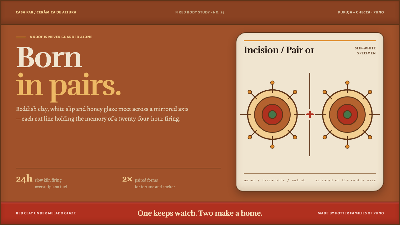 Torito de PucaráWarmth comes in pairs. Honey glaze, white slip and walnut incisions mirror ac…
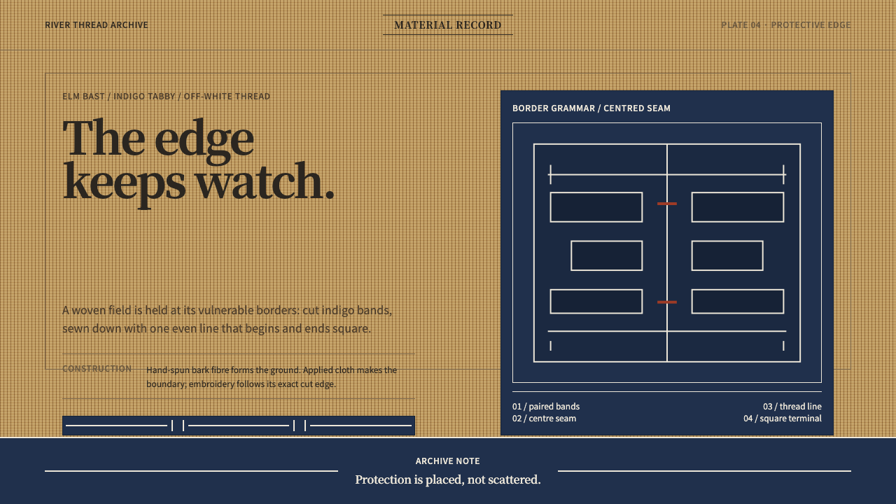 Ainu Attus RobeProtection is cut, not painted. Indigo bands and square-ended thread hold elm…
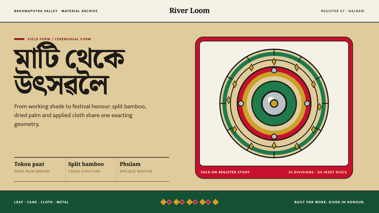 Assamese JapiWork becomes ceremony. Straw-gold rings carry green appliqué, festival red an…