What is Torito de Pucará?
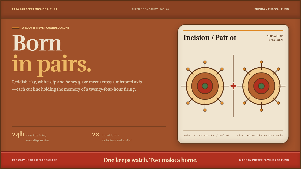
Two bulls stand on a roof ridge beside a cross, and the design that grows from them composes the same way: warm clay, honey glaze, white slip, and nothing ever alone.
Torito de Pucará in brief
Torito de Pucará is a design system drawn from the ceramic bulls of the Pucará district in Puno, on the Peruvian altiplano. Two bulls stand on the ridge of a roof beside a cross. Each is thrown from reddish Pupuja clay, coated in a white slip cut with antimony and silver scoria, incised with spirals and flowers, and fired for twenty-four hours over dung until a honey glaze gathers in every cut line.
The system takes the fired body of the bull as its ground. The page is a low-key, warm terracotta lit by amber glaze; slip-white panels float on it like the pale patches of the animal's coat; and fine walnut-coloured incisions do the work that hairlines do elsewhere — dividing, outlining and decorating. The page is dark in value but never black or cold: it is the colour of baked earth in shade.
Above all, it is a style of pairs. Nothing sits alone. The altiplano composes in twos, and a single bull set on a roof would not count. So layouts mirror, double and answer one another, and warmth is built from relationships — glaze against slip, incision against clay — rather than from one bright accent.

Where does Torito de Pucará come from?
The craft has two roots that are visibly twisted together in one small animal. The first is the ceramic skill of the Pucará region, a lineage that this system traces from about 500 BC to AD 200 and links to the Pukará culture of the Titicaca highlands. The second is the bull itself, which does not belong to the pre-Hispanic Andes. Cattle arrived with the Spanish after 1532, and the bull entered Andean imagery in the colonial centuries, finding a place in household ritual and in the clay of local potters.
The toritos of today are an example of Andean-Spanish syncretism: a European animal rendered by Andean potters in an Andean idiom, set on the roof of the house beside a cross. The usual explanation is that they protect the household and bring good fortune, which makes the roof ridge — the highest point of the house, where earth meets sky — their natural position. The cross beside the pair ties the object to Catholic practice, while the paired composition belongs to a different way of thinking. Neither source is subordinate; each carries the other.
That paired composition is not accidental. Andean thought gives great weight to complementary duality, an idea Quechua speakers express with the word yanantin: things are complete when they exist in matched, mutually dependent pairs. A single bull on a roof is unfinished; two make a household. The design system treats this as its central compositional rule and builds mirrored, answering structures wherever it can, from two-column layouts to paired accents and echoed panels.
The form was documented in 1949, in the milieu of the Instituto de Arte Peruano and José Sabogal, the painter who championed art rooted in Peruvian indigenous traditions. That documentation placed the potters of Pupuja and Checca, in the district of Santiago de Pupuja, within the larger story of Peruvian arte popular: a folk art with a name, a place and living families who make it. The potter families remain the keepers of the form. Sabogal and the Instituto are part of why it entered the national conversation about Peruvian folk art at all.
What defines the Torito de Pucará look?
Terracotta ground
The ground is the fired body: a warm, reddish earth tone held in low light. It is the colour of baked clay in shade rather than black, and every other colour is read against it. A warm ground means the whole page feels held and lit from within, even though the overall value is dark.
Amber glaze
The honey-coloured glaze is the system's accent and its highlight. It behaves as glaze does, gathering where the incised line holds it and running thin across the raised surface. The glow is therefore directional and contained: it belongs to lines, edges and inner states, not to broad gradient fills or halos. It makes things look fired, not lit by screen.
White slip panels
The pale slip coat becomes the light surface. Panels float on the terracotta like patches of slip on the animal's body: solid, matte and pale, with a hand-applied feel and gently irregular placement. They carry the main reading text because they are the highest-contrast surfaces in the system, and they are the only elements that are allowed to float.
Walnut incision lines
Dividers, outlines and ornament are drawn as thin walnut-brown lines, like cuts made with a point into wet slip. They take the place of the grey hairlines used elsewhere. Spirals and flowers, the motifs scratched into the bulls, are the only decoration, and they stay in line form: never filled, never gradient, never dropped in as a pattern wallpaper.
Pairs and mirroring
Layouts prefer twos: two columns, two cards, two mirrored halves. A single element standing alone feels incomplete, and when the content is odd it is partnered with a counterpart, a reflection or a quiet echo. Symmetry here is bilateral and relational rather than grand or monumental; it is the symmetry of two animals standing together, not of a facade.
Contained warmth
Warm hues dominate and cool hues almost never appear. Even the lightest surface is warm. This gives the page unity: the palette reads as one object, a single fired piece, rather than a collection of brand colours. Warmth is never loud; it is the steady warmth of something that has been through fire and still holds heat.
Handmade, but consistent
Shapes have the softness of something turned on a wheel and cut by hand, but they are applied consistently. The system does not imitate roughness or add artificial imperfection. It takes the honest character of craft, where each cut is deliberate, and leaves out randomness. The look is warm and made, not rustic and messy.

Who shaped Torito de Pucará?
The potter families of Pupuja and Checca are the living makers of the bulls: they dig the reddish clay, coat the bodies in white slip, incise the spirals and flowers, and fire the pieces over dung until the glaze pools in the cuts. They are the source of everything this system borrows. Its pairs, its glaze behaviour and its incised lines are all descriptions of what their hands do.
Sabogal was a Peruvian painter who championed art rooted in the country's indigenous traditions and helped bring folk craft into national attention. His association with the documentation of the Pucará bulls in 1949 belongs to that effort: treating popular objects as art with makers, places and meaning. His role in this story is recognition and recording, not authorship of the form.
The Instituto de Arte Peruano is the institution in whose circle the Pucará ceramics were documented in 1949. Its work places these bulls in the framework of Peruvian arte popular, giving a household talisman a place in the written record. The system uses that record to stay specific: it speaks of this bull, from this place, rather than a generic Andean motif.
The deeper background is the ceramic tradition of the Pucará region, which this system's sources trace across the span from about 500 BC to AD 200. The bull is a later addition, arriving after 1532, but the hands, clays and habits of firing and incising belong to the older lineage. The design system treats the bull as the newest layer of a very long craft memory.
How do you use Torito de Pucará today?
Torito de Pucará is strongest when the content is about craft, people, ritual, hospitality or any subject where warmth and relationship carry the message. It is a poor match for cold, clinical or purely technical material, and it asks the designer to think in pairs.
A presentation cover can use two mirrored elements flanking the title: a slip-white panel on one side and a glazed amber panel on the other, on a deep terracotta ground. Content slides work as two-column parallels, with problem and answer, before and after, or one voice and its response. Data slides suit paired bars and side-by-side comparisons, with a thin walnut line as the only grid. The ground stays warm and low-key, with white panels doing the reading.
In interfaces, the style fits craft marketplaces, ceramics and homeware shops, food and hospitality brands, cultural tourism, and community or storytelling products. A pricing page can set two plans side by side as slip panels on the terracotta ground; a dashboard can pair metrics in twos. Dividers are walnut lines, never grey hairlines. Glaze-amber is reserved for focus, hover and active states, where it pools at edges rather than glowing across the whole control.
For editorial and marketing work, it supports stories of makers, rituals and places, particularly from the Andes and Latin America. Long-form pages can set pull quotes on slip panels, mark chapter breaks with an incised line that ends in a small spiral, and echo images in pairs. Photography should be warm, close and tactile, showing hands and surfaces. Credit the potters and the place by name; the style is stronger when its origin is stated.
The usual mistakes follow from forgetting the pair. A lone hero element, with nothing answering it, breaks the central rule. Swapping amber for a neon or cool blue accent destroys the fired-clay warmth, and turning the ground to plain black loses the sense of an object. It is also a mistake to treat the style as generic 'rustic' or 'boho', scattering Andean-looking patterns without context. Spirals and flowers belong as incised lines, and the source, Pucará in Puno, should be named.

Torito de Pucará — FAQ
Why is everything in pairs?
Because the bulls stand on the roof in pairs, and because Andean thought gives great weight to complementary duality, which Quechua speakers call yanantin. A single bull on a roof would not count; two complete a household. The system carries this into layout: mirrored halves, twin columns, an answering accent for every accent. When a composition feels cold or unfinished, the usual fix is to give its lone element a partner.
Is this a dark-mode style?
It is built on a dark, low-key ground, but a warm one: the colour of fired terracotta in shade, not black. The light on the page comes from the slip-white panels and the amber glaze, both of which sit on that ground. If you need more light, add or enlarge the slip panels rather than lightening the whole page. A full inversion to a pale ground changes the fired-body logic and is not recommended.
What does the glaze do on screen?
It acts as the accent and the highlight, and it follows how real glaze behaves: it pools in recesses and runs thin on raised surfaces. On screen that means amber gathers at edges, dividers and focus states, and stays off broad areas. It should not become a glow, a halo or a gradient wash. Think of it as the light caught in a cut line rather than light shining from the interface.
Is it appropriate to use this style for a brand outside Peru?
It can be, with care. The principles, such as paired composition, warm contained colour and incised line work, travel well, and many products can use them honestly. What should not travel is decontextualised imitation: scattering Andean-looking motifs as decoration, or presenting the look as generic folk art. Name the origin, credit the potters where you can, and let the pairs and the glaze logic do the work.
Which decorative motifs belong to the style?
The motifs scratched into the bulls: spirals and flowers. They appear as incised walnut-coloured lines, never as filled shapes, patterns or repeating wallpaper. They work best as small terminals on dividers, as marks at the end of a section, or as quiet detail on a slip panel. Anything beyond those two motifs is an addition to the source rather than a part of it, and is better left out.
Related design styles
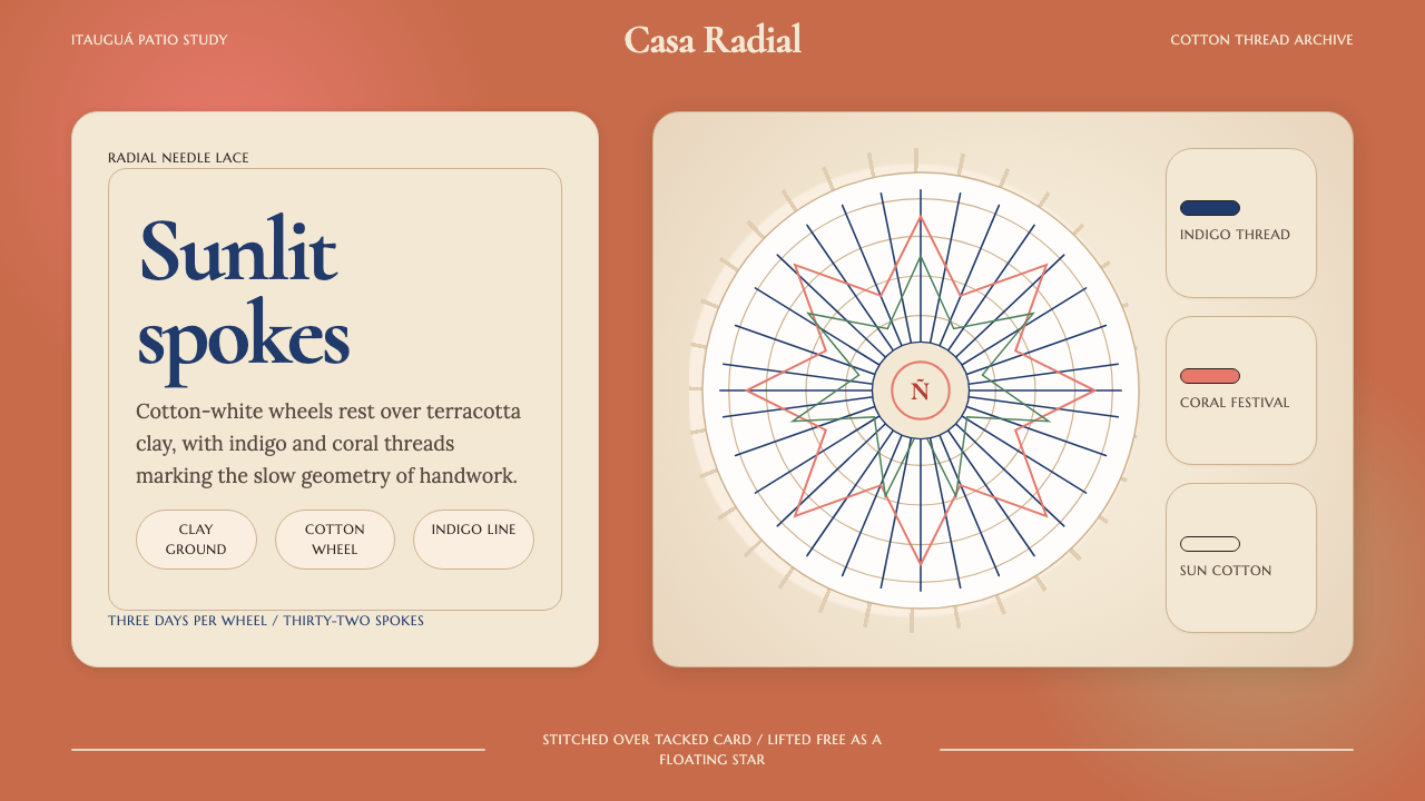 Paraguayan Ñandutí Spider-Web LacePatient lace in sunlight. Terracotta ground, Cormorant serif, indigo radial s…
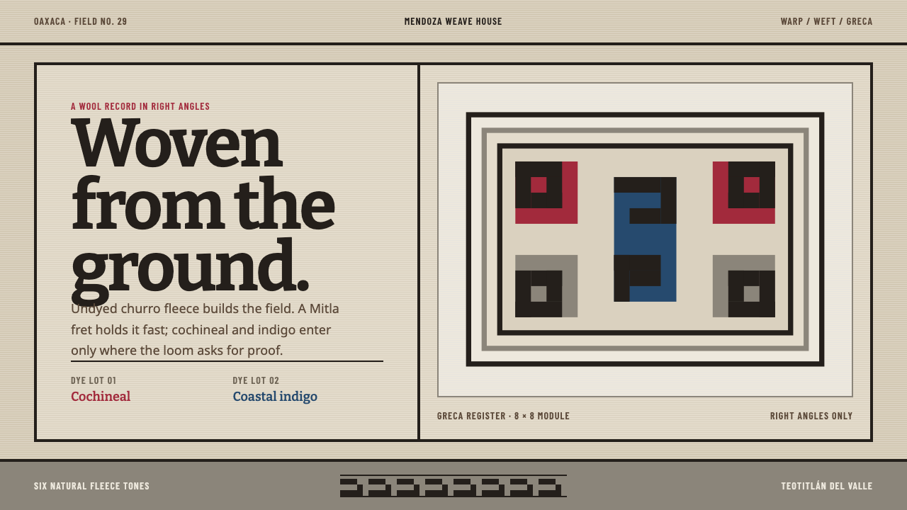 Teotitlán Wool RugCraft is structural. Raw fleece, Bitter slabs, and a hard-edged Mitla fret ho…
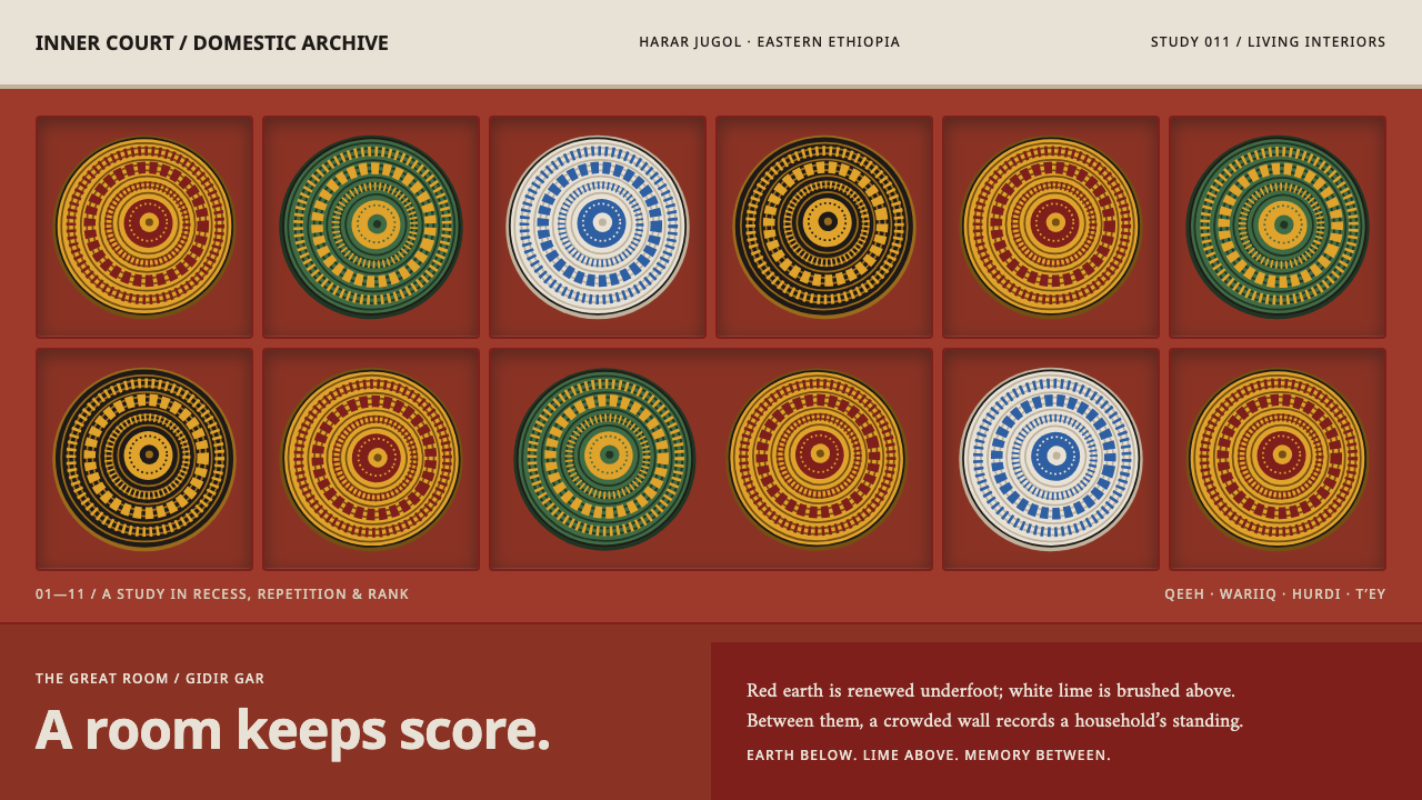 Harar House InteriorA room keeps score. Dense coiled geometry fills red-earth recesses beneath a…
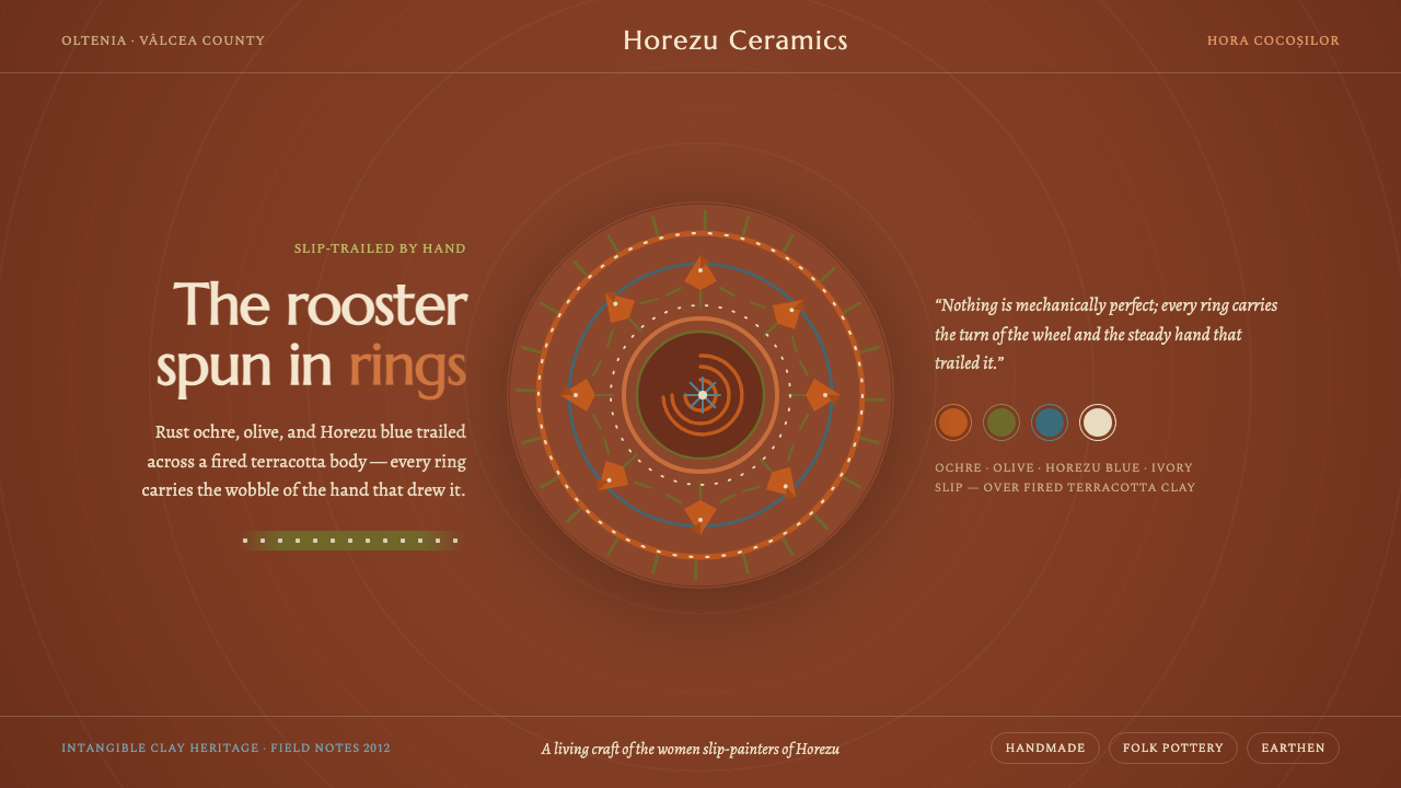 Horezu CeramicsWarm earth, steady hand. The Horezu rooster spun in ochre and olive slip acro…
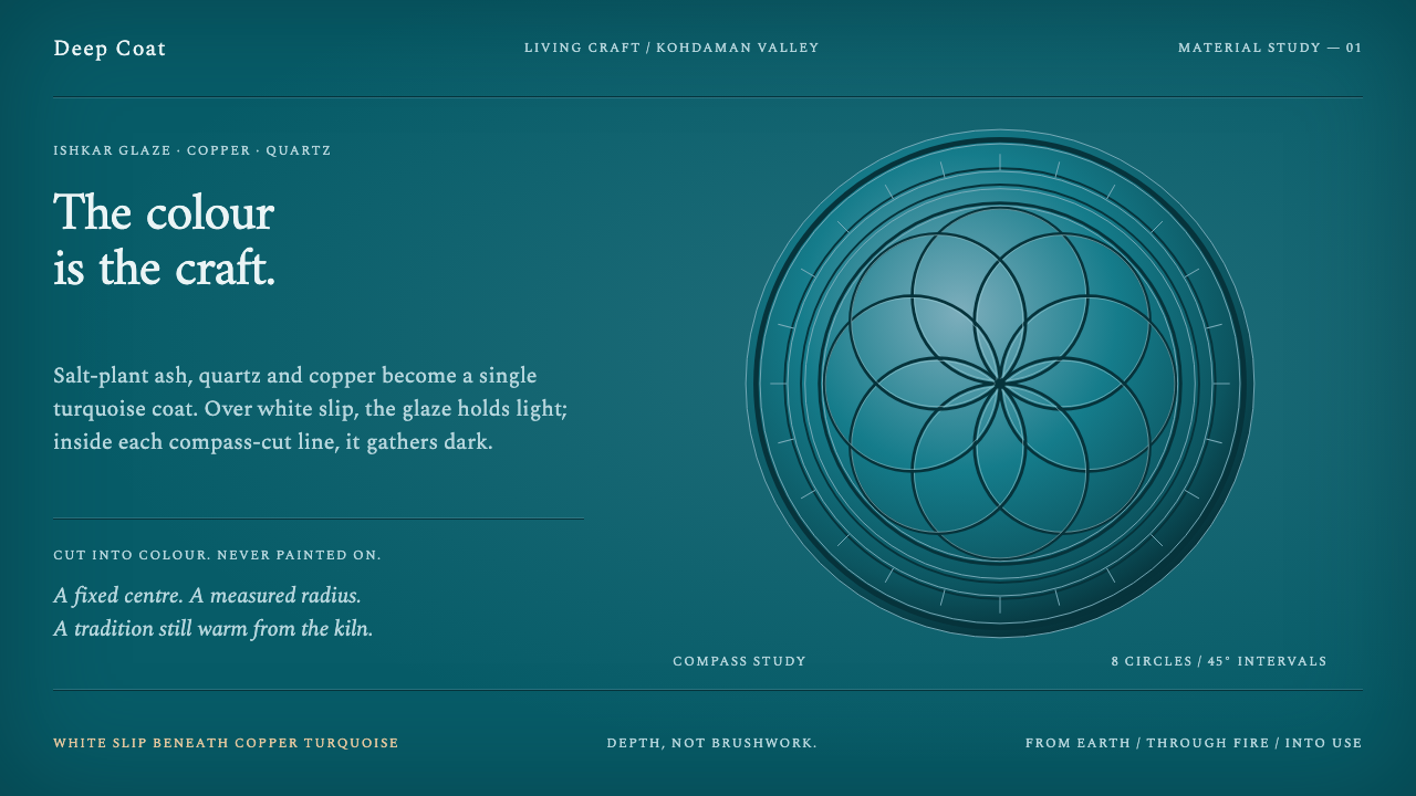 Istalif PotteryColour has depth. Copper-turquoise fields pool dark around compass-cut circle…
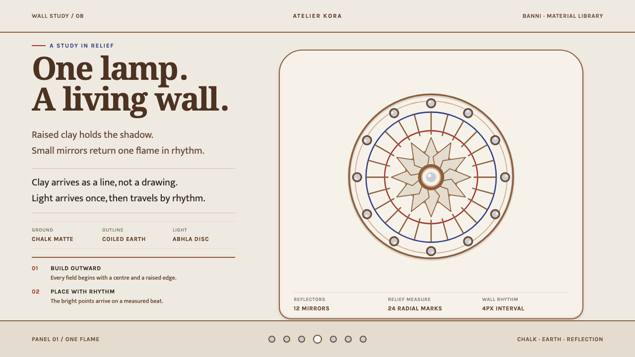 Lippan KaamLight is built into the wall. Chalk-matte relief and measured mirror discs re…