What is Light and Space?
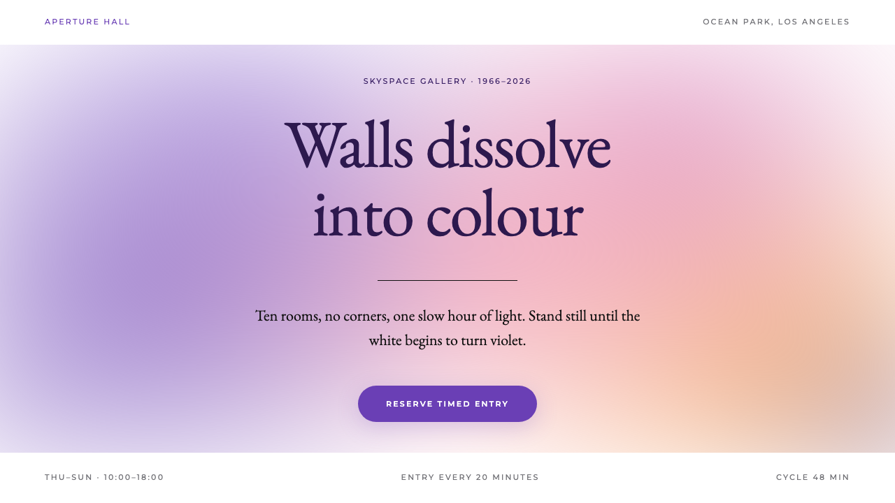
Light and Space turns a design from a surface into a room: a white page slowly filled with soft-edged colour until the edges seem to disappear.
Light and Space in brief
Light and Space is both an art movement and, in design terms, a visual system. The movement grew out of Southern California in the 1960s, where a group of artists stopped making objects to be looked at and began tuning rooms to be experienced. The design style borrows that attitude. Pages are white, colour arrives as wide, soft-edged fields of light, and the whole composition behaves less like a layout and more like an atmosphere.
The look is easy to describe and hard to fake. A very large amount of empty white sits behind everything. Colour drifts through it in gradual passages, moving from violet toward dusk pink, then magenta, then a warm sunset orange, with no hard boundary between one tone and the next. Titles are set in a classical serif and placed quietly in the middle of the space, while tiny, widely spaced sans-serif captions name the work, the year and the place. The only crisp mark on the entire page is a single thin black line.
What makes the style distinctive is restraint in the service of perception. Nothing is decorated and nothing competes. The designer's job is to control a small number of variables, namely the hue of the glow, the softness of its edge and the amount of white left around it, and to let the viewer feel the result slowly. It is a style for pages that want people to breathe out rather than scan.

Where does Light and Space come from?
The roots of the style lie in Los Angeles in the 1960s, where a loose group of artists associated with the Light and Space movement and with California Minimalism began to treat perception itself as their material. Instead of painting an image or carving an object, they asked what happens to a viewer when a room is altered so subtly that the boundaries of the room itself become uncertain. The movement is often described as a form of perceptual art, and it grew alongside the broader minimalist interest in clean surfaces and industrial finish, but with a far softer and more sensuous result.
James Turrell is the figure most closely tied to the idea. He painted walls white, rounded away the corners of a room and filled the space with light until the walls vanished into colour. A visitor standing inside no longer saw a surface but a depth that could not be measured. His Skyspace works take the idea outdoors in a different way, opening a single aperture in a white ceiling so that the sky itself becomes the artwork. His long-running project at Roden Crater, begun in 1979, extends the same thinking to an entire landscape, and installations such as Twilight Epiphany in 2012 and Aten Reign in 2013 show that the approach continued to develop well into the 2010s.
Robert Irwin approached the same territory from a different direction. In a white gallery he stretched a translucent scrim across the space and let a single black line hold it in place, so that the room seemed to hover between being a thing and being an absence. His scrim installation at the Whitney in 1977 is a frequently cited example. Alongside Doug Wheeler and Mary Corse, who are likewise associated with the movement, Turrell and Irwin created a body of work in which colour, light and emptiness are the only ingredients.
The translation into design is straightforward in spirit. The white room becomes the white page, the glowing field becomes a blurred colour wash, and the single black line from Irwin's scrim becomes the one hard rule that anchors the composition. The typographic voice is classical and calm, which echoes the gallery setting where this work was first seen. The result is a style that carries the quiet authority of a museum without needing a single frame, plinth or label panel.
What defines the Light and Space look?
Colour
Colour is never a flat fill. It appears as large fields of light that shift gradually from violet through dusk pink and magenta toward sunset orange. Each passage melts into the next with no visible seam, so the viewer reads a mood rather than a set of swatches. The ground is always pure white, which is what allows the glow to feel luminous instead of painted.
Soft edges
Every glowing shape has a blurred, feathered boundary. There are no outlines around colour, no hard cut-outs and no crisp geometric blocks. The softness imitates the way light falls on a rounded wall, where it is impossible to say exactly where brightness ends and shadow begins. This is the single most important rule of the style.
Empty white space
White is the main material, not a background. A large share of any composition is left deliberately empty so that the colour can breathe and the eye has somewhere to rest. Content is kept sparse, and elements are separated by distance rather than by boxes or dividers. If a layout feels crowded, the style has already been lost.
Classical serif titles
Headlines use a Garamond-style serif set at a calm, moderate weight and placed in the middle of the open space. The type is not meant to shout. It reads like the title card beside a work in a gallery, giving the page a sense of cultural weight and slowing the pace of reading.
Spaced-out captions
Secondary information is set in a small geometric sans-serif with generous letter spacing, used for the title of the work, its year and its location. These captions behave like museum wall labels. They are quiet, evenly spaced and never compete with the main title or the glow.
A single black line
The only hard mark on the page is one thin black rule. It plays the role that Irwin's black line played in the scrim installation: it holds the composition in place and makes the softness around it more obvious by contrast. Adding a second line, a border or an outline would weaken the effect immediately.

Who shaped Light and Space?
Turrell is the central figure of the style. By painting walls white, rounding the corners and flooding a room with coloured light, he made spaces in which the walls seem to dissolve. His Skyspaces open a single aperture to the sky, and his Roden Crater project, begun in 1979, applies the same thinking at the scale of a landscape. Installations such as Twilight Epiphany in 2012 and Aten Reign in 2013 show the idea still evolving decades later.
Irwin reached the same territory by subtraction. In a white gallery he stretched a translucent scrim across the room and let a single black line hold it, leaving the viewer unsure where the work began or ended. His Whitney scrim of 1977 is a frequently cited example, and the thin black rule used in this design system descends directly from that gesture.
Wheeler is one of the artists associated with the Light and Space movement alongside Turrell and Irwin. His name belongs to the same circle of Southern California artists who treated light, air and emptiness as materials, and he helps define the movement as a collective effort rather than the work of a single figure.
Corse is likewise counted among the artists connected to Light and Space and to California Minimalism. Her inclusion is a reminder that the movement was broader than its best-known names, and that the shared interest in perception and luminous surfaces ran through a whole generation of Southern California art.
How do you use Light and Space today?
On slides, the cover is where this style does its best work. Fill the slide with white, let one large, blurred field of violet and dusk pink drift in from an edge, and place a single serif title in the centre with a tiny spaced caption beneath it. Content slides should keep the same calm: one idea per slide, a short line of text and a great deal of untouched white. For data slides, favour a single figure or a very small chart over a dense table, and let the glow sit behind it as a quiet tint rather than a competing graphic.
On the web, the style suits interfaces that ask people to slow down. Museum and gallery sites, exhibition booking flows, meditation and sleep apps, and sound or ambient audio products all benefit from a white canvas with drifting colour. Dashboards are a harder fit, but a restrained reading dashboard can use the glow as a status indicator, letting the hue shift gently between states. Pricing pages should show very few plans, with generous space between them and the one black rule used to separate the key choice.
In editorial and marketing work, the style gives a campaign a sense of occasion. Event invitations, exhibition posters, brand announcements for wellness and design objects, and long-form feature openers can all borrow the white room and the slow colour. Because the page itself is almost empty, photography should be chosen carefully or left out. A single image with a similarly soft, luminous quality will work better than a busy collage.
A good test for any layout in this style is whether it still feels like a room when the text is removed. If the colour and the white alone suggest a space the viewer could stand inside, the composition is working. Keep the number of typefaces small, keep every glow soft-edged and let the single black line do its quiet job.
The most common mistake is to treat the glow as a decorative gradient and then fill the rest of the page with ordinary interface elements: bordered cards, heavy buttons, drop shadows and dense navigation. That destroys the sense of space immediately. A second frequent error is hard-edging the colour, which turns a field of light into a coloured shape. Remember that the style is defined by what is left out, and add elements only when the page truly cannot work without them.

Light and Space — FAQ
What is the Light and Space style?
It is a design style drawn from the Light and Space art movement of 1960s Southern California. Pages are white, colour appears as wide, soft-edged fields that drift from violet to dusk pink to sunset orange, titles are set in a calm classical serif, and the only hard mark is a single thin black line. The goal is to make a page feel like a quiet room filled with light rather than a conventional layout.
Who are the artists behind it?
The best-known names are James Turrell and Robert Irwin, joined by Doug Wheeler and Mary Corse. Turrell filled white rooms with light until their walls vanished and later began the Roden Crater project in 1979. Irwin stretched a scrim across a white gallery and held it with one black line, notably in his 1977 Whitney installation. The design system borrows ideas from both: the glowing field from Turrell and the single black rule from Irwin.
What kinds of products suit this style?
Anything that benefits from a slow, contemplative pace. Museum and gallery sites, exhibition booking, meditation and sleep apps, ambient audio products, wellness brands and event invitations are all natural fits. It works less well for dense, task-heavy tools such as data-entry screens, because the style depends on a great deal of empty space.
How is it different from ordinary minimalism?
Ordinary minimalism often relies on flat colour, crisp edges and a strict grid. Light and Space replaces those with atmosphere: colour is a soft glow without hard boundaries, and the white page is treated as a room to be filled with light rather than a blank sheet to be organised. It is quieter and more sensory, and it asks the viewer to feel the page instead of scanning it.
What is the biggest mistake when using it?
Crowding the page. Adding bordered cards, heavy buttons, drop shadows or hard-edged colour shapes breaks the illusion of a room filled with light. Keep the glow soft, keep the white generous, keep the typography calm and use only one black line. When in doubt, remove an element rather than add one.
Related design styles
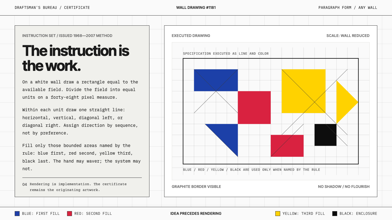 Sol LeWitt ConceptualInstruction becomes art. Mono certificates face wavering graphite grids in fo…
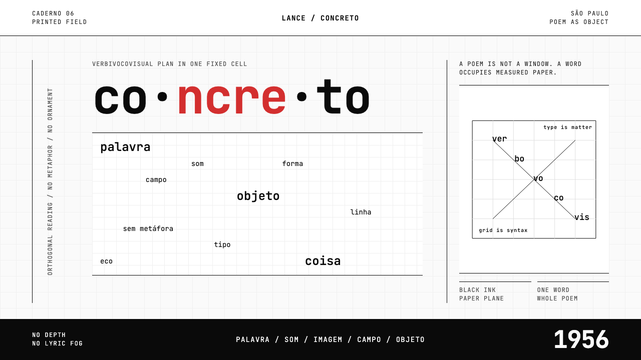 Brazilian Concrete PoetryWords become objects. Monospace cells, black-white paper, one cadmium red rup…
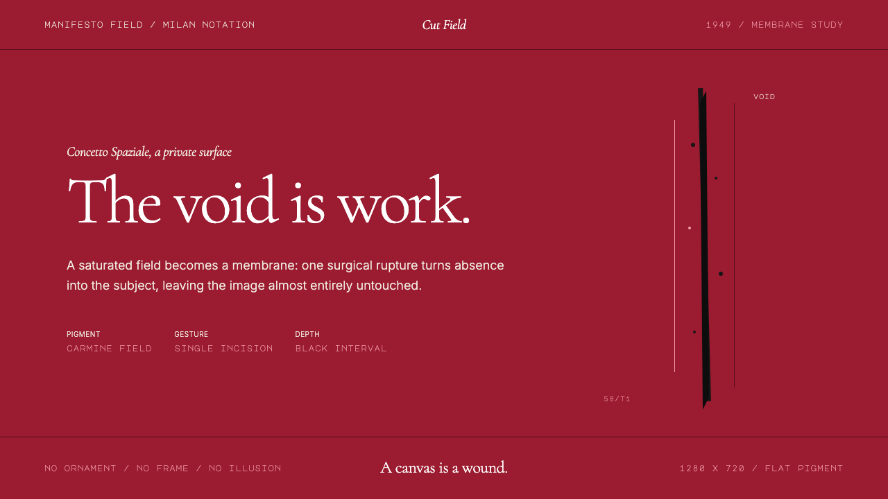 Spatialism (Fontana Cut, 1949)Absence becomes medium. Carmine field, Garamond restraint, one black incision.
 Cargo Collective PortfolioInterface disappears. White space, full-bleed blocks, mono metadata and hairl…
 Greenpeace (Activist Poster)Protest without softness. Forest-green caps over monochrome newsprint, one de…
 Jacqueline Casey MIT PostersOne sharp idea stops the corridor. Oversized Archivo type carries purple-to-b…