What is Jacqueline Casey MIT Posters?
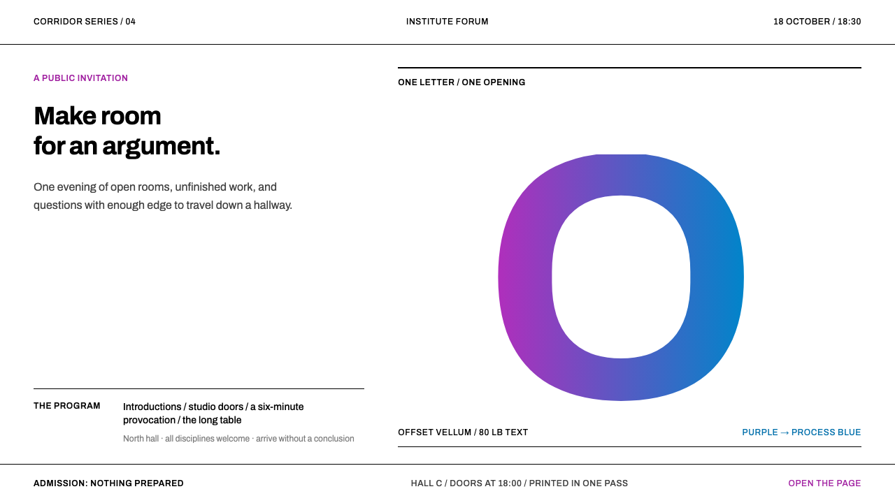
Jacqueline Casey spent thirty-four years at MIT making one kind of poster — a single sharp visual pun, set in a plain grotesque, coloured by ink that shifts across the sheet — and it still stops people in a corridor.
Jacqueline Casey MIT Posters in brief
The Jacqueline Casey MIT Posters style is built on the work of a designer who made posters for the Massachusetts Institute of Technology from 1955 to 1989 and varied her method hardly at all. Each sheet announced something ordinary, whether a lecture, an exhibition, an open house or a choral concert, and each did so with exactly one idea: a letterform blown up past the trim, a sequence of rules swelling across the page, a curve knocked out of a flooded field.
Three material facts define the look. The type is a Swiss-style grotesque, Helvetica or Univers, set large and often cropped. The paper is white vellum, printed offset, and it stays white wherever the idea does not need ink. And the colour comes from a split fountain: two or three inks meet on a single roller and go through the press in one pass, so the colour travels continuously from one end of the sheet to the other. In the digital version of the style, the purple-to-blue sweep behind oversized type is that printing trick translated to screen.
The effect is a kind of controlled loudness. Nothing on the poster is decorative, yet the whole sheet is vivid. These posters were made on an academic budget and with a small team's time, and the constraint is visible as discipline. There is room for one idea, so there is only one. Posters made this way outlived nearly everything they announced.
Where does Jacqueline Casey MIT Posters come from?
Casey joined the MIT Office of Publications in 1955 and began making posters under Muriel Cooper, the designer who led the office's graphic work. She stayed for thirty-four years, until 1989. The setting was Cambridge, Massachusetts, and the clients were the Institute's own departments, laboratories and societies: not commercial brands, but a university that needed to announce things clearly, repeatedly and cheaply.
The language she worked in was the International Typographic Style, the Swiss modernism of the postwar decades, with its grotesque typefaces, strict grids and faith in objective, legible communication. Within that vocabulary, her posters show how an institutional design programme could be more than a rulebook. The Swiss tradition supplied the typeface and the discipline; Casey supplied the pun, the single visual joke that makes someone in a corridor stop and look twice.
The colour has a specific craft pedigree. The split fountain was a printing technique brought into the office by her colleague Dietmar Winkler. Instead of laying one flat ink after another, the printer loads two or three inks into one fountain, side by side, and lets them blend where they meet on the roller. What reaches the paper is a continuous passage from one hue to another. It is a printer's skill, not a screen gradient, and the difference is visible in the slightly granular, uneven quality of ink on paper. Ralph Coburn, another designer in the same circle, is part of the group whose shared practice this style distils.
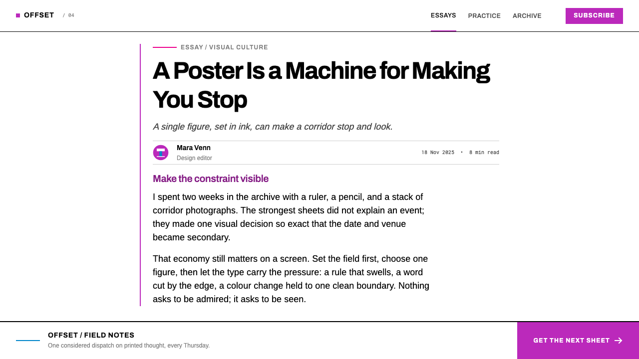
What makes the work unusual is its consistency. For more than three decades the method barely changed: one pun, one grotesque, white vellum, a few inks. Because the budget was academic and the audience was local, there was no pressure to reinvent the formula for each campaign, and the repetition became its own quality. A shelf of Casey's posters looks like a single mind thinking in many ways about the same constraint, which is a good description of what a design system should be.
What defines the Jacqueline Casey MIT Posters look?
One Idea Per Sheet
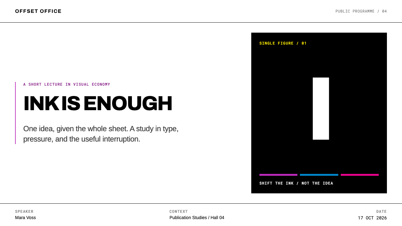
Each poster is built around a single visual pun sharp enough to stop someone walking down a corridor. There is no secondary motif, no supporting illustration and no decorative filler. The idea is usually a transformation of the text itself: a letter that becomes a shape, a rule that becomes a rhythm, a curve that becomes a gap. If two ideas compete, one of them has to go.
Oversized Grotesque
Type is Helvetica or Univers, set at a scale that makes letterforms into images, often enlarged past the trim so that only part of the character survives. The grotesque is chosen for neutrality: it carries no historical costume, so the idea does all the expressive work. In the digital version of the style an open grotesque such as Archivo stands in for it, used large and flush left.
Split-Fountain Colour
Two or three inks sit side by side in one fountain and blend where they meet, so colour passes continuously from one end of the sheet to the other in a single press run. In this system the sweep runs from purple to blue. Because it comes from ink meeting ink, the transition has a slightly granular, uneven character that a perfectly smooth screen gradient lacks, and designers translating it should keep that tooth.
The White Sheet
The paper stays white. Printed offset on white vellum, the sheet is never flooded edge to edge unless the idea demands it, and even then a pocket of untouched paper usually survives. White is not absence but an active material, the contrast against which ink looks luminous. The ink does the work; the sheet gives it room.
Swelling Rules
A sequence of rules that thickens, tightens or spreads across the page is one of the poster's signature devices. Lines are used as rhythm and volume rather than as dividers. The effect turns a plain typographic element into a form with movement, achieved with nothing more than repetition and gradual change.
Knockout and Bleed
A curve knocked out of a flooded field, a letter sliced by the trim, a shape that only completes itself outside the sheet: the posters play constantly with what is printed and what is left as paper. The edge of the page is treated as part of the composition, not as a frame around it.
Who shaped Jacqueline Casey MIT Posters?
Casey made posters at MIT from 1955 to 1989, a run of thirty-four years in which her method barely changed. Her gift was the visual pun: one idea, executed in a plain grotesque and coloured by ink that shifts across the sheet. The posters announce ordinary events yet remain memorable long after the events are forgotten, and they are the primary source of this style.
Cooper led the design work of the MIT publications office when Casey arrived in 1955, and Casey began making posters under her. She is the figure who set the Institute's graphic standards in motion and later went on to important work in book design and digital typography at MIT. Her presence explains why a university office could produce work of this seriousness.
Winkler, a colleague in the same office, brought the split-fountain technique into the group's practice. The method of loading several inks into one fountain, so that colour blends continuously across the sheet in a single run, became the visual signature of the posters. His contribution is a reminder that this style is a printer's craft before it is a colour scheme.
Coburn is counted as a key figure of the same publications-office circle in which the posters were produced. Together with Cooper, Casey and Winkler he represents the small, collaborative team behind a body of work that looks like one author's, a reminder that institutional design programmes are built by groups sharing a discipline.
The institutional home of the work, in Cambridge, Massachusetts. Its modest academic budget and its steady stream of lectures, exhibitions and concerts to announce were the constraints that shaped the style. As an institutional design programme working in the tradition of Swiss modernism, it is a clear case of limits producing clarity rather than compromise.
How do you use Jacqueline Casey MIT Posters today?
This style is best understood as a method for turning announcements into events. Its strength is a single bold gesture and its weakness is subtlety, so it belongs in places where you want one message to land at once. Apply it by choosing the one idea first, and only then adding type and colour.
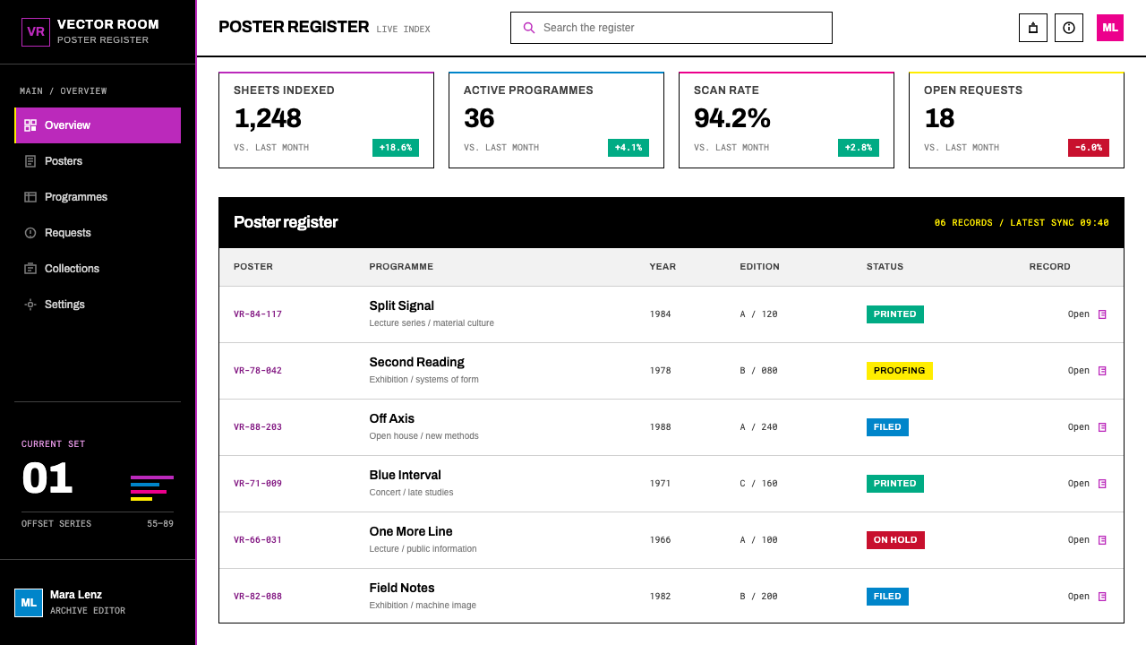
For presentation slides, a cover can carry one oversized word or letterform, cropped by the edge, over a soft sweep from purple to blue, with all other text kept small and flush left. Content slides should return to the white sheet: lots of untouched space, one grotesque in two sizes, and colour used only as a single band or a title wash. Data slides work best with plain charts on white, using the sweep once, as a background to the headline number, so that the poster-like energy is reserved for the point that matters.
For web interfaces, the style suits campaign landing pages, event pages and hero sections far better than dense dashboards. A large headline can be cropped by the viewport, with a sweep of colour behind it. Pricing tables and settings screens should stay on plain white with a neutral grotesque, because the split-fountain sweep is a poster device and loses power when it appears on every card. Keep the gradient direction consistent so that it reads as a printed sheet, not decoration.
For editorial and marketing work, it excels at lecture series, exhibitions, cultural programmes and any institutional communication that needs recognition across many events. Treat each announcement as its own pun and keep the system fixed: the same typeface, the same white ground, the same family of two or three inks, with a new idea every time. The repetition of the frame lets the changing idea stand out.
The most common mistake is to treat the sweep as a generic colourful gradient. Without the white sheet, the oversized grotesque and the single idea, it becomes a stock backdrop. Another is to use too many inks or too many effects; the posters work because two or three inks and one pun are all they have. And a third is to add a second focal point to be safe: if two things compete for the corridor, neither will win.
Jacqueline Casey MIT Posters — FAQ
Is a split fountain the same as a digital gradient?
No. A digital gradient is a mathematically smooth interpolation, while a split fountain is physical ink meeting ink on a roller. It travels from one colour to another in a single press pass, and it has the slightly granular, uneven quality of real ink on paper. On screen, the closest translation is a soft, directional sweep between two or three colours, perhaps with a little grain, used once and at large scale rather than everywhere.
Why does each poster carry only one idea?
Because the posters hang in corridors, where people pass them in a few seconds. Only one idea can register in that time, and a second idea would dilute the first. The academic budget reinforced the discipline, since a limited number of inks and a limited printing run left no room for extra material. The restriction is the design: it forces the pun to be sharp enough to survive without help.
Why Helvetica or Univers, and what should I use on screen?
Both are Swiss-style grotesques, neutral and highly legible at large scale, which suits a method where the idea does the expressive work and the type stays out of its way. On screen you need a font you are licensed to deliver in a browser. An open grotesque such as Archivo, set large and tight, reproduces the effect without the licensing complexity, and keeps the poster character of the original.
How does it relate to the International Typographic Style?
Casey's posters are a distinctive branch of it. They share its grotesque type, its trust in clarity and its institutional seriousness, and they come from the same Swiss modernist tradition. What sets them apart is the visual pun and the physical split-fountain colour, which together give a rigorous system a lively, even humorous, surface.
Can this style work for data-heavy products?
Only in a limited way. It is a poster style built for announcements, so it is strongest on landing pages, covers and hero areas. In a dense product, keep working surfaces plain white with a neutral grotesque and use the colour sweep as an occasional signature, for example behind a headline figure or on an empty state. If the sweep appears behind every row and every card, it stops being a poster and becomes wallpaper.
Related design styles
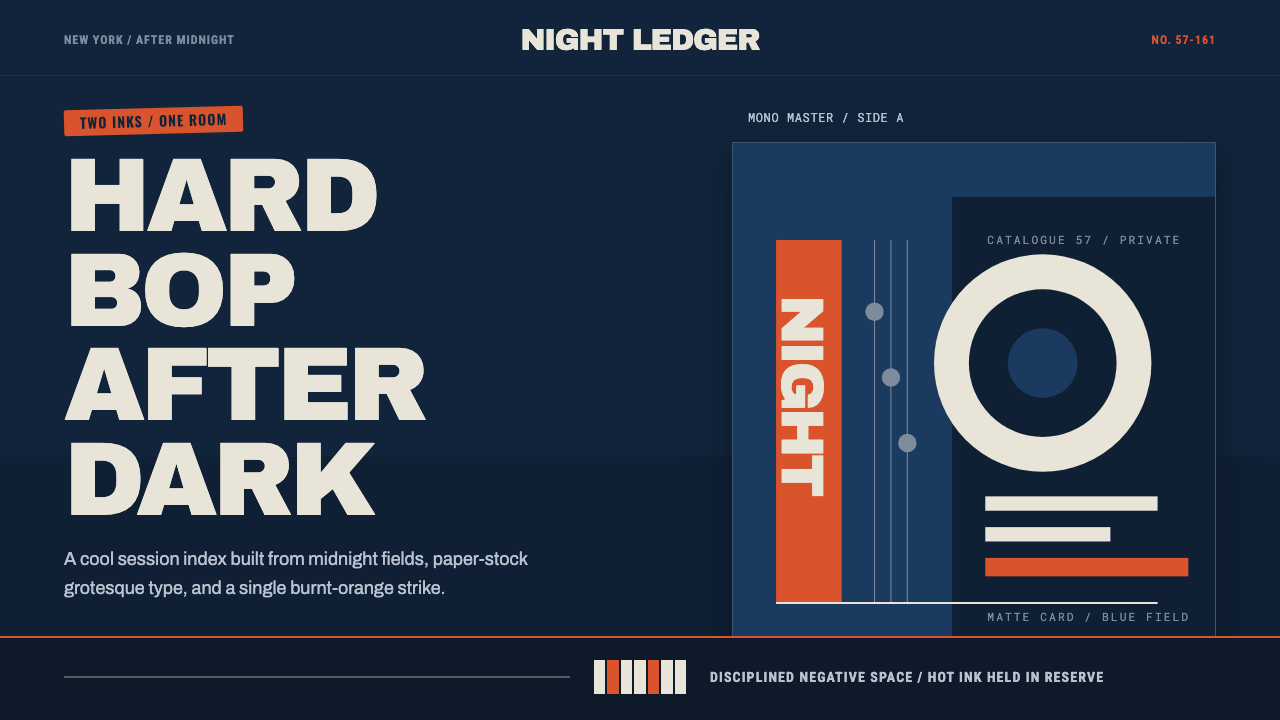 Blue Note JazzCool intelligence, printed flat. Midnight blue, paper type, and one burnt-ora…
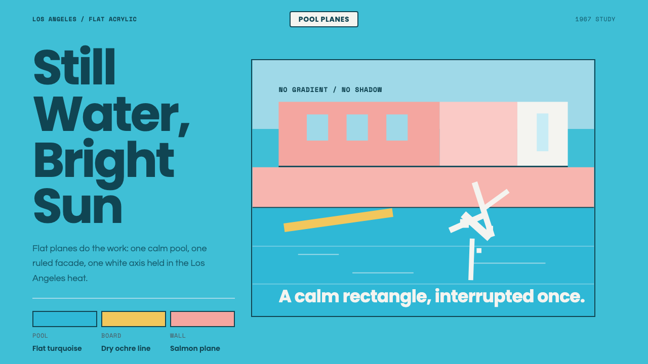 Hockney Pool BlueSerenity turns graphic. Turquoise planes, salmon edges, one white splash.
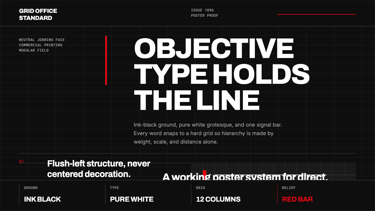 Akzidenz-Grotesk BertholdObjectivity in black ink. White grotesque type, hard grid, one rationed red b…
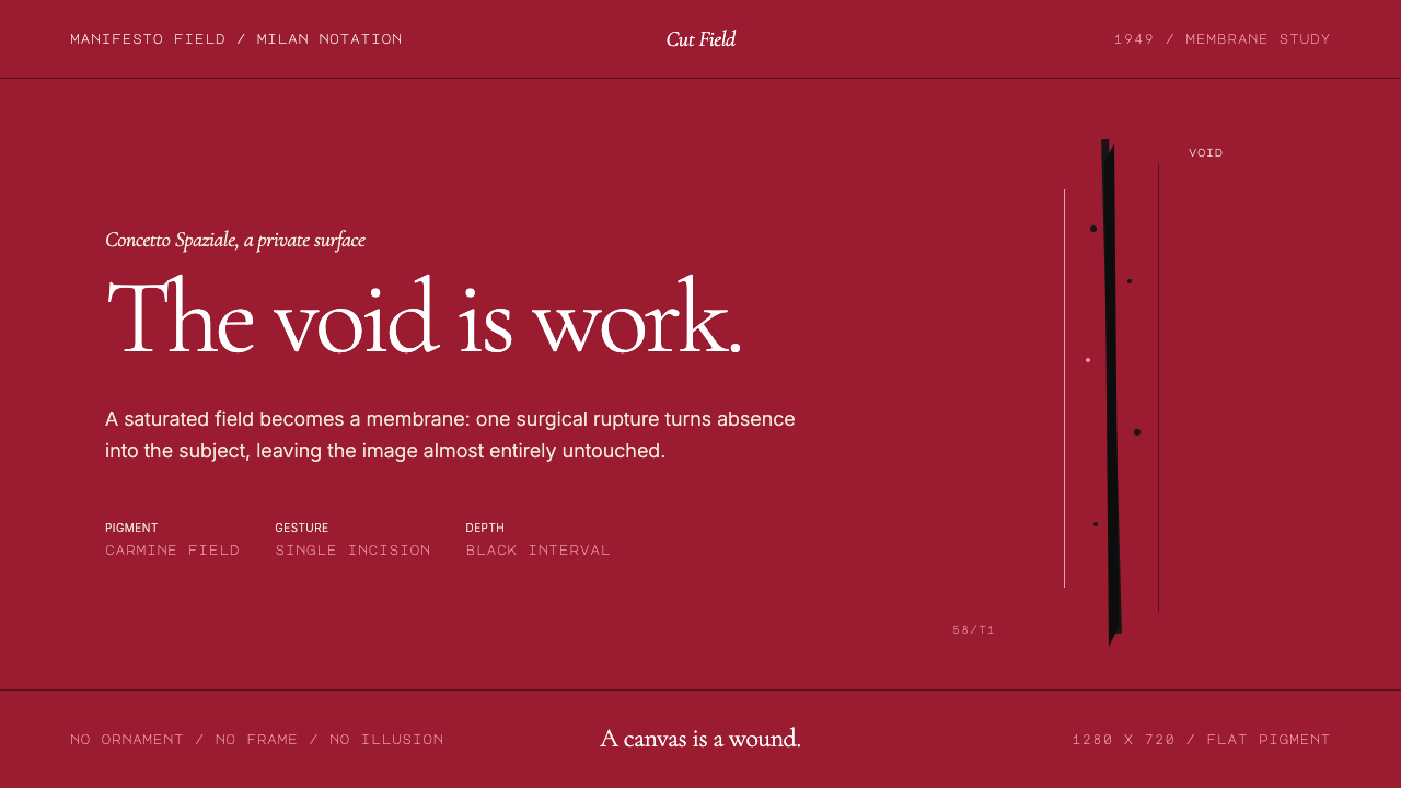 Spatialism (Fontana Cut, 1949)Absence becomes medium. Carmine field, Garamond restraint, one black incision.
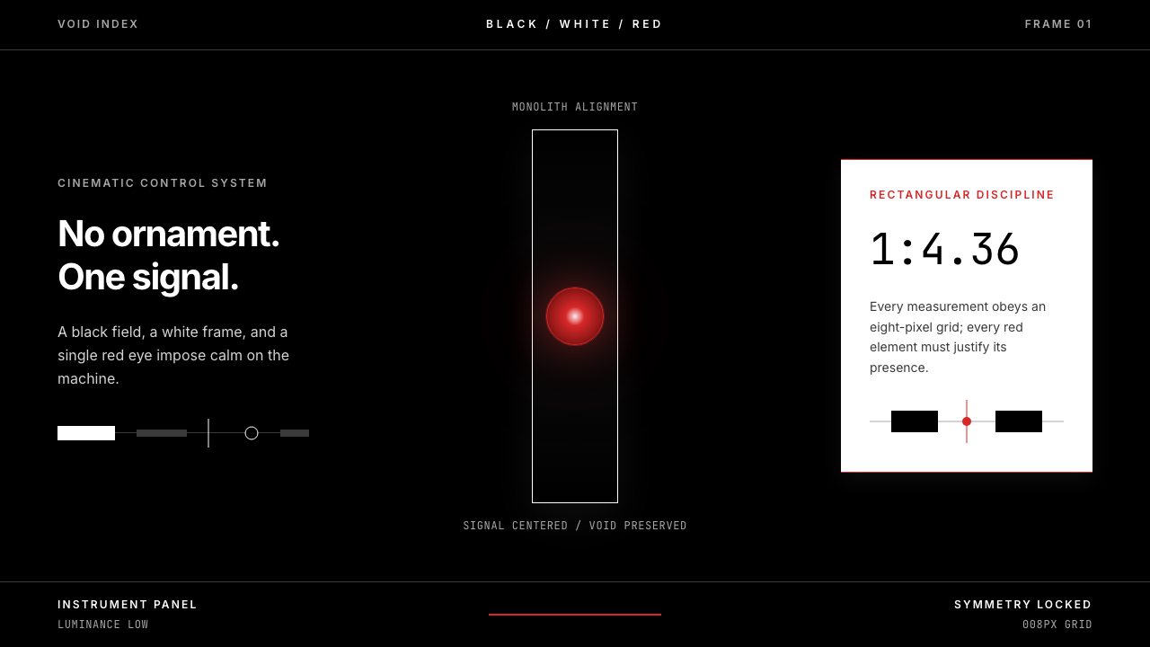 2001 — A Space OdysseyAbsolute restraint. Black void, white monolith geometry, one HAL-red signal.
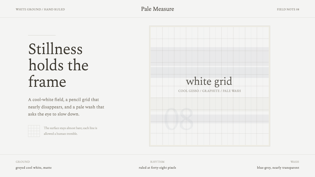 Agnes Martin White GridStillness made visible. Cool-white ground, graphite grid, and pale blue-grey…