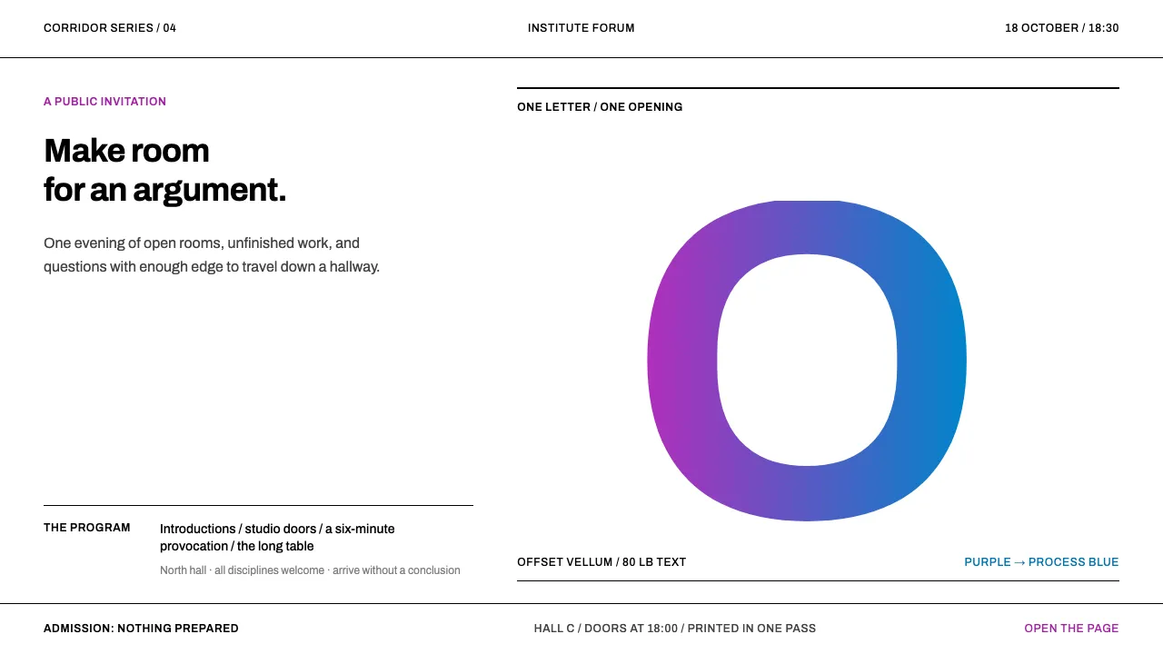
About Jacqueline Casey MIT Posters
Jacqueline Casey made posters for MIT for thirty-four years, and the method barely changed: one visual pun sharp enough to stop somebody walking down a corridor, set in Helvetica or Univers, printed offset on white vellum, and coloured with two or three inks pulled through a single split fountain.
The sheet stays white. The ink does the work. A letterform blown up past the trim, a rule sequence swelling across the page, a curve knocked out of a flooded field — announcements for lectures and open houses, made on an academic budget, that outlived nearly everything they announced.
- Origin
- Cambridge, Massachusetts, United States
- Era
- 1950–1990; at MIT 1955–1989
- Key figures
- Jacqueline S. Casey · Muriel Cooper · Dietmar Winkler · Ralph Coburn
- Movements
- International Typographic Style · Swiss modernism · institutional design programmes
Jacqueline Casey MIT Posters design spec
Colors
Typography
The other 11 sections — buttons, cards, spacing, motion, techniques and more — open once you unlock. Download the DESIGN.md or send it to your AI in one click. Unlock once, yours forever.
Sign up nowStyles similar to Jacqueline Casey MIT Posters
Also inspired by print & type, with a close feel.
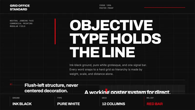 Akzidenz-Grotesk BertholdObjectivity in black ink. White grotesque type, hard grid, one rationed red bar.
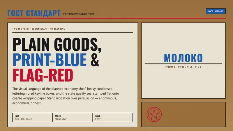 Soviet GOST PackagingAnonymous and strict. Kraft ground, red-blue ink, ruled boxes, condensed type.
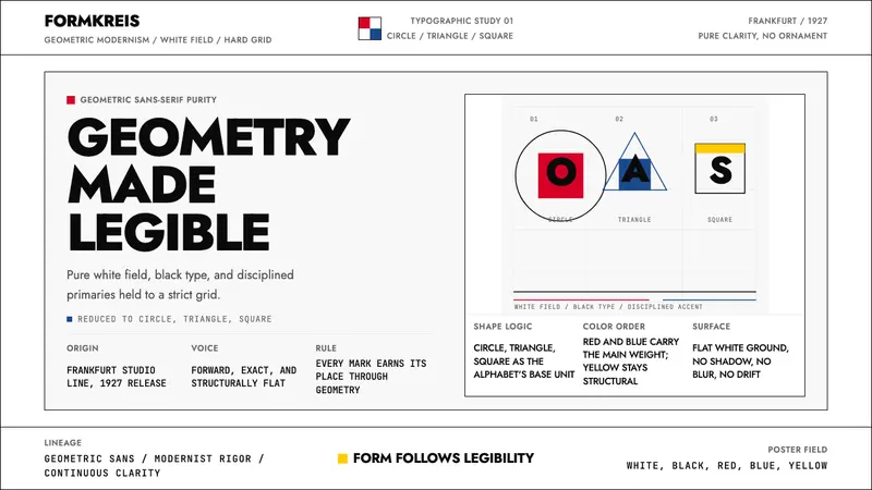 Futura Typeface (Renner, 1927)Geometry is legible. Black type and white fields, with red-blue-yellow anchors on grid.
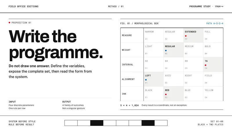 Karl Gerstner ProgrammesDesign becomes a programme. Black hairlines and a strict matrix turn parameters into form.