What is Agnes Martin White Grid?
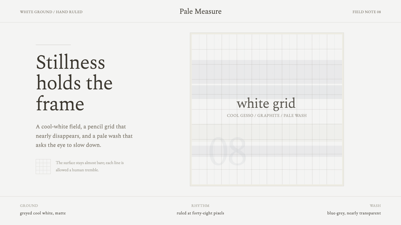
Agnes Martin White Grid makes stillness visible: cool white, trembling graphite, and a pale wash held at the threshold of disappearance.
Agnes Martin White Grid in brief
Agnes Martin White Grid is a design language derived from the mature paintings of Agnes Martin, whose work places hand-ruled graphite grids and near-transparent pale washes over white gesso grounds. The ground is never merely empty background. It is the field that allows every faint line, soft wash, and small irregularity to register. The visual effect is luminous rather than blank: a quiet surface that appears to have absorbed sun, air, and time.
The style belongs near Minimalism and meditative abstraction, but it should not be confused with impersonal reduction. Its grid is orderly without becoming mechanical. Its lines are restrained, yet their slight tremble preserves the evidence of a hand. Its color is barely present, but not absent. A cool, greyed white field carries pale blue-grey atmosphere so gently that the interface seems to recede before it asks for attention.
In digital work, Agnes Martin White Grid translates this balance into an interface system of low visual pressure. Fine graphite rules establish rhythm, pale washes mark gentle shifts of space or emphasis, and generous white ground keeps the composition breathable. The design does not perform calm through emptiness alone; it creates calm through repetition, restraint, and the refusal to make every element compete.
Where does Agnes Martin White Grid come from?
The source of this style is Agnes Martin's mature body of work, developed across the period associated with her signature grid paintings. Her visual vocabulary is spare but highly specific: a double-primed white gesso ground that remains partly visible, graphite lines ruled by hand, and pale washes so transparent that they feel suspended above the surface rather than laid heavily upon it. The apparent simplicity is therefore built from layered attention, not from the absence of decisions.
Martin's mature work is associated with New Mexico after New York, and the desert setting is essential to the style's emotional register. These paintings read as sun-bleached fields: luminous, quiet, and expansive without relying on depiction. The pale surface suggests light and weather rather than a represented landscape. Its stillness is not decorative serenity; it is an atmosphere created by limited means and sustained concentration.
The hand-ruled graphite grid gives the work its central tension. A grid promises measurement, repetition, and rational order, yet Martin's line is not industrially exact. It trembles slightly. That small deviation prevents the painting from becoming a diagram and makes the system feel lived in. The line does not announce expression through drama; it reveals expression through restraint, where the human presence is most perceptible precisely because almost everything else has been quieted.
For contemporary design, the significance of this origin is methodological. The white base must remain active, the grid must be felt more than displayed, and the wash must behave as atmosphere rather than decoration. When these elements are made too dark, too sharp, too regular, or too plentiful, the reference collapses into generic graph paper or generic minimalism. The style depends on the relationship between structure and near-erasure.
What defines the Agnes Martin White Grid look?
Living White Ground
Cool white is the primary material, not a neutral leftover. It should feel lightly greyed, luminous, and open enough for faint graphite and pale blue-grey to appear without force. Large untouched areas are essential because they make the subtle interventions legible. A fully covered or heavily tinted background breaks the style's central premise: white is the essence, and everything else only whispers.
Hand-Ruled Graphite Grid
The grid provides order, cadence, and containment, but it should never read as a technical overlay. Its graphite character is soft and dry rather than glossy or authoritative. Lines are fine, understated, and allowed a slight hand-drawn tremble. The goal is not perfect geometry; it is a repeated structure that feels patient enough to carry quiet attention.
Pale Blue-Grey Wash
Color appears as a near-transparent wash rather than a solid block. Pale blue-grey introduces cool atmosphere and a faint sense of depth, but it must remain subordinate to the white ground. It is most convincing when it seems to have settled gradually over the surface, with soft variation and no demand to become a focal image.
Near-Visibility
This aesthetic works at the threshold of perception. Grid, wash, borders, and secondary hierarchy should be discovered rather than announced. Contrast is deliberately moderated so that the eye has time to settle. If every structural device is instantly obvious, the design has become louder than its reference.
Softened Imperfection
Slight irregularity is not an accent effect. It is the evidence that a disciplined system has passed through a human hand. The tremble should remain subtle and consistent with the delicacy of the composition; dramatic roughness, distressed texture, or theatrical noise would turn contemplation into performance.
Meditative Repetition
Repetition creates the style's duration. Repeated lines, measured intervals, and restrained recurring elements invite sustained looking rather than rapid scanning. The pattern should feel continuous but not busy, as though it could extend beyond the visible frame without becoming decorative wallpaper.

Who shaped Agnes Martin White Grid?
Agnes Martin is the sole figure behind this visual language. Her mature paintings established the relationship between hand-ruled graphite grids, pale washes, and a white gesso ground that remains visibly present. The style takes its authority from that disciplined relationship, not from an interchangeable minimal surface treatment.
Martin's work is associated with Minimalism, meditative abstraction, and abstract-expressionist roots, yet its character is more intimate than a purely formal grid. The slightly trembling line keeps the system from becoming anonymous. It allows order and vulnerability to occupy the same surface.
Her mature work made in New Mexico after New York is inseparable from the style's sun-bleached, luminous reading. The paintings do not depict the desert directly; instead, their pale field, quiet repetition, and softened marks create an atmosphere of openness and stillness that interface work can translate without imitation.
How do you use Agnes Martin White Grid today?
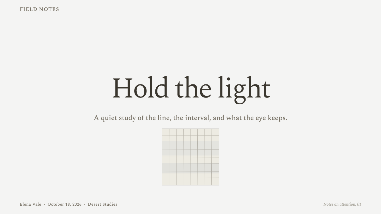
For presentation covers, use the white field as the primary statement. Let a faint graphite grid establish a barely felt order, then place the title with restrained confidence over a pale blue-grey wash or an open area of ground. Avoid treating the cover as a poster that must shout. The composition should create anticipation through quiet space, with the grid acting as an underlying measure rather than a visible graphic motif.
On presentation content pages, the grid can organize text, quotations, images, and section markers without enclosing everything in hard containers. Keep the primary reading path clear and let secondary information recede into pale rules or delicate labels. Data slides can use fine grid logic to support comparison and alignment, but charts should remain spare: the style is strongest when data feels carefully observed rather than aggressively optimized for spectacle.
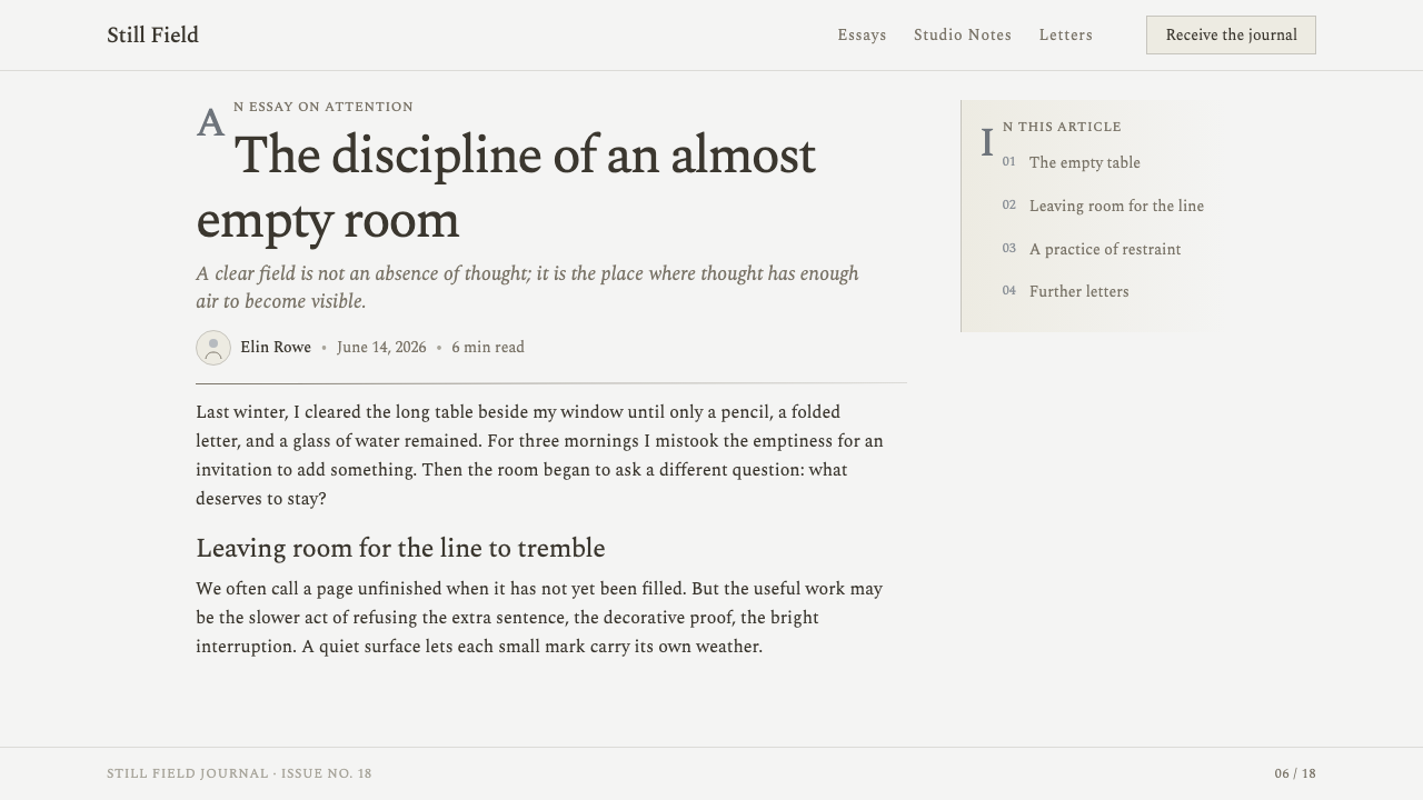
For web interfaces, Agnes Martin White Grid suits reflective dashboards, research tools, archives, journals, planning spaces, and settings where concentration matters more than urgency. A cool-white canvas can hold a barely visible grid, while pale washes differentiate zones, states, or moments of focus. Interactive elements should be calm and intelligible, with graphite-like boundaries and measured changes that preserve the sense that the interface is a place for thought, not a control room demanding constant action.
In editorial and marketing work, this system is especially effective for essays, cultural programs, portfolios, exhibitions, and products built around attention or reflection. Long-form text benefits from broad margins, quiet section transitions, and a hierarchy that emerges through placement rather than visual noise. Marketing pages can use luminous white intervals between messages, allowing a restrained wash or a recurring line field to connect separate sections without resorting to promotional clutter.
The common mistake is making the style more visible than it is supposed to be. Dark graph lines, obvious paper textures, dense grids, strong blue-grey panels, and exaggerated hand-drawn effects turn it into stationery or decorative minimalism. Another mistake is treating the white ground as empty space to fill with content. The design succeeds only when white remains active, color remains atmospheric, and the human irregularity stays quiet enough to be felt rather than displayed.
Agnes Martin White Grid — FAQ
Is Agnes Martin White Grid simply a form of generic minimalism?
No. Generic minimalism often reduces visible elements without preserving a particular emotional or material logic. This style depends on a specific relationship: cool white ground, hand-ruled graphite structure, near-transparent pale wash, and a line gentle enough to retain human tremble. Remove that relationship and the result may be sparse, but it will not carry the same stillness.
How visible should the grid be?
It should be present enough to establish rhythm and organization, but restrained enough that the viewer discovers it after the overall field. If the grid is the first thing the eye notices, it has become a graphic pattern rather than a quiet structure. Think of it as a measure beneath the composition, not as the composition's main subject.
Can stronger color be added for calls to action or data emphasis?
It can, but it changes the balance quickly. The core palette is built around cool white, graphite, and pale blue-grey atmosphere, so any stronger intervention should remain exceptional and subordinate to the field. If emphasis is needed, first use placement, spacing, grouping, or typographic hierarchy. Color should not become the mechanism that makes the interface speak loudly.
Does the hand-drawn quality require literal sketch textures?
No. Literal sketch textures usually overstate the reference. The hand-drawn quality comes from a slight softening or tremble in an otherwise disciplined line, not from roughness for its own sake. The best result preserves the impression of careful ruling by a person while keeping the page luminous, sparse, and composed.
Where does this style work poorly?
It struggles where immediate urgency, dense operational scanning, or exuberant visual energy is the product's primary need. A system built around near-visibility can obscure important signals if it is applied indiscriminately. It is most appropriate when the product can reward sustained attention and when quietness is a meaningful part of the experience rather than an aesthetic layer placed over a high-pressure workflow.
Related design styles
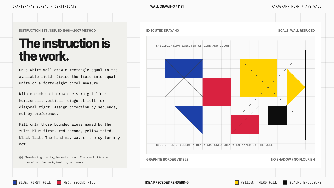 Sol LeWitt ConceptualInstruction becomes art. Mono certificates face wavering graphite grids in fo…
 Blue Note JazzCool intelligence, printed flat. Midnight blue, paper type, and one burnt-ora…
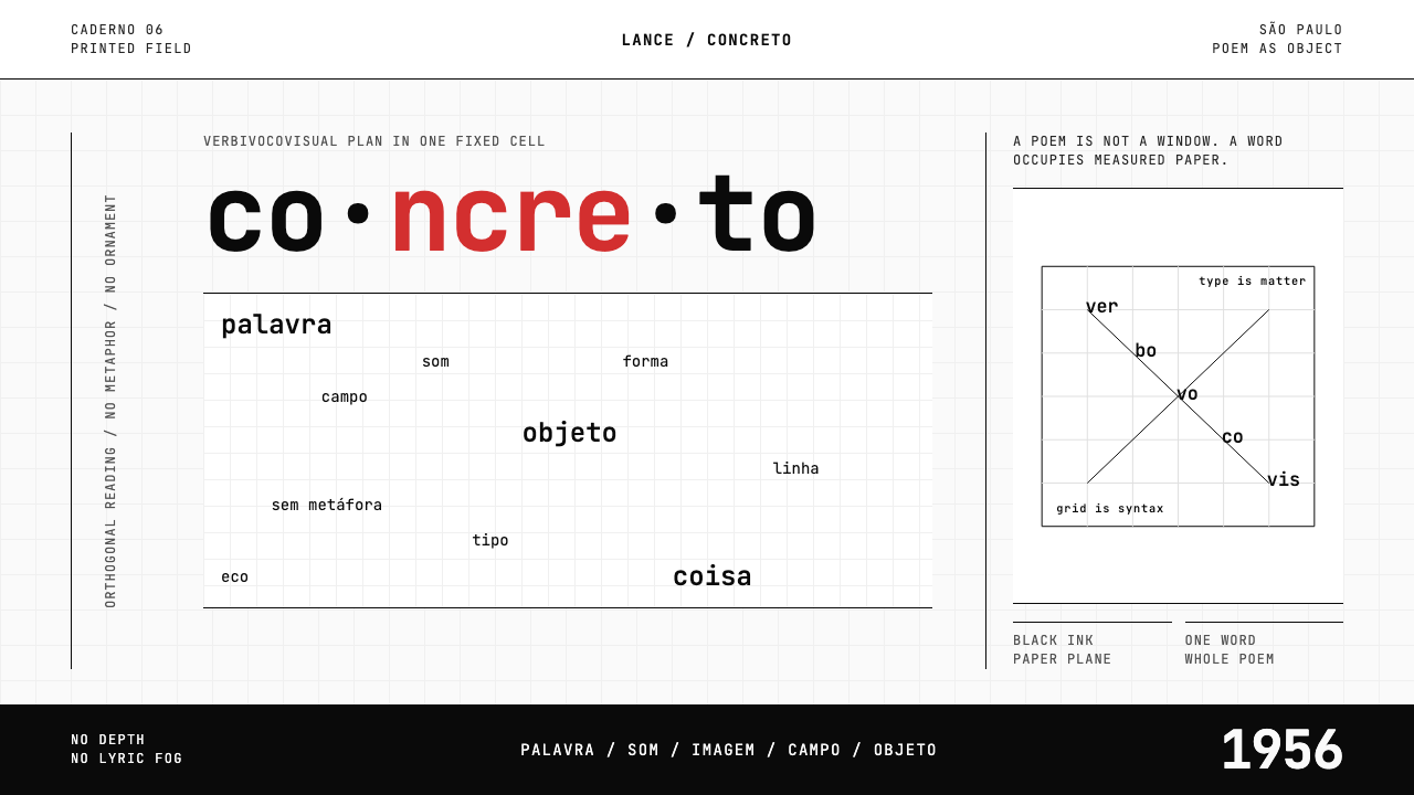 Brazilian Concrete PoetryWords become objects. Monospace cells, black-white paper, one cadmium red rup…
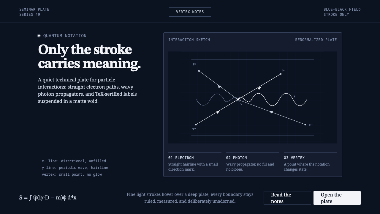 Feynman Diagram QEDMeaning reduced to strokes. Pale QED lines and TeX serif type float on blue-b…
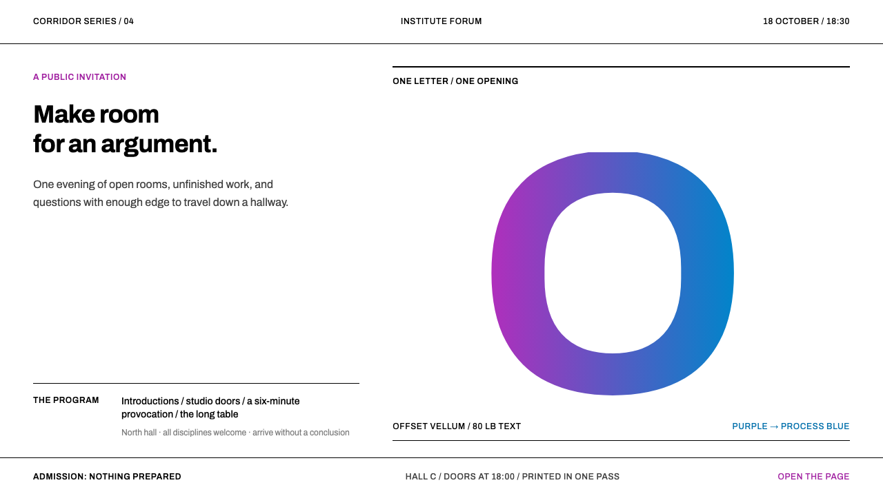 Jacqueline Casey MIT PostersOne sharp idea stops the corridor. Oversized Archivo type carries purple-to-b…
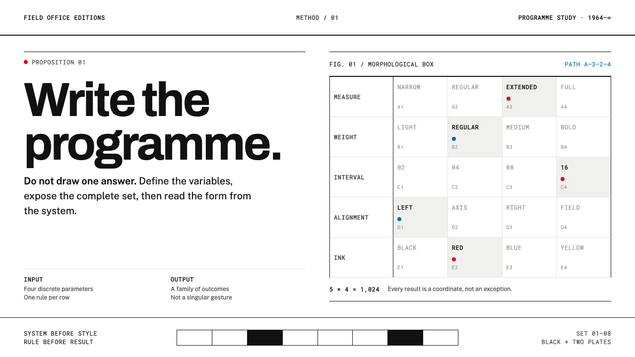 Karl Gerstner ProgrammesDesign becomes a programme. Black hairlines and a strict matrix turn paramete…