What is Wood Type Specimen?
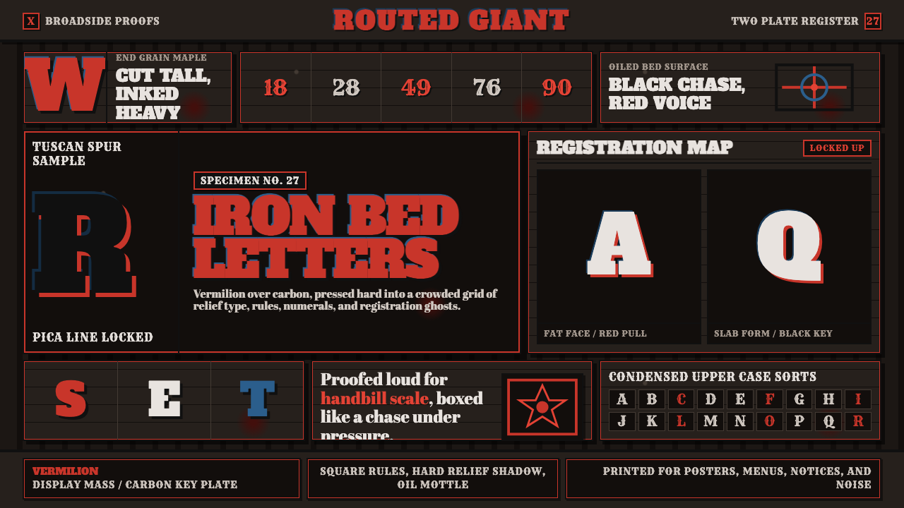
Wood type turned the printed word into a shout — oversized relief letters, inked in vermilion and carbon black, proofed shoulder-to-shoulder on the iron bed of a press.
Wood Type Specimen in brief
Wood Type Specimen is a system built from the loudest register of nineteenth-century American printing: the giant display letters cut from end-grain maple that filled broadsides, circus posters, and railway handbills. Where metal foundry type was limited by the cost and weight of casting large letters, wood type could be cut cheaply at enormous scale, which is exactly why it became the default voice of the poster — the medium that had to be read from across a street.
The look is built on mass and contrast rather than delicacy. Letterforms are heavy, often exaggeratedly so — fat, bracketed serifs or blunt slab feet, sometimes broken up with ornamental Tuscan notches or shadow outlines added purely for punch. Ink is applied in two colors that read as declarations rather than accents: a hot, oil-based vermilion red and a dense carbon black, both proofed onto a surface that carries its own dark, worked sheen rather than the flat white of a modern printout.
What distinguishes this system from generic 'vintage poster' pastiche is the press bed itself. The letters are not floating on blank paper — they sit locked into a tight grid on an iron chase, the way a compositor actually locked wood type before inking it. That grid, and the oiled, faintly reflective darkness beneath the type, are as much the identity of the style as the letterforms are.
Where does Wood Type Specimen come from?
Wood type emerged in the United States in the early nineteenth century as a direct response to a printing problem that metal type could not solve economically: posters and broadsides needed letters several inches tall, and casting type that large in metal was prohibitively expensive and impossibly heavy to store and set. Darius Wells, a New York printer, is generally credited with the decisive innovation — in 1827 he adapted the lateral router, a woodworking tool, to carve large letterforms into the end grain of dense woods like maple and boxwood. End grain mattered because it resisted the crumbling and splitting that long-grain wood suffered under the pressure of repeated inking and printing.
Wells's method was refined and industrialized by others who followed. William Leavenworth further mechanized the router-based carving process in the 1830s, and by mid-century a cluster of wood-type foundries — concentrated especially in Wisconsin, where dense native maple was abundant and railroads gave the industry national reach — were producing catalogs of display faces sold to job printers across the country. J. Edward Hamilton, operating out of Wisconsin later in the century, became one of the trade's dominant manufacturers, consolidating smaller foundries and pushing the wood-type specimen catalog into its most expansive form.
These catalogs were themselves a genre worth noting: dense, crowded pages that stacked one display face after another at full size, so a customer could see exactly how many inches of impact they were buying. The faces on offer ranged from heavy Fat Face romans, whose strokes swelled to near-block thickness, to Clarendon-style slab serifs built for maximum legibility at a distance, to ornamented Tuscan letters whose serifs split, curled, or bracketed for pure spectacle. All of it existed to serve the broadside — the announcement, the circus bill, the runaway advertisement, the railway timetable — where the letter's job was to be seen before it was read.
By the century's end, offset lithography and cheaper large-format metal alternatives had begun to erode wood type's commercial dominance, but the aesthetic it established — scale as authority, ink as declaration, the letterpress bed as a stage — outlived the technology and remains one of the most immediately recognizable print vocabularies in American design history.
What defines the Wood Type Specimen look?
Color
The palette is built around exactly two inks: a hot, oil-based vermilion red and a dense carbon black, both proofed onto a dark, worked ground rather than blank white stock. Red and black are not decorative accents but the entire color vocabulary — red typically carries emphasis or a secondary line, black carries the primary declaration. There is no tertiary hue; any third color would dilute the sense of a job press running two inks and nothing more.
Typography
Letterforms are heavy display faces designed to be read at a distance and to fill space aggressively: Fat Face romans with swollen, near-block strokes, Clarendon-style slab serifs with blunt bracketed feet, and ornamented Tuscan letters whose serifs split or curl for spectacle. Weight and size do the organizing work — a specimen line sits at enormous scale relative to any supporting text, and multiple display faces are often proofed together on the same sheet, the way a nineteenth-century foundry catalog stacked one face after another to show off its full range.
The Press Bed
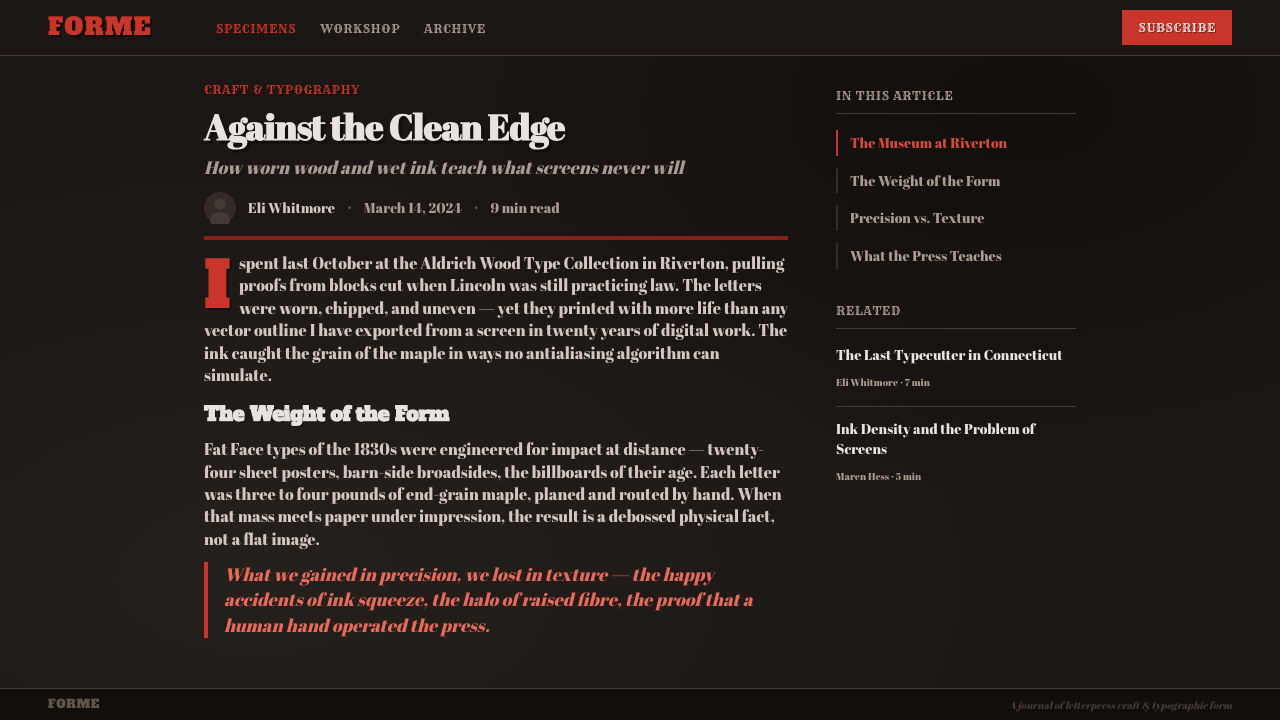
This is the element that separates the system from a generic vintage-poster look. Letters are not set against flat, blank paper — they sit locked into a tight grid, the way a compositor physically locked wood type into an iron chase before inking and proofing it. The surface beneath the type carries a dark, faintly reflective, worked sheen — the residue of oil-based ink and repeated use — rather than the flat matte white of a fresh printout. That darkness and that grid are load-bearing: remove them and the type could belong to any era.
Contrast and Scale
Everything about the composition serves legibility at a distance, which is the reason the style exists in the first place. Contrast is maximized rather than moderated: heavy dark ink against a comparatively lighter (though never pristine) ground, oversized letters against whatever supporting text exists. There is little interest in subtlety of gradation — the aim is to be seen before it is read, the same brief a nineteenth-century broadside had to satisfy from across a street or a train platform.
Ornament as Structure
Where ornament appears — a Tuscan serif split into forked tips, a hard offset shadow outline behind a letterform, a bracketed slab foot — it is never applied loosely on top of the letter. It is cut into the letterform itself, part of the same block of wood, and it reads as structural rather than decorative because it was carved, not printed as a separate layer. A shadow behind a wood-type letter is typically a second color proofed in precise register with the first, not a soft rendering effect.
Grid Discipline
Multiple pieces of wood type were locked together into a single forme before printing, which imposed a physical grid on the composition whether or not the printer intended one. Letters and lines sit tight against each other with minimal, consistent spacing — there is no loose, airy negative space of the kind a modern minimalist layout would use. The tightness is a byproduct of the medium: wood type was proofed edge to edge to conserve the expensive carved blocks and the press bed's limited real estate.
Surface and Wear
Authentic wood-type proofing shows the evidence of its own process: slightly uneven ink coverage where a worn block took less impression, faint texture in the ground from repeated use of the same press bed, edges that are crisp but not machine-perfect. This is not distress applied for effect — it is what happens when relief printing from carved wood meets an iron bed that has proofed thousands of sheets before this one. A system that looks too clean has lost the plot.
Who shaped Wood Type Specimen?
A New York printer generally credited with the decisive innovation that made wood type commercially viable: in 1827 he adapted the lateral router — a woodworking tool — to carve large display letterforms into the end grain of dense hardwoods like maple. Before Wells's method, oversized letters for posters and broadsides had to be cast in metal at prohibitive cost and weight; his router-based process made giant type cheap enough to become the default vocabulary of American commercial printing.
Leavenworth further mechanized the router-based wood-type carving process in the 1830s, building on Wells's original innovation and helping push wood type from a workshop curiosity toward an industrial-scale trade. His refinements to the carving machinery were part of what allowed wood-type foundries to produce the large specimen catalogs that spread the style across the country in the following decades.
Operating out of Wisconsin later in the nineteenth century, Hamilton became one of the wood-type trade's dominant manufacturers, consolidating smaller foundries into a larger operation. Under his direction the wood-type specimen catalog reached its most expansive form — dense, crowded pages showcasing dozens of display faces at full size — cementing Wisconsin's role as the geographic center of American wood-type production thanks to its abundant native maple.
How do you use Wood Type Specimen today?
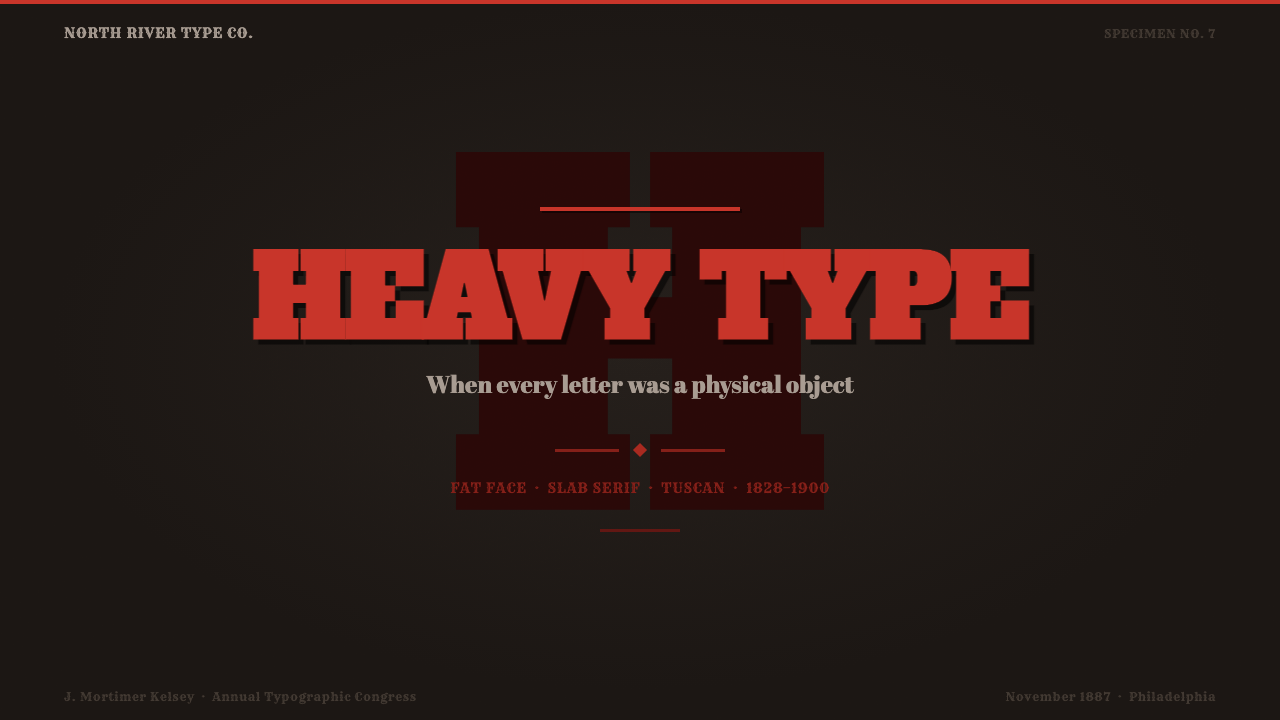
Wood Type Specimen is a poster style before it is anything else, which means it applies most naturally wherever a design needs to command attention rather than politely inform. For presentation cover slides, the style works by committing fully to scale: a single word or short phrase set at enormous size, locked tight against the slide's edges the way type was locked into a press chase, with the vermilion-and-black duotone doing all the color work. Content and data slides should resist the temptation to soften the palette — a bar chart rendered as blocky, high-contrast red and black columns against a dark, worked ground reads as authoritative rather than clinical, but only if the rest of the deck stays disciplined to the same two-ink restraint.
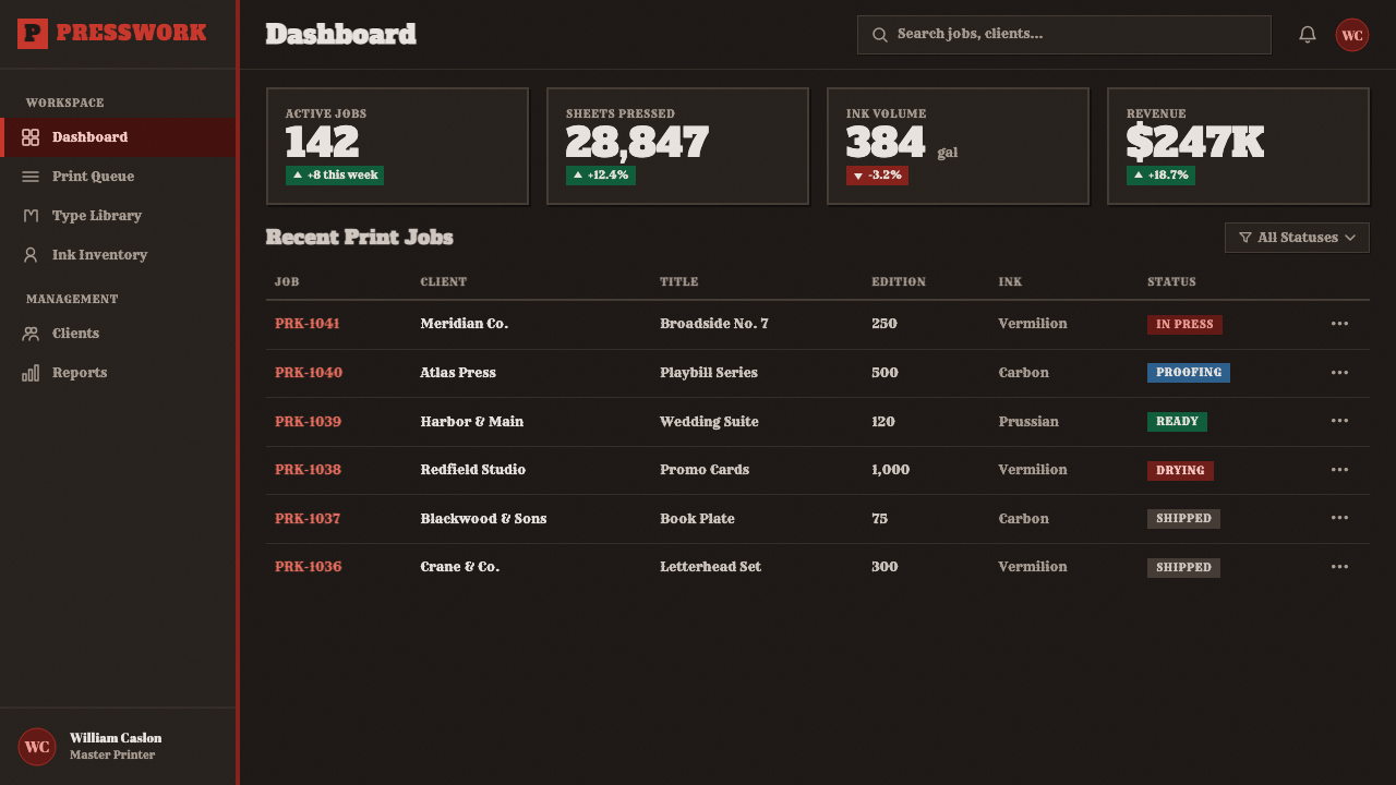
For web interfaces, this style is a harder fit than for print-derived formats, but it can work for dashboards and pricing pages that want to signal boldness and directness rather than polish. Headlines and key numerals can borrow the heavy, high-contrast display treatment, set tight with minimal letter-spacing against a dark ground, while body text and interactive controls drop into a plainer, more legible register — the wood-type voice is for the few words that need to shout, not for paragraphs of settings copy. Pricing tiers in particular can borrow the specimen-catalog logic of stacking options at different visual weights, the way a foundry catalog stacked faces to show a customer the full range.
For editorial and marketing work, the style is close to home. Magazine mastheads, event posters, and campaign landing pages can use the heavy display type as the entire headline system, with body copy set plainly beneath it in clear counterpoint — the historic broadside always paired its giant announcement line with much smaller, denser text underneath for the actual details. Marketing pages benefit from full-bleed sections that alternate the vermilion-on-dark and black-on-dark combinations the way a nineteenth-century broadside alternated ink runs, always keeping the two-color discipline rather than introducing a third hue for variety.
A recurring failure mode is treating this system as a texture filter — slapping a distressed, aged look onto ordinary sans-serif type and calling it wood type. The style's authority comes from the letterforms themselves (Fat Face, slab, and Tuscan display faces), from the strict two-ink vermilion-and-black palette, and from the dark, gridded press-bed ground beneath the type — not from a worn or scratched surface layered over unrelated typography. A second common mistake is over-decorating: piling ornamental Tuscan flourishes onto every line dilutes the impact that the style depends on, which historically came from a few dominant lines of type, not from constant embellishment.
Wood Type Specimen — FAQ
Is Wood Type Specimen the same as generic 'vintage' or 'distressed' design?
No, and this is the most common confusion. Generic vintage-distressed design applies a worn texture as a surface filter over arbitrary typography. Wood Type Specimen is defined by specific historical letterforms (Fat Face, Clarendon-style slab, ornamented Tuscan faces), a strict two-ink vermilion-and-black palette, and the dark, gridded press-bed ground the type was actually proofed against. Remove any one of those three elements and what remains is a generic distressed look, not this system.
Why only two ink colors — could a third color be added for variety?
The two-color restriction is not arbitrary taste; it reflects the economics of the actual medium. A nineteenth-century job printer ran a broadside through the press once per color, and each additional ink meant another pass, another registration risk, and more cost. Two colors — one for the primary line, one for emphasis or a secondary line — was the practical ceiling for most jobs. Introducing a third hue in a contemporary application breaks that logic and starts to read as a modern poster merely quoting wood type rather than embodying it.
Can this style work in a light, high-key layout, or does it require a dark ground?
The dark, worked press-bed ground is one of the system's defining elements, and lightening it substantially removes something structural, not just cosmetic. That said, the style can tolerate a lighter, still slightly aged ground — closer to a used specimen sheet than to fresh white stock — as long as the surface still reads as worked and printed-on rather than pristine and digital. What it cannot tolerate is a flat, bright white background with no trace of surface history; at that point the heavy display letterforms alone are not enough to carry the identity.
What kinds of products or brands does this style suit, and where does it struggle?
It suits contexts that want to announce rather than converse: event and festival branding, craft and maker-culture products, print-inspired editorial, campaign landing pages, anything that benefits from a loud, confident, slightly rough-hewn authority. It struggles in contexts that require fine-grained information density or a soft, approachable tone — long-form data tables, customer-support interfaces, wellness or children's products — where the style's deliberate loudness and heavy contrast work against the desired mood. It is also a poor fit for interfaces that need many simultaneous hierarchy levels, since the system's whole logic depends on a small number of dominant lines rather than a finely graded scale.
Related design styles
 Balinese Poleng ClothSacred duality holds. Black-white squares lock the field; one red tile charge…
 Hopi Katsina TihuEvery colour is a direction. Matte mineral fields meet in smoke-black keyline…
 Russian KhokhlomaOrnament is the message. Antique gold curls and crimson dots crowd a black la…
 Tibetan Butter SculptureDevotion made dense. Cinnabar, lapis, and gold relief glow from altar black.
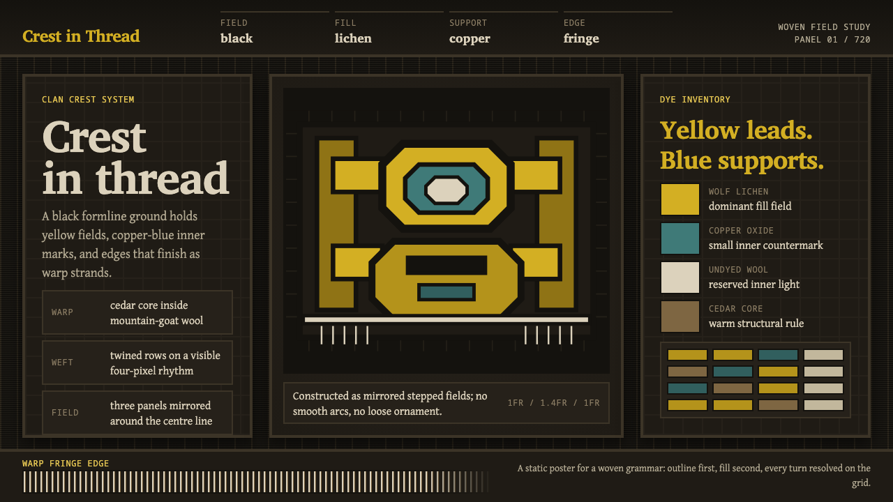 Tlingit Chilkat RobeCrest becomes thread. Black formline, lichen yellow fields, and stepped woven…
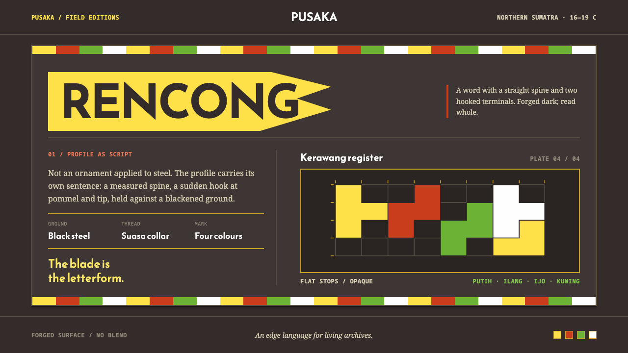 Acehnese Rencong MotifA blade that reads as a word. Flat kerawang red, white, green and yellow lock…