What is LAMY safari?
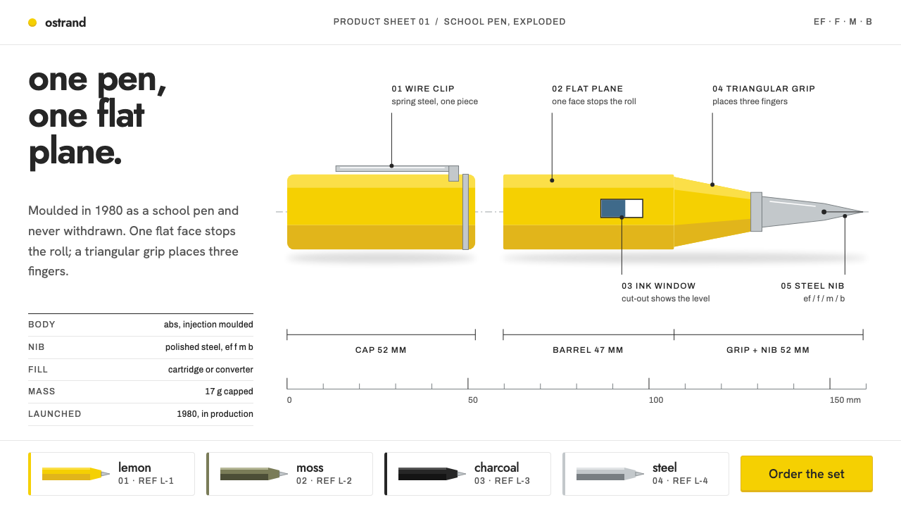
The LAMY safari is a school pen drawn like a parts sheet — one yellow object on pure white, thin leader lines naming each part, and not a single ornamental gesture.
LAMY safari in brief
The LAMY safari style is a design language built from a single injection-moulded object: the fountain pen that Wolfgang Fabian drew for LAMY in 1980 as a school pen priced at DM 18. Its visual identity is the page that a catalogue would give such an object: a clean white sweep, one yellow product placed off-centre, thin leader lines pointing to labelled parts, and small technical annotations in the margin. Almost nothing else is allowed on the page.
The style descends from Bauhaus functionalism, Ulm-school rationalism and the German industrial design associated with the Braun era. These traditions share a conviction that form should follow use, that ornament is a kind of dishonesty, and that a well-made everyday object needs no explanation beyond its own clarity. The safari is a textbook example, and the style borrows that conviction wholesale. It is neither nostalgic nor trendy, because the pen itself has never gone out of production.
Visually, the system is lean. Safari yellow does almost all of the colour work against a white ground, and a charcoal black handles type and fine detail. Layouts behave like product sheets, and colourway grids repeat the same silhouette while only the colour changes. Type is a plain geometric sans, set tight and mostly in lower case. The pen's own features, a flattened side that stops it rolling, a triangular grip and a clip bent from a single wire, are drawn as if they were the design brief, which in a sense they were.

Where does LAMY safari come from?
The pen's story starts in Heidelberg, where the company that makes LAMY pens has been based. C. Josef Lamy is the name behind the company, and he is associated with its turn toward industrial design: the decision to treat a writing instrument as a designed object, to be drawn by designers and judged on use. That decision shaped everything that followed. By the time the safari appeared in 1980, LAMY already had a lineage of rigorously modern pens, and the 2000 model of 1966 had shown that German industrial design could be applied to something as personal as a fountain pen.
The LAMY 2000 lineage is a useful context. Gerd A. Müller, a German industrial designer, is the name associated with the 2000 of 1966, and his approach, a quiet functional object with minimal vocabulary, set a standard for the company. The safari of 1980 was a different problem: not a luxury instrument but a school pen, to be injection-moulded in ABS plastic and sold at a price a pupil could afford. Wolfgang Fabian was the designer who solved it, and the result is the pen the style takes as its subject.
What Fabian drew shows the thinking of the tradition in miniature. The body is moulded in a single material, with no decoration applied. One side is flattened so that the pen does not roll off a desk. The grip is shaped as a triangle, which guides the fingers to a correct position. The clip is a piece of spring-steel wire bent into a loop. Each feature solves a practical problem and doubles as the pen's visual signature. Bernt Spiegel is a name tied to the ergonomic thinking behind LAMY's writing instruments, and the triangular grip reflects a concern with how a hand actually holds a pen.
The intellectual climate was that of German functionalism after the war. Bauhaus supplied the idea of form following function, the design school at Ulm supplied a systematic and rational approach that treated design as a discipline rather than a style, and the industrial design associated with Braun supplied a model for calm, reduced consumer products. The safari belongs in that line. The catalogue visuals that accompany it, current in the period of roughly 2015 to 2024, carry the same reasoning into photography and layout: the pen is isolated on white, annotated like a technical drawing and presented in rows of colours. Because the pen has been in continuous production, the style has never needed to be revived. It has only needed to be maintained.
What defines the LAMY safari look?
The White Sweep
The ground is a pure white, the seamless backdrop of a catalogue photograph translated into a layout. It has no texture, no tint and no gradient, and it plays the role of studio paper: a neutral surface that makes the object look weightless and exact. White is also the style's main structural element, since almost all of the composition is made by what is placed against it and how much of it is left clear.
Safari Yellow
A single saturated lemon yellow does almost all of the colour work. It belongs to the product and to the product alone, and it appears as the pen body, a swatch, an active state or a rule that needs to be noticed. Because only one hue is in play at a time, yellow behaves like a signal: where it appears, the eye goes. It is never mixed into gradients or diluted into pastels.
Charcoal for Type and Detail
Type, leader lines and fine detail are set in a charcoal black, slightly softer than pure black, which gives the page a drawn-from-life precision without harshness. It is the working colour of the technical annotation, standing apart from the yellow, and between the two the page has a clean division of labour: yellow is the object, charcoal is the explanation.
The Off-Centre Object
One product form sits off-centre on the page, usually large, often at an angle, and always with generous clear space around it. The asymmetry is deliberate: it gives the page a direction and leaves room for annotation on the side where the object does not sit. This is the layout logic of a product sheet, in which the object is the subject and the margin is its explanation.
Leader Lines and Part Labels
Thin straight lines run from the object to short labels naming each part: nib, grip, barrel, clip, cartridge. They are the style's signature device, borrowed from parts diagrams and technical drawings. The labels are small and set in the same plain type as everything else, so that they inform without decorating. In an interface the same device turns into annotated screenshots, feature callouts and spec lists.
Colourway Grids
To show a range, the style repeats the same silhouette in a regular grid and changes only the colour. The shape, scale, angle and spacing never vary, which means the eye reads the differences between colours with no distraction. This is a very efficient way to present variants, and it also states a design philosophy: the form is settled, and colour is the only variable allowed.
Lower-Case Geometric Sans
Type is a plain geometric sans, set tight and mostly in lower case. Lower case gives headings and labels a calm, conversational register, closer to a tool's own markings than to a brand's announcement. Small technical annotations, such as nib size and cartridge type, are set quietly and precisely. There are no decorative faces, no italics for effect and no mixing of families.

Who shaped LAMY safari?
Wolfgang Fabian is the designer who drew the safari in 1980. His solution, a pen moulded from one plastic with a flattened side, a triangular grip and a wire clip, turned the brief of a cheap school pen into a lasting design icon. The style named for the pen is, in effect, an attempt to carry his way of reasoning onto the page.
Bernt Spiegel is a name connected with the ergonomic thinking behind LAMY's writing instruments. His association points to a part of the story that is easy to overlook: the pen's shapes were considered in relation to how a hand really holds and moves a pen, and the page design inherits that respect for use.
Gerd A. Müller, a German industrial designer, is associated with the LAMY 2000 of 1966, the model that began the company's modern lineage. His quiet, minimal approach to a writing instrument set the standard that the later safari answered in a different register: not luxury, but the same discipline applied to an inexpensive school pen.
C. Josef Lamy founded the Heidelberg company whose name every pen still carries. The firm later chose to treat pens as designed objects, commissioning outside designers and judging a pen on use rather than ornament. That choice created the conditions in which both the 2000 and the safari could be made, and it explains why the company's visual world feels so consistent.
How do you use LAMY safari today?
The LAMY safari style is at its best when you have one thing to show and want to show it clearly. It suits products, tools, devices and any subject that can be treated as an object with parts. Its principles are easy to state and demanding to apply: isolate the subject, keep the colour to one signal, explain by annotation rather than by decoration, and let the white space do the work of a studio backdrop.
For presentation slides, build each page like a product sheet. A cover can be a white slide with one large yellow shape placed off-centre and the title set small in lower case on the opposite side. Content slides can place a single diagram or screenshot with thin leader lines to short labels, and a restrained column of text beside it. Data slides work as small multiples: the same chart repeated in a grid with only the colour or value changing, which echoes the colourway grid.
For web interfaces, the style suits product pages, hardware and gadget sites, configurators and documentation for devices. Keep the background white, use yellow only for the active state, primary action or highlight, and set everything else in charcoal. Annotated hero images, with leader lines pointing to features, are the characteristic pattern. A variant selector can be a row of identical product silhouettes in different colours. Lower-case headings and labels reinforce the tone, and controls should stay plain, with thin outlines and no shadows.
For editorial and marketing work, the style supports precise, product-led storytelling: spec sheets, launch pages, catalogues and packaging. Photography should be clean and isolated on white, with consistent angles across a range. Copy should be matter-of-fact, saying what a part is and what it does. This is a style that persuades by being exact, and it benefits from showing a real object with a real use rather than a mood board of lifestyle images.
The most common mistake is to read the yellow as an invitation to use it everywhere. When yellow floods headers, buttons, backgrounds and illustrations, it stops being a signal and the page loses its clarity. Another mistake is to add the things the original deliberately omits: drop shadows, gradients, glossy renders, rounded decorative cards or retro effects. The style is not nostalgic, and treating it as vintage misreads it. A third error is to centre the object and symmetrise the page, which removes the asymmetry that gives the layout its direction and its room for annotation.

LAMY safari — FAQ
Is this the same as Bauhaus style?
They are close relatives, not the same thing. The safari style inherits Bauhaus functionalism, the idea that form follows use and that ornament is waste, but it applies it through the lens of postwar German industrial design and product catalogues. It uses one signal colour on white, a plain geometric sans and annotated product imagery, where Bauhaus posters often use several primary colours and bold geometric composition. Think of it as the Bauhaus conviction translated into the language of a parts sheet.
Why is so much of the type in lower case?
Lower case gives the page a plain, conversational voice. Capitals tend to announce, while lower-case labels simply name. The effect is closer to the engraving on a tool than to a brand slogan, which suits a style whose subject is a functional object. It also makes the type look tighter and more uniform, which supports the clean, even texture of the layout. Capitals can still be used where a convention demands them, such as in proper names or acronyms.
Can I use colours other than yellow?
Yes, but one at a time. The colourway grids that define the style show many colours precisely because the same shape is repeated with only the colour changing, and that is a product-range device. In a layout, use a single signal colour on white and keep it consistent across a page. If a product comes in several colours, show them as a row of identical silhouettes. What the style avoids is several hues competing within one composition.
What kinds of products and projects suit it best?
Anything that can be photographed or drawn as a single object with identifiable parts: hardware, stationery, tools, appliances, wearables and physical accessories. It also works for software when a product screenshot is annotated like a parts diagram. It is weaker for abstract services with no visual subject, because the style needs something to place off-centre and label. If there is no object, a diagram or a key interface can stand in for one.
Is it a retro style?
No, and treating it as retro is the quickest way to get it wrong. The pen it is based on has been in continuous production, so the style has no nostalgic gap to fill. It is a living functional language, not a period costume. Using film grain, aged paper or vintage colours would work against it. The right approach is to keep the page crisp, current and exact, as a catalogue for a product that is still being made.
Related design styles
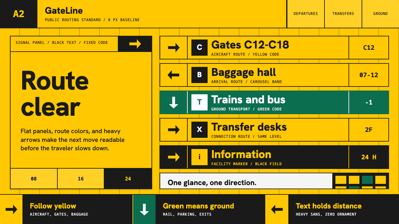 Airport Wayfinding GeometricLegibility becomes command. Signal yellow, black sans, and green route bands…
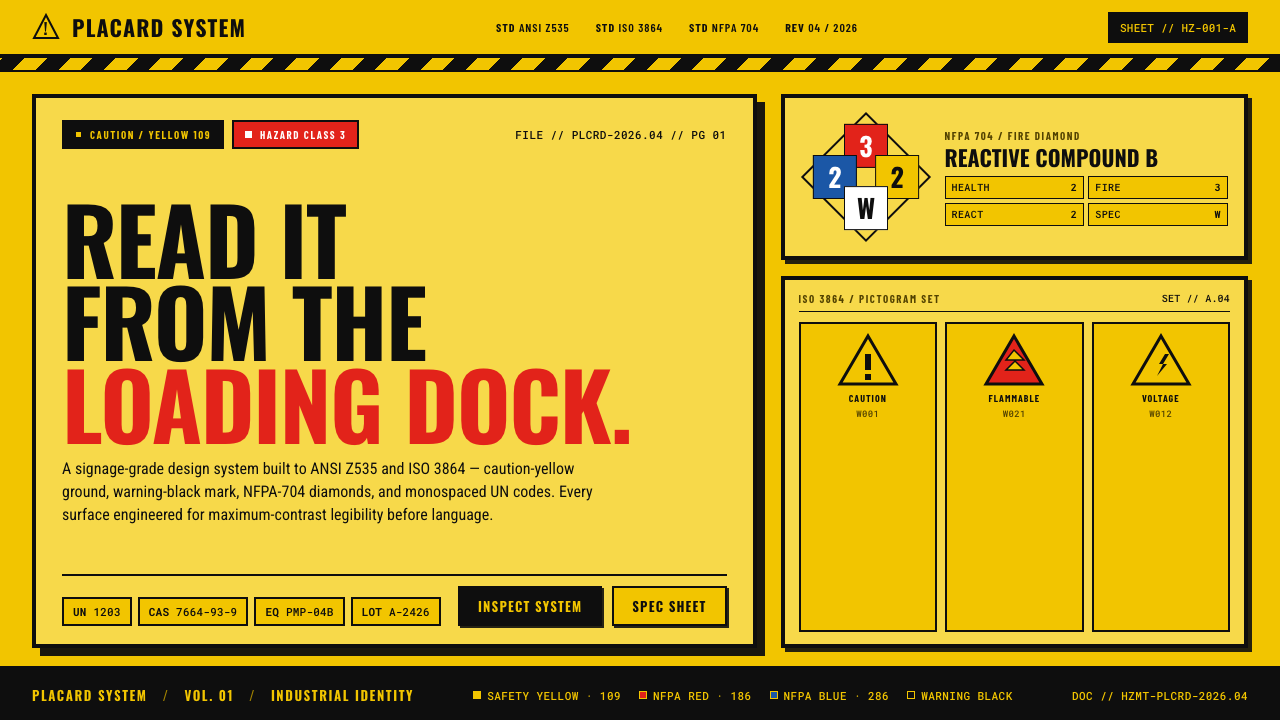 Hazmat SignageRead it from the loading dock. Caution-yellow ground, NFPA diamonds, monospac…
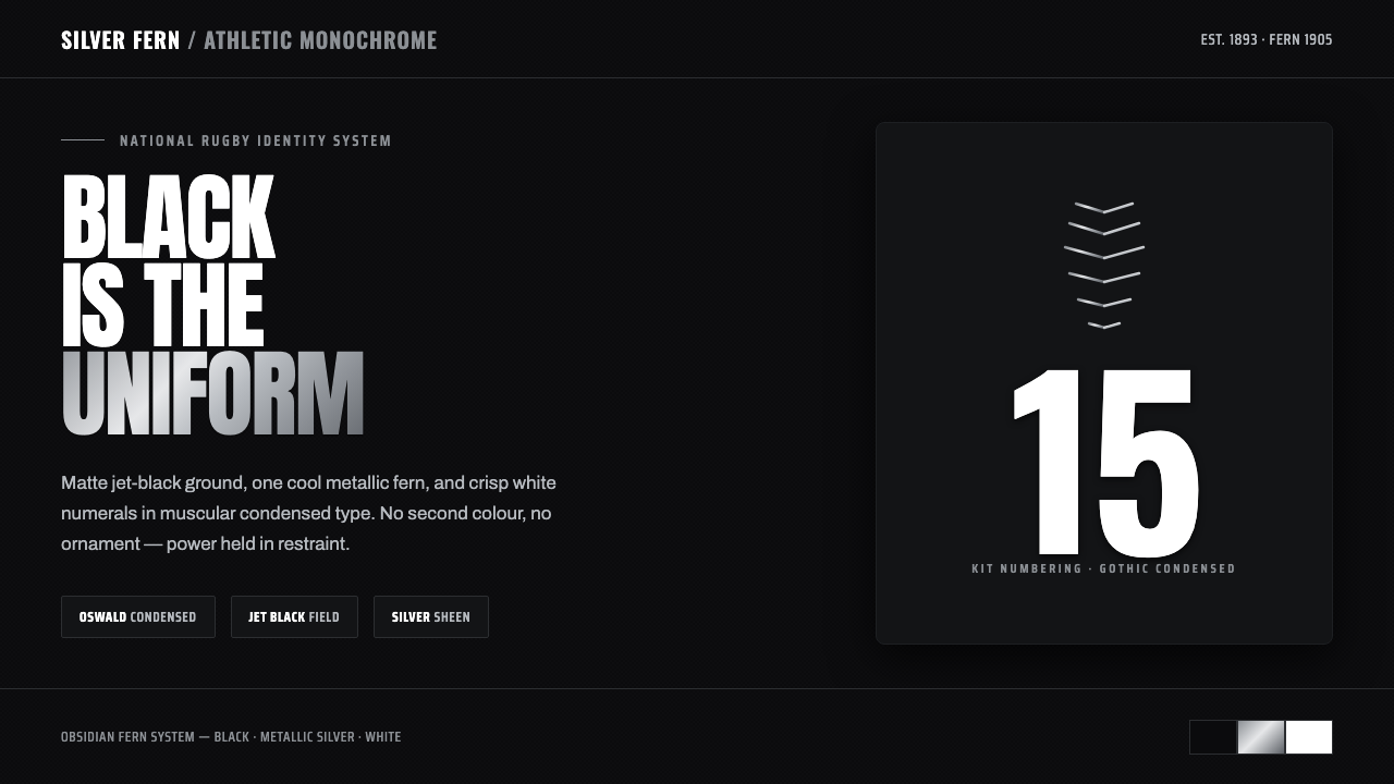 All Blacks Silver FernOne colour, total force. Jet-black field, a single metallic-silver fern, whit…
 Dentsu Tokyo CreativeSilence does the selling. Hinomaru red, sumi type, and empty columns carry th…
 EU Energy LabelRank first, decorate never. Seven stepped arrows, green to red, on white with…
 Lufthansa (Aicher)Systems speak first. Melon yellow, navy disc mark, lowercase Helvetica on a h…