What is Lagos Danfo Slogans?
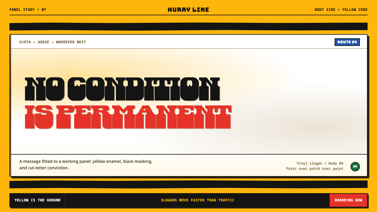
The Lagos danfo is a body panel that talks: legally mandated yellow, two black flank stripes, and a slogan lettered large enough to read from across a junction.
Lagos Danfo Slogans in brief
Lagos Danfo Slogans is a design style taken from the yellow minibuses of Lagos, Nigeria, known as danfo. Its visual language is a flat yellow ground, two black stripes running along the flanks to create horizontal bands, and a large slogan fitted between them in a heavy, slab-serifed Tuscan type. The result is blunt, loud and direct, a style that says one thing at a very large size and does not apologise for it.
What sets the style apart is that every part of it is a fact about the vehicle rather than a taste decision. The yellow is not a choice, because the 2018 Transport Sector Reform Law requires it and the agency LASTMA impounds anything else. Beneath the mandated coat there is cheap enamel over filler and rust, respray laid on respray. Across that body panel run the slogans: No condition is permanent. No King as God. Blood of Jesus. The design system treats the panel itself as its canvas, so the grit of the road is part of the grammar.
The mood is street-level conviction. Short declarative lines carry belief, endurance or defiance, and the lettering is cut or painted by hand rather than set by machine. It is a graphic language about being seen quickly from a moving crowd, which is why scale, contrast and rhythm do almost all of the work. Colour is minimal, decoration is absent, and the type is the entire image.
Where does Lagos Danfo Slogans come from?
The danfo is the yellow minibus of Lagos, and the source record places the tradition between 1990 and 2020 on a vehicle form that emerged in the 1970s. The lettering practice sits inside a wider field of West African vehicle lettering, with its own conventions of boldness and brevity, and it draws on two working crafts named in the record: hand-painted signwriting and vinyl-cut sticker type. In other words, the style belongs to the commercial street rather than to the gallery. The people who made it were doing a job, and the job was to make a bus legible to passengers and rivals alike.
The colour is legislated. The 2018 Transport Sector Reform Law requires the danfo's yellow, and the source says LASTMA impounds anything that does not comply, with the commercial minibus expected to carry a yellow body and black stripes. That fact shapes the whole system. Where most design traditions begin with the designer choosing a palette, the danfo begins with a palette fixed in advance, so that individuality has to be expressed through the only variable left: what the vehicle says and how the words are lettered.
The surface is an accumulated one. Underneath the mandated coat sits cheap enamel over filler and rust, respray on respray, and the slogans run across that body. The evidence of repair is not hidden; it is the ground. This explains why the style never looks pristine, and why a perfectly smooth, glossy yellow would be a misreading. The panel is a record of the bus's working life, and the slogan is written over that record in the same way a person might speak over a noisy road.
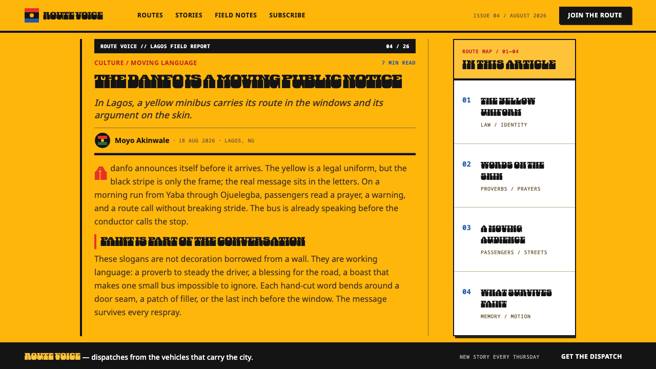
The typeface that gives the style its voice was released in 2022. Afrotype's Danfo is a Tuscan slab that Seyi Olusanya reverse-engineered together with Abu, a letterer working at Ojota station, from the hand-cut vinyl on these buses. That detail is the heart of the design system's authenticity: the letterforms were not invented in a studio and then applied to a bus. They were read off the bus, from lettering that craftspeople had already been cutting for years, and then drawn up as a typeface that others could use.
What defines the Lagos Danfo Slogans look?
Mandated Yellow
The ground is a strong, flat, legally required yellow. It is not a mood or a brand colour; it is the vehicle's identity under the law, which makes it a constraint rather than an option. Large areas are filled with it, and it gives the whole style its immediate recognisability. Because the palette is fixed in advance, the interest of a composition comes from contrast with this yellow, from what is placed on it and how forcefully.
Black Flank Stripes
Two black stripes run along the flanks and set the horizontal band structure of the whole layout. They are hand-masked, so their edges carry the slight irregularity of a brush and tape rather than the ruled perfection of a digital line. The stripes divide the panel into upper, middle and lower bands, and they establish where the message may sit. In a layout, they act as both frame and rail.
Slogan as the Image
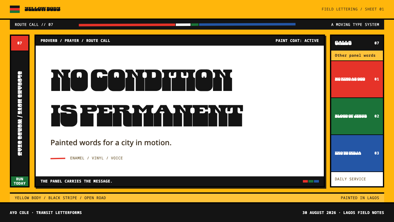
The slogan is not a caption added to a picture. It is the picture. Lines such as No condition is permanent, No King as God and Blood of Jesus are set large and fitted between the stripes, so they read in a glance from a moving distance. The voice is short, declarative and certain: statements of faith, endurance or defiance, with no hedging and almost no punctuation beyond what the words need.
Danfo Tuscan Slab
The lettering is a Tuscan slab, a heavy serif whose terminals flare or split in the manner associated with Tuscan faces. Afrotype's Danfo, released in 2022, was reverse-engineered from the hand-cut vinyl on the buses, so its forms carry the logic of a cutting knife: straight edges, blunt corners and shapes that can be cut from a sheet in one pass. The letters feel thick, confident and slightly irregular, and they are set tight.
Type Follows the Panel
Lettering respects the body it is written on. Where the sheet metal breaks, the line breaks too, so a slogan may split across a joint, a door edge or a change of plane instead of ignoring it. This makes the text feel applied to a real object rather than floating above it. In layout terms, structural breaks in the page should decide where lines end, and a long message is cut to fit its container, not shrunk until it disappears.
Road-Grit Surface
Beneath the yellow sits cheap enamel over filler and rust, respray on respray, and the style keeps some of that history visible. Surfaces are matte-to-slightly-worn rather than glossy, with faint unevenness between coats. The aim is not to simulate dirt with a texture overlay but to resist the over-clean finish of a polished interface. A page in this style should look like something that has been out on the road, repaired and put back to work.
Who shaped Lagos Danfo Slogans?
Named in the source record as a key figure. Olusanya worked with Abu to reverse-engineer the Danfo typeface from the lettering on the buses, a process that turned street craft into a usable font. The significance for design is the direction of travel: instead of designing a face and then applying it to Lagos, the work started from the vinyl already cut for Lagos buses and drew a typeface out of it, preserving the logic of the hand and the knife.
Abu is the letterer at Ojota station who worked with Olusanya on the typeface. As a working cutter of vinyl lettering, he represents the craft on which the entire style rests: the person who decides how a line breaks across a panel, how a corner is cut and how large a slogan can be made to sit between two stripes. The typeface exists because his trade had already developed a consistent hand.
The publisher of the Danfo typeface, released in 2022. Its role in the record is to give the letterforms a stable, reusable form, so that a style once visible only on moving buses can be set in documents, slides and screens. For designers, Afrotype's release is the practical hinge between the street and the interface, and it explains why the style can be applied to digital layouts without redrawing the lettering.
The anonymous craftspeople behind the movements named in the record: West African vehicle lettering, hand-painted signwriting and vinyl-cut sticker type. They mask the stripes, paint or cut the slogans and keep the buses speaking. The style is theirs. Any designer using it is borrowing a working vocabulary from a trade whose standards of legibility, speed and conviction were set on actual vehicles in actual traffic.
How do you use Lagos Danfo Slogans today?
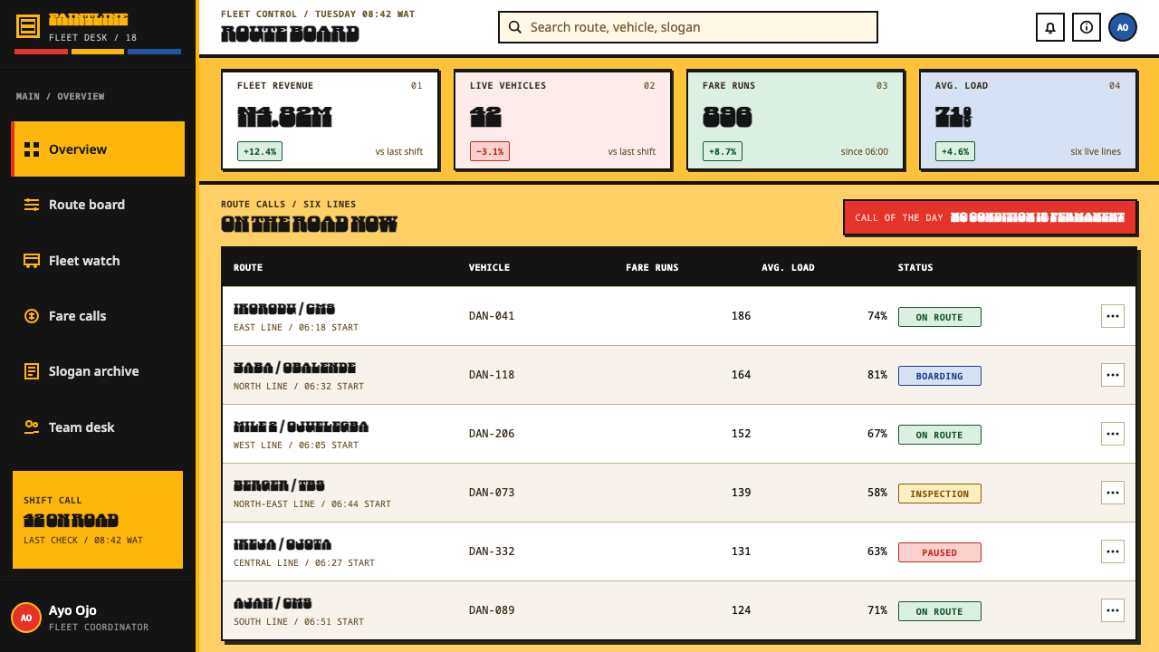
Lagos Danfo Slogans is a style for messages that must be read quickly and believed. It transfers best wherever the content is a short, strong statement rather than a long explanation. Because the colour is fixed and the structure is bands, the work of the designer is mostly editorial: choose the line, choose the scale, and let the panel carry it. Applying it well means keeping the yellow flat, the stripes bold and the lettering large.
For presentation slides, a cover can be a flat yellow field with two black bands and the title set large between them in the heavy Tuscan slab. Content slides should carry one statement each, fitted between the bands, with supporting text kept small and set below or above the stripes. Data slides work when the number is treated as a slogan: one large figure between two bands, with a short line of explanation underneath, in place of a crowded chart.
For web interfaces, the style suits campaign pages, event sites, community platforms and landing pages where a single strong message leads. A hero section can be a full-width yellow band with the headline fitted between two black rules. Dashboards are a harder fit, but a status banner or key metric may borrow the band structure. On a pricing page, plan names can be set as slogan-weight headings on horizontal bands, with the recommended plan taking the widest black stripe and the other plans staying quieter.
For editorial and marketing work, the style is made for pull quotes, posters, social cards and campaign hero images. A pull quote becomes a slogan set across two bands; a section break becomes a black stripe; a headline can break wherever the layout's structure breaks. It pairs naturally with music, street fashion, transport, food and city culture, and with any brand whose voice is plain, urgent and local. Write lines as a signwriter would: short, declarative, and not afraid of a full stop.
The most common mistake is to clean it up. A glossy gradient yellow, a thin geometric sans in place of the Tuscan slab, small timid slogans or perfect ruled stripes all remove the road from the style. A second mistake is to treat the slogans as content to be borrowed: lines such as Blood of Jesus carry real religious meaning, so use them only as examples of voice and write your own lines for your own project. A third is to add decoration, because the design only works when the type and the bands do all of the work.
Lagos Danfo Slogans — FAQ
What is a danfo, and why is it yellow?
A danfo is the yellow minibus of Lagos, Nigeria. The yellow is not a stylistic choice: the 2018 Transport Sector Reform Law requires it, with black stripes, and LASTMA impounds vehicles that do not comply. The design style takes that mandated body panel as its ground, so the colour is a legal fact of the vehicle rather than a palette decision made by a designer.
What typeface does the style use, and where does it come from?
The type is Afrotype's Danfo, released in 2022. It is a Tuscan slab that Seyi Olusanya reverse-engineered together with Abu, a letterer at Ojota station, from the hand-cut vinyl lettering on these buses. Because it was drawn from real vehicle lettering rather than invented in a studio, its forms keep the logic of the cutting knife: blunt corners, heavy strokes and shapes made to fit a panel.
Why are the black stripes hand-masked rather than perfectly crisp?
Because on the buses they are. The stripes are applied by hand over a body that already carries enamel, filler and years of respray, so their edges show the slight irregularity of tape and brush. Reproducing that quality in a layout keeps the style tied to its object. Perfectly ruled digital lines would make the page look like an imitation of a bus instead of a descendant of one.
Can I use the actual danfo slogans in my own design?
It is better to use them as models of voice and write your own lines. Slogans such as No condition is permanent, No King as God and Blood of Jesus are statements of belief written by and for the people who ride the buses, and some carry direct religious meaning. The transferable lesson is the voice: short, declarative, certain, and sized so that it can be read from a distance.
Where does the style fit, and where does it struggle?
It fits campaigns, events, posters, community and culture platforms and any product where one strong line leads. It struggles with dense information, long reading and delicate or luxury positioning, because the style relies on scale, blunt contrast and a fixed yellow ground. Use it when the message has to be read in a glance and the tone is direct.
Related design styles
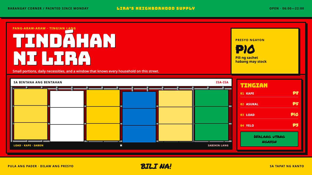 Sari-Sari Store FrontCommerce painted at street volume. Sponsor red, sachet yellow, hard outlines,…
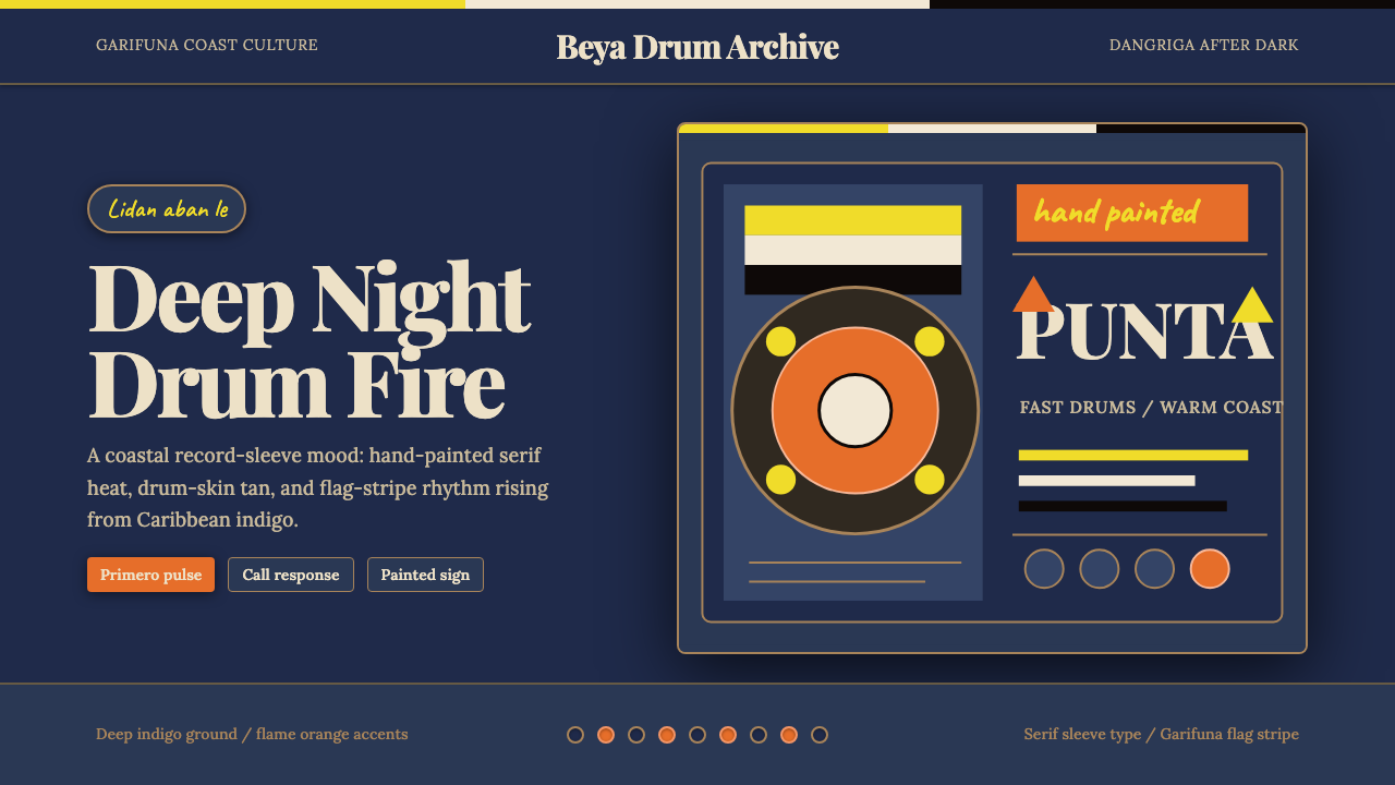 Belizean Garifuna PuntaNight rhythm burns. Indigo fields, flame-orange serif type, and flag stripes…
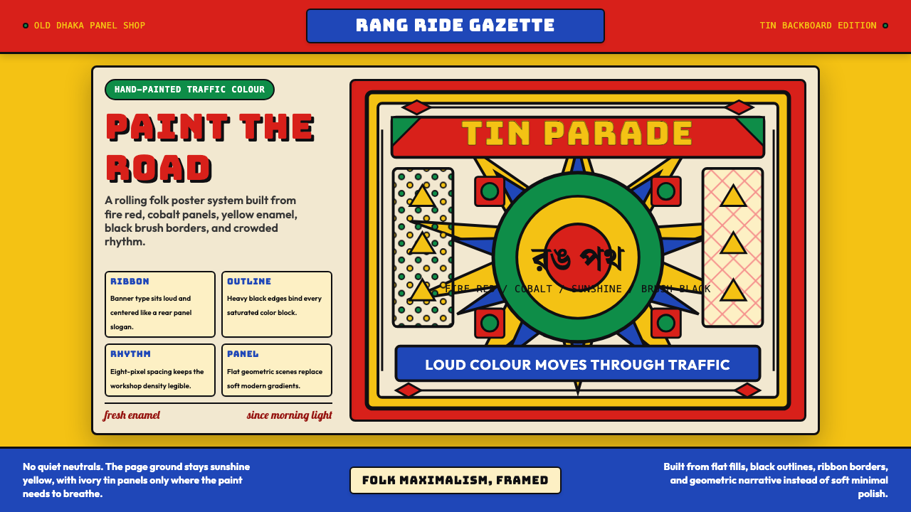 Bangladeshi Rickshaw Painting (Dhaka)Traffic shouts in color. Fire red, cobalt blue, and yellow panels lock into b…
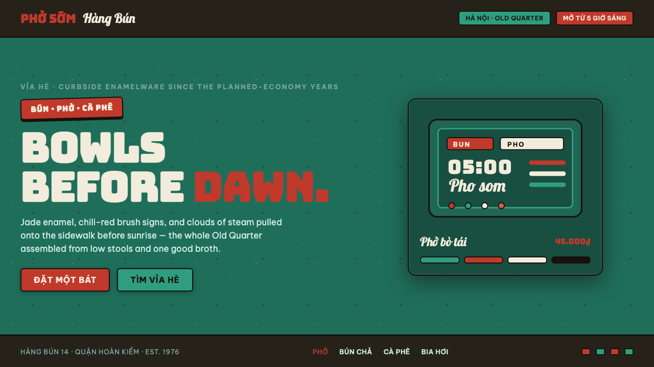 Phở Street-Stall EnamelHanoi's curbside noodle stall, systematized. Jade enamel ground, chili-red br…
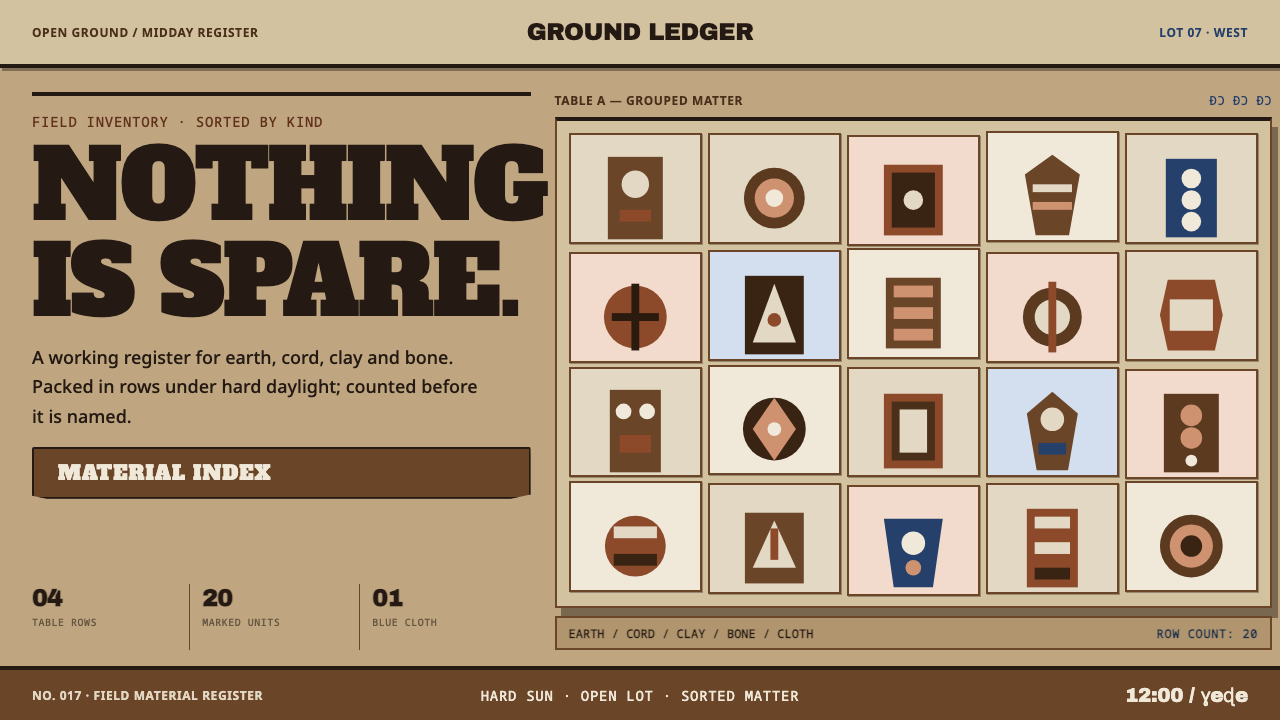 Vodun Fetish MarketDensity is the discipline. Sandy ground, crust-brown tables and hard inventor…
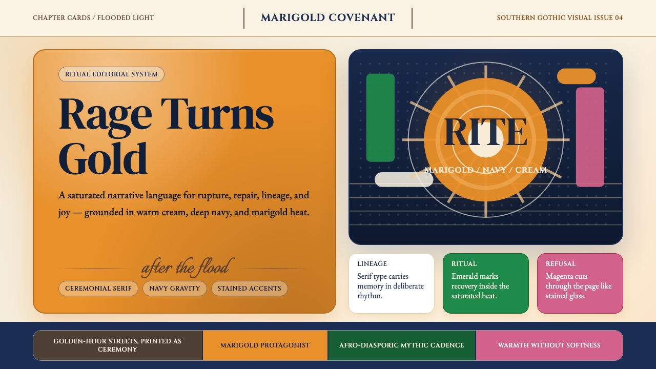 Beyoncé — LemonadeMythic heat refuses restraint. Marigold blocks, navy gravity, serif ceremony.