What is Sari-Sari Store Front?
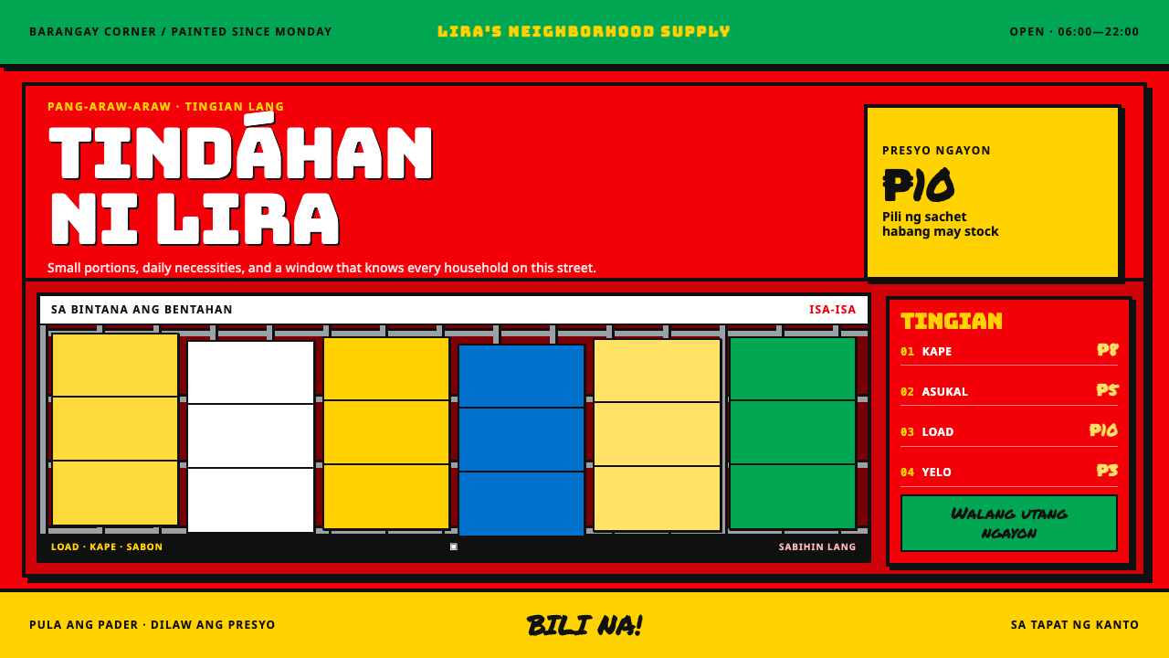
Sari-Sari Store Front is commerce painted at street volume: sponsor red, sachet yellow, hard black outlines and a hierarchy of signs that collides instead of aligning.
Sari-Sari Store Front in brief
Sari-Sari Store Front is a design language taken from the painted fronts of Philippine neighbourhood shops. Nearly every barangay has a sari-sari store, usually opening onto the street from the front of the owner's house, and its front is a privilege sign: a shop sign paid for in advertising space. The manufacturer paints the front, the shopkeeper keeps the sign. In the Philippines, the sari-sari store is where that practice still lives.
Visually, the style is red enamel over plywood and hollow block, with the shop name lettered into the panel by hand and older sponsor coats ghosting through at the edges. The system takes that panel literally. A saturated brand red is the ground, a bright sachet yellow is the working colour, hard black outlines surround everything, and the signs are not aligned but stacked, overlapped and pressed against each other. Beneath all of it is a barred window hung with strips of single-serve sachets, where the actual selling happens.
The result is loud on purpose. It treats density, overlap and repeated repainting as virtues, and it is built to be read in a second from across a road. It is a dark-leaning system: the deep red ground and black outlines sit at the dark end, and yellow does the lighting. The collision is organised, though. There is always a shop name, a price and a product, and the discipline of the style lies in deciding which of them wins.
Where does Sari-Sari Store Front come from?
The record places the style in the Philippines, in every barangay, between 1990 and 2020, on a signage practice much older than that period. The practice is the privilege sign. A manufacturer, such as a soft-drink company, telecom network, soap maker or cigarette brand, pays for the shop's front to be painted in its own colours. The shopkeeper gets a free sign, and the brand gets a wall. When the next sponsor arrives, the front is painted again, and the previous colours are left showing at the edges.
That repainting is why the surface looks layered. A sari-sari front is a record of who has paid for the wall and in what order, a kind of palimpsest in enamel. The record lists privilege signage and painted brand advertising as one of the movements behind the style, and it lists Filipino hand-lettered commercial signwriting as another. The brand colour comes from the sponsor, but the shop name is lettered by hand by a sign painter into the panel, which is where the human character of the front comes from.
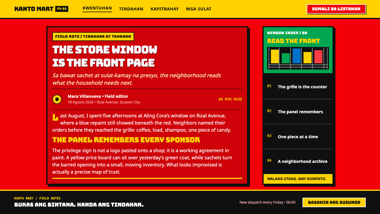
The transaction happens at the window. Sweets are kept in recycled glass jars, tinned goods and cigarettes are set in front, and oil and sugar are sold by the portion from behind. The barred window is hung with strips of single-serve sachets of shampoo and coffee, and a handwritten price board is nailed up beside it. The record names sachet economy retail as the third movement: a way of selling small, single-use packs so that customers can buy exactly what they need today. The design system takes its grid, its hanging strips and its price-board attitude from this.
The people named in the record are as important as the paint. Coca-Cola Philippines and its 5by20 programme appear alongside barangay sari-sari storekeepers and Filipino brand sign painters, which acknowledges that the style lives at the meeting point of corporate branding and neighbourhood trade. A designer should keep that tension in view: the red is a sponsor's red, but the store, the lettering and the daily trade belong to the keeper and the painter.
What defines the Sari-Sari Store Front look?
Sponsor Red Ground
The ground is a saturated brand red, like enamel brushed over plywood and hollow block: flat, hard-wearing and a little glossy. It covers the page edge to edge. Because it is a sponsor's colour, it is not a mood, and it is never softened into a gradient or tinted with transparency. It makes everything placed on it work for its place.
Sachet Yellow
The working colour is a bright, packaging-bright yellow, the colour of the single-serve sachets hung in the window. It carries names, prices, buttons and any information that must be read. Yellow panels are where long or important text lives, usually in black, because yellow on red alone is a shout, not a paragraph.
Hard Black Outlines
Letters, panels and shapes are surrounded by heavy black outlines that hold colour in place and separate yellow from red. The outline is flat, even and unapologetic, with no softening, no glow and no gradient. It echoes the signwriter's habit of fixing a letter by outlining it, and it is what keeps a crowded sign readable.
Collision Hierarchy
Signs are not neatly aligned. The shop name, the sponsor mark, the price board and the product claims overlap, crowd and partly cover one another, as they would on a real front. The hierarchy is made by who is on top, who is bigger and who is bolder, not by tidy spacing. Collision is allowed, but one thing must always win.
Barred Grid
The window bars give the system its only true grid: a repeated frame of verticals and horizontals through which goods are seen and sold. Layouts use barred panels, tiled cells and repeated slots for products, with strips hanging from the top. The grid is a physical thing, thick and dark, not an invisible alignment guide.
Hand-Lettered Names
The shop name is lettered by hand into the panel, so it is large, bold and slightly irregular, with the confidence of a brush. Display type should feel painted: heavy, filled flat, outlined, and never refined into a polished corporate wordmark. Small human variations in the letters are part of the identity and should not be corrected away.
Ghosted Coats
Older sponsor coats show at the edges as faint ghosts of earlier colours, because every repaint is partial. This layering is part of the character. A strip of a previous red, a hint of another sponsor's colour at a corner, or a shifted panel edge can suggest it. Used lightly, it gives the surface history; used heavily, it becomes noise.
Who shaped Sari-Sari Store Front?
The company named in the record whose colours and sponsorship are part of the story of the sari-sari front. Its presence marks how a manufacturer's red became the most familiar ground on the street. For a design system, the lesson is about the privilege-sign model itself, in which a brand pays for a wall and the shopkeeper keeps the sign. It is not a licence to use any company's marks.
A Coca-Cola programme named in the record. Its inclusion ties the style to the way a major brand has worked with small neighbourhood retailers, and to the long-standing relationship between sponsors and storefronts. The record gives no further detail, and a design system should avoid over-reading it; the point is that this style exists inside a commercial relationship as well as a visual one.
The shopkeepers who run the stores and keep the signs. They sell through the barred window, price by the portion, and maintain the counter, the jars and the sachet strips. They are the real authors of the layout, which is why the style is organised around the window and the counter, not around a brand guide.
The signwriters who letter the shop name into the panel by hand and apply the sponsor's colours. Their craft lies behind the hard outlines, the heavy flat letters and the layered coats of paint. When this system asks for hand-lettered display type, it is asking for the work of these painters, and it should credit that craft wherever it can.
How do you use Sari-Sari Store Front today?
Sari-Sari Store Front is the loudest system in a designer's toolkit, and it is only as good as its discipline. The collision is a composition, not a mess. Before you start, decide the one thing that must win on each page, whether a name, a price or an offer, and let everything else crowd around it.
On cover slides, use a full red ground with a hand-lettered title in yellow, heavily outlined in black, and one or two overlapped panels behind it as if stacked on a shopfront. Content slides can treat each block as a painted panel on a yellow plate, with black text that can actually be read. Data slides suit sachet strips: rows of equal narrow bars hung from a top edge like packets in the window, with each bar a single unit and the numbers written by hand on a price board beside them.
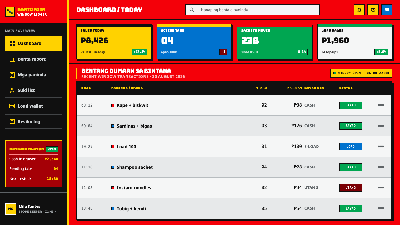
In product interfaces, build dashboards as barred grids of outlined tiles with big, direct numbers and price-tag style labels. Keep readable text on yellow panels in black and use red as the surrounding ground. Pricing pages are the natural home of this system: a handwritten price board with small, medium and large sachet-sized options, or pay-per-use plans, each in its own outlined slot. Buttons are yellow, outlined in black and plainly labelled; hover changes the fill, never adds a soft shadow.
In editorial and marketing work, the style suits street food, local retail, neighbourhood services, event posters, limited-time promotions, delivery and small-merchant products. It works best on social cards and posters that need to be read at a glance. Use hand-lettered headlines, heavy outlines and a hanging strip of repeating items as a recurring device, and credit the sari-sari tradition and its sign painters where you can. Keep the copy short, as a sign would.
The most common mistake is making everything shout equally. A collision with no winner is just noise, and the style needs one clear name or price to read first. A second mistake is softening the outlines into drop shadows or glows, which turns painted signs into digital stickers. A third is placing long text directly on red; reading text belongs on yellow plates in black. Finally, do not use real brand logos or sponsor marks, and do not use the style for quiet, premium or clinical contexts, where its volume will feel wrong.
Sari-Sari Store Front — FAQ
What is a sari-sari store, and what is a privilege sign?
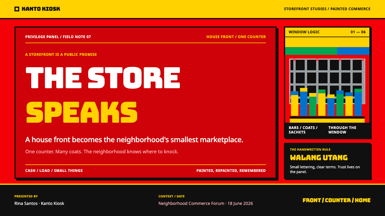
A sari-sari store is a small neighbourhood shop found in nearly every Philippine barangay, usually built into the front of the owner's house and selling goods through a barred window. A privilege sign is a shop sign paid for in advertising space: a manufacturer paints the shop's front in its colours, and the shopkeeper keeps the sign. The two come together in the sari-sari front, where red enamel over plywood and hollow block carries the shop name, hand-lettered, and the ghosts of older sponsor coats.
Why red and yellow, and why black outlines?
Red is the sponsor's colour, painted as the ground of the front; yellow is the colour of the sachets and the working colour for names and prices. Black outlines are the signwriter's way of fixing letters and separating the two loud colours, so that a crowded sign stays readable at a distance. Together they make a high-attention system, and the outlines are what keep it from dissolving into a red and yellow blur.
Isn't a collision hierarchy bad design? How do I keep it readable?
Collision is fine as long as one thing wins. Choose a single element per page, the name, the price or the offer, and make it the biggest, boldest and topmost item. Put reading text on plain yellow plates in black, not on red. Keep outlines consistent so overlapping pieces separate cleanly. The style looks chaotic but is actually organised: every overlap is chosen, and every stack has a top.
Can I use real brand logos or is this about Coca-Cola?
No. The record names Coca-Cola Philippines and its 5by20 programme as part of the context, but the style is the visual language of the sari-sari front, not any company's identity. Use a generic sponsor red and your own marks. Never reproduce another company's logo, trademark or distinctive lettering, and do not imply an association with a brand that has not agreed to one.
Where does this style work best, and where does it struggle?
It works best where speed, price and local energy matter: promotions, event and street-food graphics, small-merchant products, pay-per-use pricing, and anything that benefits from a market-stall feel. It struggles in quiet, premium, medical or financial settings that need calm and trust, and in dense reading experiences, where its volume and outlines become tiring. Use it where being noticed matters more than being subtle.
Related design styles
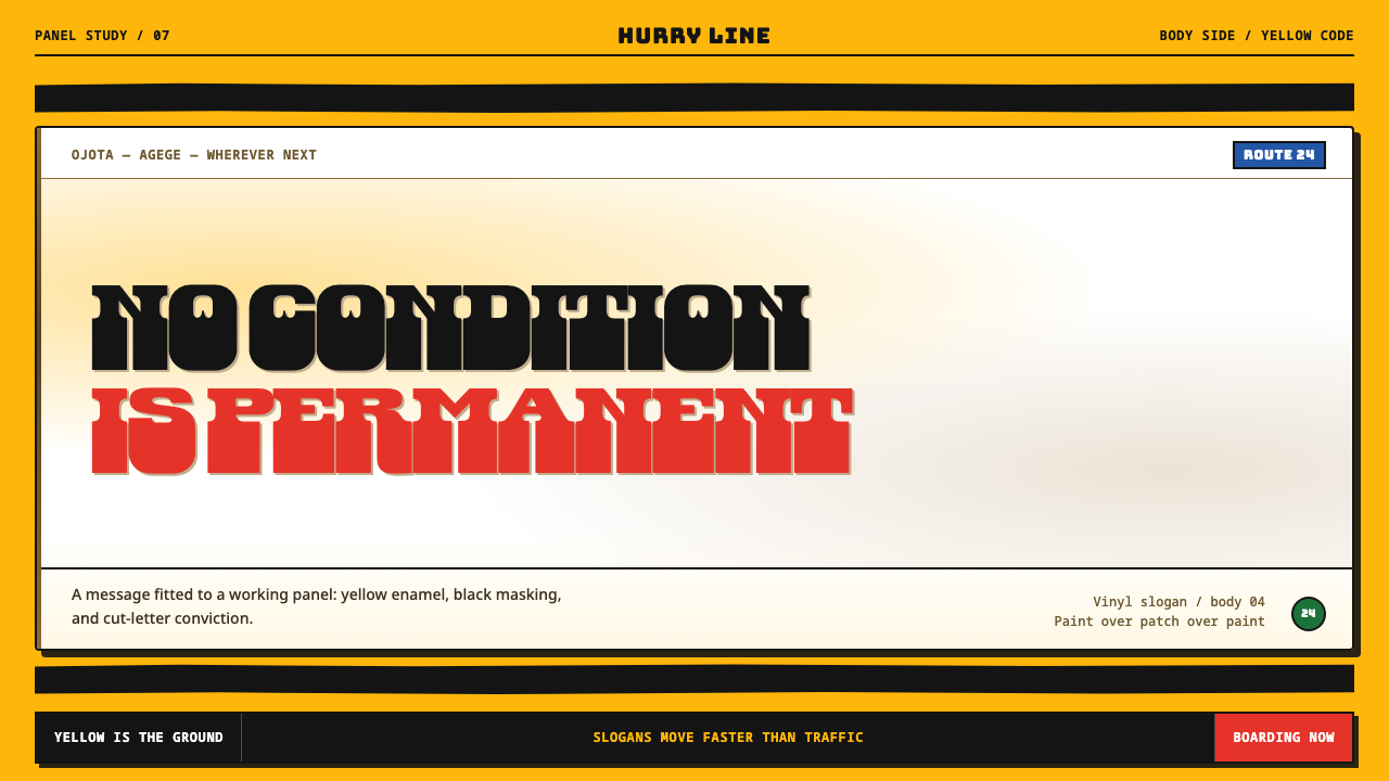 Lagos Danfo SlogansA slogan with road grit. Danfo slabs cut through mandated yellow and hand-mas…
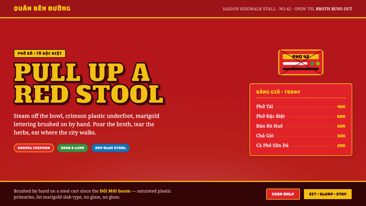 Vietnamese Pho Street CartEat where the city walks. Crimson enamel ground, fat marigold slab signage, b…
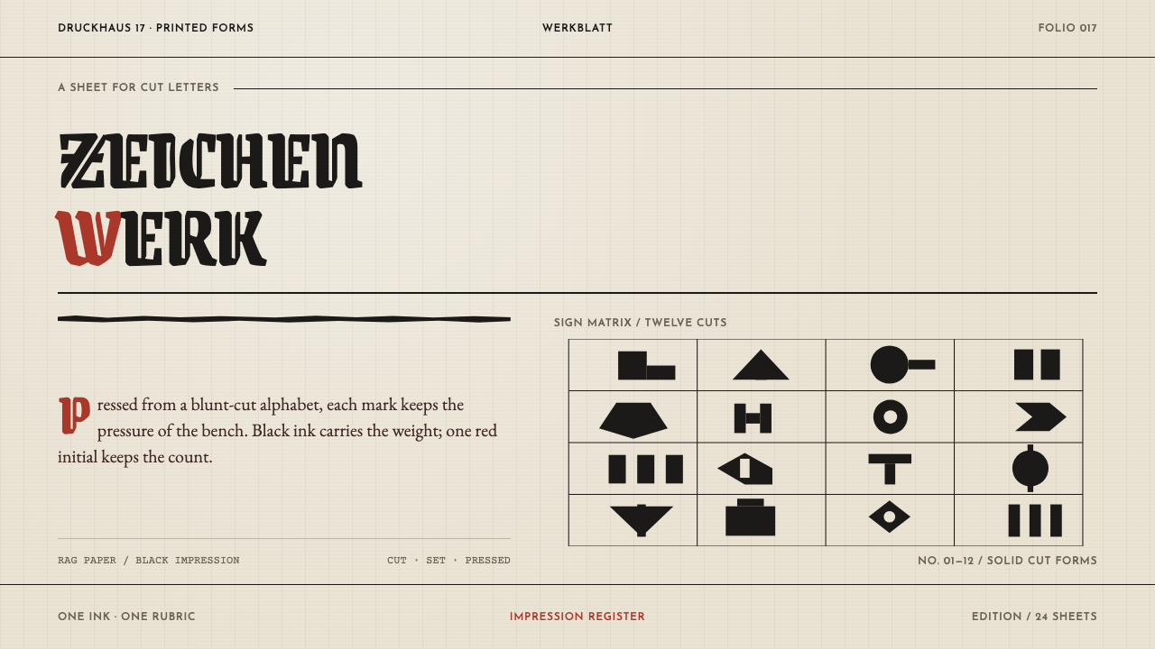 Rudolf Koch LetteringLetters take the whole sheet. Blackletter cuts and one vermilion mark bite in…
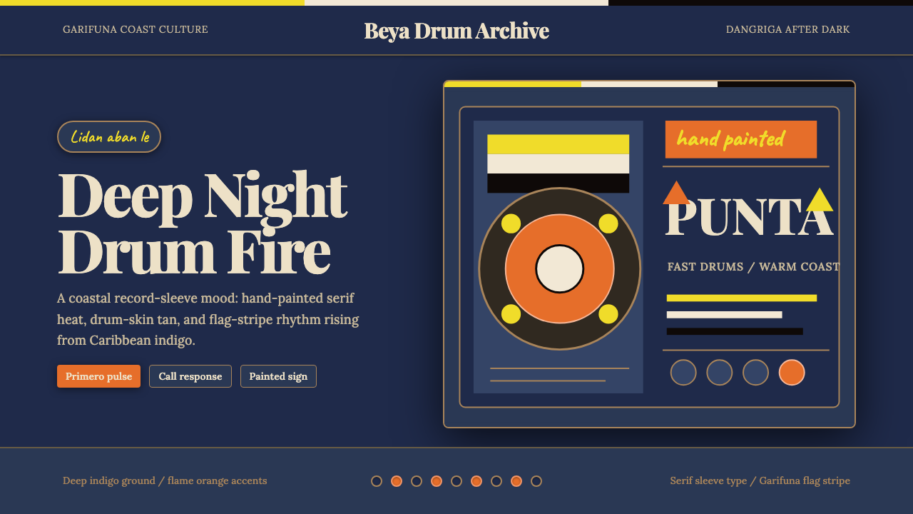 Belizean Garifuna PuntaNight rhythm burns. Indigo fields, flame-orange serif type, and flag stripes…
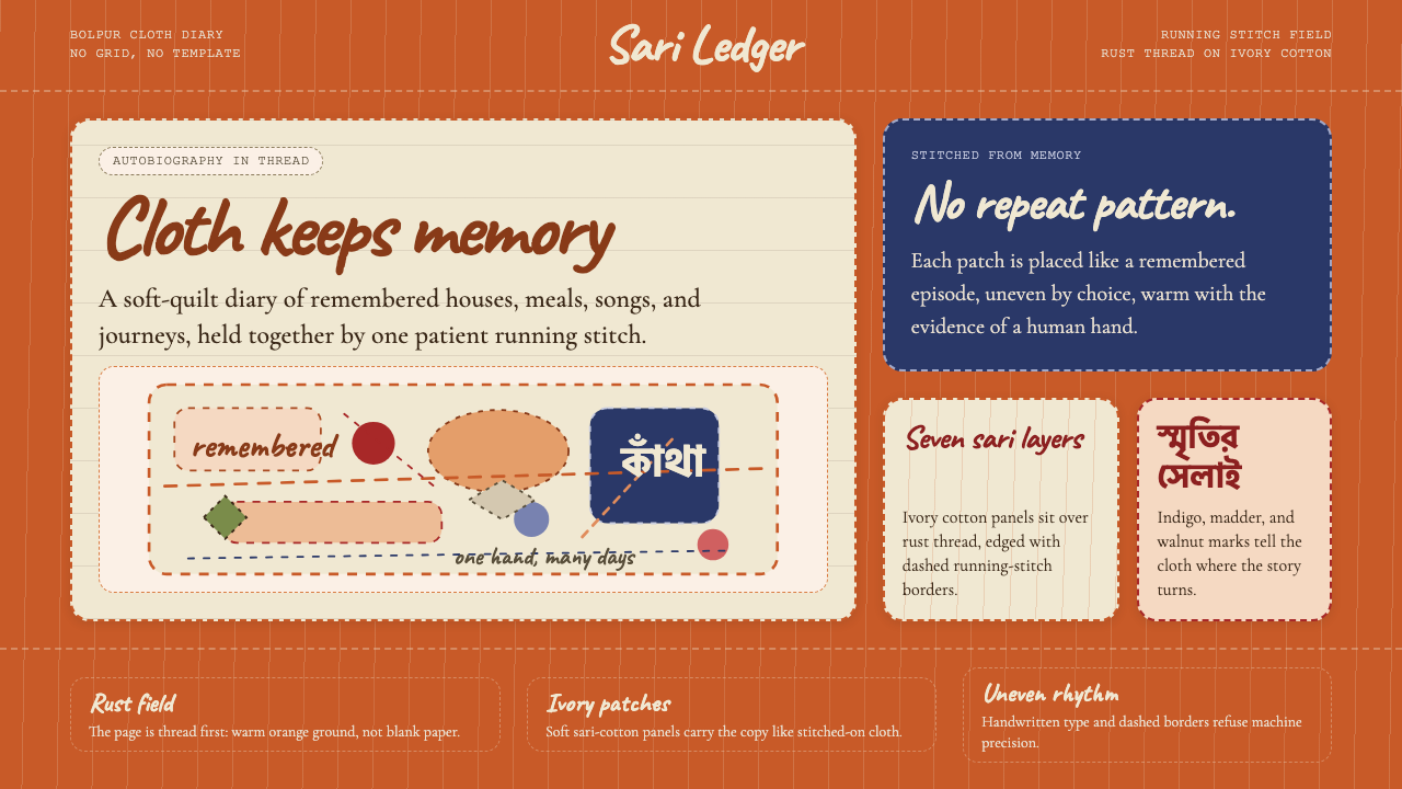 Bengali Kantha Running StitchAutobiography in thread. Rust stitch fields and Caveat lettering float on ivo…
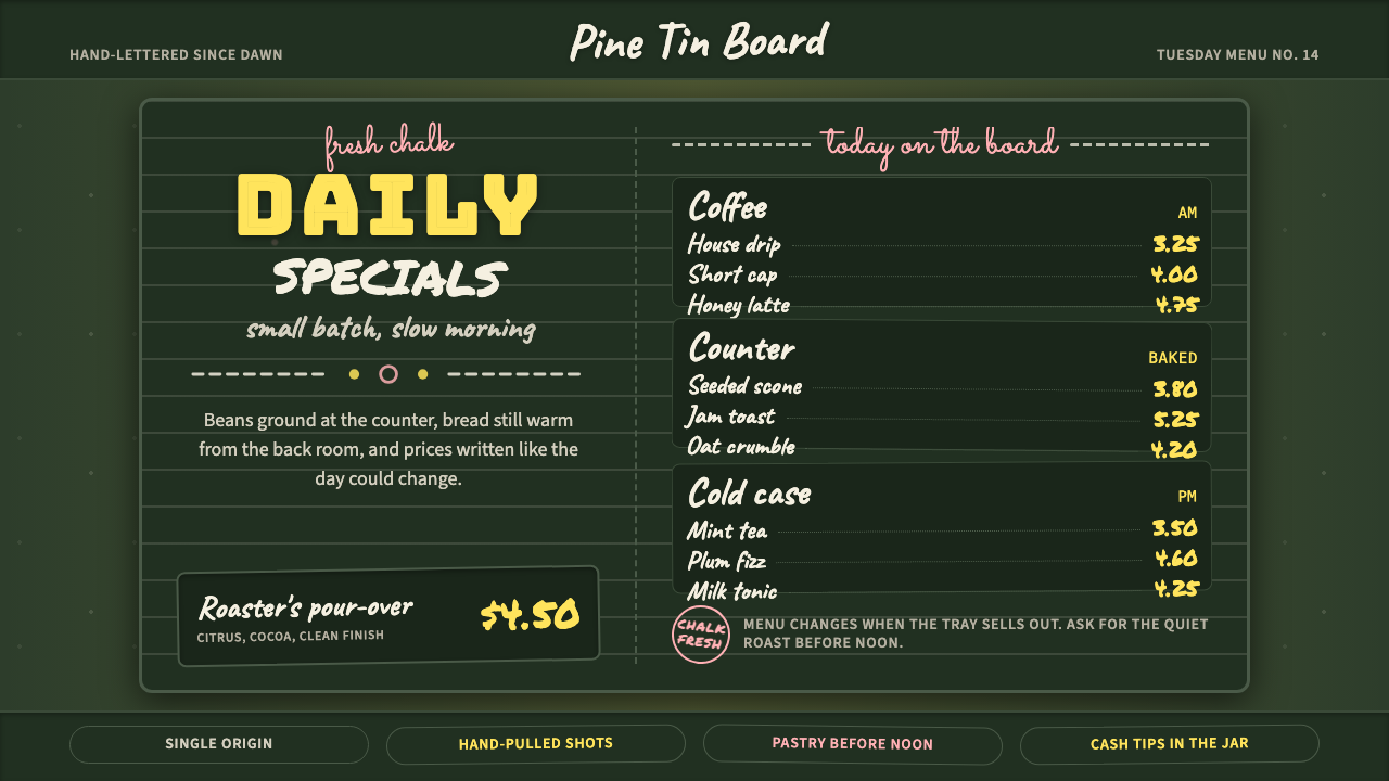 Chalkboard Cafe Menu (2010)Warm craft, handwritten. Chalk-white stacks on green slate with yellow prices…