What is Vodun Fetish Market?
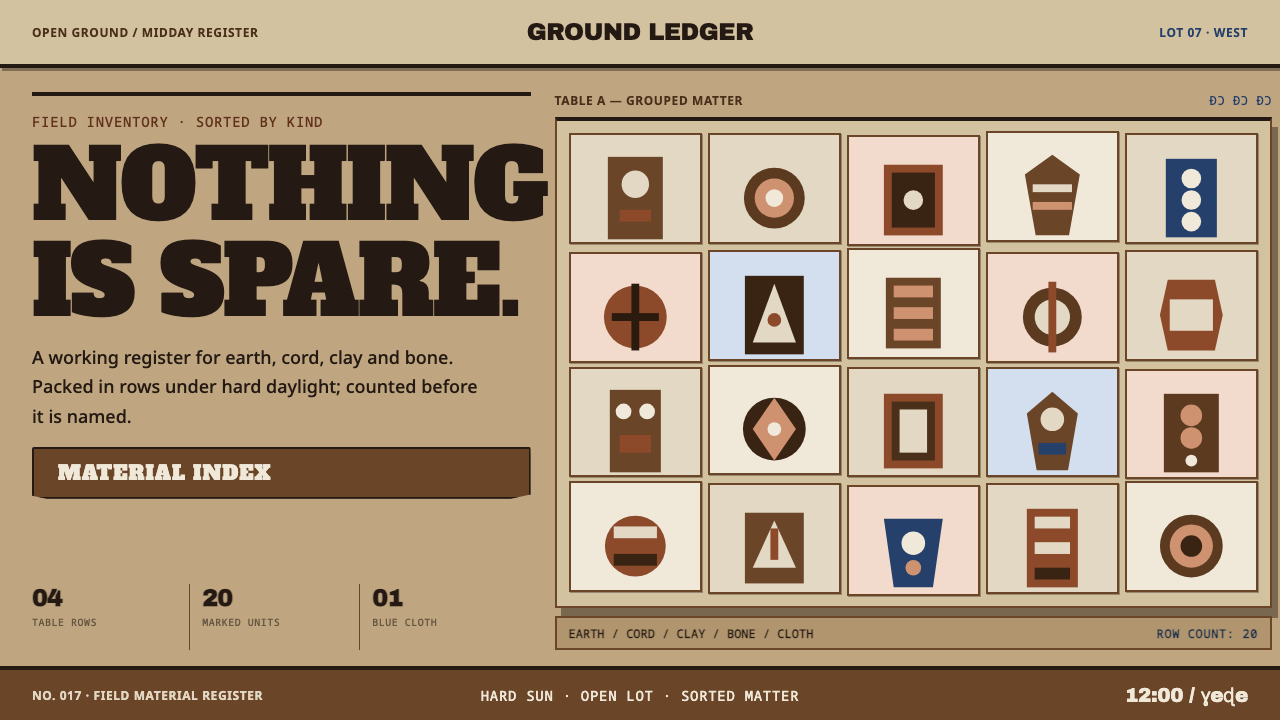
Vodun market design is an inventory: sandy ground, encrusted brown surfaces and bone laid out in hard rows, held together by density instead of mystery.
Vodun Fetish Market in brief
The Vodun fetish market style takes its rules from one place: Akodessawa, an open dirt lot in Lomé, Togo, roughly half a football field wide. Narrow alleys run between low wooden tables stacked with skulls, bound bundles, clay figures and cord. The market supplies the raw material of Vodun practice across Togo, Benin and Ghana.
The design translates the lot into a palette and a grammar: mid-tone sandy ground at real chroma, encrusted brown surfaces, bone-coloured objects laid out in hard rows, and the fat hand-painted lettering of West African market signs. The light is the hard light of midday, so shadows have crisp edges. Nothing is staged as mystery. It is outdoors, in daylight, and densely packed.
That last point is the key to using the style well. The density is not an atmosphere; it is an inventory. Everything has a place in a row or a category, the rows sit close together, and there is no breathing room because a working market does not have any. The discipline is the order inside the crowding.
Where does Vodun Fetish Market come from?
Akodessawa is in Lomé, the capital of Togo, and the library places the tradition among the Fon of Benin, the Ewe of Togo and the Ada of Ghana and Togo, in West Africa. The lot is open dirt, laid out with low wooden tables set along narrow alleys. Everything on the tables is sorted by kind: bones, bound cloth bundles, clay figures, rope and feathers, each category grouped so that a buyer can find it.
What sits on those tables is the raw material for a religion. Vodun is practised across Togo, Benin and Ghana, and the market supplies the ingredients its practitioners need. Among the objects are bocio, assemblages built from wood, cloth, bone, cord, shell, clay, beads and herbs, coated with a thick crust of earth, palm oil and powder. That crust is the origin of the crust-brown surface in the design: it is a physical accumulation, not a stylistic choice.
The library dates the practice from 1900 to 1950 onward, in continuous practice, and lists three movements: Vodun ritual art, bocio assemblage sculpture and West African sign-painting. The last matters for design. The headline lettering in the style comes from the hand-painted signs of West African markets, with their fat letterforms and thick-serifed character, which is how a market announces itself to a crowd.
The scholar Suzanne Preston Blier is the key figure the library lists for this style, and her work on West African Vodun art is one of the main routes by which outsiders have learned to see bocio as sculpture with purpose rather than as curiosities. The word 'fetish' in the style's name is a label applied from outside, and many scholars now treat it with caution. The people who use the market and its objects are practitioners of a living religion, and the style should be used with that in mind.
What defines the Vodun Fetish Market look?
Sandy Ground at Real Chroma
The ground is a mid-tone sandy colour with real chroma: neither lightened into cream nor bleached to near-white, and neither darkened for drama. It is the colour of the lot itself. Because it stays mid-tone, both the pale bone objects and the dark brown surfaces have enough contrast to read on it, which is why the whole composition holds together without tricks.
Crust-Brown Surfaces
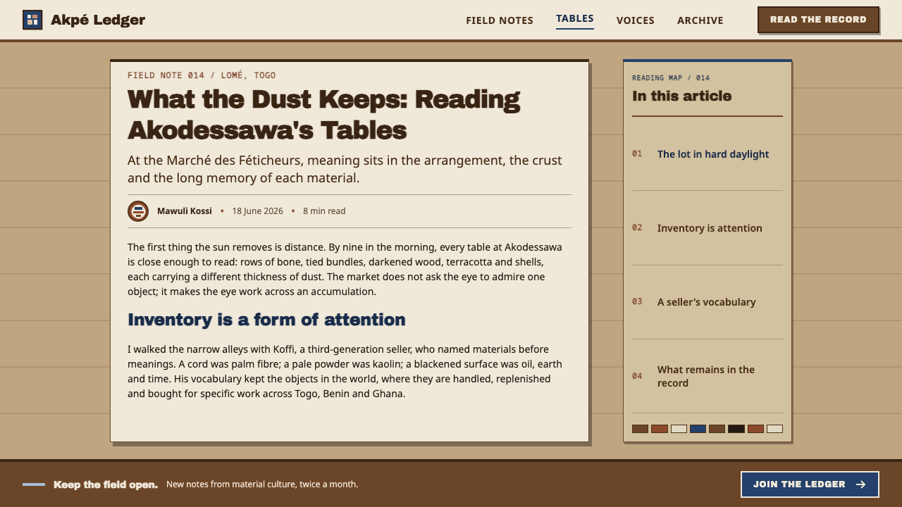
Brown is the main colour, and it is the brown of patina: tables and objects coated with earth, palm oil and powder until they look encrusted. Surfaces are matte and slightly irregular, with firm edges. In a layout, brown carries the panels, cards and table bands, and it should feel dense and settled rather than glossy.
Bone Rows
Bone-white objects are laid out in hard rows. The row is the basic unit of order: items repeat in lines at regular intervals, grouped by kind. This translates directly into grids of cards, rows in tables and repeated icons, with clear separations between categories. White appears as object, not as space.
Market-Sign Lettering
Headlines borrow the fat, hand-painted lettering of West African market signs, with a heavy, thick-serifed character. The letters are bold, slightly irregular and fully filled, announcing rather than whispering. Body text stays plain and legible; the display face carries the personality, the way a sign above a stall does.
Hard Midday Light
The light is outdoors at midday: strong, direct and unfiltered. Shadows have crisp edges and fall short and dark. There are no soft glows, no ambient diffusion and no moody gradients. In layouts, shadows, when used, are hard, offset and solid, like the shadow of a table on dry ground.
Bound and Layered
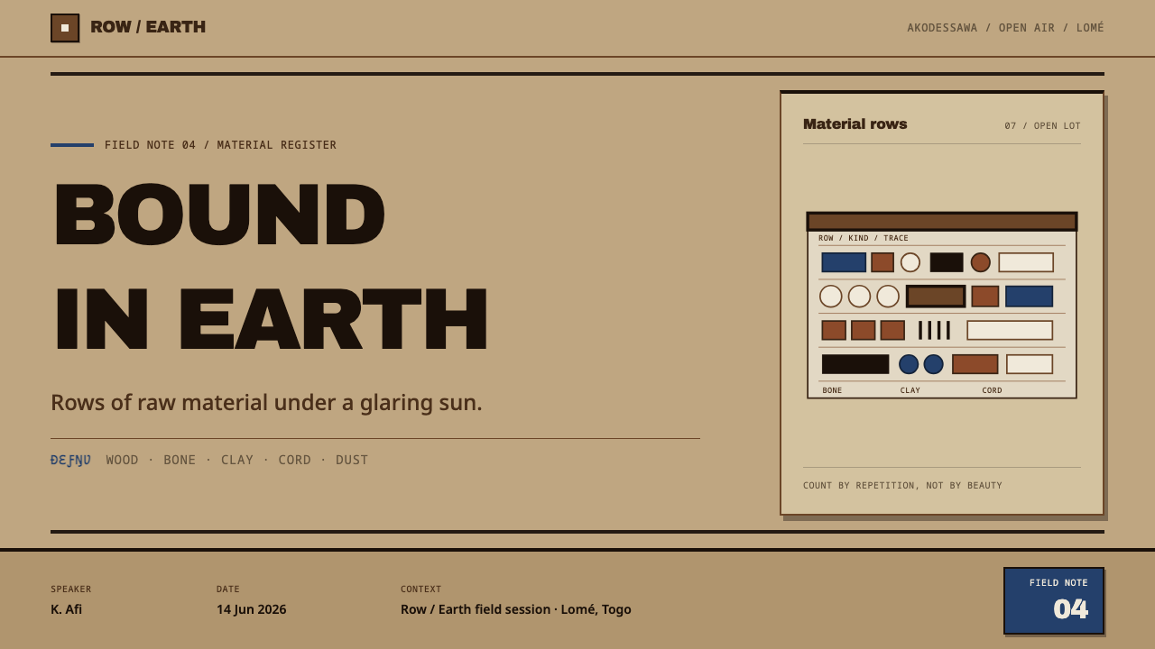
The bocio at the heart of the market are built by binding and layering: wood, cloth, bone, cord, shell, clay, beads and herbs gathered into one object and crusted over. The visual lesson is accumulation. Elements sit on and against one another, overlapping rather than floating apart, and a composition feels assembled rather than arranged.
Density as Discipline
Everything is stacked, packed and close. There is no breathing room, but there is order: each category has its place, each row its spacing, and each object its edge. The density is not an atmosphere but an inventory. If a viewer cannot name what group an item belongs to, the density has become clutter.
Who shaped Vodun Fetish Market?
Blier is the key figure the library names for this style: an art historian whose scholarship on West African Vodun art, and on Fon bocio in particular, helped make the objects legible as sculpture with purpose and history. She belongs in the record because the visual language here is not naive decoration; it is a sophisticated art tradition, and her research is one of the reasons it can be discussed that way.
Akodessawa, in Lomé, is the place the style is drawn from: an open lot where alleys run between low tables. It is where the system's ground, rows and density come from. Treating the market as a source rather than a backdrop means recognising it as a working supply point for practitioners across three countries, not a tourist set.
Bocio are the composite objects at the heart of the market: wood, cloth, bone, cord, shell, clay, beads and herbs bound together and crusted over with earth, palm oil and powder. The library lists bocio assemblage sculpture as one of the style's movements. Their surfaces are the origin of the crust-brown patina, and their binding and layering inform the way the style treats stacked information.
The hand-painted lettering of West African market signs gives the style its headline voice. These painters are anonymous in the library's record, but their letterforms are the most direct visual quotation in the system: fat, bold, hand-made and meant to be read across a crowded lot. Their tradition shows that commercial lettering can carry as much personality as any fine art.
How do you use Vodun Fetish Market today?
Vodun Fetish Market is a style for density, inventory and handmade authority. It suits catalogues, marketplaces, directories, documentary projects and cultural features, where the subject is a lot of things in a lot of categories. It is not a horror or occult look, and treating it as one is the surest way to misuse it.
For slides, the cover can be a sandy field with a heavy sign-painted headline and a hard row of bone-coloured objects or shapes along the lower edge. Content slides work as inventories: rows of items on brown plates, labelled in plain type and grouped by category. Data slides suit tallies and ledger-like bar rows, where each bar is a hard-edged block and the separations between rows are firm.
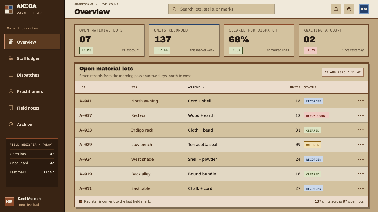
For web interfaces, the style is a natural fit for marketplaces, product catalogues, inventory dashboards and directory sites, anywhere a screen needs to show many items clearly. Use brown surfaces for cards and table bands, bone-white for the items themselves, and hard offset shadows instead of soft ones. Pricing pages can use stacked rows with sign-painted tier names. Keep focus states solid and obvious.
For editorial and marketing work, think documentary: photo essays, cultural features, museum or exhibition microsites, market guides. Large display headlines in a hand-painted character sit above tight grids of images and labels. Captions should be plain and specific, naming what an object is and where it comes from, so that density informs rather than overwhelms.
The most common mistake is to stage the subject as mystery by adding darkness, smoke, candlelight or dramatic vignettes. The source is explicit that nothing here is staged: it is midday, outdoors and crowded, and the style should feel the same. The second mistake is to lift the ground into a clean off-white, which loses the sandy chroma that holds the palette together. The third is to use sacred objects as generic decoration or as shorthand for danger. Vodun is a living religion, and references should be accurate and respectful.
Vodun Fetish Market — FAQ
Is this a dark, occult style?
No. The system is light-grounded, mid-tone and set in hard daylight. The market it comes from is an outdoor lot at midday, and the design treats it as exactly that: a place of trade, with every item laid out and visible. Dim lighting, fog and ritual drama are all additions that do not belong to the source.
Why is the word 'fetish' in the name?
The Akodessawa market is widely called a fetish market in English, a label that outsiders applied and that many scholars now treat with caution. The library keeps the name because it is how the market is commonly catalogued, but practitioners and scholars speak of Vodun, and of objects such as bocio. In your own copy, prefer 'Vodun market' or the market's name, and be specific.
How can a dense layout stay organised?
Sort first, then pack. Group items by kind, lay each group in a hard row, keep the spacing between rows consistent and let the edges of objects stay crisp. The market's density works because every table has a category. If a design is crowded but no one can say what the groups are, it is clutter, not inventory.
How do I use the style with respect?
Treat it as a market and a visual tradition rather than as costume. Name the source (Akodessawa, Lomé, and Vodun practice among the Fon, Ewe and Ada), do not stage sacred objects as spooky props, and avoid using the look for products that depend on fear or exoticism. Where possible, credit the market and the sign-painting tradition as sources.
Why does the ground stay mid-tone instead of white?
Because the lot itself is mid-tone, and because the palette depends on it. On a mid-tone sandy ground, bone-white objects stand out as pale and the encrusted brown surfaces stand out as dark, so the two main materials separate without outlines or effects. A white page would flatten the bone rows into the background and make the browns look heavy rather than settled.
Related design styles
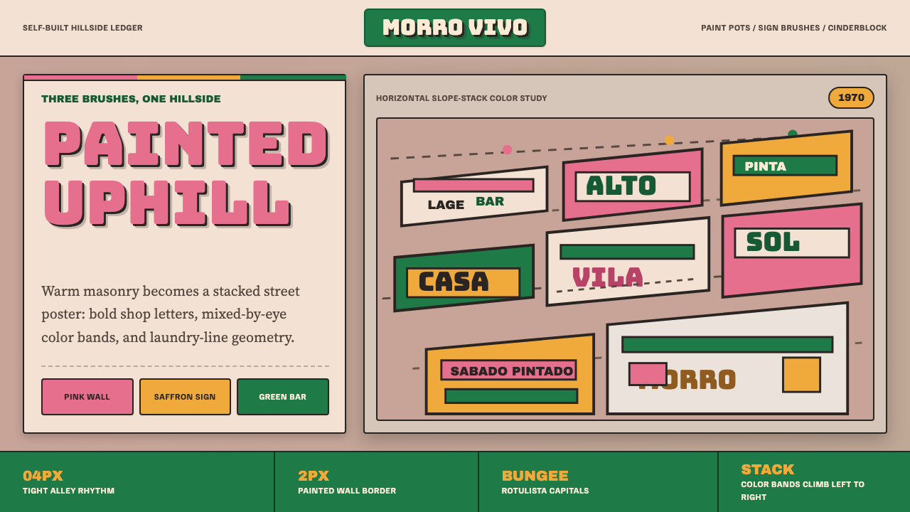 Brazilian Favela Rocinha 1970sHand-built warmth. Pink, saffron and green stripes climb cinderblock in rotul…
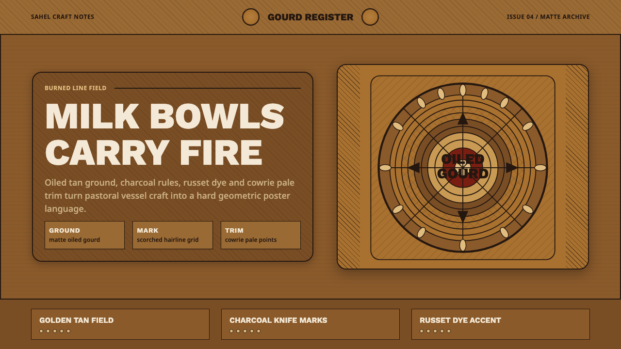 Fulani Milk CalabashMatte craft burns bright. Oiled gourd tan meets charred concentric linework.
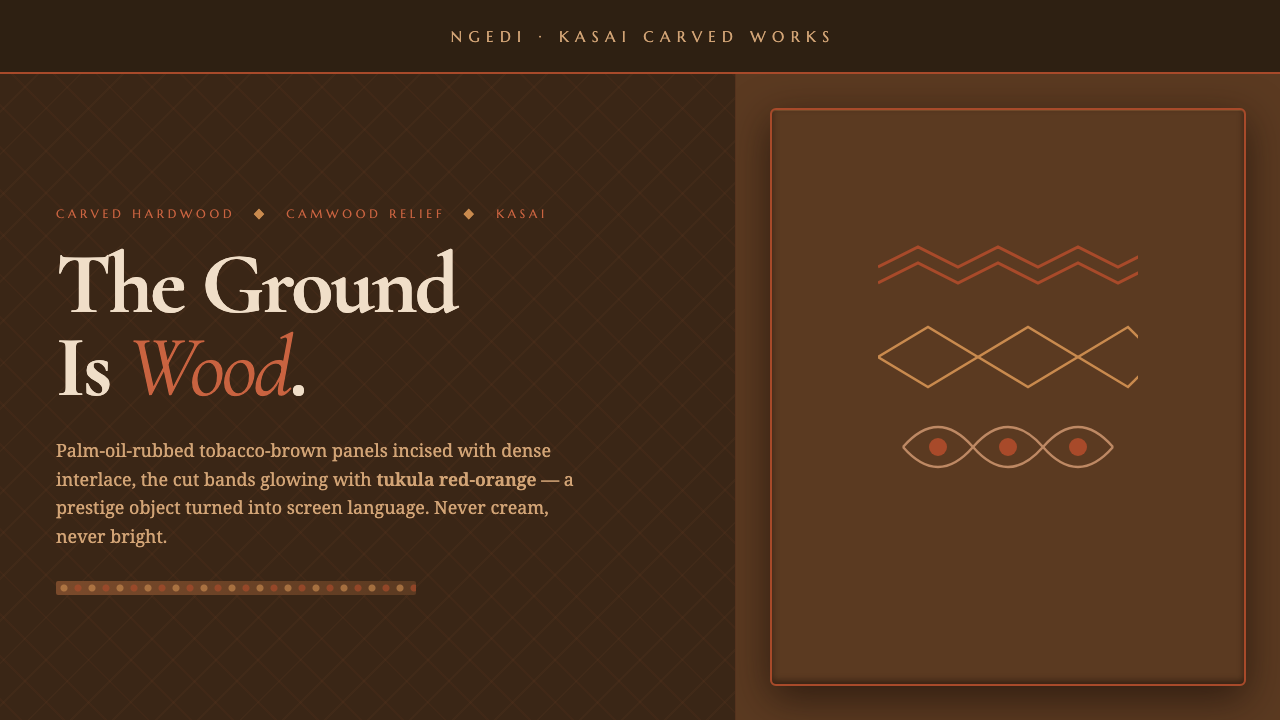 Kuba Calabash BrownPrestige in dark wood. Calabash brown ground, dense incisions, tukula red rel…
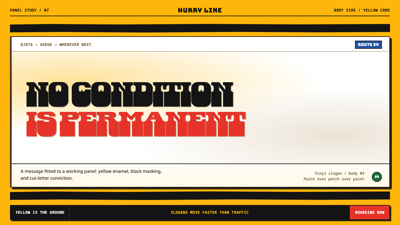 Lagos Danfo SlogansA slogan with road grit. Danfo slabs cut through mandated yellow and hand-mas…
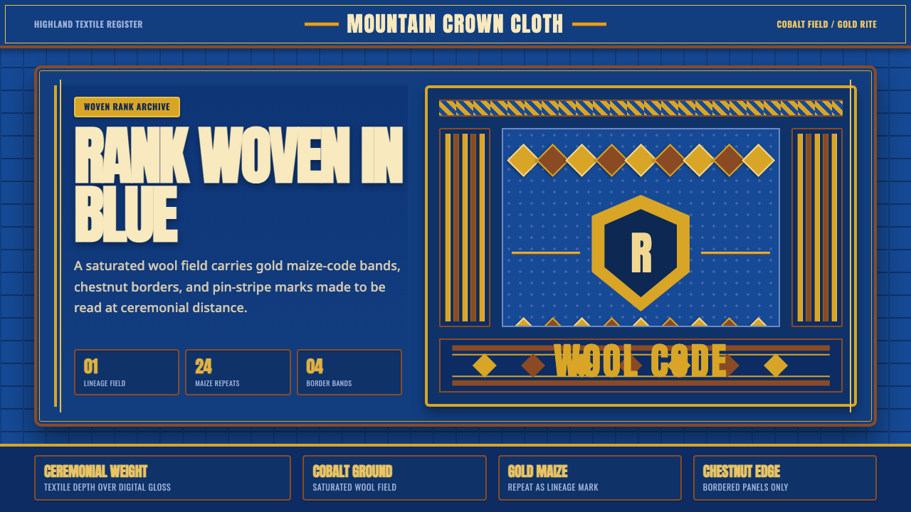 Basotho Seanamarena BlanketRank made visible. Cobalt wool, gold maize diamonds, and chestnut borders rea…
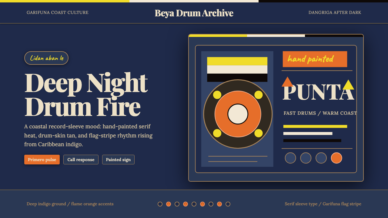 Belizean Garifuna PuntaNight rhythm burns. Indigo fields, flame-orange serif type, and flag stripes…