What is La Tène Celtic Metalwork?
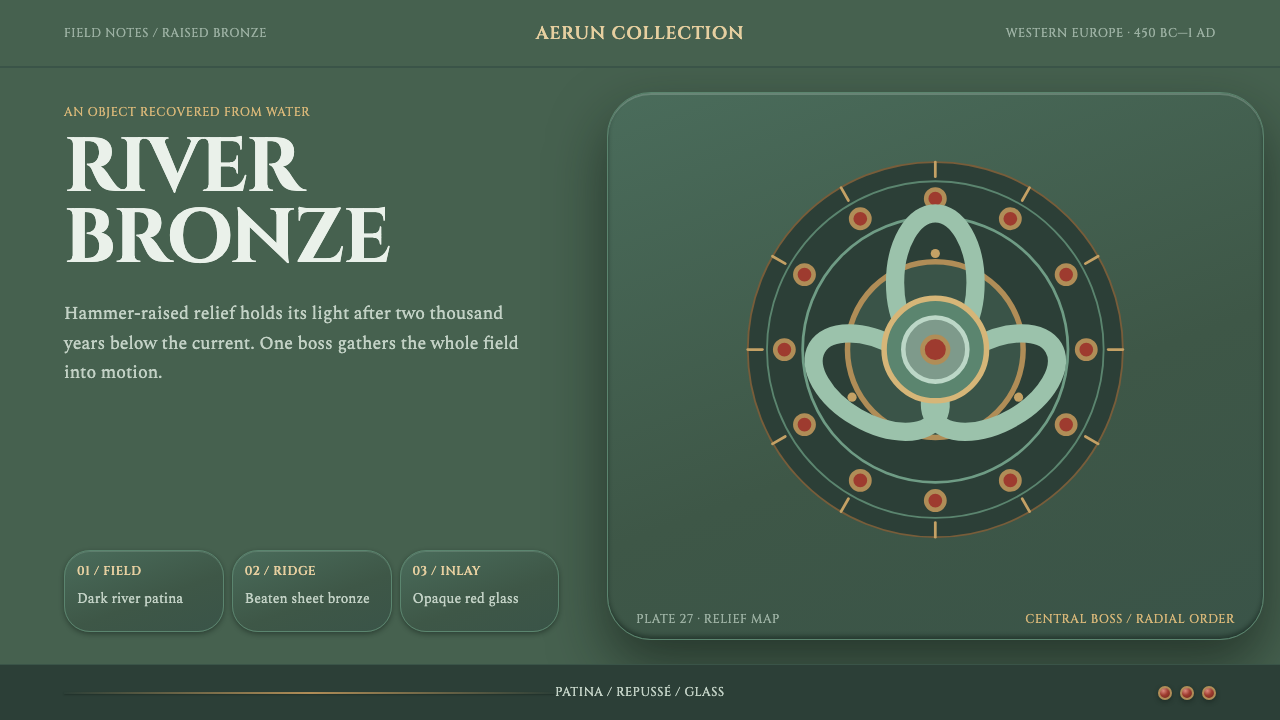
Bronze beaten up from behind until its curves rise like water, with red glass set in for sparks: La Tène is Iron Age ornament that still looks as though it is moving.
La Tène Celtic Metalwork in brief
La Tène Celtic Metalwork is the ornament of Iron Age Europe worked directly into metal. The characteristic technique is repoussé: sheet bronze is raised from behind with a hammer until triskeles, S-scrolls and lyre-palmettes stand proud of the field, and cells in the surface are then set with opaque red glass. The art belongs to the La Tène period, roughly 450 BC to the first century AD, and it is known simply as the La Tène style.
Everything in this language curves. There are no ruled lines and no square corners in the vocabulary. Ornament radiates outward from a central boss instead of repeating across a grid, and the two halves of a design are never quite the same. The outline can be symmetrical while the curls inside it are deliberately not, because a piece raised by hand is not meant to fit together perfectly.
As a design system, it is one of the few dark-ground themes in the library, and the darkness has a material reason. The objects that survive came out of rivers, carrying a dull green patina from long burial, and the system takes that colour as its own: patina-green relief radiating from a bronze boss, sparked by points of red glass. It looks cast in metal rather than drawn, with an energy that comes from the curve rather than from any decoration added to it.
Where does La Tène Celtic Metalwork come from?
The La Tène period is the later phase of the European Iron Age, placed here at about 450 BC to the first century AD. The style it names spread across Western Europe, and the regions the system lists are Britain, Ireland, Gaul, the Marne and the middle Rhine. It is a wide geography with a shared visual vocabulary, which is part of why the style reads as a language rather than as the product of one place or workshop. None of the surviving pieces carries a maker's name, so the craft appears to us through its objects rather than through its people.
Two techniques define the look. Repoussé, or raising sheet bronze from behind with a hammer, produces the relief: the metal is pushed outward from the back until the motifs stand proud of the field, and the front surface keeps the soft, rounded modelling of something that was beaten rather than carved. Champlevé red glass inlay supplies the colour: small cells in the surface are filled with opaque red glass. That glass stood in for imported coral, a more prestigious red material that was out of reach, and it gives the metalwork its sparks of colour.
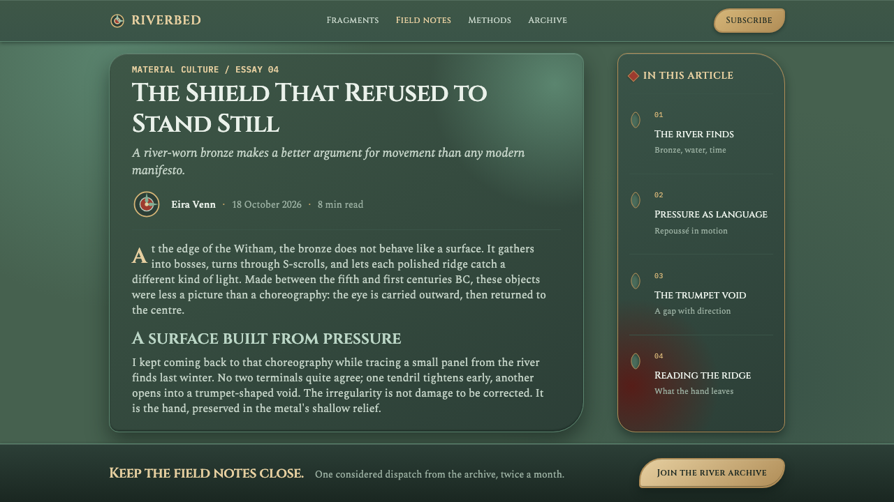
Most of what we can see today came out of rivers. The Battersea Shield was recovered from the Thames and the Witham Shield from the Witham, and both carry the dull green patina that bronze takes on in burial, after some two thousand years under silt. This is where the system's dark palette comes from. It is not an invented mood but a surface history: the bronze that was once bright now sits in a patina green, with red glass still set where the makers placed it.
The vocabulary these objects share is compact. The triskele, a three-armed curl, the S-scroll, and the lyre-palmette, a lyre-shaped leaf form, recur across the surviving pieces and are named in the system's own account. Alongside the shields, the Desborough Mirror and the Dunning triskele mount appear among its key objects, and between them they show the same curved language on different kinds of metalwork. The movements the system sits within are the La Tène style itself, repoussé sheet-bronze raising and champlevé red glass inlay.
What defines the La Tène Celtic Metalwork look?
Curve Only
Everything curves. The vocabulary contains no straight lines and no square corners, and even frames and dividers are drawn as arcs and scrolls. A layout in this style has to work without a ruled edge to lean on, which means that structure comes from the placement and weight of curved forms. Introducing a hard horizontal rule anywhere is enough to break the effect.
Radial Composition
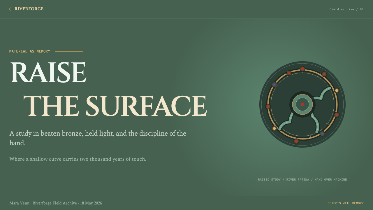
Ornament radiates outward from a central boss rather than repeating on a grid. The boss is a raised round form that acts as the focal point, and the surrounding relief spreads from it like ripples. This gives compositions a centre of gravity and a sense of outward energy. It also means that repetition, where it appears, is rotational rather than tiled.
Raised Relief
Because the metal is raised from behind, the motifs stand proud of the field instead of being drawn on it. The surface reads as dimensional, with soft convex forms that catch light on their crowns and fall away at their edges. Depth comes from shaping and from how light would lie on a beaten surface, not from hard drop shadows laid beneath flat shapes.
Patina Green on Bronze
The ground is dark, and the relief is the dull green of a bronze that has lain in a river, set against warm bronze tones at the boss. It is a colour of age and burial, muted and slightly cool, rather than a fresh or bright green. The result is a low-key palette in which almost everything sits in a narrow family of tones, so that anything outside that family shows up immediately.
Red Glass Spark
Opaque red glass is set into small cells in the metal, and in the system it appears as points of colour rather than fields. The red once stood in for imported coral, so it is a precious accent, not a base colour. Used sparingly, at the places where the curves converge, it lights up the whole composition. Used widely, it turns a restrained surface into a decorated one.
Controlled Asymmetry
The outline of a design may be symmetrical, but the curls inside it are deliberately not. Hand-raised metal never fits together exactly, and the style treats that as a quality to keep, not a flaw to correct. In practice this means that mirrored layouts should be broken in their details: the two sides share a silhouette and a weight, but differ in the direction and size of their scrolls.
A Compact Motif Vocabulary
Three motifs do most of the work: the triskele, the S-scroll and the lyre-palmette. A small, recognisable set, recombined around a central form, is what gives the style its coherence. Adding further unrelated motifs, such as leaves, animals or knotted bands, dilutes it, whereas rearranging these few across different compositions keeps the language intact.
Who shaped La Tène Celtic Metalwork?
A shield recovered from the Thames, and one of the reference objects named in the system. It carries a dull green patina from its long burial and still holds red glass studs in their original settings. For the style it supplies the full picture in one object: bronze with raised relief, a radiating composition and points of red. Its colour, patinated and muted, is the origin of the system's dark ground.
A second shield, recovered from the River Witham, and named alongside the Battersea Shield. Seen together, the two pieces show the same curved language and the same burial patina in two different finds, which is why the system can treat the style as a vocabulary rather than as one object's quirks. It also underlines that these are river finds, which is what makes the green the correct colour.
A mirror, named among the key objects of the system. Where the shields show the style on a defensive object, the mirror shows the same language on a different type of metalwork. Its presence in the reference set matters because it confirms that the curved vocabulary was not confined to one use, and that the curve could be applied to whatever form the metal was given.
A mount carrying a triskele, the three-armed curl that is one of the style's core motifs. As the reference object that names the motif outright, it anchors the vocabulary: a compact, rotational form that can sit at the centre of a composition and generate the rest around it. For designers, it is the clearest example of how a small shape can organise a larger design.
How do you use La Tène Celtic Metalwork today?
La Tène is a dark-ground style with strong ornamental energy, so the key to using it well is restraint about where the energy goes. The curve and the central boss are the idea; the rest of the layout should be calm enough to let them read. It rewards compositions that have one clear focal point.
On slides, a cover can be built around a large circular boss in warm bronze at the centre or off to one side, with patina-green relief radiating from it across a dark field, and the title set in a clear space beside it. Content slides should keep ornament to the edges and corners, where scroll forms can frame the text, leaving the reading area plain. Data slides work with chart series in the green-bronze family and a single red point, as if a red glass stud, marking the one figure that matters.
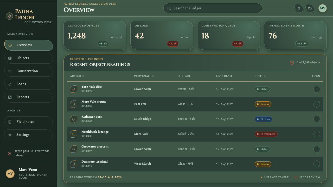
On the web, the style suits dark-mode products with a strong identity: games, creative tools, collectors' sites and anything with a craft or historical theme. In dashboards, the curved ornament should stay in headers and empty states while the data area is kept flat, legible and unadorned. On a pricing page, the plan the product wants to recommend can carry the red glass accent, and the other plans stay in the green-bronze family. Controls need clear states, so ornament should never replace labels or affordances.
In editorial and marketing work, the style fits museum and archaeology content, heritage and craft brands, spirits and jewellery, and fantasy or game worlds that want a grounded, material look instead of a decorative one. A long article can open with a boss-centred hero and then move into plain dark reading columns, returning to a small scroll motif to close each section. Because the relief is meant to feel hammered and not printed, photography of real metalwork pairs naturally with it.
The most common mistake is confusing the style with the generic interlaced knotwork many people picture under the word 'Celtic', which is a different visual idea; this system draws on sheet-bronze relief with scrolls, triskeles and palmettes. Other frequent errors are to tile the ornament across the page as wallpaper, which contradicts its radial logic, to make the symmetry perfect, which removes the hand-raised quality, and to saturate the green into a bright emerald, which loses the age of the patina. Red should stay a spark, never a field.
La Tène Celtic Metalwork — FAQ
What is the La Tène style?
It is the ornamental style of the La Tène period of the European Iron Age, roughly 450 BC to the first century AD, found across Britain, Ireland, Gaul, the Marne and the middle Rhine. Its signature is curved relief, with triskeles, S-scrolls and lyre-palmettes raised from sheet bronze and set with opaque red glass. As a design system, it reads as green-patinated bronze with red sparks on a dark ground.
Is it the same as Celtic knotwork?
No. The interlaced knotwork many people picture under the word 'Celtic' is not what this system draws on. Its source is Iron Age sheet-bronze work: relief raised from behind, motifs such as the triskele and the S-scroll, and red glass inlay. The vocabulary is curve, boss and radiating scroll, not woven bands.
Why is the theme dark?
Because of how the objects reached us. The surviving pieces were largely recovered from rivers, such as the Battersea Shield from the Thames and the Witham Shield from the Witham, and the bronze took a dull green patina in the ground. The dark ground and the green relief reproduce that surface rather than imitating a fashionable dark mode.
Why red glass rather than a gemstone or a bright accent?
Because the red glass in the original metalwork was a stand-in for imported coral, set in small cells in the bronze. It is a precious but modest red, used as points rather than fields. In the design system it works the same way: a sparing accent at the places where the curves converge, never a wash.
How do I stop it looking like a fantasy game interface?
By confining the ornament. Keep the radiating relief to a boss, a header or a frame, and keep reading areas, tables and forms plain and dark. Use real metalwork photography where you can, hold the red to a single spark, and stay inside the patina-green and bronze family. The more material and the less decorative the surface feels, the further it sits from a game skin.
Related design styles
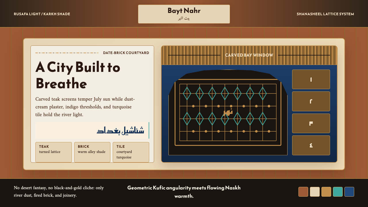 Iraqi Baghdad Shanasheel HouseBreathes through ornament. Date-brick ground, teak lattice, and turquoise til…
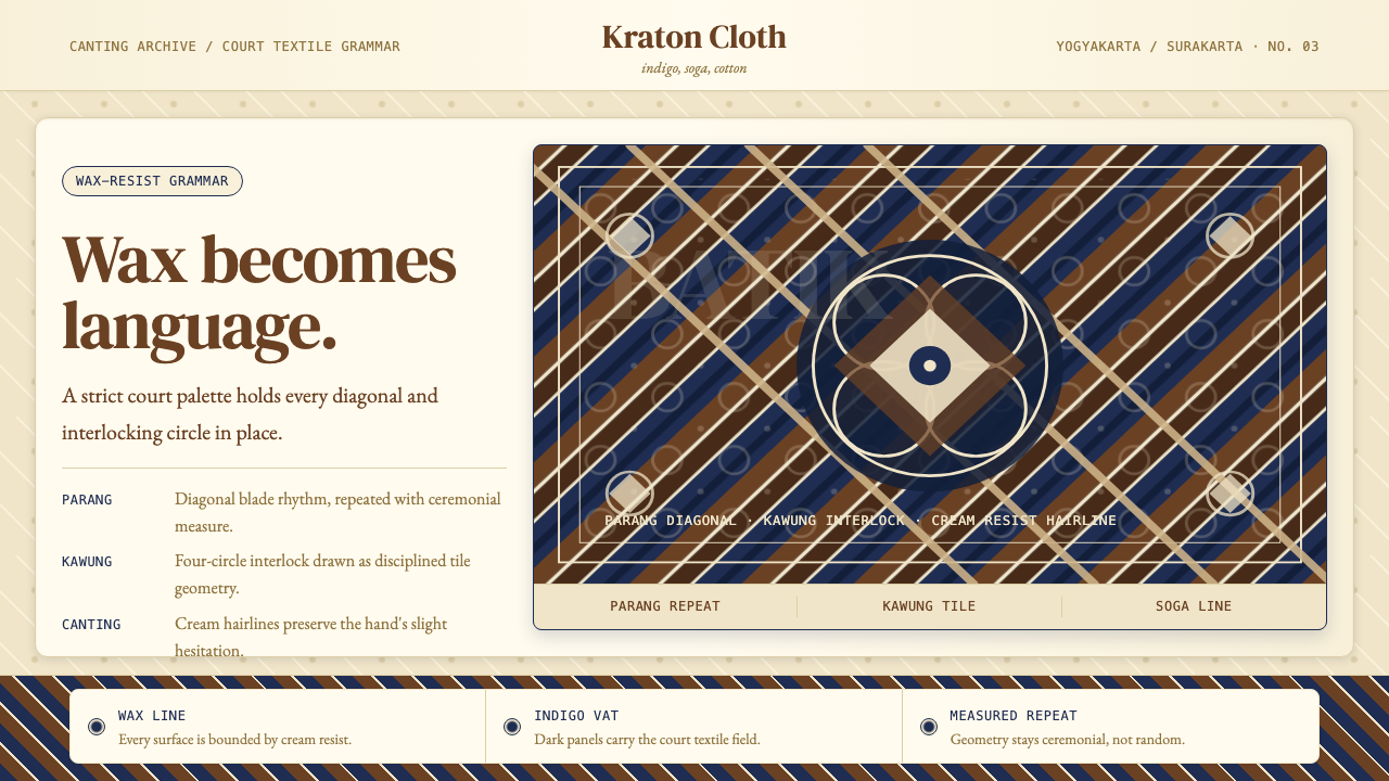 Javanese BatikCeremonial repetition. Indigo, soga, and cream frame a tiled canting motif.
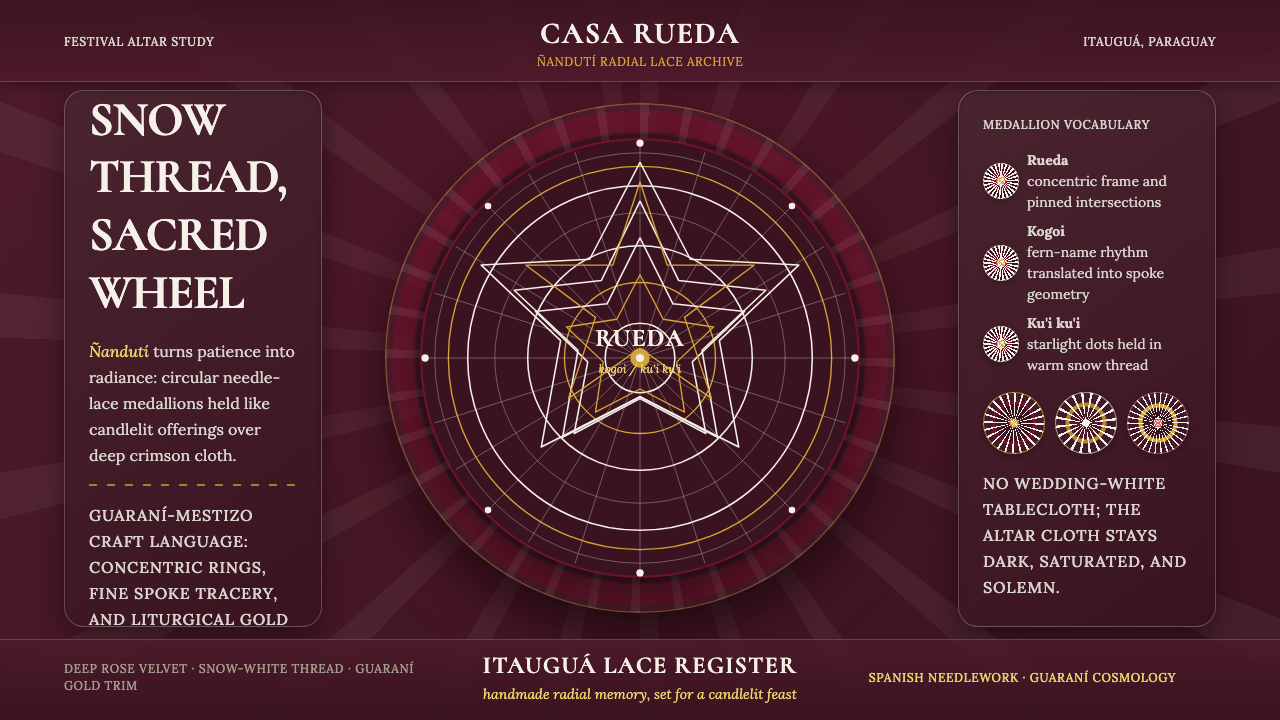 Paraguayan Itauguá Ñandutí Spider LaceReverent craft glows. Snow lace medallions radiate over rose velvet with Guar…
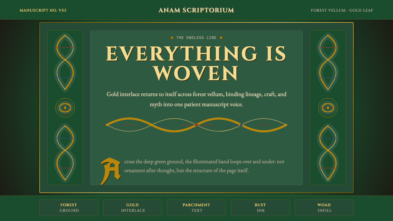 Celtic KnotworkEverything is connected. Gold Cinzel interlace frames forest-green vellum.
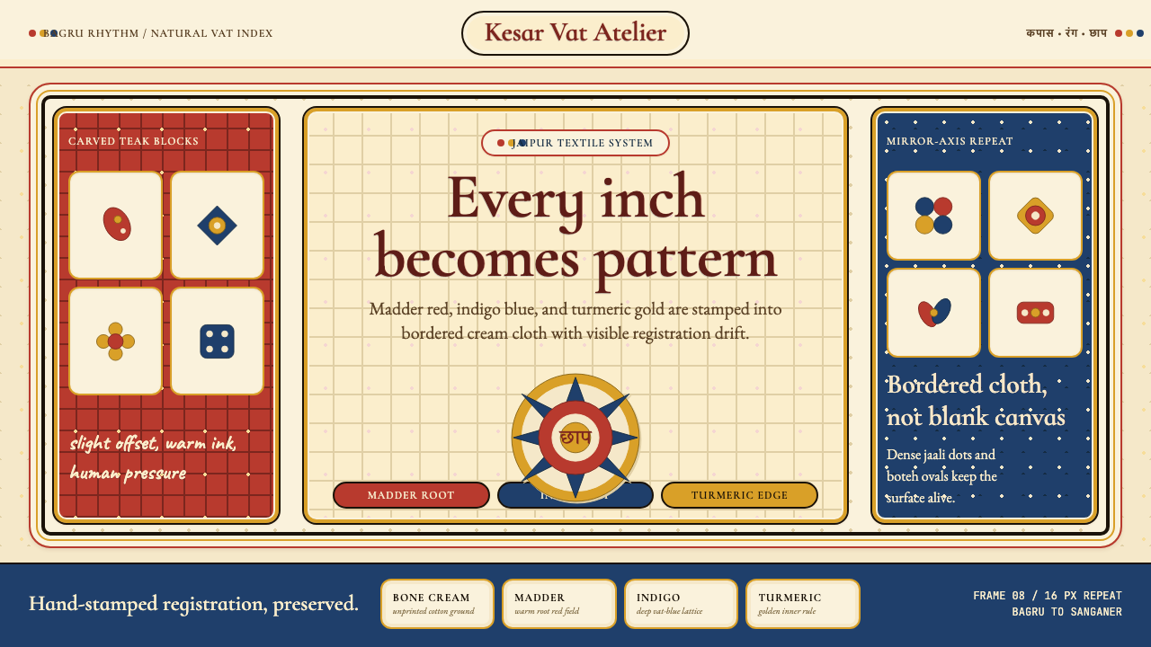 Indian Block PrintPattern claims every inch. Madder, indigo and turmeric stamp dense bordered c…
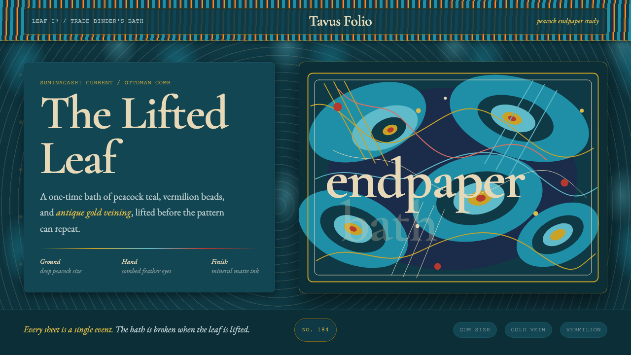 Marbled EndpaperInk refuses repetition. Peacock teal, vermilion beads, and gold veins drift l…