What is Kurdish Jamana?
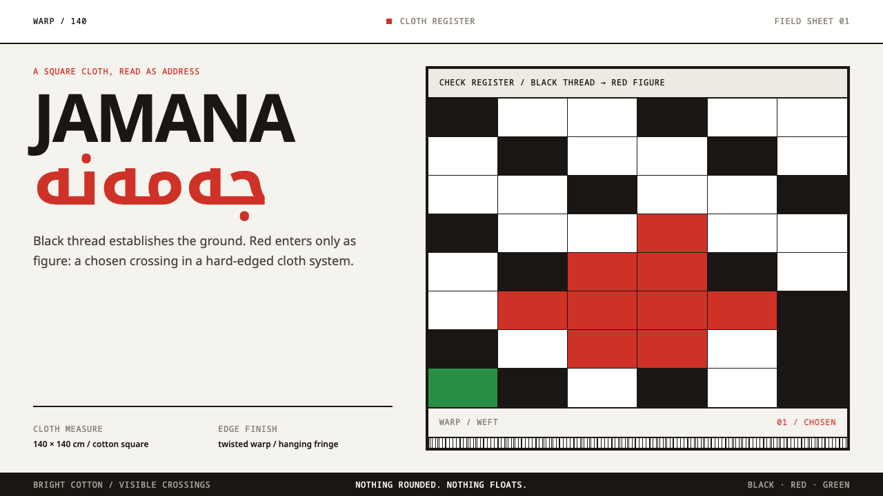
A square of white cotton, a check woven in black thread and a run of fringe: the Kurdish jamana turns pattern into an address, and the design built on it keeps everything woven, flat and square.
Kurdish Jamana in brief
The Kurdish Jamana style takes the jamana, the cloth that Kurdish men wind over a skullcap called the klaw, as the model for an interface and presentation language. The jamana is a square of cotton, wound over the cap with its fringed ends left hanging. The cloth is white. The pattern is black thread. Everything in the design system follows from taking that object literally.
What makes the cloth unusual as a design reference is that the pattern is an identity, not a decoration. Which pattern a man wears reads as tribe and region: black-and-white for the Zebari, Harki and Doski, red-and-white for the Barzani. A glance across a room tells you who someone is and where they come from. The colours are not chosen for mood. They are chosen because they say something, and the style keeps that logic, so that colour in this system is always a statement rather than an atmosphere.
Visually, the system is calm and exact. Black check on bright white is the base state. Red is brought in as a figure, a deliberate mark laid against the field, and every edge is a woven band or a run of fringe. Nothing is rounded and nothing floats: it is cloth, laid flat. There are no drop shadows, because a woven cloth does not lift off the surface it lies on.
Where does Kurdish Jamana come from?
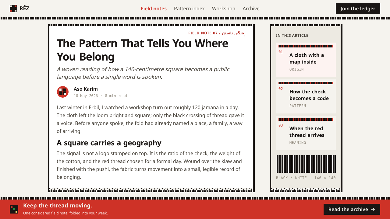
The jamana belongs to Kurdistan, and the places named in the system's own account are Erbil, Barzan, Zebar and Duhok in Iraqi Kurdistan, together with Kurdish communities in Turkey, Iran and Syria. It is not a historical costume revived for the occasion. The dress is dated to before 1900 and described as continuous, worn both as everyday dress and for formal occasions. That continuity matters for anyone borrowing from it: the cloth has no 'period' to be quoted, because it is still being worn.
The garment is part of what Kurdish usage calls traditional male dress, shal û shepik, in which the headcloth is one element of an outfit rather than an accessory added to it. The jamana itself is a square of cotton wound over the klaw skullcap, with the twisted fringe at its ends left hanging. The ground is white, and the pattern is woven in black thread. Workshops in Erbil still weave the cloth every day, and the white they produce is bright, the kind of white that looks lit from within.
Pattern works as a regional and tribal marker. The system's reference points are the Zebari, Harki and Doski tribes, whose cloths read black-and-white, and the Barzani, whose cloth reads red-and-white, with Mustafa Barzani named among its key figures. The movement the system sits within is described as tribal dress as a regional identity marker: dress used not to hide a person's origin but to announce it, in a code that is legible to anyone who knows how to read it.
A design system built on this has to decide what it takes and what it leaves. It takes the construction: the base, the thread, the edge and the fringe. It takes the logic of the colour pairing, in which a small, fixed vocabulary is made to carry meaning. It leaves behind any attempt at costume. The result is not a Kurdish-themed interface in the decorative sense, but a design built the way the cloth is built, which is why it can feel so restrained.
What defines the Kurdish Jamana look?
Cotton White Ground
The base colour is the white of the cotton itself, bright and clean, the kind of white that comes from cloth rather than from a screen. It is the resting state of every surface: pages, cards and panels begin as white cloth and only receive pattern where something needs saying. Large fields of other colour are not part of the vocabulary, so the white is always the ground and never one choice among several.
Black Check as Default
The check, woven in black thread, is the base pattern and the starting point of the system's rhythm. It is treated as structure rather than texture: it divides, bands and borders, and it sets the beat that the rest of the layout follows. Because it is a woven grid, it stays regular and quiet. It should never be enlarged into a loud graphic or laid under body text.
Red as Figure
Red is not an ambient colour here. It arrives as a figure: a single chosen mark set against the white and black field, to be read at once. That mirrors the way red-and-white speaks in the cloth itself, where the colour pairing is a declaration. In a layout, red should be used where something must speak, a primary action or a key figure, and kept absent elsewhere.
Woven Edges
An edge is not an outline drawn around an object. It is a band of check woven into the cloth, part of the structure itself. Borders on cards, panels and page frames therefore read as bands with a little thickness and pattern rather than as hairline strokes. This is the main reason the system looks built rather than drawn.
Fringe as Terminus
On the jamana, the ends of the cloth are left as twisted fringe, and in the system the lower edge of a card ends in a run of fringe. The fringe marks where an element stops, and it does so with a texture that no other part of the layout uses. It is a terminating gesture, which is why it belongs to the bottoms of things and never to the middle.
Square, Flat, Unshadowed
There are no rounded corners, no floating layers and no shadows. Cloth lies on the surface it is laid on, so every element sits flat and square against the page. Depth, where it is needed, comes from overlap and from the thickness of a woven band, not from a simulated light source. Anything that appears to hover has stopped being cloth.
Pattern as Address
In the cloth, black-and-white and red-and-white are different statements about who the wearer is. The system carries this over as a discipline: a small, fixed set of colour pairings, each with a meaning, applied consistently. Choose a pairing for a product and keep it, instead of mixing both across a single page, because mixing turns a declaration into decoration.
Who shaped Kurdish Jamana?
Named among the key figures of this system, and attached to the Barzani, whose cloth is the red-and-white one. His name stands for the red-and-white branch of the jamana's vocabulary, the pairing that the style uses when red needs to enter the white and black field as a figure. The source gives his name and the connection to the Barzani rather than a full biography, so he is best read here as the name that anchors that pairing.
One of the three tribes whose jamana reads black-and-white, and the reference for the black check on white that serves as the system's base state. The system names them first among the black-and-white groups, ahead of the Harki and the Doski. In design terms they supply the default: the pattern that the layout falls back on whenever nothing else needs to be declared.
The second of the black-and-white tribes named by the system. Its place among the key figures reinforces the point that the default pattern is shared rather than singular, a family of related cloths in the same two colours. For a designer, that is a reminder that the base check can have small variations in scale and rhythm without ever leaving its colour pairing.
The third black-and-white tribe in the source. Together with the Zebari and the Harki, the Doski complete a set in which three distinct groups share one visual register, and in which a viewer reads the group and the region from the pattern itself. The system takes from them the habit of letting one fixed vocabulary carry a good deal of information.
The workshops in Erbil that still weave the cloth every day, in a white that looks lit from within. They are the reason the system can treat the jamana as a living object instead of a museum piece. Their work is also the best argument for the style's flatness and exactness: a woven check is regular because it is made on a loom, and a design that borrows it should hold the same discipline.
How do you use Kurdish Jamana today?
The jamana style is a strong choice when a product wants to look woven, grounded and exact, and when it values meaning over atmosphere. Applying it well means taking the construction of the cloth seriously: a bright base, a regular black check used as structure, red used as a single decisive figure, and edges that are bands rather than lines.
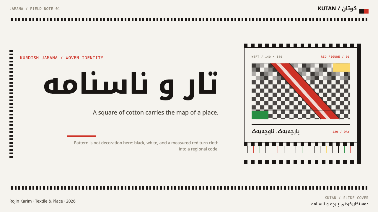
On slides, a cover can be a white field with a band of black check running across the top or down one edge and the title set flat beside it, with a single red figure, a number or a short phrase, as the only coloured mark. Content slides can use the check band as a divider and the fringe as a closing rule at the foot of a block. Data slides work best in black on white, with one series in red when the chart has a single point to make.
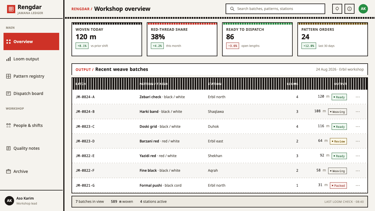
On the web, dashboards and cards benefit from the system's flatness. Cards sit square on a white page, with a woven band along the top edge and a short run of fringe at the foot to mark the end of each unit, and with no shadows, rounded corners or floating layers. In a pricing layout, the recommended plan can be the one that receives the red figure, while the others keep the black-and-white pairing, which makes the hierarchy readable without any badge or glow.
In editorial and marketing work, the style suits cultural institutions, craft and textile makers, regional food and trade brands, and long-form writing about place and people. It works best when the source is named and respected: a story about weaving or dress can use the system as its natural frame. Section breaks can be woven bands, and pull quotes can sit inside a single check border, so the page reads as one continuous cloth.
The most common mistake is to treat the check as wallpaper, filling backgrounds behind text until the pattern stops being structure and becomes noise. A related error is to use red everywhere, which removes its force as a figure. Adding rounded corners or soft shadows breaks the cloth logic, since woven cloth does not float. And because these patterns are an identity code for people who wear them, mixing the black-and-white and red-and-white pairings arbitrarily, or treating them as a generic 'ethnic' look, misreads what the cloth is saying.
Kurdish Jamana — FAQ
What is a jamana?
A jamana is a square of cotton that Kurdish men wind over a skullcap called the klaw, with the fringed ends left hanging. The cloth is white, and the pattern is woven in black thread. It is part of traditional male dress, shal û shepik, and the pattern it carries reads as tribe and region, so it works as an identity marker as well as a garment.
Do the colours in the pattern mean anything?
Yes. In the source material, black-and-white reads as the Zebari, Harki and Doski, and red-and-white reads as the Barzani. Which pattern a man wears tells others his tribe and region. The design system keeps this logic by treating colour as a statement: black check on white is the base state, and red enters only as a deliberate figure.
Why are there no rounded corners or shadows?
Because the system takes the cloth literally, and cloth is laid flat. A woven square has square corners, its edges are woven bands, and it does not float above the surface it rests on. Rounded corners and soft shadows are borrowed from other materials, so they would break the logic that makes the style look built rather than drawn.
Is it appropriate to use this style for a non-Kurdish product?
It can be, with care. The jamana is dress that people still wear, and its patterns carry real meaning for them, so the respectful approach is to use the style for its construction and logic, and to credit the source, rather than to use it as a costume or a generic ethnic motif. It suits work that is actually about weaving, craft, region or identity, and sits less comfortably on products with no connection to any of those.
Can the style work on a dark background?
The source theme is light-ground: the cotton white is the base state, and the black check and the red figure are read against it. A dark inversion would turn the check into a pale-on-dark pattern and take away the sense of bright cloth that is the whole point. If a dark variant is unavoidable, keep the white as a framed panel inside the dark page, so that the cloth itself remains white.
Related design styles
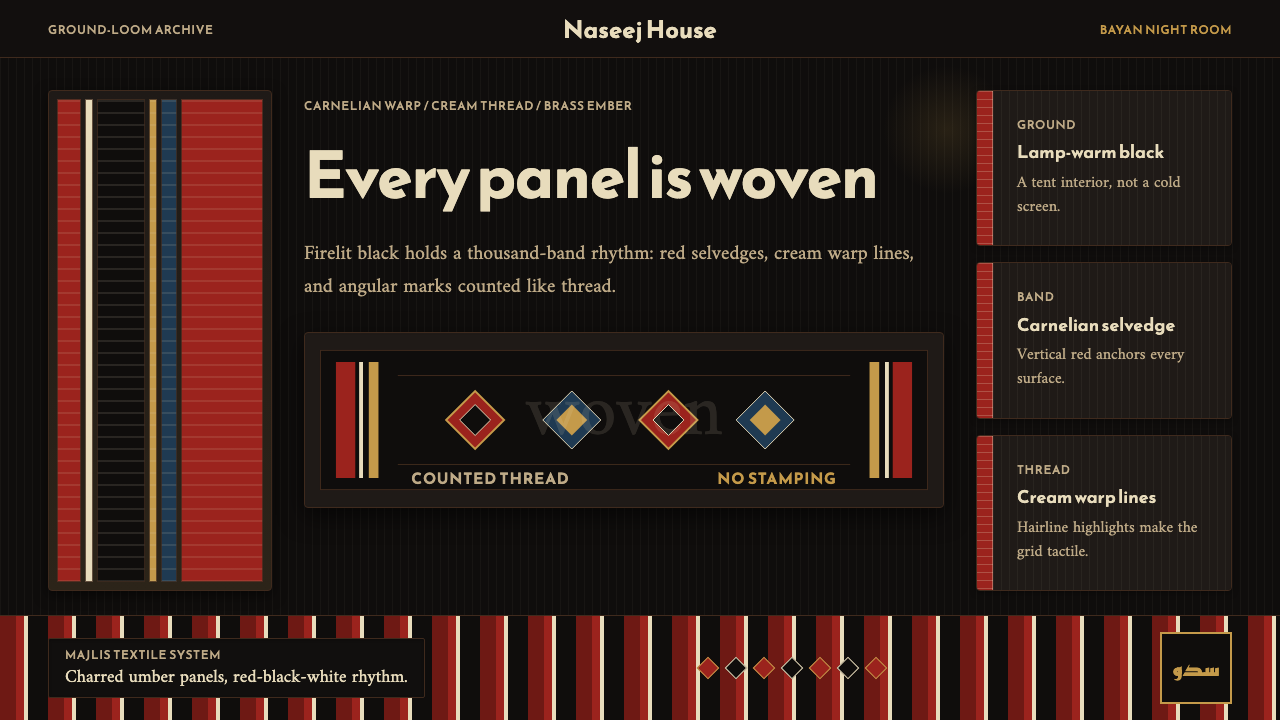 Kuwaiti Sadu Bedouin WeaveFirelit craft, not dark mode. Carnelian bands and cream warp lines make each…
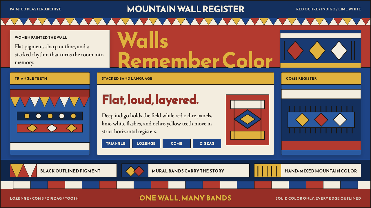 Saudi Asiri Qatt Wall PaintingPainted walls speak loudly. Indigo bands, red triangles, ochre teeth, black o…
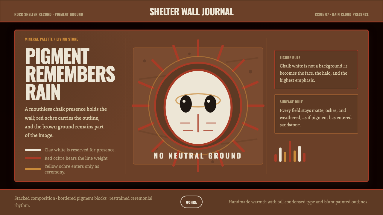 Aboriginal Wandjina KimberleyAncestral presence in stone. Chalk white haloes and red ochre outlines sit on…
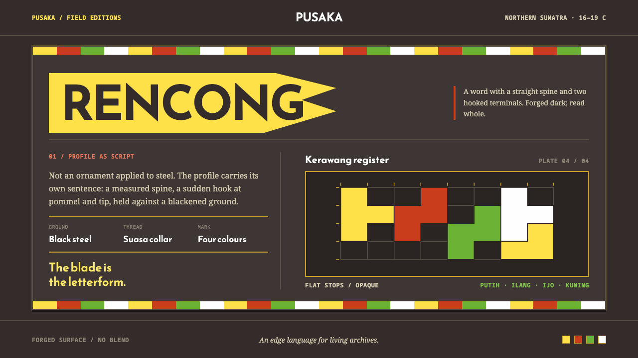 Acehnese Rencong MotifA blade that reads as a word. Flat kerawang red, white, green and yellow lock…
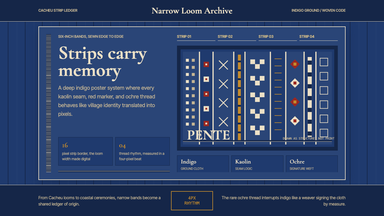 Bissau-Guinean Pano de PenteIndigo remembers. Narrow bands and kaolin seams turn weave grammar into pixel…
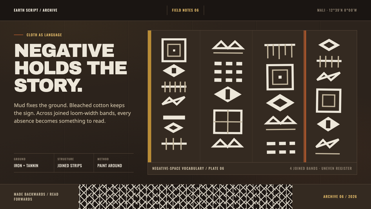 Bogolanfini MudclothAbsence becomes language. Warm iron-black bands hold uneven bleached-cotton s…