What is Kris Pamor Blade?
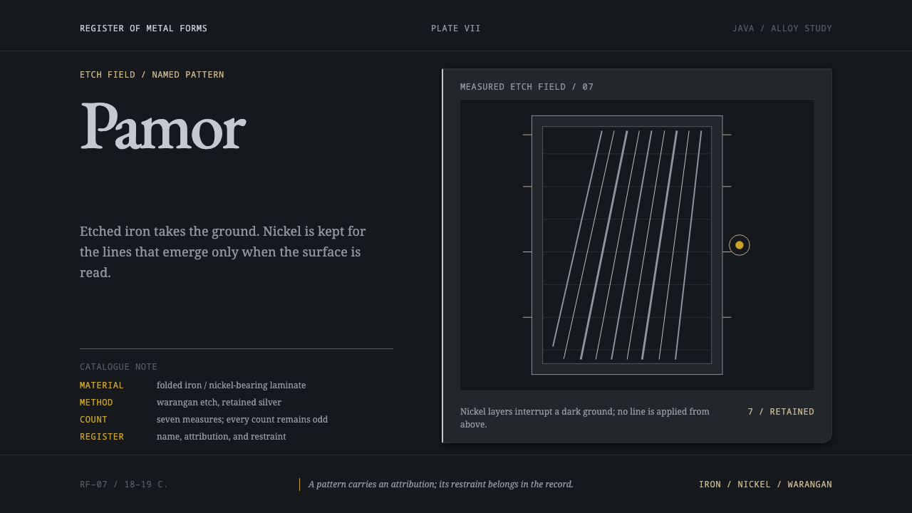
Kris Pamor Blade is a style in which pattern belongs to the metal: silver fold lines emerge from an iron-black ground, set in the measured voice of a catalogue.
Kris Pamor Blade in brief
Kris Pamor Blade is a dark, precise, catalogue-like design style drawn from the pamor patterns of the Javanese keris. A keris blade is folded from iron and nickel-bearing metal, then bathed in warangan, a solution of arsenic and citrus juice that bites the iron nearly black and leaves the nickel silver. The pattern, called pamor, is not engraved or painted on the surface. It lives inside the metal and appears only when acid reveals it.
As a visual language, the style takes the etched blade as its ground. Dark iron covers almost everything. Silver is reserved for what matters, appearing as fine fold lines, layered grain and thin highlights. Wood and worn gold are used for the fittings, the way a keris has a scabbard and a ring around the blade. Type is scholarly rather than dramatic: this is the register of a catalogue of forms, where each pattern carries a name, an attributed effect and a prohibition.
The result is a style of restraint with unusual depth. It does not decorate; it reveals. It does not announce; it records. For work that needs to feel authoritative, archival and quietly precious, it offers a principle that is easy to state and hard to fake: ornament should come from the material itself, and tone should come from the voice of someone cataloguing, not selling.

Where does Kris Pamor Blade come from?
The keris is a Javanese blade, and its pamor is the signature of how it is made. The smith folds iron together with nickel-bearing metal, forging the layers into one body. When the finished blade is bathed in warangan, the iron darkens almost to black while the nickel stays silver, and the folded structure shows itself as lines and grain. Blades may be straight or wavy, and the number of waves, known as luk, is always odd. Everything about this process is subtractive and revealing: the pattern is not added, it is uncovered.
The source places the tradition in a long span, from the Majapahit period through the nineteenth-century keraton workshops, and names the courts of Surakarta and Yogyakarta as the centres of the work. Keraton court metalwork is the first of the movements the record names for the craft. Within that court setting, a named-pamor canon was codified in the eighteenth and nineteenth centuries: a system in which each pamor pattern has a name, an attributed effect and a prohibition. That structure is the reason the design system sounds like a catalogue of forms rather than an advertisement.
The most precious pamor material, according to the source, comes from an iron meteorite that fell near Prambanan in the eighteenth century and was later collected into the Surakarta palace. The detail matters for the style because it shows how seriously the metal itself is valued: the most prized pattern material is iron that arrived from the sky. The record also lists UNESCO Intangible Cultural Heritage among the movements around the keris, which marks the craft as a living tradition recognised well beyond Java.
The design translation is direct. The etched blade is the ground: dark iron everywhere, with silver reserved for what matters, and wood and worn gold used only for fittings such as the scabbard and the ring. Type follows the voice of the canon, scholarly, measured and descriptive, because each pattern was named, described and cautioned about. The style is therefore less an imitation of a weapon than an adaptation of a way of knowing: pattern as something found in the material, and knowledge organised as a careful register.
What defines the Kris Pamor Blade look?
Iron-Black Ground
The foundation is a deep, matt, iron-black, the colour of a blade that has been bitten by acid. It covers pages, panels and plates almost entirely. Because the ground is so dark and so uniform, it behaves like a catalogue plate: a surface on which a small number of precise things are shown. Large black areas are not emptiness here; they are the metal.
Silver Fold Lines
Silver is the nickel showing through, and it is rationed. It appears as fine fold lines, layered grain, thin rules and small highlights, never as large flat fills. The lines should look as though they were already in the metal: slightly irregular, following the logic of folded layers, and visible mostly at the places that deserve attention. A page with too much silver loses the effect, because the revealed pattern needs a dark field to emerge from.
Pattern Inside the Material
The pamor is not engraved on the blade; it lives inside the metal and appears only under acid. In design terms, this means pattern should read as structural rather than applied. Texture belongs to the surface it sits on, edges and lines come from the layering of the material, and nothing looks like a decorative overlay. Interfaces can reinforce this by revealing detail gradually, as a pattern would appear during etching, rather than printing it across the surface from the start.
Wood and Worn Gold Fittings
Warm materials appear only as fittings, the way a keris has a scabbard of wood and a ring of worn gold around the blade. Wood grain and a muted, softly worn gold are used for frames, labels, small badges and borders, never for the main field. The contrast is deliberate: cold, dark metal in the foreground, warm and handled materials at the points of contact. Gold here is aged and slightly dull, not bright or glossy.
Scholarly Type
Type is scholarly rather than dramatic. Headings are set like catalogue entries: calm, even and descriptive, with small labels, numbers and captions doing much of the structural work. Body text is measured and sober, in a voice closer to a museum record than to a headline. Nothing is shouted. The tone should sound like a person cataloguing forms, aware of what each entry means, not like a campaign trying to persuade.
Named Entries with Effect and Prohibition
In the named-pamor canon, every pattern has a name, an attributed effect and a prohibition. That gives the style a ready-made content structure: entries composed of a title, a description of what the item is said to do and a note of what to avoid. In an interface, this becomes a card or plate format with three clear zones. It is a way of treating information as a register in which each item is identified, characterised and limited.
Odd-Numbered Waves
Blades may be straight or wavy, and when they are wavy the number of waves is always odd. The rule has a visual consequence: curved rhythms in this style resolve to a centre, with one wave in the middle and pairs on either side. It gives repeating motifs, scalloped edges and wavy dividers a quiet, settled asymmetry-within-symmetry. Even counts feel wrong here, because they would leave the rhythm without a centre.

Who shaped Kris Pamor Blade?
Empu is the honorific for a master keris smith, and Empu Supa is the first name in the record's list of key figures. The source gives no biography, and none is invented here. His place in the list marks the authority of the smith, the person whose judgement about iron, nickel, folding and etching determines whether a pattern emerges. For the design system, that authority is expressed through precision and restraint rather than display.
Pakubuwana III is the royal name among the key figures and belongs to the Surakarta court, which the source describes as one of the two keraton centres of the craft and the palace into which the meteoritic iron was later collected. The record does not describe his personal role, but his place in the list ties the named-pamor tradition to court patronage and to the codification of the canon in the eighteenth and nineteenth centuries.
Empu Djeno Harumbrodjo is the third key figure and, like the first, carries the title of a master smith. The record does not date him. His inclusion beside the historical names signals that the tradition is not merely archival: keris smiths continue to work under the same title, and the craft is described as part of UNESCO's Intangible Cultural Heritage. That continuity is why the style should feel serious and living, not antiquarian.
How do you use Kris Pamor Blade today?
Kris Pamor Blade is a specialist style for work that needs to sound careful, archival and quietly precious. Its principle is that ornament comes from the material and tone comes from the voice of a cataloguer. Applying it well means keeping the ground dark, rationing the silver, using warm materials only for fittings and writing as if each entry were being recorded for the long term.
For presentation slides, a cover works well as a single dark plate with a title set in a calm serif or humanist face, a thin silver fold line along one edge and a small wood or worn-gold label for the date or author. Content slides can be organised as catalogue entries, with a name, a short description and a note, each on its own plate. Data slides suit thin silver lines and muted bars on a very dark ground, where the chart reads like an etched diagram and the emphasis is provided by the one series left in bright silver.
For web interfaces, the style suits archives, museum and collection catalogues, documentation sites, reference tools, design-system libraries and any product where the content is a register of named items. Cards can follow the three-zone format of name, effect and caution. Navigation should be quiet and typographic, controls dark with thin silver edges, and active states shown by a silver line rather than a bright fill. Pricing pages can present plans as plates in a catalogue, each with a name, a plain description of what it does and a note of its limits.
For editorial and marketing work, the style supports long reads about craft, material culture, metallurgy, heritage and authenticity, as well as brands that sell precision or provenance. Set text in a measured voice with captions and plate numbers, and let wood and worn gold carry the human touch at the margins. When the subject is the keris itself, treat the objects and the patterns with respect for the named-pamor tradition and its UNESCO recognition, and credit Java's keraton workshops and smiths.
The common mistakes are all forms of over-statement. Bright, mirror-like chrome instead of a rationed, slightly grainy silver; engraved flourishes laid on top of the ground; large gold areas that overpower the fittings logic; and aggressive, game-like treatments that turn a heritage object into a weapon aesthetic. Another is writing copy in an advertising voice. The register should be that of a catalogue, with names, descriptions and cautions, and the ornament should always look as though it was already in the metal.

Kris Pamor Blade — FAQ
What is pamor, and why does the pattern appear only under acid?
Pamor is the pattern in a keris blade that comes from folding iron with nickel-bearing metal. The two metals respond differently to the warangan bath, an arsenic and citrus solution: the iron is bitten nearly black while the nickel stays silver. The pattern therefore exists in the structure of the metal and is revealed by etching, not drawn on the surface. In design, that is the principle of pattern as part of the material.
Why is silver used so sparingly?
Because silver is the nickel showing through, and it only reads as a revealed pattern when it emerges from a dark field. If it is spread widely, the contrast that makes the pattern legible is lost and the page begins to look like generic metallic styling. The style reserves silver for fold lines, fine rules and the elements that deserve attention, so each appearance of silver means something.
Why is the typography so restrained and scholarly?
Because the named-pamor canon is a catalogue. Each pattern has a name, an attributed effect and a prohibition, which is the structure of a register or reference work. The style adopts that voice: calm headings, small labels, captions and plate numbers, and body text that describes rather than persuades. A dramatic or promotional typographic voice would contradict the tradition the style draws from.
Do I have to show a keris or other weapon imagery?
No. The style takes its principles from how the blade is made and described, not from its shape. Dark iron grounds, rationed silver fold lines, wood and worn gold fittings and catalogue-style writing are enough to evoke it. Weapon imagery tends to push the work toward aggression or gaming, which is the opposite of the measured, archival tone. If the keris is shown, present it as a heritage object with a recognised tradition.
What does the odd-number rule for waves mean in practice?
In the source, the number of waves on a wavy blade is always odd. Applied to design, it suggests that repeating wavy motifs, scalloped borders and curved dividers should resolve to a centre, with one element in the middle and pairs on either side. It is a small rule, but it keeps curves in the style looking deliberate and settled, and it is a good detail to check when reviewing a layout.
Related design styles
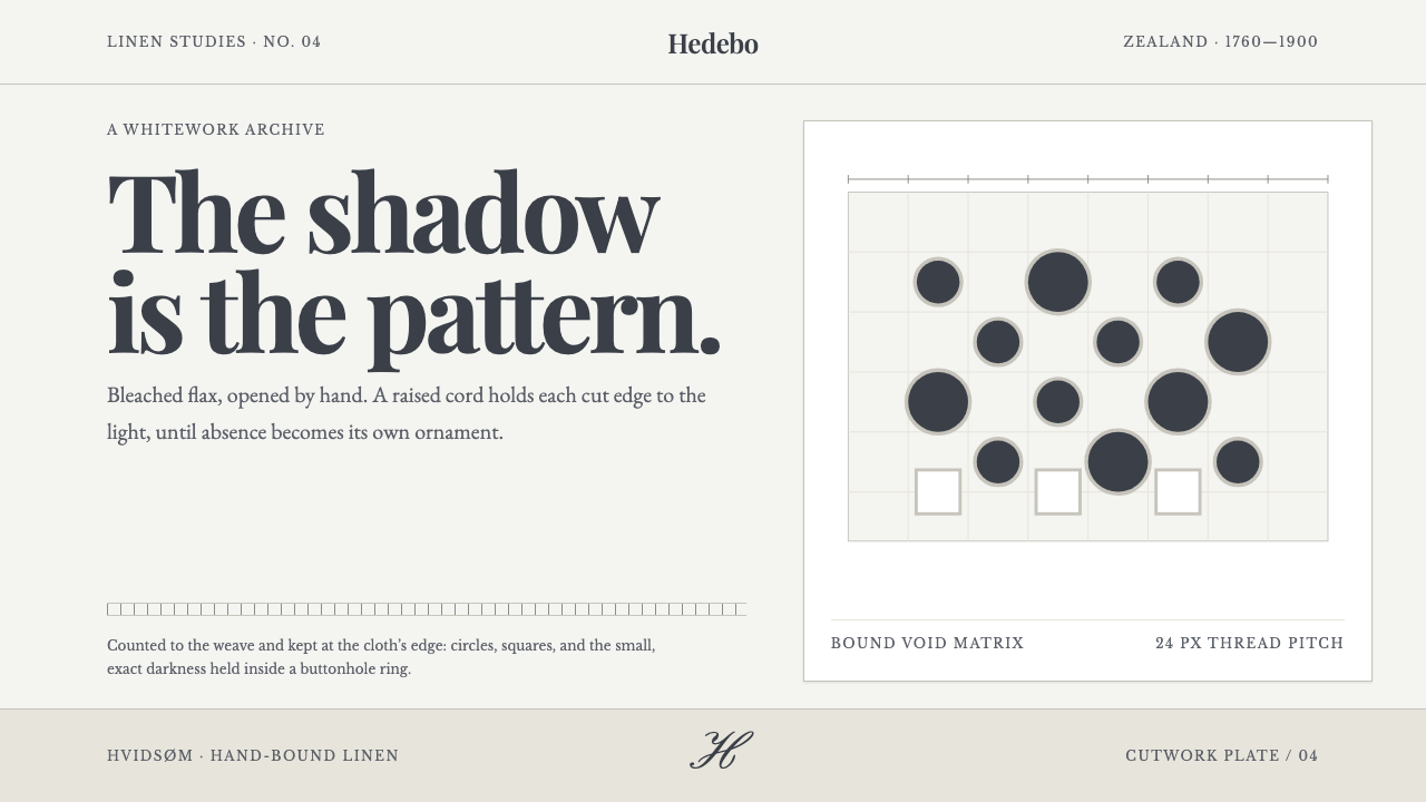 Danish Hedebo CutworkOrnament is cut, not applied. Bleached linen and bound shadow turn voids into…
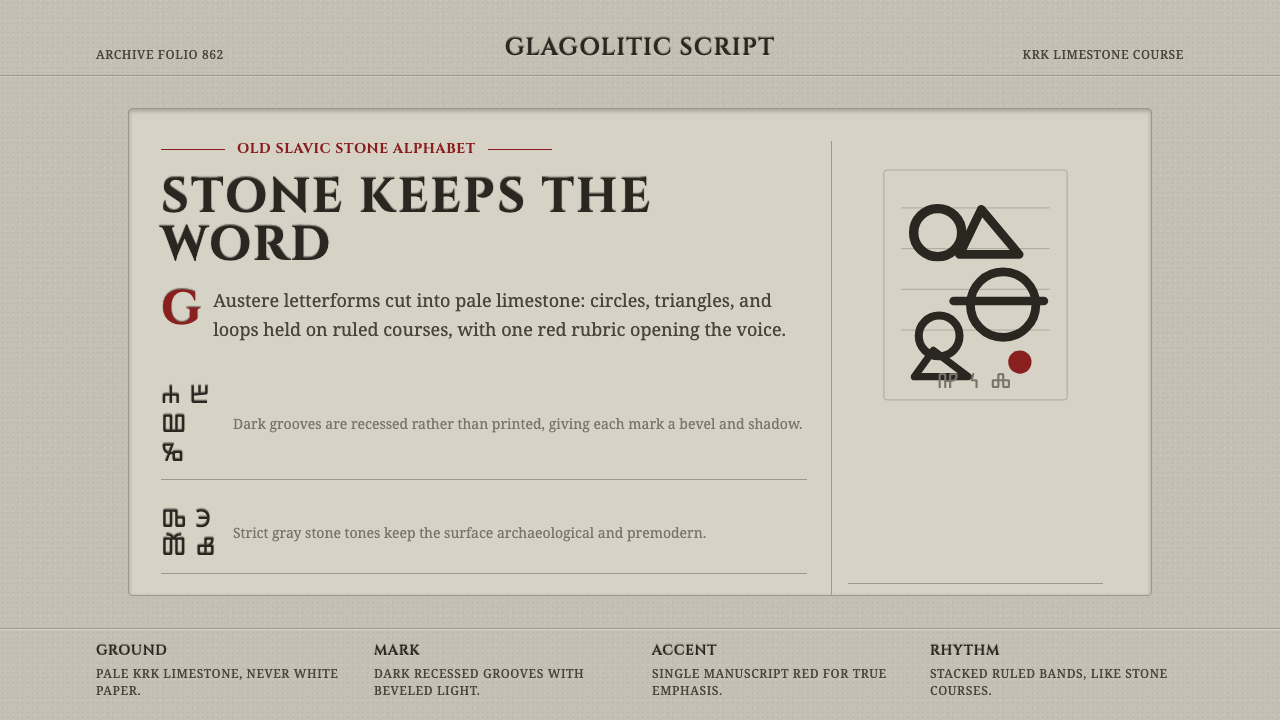 Glagolitic ScriptCarved faith in limestone. Cinzel capitals and red rubrics sit in shadowed gr…
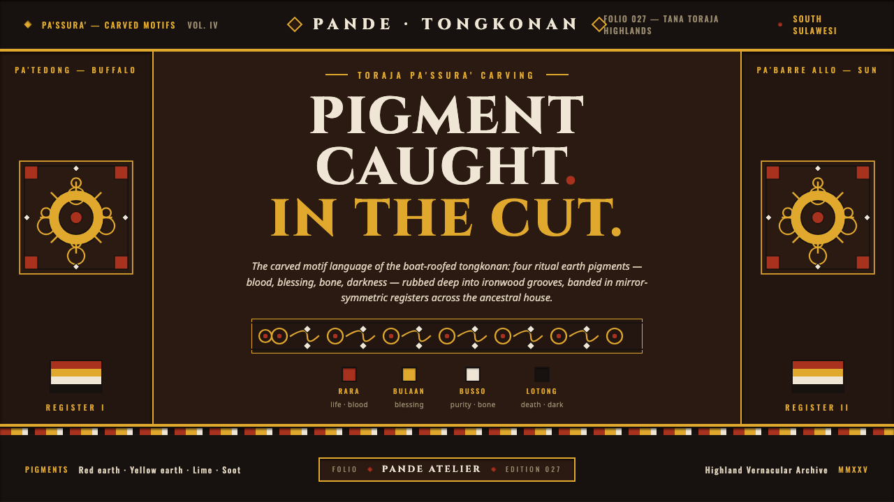 Toraja Pa'ssura CarvingPigment caught in the cut. Red, yellow, lime, soot rubbed into ironwood groov…
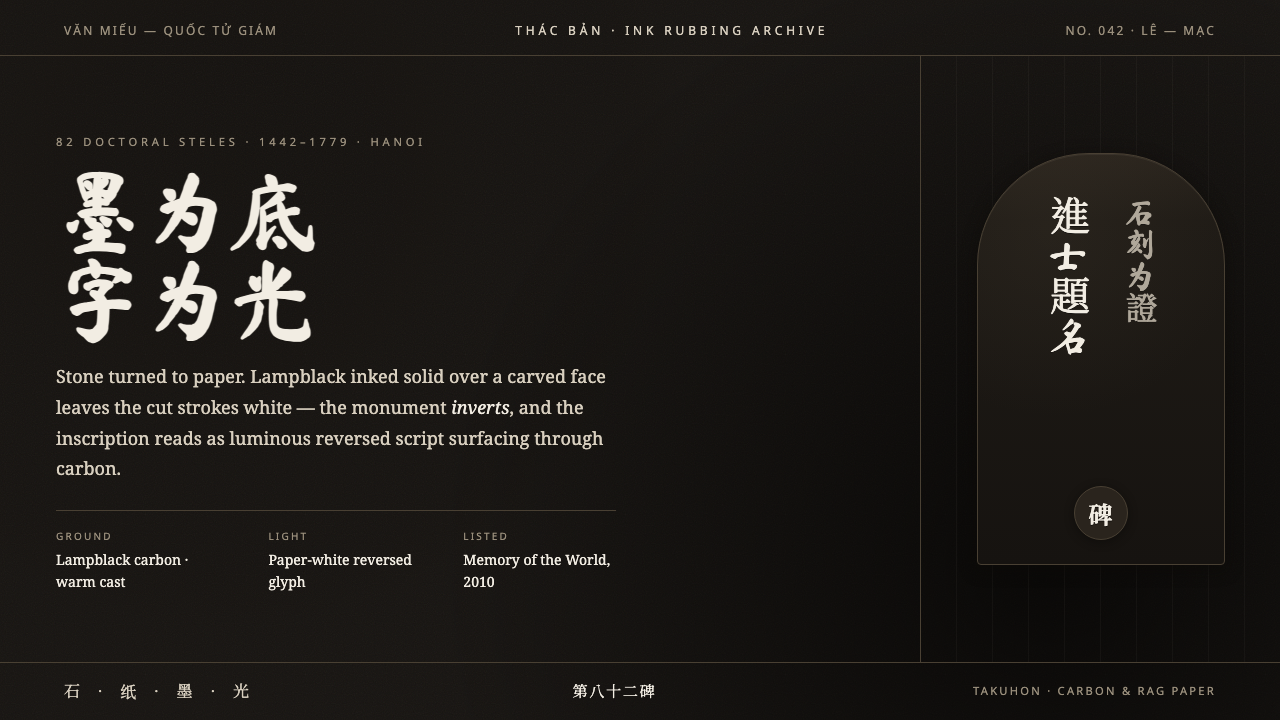 Vietnamese Stele RubbingStone turned to paper. Lampblack ground, ghost-white carved Han glyphs surfac…
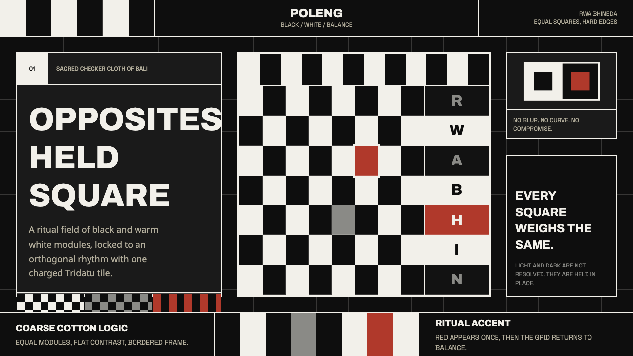 Balinese Poleng ClothSacred duality holds. Black-white squares lock the field; one red tile charge…
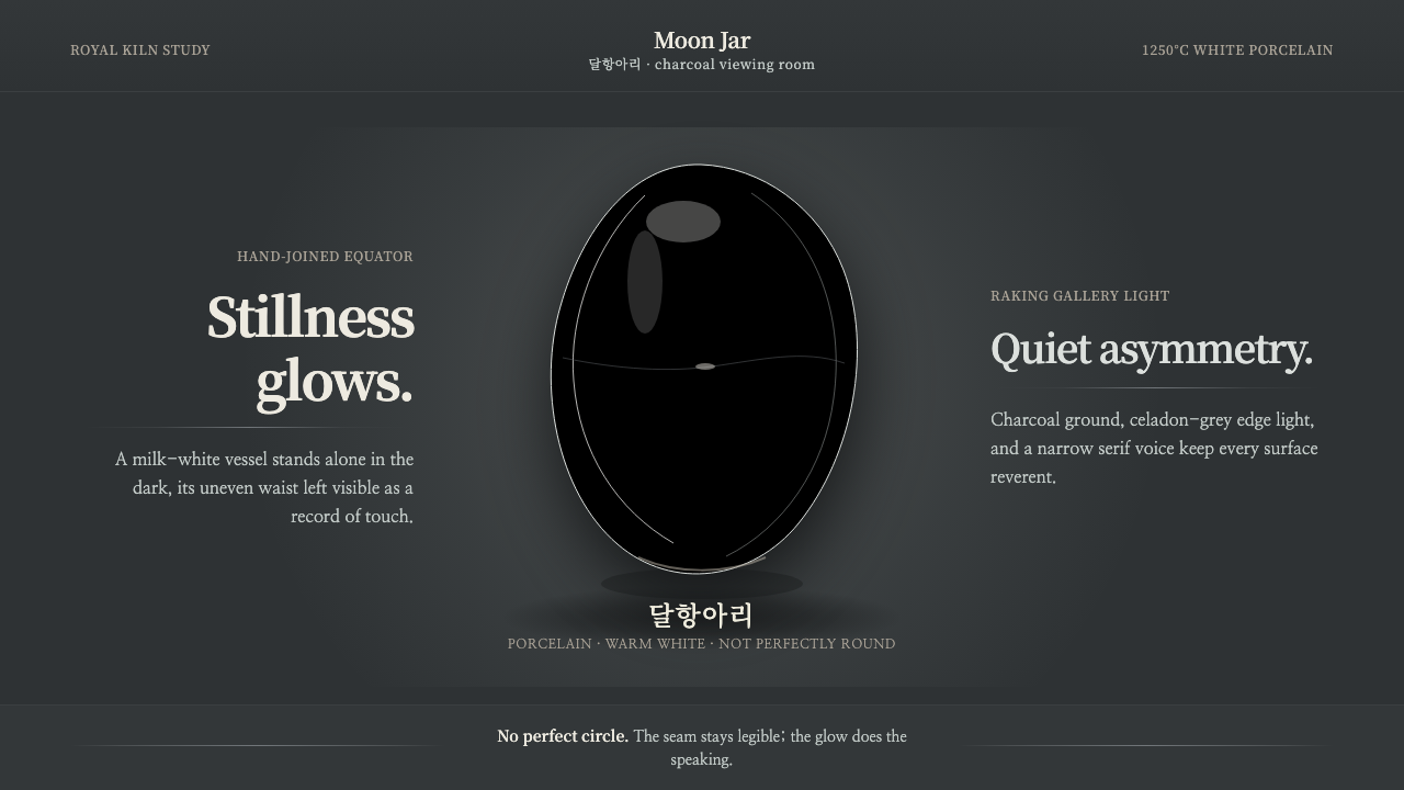 Joseon Moon JarQuiet imperfection glows. Milk-white porcelain floats on charcoal with a visi…