What is Prishtina National Library?
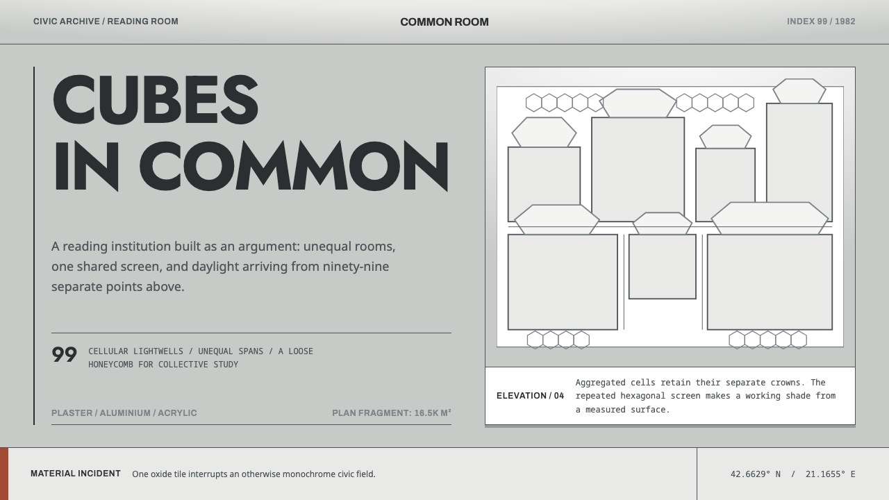
A national library built as ninety-nine plaster-white cells under a single aluminium net, the Prishtina National Library is a civic building that refuses to give one answer.
Prishtina National Library in brief
The Prishtina National Library style is a design language drawn from the National Library of Kosovo, the civic building in Prishtina that was designed from 1971 and opened on 25 November 1982 by the Croatian architect Andrija Mutnjaković. It belongs to late Yugoslav modernism, and its image is unmistakable even to people who have never visited: a loose cluster of cast concrete cubes, each capped by its own translucent dome, all of it wrapped in a grey aluminium net of hexagons.
The idea at the centre of the building is that a library need not be one object. Mutnjaković did not design a single library volume. He designed ninety-nine small ones and pushed them together, so that the whole reads as an aggregation of cells rather than a monolith. The cells are unequal in size and sit in a loose honeycomb instead of a strict grid. Over them lies the one rigorous element, a measured net that never varies. Irregular below, regular above: the two systems are held in tension and neither is allowed to win.
As a design language, this is a style about ambiguity handled with discipline. The palette is quiet, built from plaster white, concrete and the dull grey of aluminium, so the character comes from structure rather than colour. The surface can be read several ways at once, as a fishing net, as filigree, as a veil, and, quite plainly, as a sunshade. The building has been placed on lists of the world's ugliest buildings and on lists of its masterpieces with roughly equal frequency. The style inherits that double life and puts it to work.
Where does Prishtina National Library come from?
The library was designed from 1971 and opened on 25 November 1982, in Prishtina, which at the time lay within the Socialist Federal Republic of Yugoslavia. Its architect was Andrija Mutnjaković, a Croatian architect, and the building sits at the meeting point of three currents: Yugoslav modernism, structuralism with its logic of cellular aggregation, and the civic architecture of the Non-Aligned era. Each of them leaves a visible mark. Modernism supplies the cast concrete and the refusal of period ornament. Structuralism supplies the idea that a large building can be assembled from repeated, varied units rather than composed as one gesture. The civic tradition supplies the sense that a library is a public room for everyone, not a private monument.
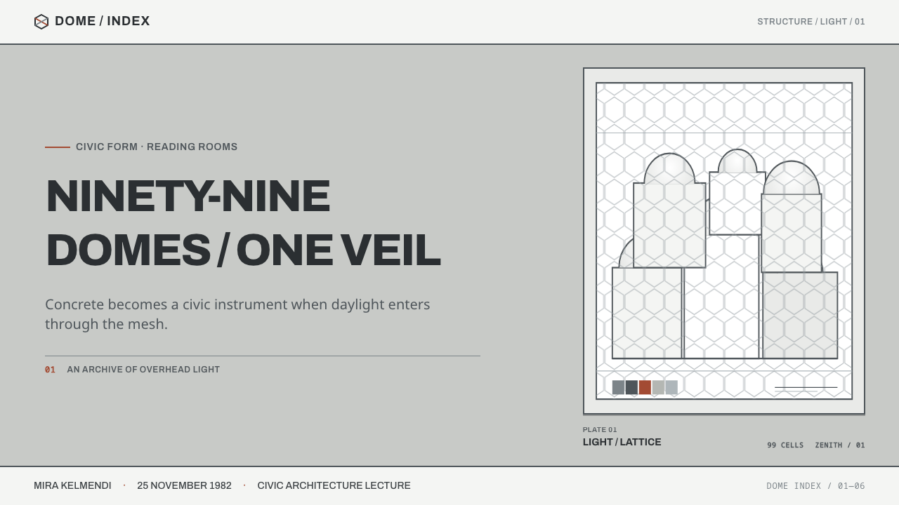
The construction method is the key to the look. The building is made of cast concrete cubes with white plaster inside and marble on the floors. Each cube is capped by its own translucent acrylic dome, and the domes are all different sizes, ninety-nine of them in the finished building, so that daylight falls from above straight into the reading rooms. The cubes are not set out on an orthogonal grid. They cluster in a loose honeycomb, which gives the library the character of a collection of related rooms rather than one hall repeated.
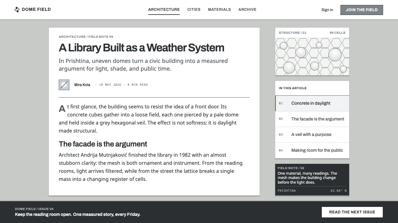
Over the whole cluster goes a grey aluminium net of hexagons. It is the building's most discussed feature, and people have read it in different ways: as a fishing net, as filigree, as a veil. Some see in it the filigree craft of Kosovo. It is also, without any mystery, a sunshade, and that double identity matters. The net is ornament and utility at once, the point on the façade where symbolism and practical function coincide. For a design system, it is a model of a decorative layer that earns its place.
The reception has been polarised ever since. The library appears on lists of the world's ugliest buildings and on lists of Yugoslav modernist masterpieces with roughly equal frequency, and the two camps are describing the same façade. Rather than trying to resolve the argument, the design system treats it as a feature. The style is made for work that is willing to be read in more than one way, and that holds its nerve when people disagree about it.
What defines the Prishtina National Library look?
Cellular Aggregation
The composition is built from many separate cells pushed together rather than from one large container. The cells are unequal in size, and they sit in a loose honeycomb instead of a strict grid. In a layout this means modules of different weights packed closely, where the differences between them carry the hierarchy: a large cell for what matters most, smaller cells around it, and no pretence that all content deserves equal space.
The Hexagonal Net
A grey, metallic net of hexagons is laid over the whole composition. It is the only strictly measured element, and it is deliberately more regular than anything beneath it. It has to stay open enough for the cells under it to remain visible, and it works best as a fine, even overlay rather than as a heavy texture. Its regularity is what makes the irregularity below it legible.
Plaster White
The cells are white plaster, the structure is cast concrete, and the net is aluminium grey. The palette is a family of pale and grey neutrals with almost no chroma, so identity does not depend on colour. Light does that work instead: the white surfaces exist to receive daylight and show its gradations. Where an accent is needed, it should be rare and should never compete with the net.
Domes and Daylight
Each cell is capped by its own translucent dome, and the domes differ in size, which sends daylight straight down into the room beneath. In interface terms this suggests soft, diffuse glow arriving from above and translucent layers capping a module, not hard cast shadows. The light is part of the architecture. It is the one thing that every cell has in common.
Material Honesty
The materials appear under their own names: cast concrete, white plaster, marble floors, aluminium net, acrylic domes. Each does its own job and none pretends to be another. A design faithful to this keeps surfaces plain and distinguishable. It does not simulate textures it does not have, and it does not decorate merely to look rich.
Ornament That Works
The net is read as filigree and as a veil, but it is also a sunshade. That is the principle at the heart of the style: the most expressive element is also a functional one. In a layout, the overlay should do something, whether grouping, shading, framing or signalling, and should not exist only to look rich.
Tension Without Resolution
Irregular cells beneath, a regular net above: neither is subordinated to the other. The building does not resolve into a single reading, and the style should not either. Hierarchy comes from the contrast between loose and strict, which is why swapping the loose cells for a uniform grid, or the net for a looser pattern, collapses the whole idea.
Who shaped Prishtina National Library?
The Croatian architect behind the National Library of Kosovo, whose design began in 1971 and whose building opened on 25 November 1982. His approach, in the design system's own account, was to treat the library not as one building but as ninety-nine, joined in a loose honeycomb with a single net laid over the top. He is the only author this system names, and his name remains attached to a debate about the building that has never settled.
The institution that gives the style its name and its subject. Opened on 25 November 1982, it is a public building in which concrete cubes, white plaster interiors, marble floors and translucent domes serve readers beneath a metal net. Its presence on both the 'ugliest' lists and the masterpiece lists makes it as much a talking point as a public service, and the design system treats that notoriety as part of its material.
Filigree, the craft of fine worked metal thread, is one of the readings people give to the net, alongside fishing net and veil. It is something some viewers see rather than a documented intention, and the style honours that: the net evokes craft without copying it. It is a reminder that the best ornament invites associations instead of prescribing one.
How do you use Prishtina National Library today?
Applied well, this style gives interfaces and presentations a calm, civic authority with a structural idea underneath. It suits work that has to feel public, institutional and deliberate, and it asks the designer to hold two systems at once: loose modules and a strict overlay. The type should stay quiet and civic so that the cells and the net carry the character.
On slides, a cover can be built as a small cluster of unequal pale cells, with the title set inside the largest one and a fine, regular hexagonal net spread across the whole composition as a restrained overlay. Content slides work as aggregates: one large cell for the main statement, smaller cells for supporting points, evidence and sources, packed closely and sized by importance rather than equalised. Data slides can place each chart in its own cell. The net should disappear there, or recede to a faint presence at the edges, so that it never competes with the numbers.
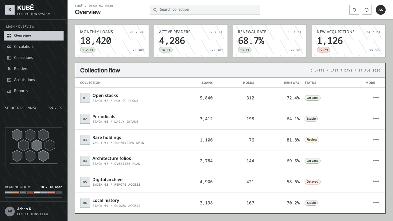
On the web, the style fits dashboards particularly well, because a dashboard is already an aggregation of modules. Cards of different sizes sit tightly together on a pale ground, with the largest reserved for the primary metric, and the hex net is limited to the header band, an empty state or a section backdrop, never behind tables or forms. Pricing pages can let the recommended plan occupy a larger cell than the others instead of relying on a coloured badge. Navigation should stay plain and typographic, in a quiet institutional voice.
In editorial and marketing work, the style belongs with libraries, archives, museums, public institutions, architecture practices and cultural programmes: anywhere the subject is the public realm. A long-form article can open with a veil-like hero in which the net lies over a photograph or a plaster-white field, then fall back to calm, well-spaced reading columns. Case studies and annual reports benefit from the cell logic, with each project occupying a block sized to its weight in the story.
The most common mistake is to keep the net and lose the cells, or the reverse. A uniform grid of equal cards under a hexagon pattern is just a textured template, while irregular cells without a measured overlay look like a collage. A second mistake is to treat the net as wallpaper, repeating it behind every surface until it stops being a single act of covering and becomes noise. Finally, resist adding drop shadows, glossy gradients or bright accents to make the cells pop. The style's strength is that its materials are plain and its light is borrowed from above.
Prishtina National Library — FAQ
What is the Prishtina National Library design style?
It is a design language taken from the National Library of Kosovo in Prishtina, designed from 1971 by Andrija Mutnjaković and opened in 1982. Its two defining ideas are a cluster of unequal plaster-white cells and a single measured aluminium net of hexagons laid over them. In an interface this becomes modules of different sizes beneath one strict, regular overlay, in a restrained palette of whites and greys.
Is it Brutalism?
The building uses cast concrete, which is why it is often discussed alongside the concrete architecture of its era, but the labels attached to this system are Yugoslav modernism, structuralism with cellular aggregation, and Non-Aligned-era civic architecture. Its distinctive parts, white plaster interiors, translucent domes and a metal net, are lighter and more ornamental than the heavy, monolithic image most people associate with Brutalism. It is better approached under those more specific labels.
Why pair irregular cells with a regular net?
Because the pairing is the idea. The cells are deliberately unequal and arranged in a loose honeycomb, while the net above them is strictly measured. Each makes the other legible: the net's regularity shows how irregular the cells are, and the cells' variation keeps the net from becoming a bland pattern. Remove either and the composition loses its tension.
Does the style work in dark mode?
It is a light-ground style by origin. The plaster interiors and the daylight falling through the domes are the logic of its surfaces, and white is its base. A dark version can be attempted, but the net then has to be treated as light metal over dark cells, and the sense of daylight is easily lost. If you need a dark variant, keep the net the lightest element and keep the cells close together in tone.
Is it risky to build a brand on a building people disagree about?
It can be, and that is the point. The library appears on lists of the ugliest buildings and on lists of masterpieces with roughly equal frequency, and the two sides are looking at the same façade. The style suits brands and products that are comfortable being read in several ways and that value conviction over universal approval. If your product needs to feel uncontroversial and soft, choose another style.
Related design styles
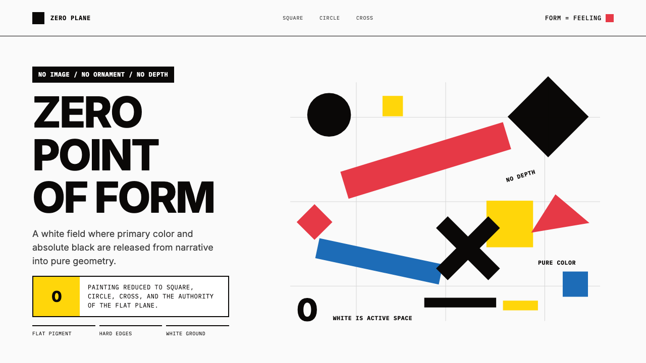 Malevich SuprematismGeometry declares zero. Red, yellow, blue and black blocks float on active wh…
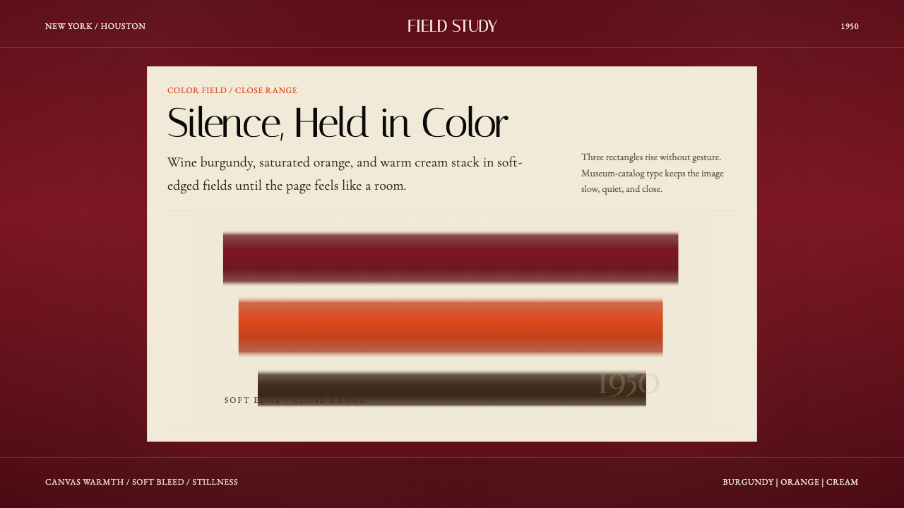 Mark Rothko Color Field (1950)Silence made visible. Burgundy, orange, and cream stack in soft-edged fields.
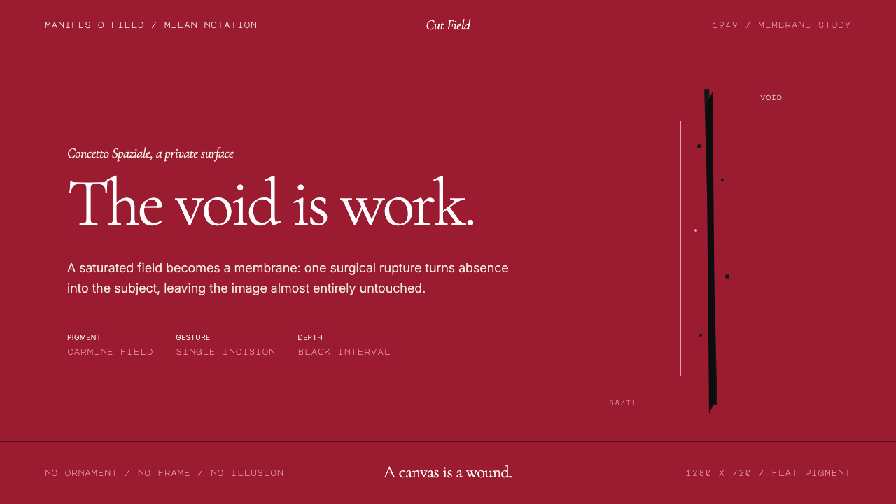 Spatialism (Fontana Cut, 1949)Absence becomes medium. Carmine field, Garamond restraint, one black incision.
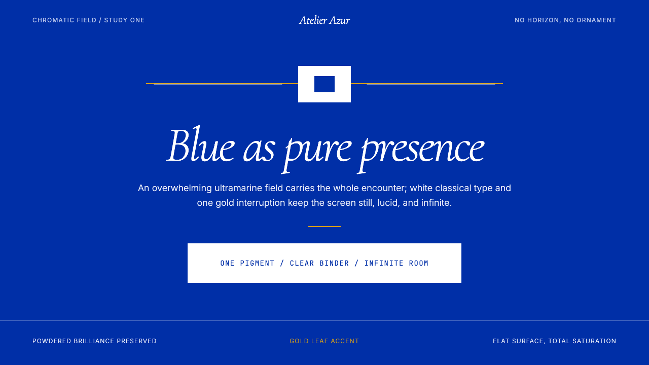 Klein Blue (IKB)Color becomes the content. Pure ultramarine field, white italic serif, one go…
 Pink Floyd — Dark Side of the MoonOne image does everything. Black void, white beam, hard prism, seven exact co…
 Argentine Arte ConcretoCanvas becomes object. Primary blocks, black hairlines, and a cut-frame grid…