What is Shigeo Fukuda Optical?
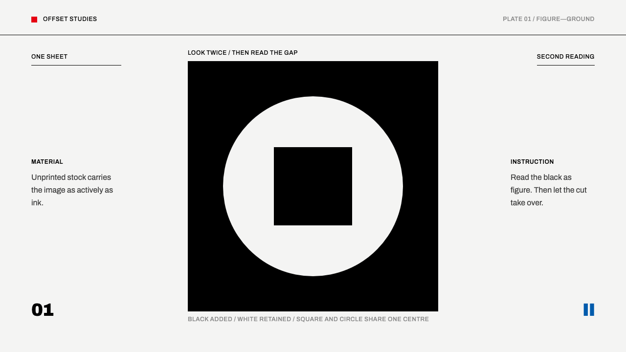
Shigeo Fukuda's optical posters make one sheet do two jobs — black ink on white paper, a flat cut between figure and ground, and a second reading that appears the moment you notice the white.
Shigeo Fukuda Optical in brief
Shigeo Fukuda Optical is a design language based on the posters of the Tokyo designer Shigeo Fukuda, whose defining work runs from 1967 to 1985. His method was closer to a magician's than a decorator's: one sheet, one idea, and a figure that turns into something else the moment the viewer notices the ground. The material story is almost nothing — black printing ink on an unprinted white sheet — and the white does half the work.
The system takes him at his word. The page is near-white, the one ink is black, and a small supporting set of flat spot colours, red, blue and yellow, each used once and always solid, stays in reserve. Nothing is shaded, nothing is textured, and no margin is filled to be safe. Type is a plain grotesque, set small and kept in a corner where it does not compete with the image.
What holds the design together is not decoration but the cut: the line where figure meets ground, and the second reading hiding in it. The rule that governs everything else is a restriction of scope. One sheet carries one pun, and once it has been told, the poster stops.
Where does Shigeo Fukuda Optical come from?
The lineage runs from 1950 to 1990, with the defining posters falling between 1967 and 1985, and it is set in Tokyo, Japan. Three movements are named: Swiss and International Typographic minimalism, Japanese poster design, and optical art and impossible figures. Together they describe a designer working at the crossing of a European discipline of restraint, a local poster culture, and a tradition of images that deceive the eye on purpose.
Fukuda is the centre of the lineage, and three Japanese contemporaries are named around him: Yusaku Kamekura, Ikko Tanaka and Kazumasa Nagai. They put the work in context. Fukuda's wit was not a lone eccentricity but one voice in a Tokyo poster scene that took international modernist discipline seriously, with its plain type and its reduction of colour, and used it to say something surprising.
The materials are strikingly modest. A catalogue entry at the Victoria and Albert Museum records the work in plain terms: colour offset lithography, printed by Toppan Printing, ink on paper. The record lists nothing more exotic than ink and paper. The cleverness lives entirely in the image, in how a black shape and an unprinted white sheet can be read as two different things at once, and the system respects that by adding nothing.
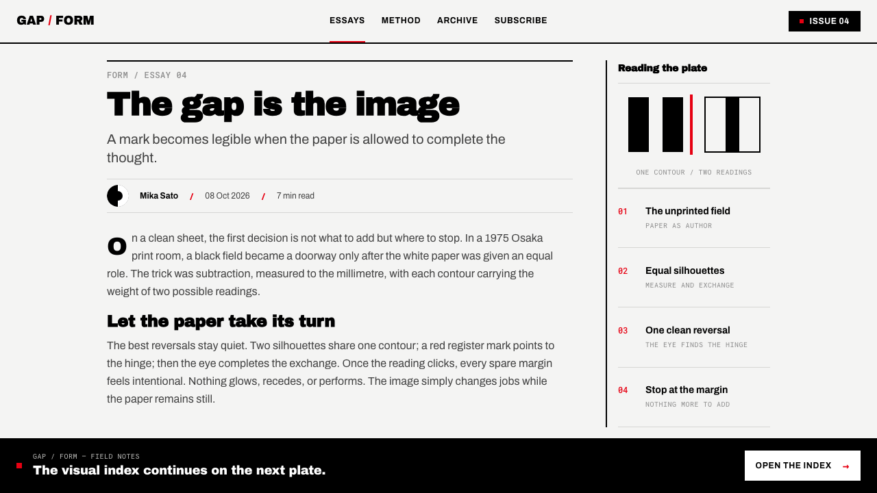
Translating this into a design system means respecting the economy. A near-white page stands for the unprinted sheet; black is the only ink that is truly added; red, blue and yellow appear once each as flat spot colours, never shaded and never textured. The grotesque type is small and polite. Because the poster's force depends on the viewer discovering the ground, the margin must stay open and the composition must leave white exactly where the second reading can form.
What defines the Shigeo Fukuda Optical look?
Figure and ground that trade places
The central device is a figure that turns into something else when the viewer notices the ground. Black shape and white sheet each carry meaning, and the image works only if both are read. The cut between them is the design: edges must be clean, decisive and exact, because the second reading depends on the boundary.
One ink on unprinted white
The material story is black printing ink on an unprinted white sheet. The paper is not a background but a colour in the composition, the one that does half the work. Treating the white as active, as something the design uses rather than merely leaves over, is what separates this style from simple black-on-white graphics.
Flat spot colours, each used once
Red, blue and yellow form a small supporting set, and they are always flat solid fills. Each is used once in a composition, never gradated and never layered into secondary mixes. They act as a single note, a point of emphasis, rather than as a palette that decorates the whole sheet.
No shading, no texture
Nothing is shaded and nothing is textured. There are no gradients, no shadows, no grain, no simulated paper. This is not minimalism as a mood but a technical requirement of the trick: any tonal modelling would give the eye a reason to read the shape as an object, and the figure-ground reversal would fail.
A plain grotesque, set small
Type is a plain grotesque with no personality of its own. It is set small and kept to a corner so that it never competes with the image. Its job is information, not expression. The restraint means the typography reads as a caption written by a modest assistant to the idea.
An open margin
The margin is never filled. Empty space around the image is not nervousness about leaving gaps; it is where the viewer's attention rests, and where the white can behave as figure. A layout that crowds the edges with borders, logos or taglines undercuts the very ground the image relies on.
One sheet, one pun
Each poster tells one joke or one idea, once, and then stops. This is the discipline that holds the other rules in place. A second idea, a second layer of meaning or a second visual surprise breaks the rhythm of discovery, which is the entire pleasure of the format.
Who shaped Shigeo Fukuda Optical?
The centre of the system and the designer whose posters, between 1967 and 1985, define the style. He built posters the way a magician builds a trick: one sheet, one idea, and a figure that turns into something else once the ground is noticed. The lesson he leaves a designer is about economy: when the idea is right, black ink on white paper is enough, and anything else is a way of not trusting it.
Named among the key figures of the Tokyo poster lineage and a contemporary of Fukuda. His name stands in this system for Japanese poster design as a discipline, a field in which a single sheet had to deliver a clear idea at a glance. For individual works and context, histories of Japanese graphic design are the better guide; what the system borrows is the shared seriousness of purpose.
Another of the Japanese contemporaries named in the lineage. His inclusion points to the second strand of the system's background, the restraint of Swiss and International Typographic minimalism as it was absorbed in Tokyo. Alongside Fukuda's wit it demonstrates that the plain type, reduced colour and open margin are a discipline in their own right, not merely a backdrop for the joke.
The fourth name in the roster, completing a picture of a Tokyo scene rather than a lone figure. For anyone applying the style, the useful reading is that Fukuda's optical trick sits on top of shared rules, and that the rules are the part that can be reused with confidence. The trick itself has to be invented fresh each time, from an actual idea.
How do you use Shigeo Fukuda Optical today?
Shigeo Fukuda Optical is a style where less is the engine rather than the aesthetic, and it only works when there is a real idea to carry. With no idea, the result is an empty page; with one, it is a precise instrument. Before applying it, decide what the second reading is, because everything else in the system exists to protect that moment of discovery.
On slides, the cover is the poster: a near-white field, a bold black shape whose cut with the white produces a second image, and a title in small grotesque type tucked in a corner. Content slides carry one claim each, set plainly, with the white doing the emphasis. For data slides, build charts from solid black shapes, use a single flat red, blue or yellow once to isolate the number that matters, and avoid gridlines, shading and decorative legends.
On the web the style suits portfolios, studios, cultural institutions, campaigns and advocacy, and product pages with one concept per section. A hero can be a single large figure-ground image with a small navigation set in plain type; sections follow with open margins and one idea each. Cards are areas of white without borders or shadows, buttons are flat blocks of black, and the one flat spot colour is reserved for the primary action.
In editorial and marketing work, such as posters, campaign key visuals, magazine covers, exhibition announcements and public-service messages, the style is at its most natural. Choose the idea first, then reduce it until it fits in one ink and one cut. Captions and credits stay small and sit in a corner; the image gets the rest of the sheet and the margin around it gets left alone.
The common mistakes are decorating the white and doubling the idea. Textures, gradients, drop shadows or noise on the page destroy the figure-ground logic; using all three spot colours at once turns emphasis into a palette; adding a second visual gag dilutes the first. Large, expressive typography competing with the image is another way to lose, as is crowding the margin with borders, logos and taglines.
Shigeo Fukuda Optical — FAQ
What does figure-ground reversal mean in a poster?
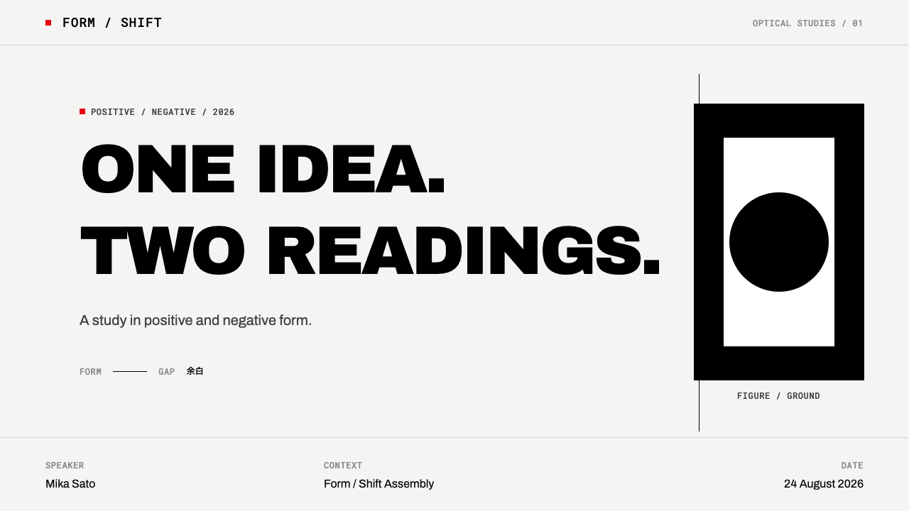
A figure is the shape you read as the subject, and the ground is the space around it. A figure-ground reversal is when the ground turns out to be a subject in its own right, so the image has a second reading that appears once you notice the white. In Fukuda's posters the cut between black ink and unprinted paper is the whole mechanism, which is why the edges have to be exact.
Why is there only one ink?
Because the unprinted white sheet is the other half of the image. Black is the only ink that is truly added, and the paper does the rest of the work, so adding more tones would give the eye additional objects to read and break the reversal. The record of the work is just as plain: colour offset lithography, ink on paper, with no extra material.
How should the red, blue and yellow be used?
As flat spot colours, each at most once in a composition, always as a solid fill. They are emphasis rather than palette. In a slide or a page, that means one coloured element that points at the thing you want seen first, with everything else in black and white. If you reach for a second colour, check whether the hierarchy needs fixing instead.
Do I need an illustrator to use this style?
No, but you do need an idea. The images are built from simple, bold, flat shapes, and the cleverness is in how those shapes meet the white. Start from a pair of readings, such as an object that is also something else, and reduce them to a single black form and a cut. If you cannot say what the second reading is in one sentence, the poster is not ready.
Does this style work on a dark background?
It is built on an unprinted white sheet, and the white is half of the image, so the natural form is dark on light. Inverting changes the logic: the paper is no longer the unprinted ground and the ink is no longer black, which alters the discovery the poster depends on. If you must go dark, keep the same flatness, the same single ink and the same open margin, and test the second reading carefully.
Related design styles
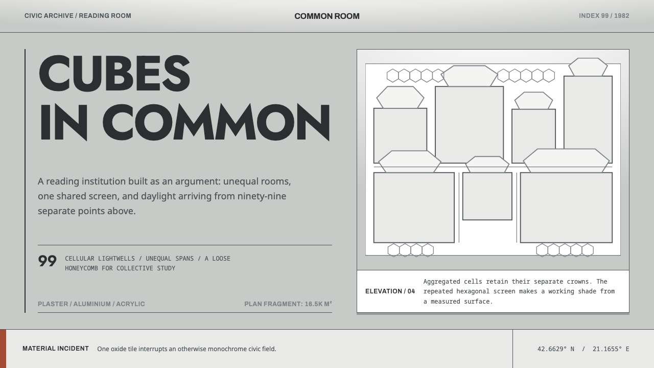 Prishtina National LibraryCivic modernism that refuses one answer. Unequal plaster cells sit beneath a…
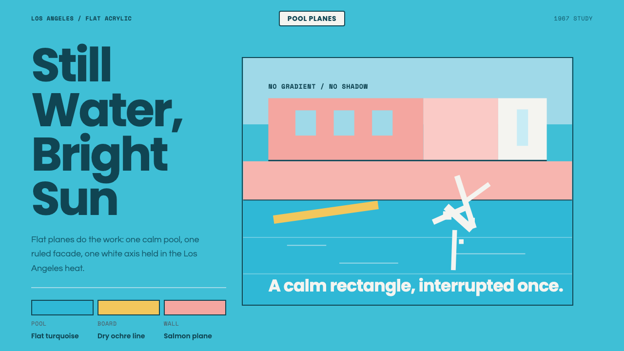 Hockney Pool BlueSerenity turns graphic. Turquoise planes, salmon edges, one white splash.
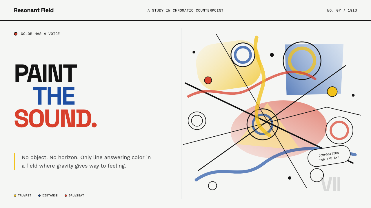 Kandinsky Composition (1913)Color becomes sound. Primary washes, hollow circles, and black diagonals coll…
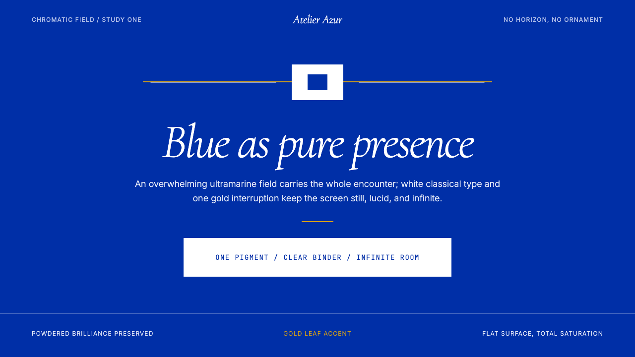 Klein Blue (IKB)Color becomes the content. Pure ultramarine field, white italic serif, one go…
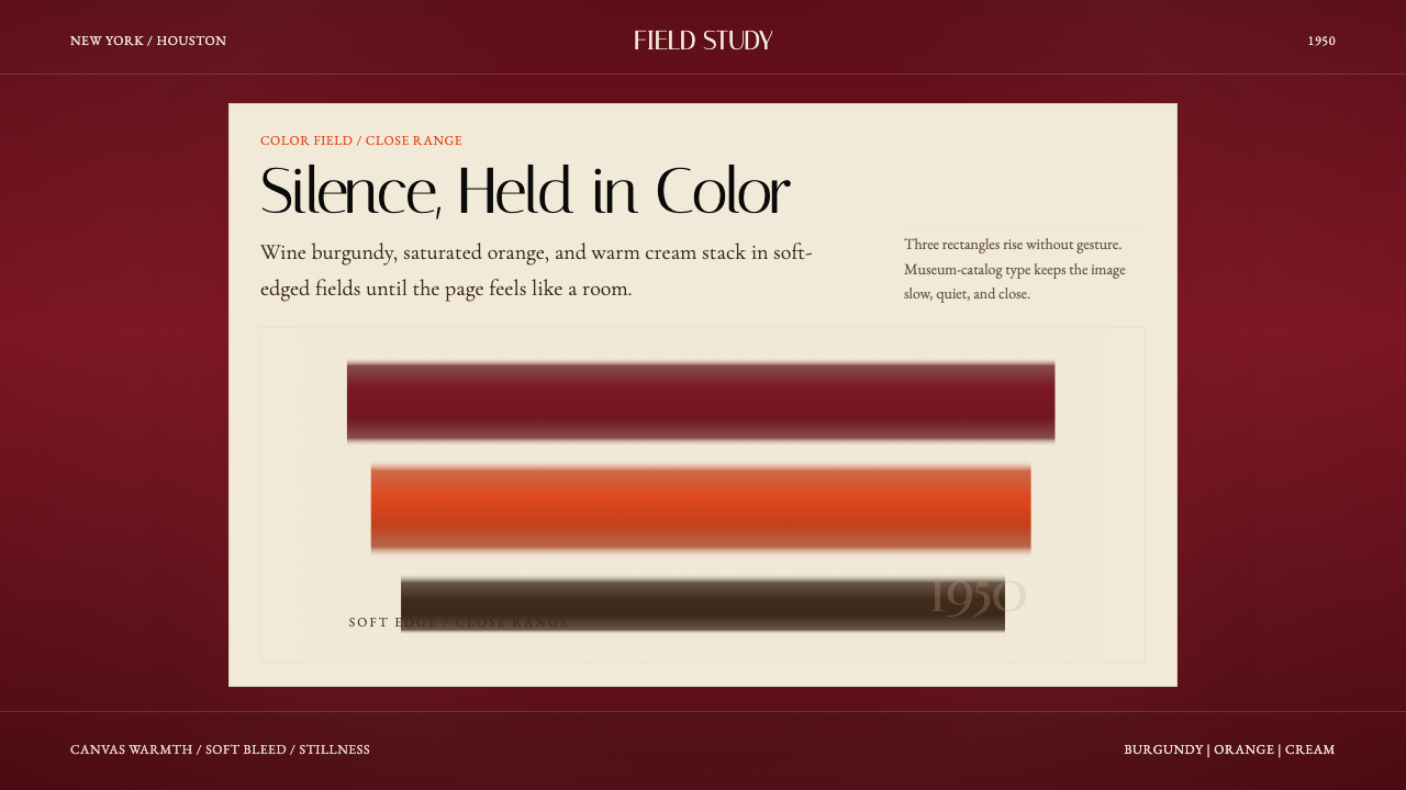 Mark Rothko Color Field (1950)Silence made visible. Burgundy, orange, and cream stack in soft-edged fields.
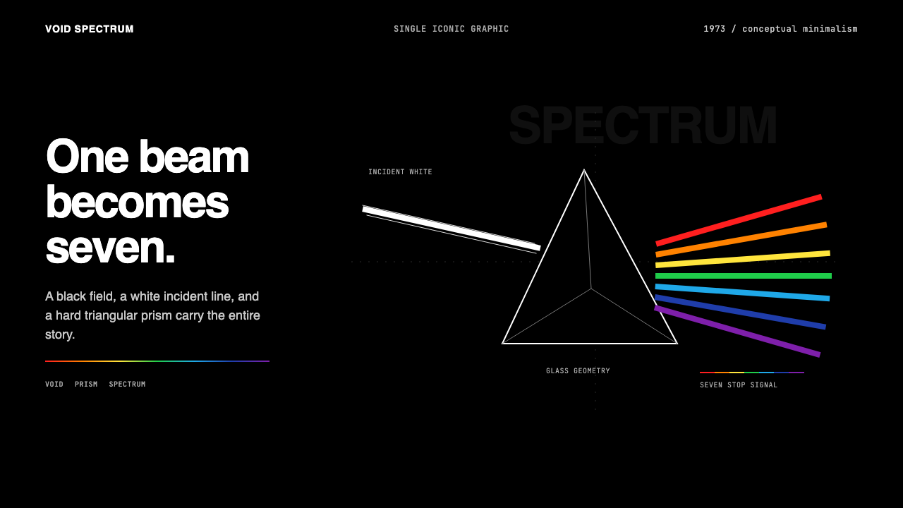 Pink Floyd — Dark Side of the MoonOne image does everything. Black void, white beam, hard prism, seven exact co…