What is Kinfolk?
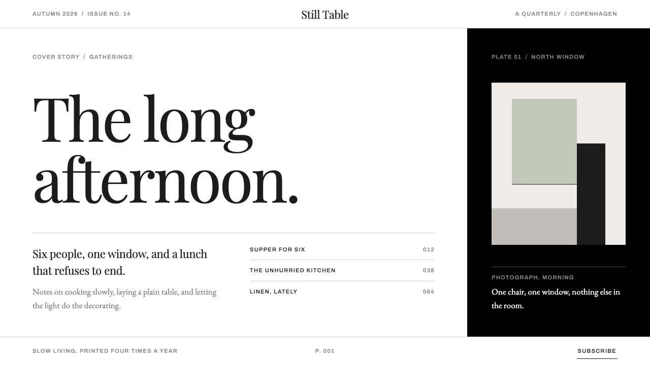
Kinfolk made the empty page the main event — true white matte paper, a hairline serif, one window-lit photograph, and the confidence to leave most of the sheet unprinted.
Kinfolk in brief
Kinfolk is a quarterly magazine founded in 2011 in Portland, Oregon, whose pages have become shorthand for a whole genre of slow-living publishing. Its look is easy to describe and surprisingly hard to copy: true white matte paper, near-black type, a headline in a fine-hairline serif with strong contrast between thick and thin strokes, a single photograph lit by a single window, and a page that is mostly empty on purpose.
The style sits where three currents overlap. Slow-living and new-domesticity publishing supplied the subject matter: shared meals, small gatherings, unhurried routines, the home as a place worth paying attention to. Scandinavian editorial minimalism supplied the discipline: restraint in colour, a preference for quiet typography, and a belief that a page can be finished by taking things away. The independent-magazine revival supplied the form: a printed object meant to be kept on a shelf rather than scrolled past, in which paper stock and white space are part of the argument.
Visually the system is built from very few parts. Hairline rules replace boxes and cards. Captions, folios and running heads are set in a small-caps sans-serif so quiet that it reads as texture until you look for it. Warm grey and a pale sage green appear only on panels and cards, never flooded across a whole page. Every few pages a full-bleed black page interrupts the white, resetting the eye the way a pause resets a conversation. There are no drop shadows, no gradients and no ornament; the only atmosphere comes from the photograph and from the air around it.

Where does Kinfolk come from?
The story begins at a dinner table. Kinfolk started in 2011 in Portland, Oregon, as a magazine about small gatherings: cooking for friends, eating slowly, and spending time with people without an agenda. Nathan Williams and Amanda Jane Jones are the names most closely tied to the founding years. The premise was modest and, in hindsight, well timed. Its subject was the unglamorous act of sitting down together, photographed in natural light rather than staged under studio strobes, and it gave that subject the production values of an art book.
Over the following years the editorial base moved from Portland to Copenhagen, and the move left a visible mark. Scandinavian editorial minimalism was less an influence the magazine borrowed than a climate it came to work in: pale surfaces, disciplined grids, and a respect for negative space that Nordic design culture is widely associated with. The magazine's object quality, heavy on paper choice and light on decoration, made it collectible. Readers kept issues rather than recycling them, which is exactly the behaviour a slow-living publication hopes to cultivate.
The magazine's look has been revised more than once, and the revisions are part of the record. A redesign in 2015–16 is associated with the designer Charlotte Heal; Alex Hunting is another designer whose name is connected with the magazine's visual direction; and a tenth-anniversary redesign in 2021 brought in typefaces from the foundry Schick Toikka. What matters for anyone borrowing the style is that Kinfolk has never been a frozen template. The constants — white paper, hairline serif, generous margin, the occasional black page — survive each revision, while the finer details of typeface, proportion and structure are refreshed. The identity lives in the rhythm, not in any single font or rule.
The cultural moment helped. The early 2010s saw a wave of independent print magazines arriving just as print was supposed to be finished, and a broader turn toward home life, cooking and handmade things that is sometimes called new domesticity. Kinfolk was one of the clearest expressions of both. Its influence then travelled far beyond the magazine rack: cafés, hotels, skincare brands and furniture labels all borrowed the white page and the soft window light until the look became a default language for calm, considered living. That wide imitation is also why the original is worth studying carefully. The borrowed versions usually keep the whiteness and lose the discipline.
What defines the Kinfolk look?
Paper and White
The ground is true white, imagined as an uncoated matte sheet with no gloss and no cream cast. Nothing is tinted to look 'warm'; warmth comes from the photographs and from small, quiet accents. The paper is the first design decision, because every other element — near-black type, hairline rules, soft photographs — depends on the white being clean and unlit. On screen this means an honest white background with no texture overlay, no off-white wash and no gradient.
Hairline Display Serif
Headlines are set in a fine-hairline serif with a pronounced contrast between thick and thin strokes. At large sizes the thin strokes become almost invisible, which gives the title an airy, drawn quality. It is typically broken across several short lines rather than run out in one, so the headline reads as a small block of shape in the margin. The serif carries the editorial voice; it is used sparingly and never for body labels.
Small-Caps Caption Sans
Captions, folios, running heads and credits are set in a small-caps sans-serif, tracked open and kept quiet. This second voice does administrative work: it tells you the page, the place, the credit, and it stays out of the headline's way. The pairing of a refined serif for voice and a small sans for information is the typographic backbone of the whole system.
Hairline Rules, Not Boxes
Where other layouts reach for cards, boxes and fills, Kinfolk uses a single fine line. A hairline separates a column from a margin, a heading from a list, one section from the next. Boxes are absent and shadows are absent. The line implies a division without making a container, which keeps the page continuous and lets the whitespace do the grouping.
Margin as Layout
Empty space is the layout. A typical page carries one photograph lit by a single window, a short headline and a narrow measure of text, with the remainder left blank by design. This is not an unfinished page but a composed one, in which the amount of margin sets the pace of reading. Take the margin away and the style collapses into ordinary lifestyle layout.
The Full-Bleed Black Page
Every few pages a black page fills the sheet edge to edge. It acts as a reset, a breath between sections, and it makes the white before and after look brighter. It is used as a pause rather than a feature: it usually carries very little, perhaps a single line of type or a quotation. In interface terms it maps naturally to a section break, an interstitial or a closing band.
Color as a Whisper
Beyond white and near-black, the palette holds a warm grey and a pale sage green, and these appear only on cards and panels, never as full-page grounds. They are the tones of ceramic, linen and leaves rather than of brand colour. Saturated buttons, coloured headings and loud accents are outside the vocabulary.

Who shaped Kinfolk?
Nathan Williams is the name most closely associated with Kinfolk's founding in 2011 in Portland. The magazine's premise — that small gatherings and slow routines deserve the care normally given to fashion or architecture — is bound up with the founding vision, and the unforced, observant tone of the early issues remains the reference point for the magazine's voice.
Amanda Jane Jones is named among the people behind the magazine's early years in Portland. Her association with the founding period places her among those who helped establish the identity of the first issues, before the editorial base moved to Copenhagen and the look went through its later redesigns.
Charlotte Heal is the designer associated with the magazine's 2015–16 redesign. Her involvement marks a period when the page system was revisited and consolidated, and it is a useful reference for anyone studying how the grid and typographic hierarchy matured after the magazine's first years.
Alex Hunting is another designer whose name is connected with the magazine's visual direction. He is a reminder that the Kinfolk look is the product of successive art-direction hands rather than a single author, which helps explain why its principles are more consistent than its individual details.
Schick Toikka is the type foundry whose typefaces accompanied the tenth-anniversary redesign in 2021. A refined serif and a quiet sans working as a pair are central to the magazine's tone, and the foundry's involvement shows how much of the identity depends on the choice of letterforms.
How do you use Kinfolk today?
Kinfolk's style transfers best to work that is about people, objects and attention rather than information density. It rewards content that can survive being given room: a single strong image, a short heading, a sentence or two of text. Applying it correctly means committing to the emptiness — the style is a decision about what to leave out — rather than adding a hairline serif to an otherwise crowded page.
For presentation slides, a Kinfolk-style deck is mostly white. Covers work best with a single image, a short serif title in the upper area and a small-caps caption line at the foot, with nothing else competing. Content slides hold one idea each, with the headline in the serif and a narrow column of supporting text. Hairline rules separate a title from its body or hold a short list together. Use the full-bleed black slide as a chapter break or a closing statement. Data slides stay spare: thin lines, small labelled axes, generous margins around the chart and no filled panels.
In web interfaces the style suits portfolios, product stories, hospitality and boutique commerce, and long-form reading experiences. Keep the background pure white, the type near-black and the layout single-column or sparsely two-column. Replace card shadows with hairline dividers, reserve the warm grey and pale sage for the occasional panel or form surface, and keep controls understated — text links and thin-outlined buttons rather than heavy filled ones. Dashboards and dense admin tools are a poor fit, because the style depends on space that those interfaces cannot spare.
For editorial and marketing work, the pattern is one story per spread: a naturally lit photograph, a short headline, a deck line and a few paragraphs. Email newsletters, lookbooks, brand journals and menus can all be built on that pattern. Photography matters more here than in almost any other style: soft, naturally lit, quiet in subject and unretouched in feeling. Insert a black section as a pause between stories, and set captions and credits in the small-caps sans to give the piece an editorial finish.
The most common mistake is to copy the surface and drop the restraint: filling the margins, adding a second accent colour, stacking cards with soft shadows, or tinting the white toward cream. Another is overusing the black page, so that it stops being a pause and becomes a theme. A third is setting long body copy in the hairline display serif, where the thin strokes disappear at reading sizes; the display serif is for headlines, and running text needs a sturdier setting. When in doubt, remove an element rather than adding one.

Kinfolk — FAQ
Is the Kinfolk style just minimalism?
Not quite. Minimalism is often a rule about reducing elements; the Kinfolk look is a rule about pacing. It uses a particular paper white, a particular pairing of hairline serif and small-caps sans, and a particular rhythm of photograph, text and empty space, and it adds the unexpected full-bleed black page as punctuation. A minimalist layout that ignores that rhythm will look sparse, but it will not look like Kinfolk. The warmth also matters: the subject is domestic life, so the restraint is meant to feel hospitable rather than clinical.
How is it different from Bauhaus or Swiss International style?
Bauhaus and the Swiss International style are driven by grids, geometric form, heavy sans-serif type and sometimes bold colour; their authority comes from structure. Kinfolk's authority comes from atmosphere. It is led by photography and a delicate serif rather than a heavy grotesque, it avoids loud colour altogether, and its structure is deliberately hidden behind generous margins. If those styles feel like architecture drawings, Kinfolk feels like a quiet room with the window open.
How do I use the full-bleed black page on screen?
Treat it as a section break rather than a decoration. A full-width black band between two stories, a closing statement before the footer, or a quotation set alone in light type can all do the job. Keep it rare, because its power comes from contrast with the white around it, and keep what it carries minimal. Used on every screen it becomes a dark theme; used once in a while it becomes a pause that makes the white page feel brighter.
Can the style carry dense information such as tables or dashboards?
Only with compromises. The style is built on space, and dense information consumes space. A simple table can work if it is ruled with hairlines, set in the small-caps sans and given wide margins, but a multi-panel dashboard will fight the style at every step. In practice, products that need both a calm brand surface and dense tools tend to apply the Kinfolk look to marketing and reading pages, and a more structured system to the working interface.
What kind of photography suits it?
Quiet, naturally lit images with a single clear subject: a table set for a meal, hands at work, a corner of a room in window light. The light should look found rather than constructed, the colours should sit in the same soft range as the warm grey and sage of the panels, and the composition should leave air around the subject. Heavily retouched, high-saturation or staged commercial photography breaks the spell, because the page is so empty that every image has to justify its place.
Related design styles
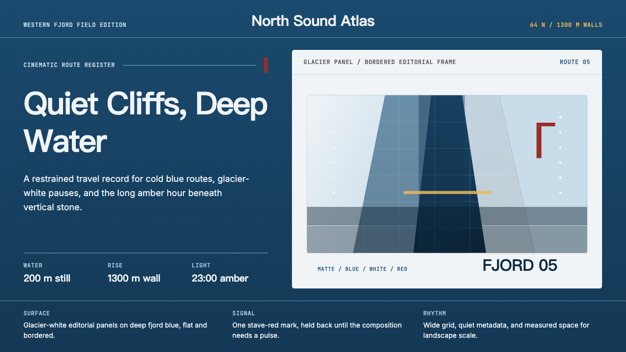 Norwegian Fjord TourismMonumental, not loud. Fjord blue, glacier-white panels, and one stave-red acc…
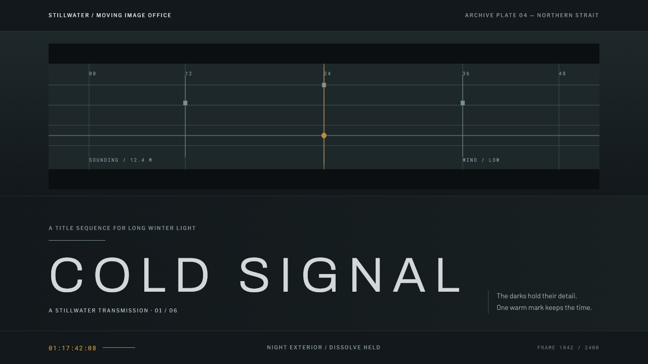 Nordic Noir TitlesThe grade carries the drama. Cold blue-green plates and low tracked caps hold…
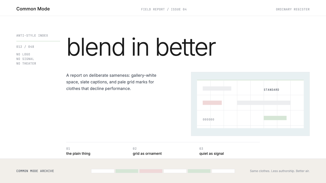 Normcore (2014)Quiet is radical. Inter, slate captions, and pale mint grid marks make refusa…
 Seydou Keïta PortraitsPattern is the portrait. Silver-grey cloth fields collide inside crisp white…
 ApartamentoRooms left as they were found. Heavy Fraunces over plain white, Jost captions…
 Bengali Art-House CinemaLight becomes restraint. Near-black ground, silver serif, and Bengali script…