What is Apartamento?
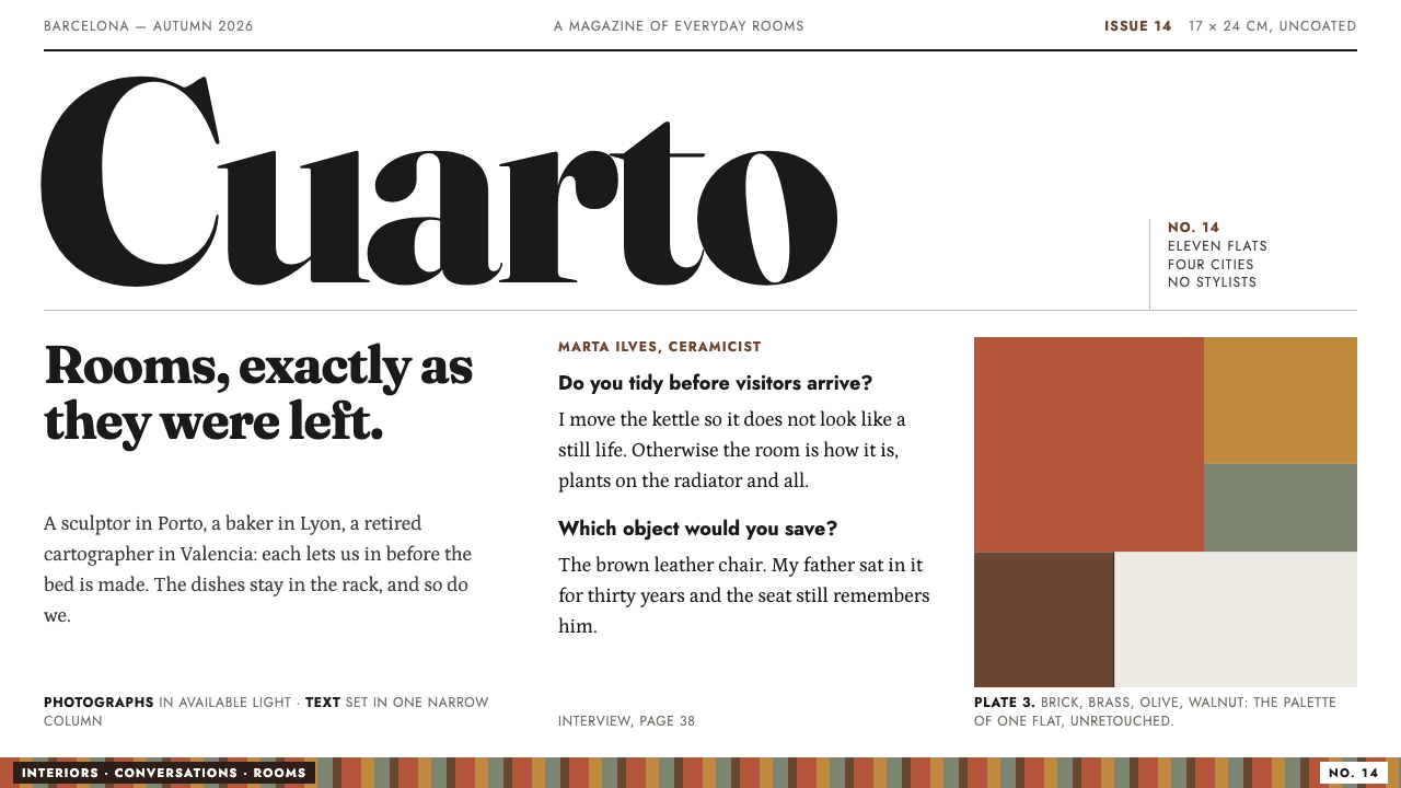
Apartamento leaves rooms as they were found: heavy serif headlines on plain white, geometric captions, walnut-brown ink, and photographs that are never tidied up.
Apartamento in brief
Apartamento is an interiors magazine that calls itself an everyday life interiors magazine, and the design style drawn from it is one of deliberate plainness. The page stays white, headlines are set in a heavy, sturdy serif, captions are set in a clean geometric sans, and photographs of real flats are placed with no styling and no polish. The result feels less like a design publication than like a well-made book that happens to be about how people live.
The central idea is that nothing should be arranged for the camera. An unmade bed, a plant on a radiator, a desk piled with objects: the magazine photographs them as they are, and the design system extends the same attitude to the page. Colour is not added as decoration. Warmth comes from what appears in the pictures, the walnut of old furniture, the red of brick, the brown of worn leather, and the page itself is kept as neutral as paper.
Layout is equally restrained: a narrow column of text, a hairline rule, and a photograph that either runs to the edge of the page or sits loosely beside an interview. There are few columns and no boxes. The style asks the viewer to slow down and read, in the same manner as turning pages of a compact, perfect-bound volume, rather than to scan a dashboard or scroll a feed.

Where does Apartamento come from?
Apartamento was launched in Barcelona in 2008 by Omar Sosa, Nacho Alegre and Marco Velardi. The origin notes date its first issue to April 2008, at Milan Design Week. The magazine arrived as a small perfect-bound book on uncoated white stock, with Clearface headers, two weights of Futura and snapshots of real flats bled to the trim, a look that was already plain and unpolished by design.
The magazine's own phrase, everyday life interiors, summarises the editorial stance. Rather than showing a finished room as it would look on the day of a photoshoot, it shows a room as someone lives in it. That position belongs to the three movements named in the notes: an independent magazine revival, in which small publishers rediscovered print as a carefully made object; anti-styling interiors photography, which rejects the staged look of the glossy home magazine; and a snapshot aesthetic, in which pictures are meant to look found rather than composed.
Recognition followed. The notes record a D&AD Yellow Pencil in 2010, an award that signals how the magazine's restraint was understood as a design achievement as well as an editorial one. The notes also give the dates of the visual identity this style documents as 2008 to 2024, a long run for a look that depends so little on trend. Part of the reason it lasted is that it contains so little to date: a serif, a sans, white paper and photographs of rooms that look the same in any decade.
The design system built from this look inherits the magazine's rules and applies them to screens. The page stays white, because the paper was white. The colours that appear, walnut and brick, are taken from what is in the room rather than invented for the layout. The hairline rule and the narrow column keep the structure honest, and the photograph is left as it was found. In other words, the system tries to keep a magazine's attitude, not just its fonts, which is why it feels more like a book than a website.
What defines the Apartamento look?
Plain white paper
The ground is a plain white that stands in for uncoated paper stock. There is no cream tint, no texture overlay and no off-white warmth added for charm. The white is a neutral stage on which the colour of the photographs does all the talking. Because the page is so plain, small decisions such as the weight of a rule or the gap between lines become visible and therefore important.
Heavy serif headlines
Headlines are set in a heavy, soft-edged serif with a slightly old-fashioned character, in the spirit of the magazine's Clearface headers. They are large and confident but never decorative. The weight gives each page a clear point of entry against the quiet white, and the serif keeps the voice warm, bookish and human. Headings should be few and short.
Geometric captions
Captions and supporting text use a clean geometric sans in the lineage of Futura, in two weights only: a lighter one for running text and a heavier one for emphasis. It contrasts with the heavy serif and keeps the secondary level of the page clear and neutral. The restriction to two weights is part of the discipline, and hierarchy comes from placement and spacing rather than from extra styles.
Colour borrowed from the room
The only colours beyond black and white are walnut and brick, and they are taken from the materials visible in the photographs: old furniture, red brick, worn leather. Walnut brown appears as an ink for small accents such as a link, a number or a rule. The restraint is important: if the colours are heavy, they begin to look like a brand palette rather than the colour of a lived-in room.
Narrow column, hairline rule
Text is set in a narrow column with generous margins, and structure is expressed by a hairline rule rather than by boxes or panels. There are few columns on the page, and the eye moves through them in a plain reading order. This is a layout that trusts the reader, using space and a single fine line to separate sections where other systems would draw cards.
Photographs left as found
Photographs show real flats and are never cleaned up, retouched or staged. They either bleed to the edge of the page or sit loosely beside a block of text, without frames, shadows or rounded corners. The picture is treated as a record of a room, not as a decorative element. The aim is the snapshot feeling: the sense that someone simply happened to be there.
A book, not a website
The overall feeling is of a small, perfect-bound book held in the hand. There are no floating panels, glass effects or animated flourishes; pages follow one another and the interface gets out of the way. Interaction, where it exists, is as plain as a page turn. This is what separates the style from a typical modern editorial theme, which tends to add layers of interface to the same content.

Who shaped Apartamento?
One of the three people who launched Apartamento in Barcelona in 2008. The story his name is attached to starts in April 2008, when the first issue appeared at Milan Design Week as a small perfect-bound book. For the style, the relevance is the founding decision to make an interiors magazine that looked and felt unlike the glossy publications around it.
Another of the three founders named in the origin notes. His name stands for the editorial position that became a visual one: show interiors as they are lived in, and keep the page as plain as the stock it is printed on. Alegre's inclusion reminds us that this look is the result of shared editorial choices rather than of a single art director's signature.
The third founder in the notes. Together with Sosa and Alegre, his name is linked to a publication that received a D&AD Yellow Pencil in 2010 and kept its visual identity from 2008 to 2024. The long life of that identity is the best argument for the style's central claim, that an approach built on restraint can outlast fashion.
How do you use Apartamento today?
Apartamento's style suits any project that wants to feel personal, human and unhurried: independent publishers, interior and furniture studios, architects, personal portfolios, photography projects, journals and newsletters, and brands that sell objects with a lived-in character. Its strength is trust. The page does not try to impress, and that makes whatever is shown on it, a room, a chair, a person, feel more real.
On slides, a cover should be a plain white field with a single large serif title and either one full-bleed photograph or a small image with a short caption. Content slides follow the magazine page: a narrow text column, a hairline rule and a photograph placed beside the text rather than framed by it. Data slides should be as quiet as possible, with thin axes, walnut or brick for the key series, small sans labels and no heavy gridlines.
In web interfaces the style fits editorial sites, portfolios, product pages for objects and furniture, interviews, case studies and long reads. Keep the layout to a narrow column with ample margins, show images without cards or shadows, use the heavy serif for headings and the geometric sans for captions and navigation, and let a walnut accent mark links and numbers. It is not suited to dense dashboards, but a restrained account page or a plain shop can borrow its calm.
For editorial and marketing work, interviews, photo essays, newsletters and lookbooks are the natural fit. Pair a short headline with an unstyled photograph, set the text beside it in a narrow measure and separate sections with a hairline rule. Marketing pages can follow the same recipe, with one honest image per section and very little copy, and let the pictures of real spaces carry the brand. The lack of effects is itself the message.
The most common mistake is styling the unstyled. Adding gradients, drop shadows, rounded cards, filters on photographs or perfectly staged images destroys the premise. Other errors include centring everything, using many type sizes, turning walnut and brick into large colour blocks, and replacing the plain white with a tinted paper effect. When a layout feels bare, the answer is almost never more decoration; it is better editing of the words and the pictures.

Apartamento — FAQ
What is Apartamento, and what does everyday life interiors mean?
Apartamento is an interiors magazine launched in Barcelona in 2008 by Omar Sosa, Nacho Alegre and Marco Velardi, and it describes itself as an everyday life interiors magazine. The phrase means that homes are shown as people actually live in them, not as finished showrooms. Its photographs are left unstyled, and the design system extends that idea to white pages, plain type and a narrow column.
Why is the page plain white and not cream or textured?
Because the magazine was printed on uncoated white stock, and the style keeps that plainness. A cream tint or paper texture would be an added effect, and the whole system is built on not adding effects. The warmth is meant to come from the photographs, where walnut, brick and leather appear as real materials. White also gives photographs the neutral surround that lets their colour read accurately.
Does the style depend on photography?
Largely, yes. The magazine's identity is built around snapshots of real flats, and the page layout exists to hold them without interference. Without photographs the style is reduced to type, rules and white, which can still look elegant but loses its warmth. If you have no real photographs, use few images and let the text carry the page rather than substituting polished stock imagery.
Can the style be used for e-commerce or product pages?
Yes, particularly for objects with a lived-in character such as furniture, ceramics and homeware. Show products in real rooms rather than on cut-out white backgrounds, keep the layout to a narrow column, and use the heavy serif for product names and the geometric sans for prices and details. It is less suitable for high-volume catalogues where grid density and filtering are needed.
Is there a dark version of this style?
The documented style is light, and its logic relies on white paper. A dark version would turn photographs into glowing screens and weaken the printed, book-like quality that defines the look. If a dark surface is required, keep it as a contained exception, such as a full-bleed image page, and keep the main reading experience on white.
Related design styles
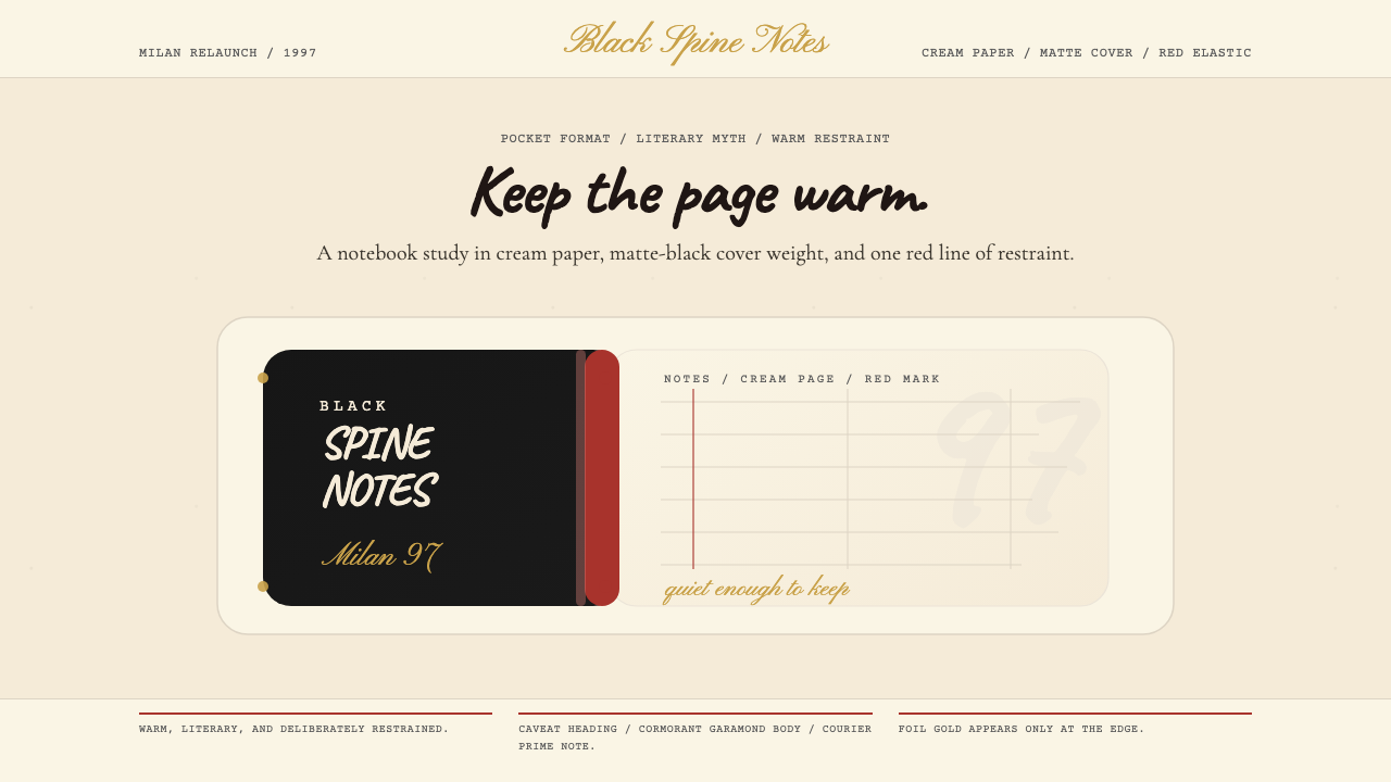 Moleskine Sketchbook (1997)Quietly literary. Cream paper, matte black, and a red elastic stripe do the w…
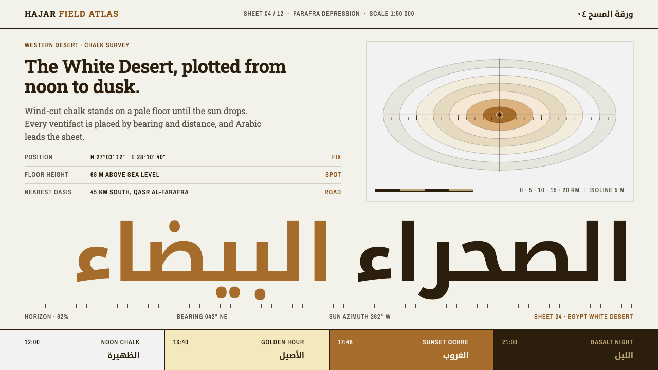 Egypt White DesertChalk at noon, ochre at dusk. Kufi Arabic leads a survey sheet of condensed l…
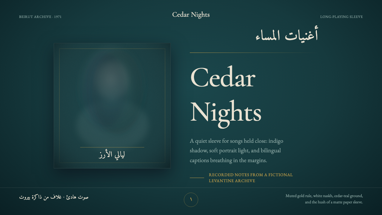 Fairuz Record SleeveQuiet luxury holds the sleeve. Cedar teal, white naskh, and one muted gold ru…
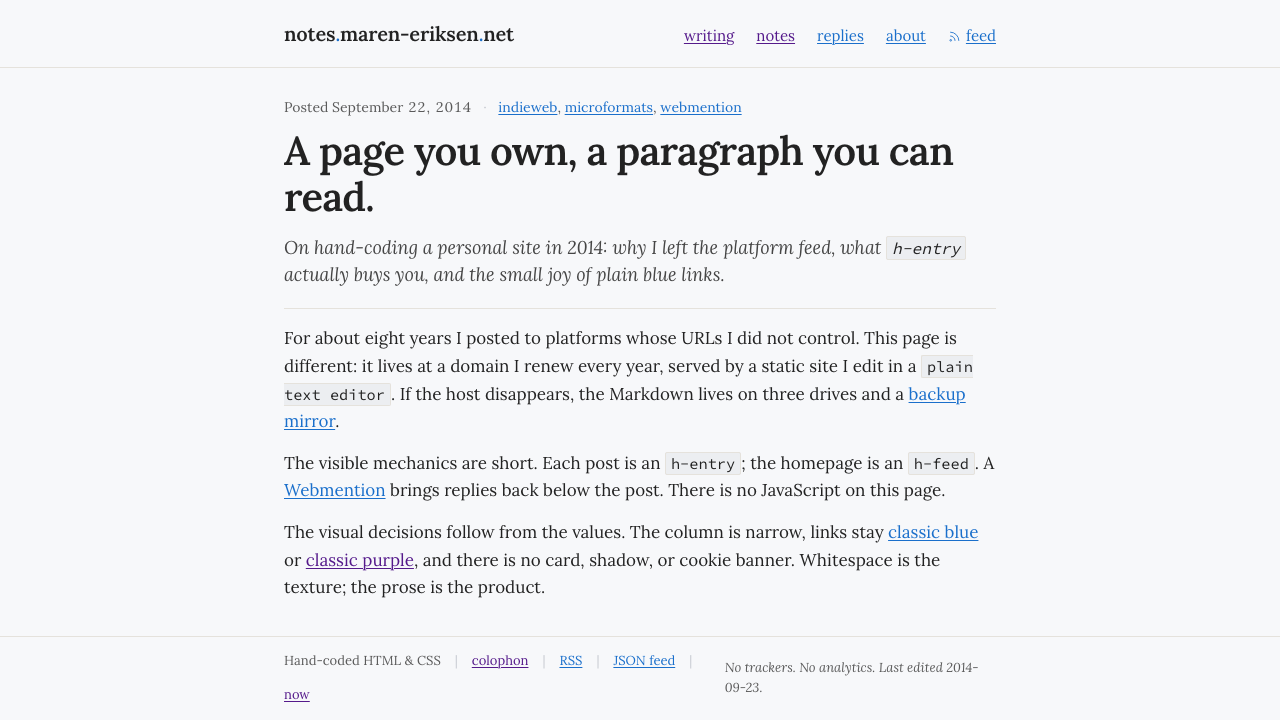 IndieWeb / Personal SiteOwn your URL, own your paragraph. Narrow Lora column, near-black on cool whit…
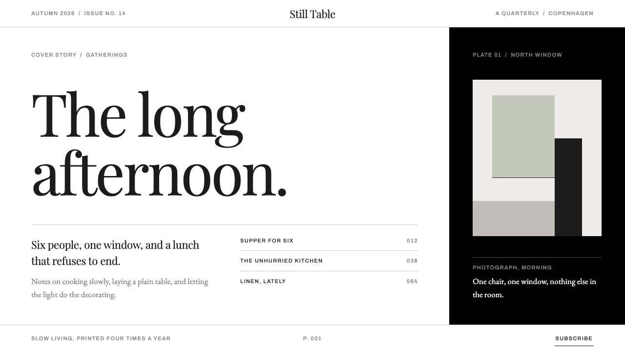 KinfolkA quarterly of mostly margin. Hairline serif on true white, broken by one ful…
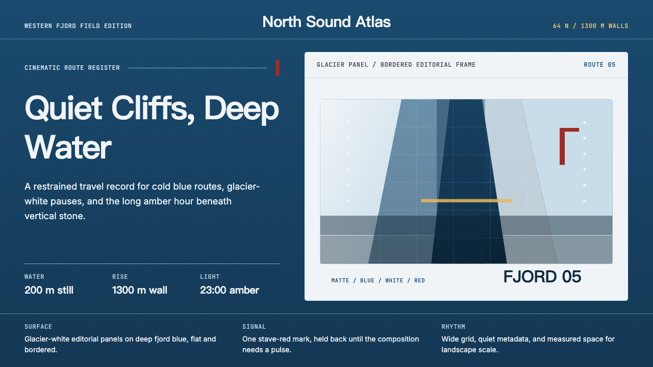 Norwegian Fjord TourismMonumental, not loud. Fjord blue, glacier-white panels, and one stave-red acc…