What is IndieWeb / Personal Site?
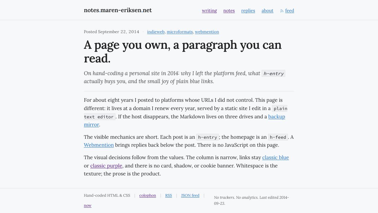
IndieWeb / Personal Site treats the web as a place to inhabit, not a feed to consume: own the URL, write the paragraph, and let the page stay readable.
IndieWeb / Personal Site in brief
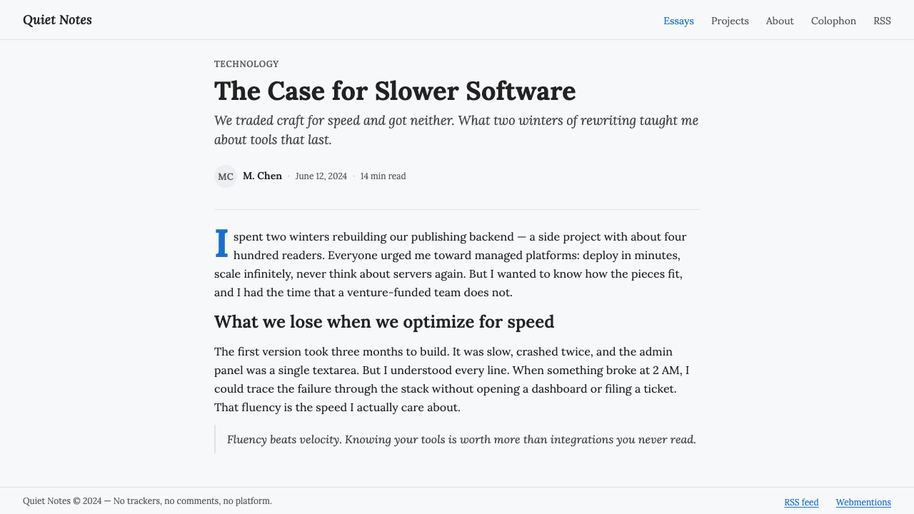
IndieWeb / Personal Site is the hand-coded, content-first aesthetic of people who maintain their own corner of the internet. Its visual language is deliberately modest: a single comfortable reading column, near-black serif text on a cool white ground, and links that retain the familiar blue and purple of the default web. The page does not perform software; it presents writing.
Instead of cards, feeds, dashboards, and SaaS-style interface chrome, the structure comes from the content itself. A personal identity, an entry, or a collection of entries can be expressed through microformats such as h-card, h-entry, and h-feed. Webmentions extend that structure beyond one domain, allowing conversation and response to travel between independent sites.
The style has a particular kind of visual texture: generous whitespace, quiet hierarchy, and the steady rhythm of reading. It feels personal without becoming ornamental, technical without becoming productized. Ownership is not represented by a badge or account menu; it is expressed by the fact that the page has its own address, its own paragraph, and its own rules.
Where does IndieWeb / Personal Site come from?
The IndieWeb movement emerged in the 2010s and continues onward across the global internet. Its starting point is simple but consequential: people should be able to own a URL and maintain a personal site rather than treating a platform profile as their permanent home. Hand-coded personal sites became both a technical practice and a visual response to the increasingly standardized language of feeds, cards, and platform chrome.
The movement gathered around a family of related practices and ideas, including IndieWeb, POSSE, microformats, and hand-coded personal sites. Together they describe a web where content remains readable on its source site and where identity is tied to a domain rather than to a platform interface. The resulting aesthetic is not nostalgia for an earlier web so much as a deliberate return to control, legibility, and direct publishing.
Microformats2, associated with the period around 2012, gave the style a semantic foundation. Patterns such as h-card, h-entry, and h-feed allow a page to describe identity, individual entries, and collections of entries in a way that remains close to the visible document. The important design consequence is that structure does not need to be shown as application chrome; it can be carried by the page's content and markup.
Webmention reached W3C Recommendation status in 2017 and extended the movement's social dimension. It allows responses and references to be federated across independent sites, so conversation does not have to remain inside a single platform's comment system. The visual result is intentionally quiet: the network may be technically distributed, but the page still reads like a personal document rather than a social product.
What defines the IndieWeb / Personal Site look?
Color
The palette is built from a cool white ground, near-black text, and the familiar blue and purple of ordinary web links. Color is restrained because the page's primary distinction should come from what it says. Blue and purple are not decorative accents added to manufacture personality; they signal the ordinary states of navigation and memory that make the web feel direct and inhabited.
Typography
Lora and other readable serif forms give the page a literary, continuous reading voice. Type is treated as the main interface: headlines introduce an entry, body text carries the experience, and modest hierarchy keeps the document navigable. The style favors comfortable density and sustained attention over oversized display type or competing families.
Reading Column
The layout is organized around one narrow, comfortable reading column rather than a field of modular panels. This creates a clear relationship between the page and the paragraph: the eye knows where to begin, where to continue, and where the document ends. Supporting information can exist, but it should remain subordinate to the central act of reading.
Links
Links remain plain, recognizable, and visibly connected to the history of the web. Classic blue links and purple visited links provide affordance without requiring pills, oversized buttons, or custom iconography. Their familiarity is part of the style's honesty: navigation is allowed to look like navigation instead of being disguised as decoration.
Semantic Structure
The page's deeper organization comes from microformats rather than visible application scaffolding. h-card can describe a person, h-entry can describe a published item, and h-feed can describe a collection. These patterns connect meaning and presentation, allowing a page to remain visually simple while still participating in a broader, machine-readable network.
Whitespace and Ownership
Whitespace supplies the texture that cards and decorative surfaces would otherwise provide. It separates thoughts, slows the eye, and makes a personal page feel authored rather than assembled from a product kit. Ownership is therefore an aesthetic quality as well as a technical one: the page feels like a place because its rhythm belongs to the writer.
Who shaped IndieWeb / Personal Site?
The IndieWeb community is the central collective figure in this aesthetic. It represents a shared commitment to independent sites, readable content, and a web whose social connections can extend beyond platform boundaries. The style is therefore communal without looking institutional: its common language is a set of practices rather than a branded visual system.
Tantek Çelik is named among the key figures associated with the source material. His inclusion signals the technical and community lineage behind the movement: the personal site is not merely a visual preference, but part of a broader effort to make identity, publishing, and connection more independent.
Aaron Parecki is likewise identified as a key figure in the IndieWeb context. His place in the material reinforces the movement's emphasis on standards and participation across independent sites, where a page can remain personal while still belonging to a connected web.
The authors of microformats form a collective technical figure rather than a single design celebrity. Their work is represented here through h-card, h-entry, and h-feed, patterns that let ordinary pages carry structured meaning without surrendering their document-like appearance.
How do you use IndieWeb / Personal Site today?
For presentation slides, the style works best when the cover feels like the opening of a personal essay rather than a software splash screen. Use a cool white field, a strong serif title, and a quiet line of context. Content slides should preserve a single reading direction with generous breathing room. Data slides can use plain text labels, restrained rules, and blue or purple links where navigation matters; the information should remain more prominent than the interface around it.
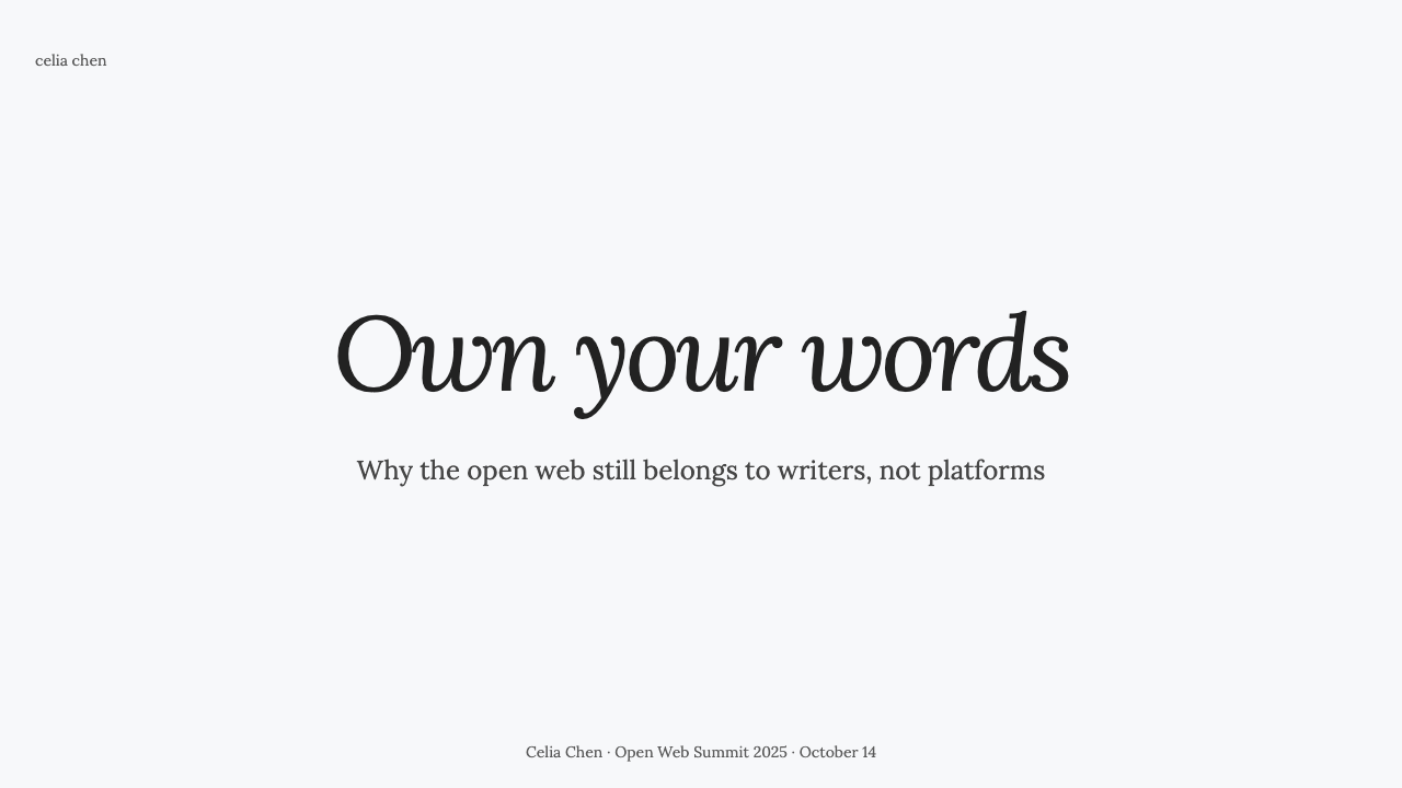
For web interfaces, IndieWeb / Personal Site principles suit dashboards and pricing pages when the product wants to communicate independence, transparency, or editorial seriousness. Keep the page organized around a readable main column, use near-black text for essential information, and let controls remain recognizable rather than ornamental. A pricing page can present tiers as clearly separated sections instead of glossy cards, while a dashboard can privilege readable entries and status text over dense application chrome.
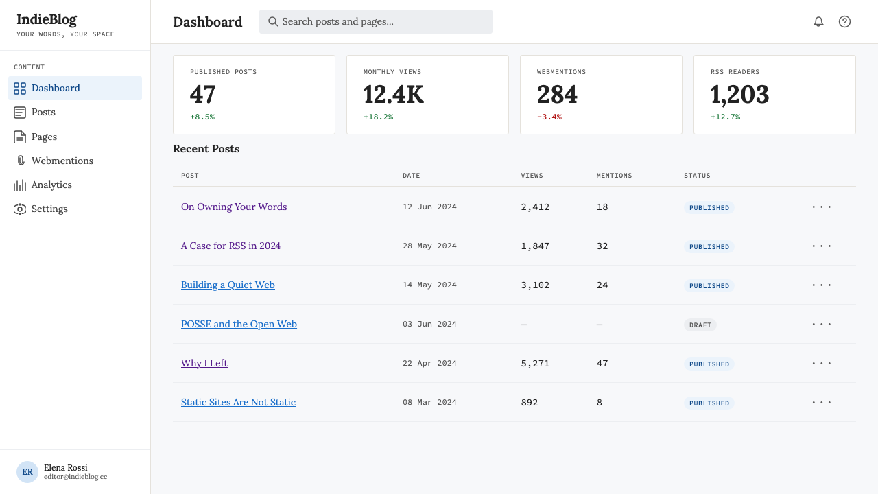
For editorial work, the style is naturally suited to essays, newsletters, personal archives, documentation, and long-form notes. Give the text a narrow measure, preserve visible authorship, and let headings, dates, metadata, and links support the reading rather than interrupt it. For marketing, the same principles create a more credible voice: a page can make a direct argument, show its source links plainly, and feel like a person or organization speaking from its own address instead of performing inside a campaign template.
A common mistake is copying the surface cues while rebuilding the same platform logic underneath. A white background, serif type, and blue links do not create an IndieWeb page if the experience is still dominated by cards, feed mechanics, promotional chrome, and opaque ownership. Another mistake is making the page so deliberately plain that hierarchy disappears. The goal is not visual neglect; it is to make structure, authorship, and reading rhythm do the work that decoration usually performs.
IndieWeb / Personal Site — FAQ
Is IndieWeb / Personal Site just a blank blog?
No. Its restraint is structural, not careless. The single reading column, serif text, plain links, and generous whitespace create a deliberate environment for publishing and reading. Beneath that quiet surface are microformats, personal identity, entries, feeds, and Webmentions that allow the site to participate in a connected network while remaining under its owner's control.
Why keep blue and purple links instead of designing custom buttons?
Because the familiar link colors communicate function immediately and preserve the style's connection to the ordinary web. Custom buttons can be appropriate when an action truly needs emphasis, but replacing every link with a pill or branded control turns navigation into interface decoration. IndieWeb / Personal Site treats recognizability as a form of clarity and respects the reader's existing habits.
Can this style work on a dark background?
It can be adapted, but the source style is fundamentally light-ground: cool white, near-black text, and ordinary blue and purple links. A dark inversion changes the reading atmosphere and can make the familiar link colors feel more like decorative accents. If the goal is to preserve the style's character, keep the page light and let ownership, typography, whitespace, and semantic structure carry the identity.
How do microformats and Webmentions change the visual design?
They move important structure into the page's meaning rather than its visible chrome. h-card, h-entry, and h-feed can describe the person, the entry, and the collection, while Webmention connects responses across independent sites. The visual consequence is a calmer page: the network is real and active, but it does not need to announce itself through feeds, badges, or platform widgets.
Does the style suit dashboards and pricing pages?
Yes, when the product values clarity, independence, and readable information. It is especially useful when a dashboard should feel like a document or a pricing page should make its argument plainly. It is less suitable when the product depends on dense visual monitoring, highly promotional surfaces, or an energetic SaaS identity. The right question is whether the product's values align with direct publishing and user control.
Related design styles
 Everest Expedition (1953)Quiet heroism, precisely measured. Ice-blue contours and mono data cross a sn…
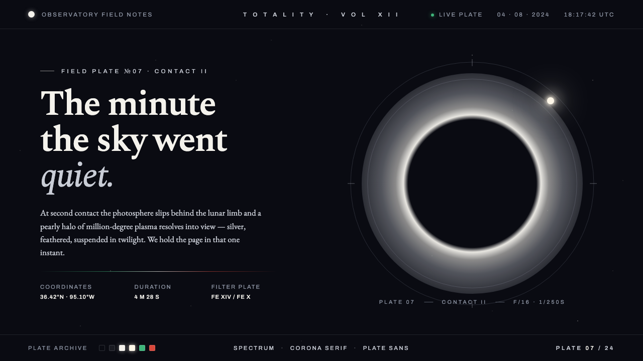 Solar Eclipse CoronaThe minute the sky went quiet. Pearly silver corona on twilight-black, one wa…
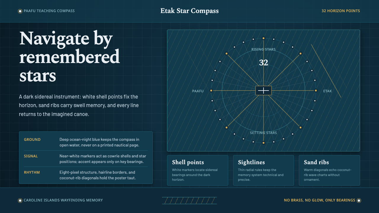 Micronesian Etak Star CompassNavigation as memory. White star points and sand ribs map a 32-point ocean-ni…
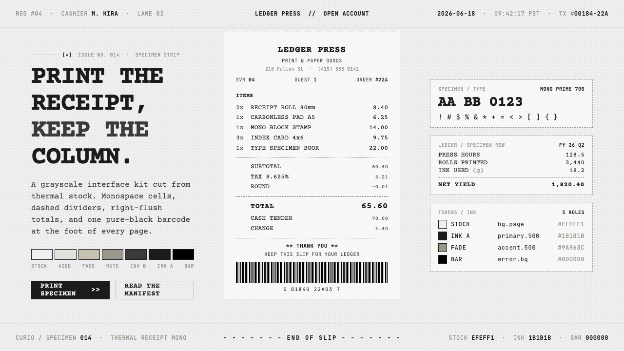 Thermal Receipt MonoReceipts as an interface. Grainy near-black monospace on warm-gray thermal st…
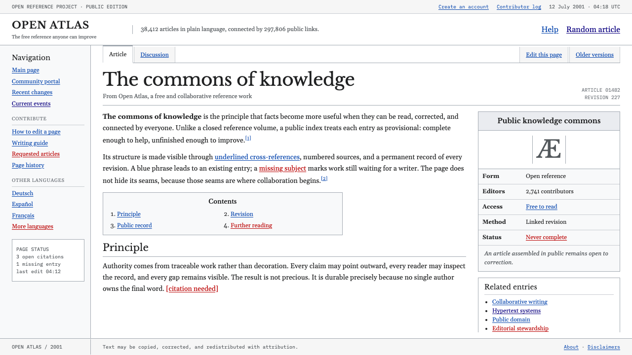 Wikipedia (2001)Content needs no ornament. Black serif text, gray hairlines, and blue links e…
 X-Ray CrystallographyQuiet evidence glows. Near-black film, Spectral serifs, and an X-cross spot l…