What is Khasi Living Root Bridge?
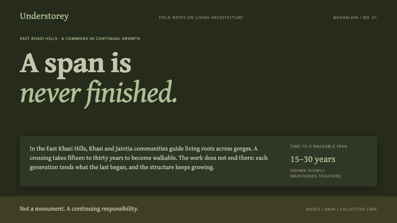
Khasi Living Root Bridge is a style that grows rather than builds: wet-stone darkness, moss-green light, and braided forms that are never quite finished.
Khasi Living Root Bridge in brief
Khasi Living Root Bridge is a dark, damp, low-contrast design style drawn from the living bridges of the East Khasi Hills in Meghalaya, northeast India. There, villagers guide the aerial roots of Ficus elastica, the rubber fig, across river gorges on bamboo scaffolds, then wait fifteen to thirty years while the roots fuse into a span that people can walk across. About seventy-two such bridges are documented. Some are roughly five centuries old, and they are still thickening. The style takes this slow, living construction as its governing idea: an interface is not assembled in an afternoon but allowed to establish itself.
Visually, the style is the gorge floor rendered as an interface. The ground is the colour of wet stone, so dark that it reads nearly black yet carries a trace of olive. The light that falls on it arrives already green, filtered through a canopy, and every surface appears damp. A living moss green takes the role that an accent colour would play elsewhere. Roots are a brown-grey softened by moss rather than a warm chestnut brown, and mist flattens depth so that near and far sit closer together than they would in a crisp digital layout. Serif type and layered dark bands, stacked like the decks of a bridge, complete the picture.
What distinguishes it from other nature-inspired styles is its refusal of postcard imagery. It takes its values from the gorge floor, not from a travel photograph: there is no bright sunlit hero shot, no saturated foliage, no scenery offered up for consumption. Its structures are braided and asymmetric because nothing here was drawn before it was grown, and its tone is slower than almost anything else in the library. It suits work that should feel cultivated, tended and continuing rather than launched.

Where does Khasi Living Root Bridge come from?
The bridges at the heart of this style belong to the East Khasi Hills of Meghalaya, in northeast India, and are tended by Khasi and Jaintia village communities such as those around Nongriat. The method is simple to state and demanding to carry out. Young aerial roots of Ficus elastica are guided across a gorge on scaffolds of bamboo. As the roots lengthen they are steered across the gap, and over fifteen to thirty years the strands fuse into one another and into a braided, load-bearing span. The scaffold is only a temporary aid. Once the work is done, the living tissue is the structure.
The source record places the tradition before 1900 and describes it as continuously grown and maintained into the present. No founding moment is recorded for it, and none should be invented: the record names no individual maker, no first drawing and no completion date. Some bridges are roughly five centuries old and are still gaining girth, which means that a span in use today may have been begun by people whose names are not remembered, and will be thicker for people not yet born. This is where the style's insistence on being unfinished comes from. The bridges are not heritage objects frozen at a moment of perfection. They are working infrastructure that keeps changing.
Outside observers have placed the bridges in two overlapping frames. One is living architecture, often discussed under the German-derived term baubotanik, the practice of making structures from living plants that grow stronger as they mature. The other is vernacular bioengineering: the idea that a community can solve a structural problem with knowledge of a species rather than with industrial materials. Two researchers named in this record, Ferdinand Ludwig and Wilfrid Middleton, belong to that outside conversation. Beside those academic frames sits an older one that the style respects equally, Khasi commons stewardship, in which a bridge is understood as shared property kept up by the people who cross it, across households and across generations.
Turning this into a design system required a decision about what to borrow. The translation does not draw bridges, roots or leaves. It borrows conditions: the dim, damp light under a canopy, the stone and leaf litter underfoot, the mist that blurs the far side of the gorge, the unrepeating geometry of roots that find their own way across. The result is a style whose period reference is not a date at all. It is a rate of change, roots thickening over centuries, and the interface it produces is meant to feel like something that has been tended long enough to belong where it is.
What defines the Khasi Living Root Bridge look?
Wet-Stone Ground
The foundation is a very dark olive-black, the tone of wet stone and leaf litter seen beneath a closed canopy rather than the pure black of a switched-off screen. It is slightly warm and slightly green, which keeps large dark areas from feeling cold or industrial. Because this ground is the true brightness of the gorge floor, everything else is positioned relative to it: text, panels and ornaments sit a few steps lighter, never dramatically lighter.
Green Light and Moss
The principal colour is a living moss green, muted and slightly yellow, the green of something growing rather than of a corporate success badge. Light in this style is described as arriving already green, so even neutral elements pick up a faint green cast. The effect is of one filtered light source shared by every surface. Saturation stays modest: this green is not a neon highlight but the colour of a whole environment.
Root Tone
Roots and structural elements are rendered in a brown-grey wrapped in moss, deliberately not chestnut or warm timber brown. Chestnut would suggest a cabin, a library or a coffee brand; the root tone here suggests bark and damp fibre that has sat in shade for decades. It acts as the style's second neutral, used for borders, dividers, inactive controls and the thickened lines that echo braided roots.
Damp, Low Contrast
Contrast is kept low on purpose. Surfaces read as damp, edges soften where they meet mist, and the mist flattens depth so that foreground and background sit nearer one another than in a typical interface. This is a quiet style: hierarchy is built from small differences in lightness and from placement rather than from stark opposition. The discipline is to make sure low contrast never tips into illegibility; body text must still be comfortable to read.
Braided Asymmetry
The spans in this style are braided and asymmetric, and no unit repeats exactly. Instead of a crisp modular grid with identical cards, compositions use strands of different widths that cross, merge and part again, as roots do when they find their own way. Alignment still exists, because the gorge has two banks, but between those anchors the structure is organic. Repetition, when it appears, is approximate: similar, never cloned.
Serif Voice
Typography is serif, set calmly, and coloured in the moss green or a pale tint of it. The serif is chosen for its association with continuity and record-keeping rather than for fashion, which suits a style about something tended for centuries. Headlines are unhurried and body text is generous. Nothing is shouted, and nothing is set in the all-capital, widely spaced manner that signals urgency.
Layered Dark Decks
Content is organised into layered dark bands, like the decks of a bridge or the strata in a gorge wall. Each band sits slightly apart from the next in lightness, so depth reads as geology rather than as floating cards with drop shadows. Bands can overlap, sag or step, and they carry the section structure of a page or a slide. The layering is the main device for building hierarchy without leaving the dark, damp register.

Who shaped Khasi Living Root Bridge?
The source credits the bridges first and foremost to the communities who guide, tend and repair them, with Nongriat given as the village context. Their work spans the whole timeline of the style: they set a bridge going knowing it will need fifteen to thirty years before it can be used, and they keep older spans in good order for decades more. The technique is a collective inheritance rather than an individual invention, and the slow tempo of the design system is a direct portrait of that patience.
Ludwig is the name most closely tied here to baubotanik, the practice of building structures from living plants. His inclusion marks the point at which an outside discipline began describing the root bridges in its own vocabulary, as an early and still-working example of architecture that is alive. For the design system, the value of that framing is the idea that a structure can strengthen as it ages, which is the opposite of the usual digital assumption that things only wear out.
Middleton appears beside Ludwig as an outside researcher of the bridges. Together they represent the engineering and architectural reading of a practice the Khasi communities had long carried in their hands: vernacular bioengineering, in which a structure is made by working with how a species behaves. The style does not depend on their conclusions, but their presence in the record shows how a local craft has come to be studied as serious structural knowledge.
How do you use Khasi Living Root Bridge today?
Khasi Living Root Bridge is a specialist style, and it repays use where its subject matches the work: projects about time, ecology, craft, stewardship and slow accumulation. It is less a decorative skin than a mood of patience. Applying it well means understanding what the style is doing, namely using darkness and low contrast to make a space feel lived-in, using moss green as the colour of a whole environment, and using layered bands to build structure the way strata or bridge decks do.
For presentation slides, a cover works well with a very dark ground, a single serif title in moss green or pale moss, and two or three layered bands along the lower edge, as if the slide were a section through a gorge. Content slides should give each idea its own band and let the bands carry the hierarchy. Data slides suit lines and bars that behave like roots: muted green and brown-grey series, uneven but legible, with a single brighter moss tone reserved for the series the audience must follow. Avoid neon palettes, which break the filtered-light illusion at once.
For web interfaces, the style fits dashboards and tools about long-running processes, such as environmental monitoring, research notebooks, archives and community platforms. Build the page from layered dark bands, separate sections by small steps in lightness rather than by drop shadows, and keep controls in the root tone until they are active. Pricing and plan pages can present tiers as parallel strands of different thickness rather than identical boxes. Motion should be gradual, with soft fades and slow settling, and progress indicators should read as growth rather than a countdown. Always check focus states and form fields, because the low-contrast register makes it easy to lose them.
For editorial and marketing work, the style supports long-form essays, field reports, case studies, conservation and sustainability stories, and brands that want to sound unhurried. Set body text in a generous serif, give pull quotes their own deck, and let the page end on a quiet note rather than a loud call to action. Photography should be close, misted and shaded: texture of bark, stone and moss, not panoramic postcards. If the subject is the Khasi bridges themselves, credit the communities who keep them rather than treating them as scenery.
The most common mistake is to reduce the style to a generic forest-green dark mode. Bright greens, hard black-and-white contrast, perfectly symmetrical tiles, glossy surfaces and literal vine or leaf decoration all contradict the source idea. So does treating the bridge as a finished product, for instance with a fully completed progress bar as the page's final flourish. A second mistake is to cut contrast so far that text is no longer comfortable to read; the quiet should come from restraint, not from low legibility.

Khasi Living Root Bridge — FAQ
Is Khasi Living Root Bridge just a dark green theme?
No. Plenty of dark green themes exist, but this one is organised around a specific idea: a structure that is grown rather than drawn and is never finished. That idea shows up in the very dark olive ground, the moss green treated as an environment rather than an accent, the brown-grey root tone, the low contrast, the unrepeating braided composition and the slow serif voice. Remove any one of these and the result drifts back toward a generic nature palette.
Why does the style avoid sharp contrast and crisp shadows?
Because its reference is a gorge floor under a closed canopy, where light is filtered, surfaces are damp and mist blurs the far bank. Sharp contrast and hard shadows would imply a bright, open, sunlit scene, which is the postcard view this style rejects. Depth is therefore built from small steps in lightness and from layering, not from dramatic lighting. The caution is that body text and interactive states still need to stay comfortably readable.
Does the design have to show bridges, roots or leaves?
No, and it usually should not. The style borrows conditions rather than pictures: the dim green light, the damp surfaces, the braided and asymmetric structure and the sense of slow time. Literal root illustrations or leaf borders tend to turn it into decoration, which is the opposite of what living architecture stands for. If imagery is needed, choose close texture such as bark, stone or moss, shot in shade, over wide scenic views.
Which products suit this style, and which do not?
It suits products and stories about patience: environmental and conservation projects, research and archive tools, community platforms, long-form publishing and brands that value craft and continuity. It is a poor fit for products that rely on urgency or visible speed, such as flash sales, trading screens, countdown-driven funnels or playful consumer apps. The style's quiet, damp register would work against the energy those products need.
How should motion and progress be handled in this style?
Slowly and without a sense of finality. Transitions should fade and settle gently, as if mist were moving, rather than snapping or bouncing. Progress is best shown as accumulation, a strand thickening or a band extending, instead of a bar racing to completion. This echoes the bridges themselves, which are measured in decades and never declared finished, and it keeps the interface faithful to the idea that the thing is still growing.
Related design styles
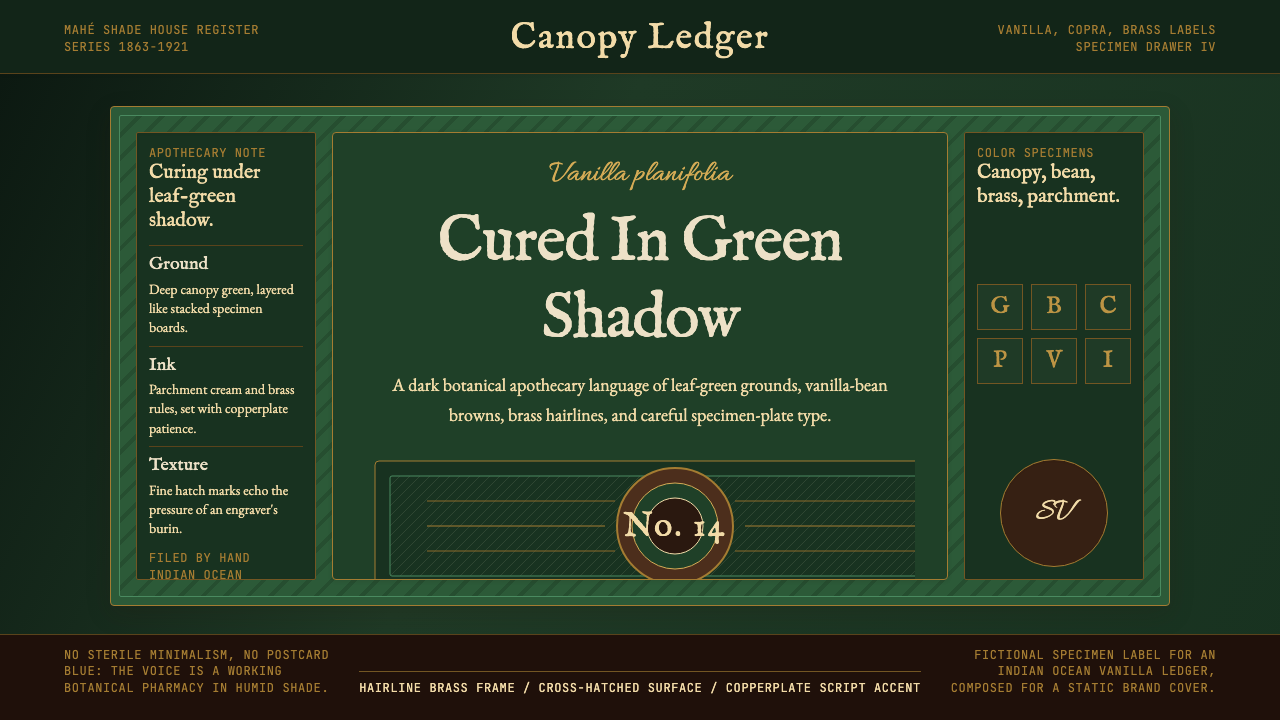 Seychellois Vanilla TakamakaBotanical apothecary in shadow. Deep green, brass hairlines, and copperplate…
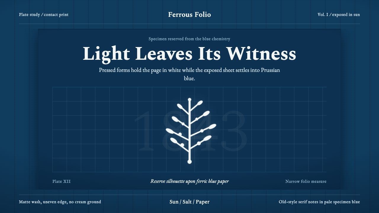 Anna Atkins CyanotypeScience turns spectral. Prussian blue ground, white reserves, Victorian serif…
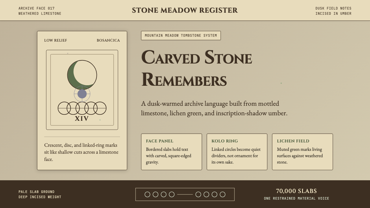 Bosnian Stećak Medieval TombstoneStone remembers quietly. Lichen green and Cinzel cuts sit on weathered limest…
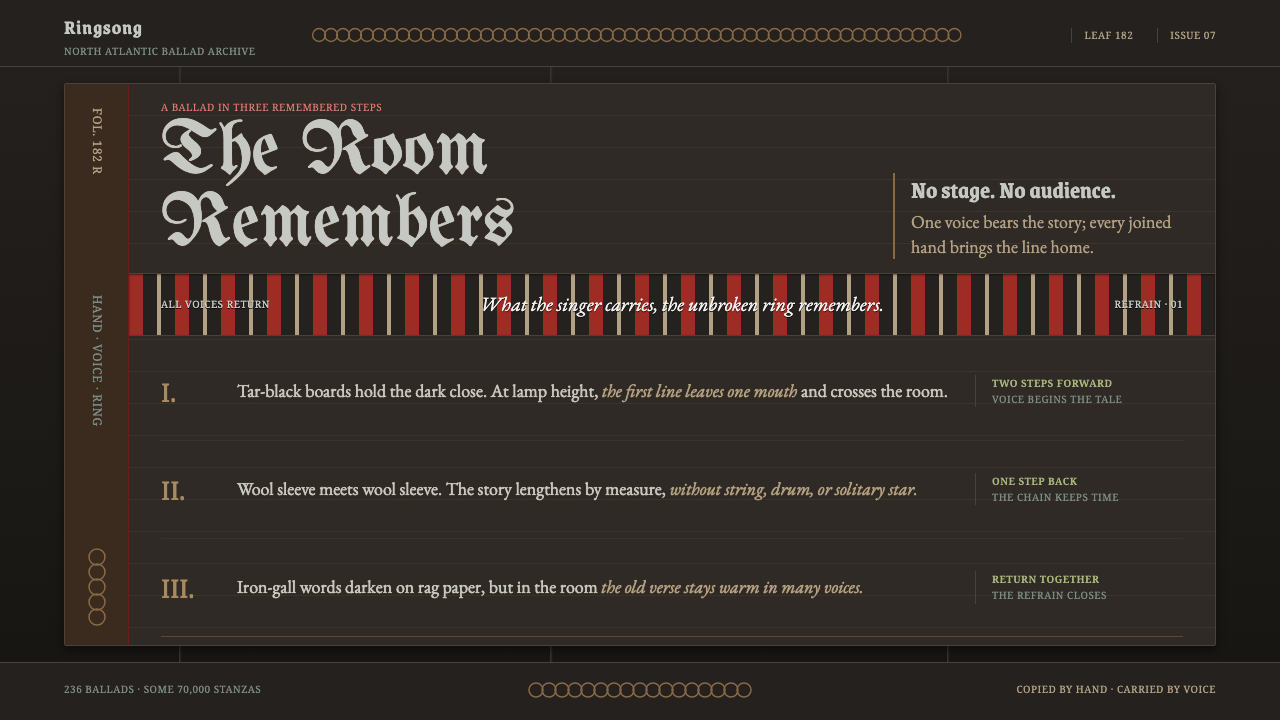 Faroese KvæðiThe room sings as one. Silver type and red refrain bands rule a tar-black man…
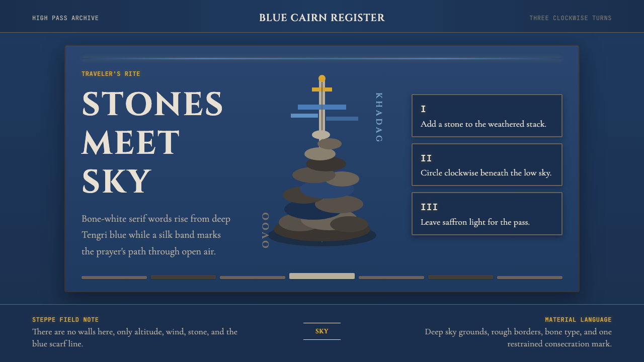 Mongolian Ovoo (Cairn Prayer Site)Sacred austerity. Steppe-blue ground, bone serif type, and one silk-blue pray…
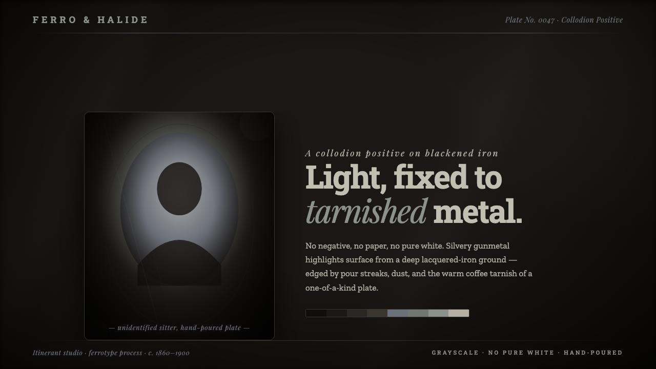 Tintype Wet PlateLight fixed to tarnished metal. Gunmetal grays rise from blackened iron, capp…