What is Trekking Permit 1980?
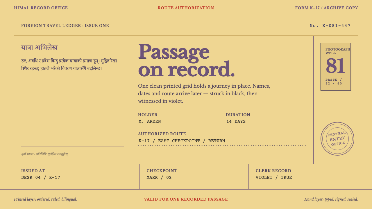
A Nepalese trekking permit from the Panchayat era is a design in two layers: an orderly violet letterpress form underneath, and typewriter lines and slanted rubber seals added on top by other hands.
Trekking Permit 1980 in brief
The Kathmandu Trekking Permit is a document, not a poster. The reference is a yellow card, printed once in violet ink and then finished by other hands: a typewriter fills the route line, a clerk's ballpoint adds details, and a rubber seal is pressed down at whatever angle the wrist allowed. The sampled permit is from 1981 and covers a trek in the Everest region, and the record places the type within state printing of the Panchayat period, roughly 1950 to 1990.
The design lives in a division of labour. The printed layer is orderly: ruled boxes, Devanagari on the left, English in the centre, and a photo well at the top right. The added layer is crooked and blotted: typed lines, ballpoint pressure, and the round seals of the Ministry of Home Panchayat Affairs and the Central Immigration Office laid over the form at slanting angles, sometimes crossing the rules. The central instruction of the style is to keep both layers, and to keep them separate.
That separation is what makes the reference useful. Many vintage treatments smear wear evenly across everything, and the result looks like a filter. Here the grid stays true, and damage appears only where hands actually touched the card: at the seals, along the creases, on the corners of the photo. The paper is intact. It has simply been handled, stamped, and carried in a rucksack. The style therefore produces layouts that are rigorous underneath and humanly marked on top.
Where does Trekking Permit 1980 come from?
The permit was issued in Kathmandu, Nepal, for trekking regions including Solukhumbu, Annapurna and Langtang. The reference record dates the tradition of this kind of paperwork to 1950 to 1990, the span of Panchayat-era state printing, and the sampled document is a 1981 permit for the Everest region. It belongs to the world of bureaucratic printing: forms produced in bulk by a state press, in one ink, designed to be completed by hand and typewriter after the fact.
Its design logic comes from letterpress form design, in which a printed form is really a set of questions with fixed places for the answers. Right-angled boxes mark where information goes, dotted leaders guide the eye across blank lines, and the spacing between letters is determined by metal type rather than by any software setting. Printing in a single violet ink keeps the printed layer unified and a little formal, as though the state were speaking in one voice.
The language arrangement tells its own story. Devanagari, the script of Nepal's national language, sits in the left column, and English sits in the centre, so a document aimed at both an official reader and a foreign traveller shows both without choosing between them. The photo well at the top right reserves a place for the holder's portrait, which is attached rather than printed. In design terms the card is a negotiated space between the state, the traveller and whoever happened to be at the desk.
The authorities that touched the permit leave their marks as seals: the Ministry of Home Panchayat Affairs, the Central Immigration Office in Kathmandu, and the Pokhara Immigration Office. The reference sits alongside expedition and trekking documentation, a genre in which paperwork follows the traveller and accumulates wear as the trip proceeds. Folds, rubbed edges and overlapping stamps are not defects here. They are the record of a journey being processed and carried.
What defines the Trekking Permit 1980 look?
Violet Letterpress
The whole printed layer is a single violet ink, applied once. That means every printed element, rules, labels, headings and the form's own text, shares one hue, and variation comes only from how heavily the ink lies. Letterpress ink tends to be slightly uneven, a touch denser in some strokes than in others, which gives the print a quiet mechanical warmth. Treat the violet as the voice of the institution: formal, consistent and a little cool.
Card Handled, Not Damaged
The ground is a yellow card stock, sturdy and warm, and its condition is the subtle point. The card is intact. Wear is concentrated where hands and tools acted: around seal impressions, along the folds, at the corners of the photo. A good interpretation puts texture and slight discolouration in those places only, and leaves the rest of the surface clean, so the viewer feels use rather than decay.
Ruled Boxes and Dotted Leaders
Structure comes from right-angled boxes and dotted lines that lead the eye across empty fields to the place where an answer belongs. Every cell exists to be filled, and the labels sit small and fixed above or beside it. The effect is administrative clarity: a layout that is mostly questions, ready to receive information. It suits any interface in which a person completes, confirms or checks something.
Two Scripts, Two Columns
Devanagari sits on the left and English in the centre, so the page reads as bilingual by construction rather than by translation after the fact. The two scripts have different rhythms and visual weights, and the layout lets both stand at the same level without ranking them. For designers, the lesson is parallel columns, each language given its own space, with neither crowded into the margins of the other.
The Photo Well
At the top right of the form is a reserved rectangle for the holder's portrait. It is an empty frame in the printed layer that is filled by a different process, a photograph attached by hand. The placement anchors the page, gives the top-right corner a clear job, and makes the document personal. In an interface it becomes an avatar slot, an ID thumbnail or a primary image area bounded by a simple outline.
The Tilted Seal
Round rubber seals are pressed over the form at whatever angle the wrist allowed, overlapping the rules, with ink that leaks at the edges and lines that break where the rubber lifted. The tilt is the point. It marks the moment of authority landing on paper, imperfect and human. Keep the seal rotated and partially overlapping the grid, and let it be the only element that visibly disobeys it.
Typed and Inked Additions
The route line is filled by a typewriter, and the clerk's ballpoint adds further details. This second layer is crooked and blotted compared with the first: letters sit slightly off the baseline, pressure varies, and ink pools. It speaks in a different voice from the printed form, closer to a person. Distinguish the layers by tool and tone, with a typewriter-like face for typed content and a handwritten feel for pen additions, and never merge them into one texture.
Who shaped Trekking Permit 1980?
The Ministry is named in a round seal on the sampled permit, pressed at a slant over the printed form. As the issuing authority it stands for the state voice of the document: the part that says this paper is official. For designers, its seal is the model for any high-status stamp, rotated, partially overlapping and clearly applied after the fact.
The Central Immigration Office adds a second kind of authority: the border, rather than the ministry. Its seal belongs to the added layer, the part of the permit that turns a printed form into a processed record. The office is a reminder that what makes this style recognisable is not the form itself but the evidence that someone handled it.
The Pokhara office appears in the reference record alongside the Kathmandu office, which points to a paper trail running through more than one desk. That multiplicity matters visually: a convincing interpretation allows for more than one seal, each at its own angle, rather than a single tidy stamp of approval.
How do you use Trekking Permit 1980 today?
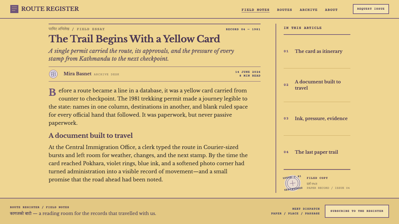
Trekking Permit 1980 is best used wherever a screen or page is, at heart, a record: a pass, a ticket, a confirmation, a receipt, a status document. Its core principle is the two-layer rule. Build a rigorous, orderly printed layer first, then let a separate, visibly human layer sit on top, and never let the roughness of the second infect the structure of the first.
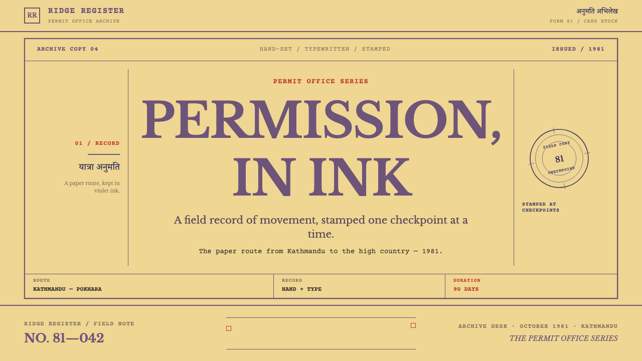
On slides, a cover can sit on the warm yellow card ground with a violet ruled frame around the title and a single round stamp rotated in a corner, carrying a status or date. Content slides work as forms, with small labels over ruled cells and the answers set in a typewriter-like face. Data slides can present tables as filled-in forms, with the figures in a different tone from the labels, so the eye understands which words belong to the template and which were added later. Keep charts square to the page and put any distress on the stamp, never on the axes.
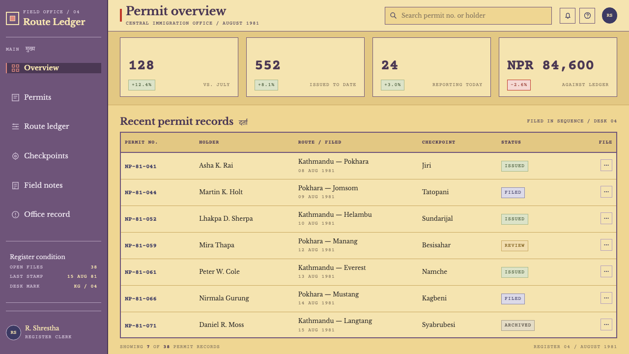
In web interfaces, the style fits dashboards that behave like registries, onboarding and checkout flows that behave like applications, and confirmation pages that want a sense of occasion. Inputs become ruled boxes with dotted leaders, and values entered by the user can appear in the typewriter voice. Status badges can be built as slightly rotated stamps, as long as the status is also stated in plain, level text for legibility and accessibility. A pricing page can present each plan as a permit with fields for what it allows.
In editorial and marketing work, the permit frame suits travel stories, expedition write-ups, archive features, itineraries and any narrative about crossing a border or getting permission. A confirmation moment, such as a booking made or a form approved, can be marked with a stamp that lands slightly off-axis. Long-form pages benefit from the style's clarity of structure: label-and-value pairs, small ruled captions, and clean columns with bilingual or multi-language headings.
The most common mistake is spreading distress evenly, so that every edge is scuffed and every line is faded; that turns a convincing document into a retro filter. A second is tilting the grid itself, which removes the contrast the style depends on, since the printed layer is supposed to be straight. A third is making the stamps pristine and perfectly aligned, which strips out the human hand. Finally, resist rotating body text or inventing extra ink colours; the layers are separated by tool and tone, not by a rainbow of effects.
Trekking Permit 1980 — FAQ
What is the Trekking Permit 1980 style based on?
It is based on a Nepalese trekking permit issued in Kathmandu during the Panchayat period, with the sampled reference a 1981 permit for the Everest region. The card is yellow and printed once in violet ink, with Devanagari on the left, English in the centre and a photo well at the top right, then completed by typewriter, ballpoint and rubber seals. The style keeps the printed layer and the added layer distinct.
Why does the style insist on keeping two layers separate?
Because the character of the document comes from the contrast between them. The printed form is orderly: right-angled boxes, ruled lines, two columns, one ink. The added layer is crooked and blotted: typed text, pen pressure, tilted seals. If you merge them into one uniform texture, the document loses both the authority of the form and the humanity of the handling. Straight grid, slanted stamp is the simplest summary.
Where should wear and distress appear?
Only where hands and tools acted: around the seals, along the folds and on the corners of the photo. The card itself is treated as intact, just handled and carried. Putting wear on the grid or the printed type works against the style, because the printed layer is meant to look as it did when it left the press. Careful, local wear reads as use; blanket wear reads as a filter.
Is the style only suitable for travel-related designs?
No. Travel is the source, but the structure applies to any product built around records, forms and status: tickets, receipts, bookings, applications, registries, certificates and audit trails. Any interface where something is submitted, checked and stamped can use the two-layer logic. The yellow card and violet ink are what make it recognisable, but the underlying idea, an orderly template plus visible human handling, is general.
Can the style work in a dark theme?
The reference is a light, warm, card-stock system, so dark mode is a departure. A violet ink printed on dark ground would lose its contrast, and the sense of a stamped paper document would fade. If you need a dark version, treat the card as a dark board with light printed rules, keep the stamps as lighter overlays, and keep the separation between the orderly and the crooked layers, since that is the part of the style that survives.
Related design styles
 Manchester United (Red Devils)Heritage hits like a chant. Red-black blocks, Bungee type, and gold filigree…
 Afghan War Rug (1980)Witness in wool. Madder red, indigo, and cream borders knot testimony into a…
 Bayern Munich (Rot)Heritage, not hype. Saturated rot fields, gold rules, and blue lozenges enfor…
 Brazilian Cordel (Northeast Folk Literature)Folk poetry, cut in lampblack. Cream newsprint, bordered chapbooks, one rust-…
 Broadsheet LetterpressAuthority in ink. Lampblack serif decks lock into tan paper with strict ruled…
 Cherokee SyllabaryLiteracy as inked record. Carbon type, muted red rules, and syllabary on tan…