What is Karel Martens Print Matter?
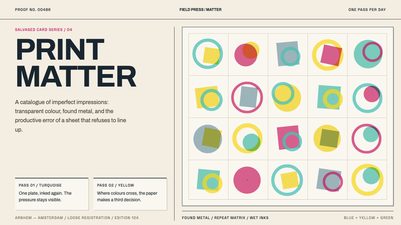
Karel Martens prints on what the world throws away, lays down one colour a day, and treats the drift between passes as the finished work.
Karel Martens Print Matter in brief
Karel Martens Print Matter is a design style drawn from the printed work of the Dutch designer Karel Martens, whose practice runs from the 1960s to the present and whose most characteristic printmaking sits in the years from 1990 to 2010. Its signature is overprint: transparent turquoise, yellow and magenta inks laid one over another on salvaged card, with each pass slightly out of register with the one before. The misprint, in effect, is the masterpiece.
Martens prints on what the world discards: dead Stedelijk Museum catalogue cards designed by Willem Sandberg, blank documents, raw packing paper. They are pulled through a small bookbinder's press. The printing forms are not metal type but found metal, such as car parts, discs, perforated plates and roadside scrap, inked and then repeated. Each of these choices keeps the work in the world of material rather than software: the object has been used before it is printed, and the print inherits that history.
The word 'letterproef' in the style's name is the Dutch for a type specimen, a sheet that shows what letters can do. Here the specimen is expanded to include everything that can print, from a machine part to a perforation. What results is a design language of systems and accidents working together. It looks rigorous, since the same forms are repeated in careful order, and it looks alive, since no two passes meet exactly.
Where does Karel Martens Print Matter come from?
Karel Martens belongs to Dutch postwar graphic design, working across Arnhem and Amsterdam in the Netherlands. The core of the style is dated to 1990 to 2010, inside a practice that began in the 1960s and continues today. That span matters, because the method did not appear overnight: the same preoccupations with system, grid and material recur across more than half a century of his work.
The ground he prints on carries its own history. Dead catalogue cards from the Stedelijk Museum in Amsterdam were designed by Willem Sandberg, the museum's celebrated designer-director, and Martens uses them as raw material. Printing on them is a quiet conversation with a predecessor, a way of giving a discarded object a second life. Blank documents and raw packing paper extend the same attitude to the plainest paper in the world.
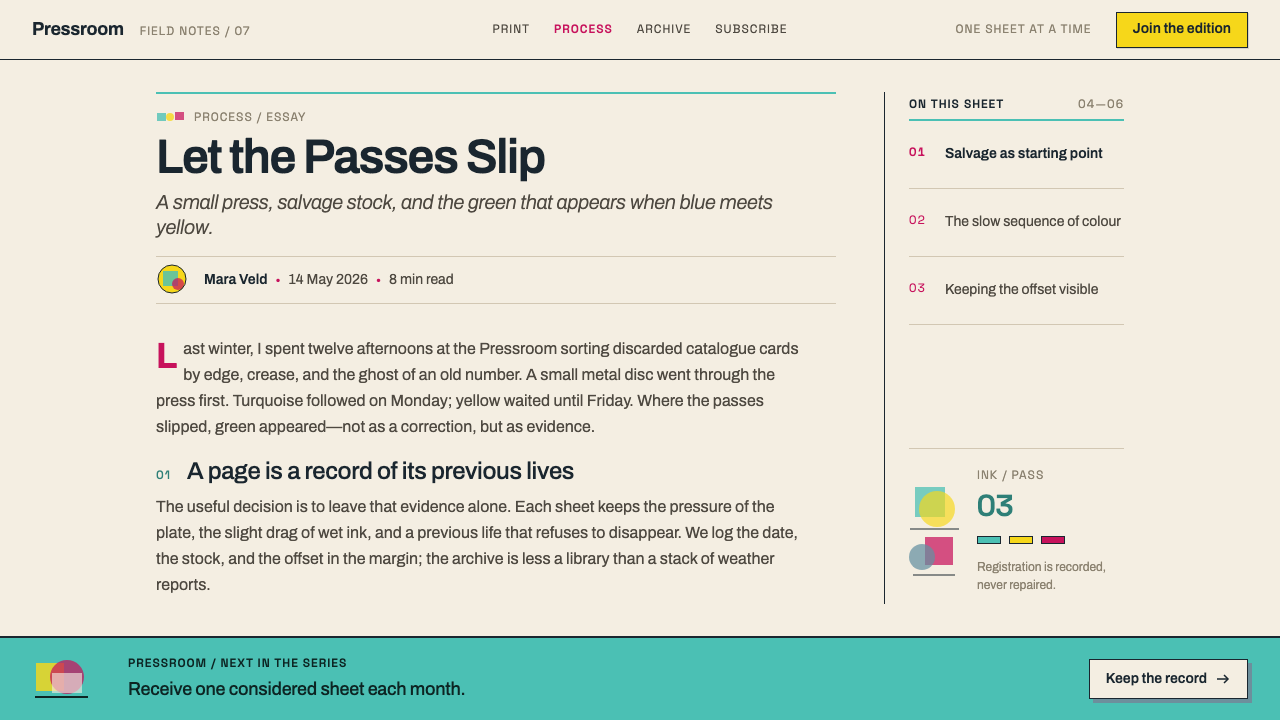
The process is slow by design. Martens lays down one colour a day and waits for it to dry, sometimes for months. Because the inks are transparent, they overprint into third colours: blue over white makes grey, blue over yellow makes green. White, to become opaque, needs repeated passes. Registration drifts between passes, and he does not correct the drift. The accumulated misalignments are what you see, so the final image is a record of time as much as of form.
The work is usually filed under three movements: Dutch postwar graphic design, letterpress monoprinting, and systematic design applied to found material. The last of these is the key. Martens is not improvising in the manner of an expressive artist. He sets up a system, whether a repeated form, an order of colours or a number of passes, and lets the material interrupt it. His stated taste in type, uneasy and imperfect like jazz, applies to the whole practice: a rigorous structure with room for a wrong note.
What defines the Karel Martens Print Matter look?
Salvaged Ground
The surface is something that already existed: a dead catalogue card, a blank document, raw packing paper. It is not neutral. Its warm, slightly dull paper tone, its edges and its wear all show through the ink and take part in the colour. The ground is a collaborator rather than a canvas, so design on it should leave the paper visible.
Found-Metal Forms
The printing shapes are not letters but found metal: car parts, discs, perforated plates, roadside scrap. They are inked and repeated, producing rings, grids of dots, cogs and slotted bars. These shapes are industrial and slightly anonymous, which gives the work a geometry that is systematic without being clean, as if a factory had been asked to make a pattern.
One Colour at a Time
Martens lays down one colour a day and waits for it to dry, sometimes for months. The slowness is visible in the result: every colour has had time to settle, and the sequence of passes can be read in the layers. The design process is a calendar, not a single act, and the final sheet carries that duration.
Transparent Overprint
The palette is turquoise, yellow and magenta, in transparent inks. Where two overlap, a third colour appears: blue over white makes grey, blue over yellow makes green. Colour is therefore generated at the intersections, not applied from a swatch. Overlaps should be treated as part of the design, with the three inks combined rather than kept apart.
Drifting Registration
Each pass lands slightly off the previous one, and Martens does not correct it. The drift produces thin slivers of unmixed colour along the edges of shapes and makes every impression different from its neighbour. The misalignment is the work: a design that would be flawless if registered perfectly looks lifeless here.
Uneasy Type
His stated taste in type is uneasy and imperfect, like jazz. Letterforms are chosen and handled with a slight wrongness, a hesitation or an irregularity that keeps them from settling into polish. The type belongs to the same family of found, repeated and slightly off forms as the printed shapes, rather than sitting on top as a neutral label.
Who shaped Karel Martens Print Matter?
A Dutch designer working from Arnhem and Amsterdam, whose practice runs from the 1960s to the present. His printmaking uses discarded paper, found metal formes and a small bookbinder's press, with one colour laid per day. He is the source of the whole style: a rigorous, systematic mind who deliberately lets drift and accident into his work and treats them as part of the design.
The designer of the Stedelijk Museum catalogue cards that Martens now prints on. Sandberg's cards, once working administrative objects, become a ground on which a later designer builds a new layer. This lineage connects the style to Dutch postwar graphic design and gives the printed work an inheritance rather than a blank start.
The Amsterdam museum whose retired catalogue cards supply Martens with material. As an institution it appears here less as a patron than as a source of discarded paper, the kind of administrative leftover that most people would throw away. It shows that this style begins by looking at what organisations leave behind and asking what it could still do.
How do you use Karel Martens Print Matter today?
Karel Martens Print Matter is a style for work that wants to feel made, slow and slightly wrong in the right places. It suits projects with a craft, cultural or experimental character and gives a system a human tremor. Applying it well depends on separating what is systematic from what is allowed to drift.
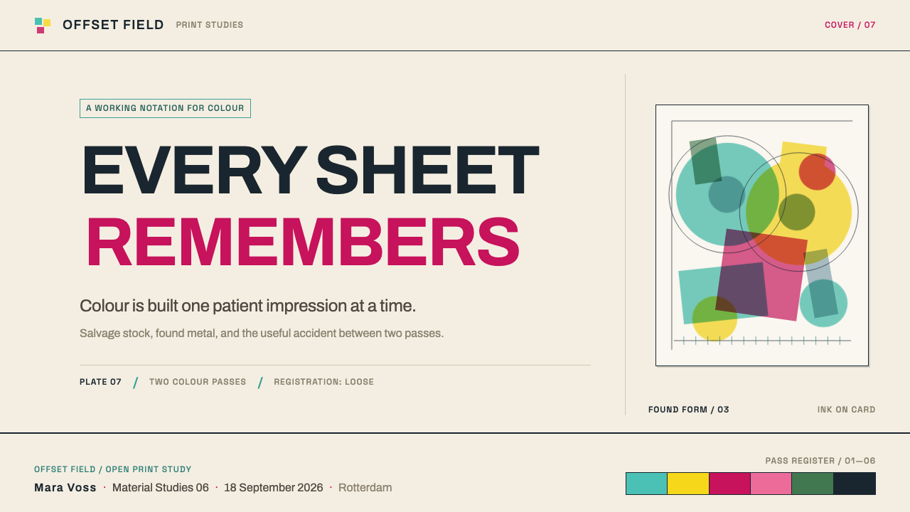
For presentation slides, a cover can use two or three overlapping shapes in transparent turquoise, yellow and magenta, with the overlaps producing third colours and one pass visibly offset from the others. Put them on a warm, slightly dull paper tone rather than pure white. Content slides should stay calm, with text on the paper tone and a single strip of overprint as a marker. Data slides can use overlapping translucent bars or areas, so intersections reveal combined values, with a small deliberate offset to keep the print feel.
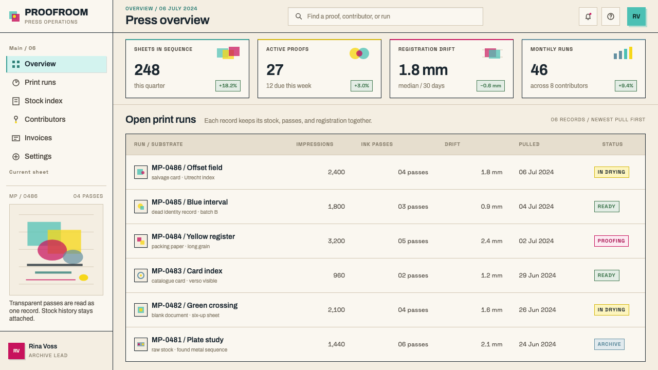
For web interfaces, use multiply blending on semi-transparent layers so that overlapping elements generate third colours instead of covering one another. This works well for hero sections, section dividers, card decorations and illustrations. Keep working surfaces such as forms, tables and dashboards plain and legible, and reserve the drift for decorative or identity moments. The misregistration should be an exact, repeatable offset in the stylesheet, not a random filter.
For editorial and marketing work, the style suits cultural institutions, publishers, studios, exhibitions and any brand that wants to show how things are made. Show the material: visible paper, a trace of the printing form, a mention of the process. Because the method is about reuse, it pairs well with projects that talk about archives, recycling and craft. Keep the system fixed so that the variation reads as variation.
The most common mistake is faking imperfection with grunge: random noise, scratches and distress filters that say messy but not made. Martens' drift comes from a strict system meeting a physical process, so the offset should be consistent and legible. Another mistake is using opaque fills, which cover each other and kill the overprint logic that creates third colours. And a third is dressing a conventional layout in a mild offset effect; the idea is a method, not a texture.
Karel Martens Print Matter — FAQ
What does 'Letterproef' mean?
It is the Dutch word for a type specimen, the sheet on which a typeface shows what its letters can do. In this style the idea is widened: the specimen includes everything that can print, from found metal parts to perforated plates. It frames the work as a demonstration of what a set of forms, inks and passes can do, rather than as a finished picture.
Is the misregistration random?
Not in spirit. Martens works from a system: a repeated form, a sequence of colours, a number of passes. What he does not do is correct the drift that physical printing produces between passes. On screen you should therefore build a consistent, deliberate offset, the same direction and amount for a given layer, rather than scattering random jitter. The look is systematic work interrupted by material, not noise.
How do I translate overprinting to screen?
Use semi-transparent layers in turquoise, yellow and magenta and combine them with multiply blending, so that overlaps darken and mix into third colours the way transparent inks do. Avoid opaque fills, which simply cover what lies beneath. Test on a warm paper tone, since the ground takes part in the colour, and check that the overlaps still look intentional rather than muddy.
Why does he print on discarded material?
The record gives the fact rather than the motive: he prints on what the world discards, including dead Stedelijk catalogue cards, blank documents and raw packing paper. The effect is that the ground carries its own history and tone into the work. For a designer, the lesson is to let the surface take part in the design, not hide it behind a flat colour.
Is this just a grunge or distressed look?
No. Grunge applies mess as a texture over a conventional layout. This style begins with a rigorous system, repeated forms and ordered passes, and lets the physical process introduce the irregularity. The difference shows in the details: clean, repeated shapes with consistent colour logic, and drift that follows the same rule everywhere, rather than scratches scattered at random.
Related design styles
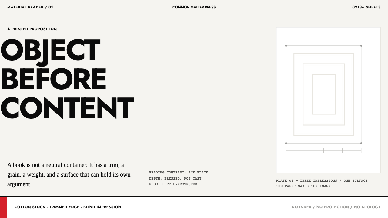 Irma Boom Book ObjectsPaper becomes the argument. Ink-black trim type and blind-embossed white make…
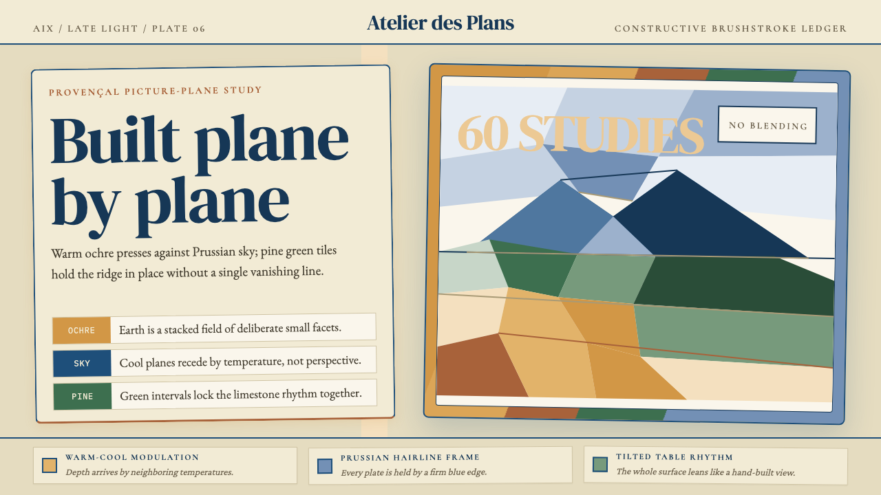 Cézanne — Mont Sainte-VictoireBuilt, not blended. Ochre, Prussian blue, and pine facets tilt into a constru…
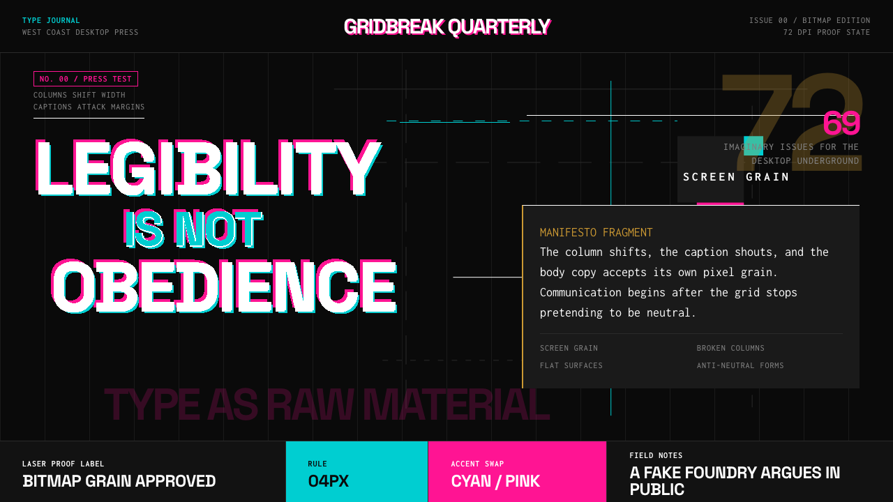 Emigre Magazine (1984–2005)Defies the tidy grid. Cyan, ochre, and hot-pink bitmap type collides on black.
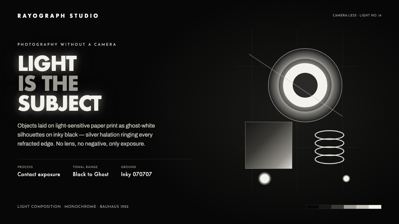 Photogram RayographLight is the subject. Ghost-white silhouettes and silver halation float on in…
 Superstudio Continuous MonumentThe grid does not end. Hairline black isometric ruling on toned newsprint-gra…
 Cargo Collective PortfolioInterface disappears. White space, full-bleed blocks, mono metadata and hairl…