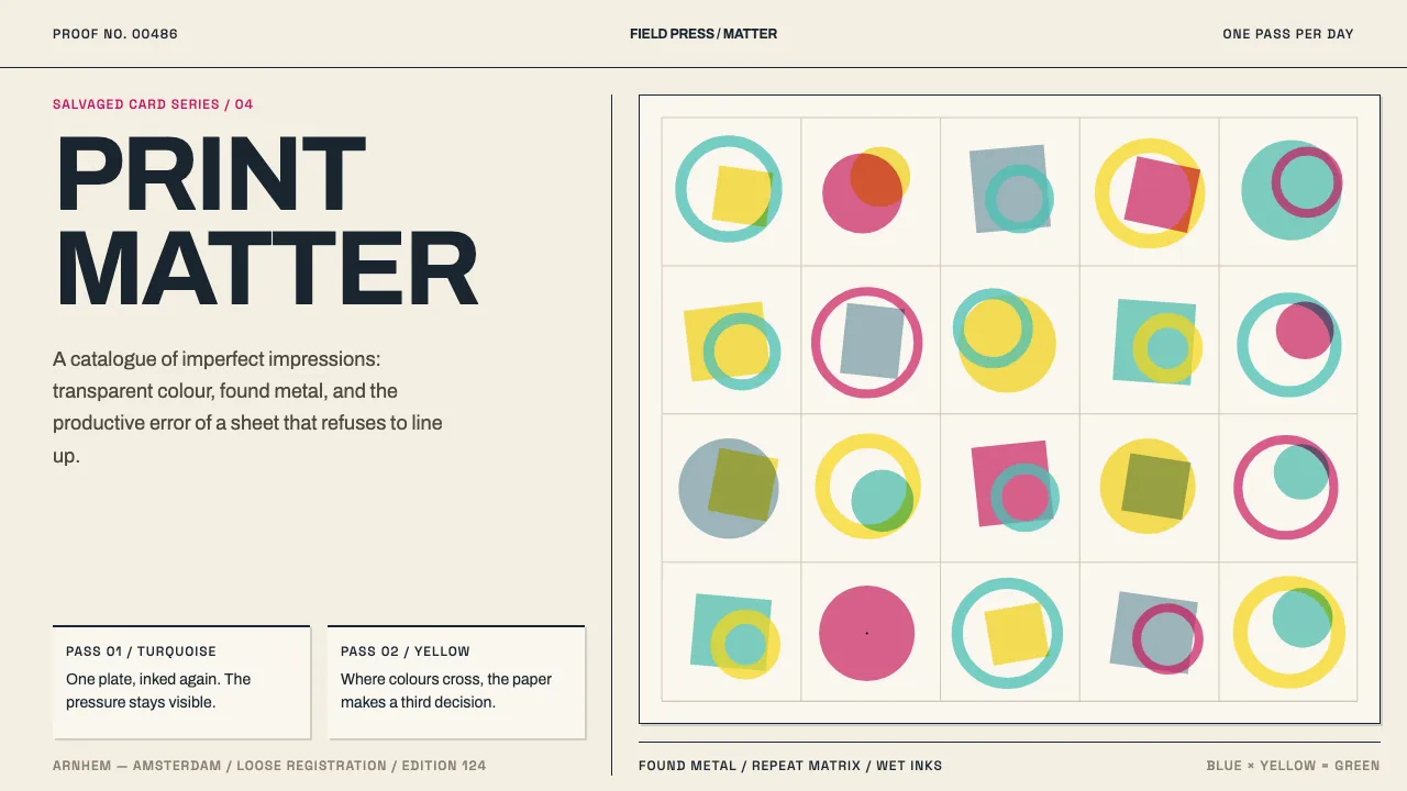
About Karel Martens Print Matter
Karel Martens prints on what the world discards — dead Stedelijk catalogue cards designed by Willem Sandberg, blank documents, raw packing paper — pulled through a small bookbinder's press. The formes are not type but found metal: car parts, discs, perforated plates, roadside scrap, inked and repeated.
He lays one colour a day and waits for it to dry, sometimes months. Transparent inks overprint into third colours: blue over white makes grey, blue over yellow makes green. Registration drifts between passes, and the drift is the work. His stated taste in type is uneasy and imperfect, like jazz.
- Origin
- Arnhem and Amsterdam, the Netherlands
- Era
- 1990–2010, within a practice running from the 1960s to now
- Key figures
- Karel Martens · Willem Sandberg
- Movements
- Dutch post-war graphic design · letterpress monoprinting · systematic design applied to found material
Karel Martens Print Matter design spec
Colors
Typography
The other 11 sections — buttons, cards, spacing, motion, techniques and more — open once you unlock. Download the DESIGN.md or send it to your AI in one click. Unlock once, yours forever.
Sign up nowStyles similar to Karel Martens Print Matter
Also inspired by print & type, with a close feel.
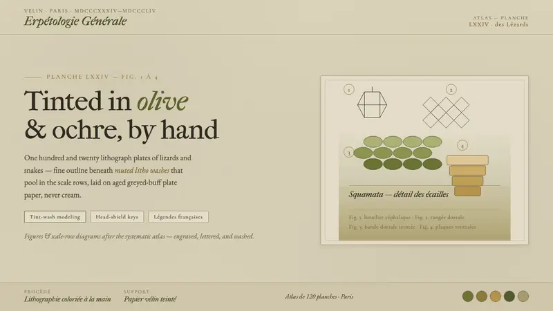 Herpetology Scale PlateA 19th-century herpetology atlas, digitized. Olive-and-ochre litho washes on buff plate paper.
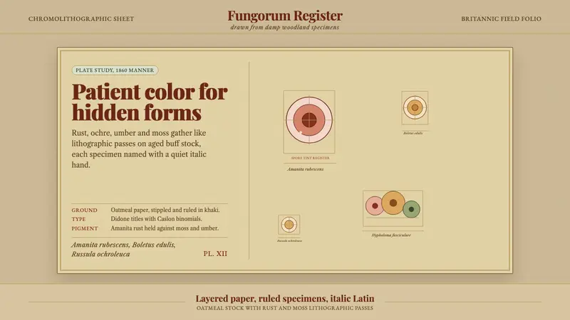 Victorian Mycology PlatePatient field science. Rust and moss specimens sit on stippled buff paper with italic Latin.
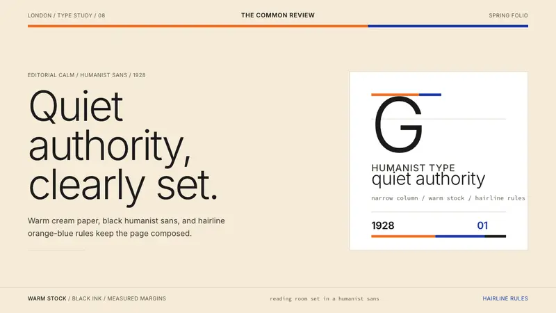 Gill Sans (BBC, 1928)Quiet authority, clearly set. Warm cream, black humanist sans, and hairline orange-blue rules.
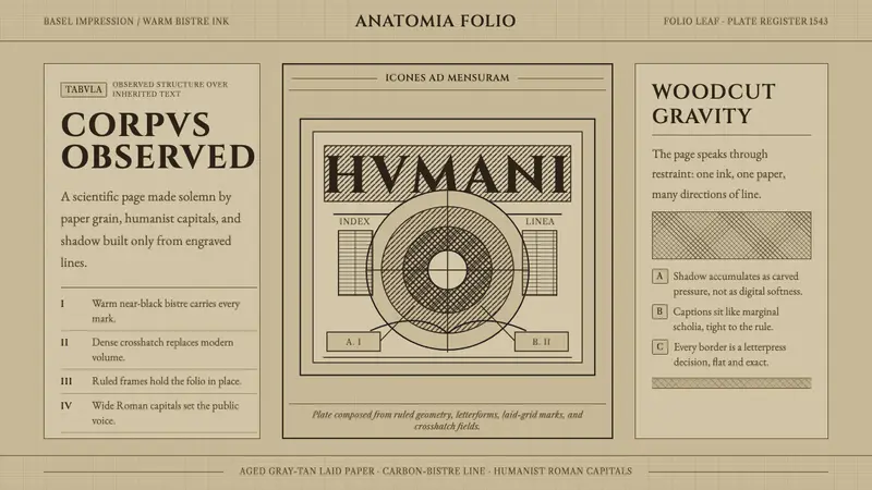 Vesalius AnatomyScience feels hand-pressed. Bistre Cinzel, hatchwork, and warm laid paper hold the page.