What is Irma Boom Book Objects?
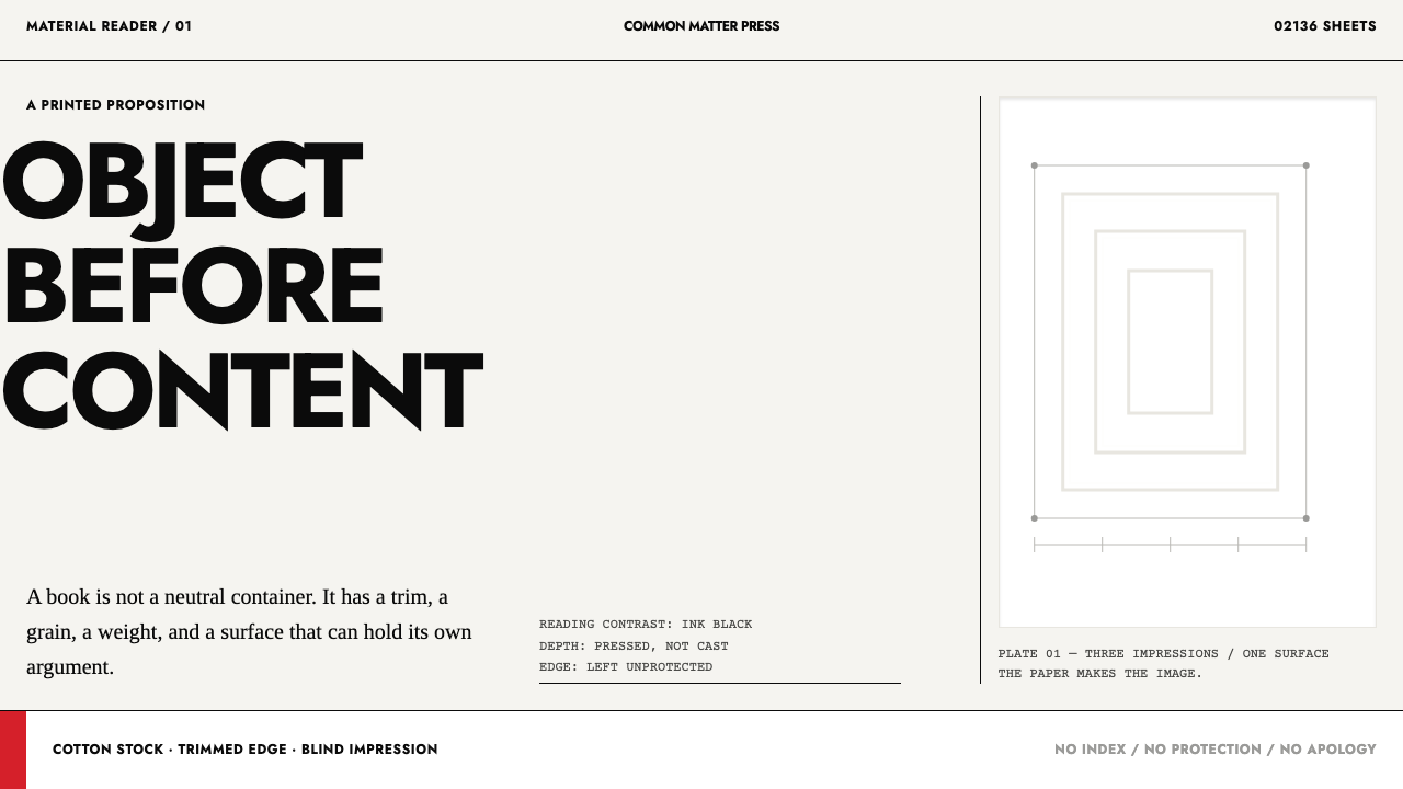
Irma Boom builds books the way other people build objects, and this style follows her: paper is the argument, black is only for reading, and depth is pressed into white rather than floated on shadow.
Irma Boom Book Objects in brief
Irma Boom Book Objects is a design language drawn from the work of the Amsterdam book designer Irma Boom, who treats a book as a physical object to be built rather than a container of layout. Her books are heavy, tactile and structural, and the design decisions are made at the level of paper, binding, edge and weight as much as at the level of type. The Curio system takes this literally and turns it into a screen language in which the surface is paper and everything else is an impression made on it.
Visually it is bright, quiet and rigorous. The ground is a white or near-white paper surface. Black is the only colour that does the work of reading: text and fine structure are set in an ink black that contrasts cleanly with the sheet. Red appears once, in a single decisive mark, and nowhere else. Depth, where it exists at all, is made as blind embossing, a white shape raised from or pressed into a white surface, so that the eye reads relief through light and edge, not through drop shadows or blur.
The consequence is a style that is physical without being skeuomorphic. It does not imitate leather or wood or glossy plastic. It borrows the logic of a printed object, in which paper has thickness, ink has a single job and a pressed edge casts its own light. Type runs to the trim of the page rather than hiding behind a protective margin. The system asks the designer to commit: the sheet is the thing, and nothing needs to be added to it to give it presence.
Where does Irma Boom Book Objects come from?
The lineage comes from Amsterdam, in the Netherlands, and spans the 1990s to the 2010s. Two books define it in the library's account: the SHV Think Book of 1996 and Chanel N°5 Culture of 2013. They are very different objects, yet they share an idea: that the book is not a neutral carrier of content but the content's physical argument. The library sets the style within Dutch book design, within the idea of the book-as-object, and within the generation of Dutch graphic design that came after the studio-scale systems of Total Design.
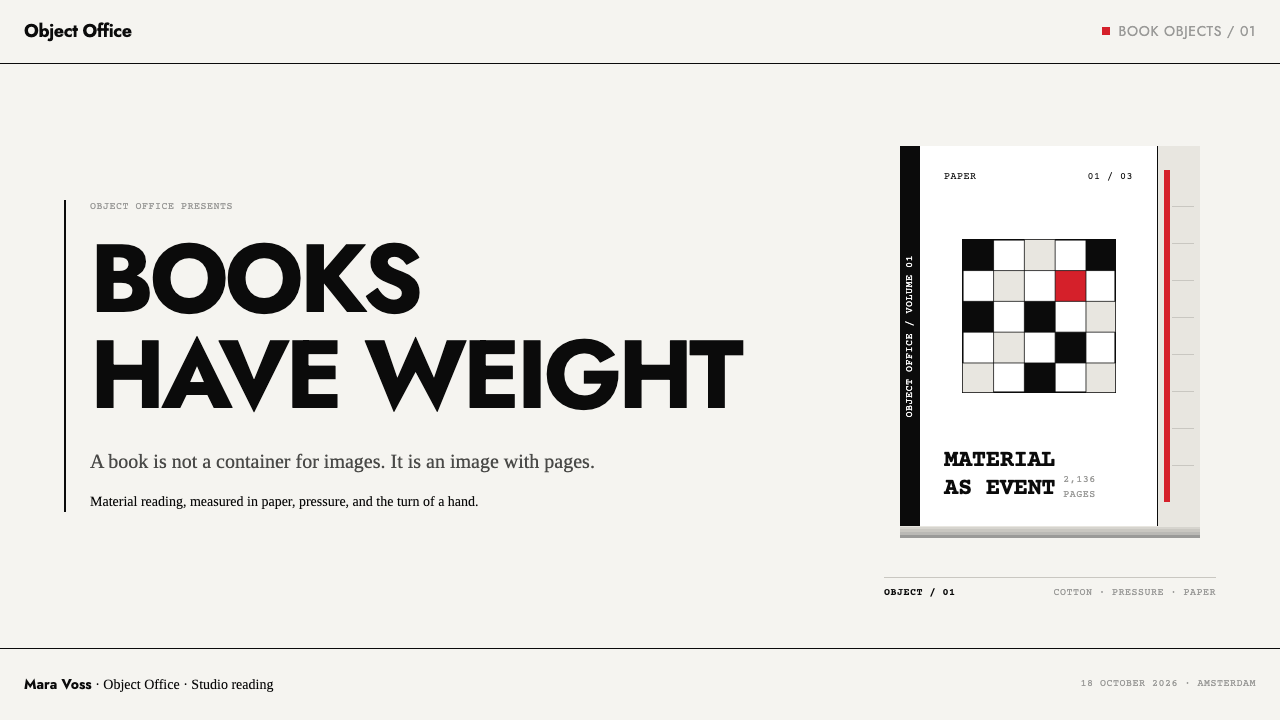
The SHV Think Book is a brick. It has 2,136 pages bound in white cloth, and the paper is a cotton stock that Boom developed herself. It has no page numbers, no contents and no index, which removes the usual apparatus of finding and leaves only the experience of the pages. A tulip field is printed into the fore-edge, the cut side of the pages, and the other direction of the fan shows a poem. Eight red bookmarks arrange a hidden title, the spine is hollow with a steel plate set inside it, and the whole is housed in a black box. Each of these decisions is physical, and each turns a feature of the book's construction into part of its meaning.
Chanel N°5 Culture, from 2013, goes the other way. It uses no ink at all. Its 300 pages are blind letterpress, with images pressed into white paper as raised and recessed relief, so that a picture exists only as a change in surface. The same principle is at work as in the earlier book: paper is not a surface to be printed on but the material of the image itself. Absence of colour becomes the colour, and the reader has to move the book in the light to see what is there.
The system turns these two ideas into screen rules. Paper is the surface, black is the only reading contrast, red appears once per screen, and every impression of depth is stamped rather than floated. Type is set to the trim edge with no protective margin. The wider Dutch tradition provides the discipline: a belief that restraint, structure and material honesty are more eloquent than ornament. The lineage also carries a message about authorship, since in Boom's practice the designer is the author of the object, not an illustrator of someone else's text.
What defines the Irma Boom Book Objects look?
Paper Is the Surface
The ground is a white paper with presence: not a neutral background but the material the whole interface is made of. Components do not float above it on cards or shadows. They are printed, pressed or cut into it. This gives the system a physical logic in which the screen is a sheet and every element is an operation performed on that sheet.
Black Only for Reading
Ink black is the only contrast colour in the system, and it exists to be read. Text, thin rules and structural marks are black, so the page has one clear tonal axis, from white paper to black type. There are no mid-grey fills and no tinted panels, and the result is a surface that reads almost like newsprint at its best: unambiguous and sharp.
Red, Once
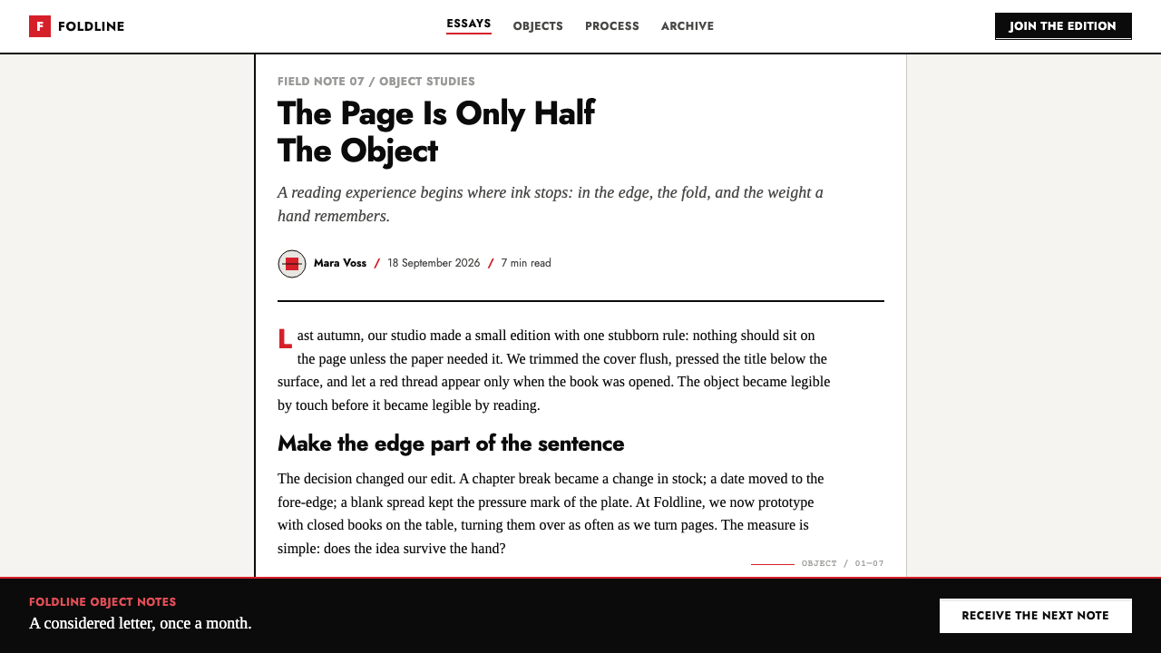
Red appears a single time per screen, as one decisive mark. It might be a single word, a rule, a small shape or a bookmark-like ribbon, and it directs the eye to the one thing that matters. Because it is not repeated, it never becomes decoration. A second red mark would cancel the first, and the page would start to look like an ordinary themed interface.
Blind Emboss
Depth is made by pressing, not by lighting. A white shape is raised from or pressed into the white paper, so that the eye perceives it through its edges and the subtle change of tone around them. This is the principle of the Chanel N°5 Culture book, where images exist as relief alone. In the system there are no drop shadows and no blur, only the quiet drama of a pressed edge.
Type to the Trim
Text is set to the edge of the page, with no protective white margin around it, the way a printed block can run right to the cut. This gives the layout a tension and a feeling of being cropped from something larger. It is a deliberate risk: the trim becomes part of the composition, and the edge of the screen is treated as the edge of a physical sheet.
No Apparatus
The SHV Think Book has no page numbers, no contents and no index, and the system shares that suspicion of apparatus. Navigation is reduced to what is needed, and interface furniture such as badges, chrome and decorative labels is removed. Structure is carried by the layout itself. The reader is trusted to find their way, and the design takes responsibility for making the way obvious.
Hidden Layers
Boom's books hide things in plain sight: an image on the fore-edge that only appears when the pages are fanned, bookmarks that spell a title, a steel plate inside a hollow spine. The system borrows this as a principle of reward. A screen can reveal more on interaction, through a pressed surface that changes under a hover or a secondary layer that appears when the page is scrolled, but it must never hide the essentials.
Who shaped Irma Boom Book Objects?
The Amsterdam book designer at the centre of the style. Her SHV Think Book of 1996 and Chanel N°5 Culture of 2013 are the two works that define it, one a dense white brick with a hidden fore-edge image and the other a book made entirely of blind impressions. Her core idea is that a book is an object whose material form is part of its argument.
The American textile artist listed in this style's lineage. Her presence suggests that the thinking behind the system concerns material as much as layout: fibre, weave, surface and the way a thing is made. It is a useful reminder that book design in this tradition borrows from sculpture and textile, not only from typography.
A Dutch graphic design figure named in the library's lineage for this style. He appears as part of the context in which Boom works, the Dutch design culture that treats structure and restraint as a form of intelligence. His place is that of a reference point in the tradition, not of a signature work.
The Amsterdam design studio whose systematic, large-scale approach shaped Dutch graphic design before Boom's generation. The library places the style in the period after it, so the studio stands for what came before: a model of corporate order that later Dutch designers absorbed, questioned and reworked into more personal and physical forms.
How do you use Irma Boom Book Objects today?
This is a style for work that wants to feel like a physical object in a screen medium. It suits products and campaigns where material, craft and restraint are the message, such as publishing, architecture, art, fashion and luxury goods, and it rewards content with real substance. It punishes decoration of any kind, and it works best when the designer is willing to leave most of the surface alone.
For slides, a cover is a clean white sheet with the title set in black type running to the trim, and one red mark. A blind-embossed shape, perhaps a logo or an image silhouette, sits in the white as a pressed relief. Content slides use black type on white with a single idea, no panels and no icons, and data slides rely on thin black rules and black figures, with the one red mark identifying the number that matters. Charts should be drawn with ink and spacing only, never with fills or gradients.
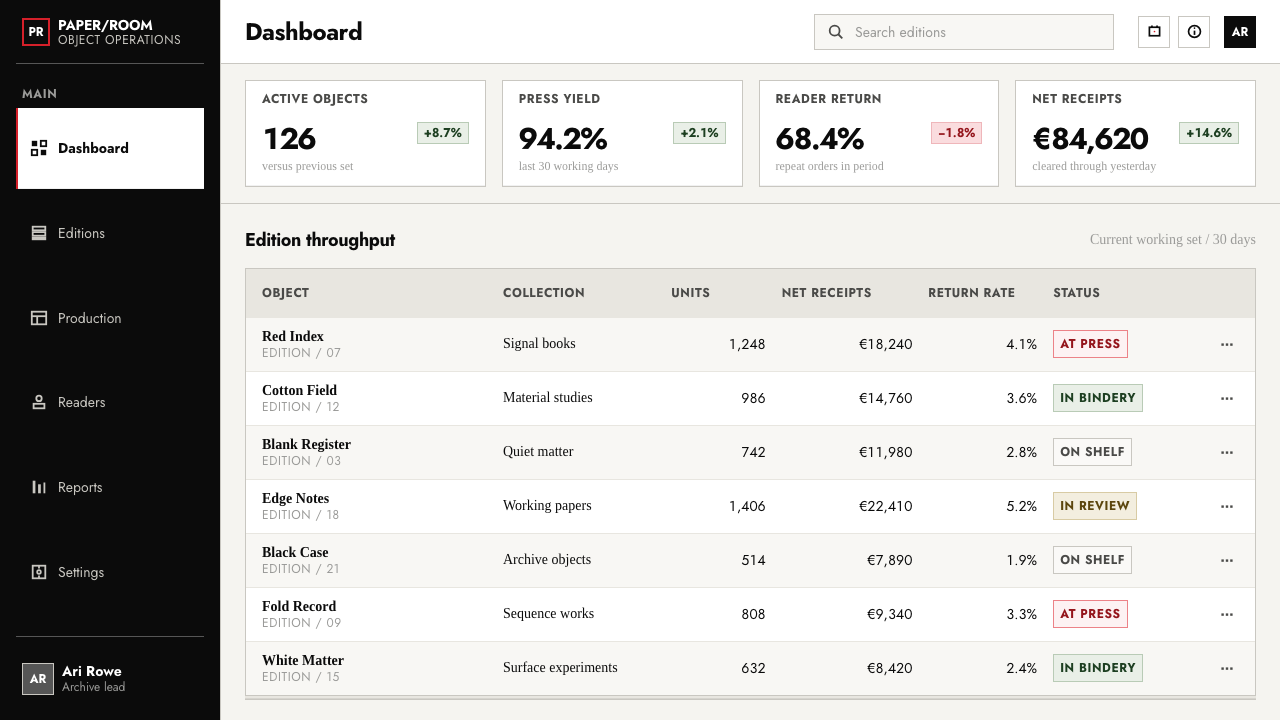
For web interfaces, the style fits portfolios, publishing sites, gallery and museum pages, and product pages for objects that earn attention through craft. Layouts are white with black type, and cards are replaced by pressed regions, outlined by embossed edges rather than shadows. Navigation is minimal and typographic. Buttons are black text with a pressed outline, and the single red element on each page marks the primary action or the key message. Dashboards need care, because the system resists density, so use it where clarity matters more than information volume.
For editorial and marketing work, the style gives a book-like authority. A page can open with a large black headline running to the edge, sit a pressed image beside it, and place a single red word in the text. Long-form pieces benefit from the lack of apparatus: no sidebars, no badges, just a sequence of sections. Campaigns for objects, publications and exhibitions can lean on the idea of a hidden layer, with something revealed on interaction that rewards attention.
The common mistakes are to add shadows, blur, glow or grey panels to make depth, which contradicts the central idea that depth is pressed, not floated. Another is to use red more than once per screen, which turns it into an accent colour rather than an event. A third is to wrap type in generous protective margins and containers, losing the tension of the trim. Finally, do not copy the look without the commitment: a system built on paper and impression collapses when it is filled with ornament.
Irma Boom Book Objects — FAQ
What does blind embossing mean in a screen design?
Blind embossing is a print technique in which paper is pressed to make a raised or recessed shape without any ink. On a screen it means making a white or near-white shape visible only through subtle tonal changes at its edges, so that it reads as relief. It is the opposite of a drop shadow, which suggests a floating object. Here the shape belongs to the sheet itself, as if pressed into it.
Why is red allowed only once per screen?
Because red here is a decisive mark, not a theme colour. A single red element tells the reader exactly where to look, much as a single coloured bookmark does in a book. If red appears many times, it competes with itself and the page loses its focus. The restriction forces the designer to decide what the screen is actually about, and the whole system depends on that kind of decision.
Can I use the style for a data-heavy dashboard?
It is difficult, because the system resists density, apparatus and decoration. You can build clear tables with thin black rules and black figures, and use the single red mark for the key metric, but dense multi-panel layouts will fight the style. It is better suited to reports, summaries and focused views than to monitoring screens. When you need density, reduce it by splitting content across sections instead of squeezing it.
Does the style need physical imagery of books?
No. The system borrows the logic of the book-as-object, not its pictures. You do not need photographs of paper, bindings or spines. What matters is the behaviour of the surface: paper as the ground, black for reading, red as a single mark and depth as impression. Photographs of books can appear as content, but the interface itself should not imitate them.
How is this different from a minimal white design?
A generic minimal white design usually removes things and leaves a neutral background with soft shadows and a coloured accent. This system is a positive statement about materials. Paper has presence, depth is pressed, type may run to the trim, and there is a rule about red. It does not simply remove decoration. It replaces it with a physical logic that gives the surface character.
Related design styles
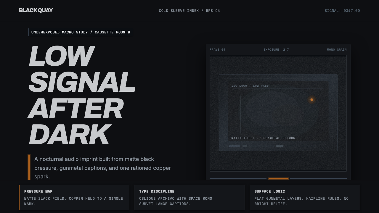 Bristol Trip-HopMenace through minimalism. Near-black grain, gunmetal type, one copper spark.
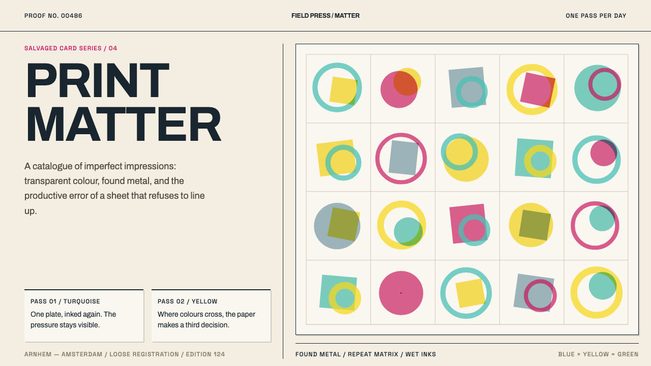 Karel Martens Print MatterThe misprint is the masterpiece. Transparent turquoise, yellow and magenta dr…
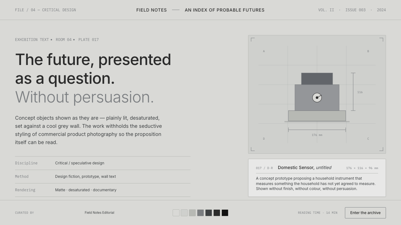 Speculative DesignRefuses to seduce. Cool-grey wall, Inter labels, matte concept objects — the…
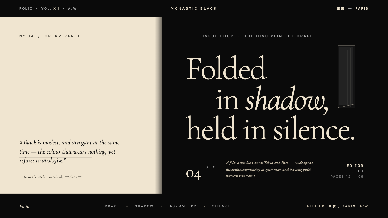 Yohji Yamamoto Monastic BlackBlack as philosophy. Monastic ink ground, warm cream reprieve, low-weight Gar…
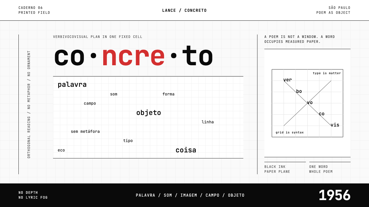 Brazilian Concrete PoetryWords become objects. Monospace cells, black-white paper, one cadmium red rup…
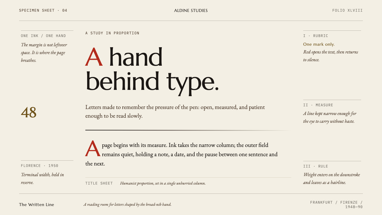 Hermann Zapf CalligraphyThe sheet is the subject. Warm paper, Marcellus display, one red initial and…