What is Droog?
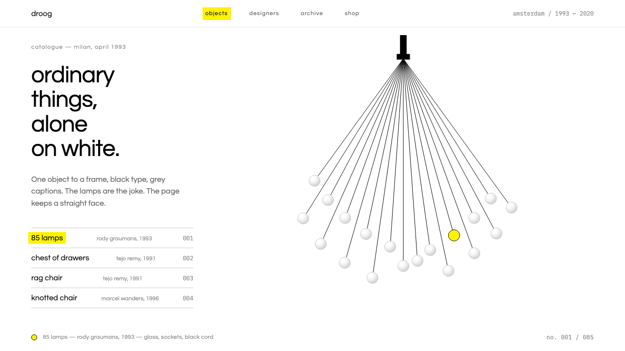
Droog design lets the objects tell the jokes while the page keeps a perfectly straight face: white space, black type, grey captions and one yellow highlight.
Droog in brief
Droog is a Dutch design label founded in Amsterdam in 1993 by the designer Gijs Bakker and the design historian Renny Ramakers. The word droog is Dutch for dry, and the humour it stands for is dry too: understated, never explained, and carried entirely by the thing itself. This design system takes its look from the way Droog presented its work, not from any single object.
In the same year they founded the label, Bakker and Ramakers took a handful of odd, cheap-looking objects to the Milan furniture fair. There were bare bulbs bunched together on their cords like a ponytail, a stack of salvaged drawers held together with a strap, and a chair made of rags. The objects looked as though they had come from a scrapyard, yet they were considered and precise in their ideas.
The page follows the logic of a catalogue. A large white ground, one object per frame, black headline text, short grey captions for the designer, year and material, and a yellow highlight that appears only when something is selected or hovered. The layout does not try to be funny. The objects carry the jokes and the type keeps a straight face.

Where does Droog come from?
Droog was founded in Amsterdam in 1993 by Gijs Bakker and Renny Ramakers, and it debuted in Milan the same year. The partnership matters: Bakker was a designer, Ramakers a design historian, and the label was as much a curatorial and critical project as a manufacturing one. It brought together objects by other designers under a shared attitude instead of building a single house style.
The Milan presentation is the story most often told about the beginning. The bare bulbs on their cords, the drawers strapped into a cabinet and the rag chair were shown together, and what they shared was less a look than a way of thinking. Each object takes something ordinary or discarded, such as a bulb, a drawer or a pile of cloth, and changes how it is used or seen, with a gesture that is simple and exact.
The background of the style names two movements: Dutch conceptual design and readymade and found-object design. The first points to a tradition in which an idea is the real material and the object is its proof. The second points to a lineage of art and design where existing objects are chosen and recontextualised rather than invented from scratch. Together they describe design that works by selecting, combining and reframing.
Droog's reach grew over the following decades. The work was shown at MoMA in 1996, and the visual language of its catalogues continued through the 1990s and into 2020. Besides the founders, the key names include Rody Graumans and Tejo Remy, two designers whose objects stand for the label's approach. The system keeps the way the work was presented, which is why the page is so quiet: the quiet is what lets the objects speak.
What defines the Droog look?
Color
The page is white, the headlines are black and the captions are grey. Yellow appears only as a highlight when something is selected or hovered, in the manner of a marker pen running over a line in a catalogue. Because the colour is so rare, when it shows up it carries meaning: it tells you what you are looking at right now.
Typography
Type is plain, upright and unemphatic. Headlines in black name the object; short grey captions give the designer, the year and the material. There is no expressive lettering, because the humour is in the object. The restraint of the type is the deadpan itself.
Layout
One object sits alone in each frame with generous white space around it. The composition resembles an exhibition catalogue or a museum label, where nothing competes with the piece. There are no busy grids or competing cards. The reader's attention is directed entirely at the thing being shown.
Imagery
Objects are photographed alone on white, such as a bunch of bare bulbs on their cord, a stack of drawers held by a strap or a chair of rags. The image is the star and is given enough room to be examined. Everything else on the page is arranged so as not to explain the joke.
Tone
The tone is dry in the Dutch sense: understated, serious on the surface and funny underneath. Interface copy should never wink at the reader. The humour is carried by what is being shown, and the interface behaves like a neutral curator.
Interaction
Interaction is minimal and quiet. Hovering or selecting an item brings up the yellow highlight and nothing else. There are no elaborate transitions, no shadows and no decorative flourishes. The system rewards looking rather than clicking, and its feedback is as understated as the rest of the design.

Who shaped Droog?
Bakker is a designer and one of the two founders of Droog in Amsterdam in 1993. He took the first group of objects to the Milan furniture fair with Renny Ramakers, and his role represents the design half of the partnership.
Ramakers is a design historian and the other founder of Droog. Her background supplies the curatorial and critical side of the label, which is why the work was presented as a considered body of ideas rather than as a product line.
Graumans is listed among the key names connected to Droog. His work is associated with the bare-bulb cluster hanging on a bunch of cords, one of the objects that came to stand for the label's dry, found-object approach.
Remy is another key designer connected to the label. His name is linked with the stacked salvaged drawers bound with a strap, an object that shows how reuse and a single gesture can become a complete piece of furniture.
How do you use Droog today?
On slides, the Droog system suits decks that present a collection, a portfolio or a series of ideas one at a time. A cover is a white slide with one image or one title in black and a short grey line beneath it. Content slides show one item per slide with its name, a grey caption and nothing else. Data slides work when each figure is allowed to stand alone with its caption, and yellow can mark the one number the audience should look at.
In web interfaces, it fits catalogues, shops for objects, gallery and archive sites, and portfolios. A product grid should present one object per cell with generous space, black names and grey details, and the yellow highlight on hover or selection. It also works well for documentation or reading interfaces where the content should speak and the chrome should stay out of the way.
In editorial and marketing, it is useful when the subject is already interesting and the layout should avoid competing with it. Exhibition pages, product launches for design objects and essays about things all benefit. The deadpan voice of the copy is part of the system: describe the object plainly and let the reader find it funny.
The most common mistake is to try to make the layout funny. Playful fonts, bouncing animations or jokey captions undo the deadpan, which is the whole point. A second mistake is to overuse yellow; it is a highlight, not an accent colour for buttons and headings. A third is to crowd the frame: the white space is what gives each object the room to be strange.
A useful test is to cover the object with your hand and see whether the page is still dull in the right way. If the layout is clearly neutral and quiet, it is working as a stage. If the layout is trying to entertain, the objects will have to compete with it.

Droog — FAQ
What does Droog mean?
Droog is the Dutch word for dry. The label was founded in Amsterdam in 1993 by Gijs Bakker and Renny Ramakers, and the name describes its humour: understated, never explained and carried by the objects themselves.
What objects did Droog show in Milan?
Among the first works were bare bulbs bunched on their cords like a ponytail, salvaged drawers held together with a strap, and a chair made of rags. They looked cheap and found, but each carried a considered idea.
Why is yellow only used on selection?
Because the system treats yellow as a highlighter, not a brand colour. It appears when something is selected or hovered, which keeps the page white, black and grey otherwise and makes the highlight meaningful.
Is this a minimalist style?
It looks minimal but the reasoning is different. The empty space is a stage for strange objects, and the quiet type is a deadpan voice. The aim is not to reduce things for their own sake but to let the objects carry the humour.
Related design styles
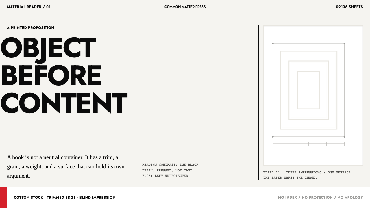 Irma Boom Book ObjectsPaper becomes the argument. Ink-black trim type and blind-embossed white make…
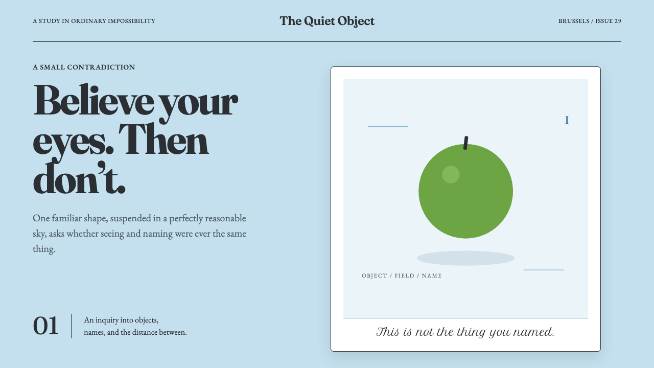 Magritte Surrealism (1929)Ordinary things tell quiet lies. A flat cerulean sky suspends one green inter…
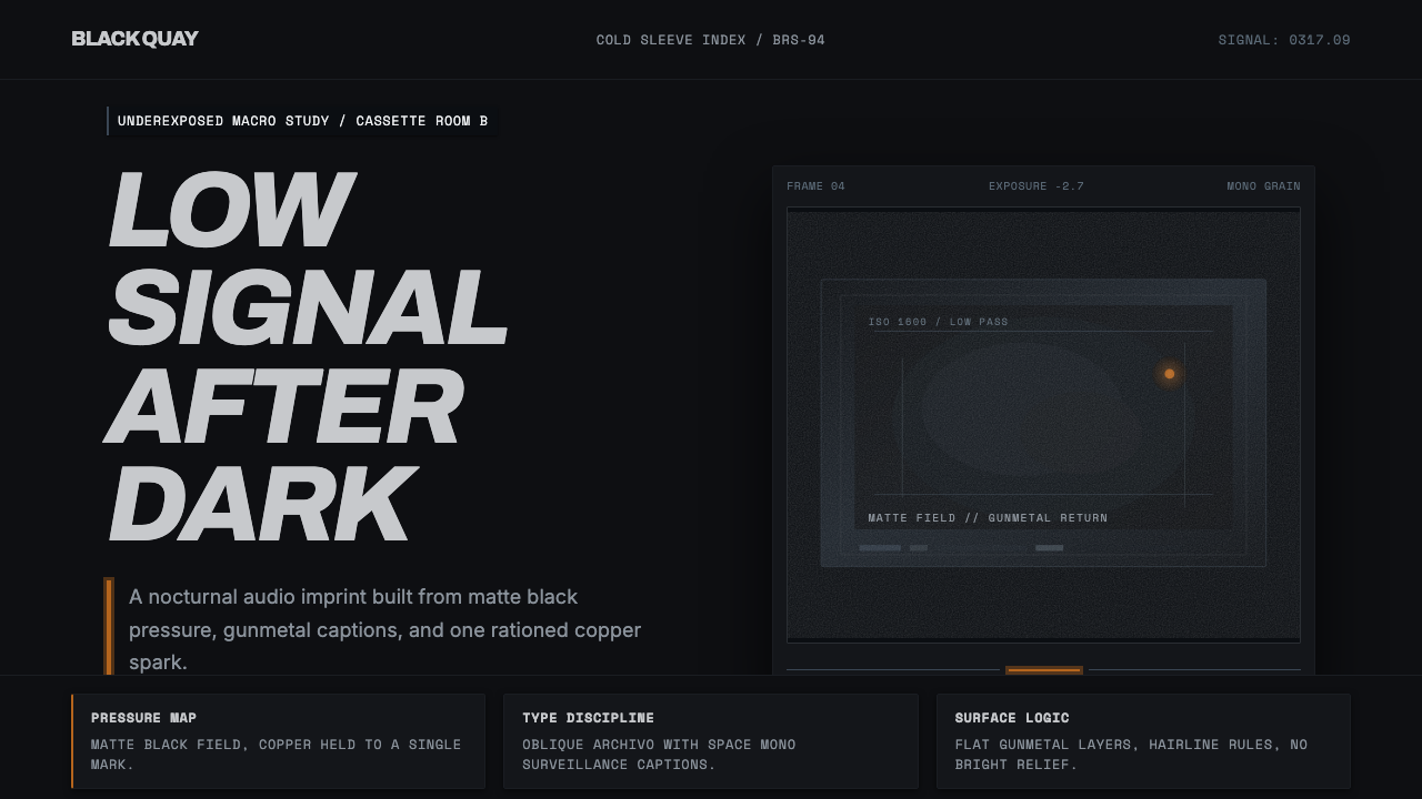 Bristol Trip-HopMenace through minimalism. Near-black grain, gunmetal type, one copper spark.
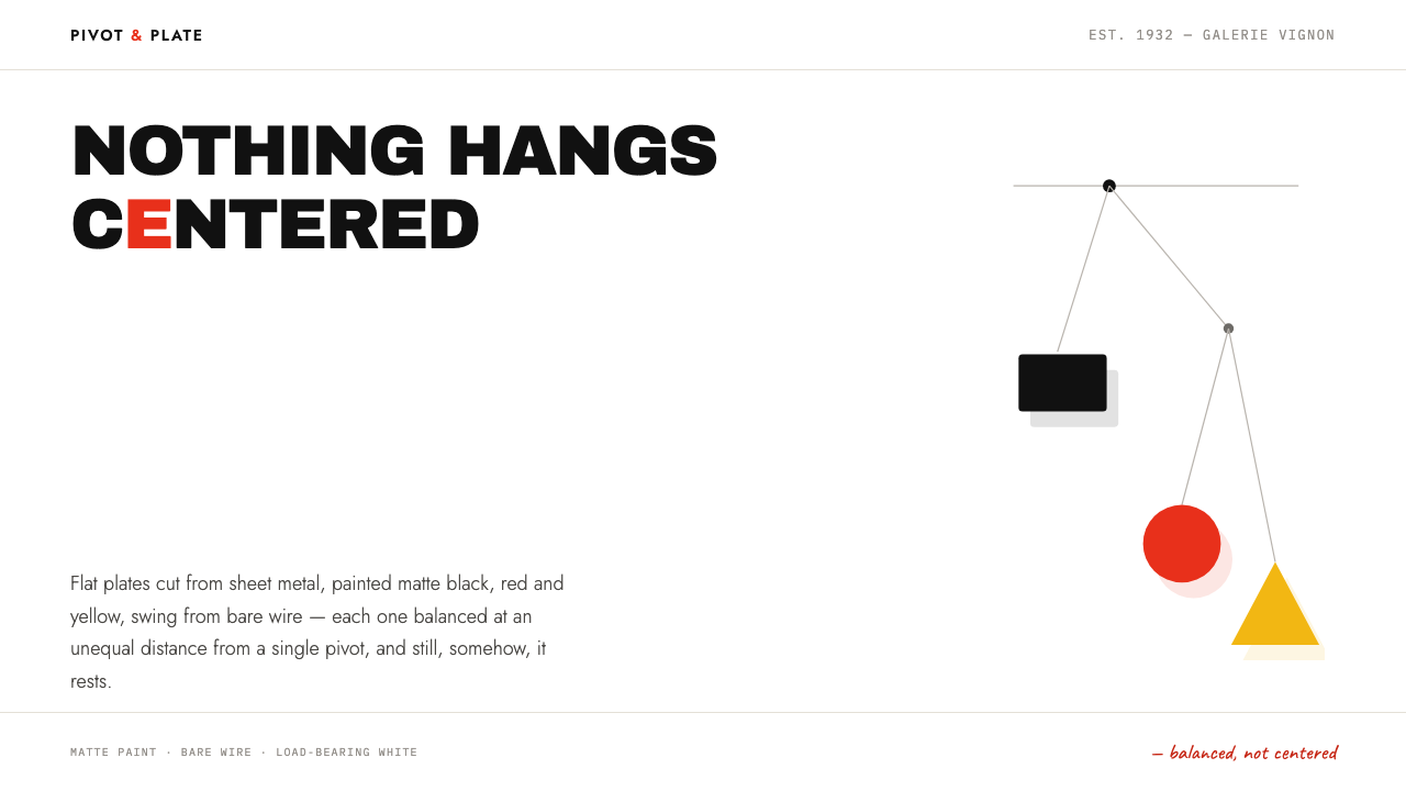 Calder MobileBalance, not symmetry. Flat painted plates hang off-centre from hairline wire…
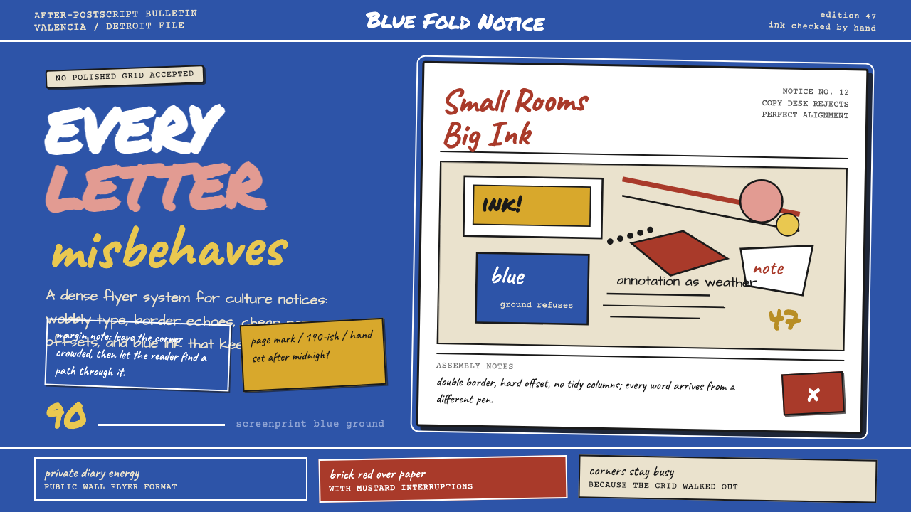 Ed Fella Hand-Drawn (1990)Handmade rebellion. Screenprint blue, wobbly type, and crowded margin notes r…
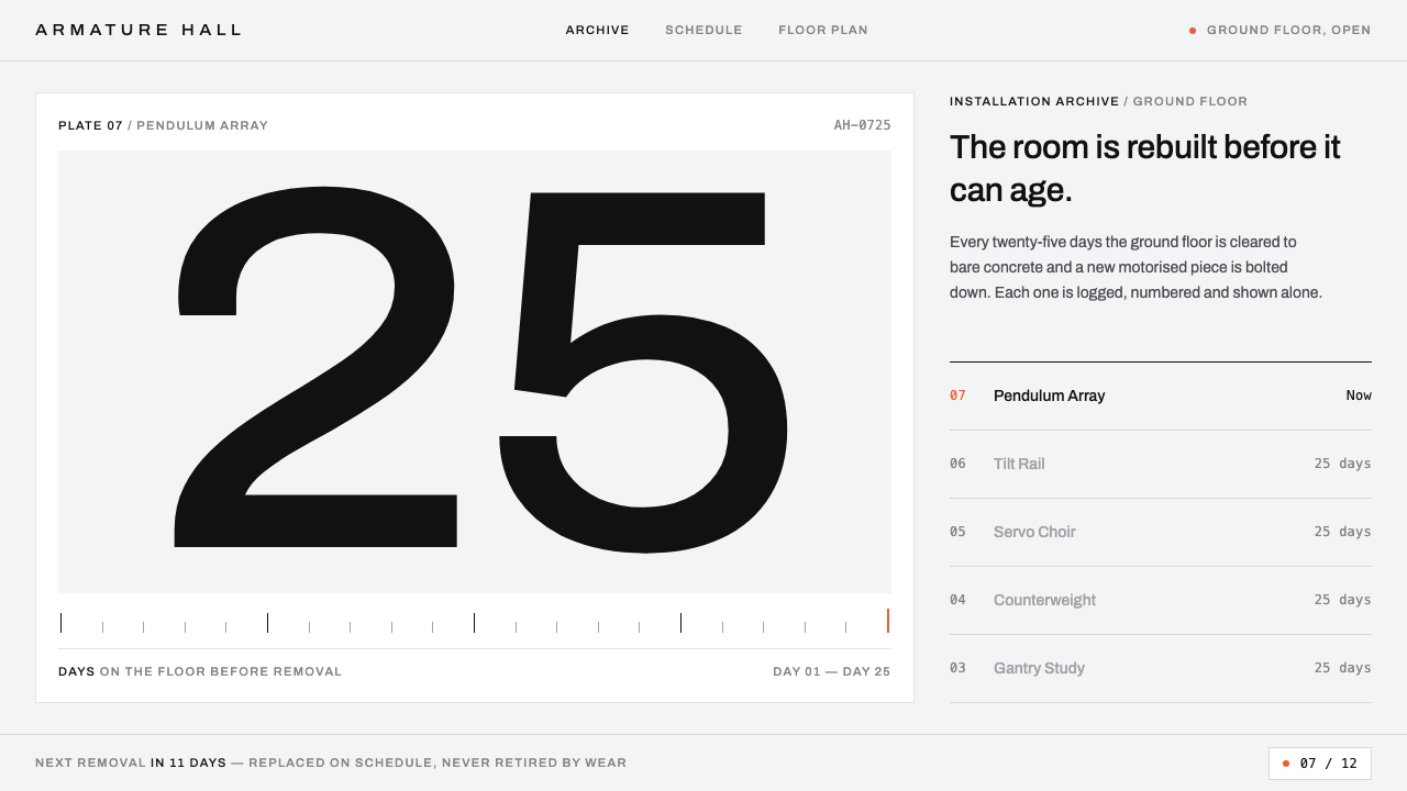 Gentle MonsterObjects filed like machine parts. Grey sweep, tracked Archivo, hairline rules…