Design style guide设计风格指南
What is Ed Fella Hand-Drawn (1990)?什么是 Ed Fella Hand-Drawn (1990)?
Ed Fella abandoned the computer at the peak of its promise and spent fifteen years proving that the hand could say things PostScript never could.埃德·费拉在电脑排版最辉煌的时刻选择放弃,用十五年时间证明了手绘能说出 PostScript 永远无法说出的话。
Ed Fella Hand-Drawn (1990) in briefEd Fella Hand-Drawn (1990) 速览
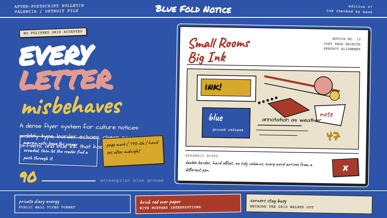
Ed Fella Hand-Drawn is a graphic design style rooted in the flyers Ed Fella produced for the Detroit Focus Gallery between 1987 and 2001. Where the dominant design culture of that era moved toward clean digital output and the smooth authority of PostScript type, Fella moved in the opposite direction — toward the imprecision, density, and personal energy of the hand. Each flyer was a one-of-a-kind object: letters drawn individually so that no two shared the same proportion, margin notes crowding every white corner, multiple hand-lettered voices competing on the same page.埃德·费拉手绘风格植根于费拉在1987至2001年间为底特律 Focus Gallery 制作的传单。在那个时代,主流设计文化正向干净的数字输出和 PostScript 字体的流畅权威感靠拢,费拉却走向了反面——走向手的不精确、密度与个人能量。每张传单都是独一无二的物件:字母逐个手绘,没有两个共享相同的比例;边注挤进每一处白色角落;多种手绘字体的声音在同一张纸上相互竞争。
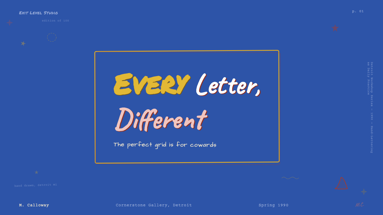
The visual character of the style is immediately distinct. A screenprint-blue ground — flat and slightly industrial, the color of a mimeograph gone electric — anchors the compositions. Against it, hand-drawn letterforms wobble and lean, each one carrying the pressure and hesitation of the moment it was made. The page is dense rather than airy, layered rather than hierarchical in the conventional sense. Annotations and asides accumulate in the margins the way a working notebook does, not a publication. The overall effect is of a document that is also a diary, a proof that also argues with itself.这种风格的视觉特征立刻与众不同。丝网印刷蓝色的底面——平整而略带工业感,像是一张被电气化了的油印机蓝——锚定着所有构图。在它的映衬下,手绘字形摇曳、倾斜,每一个都承载着书写那一刻的压力与迟疑。页面密集而非通透,叠层而非以常规意义上的层级来组织。注释与旁白积聚在边缘,像一本工作笔记,而非一本出版物。整体效果是:这是一份也是日记的文件,一个也在与自身争论的证明。
This is not naive art or outsider design — Fella spent twenty-five years as a professional commercial illustrator before turning this direction, and the work is deeply knowledgeable about the conventions it refuses. The wobble is controlled. The crowding is composed. The apparent disorder is the result of specific, repeated decisions about what draws the eye and where the page needs rest. Understanding the style means understanding the difference between calculated irregularity and genuine accident.这不是素人艺术,也不是局外人设计——费拉在转向这个方向之前,已做了二十五年专业商业插画,他的作品对所拒绝的那些惯例了如指掌。摇晃是受控的。密集是经过构图的。表面上的失序,是关于什么吸引眼球、何处需要留白的特定、反复决策的结果。理解这种风格,意味着理解有意为之的不规则与真正的偶然之间的差别。
See the Ed Fella Hand-Drawn (1990) design system →查看 Ed Fella Hand-Drawn (1990) 完整设计系统 →
Where does Ed Fella Hand-Drawn (1990) come from?Ed Fella Hand-Drawn (1990) 从何而来?
Ed Fella was born in Detroit in 1938 and spent the bulk of his professional life in that city's commercial art scene. For over two decades he worked as a graphic designer and illustrator for advertising agencies, producing polished, client-ready work that had no visible connection to what would come later. He was competent, employed, and entirely within the mainstream. Then, at the age of forty-seven, he enrolled as an MFA student at Cranbrook Academy of Art — an unusual move for a practicing professional in the middle of his career — and graduated in 1987.埃德·费拉1938年生于底特律,职业生涯大半在那座城市的商业美术圈中度过。二十余年间,他在广告公司担任平面设计师兼插画师,产出精良、适合客户的作品,与日后的转变毫无表面关联。他称职、有工作、完全置身于主流之中。随后,在四十七岁时,他以学生身份就读于克兰布鲁克艺术学院的艺术硕士课程——对于一位职业中途的执业设计师而言,这是罕见之举——并于1987年毕业。
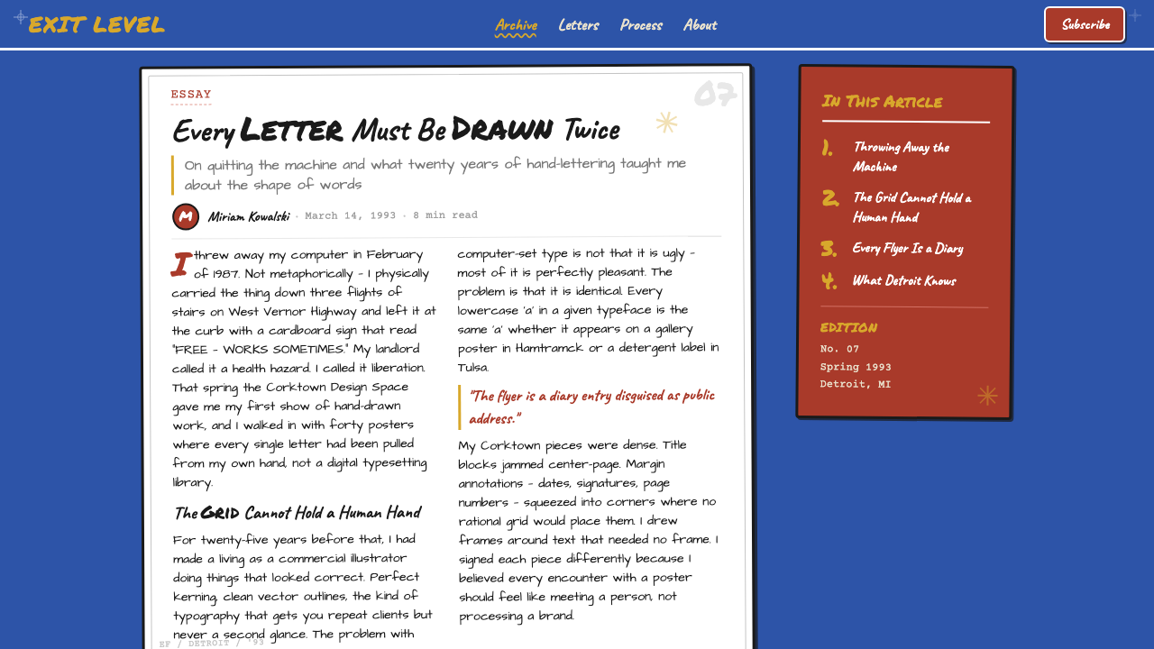
That same year, Fella joined the faculty at the California Institute of the Arts (CalArts) in Valencia, where he would teach for the next twenty-six years. But the work that defines his legacy began not in California but in Detroit, where he continued to produce flyers for the Focus Gallery — a nonprofit contemporary art space — as a kind of personal research project. These were not commissioned pieces in the conventional sense; they were self-assigned experiments, produced for a real audience but freed from the requirements of a paying client. Fella described them as work made 'after the fact,' meaning outside the commercial constraints that had governed his professional life.同年,费拉加入位于巴伦西亚的加州艺术学院(CalArts)师资队伍,在那里任教长达二十六年。但定义其遗产的作品并非始于加州,而是在底特律——在那里,他继续为 Focus Gallery(一家非营利当代艺术空间)制作传单,作为一种个人研究项目。这些并非传统意义上的委托作品;它们是自我指派的实验,面向真实受众,但摆脱了付费客户的要求。费拉将它们描述为“事后制作”的作品,意指在支配其职业生涯的商业约束之外完成的作品。
The context matters. The late 1980s and early 1990s were a moment of significant transition in graphic design. Desktop publishing had arrived; the Macintosh and applications like PageMaker and QuarkXPress were transforming what could be produced by a single designer without a print shop. For most practitioners, this was liberation — access to precision, variety, and speed that had previously required expensive specialists. Fella read it differently. He saw the computer as producing a kind of typographic homogeneity, a smoothing-out of the personal and the imprecise. His response was to move entirely in the opposite direction: to make the hand visible, to refuse PostScript's clean curves, to produce work that could only have come from one specific person at one specific moment.背景至关重要。1980年代末至1990年代初是平面设计领域重大转型的时刻。桌面出版已经到来;麦金塔电脑以及 PageMaker、QuarkXPress 等软件正在改变单个设计师无需印刷车间便能产出的成果。对大多数从业者而言,这是解放——获得了此前需要昂贵专业人员才能实现的精确性、多样性与速度。费拉的解读截然不同。他看到的是电脑制造了一种排版的同质性,一种对个人性与不精确性的抹平。他的回应是完全走向反面:让手变得可见,拒绝 PostScript 的光滑曲线,产出只能来自某个特定的人在某个特定的时刻的作品。
The movements associated with this style — Vernacular Modernism, Post-PostScript, Anti-grid Hand-lettering — reflect an intellectual environment at CalArts and Cranbrook that took seriously the idea that graphic design could be critical practice, not just a service. Lorraine Wild, a colleague and collaborator, developed parallel arguments about vernacular typography. Jeffery Keedy and P. Scott Makela, both associated with the same institutional milieu, were also producing experimental typefaces and layouts that challenged the computer's authority. Fella was not an isolated eccentric but a participant in a specific, historically situated conversation about what design could and should do at the end of the twentieth century.与这种风格相关联的运动——乡土现代主义、后 PostScript、反网格手绘字——反映了 CalArts 与克兰布鲁克的一种知识环境:严肃对待平面设计可以是批判性实践而非仅仅是服务这一想法。同事兼合作者洛兰·怀尔德发展了关于乡土排版的平行论述。杰弗里·基迪与 P. 斯科特·马克拉,同属这一机构氛围,也在制作挑战电脑权威的实验性字体与版面。费拉不是孤立的怪才,而是二十世纪末一场关于设计能够且应当做什么的特定历史性对话的参与者。
What defines the Ed Fella Hand-Drawn (1990) look?Ed Fella Hand-Drawn (1990) 的视觉特征是什么?
Hand-Drawn Letterforms手绘字形
Every letter in the Fella system is drawn individually rather than set from a font. This means each character carries traces of its making — variations in stroke weight, slight tilts, the idiosyncratic loops and terminals of a specific hand working under specific conditions. No two letterforms repeat exactly. The result is a headline that reads as a singular event rather than a repeatable specification, and a page that could not have been generated by any tool other than a human hand with a pen or brush.费拉体系中的每个字母都是单独手绘,而非从字库设置。这意味着每个字符都携带着制作痕迹——笔画粗细的变化、轻微的倾斜、特定的手在特定状态下工作时独特的圆弧与末端。没有两个字形完全重复。结果是一个标题作为独一无二的事件被阅读,而非可重复的规格,以及一张只能由持笔或刷的人手产出的页面。
Screenprint Blue Ground丝印蓝底面
The characteristic background tone is a mid-value blue with the flat, slightly chalky quality of screenprint ink — neither the precise blue of digital color nor the variable blue of hand-mixed paint, but something between industrial and handmade. It reads as deliberate, as a prepared field rather than a default, and it gives the compositions a consistent identity even when every other element changes from piece to piece.标志性底色调是一种中等明度的蓝色,具有丝网印刷油墨的平整而略带粉质感——既非数字色彩的精确蓝,也非手调颜料的变化蓝,而是介于工业与手工之间的某种东西。它给人以刻意为之的感觉,是一块预备好的底面而非默认值,即便每件作品的其他元素都在变化,它也赋予了构图一致的身份认同。
Marginal Annotation边缘注释
Margins in the Fella style are not empty. They are filled with secondary text — dates, labels, credits, asides, and comments — written in a smaller, more cramped hand than the main headline. These annotations treat the white space around the central composition as available real estate rather than necessary breathing room. The page becomes a document that has been worked on rather than laid out, with the evidence of process visible in every corner.费拉风格中的页边距不是空白的。它们充满了次要文字——日期、标签、署名、旁白和注释——以比主标题更小、更局促的手写完成。这些注释将中心构图周围的空白视为可用地产,而非必要的留白。页面成为一份被操作过而非被排版的文件,制作过程的证据在每个角落可见。
Mixed Typographic Voices混合排版声音
A single Fella composition typically contains several distinct lettering modes — a large, wobbly display hand for the headline; a smaller, more controlled printed hand for supporting information; occasional cursive or script passages for dates or names; and perhaps a stencil-like quality for certain words or numbers. These modes coexist without hierarchy in the typographic sense: they are all hand-drawn, which gives them a family resemblance even while their characters differ.单张费拉构图通常包含几种截然不同的书写方式——大而摇曳的展示手写体用于标题;较小而更受控的印刷手写体用于辅助信息;偶尔用于日期或姓名的草书或连写段落;以及某些词语或数字可能呈现出的近似模板字的质感。这些方式在排版意义上共存而无层级:它们都是手绘的,这给了它们一种家族相似性,即便各自的字形有所不同。
Asymmetric, Anti-Grid Composition非对称反网格构图
Where Bauhaus asymmetry is still governed by an underlying structural grid, Fella's compositions resist the grid entirely. Elements are placed by intuition and adjusted by eye rather than by mathematical relationship. The result is a kind of balance that cannot be reduced to a rule — dense in one area, sparse in another, with diagonal axes cutting through the page in ways that a grid-based system would never generate. The page feels discovered rather than planned.包豪斯式的非对称仍受底层结构网格支配,而费拉的构图则完全抵制网格。元素依靠直觉放置,以眼睛调整,而非依据数学关系。结果是一种无法还原为规则的平衡——一处密集,一处稀疏,对角线轴以网格系统永远不会产生的方式切过页面。页面感觉是被发现的,而非被规划的。
Paper Offsets and Registration Marks纸张偏移与套准标记
The Fella flyers often showed evidence of their production process — slight misregistrations between layers, the visible edges of cut-and-pasted paper, registration marks left in the composition rather than trimmed away. In the design system, these production artifacts become intentional visual elements: the page acknowledges that it was made, that it exists as a physical object with a history, not as a purely digital surface.费拉的传单通常显示出生产过程的痕迹——各层之间轻微的套印偏差、剪贴纸张的可见边缘、留在构图中而非裁掉的套准标记。在这个设计系统中,这些生产印记成为有意为之的视觉元素:页面承认自己是被制作出来的,作为一个有历史的物理对象而存在,而非纯粹的数字表面。
Deliberate Imperfection as Tone刻意的不完美作为基调
The imperfection in Fella's work is not a failure of execution but a communicative choice. A perfectly drawn letterform says nothing about the moment of its making; a slightly off-axis letter with uneven stroke pressure says that someone made this, here, now, in a particular state. That record of presence is the tone the style carries — intimate, specific, irreproducible. To apply this quality well is to understand that the wobble must feel natural rather than performed, which is the hardest thing to achieve.费拉作品中的不完美不是执行的失败,而是一种传达选择。一个画得完美的字形对制作时刻什么也没说;一个略微偏轴、笔触压力不均的字母则表明:有人在这里,现在,以特定的状态制作了这个。那种在场的记录就是这种风格携带的基调——亲密、具体、不可复制。要恰当地运用这种质感,需要理解摇晃必须感觉自然而非表演,这是最难实现的事情。
See the Ed Fella Hand-Drawn (1990) design system →查看 Ed Fella Hand-Drawn (1990) 完整设计系统 →
Who shaped Ed Fella Hand-Drawn (1990)?谁塑造了 Ed Fella Hand-Drawn (1990)?
The originator of this visual language, Fella spent over two decades as a Detroit commercial illustrator before pursuing his MFA at Cranbrook at age forty-seven. The flyers he produced for the Detroit Focus Gallery from 1987 onward became some of the most discussed examples of post-digital graphic design — not because they rejected technology in principle, but because they showed what technology's dominance had made invisible. At CalArts, he became one of the most influential graphic design educators of his generation, shaping students who went on to define experimental American typography in the 1990s and 2000s.这套视觉语言的创始者,费拉在克兰布鲁克以四十七岁之龄攻读艺术硕士之前,已在底特律做了二十余年商业插画师。他从1987年起为底特律 Focus Gallery 制作的传单,成为后数字平面设计中讨论最广泛的案例之一——不是因为它们在原则上拒绝技术,而是因为它们揭示了技术主导地位所遮蔽的东西。在 CalArts,他成为其一代最具影响力的平面设计教育者之一,培育了在1990至2000年代定义美国实验排版的学生。
A graphic designer, educator, and critic closely associated with CalArts and the intellectual milieu from which Fella's work emerged. Wild developed extended arguments about vernacular typography — the visual language of ordinary, non-professional, or pre-modernist printing — as a source of legitimate design knowledge rather than noise to be corrected. Her theoretical work provided an intellectual framework for understanding what Fella was doing formally, and her own design practice ran in parallel: thoughtful, historically aware, and resistant to the idea that design progress required leaving all pre-digital forms behind.平面设计师、教育者与批评家,与 CalArts 及费拉作品所植根的知识环境密切相关。怀尔德围绕乡土排版——普通的、非专业的或前现代主义印刷的视觉语言——发展了延伸论述,将其视为合法的设计知识来源,而非有待纠正的噪音。她的理论工作为理解费拉在形式上所做之事提供了知识框架,她自己的设计实践也平行展开:深思熟虑,具有历史意识,抵制设计进步需要抛弃一切前数字形式的想法。
A type designer and writer who taught at CalArts and was among the key voices of the experimental typography movement of the late 1980s and 1990s. Keedy designed typefaces that deliberately broke or subverted modernist type conventions — letterforms with unexpected quirks, references to vernacular lettering, or structural decisions that no rational type system would sanction. His critical writing argued that typography should be culturally situated and historically aware rather than pretending to a universal neutrality that modernism had always claimed but never achieved.字体设计师兼作家,在 CalArts 任教,是1980年代末至1990年代实验排版运动的核心声音之一。基迪设计的字体故意打破或颠覆现代主义排版惯例——字形带有出乎意料的怪癖、乡土手写的参照,或任何理性字体系统都不会认可的结构决策。他的批评性写作主张,排版应当有文化定位和历史意识,而非假装拥有现代主义一直宣称却从未实现的普遍中立性。
A graphic designer who studied at Cranbrook and became one of the most distinctive visual voices of the 1990s before his early death in 1999. Makela's work pushed in a different direction from Fella — toward the digital, the overloaded, the MTV-influenced high-velocity image — but both shared a commitment to graphic design as something that could carry subjective pressure and cultural argument. The association between Fella and Makela in the critical literature of the period reflects the breadth of the experimental typography conversation, which contained voices from the hand-made and the machine-made ends of the spectrum simultaneously.平面设计师,曾就读于克兰布鲁克,在1999年英年早逝前成为1990年代最具辨识度的视觉声音之一。马克拉的作品朝向不同方向发展——走向数字的、过载的、MTV影响下的高速图像——但他与费拉都对平面设计能够承载主观压力和文化论点这一点有所坚持。这一时期批评文献中费拉与马克拉的并置,反映了实验排版对话的广度——它同时包含了手工制作与机器制作两端的声音。
How do you use Ed Fella Hand-Drawn (1990) today?今天怎么用 Ed Fella Hand-Drawn (1990)?
Applying the Ed Fella Hand-Drawn style in contemporary contexts requires accepting that its power comes from specificity and irreproducibility — qualities that are genuinely difficult to achieve without developing a personal hand. It is not a style that can be assembled from found assets or replicated by mixing existing digital typefaces with rough-texture overlays. Those approaches produce something that looks like Ed Fella the way a costume looks like a person: the silhouette is present but the interiority is missing. That said, the style's organizational principles — density, layering, annotation, and the deliberate embrace of imperfection — can be applied with intent even by designers working digitally, provided the hand remains genuinely involved.在当代语境中运用埃德·费拉手绘风格,需要接受其力量来自特殊性与不可复制性——这些特质在没有发展出个人笔迹的情况下,确实难以实现。这不是一种可以从现成素材拼装、或通过混合现有数字字体与粗糙纹理叠加来复制的风格。那些方法产出的东西,像费拉一样的程度,如同一套戏服像一个人:外形在场,内在缺失。话虽如此,这种风格的组织原则——密度、叠层、注释,以及对不完美的刻意接纳——即便对以数字方式工作的设计师也可以有意识地应用,前提是手确实保持真实介入。
For presentation slides, the Fella approach inverts most conventional assumptions. A cover page in this style should feel like a found document rather than a designed artifact: the title drawn by hand in a large, slightly uneven script, subsidiary information in a smaller, denser hand crowding the edges, the background a flat non-white ground. Content slides abandon the clean grid: key terms might be circled or underscored in a hand that looks like it was added in review; arrows connect elements in a way that breaks the slide's geometric frame. Data, where it appears, is annotated rather than formatted — numbers written out, relationships indicated with drawn lines rather than chart types. The effect is intimate and assertive at the same time.对于演示文稿,费拉方式颠覆了大多数常规假设。这种风格的封面页应感觉像一份被发现的文件,而非被设计的产物:标题以大而略不均匀的手写体写就,辅助信息以更小、更密的手写挤满边缘,背景是一块平整的非白底面。内容页放弃干净的网格:关键术语可能以看起来像审阅时添加的手写圆圈或下划线标注;箭头以打破幻灯片几何框架的方式连接元素。数据(若出现)被注释而非格式化——数字手写出来,关系以手绘线条而非图表类型标示。效果同时是亲密的和断然的。
For web interfaces and interactive contexts, the style is most powerful where it is used selectively rather than comprehensively. A website built entirely in this style risks becoming illegible at smaller scales and straining users who expect interactive affordances to read clearly. More productive approaches use the Fella aesthetic at high-impact moments — a landing page headline, a section break, an error state — while keeping functional interface elements in a more legible system. The hand-drawn elements serve as an affirmation of human presence within a digital context, which can be a significant communicative gesture in the right product category.对于网页界面和交互场景,这种风格在选择性而非全面性使用时最为有力。整个网站都以这种风格构建,有在小尺寸下变得难以辨读的风险,并会令期望交互功能清晰可读的用户感到疲惫。更富成效的方法是在高影响力时刻使用费拉美学——登陆页标题、章节分隔、错误状态——同时将功能性界面元素保持在更易读的系统中。手绘元素在数字语境中作为人的在场的确认,在适当的产品类别中可以是一个重要的传达姿态。
For editorial and marketing work, the style is most naturally suited to cultural contexts: arts organizations, independent publishing, music, fashion, and brands that want to signal that they operate outside corporate design norms. An event poster, a zine, a music release, an exhibition announcement — these are formats where the Fella style's origins are legible and its energy is appropriate. In marketing contexts, the density and irregularity of the style work well for audiences who read the absence of polish as authenticity rather than as incompetence. It is a style that flatters a sophisticated, culturally aware audience and can alienate one that is not.对于编辑与营销工作,这种风格最自然地适合文化语境:艺术机构、独立出版、音乐、时尚,以及想要表明自己在企业设计规范之外运作的品牌。活动海报、小志、音乐发行、展览公告——这些是费拉风格的起源清晰可辨、其能量恰如其分的格式。在营销语境中,这种风格的密度与不规则性对于那些将无光泽读作真实而非不称职的受众效果良好。这是一种讨好有鉴赏力、有文化意识的受众,同时可能疏远不具备这些特质的受众的风格。
The most common mistake is treating imperfection as a visual filter rather than as an approach to mark-making. Designers who apply texture overlays, distress effects, or deliberately misaligned digital elements to otherwise clean, grid-based layouts produce work that announces its roughness without earning it. The Fella style's authority comes from the fact that every stroke on every page was made by a specific person with a specific intention. Digital approximations of that quality succeed only when the designer has internalized the logic of the hand — when the irregularity comes from decisions, not from software presets.最常见的错误是将不完美当作视觉滤镜而非笔迹处理方式。设计师对原本干净的、基于网格的版面施加纹理叠加、做旧效果或故意错位的数字元素,产出的作品宣告了自身的粗糙而未赢得它。费拉风格的权威来自这样一个事实:每张纸上的每一笔都是由特定的人以特定的意图制作的。对那种质感的数字近似,只有在设计师内化了手的逻辑时才能成功——当不规则来自决定,而非来自软件预设。
See the Ed Fella Hand-Drawn (1990) design system →查看 Ed Fella Hand-Drawn (1990) 完整设计系统 →
Ed Fella Hand-Drawn (1990) — FAQEd Fella Hand-Drawn (1990) · 常见问题
Is Ed Fella Hand-Drawn a style that can be learned, or does it require a unique personal hand?埃德·费拉手绘风格是一种可以习得的风格,还是需要独特的个人笔迹?
Both are true. The organizational principles of the style — dense layering, marginal annotation, deliberate imperfection, the rejection of the grid — can be understood and applied by any designer willing to engage with them seriously. But the specific quality of Fella's hand cannot be reproduced, and attempts to imitate it directly tend to produce work that feels either mimicry or parody. The productive approach is to understand what the style is doing conceptually and then find equivalent approaches in your own hand. The result will look different from Fella's work, which is as it should be — the point of the style is that it carries the specific presence of one person, not that it creates a recognizable brand.两者都对。这种风格的组织原则——密集叠层、边缘注释、刻意的不完美、对网格的拒绝——任何愿意认真对待它们的设计师都能理解和应用。但费拉笔迹的具体质感无法被复制,直接模仿的尝试往往产出感觉像摹仿或戏仿的作品。富有成效的方式是理解这种风格在概念上做了什么,然后在自己的笔迹中找到等效的方式。结果看起来会与费拉的作品不同,这是应该的——这种风格的重点在于它承载了某个特定的人的存在,而非它创造了一个可识别的品牌。
How does this style relate to the broader history of vernacular typography?这种风格与乡土排版的更广泛历史有何关联?
Vernacular typography refers to the visual language of ordinary, non-professional, or pre-modernist printing — hand-painted signs, letterpress handbills, trade cards, announcement posters, the whole vast category of graphic production that predates the modernist commitment to clean, rational, universal type. Fella's work draws explicitly on this tradition: the wobbly letters, the crowded margins, and the heterogeneous mix of lettering modes all reference the look of pre-modernist printed matter that modernism declared obsolete. The difference is that Fella's use of vernacular forms is knowing and critical rather than naive — he is not producing vernacular typography, he is quoting it with full awareness of what the quotation means in a post-PostScript context.乡土排版指的是普通的、非专业的或前现代主义印刷的视觉语言——手绘招牌、活版印刷传单、商业名片、告示海报,以及现代主义对干净、理性、普遍字体的承诺出现之前的整个庞大图形生产类别。费拉的作品明确借鉴了这一传统:摇曳的字母、拥挤的边距,以及书写方式的异质混合,都参照了现代主义宣布为过时的前现代主义印刷品外观。区别在于,费拉对乡土形式的使用是自觉而批判性的,而非素朴的——他不是在制作乡土排版,他是在引用它,同时完全意识到这种引用在后 PostScript 语境中意味着什么。
What is the relationship between this style and legibility?这种风格与可读性之间是什么关系?
Fella's flyers are legible — the event information they communicate is retrievable — but legibility is not their first commitment. The style assumes a reader who is willing to slow down, to work slightly against the composition's density, to reward close attention with more detail. This is appropriate for the cultural contexts in which the style operates best: gallery announcements, arts events, design publications, and other venues where the audience has already signaled interest by picking up the piece. It is not appropriate for contexts where fast, frictionless information retrieval is the primary need — transportation signage, medical instructions, emergency alerts, or any interface where the user's default state is hurried rather than curious.费拉的传单是可读的——它们传达的活动信息是可检索的——但可读性不是它们的首要承诺。这种风格假设读者愿意放慢脚步,略微与构图的密度相抗,以细细注意来换取更多细节。这对于这种风格表现最佳的文化语境是适当的:画廊公告、艺术活动、设计出版物,以及其他受众通过拿起作品已经示意了兴趣的场所。这对于快速、无摩擦的信息检索是首要需求的语境是不适合的——交通标识、医疗说明、紧急警示,或任何用户默认状态是匆忙而非好奇的界面。
How is this style different from just scanning handwritten notes and using them as texture?这种风格与扫描手写笔记并将其用作纹理有何不同?
Using scanned handwriting as a texture layer treats the hand as a surface effect rather than a structural principle. The scanned notes sit on top of a designed layout; in authentic Fella-derived work, the hand-drawn elements are the layout. There is no underlying grid that the roughness is applied to — the composition is built entirely through the act of drawing. This distinction matters practically: scanned-texture approaches typically produce work that is polished underneath and rough on the surface, whereas the Fella style is rough at every level of structure. The former feels like a digital product that has been aged; the latter feels like a document that was made.将扫描手写体用作纹理层,是将手当作表面效果而非结构原则。扫描的笔记叠加在设计好的版面之上;在真正源自费拉的作品中,手绘元素就是版面本身。没有一个底层网格被施加了粗糙感——构图完全通过绘制行为建立。这一区别在实践中很重要:扫描纹理方式通常产出的作品底层是精良的,表面是粗糙的;而费拉风格在每个结构层面都是粗糙的。前者感觉像一件被做旧的数字产品;后者感觉像一份被制作的文件。
Can this style work for brands, or is it only appropriate for one-off cultural artifacts?这种风格适用于品牌,还是只适合单次的文化产物?
A small number of brands have successfully deployed aesthetics adjacent to this style — typically independent record labels, art book publishers, independent fashion houses, and cultural institutions comfortable with deliberately unpolished visual identities. The challenge for brand application is consistency: the style derives its energy from the fact that each piece is unique, and a brand system requires a degree of repetition and recognition that can work against that energy. The most successful approaches treat the style's elements as a general approach rather than a specific look — the brand commits to hand-drawn letterforms, to annotation, to deliberate density — while allowing those elements to be interpreted differently across applications. The result is coherent without being repetitive.少数品牌成功部署了与这种风格接近的美学——通常是独立唱片公司、艺术书籍出版商、独立时装屋,以及对刻意未加工的视觉身份感到自在的文化机构。品牌应用的挑战在于一致性:这种风格的能量来自每件作品都是独一无二这一事实,而品牌系统需要一定程度的重复与识别度,这可能与那种能量相悖。最成功的方式将这种风格的元素视为一种总体方式而非特定外观——品牌承诺手绘字形、注释、刻意的密度——同时允许这些元素在不同应用场景中被不同诠释。结果是连贯的,而非重复的。
Related design styles相关设计风格
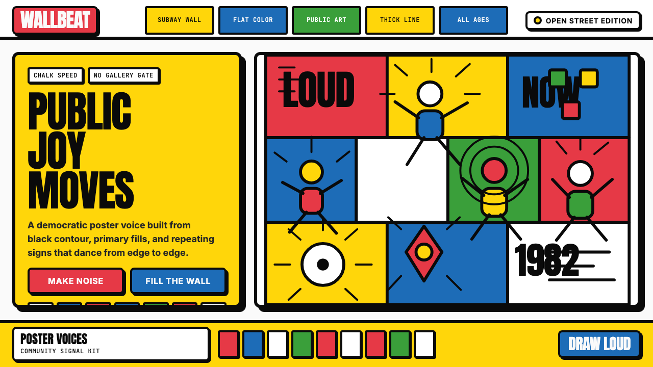 Keith Haring PopJoy refuses the gallery. Thick black contours pack primary color into a danci…快乐拒绝画廊:粗黑轮廓把原色塞进跳动墙面网格。
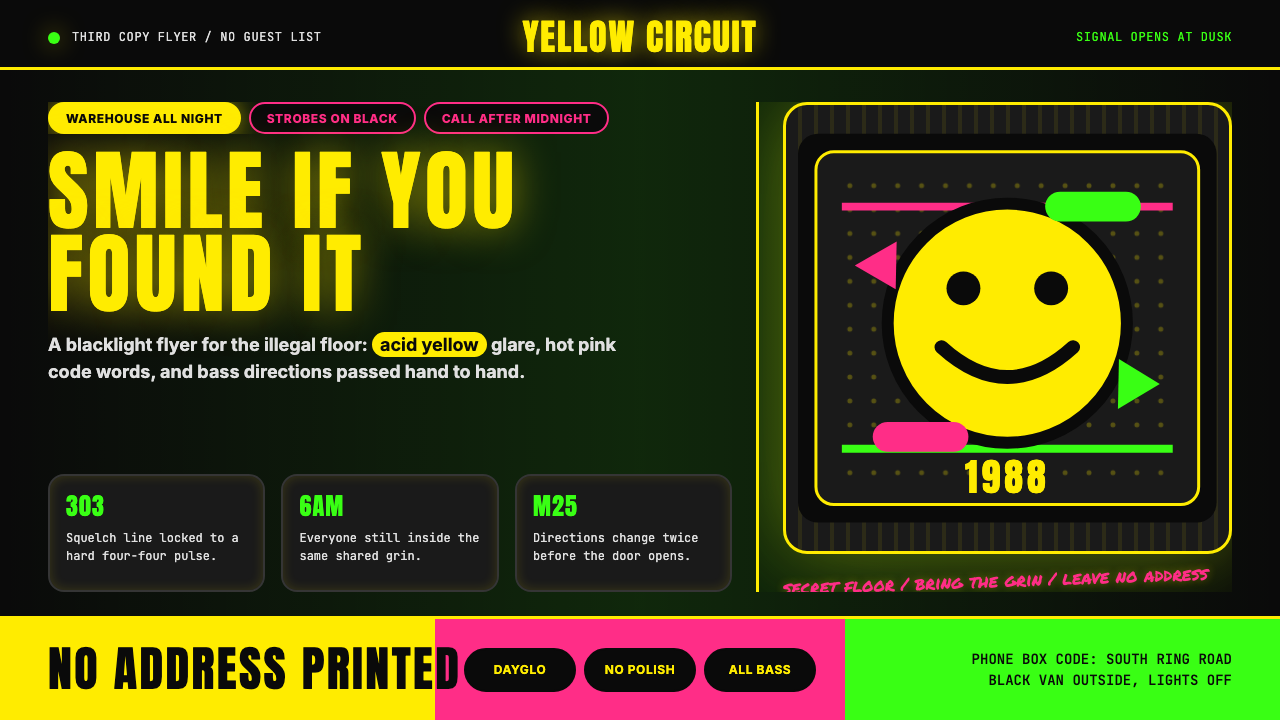 Acid House Smiley (1988)Rave energy hits first. Acid yellow on black, Anton caps, smiley glow.锐舞能量先撞上来。黑底酸黄、Anton大写与笑脸辉光。
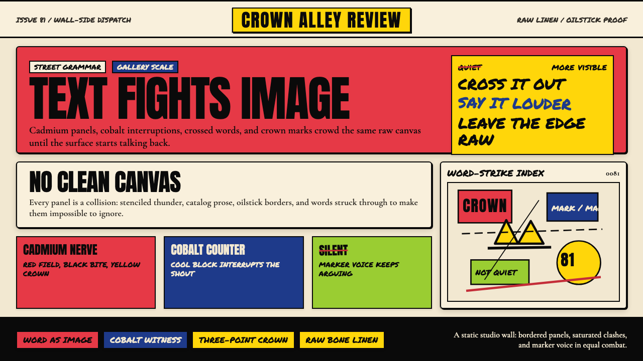 Basquiat Neo-ExpressionismExplodes off raw linen. Cadmium red, cobalt blue, Anton blocks, and struck ma…原生亚麻上爆裂:镉红、钴蓝、Anton 字块与划掉的手写字相撞。
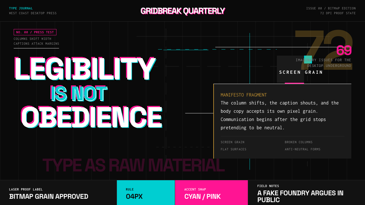 Emigre Magazine (1984–2005)Defies the tidy grid. Cyan, ochre, and hot-pink bitmap type collides on black.拒绝整齐网格:黑底上的青色、赭色与热粉像素字相撞。
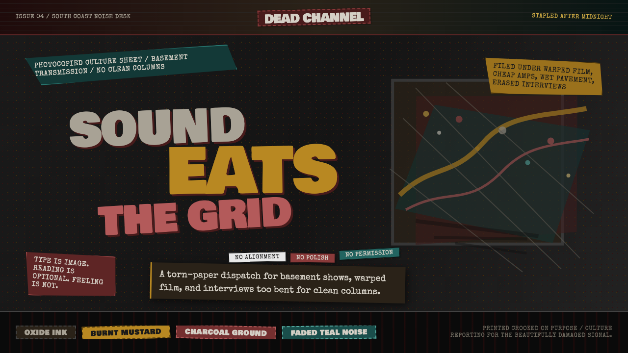 Grunge (Carson 1993)Carson's anti-rules, photocopied. Oxblood on charcoal, distressed type, delib…大卫·卡森颠覆现代主义排版的粗粝美学:暗红与焦黄、炭灰底、刻意打破的网格、油墨…
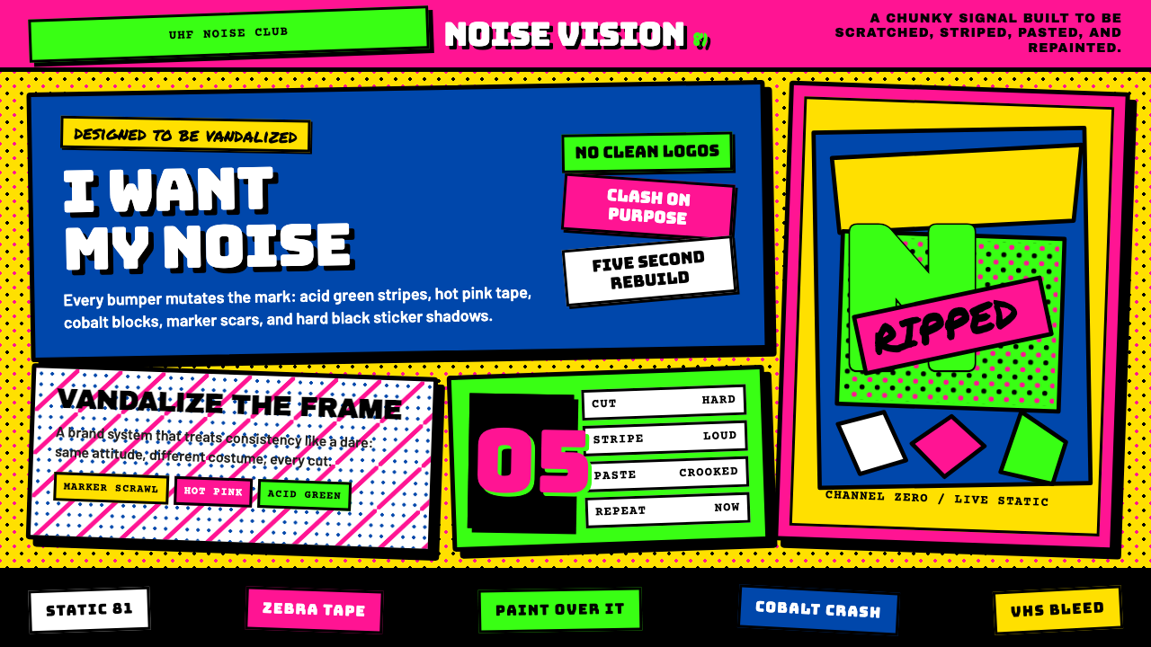 MTV Launch Identity (1981)Built to be vandalized. Hot pink, acid green, Bungee blocks, and crooked stic…天生被涂鸦:热粉酸绿、Bungee方块字与歪贴纸黑框。