What is Calder Mobile?
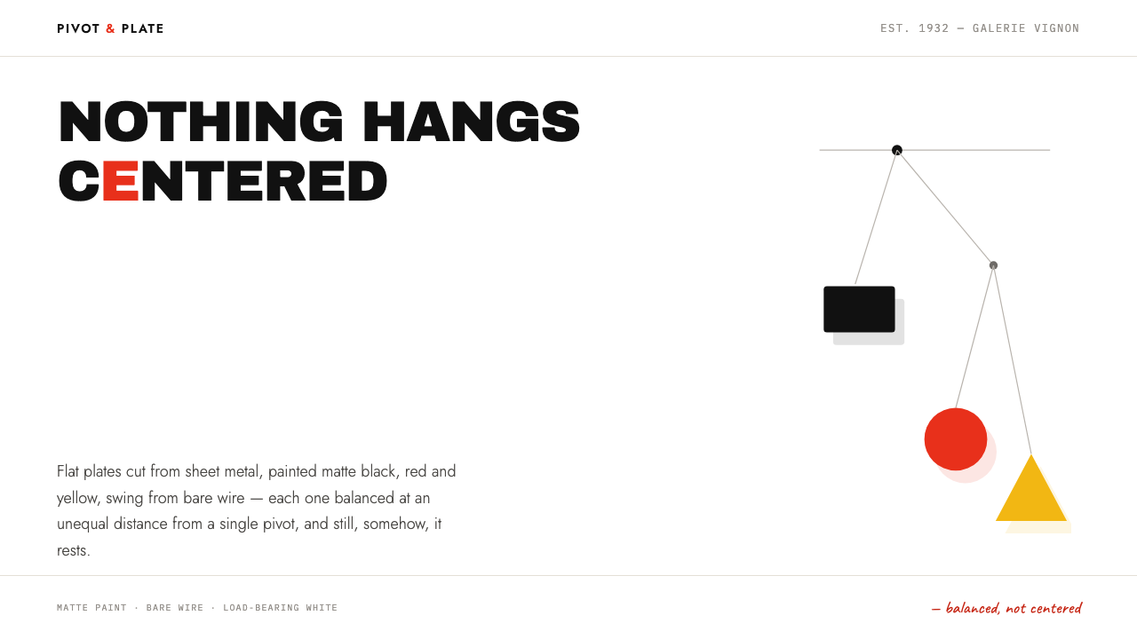
Calder hung flat painted plates from hairline wire and let the air decide the rest; this style turns that balance without symmetry into a layout language.
Calder Mobile in brief
Calder Mobile is a design style drawn from the hanging sculptures of Alexander Calder: flat, painted plates of metal suspended from bare wire and balanced against one another in open space. Translated into an interface, it means flat colour fills with cut, hard edges, thin rule lines that behave like wire, a warm white ground that plays the part of the gallery wall, and a layout in which nothing sits exactly in the centre. Its governing idea is balance without symmetry.
The sculptures are physical proof of that idea. Every weight hangs at a different distance from a single pivot, so the arrangement looks lopsided, yet it rests. The design system treats this as a layout rule. Instead of mirroring one side with the other, you compensate a large form with a small one placed farther away, or a dense block of text with a long stretch of white. Emptiness is not leftover room; it is the counterweight.
The palette is small and strongly characterised: a lamp black, a particular red associated with Calder, a warm white, a yellow, a blue, and the grey of unpainted steel. Shapes carry no outline and no gradient. Shadows, where they appear, are hard-edged plates set apart from the object that casts them, echoing the way a slowly travelling shadow on a plaster wall was always part of the work.

Where does Calder Mobile come from?
Calder cut shapes from sheet metal, painted them matte and hung them from bare wire so that the air would do the rest. The first mobiles date from 1931 to 1932 in Paris, and they were shown at the Galerie Vignon in February 1932. In that same year Marcel Duchamp gave the new objects their name, calling them mobiles. The name stuck, and it described something unusual: sculpture that was not meant to stand still, and whose final form was decided by a draught, a passer-by or a change in the room.
The origin notes tie the style to two places, Paris and Roxbury, Connecticut. Paris was where the first mobiles were made and exhibited; Connecticut belongs to the longer arc of a career in which the same vocabulary kept developing. The notes also record that the visual language was carried forward into the 1960s and 1970s through the stabiles, the stationary counterparts to the hanging works. So this is not a one-year fashion but a vocabulary that stayed coherent across several decades: flat fills, cut edges, a few pure colours and a great deal of air.
Around that vocabulary sit three movements that the source names. Kinetic sculpture supplies the premise that a work can move and that motion can be part of its composition. Abstraction-Création and Neo-Plasticism supply the grammar: a few pure colours against white, abstract form with no pictorial subject, and a preference for asymmetrical balance over classical symmetry. Jean Arp and Piet Mondrian are listed beside Calder and Duchamp as key figures, and they make a useful pair: one stands for free, curved, cut-out shapes, the other for rigorous reduction to colour, line and white.
What makes a sculpture usable as a design system is that its rules are explicit. A plate is flat. Paint is matte. A line is wire. A wall is the structure that holds everything in place. The Curio system takes those rules and applies them to pages: the white wall becomes the layout ground, the plates become colour fields and shapes, the wire becomes hairline rules and connectors, and the travelling shadow becomes a hard offset plate. Even the pace is borrowed. The sculptures move slowly and without force, and an interface in this style should drift rather than bounce.
What defines the Calder Mobile look?
Balance, not symmetry
The core rule is that weights hang at unequal distances from one pivot, and the whole still rests. In a layout this means a large block is answered by a small element placed far away, never by a mirror image. Nothing is centred, and the eye keeps moving between elements while the composition stays steady. Symmetry would stop the composition; counterweight keeps it alive.
The white wall as structure
The ground is a warm white that behaves like a plaster gallery wall, and it is treated as part of the structure rather than as emptiness. Distances across it carry the meaning: how far a plate hangs from the pivot, how much air surrounds a headline. Designers who read the white as spare room tend to fill it; designers who read it as the wall tend to protect it.
Flat plates with cut edges
Shapes are solid fills with a clean, cut edge, in the manner of leaves, discs and crescents snipped from sheet metal. They have no outline, no gradient and no simulated volume. A shape reads as a plate that has been painted and hung, not as a rendered object, so its contour carries all of its character.
Hairline wire rules
Dividers and connectors are as thin as wire. They do structural work, linking a hanging element to its source or separating one zone from the next, but they never become heavy borders. A line should feel like something that carries weight, not like a frame, and it should be easy to forget until you notice what depends on it.
Six-colour palette
Only six colours are in play: lamp black, Calder red, warm white, yellow, blue, and the grey of unpainted steel. Each plate takes one of them in full and flat; they never blend. The restraint matters because the hanging composition relies on the colours being few enough that each can be read as a distinct weight. Use red and black as the heavy elements, and let yellow and blue serve as accents.
Travelling hard shadows
A shadow here is a hard-edged shape that sits at a distance from the object casting it, as if falling on a plaster wall behind. It is never a soft blur around the element. The shadow is treated as a second plate in the composition, one that implies where the light is and how far the wall stands behind, and the gap between object and shadow is part of the design.
Matte finish
The sculptures were painted matte, and the system keeps that quality: no gloss, no glow, no sheen. Surfaces read as dry enamel on metal. This keeps colours opaque and calm and prevents the composition from drifting into the glossy look of an app icon. The result feels handmade and industrial at once, like a workshop object that has been carefully balanced.

Who shaped Calder Mobile?
The sculptor whose work this style documents. He cut shapes from sheet metal, painted them matte and hung them from bare wire. The first mobiles date from 1931 to 1932 in Paris and were shown at the Galerie Vignon in February 1932. The vocabulary he established was carried into the 1960s and 1970s in the stabiles, and the origin notes also link him to Roxbury, Connecticut.
Duchamp named the hanging works mobiles in 1932. The naming is part of the design story: it captured the idea that sculpture could move and gave the work a vocabulary of its own. For a designer the lesson is that a good name can fix a form in the public mind, and this one has stayed attached to Calder's objects ever since.
Listed in the origin notes among the key figures, and connected through the movement Abstraction-Création. Arp is a useful reference for the other side of the vocabulary: free, curved, cut-out forms that feel organic rather than geometric. In this style his presence is a reminder that the plates are not limited to circles and squares and that a soft contour can be as disciplined as a hard one.
Another key figure named in the origin notes, tied to the movement Neo-Plasticism. Mondrian stands for the disciplined end of the vocabulary: a few pure colours, black line and white ground, and a refusal of symmetry in favour of balanced tension. Calder's mobiles can be read as that discipline set free into space, with colour planes that hang and turn instead of staying on a canvas.
How do you use Calder Mobile today?
Calder Mobile is among the most distinctive styles for work that needs to feel curated, intelligent and slightly playful. It suits cultural institutions, design studios, galleries, independent publishers and any product that wants to look confident with only a few elements. The discipline required is to keep the page sparse, off-centre and colour-restrained, and to design with distances rather than with decoration.
On slides, a cover works well as a warm white field with one or two colour plates hung off-centre from a hairline that drops from the top edge, and a title set to one side as the counterweight. Content slides should avoid centred columns; place the main text on one side and let a small coloured shape or a short rule balance it on the other. For data, bars and bubbles can become flat painted plates on a thin axis, and a hierarchy or process can be drawn as an actual mobile, a thin line that splits into branches with a plate at the end of each.
In web interfaces the style suits portfolios, product pages, dashboards for creative teams and long-form content with a calm rhythm. Use an uneven grid in which modules differ in size but balance in visual weight, hairline dividers in place of boxes, flat fills for buttons and tags, and hard offset shadows on a few key cards. For pricing, resist presenting equal columns; let the recommended option carry more weight through size and colour, and let whitespace balance the others.
For editorial and marketing work, the style rewards asymmetry: a narrow text column pushed to one side, a wide margin on the other that holds a single plate or caption, and images placed off-centre with generous air around them. Campaign visuals can be built from three or four coloured shapes suspended against white with one dominant hue, which gives instant recognition without the need for photography.
The most common mistake is centring things. A centred title on a centred column kills the idea, because the whole system exists to prove that balance does not need symmetry. Other typical errors are adding soft shadows or gradients to the plates, outlining shapes, using all six colours at equal weight on one page, and treating the white as space to be filled. If a layout feels static, move the heaviest element away from the axis and rebalance with distance rather than with more content.

Calder Mobile — FAQ
How can a sculpture become a design style?
Because the sculptures follow explicit rules that carry over to pages. The shapes are flat and painted, the lines are as thin as wire, the ground is a plain wall, and the whole thing is organised by balance rather than by symmetry. Those rules can be written down as fills, rules, grounds and layout principles. The style does not copy the objects; it keeps the logic that made them look the way they do.
Does asymmetry mean the layout is random?
No. In the sculptures every plate is placed so the whole still rests, and the layout works the same way. A heavy element is answered by a lighter one placed farther away, and the distances are deliberate. If you remove or move an element and the composition feels as though it is tipping, it was part of the balance. Random placement produces a mess; counterweighted placement produces calm.
Can this style be used with a dark background?
The documented style is a light one. The warm white ground stands in for a plaster wall, and the logic of a shadow falling at a distance on that wall depends on it. A dark version is possible, but it changes the character: shadows become hard to read and the matte plates lose their relation to the wall. If you must go dark, keep the shapes flat, the rules thin and the number of colours small.
How is it different from Mondrian-style grid design?
Neo-Plasticism is one of the movements the origin notes name, and the two share a taste for a few pure colours, black and white, and asymmetrical balance. The difference is that a Mondrian-style grid is rigid and sits on the surface, while a mobile hangs in space and is loose and moving. This style therefore uses fewer enclosing boxes, more free-floating shapes, and thin wire-like lines that connect rather than contain.
Is it suitable for text-heavy or data-heavy products?
It can work, with care. The style depends on air and a small number of elements, so dense tables and long dashboards will push against it. The best approach is to keep a narrow reading column with ample space beside it, use hairline rules for structure, and let flat coloured plates carry the key figures. It is at its best on products that present a few things well rather than many things at once.
Related design styles
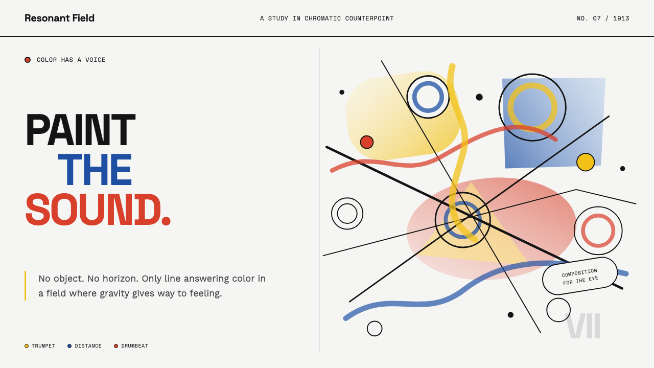 Kandinsky Composition (1913)Color becomes sound. Primary washes, hollow circles, and black diagonals coll…
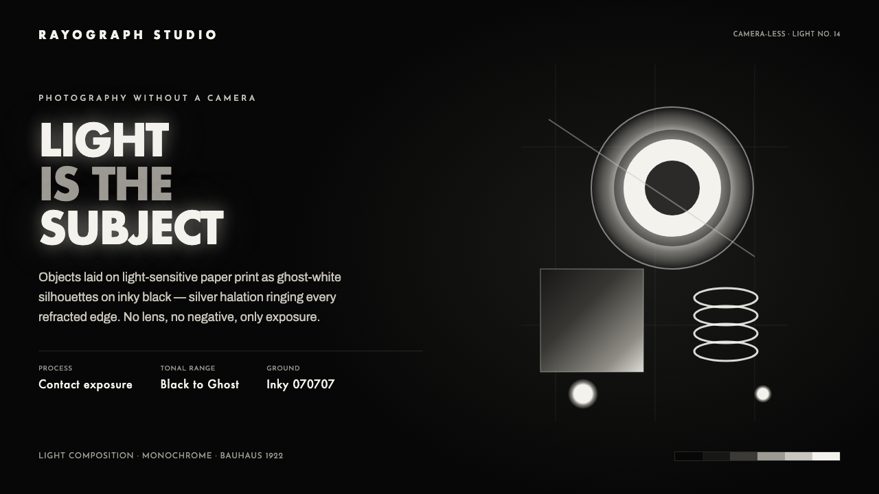 Photogram RayographLight is the subject. Ghost-white silhouettes and silver halation float on in…
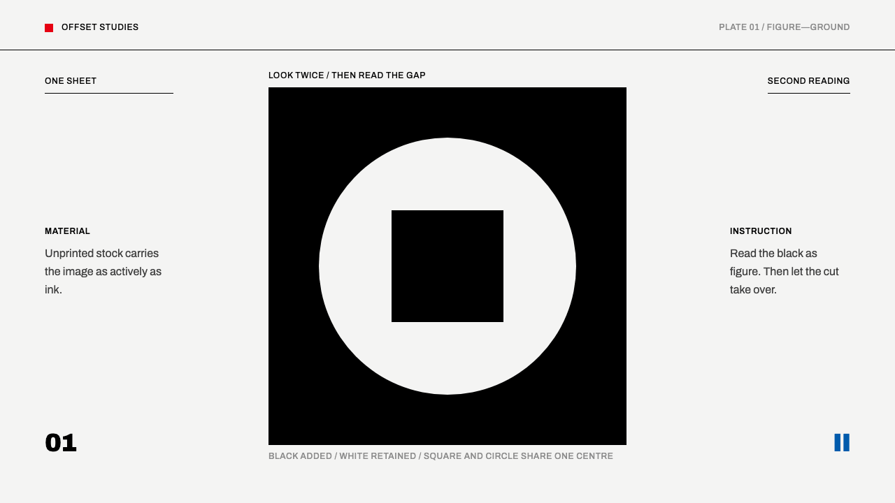 Shigeo Fukuda OpticalOne ink, two readings. Black geometry and a white cut make the sheet do half…
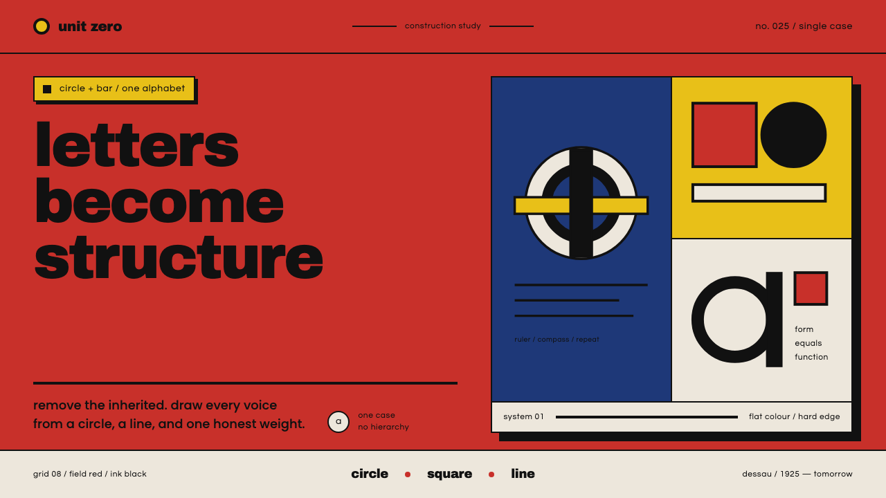 Bayer Universal BauhausLetters become structure. Bauhaus red, primary blocks, and black circle-bar f…
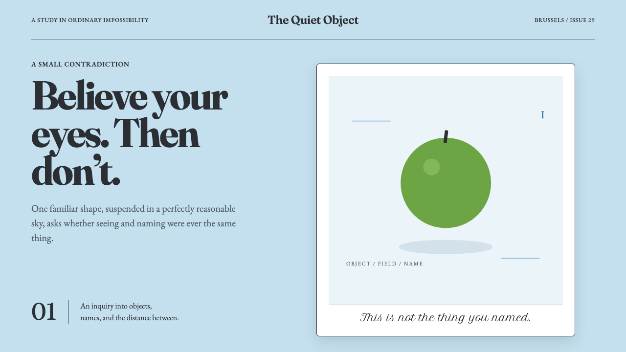 Magritte Surrealism (1929)Ordinary things tell quiet lies. A flat cerulean sky suspends one green inter…
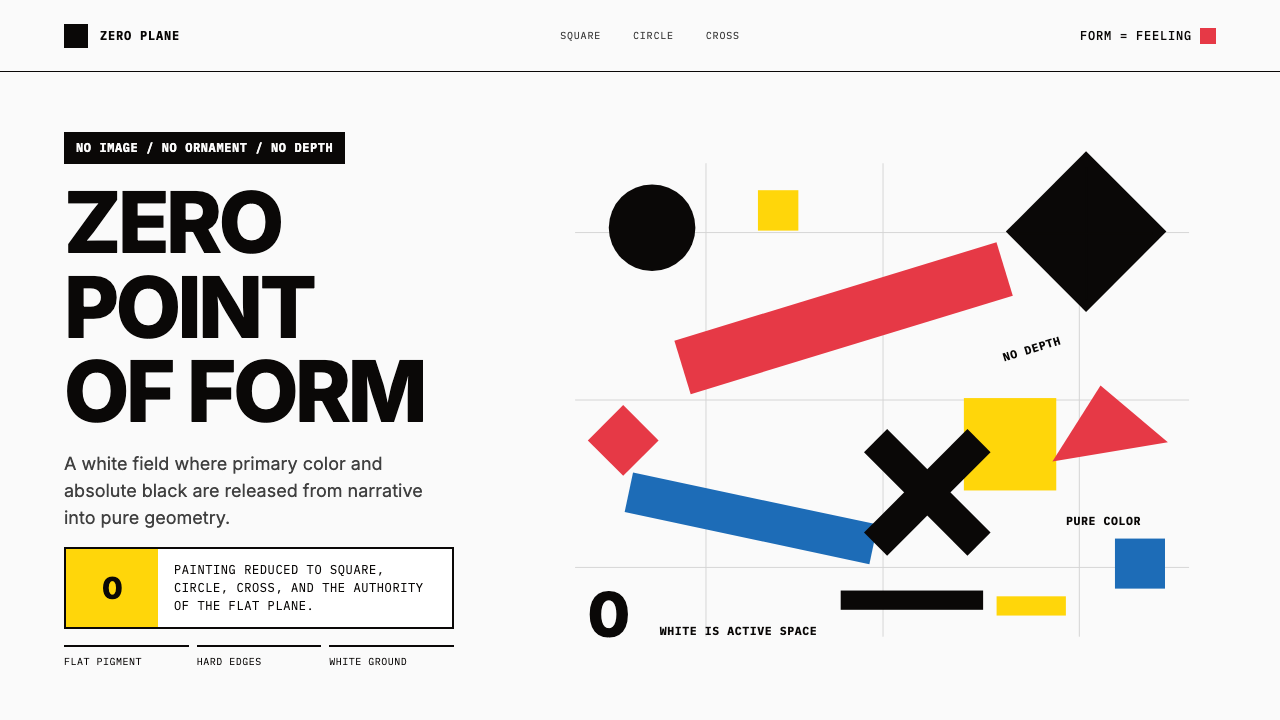 Malevich SuprematismGeometry declares zero. Red, yellow, blue and black blocks float on active wh…