What is Karakalpak Yurt Interior?
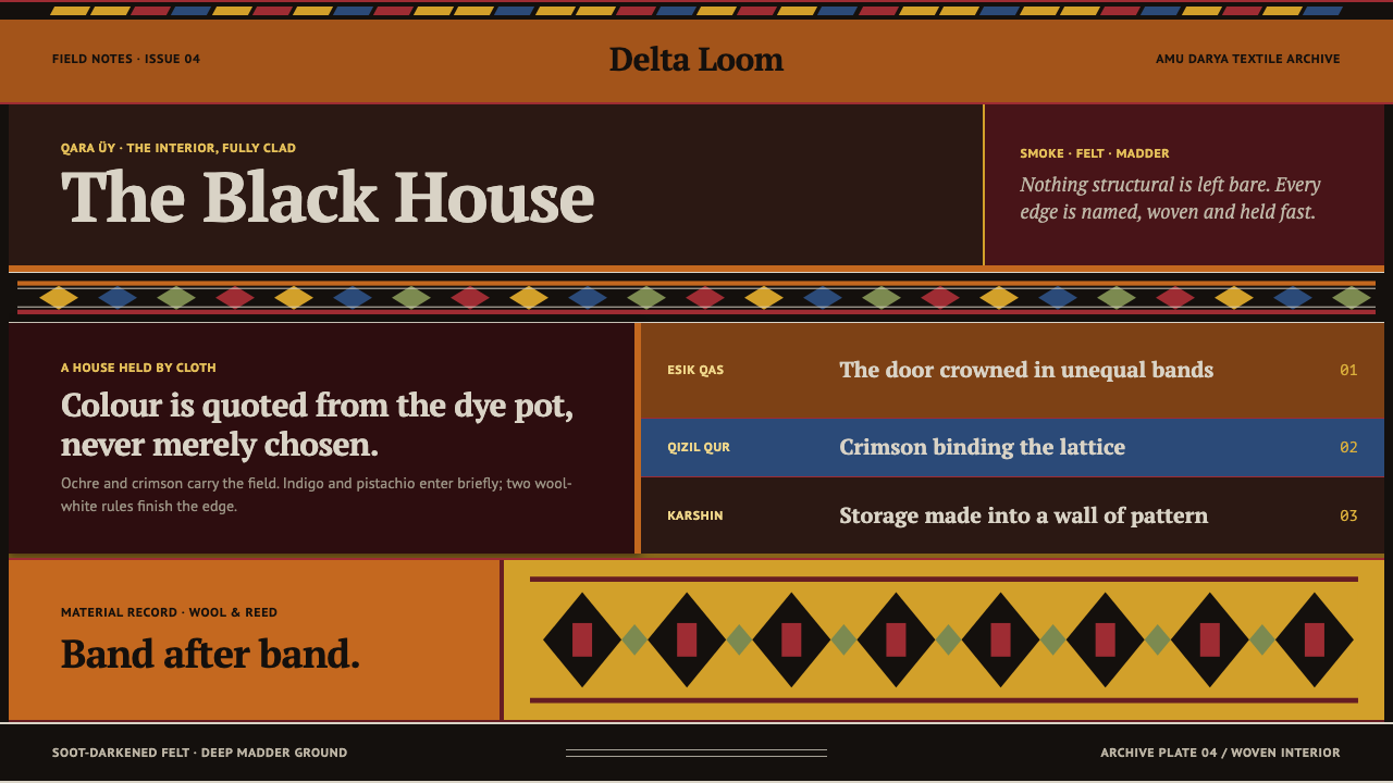
Inside a Karakalpak yurt, no surface is left bare — every band of woven wool has a name, wrapped around a smoke-darkened field of deep red.
Karakalpak Yurt Interior in brief
The Karakalpaks, a Turkic people of the Amu Darya delta south of the Aral Sea, call their portable dwelling the qara üy — literally the black house — a name earned rather than poetic. Years of smoke from a central hearth darken the felt covering and the reed shiy screens that line the interior, and the accumulated soot becomes part of the structure's character rather than a flaw to be hidden. Against that smoke-darkened backdrop, a deep madder-red field forms the dominant ground color of the interior.
What distinguishes the qara üy from a merely functional tent is that every soft surface inside it is a specifically named, specifically placed weaving. The esik qas is the lambrequin hung above the door. The qizil qur and ak-baskur are the bands that wrap the lattice frame holding the structure together. Karshin storage bags line the walls. None of these are generic textiles; each has a fixed role, a fixed position, and a name that identifies it precisely — decoration here is inseparable from structure and function.
Color in this tradition is not selected from an open palette; it is quoted from a specific, inherited dye vocabulary. Ochre and crimson come from tomar glasswort and elaeagnus, yellow from mulberry, green from pistachio, indigo blue from kok koylek dyeing, and undyed natural wool is held back deliberately, appearing only as two hairline stripes rather than as a field of its own. Because each hue is tied to a named plant or process rather than to a decorator's whim, the palette reads as inherited rather than invented — a closed, historically fixed set of choices rather than an open one a designer could freely expand. This system carries that exact logic forward: a dark ground, horizontal bands of unequal width, ornament packed onto every surface that touches the structural frame, and nothing resembling the empty white wall of a modern gallery. The interior it draws from was never organized around a single focal object meant to be admired in isolation; it was organized around total coverage, where the cumulative effect of many named bands working together, rather than any single piece standing alone, produces the sense of richness.
Where does Karakalpak Yurt Interior come from?
The qara üy tradition documented among the Karakalpaks belongs to a broader family of Central Asian Turkic nomadic textile arts, practiced across the Amu Darya delta region south of the Aral Sea in present-day Uzbekistan. The weaving and embroidery techniques that produce the esik qas, the qizil qur and ak-baskur bands, and the karshin storage bags were refined and documented into the nineteenth and early twentieth centuries, passed down as a living craft tradition rather than as an archival curiosity.
Recognition of this textile heritage as a distinct and valuable cultural achievement grew through the twentieth century, culminating in UNESCO's 2014 inscription of yurt-making — including its Karakalpak variant — as intangible cultural heritage. That recognition formalized what practitioners had long understood: that a qara üy is not an anonymous piece of vernacular architecture but a structure whose every woven component is a named craft object with its own technique and its own place in the whole.
Preservation of this material record owes a great deal to institutional collecting. Igor Savitsky, whose collecting work in the region assembled one of the most significant archives of Central Asian applied and decorative art, helped ensure that pieces of this textile tradition survived and remained studied rather than dispersed or lost. David Richardson and Sue Richardson likewise contributed to documenting and preserving the specific techniques and vocabulary of Karakalpak embroidery and band-weaving, work that keeps the precise names and functions of pieces like the qizil qur and ak-baskur legible to later generations rather than reduced to generic ethnographic description.
Taken together, the yurt architecture, the embroidery and band-weaving craft, and the specific dye tradition of ochre, crimson, mulberry yellow, pistachio green, and kok koylek indigo form a single continuous system — one in which structure, textile, and color were never separated into distinct design disciplines but developed together as a single, densely coded interior.
What defines the Karakalpak Yurt Interior look?
Ground Color
The base is a deep madder-red, its intensity muted further by an overlay of accumulated smoke darkening from the interior hearth. This is not a bright decorative red; it is a heavy, aged tone that anchors the entire interior as a single dominant field beneath the woven bands.
Quoted, Not Chosen, Palette
Every color in this system traces back to a specific dye source rather than an open decorative choice: ochre and crimson from tomar glasswort and elaeagnus, yellow from mulberry, green from pistachio, blue from kok koylek indigo. Undyed natural wool is treated as a rationed accent, appearing only as narrow hairline stripes rather than as its own field.
Horizontal Bands
Ornament is organized in horizontal bands of unequal width wrapping around the structure, rather than in a single repeating pattern or a symmetrical grid. Wider bands carry the more elaborate named weavings, while narrower bands hold the rationed hairline stripes of undyed wool.
Total Ornament Coverage
No soft surface is left plain. Every element that touches the structural frame — the door lambrequin, the lattice-wrapping bands, the storage bags along the wall — carries its own named pattern. The governing rule is coverage, not restraint: bareness is the exception, not the default.
Named, Positional Weaving
Each woven element has a fixed name and a fixed position rather than functioning as generic decorative fabric — the esik qas belongs over the door, the qizil qur and ak-baskur belong wrapping the lattice, the karshin belong along the wall. Ornament and structure are inseparable; a piece is defined by where it sits as much as by its pattern.
No Gallery Space
There is no equivalent anywhere in this interior to a blank, lit gallery wall meant to let a single object breathe. Every surface is claimed by pattern, band, or named weaving, and negative space, where it exists at all, is confined to the narrow hairline stripes of undyed wool.
Who shaped Karakalpak Yurt Interior?
Savitsky's collecting work in the region assembled one of the most significant archives of Central Asian applied and decorative art, helping ensure that pieces of this Karakalpak textile tradition survived and remained available for study rather than being dispersed or lost.
Richardson contributed to the documentation of Karakalpak embroidery and band-weaving, work that helped keep the precise techniques and named vocabulary of pieces such as the qizil qur and ak-baskur legible and preservable rather than reduced to generic ethnographic description.
Richardson's work alongside the documentation effort helped preserve the specific structure of Karakalpak embroidery and band-weaving as a named, positional craft system — recording which weaving belonged where within the qara üy rather than treating the textiles as interchangeable ornament.
How do you use Karakalpak Yurt Interior today?
This system works because it commits fully to one design idea: total, named coverage of every surface within a single dark, dominant ground color. Applying it successfully means resisting the instinct to introduce empty breathing room — the whole visual logic depends on density and layered horizontal bands, not on negative space, and a version that adds generous white margins loses the interior it is drawn from.
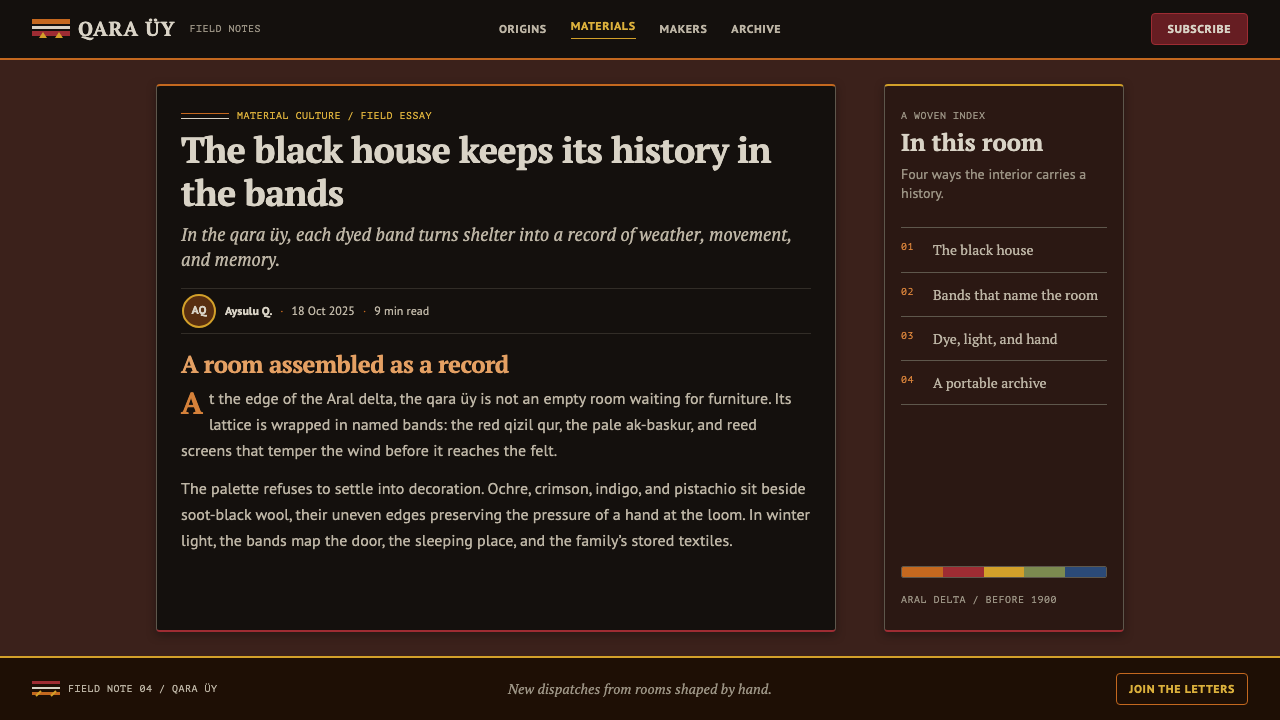
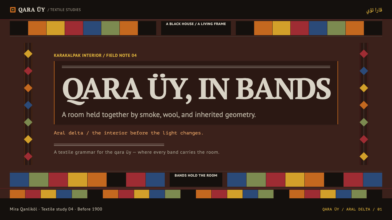
For presentation slides, this style suits a cover or an opening section slide where a densely patterned horizontal band can run across the top or bottom of a dark red field, framing a title set in a restrained, secondary position rather than dominating the composition. Content slides work best when data or text is organized into its own horizontal band, echoing the qizil qur or ak-baskur logic of a bounded strip of information wrapping the page, rather than free-floating text on an open background.
For web interfaces, the style favors a landing page, a cultural archive, or a storytelling project over a data dashboard. A hero section can use a deep red ground with a patterned horizontal band framing the top and bottom of the viewport, while interior sections carry their own named bands of accent color — mulberry yellow, pistachio green, kok koylek indigo — used consistently for the same type of content rather than randomly across the page, echoing how each named weaving had one fixed role.
In editorial and marketing layouts, this system rewards treating section dividers as ornamented horizontal bands rather than thin plain rules, and using the narrow undyed-wool hairline stripe as a rare, disciplined accent between denser patterned sections — a moment of visual rest that should stay genuinely rare rather than becoming a repeated background texture.
The most common mistake is lightening the palette or introducing large areas of plain white space in the name of modern minimalism. That instinct directly contradicts the source material: there is no blank gallery wall anywhere in a qara üy interior, and a version of this style that opens up generous empty space has abandoned the very density that makes it recognizable.
Karakalpak Yurt Interior — FAQ
Why does this style avoid empty white space so completely?
Because the qara üy interior it is drawn from has no equivalent to a bare, lit gallery wall — every soft surface, from the door lambrequin to the storage bags along the wall, carries its own named weaving. The system inherits that total-coverage logic directly: introducing generous empty space contradicts the interior it is built to represent rather than simply modernizing it.
Where does the color palette actually come from?
It comes from a specific, inherited dye vocabulary rather than an open decorative selection: ochre and crimson from tomar glasswort and elaeagnus, yellow from mulberry, green from pistachio, and indigo blue from kok koylek dyeing, with undyed natural wool reserved for a pair of narrow hairline stripes. Every color in the system can be traced back to one of these named sources.
What does it mean that every weaving is 'named'?
It means each piece is not a generic decorative textile but a specifically identified object with a fixed position and function — the esik qas is the lambrequin over the door, the qizil qur and ak-baskur wrap the lattice frame, the karshin are the storage bags along the wall. Applying the style well means respecting that each band or panel should have a clear role, not treating pattern as interchangeable filler.
Is this style suited to a dense information dashboard?
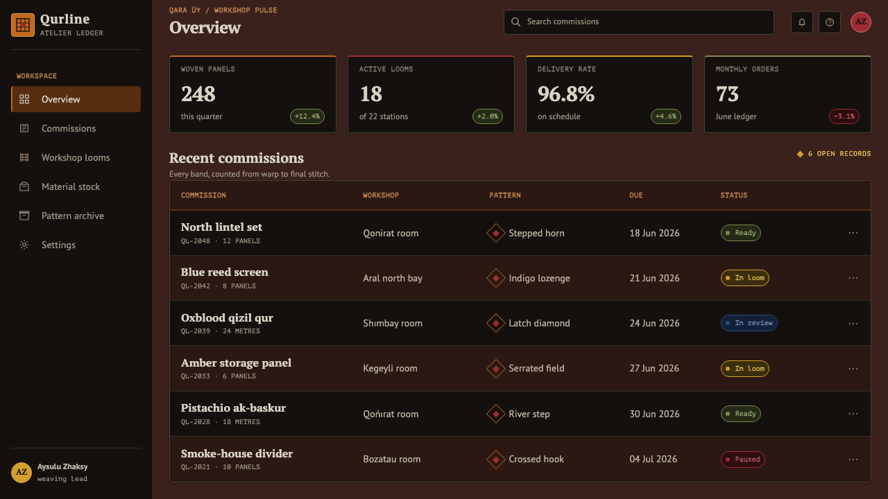
It can work for a dashboard if the density is organized into clear horizontal bands rather than scattered freely, echoing how the qara üy assigns each named weaving to a specific band and position. It is a poor fit for a dashboard designed around wide-open breathing room and sparse accents, since that approach contradicts the total-coverage principle the style depends on.
Related design styles
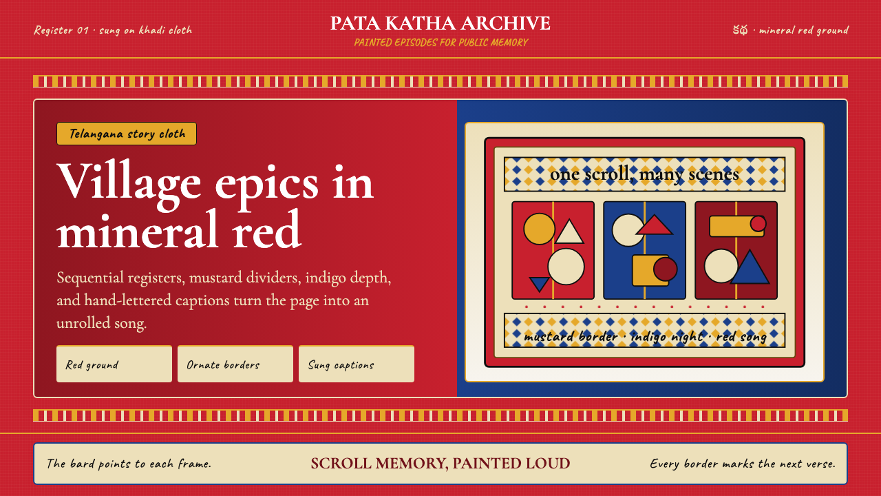 Andhra Cheriyal Scroll PaintingSaturated oral memory. Mineral red registers, mustard diamonds, and serif son…
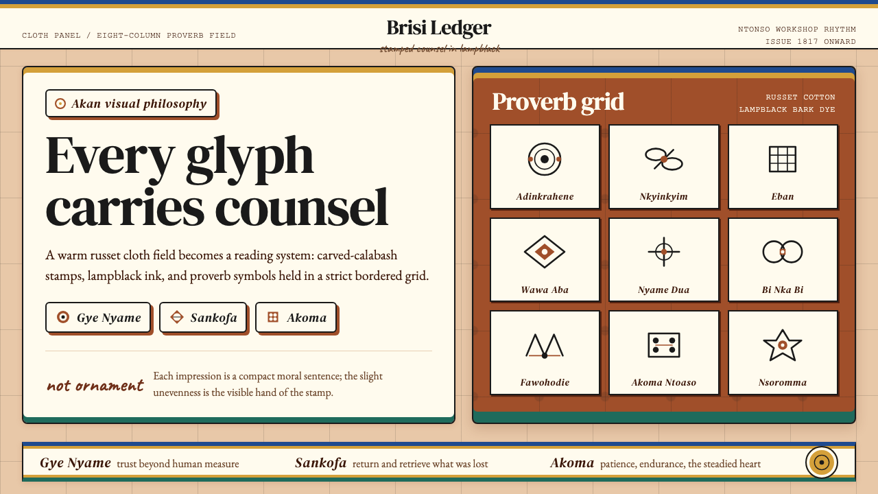 Akan Adinkra (Ghana)Proverbs become cloth. Russet grids, lampblack serif marks, and gold-edge ban…
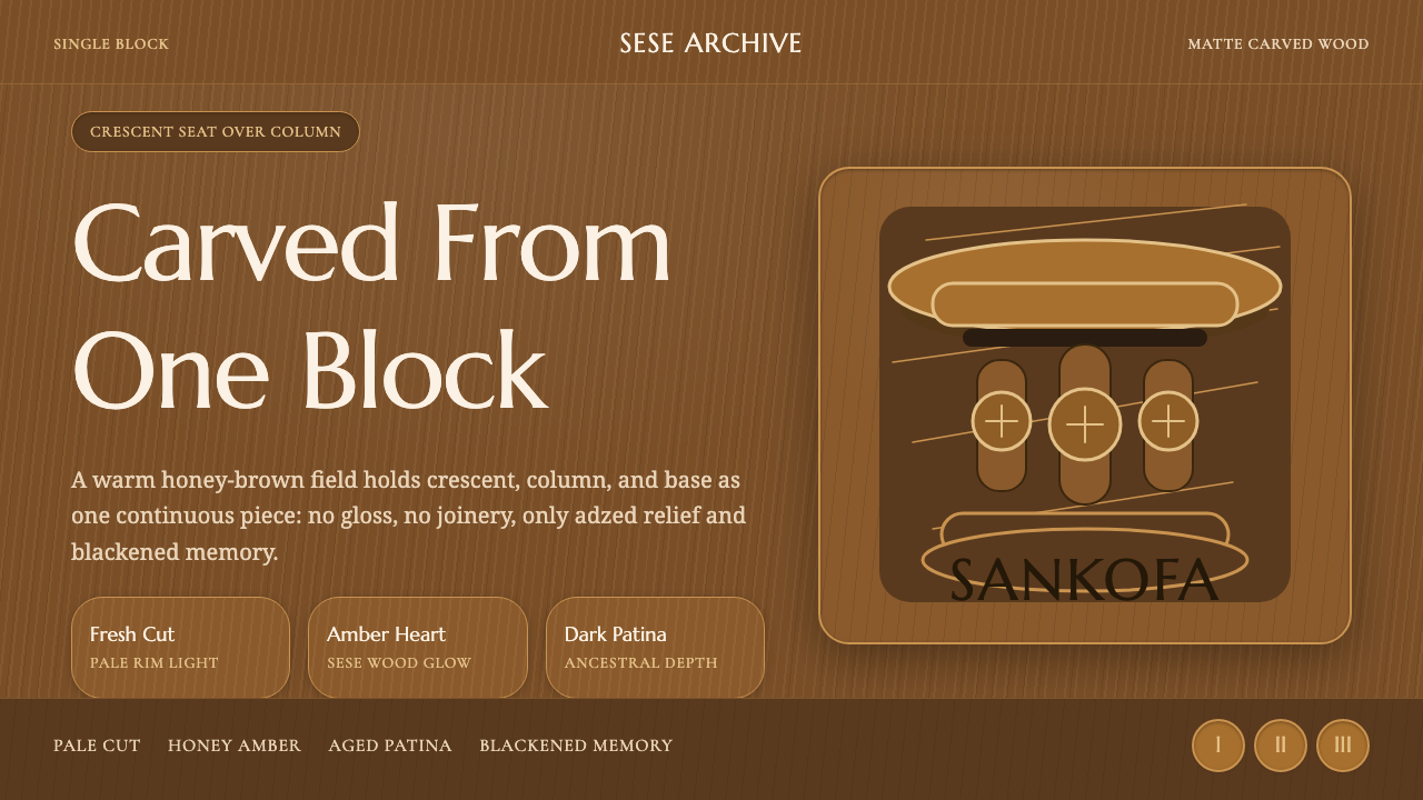 Akan Carved StoolMatte wood carries memory. Honey amber, Marcellus type, and crescent-column r…
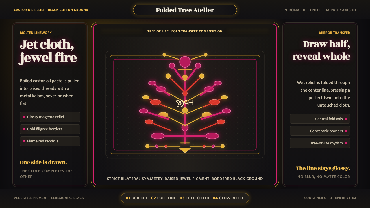 Kutch Rogan Castor-Oil PaintingGlossy symmetry holds the dark. Magenta castor-oil lines mirror across black…
 Lepakshi Vijayanagara CeilingEarth remembers in registers. Ochre gold, red underdrawing and black rules ma…
 Mauritian Sega Creole (1810)Rhythm made visible. Coral stripes, cream sleeve type, and ravanne circles ca…