What is Kanchipuram Silk Saree (Temple Korvai)?
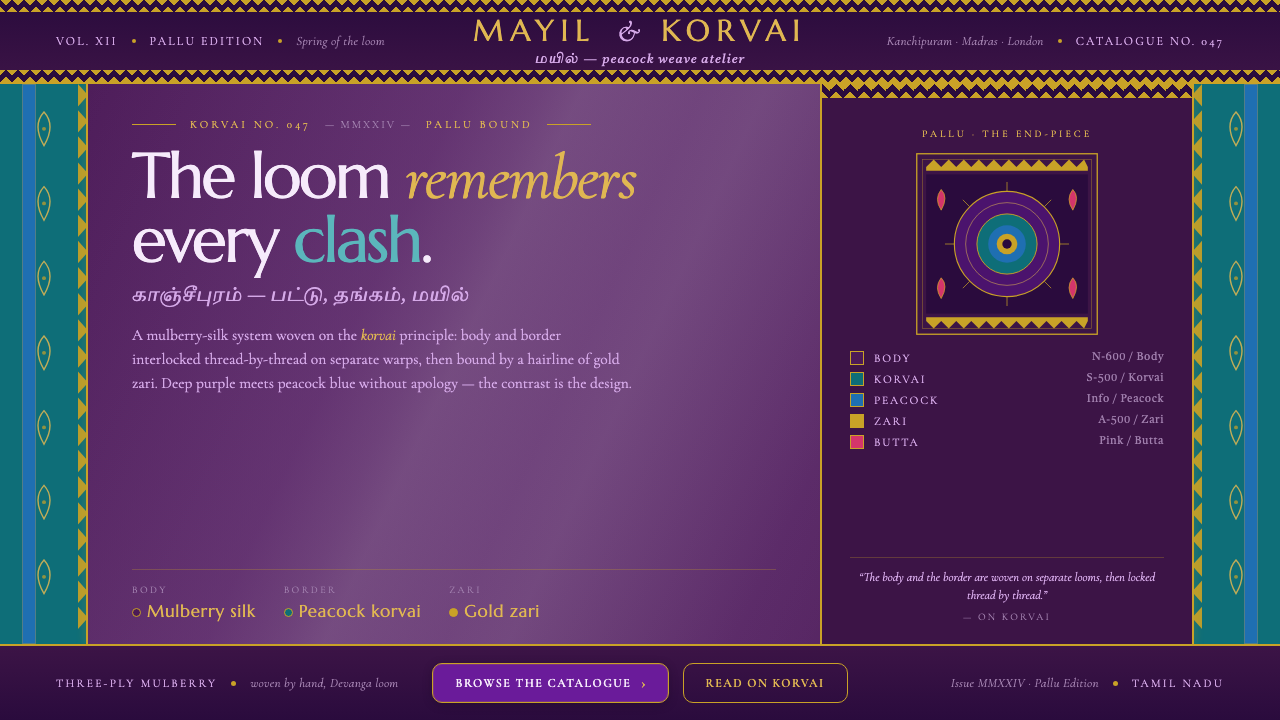
Kanchipuram silk refuses to blend — mulberry purple locks against peacock-blue korvai, while gold zari turns every edge into a deliberate glint.
Kanchipuram Silk Saree (Temple Korvai) in brief
Kanchipuram, or Kanjivaram, silk saree is a lustrous weave from Tamil Nadu, India, defined by the korvai technique. The body and border are woven separately, then interlocked so their colors meet with visible tension rather than blending into a smooth transition. The result is a textile system built around contrast, seam, and controlled opulence.
Its signature composition places a rich mulberry-purple silk body beside a peacock-blue border, often with peacock-teal used to intensify the collision. Gold zari runs through the structure like metallic punctuation. Gopuram temple-spire borders, mango paisley buttas, and peacock-eye motifs provide a compact vocabulary of architecture, ornament, and repeated natural form.
Translated into a design language, Kanchipuram Silk Saree becomes a dark, lustrous interface with clearly separated zones: a deep silk ground, a strong korvai edge, and a broad pallu that carries the richest ornament. It is not a blended luxury aesthetic. Its character comes from the fact that every material, color, and boundary remains legible.
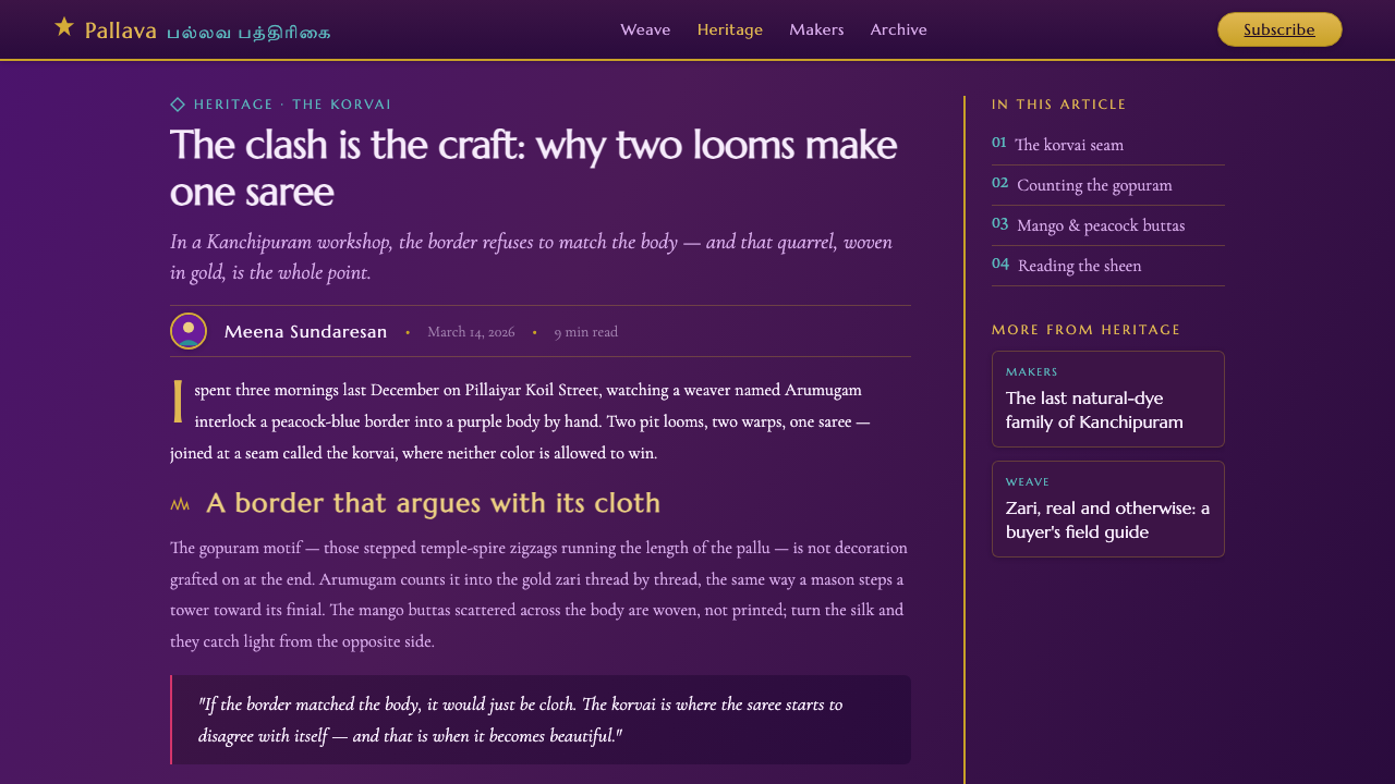
See the Kanchipuram Silk Saree (Temple Korvai) design system
Where does Kanchipuram Silk Saree (Temple Korvai) come from?
The style belongs to the long-running classical silk-weaving tradition of Kanchipuram in Tamil Nadu, India. Its visual identity is tied to South Indian temple-saree silk weaving, where the textile carries a strong relationship between a lustrous silk field, architectural borders, and richly articulated ornament. The design system treats this regional vocabulary as structural rather than incidental.
Korvai is the decisive construction principle. The body and border are woven separately and then interlocked, allowing contrasting shades to meet along a firm, intentional boundary. This technique explains why the palette feels locked together instead of tonally blended. The seam is not hidden; it is the point at which the design announces its identity.
The weave is also associated with zari, the gold-thread brocade that moves through the textile and catches light like real metal thread. Against mulberry purple and peacock blue, the gold does not soften the contrast. It binds the composition visually while preserving the force of the opposing silk colors. Ornament therefore operates as part of the structure, not as a layer placed on top.
The source places this classical weave within the period from 1950 to 1990 and identifies the Devanga and Saliyar weaving communities, together with Kanchipuram silk-weaving guilds, as key figures. The screen translation carries forward their associated vocabulary: temple-spire borders, mango paisley buttas, peacock-eye motifs, separate body and border zones, and a broad pallu reserved for concentrated visual richness.
What defines the Kanchipuram Silk Saree (Temple Korvai) look?
Mulberry Ground
The ground is a deep mulberry purple with the dense, lustrous presence of silk. It should feel substantial rather than blackened, giving the interface a dark foundation while retaining visible color. Purple is the field on which every other decision is measured: the peacock shades must push against it, and the gold must appear to catch light from within it.
Korvai Boundary
The border is not a gentle frame or a tonal fade. It is a separate visual band that meets the body with a crisp, interlocked edge. This boundary should be felt in page structure, component grouping, and navigation treatment. The transition is an act of joining two distinct parts, so the interface gains energy from its seam.
Peacock Contrast
Peacock blue and peacock teal create the principal chromatic tension against mulberry purple. Their quality is saturated, jewel-like, and unmistakably separate. Use the blue family to mark borders, selected states, or strong directional areas; do not dissolve it into the purple ground. Contrast is the system’s organizing force.
Gold Zari
Gold zari is used as a glinting structural thread, not as a general metallic wash. It should trace borders, emphasize joins, and pick out selected motifs with the impression of real metal catching light. Gold is most convincing when surrounded by deep purple or peacock color and allowed to remain concentrated.
Temple Geometry
Gopuram temple-spire borders introduce a stepped, architectural rhythm. Their geometry can organize section headers, card edges, or repeated horizontal bands without becoming literal illustration. The pattern should read as a disciplined silhouette: rising, descending, and repeating with the authority of a built form.
Motif Concentration
Mango paisley buttas and peacock-eye motifs provide the ornamental vocabulary. They work best in concentrated areas such as the pallu, a feature panel, or a decisive background field. Repetition should create textile density, while surrounding space keeps the motifs legible and prevents the interface from becoming uniformly busy.
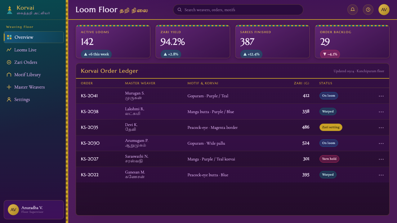
See the Kanchipuram Silk Saree (Temple Korvai) design system
Who shaped Kanchipuram Silk Saree (Temple Korvai)?
The Devanga weaving community is identified as a key figure in the Kanchipuram silk context. Within the design system, its presence is represented through the disciplined relationship between silk body, contrasting border, and woven ornament.
The Saliyar weaving community is another named foundation of this classical weave. Its place in the system is expressed through the insistence that color, seam, and ornament belong to the construction of the textile itself.
Kanchipuram silk-weaving guilds represent the collective craft structure behind the regional tradition. They are reflected in the design language’s repeatable rules: zoned composition, korvai contrast, zari articulation, and a broad pallu for emphasis.
South Indian temple-saree silk weaving is the broader movement named in the source. Its contribution is the union of lustrous silk, temple-spire geometry, and ornament that is integrated into the fabric rather than applied as surface decoration.
How do you use Kanchipuram Silk Saree (Temple Korvai) today?
For presentation slides, use the mulberry ground as the cover field and let a strong peacock korvai band establish the visual identity immediately. Keep the title clear and authoritative, with the gold zari accent reserved for a key rule, motif, or small emphasis. Content slides should divide information into body and border-like zones; data slides can treat charts as woven bands, with gold reserved for the decisive value and peacock color marking comparison or direction.
For web interfaces, the system suits dashboards and pricing pages that need a dark, premium, highly structured surface. Use the purple ground for the main field, peacock shades for navigation, selected states, or tier separation, and zari-like gold for the strongest action or status. Cards should feel like textile panels with clear joins. Borders should be visibly intentional, and dense motifs should remain confined to feature areas rather than compete with functional information.
For editorial and marketing work, build pages around the drama of the korvai meeting point. A long-form article can use a restrained silk body for reading, a broad pallu-like section for a major quote or thematic conclusion, and temple-spire geometry as a recurring section marker. Marketing pages can alternate deep purple fields with peacock bands, using mango paisley and peacock-eye motifs as concentrated signatures around campaign statements rather than filling every surface.
The common mistake is treating Kanchipuram as generic ornate luxury: covering the whole layout in gold, scattering motifs everywhere, or blending purple and blue until the korvai contrast disappears. The style depends on refusal to blend. Preserve the hierarchy of body, border, and pallu; let ornament gather in deliberate zones; and make gold a precise glint within a dark silk structure.
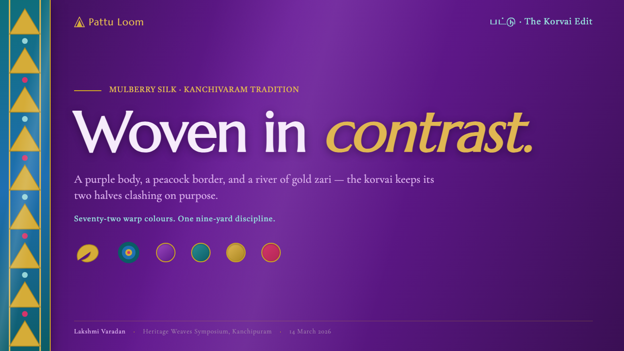
See the Kanchipuram Silk Saree (Temple Korvai) design system
Kanchipuram Silk Saree (Temple Korvai) — FAQ
Is this a generic Indian textile style?
No. The system is specifically based on Kanchipuram, or Kanjivaram, silk saree from Tamil Nadu. Its identity depends on the korvai contrast-border technique, gold zari, temple-spire borders, mango paisley buttas, and peacock-eye motifs. Removing those relationships and keeping only purple, blue, and gold would reduce it to a decorative color theme.
Why must the purple and peacock colors remain visibly separate?
Because their meeting is the visual expression of korvai. The body and border are woven separately and then interlocked, so the boundary carries the character of the textile. A blended transition weakens the constructional idea. The design should make the joining visible, energetic, and deliberate.
How should gold zari be used on screen?
Use it as concentrated metallic emphasis. Gold can trace an edge, identify a decisive action, or illuminate a selected motif, echoing the way zari catches light within the weave. If gold is spread uniformly across every component, it loses its role as a glint and the dark silk ground loses its depth.
Where should the richest motifs appear?
Keep mango paisley buttas, peacock-eye motifs, and the strongest temple-spire geometry in concentrated feature zones, especially a broad pallu-like panel or a major campaign area. Functional content needs calmer space around it. The contrast between decorated and restrained zones is what allows both to remain legible.
Related design styles
 Rajasthani Meenakari EnamelJewel-box intensity. Emerald enamel, cobalt cells, ruby sparks, and gold-wire…
 Bohemian Cut CrystalOpulence glows in shadow. Ruby and cobalt facets sit on velvet under gilt rim…
 Deccan Basalt TempleMonumental shadow, carved. Near-black basalt, Cinzel capitals, and relief gri…
 Gucci Double-GOrnament rules here. Bodoni on cream, framed by green-red-green and gold hard…
 Minangkabau Rumah GadangMatrilineal grandeur, carved. Red-gilt ukiran relief on dark lacquered wood u…
 Babylonian Ishtar GateMonumental by procession. Lapis brick, gold registers, and carved capitals ho…