What is Arabia Paratiisi?
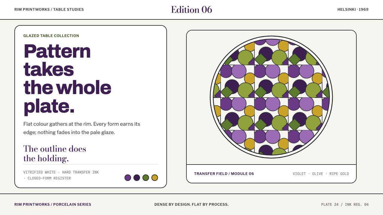
Arabia Paratiisi is ornament that refuses restraint: fruit, violets and blackcurrants packed edge to edge, each form closed in a dark line and filled with flat violet or olive on pale porcelain.
Arabia Paratiisi in brief
Paratiisi, Finnish for paradise, is the tableware decoration that Birger Kaipiainen drew for the Arabia factory in Helsinki in 1969. It was reworked from a relief he made for Expo 67, titled Orvokkimeri, a name that can be read as a sea of violets. Fruit, violets and blackcurrants crowd the plate from corner to corner. Every form is closed with a near-black line and filled with a flat colour, and the whole drawing was silkscreened onto white vitrified porcelain.
This is a printed system, not a painting, and the difference defines the style. Boundaries are hard. Colour is solid. There is no shading, no modelling and no breathing room. A dark figure sits on a light ground, and the pattern crowds the surface instead of decorating it politely. The purple colourway, a later variant, sets plum and violet grapes over olive and leaf greens on a pale glazed ground, a combination that is rich without ever becoming soft.
In design terms, Paratiisi is a maximalist style with a strict internal discipline. It is dense, but it is never messy, because every shape has an outline and every fill is flat. It asks a layout to be full, to have edges, and to keep its quiet zones deliberate. Where an interface needs to be read, the pale ground is kept clear; where it does not, the pattern is allowed to press right up to the border.

Where does Arabia Paratiisi come from?
Birger Kaipiainen was a ceramic artist at Arabia, the porcelain factory in Helsinki, and Paratiisi is the decoration most closely tied to his name. It was issued in 1969 and has been in continuous production since, which means the pattern has stayed in front of customers for decades. It belongs to the world of postwar Finnish ceramics and to the Arabia art department, where an artist's drawing was translated into a repeatable factory decoration.
The design has a documented ancestor. Kaipiainen reworked Paratiisi from Orvokkimeri, the relief he showed at Expo 67, translating a sculptural, handmade surface into a flat drawing that a factory could print. That journey explains the decoration's character. The crowding, the sense of abundance and the profusion of small rounded forms all come from a work whose very title promises a sea of violets, and the flat outlines are what remained when that abundance was moved onto a plate.
The method matters as much as the motif. Paratiisi was one of Arabia's earliest printed decorations, silkscreened onto white vitrified porcelain rather than painted by hand. Screen printing works in separate flat layers of ink, and it favours exactly what the pattern shows: closed shapes, hard boundaries and solid colour. Shading is not natural to the process. The style's refusal of gradients is therefore not austerity but fidelity to its medium.
The decorative tradition behind it is figurative decoration, the use of recognisable fruit, flowers and leaves as ornament rather than abstraction. What Paratiisi adds to that tradition is density. The plate is not a field with a motif placed on it; the motif is the field. For anyone translating the idea to a screen, the lesson is that this style is built on filling, bordering and outlining, and that restraint, here, would be a misreading.
What defines the Arabia Paratiisi look?
Corner-to-Corner Crowding
Fruit, violets and blackcurrants press against one another across the entire surface, leaving almost no empty ground. Overlap is minimal; shapes touch and nest instead. The effect is abundance as a structural principle, and any gap that remains is small and intentional.
Closed Forms with a Dark Outline
Every shape is sealed with a near-black line and filled flat inside it. The outline is what holds the crowd together: it separates neighbouring shapes of similar colour and gives the surface its graphic snap. Lines are even and confident, with no tapering and no sketchy variation.
Flat Solid Fills
Colour sits as a single, even area inside each outline, exactly as a screen-printed layer would. There is no shading, no highlight and no modelling of volume. Fruit looks like a printed symbol of fruit rather than a picture of it, and that flatness is the source of the style's decorative authority.
Plum, Violet and Olive
The purple colourway pairs plum and violet grapes with olive and leaf greens. The purples are cool and heavy, the greens earthy and slightly yellow-leaning, and together they feel rich rather than sweet. Tints stay dark and full; pastel versions of the same hues weaken the weight of the pattern.
A Pale Glazed Ground
The ground is the pale white of glazed porcelain, a soft off-white rather than a stark one. It supplies the light half of a dark-figure, light-ground structure and gives the outlines their contrast. This ground is an object surface, not a neutral void, so it should feel like glazed material, not an empty page.
No Shading, No Light Source
There are no gradients, no soft shadows and no highlights. Nothing suggests a light source, and nothing lifts off the surface. Where depth is needed, it comes from overlap and colour contrast, not from simulated lighting. This is the logic of a printed system rather than a painting.
Reserved Quiet Zones
Breathing room is not eliminated so much as relocated. In the original, the whole plate is pattern; in an interface, the pattern must yield in the places where people read. The style keeps clear, pale areas for body text and controls and lets the decoration fill everything around them.

Who shaped Arabia Paratiisi?
Birger Kaipiainen is the ceramic artist who drew Paratiisi for the Arabia factory in Helsinki in 1969. His drawing combines botanical subject matter with a graphic, outlined treatment, and the result has stayed in production ever since. For designers he is the model for a particular idea: that abundance can be controlled, as long as every form is closed and every fill is flat.
The Arabia art department is the setting in which an individual artist's drawing met the needs of factory production. Its postwar Finnish ceramics sit between studio work and mass manufacture, which is why a decoration like Paratiisi is both personal in its drawing and repeatable in its execution. The department stands for the idea that a distinctive hand can survive industrial printing.
Orvokkimeri is the relief Kaipiainen made for Expo 67, and the starting point from which Paratiisi was reworked. Its title can be read as a sea of violets, and it supplies the sense of overflow that the plate preserves in flat form. It is the link between a sculptural, handmade object and the printed decoration that followed, and it explains why the pattern feels abundant rather than merely busy.
How do you use Arabia Paratiisi today?
Arabia Paratiisi is a style for expression, not neutrality. It works when a product wants to feel generous, handmade and confident, and it asks for a layout that is willing to be full. The practical question is not how much pattern to add but where the quiet zones go.
On presentation slides, a cover can carry the pattern edge to edge, with a clear pale cartouche or band for the title so that type has somewhere to sit. Content slides work best with a pattern border or a pattern column framing a clean light area for text, rather than pattern behind the text. Data slides can borrow the logic of the print: bars and segments as closed shapes with dark outlines and flat violet, olive and leaf-green fills, packed closely together.
For web interfaces, the style fits product pages, shops, hospitality, food and craft brands, and campaign microsites. Hero sections can be dense pattern fields with a pale reading panel on top. Cards take dark outlines and flat fills, and buttons are closed shapes with a near-black edge. Dashboards and heavy data tools are a poor match, but a pricing or onboarding page can use the pattern as a frame around a calm, readable core. Keep shadows out entirely and let outlines do the separating.
In editorial and marketing work, the style is made for packaging, menus, posters, book covers, invitations and seasonal campaigns. A long-form page can open with a dense pattern masthead and then settle into pale columns of text, returning to the pattern in section breaks. Photography does not sit well on top of the pattern; use it inside pale panels with a dark outline, or replace it with flat illustration in the same drawing language.
The most common mistake is to treat the pattern as a light garnish. Sprinkling a few fruit motifs across a lot of empty space turns Paratiisi into generic floral decoration and removes the crowding that defines it. Other typical failures are soft or blurred outlines, gradients or shadows inside the shapes, pastel desaturated colours, and pattern placed directly behind long text so that nothing can be read. A good version is full, outlined and flat, with clear quiet zones where words live.

Arabia Paratiisi — FAQ
Is this a maximalist style?
Yes, but a disciplined one. Paratiisi crowds the surface from corner to corner, yet every form is closed with an outline and filled flat, so the density never turns into noise. The abundance is the point, and the control is what makes it readable. A looser, messier maximalism would lose the printed clarity that defines the style.
Why are the outlines so important?
Because they hold a crowded surface together. With so many shapes touching, similar colours would blur into one another without a dark line between them. The near-black outline also reflects how the decoration was made, as a silkscreened system of closed shapes, and it is what separates the style from soft, painterly florals.
Do I have to use violet and olive?
The purple colourway, with plum and violet grapes over olive and leaf greens, is the palette this style is built on, and it was a later variant of the decoration. The logic can carry other palettes as long as they stay solid, dark-outlined and set on a pale ground. What does not survive is lightening the colours or turning the ground dark, because the dark-figure, light-ground structure is the heart of the look.
Can it work on text-heavy pages?
Yes, if the pattern and the text are given separate territories. The style reserves clear pale zones for reading and lets the decoration fill the border, header or side column. The mistake is to put long text over the pattern. When the quiet zones are generous and clean, a text-heavy page can carry a very dense frame without losing legibility.
How is it different from a painted floral print?
A painted floral usually uses soft edges, blended colour and a sense of light. Paratiisi does the opposite: hard outlines, solid fills, no shading and no sense of a light source. It is printed rather than painted in spirit, and its fruit and violets read as graphic symbols. That is why it feels bold and decorative rather than delicate.
Related design styles
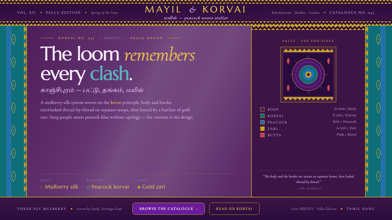 Kanchipuram Silk SareeRefuses to blend. Mulberry purple locked against peacock-blue korvai, every e…
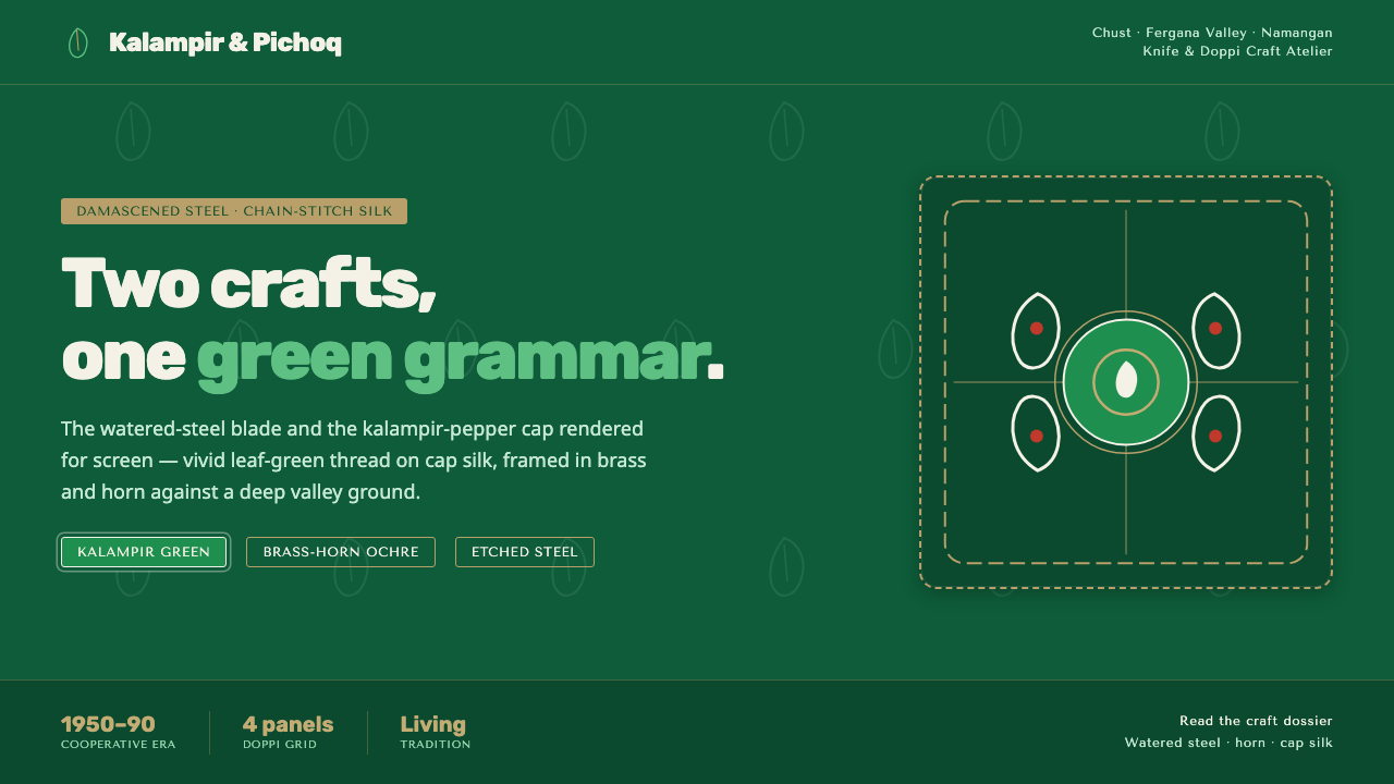 Chust Pichak Knife CraftTwo crafts, one green grammar. Vivid kalampir chain-stitch on cap silk, brass…
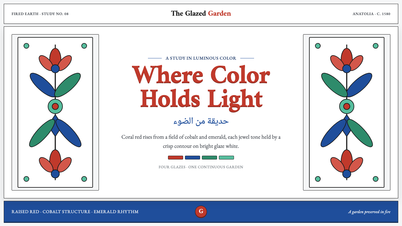 İznik Carnation PanelColor holds light. Raised coral red and cobalt ornament gleam against glaze w…
 Wau Bulan Moon KiteKelantan moon-kite craft. Purple tissue, emerald piping, symmetric gold-and-p…
 Aboriginal Dot PaintingAncient story-map energy. Red ochre, bone dots, concentric circles, and U-mar…
 Aboriginal Dot Painting (Papunya 1971)Ochre memory, held steady. Raw umber ground, Cormorant type, disciplined dot-…