What is Bohemian Cut Crystal?
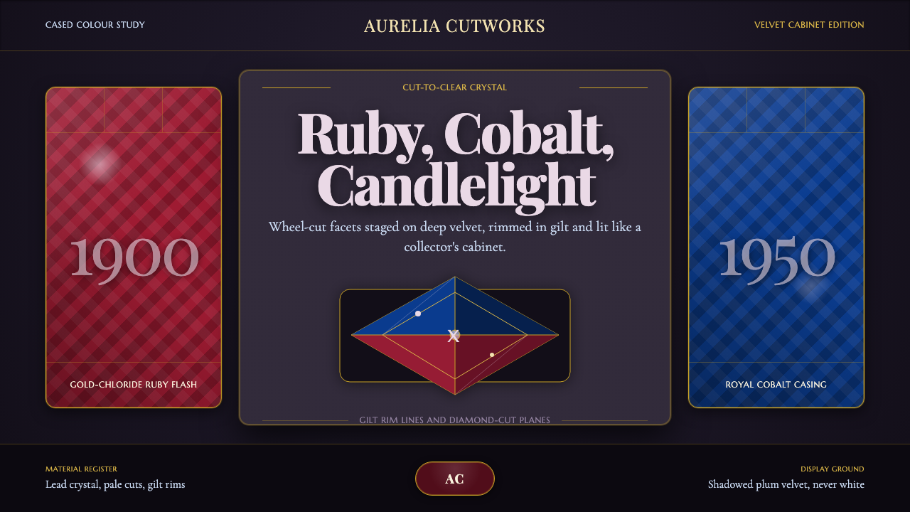
Bohemian cut crystal turns tableware into jewelry — ruby and cobalt glass laid over clear crystal, wheel-cut into facets, and staged against velvet dark so every edge throws light.
Bohemian Cut Crystal in brief
Bohemian Cut Crystal is a digital design language built from the lead-crystal glassware of the Czech lands — goblets, decanters, and vases whose walls are cased in deep color and carved with faceted cuts so that light, not paint, does the work of decoration. The defining move is color-over-clear: a layer of tinted glass, ruby red or royal cobalt, sits over a body of colorless lead crystal, and a cutter grinds through the colored skin to expose the clear glass beneath, leaving a pattern of jewel-bright facets ringed in color.
The style is inseparable from how this glass has always been shown. Collectors and dealers photograph cut crystal against black or deep-toned velvet, never against a bright, even field, because a pale background flattens the very sparkle the cutting exists to produce. Dark grounds let each facet register as an individual point of light, the same way a jeweler's black velvet tray makes a diamond look brighter than it is.
Gilt is the style's second signature: a thin band of gold, applied to a rim or a stem and fired into the glass, that catches light the way the facets do but in an unbroken line rather than scattered points. Together, saturated color, faceted cut, and gilt edge produce a mood of contained opulence — richness that is precise and hard-edged rather than soft or casual.
Where does Bohemian Cut Crystal come from?
Bohemian glassmaking traces back to the forested Ore Mountains straddling the modern border of the Czech Republic and Germany, a region that had everything a glass industry needed close at hand: silica-rich sand, potash from burned beechwood, and the fuel to keep furnaces running for centuries. Glasshouses had operated there since the medieval period, but it was the seventeenth and eighteenth centuries that turned Bohemian glass into a name recognized at royal courts across Europe, prized for a clarity and hardness that took engraving and cutting exceptionally well.
Color transformed the tradition. Gold-chloride ruby glass — glass that turns a deep red when a small quantity of gold is dissolved into it and the piece is reheated, a technique refined in German-speaking lands in the seventeenth century — became a Bohemian specialty by the nineteenth century, prized enough to be nicknamed 'cranberry glass' in English-speaking export markets. Cobalt oxide produced the complementary blue. Both colors were most often applied as a cased layer over clear crystal rather than throughout the whole piece, because casing let cutters carve all the way back to clear glass and produce the two-tone faceted effect that became the style's calling card.
The wheel-cutting itself descended from a court tradition of glass engraving that Bohemian workshops had practiced since the Baroque era, when hand-turned copper and stone wheels, fed with abrasive, were used to carve deep hollows and facets into thick-walled glass. By the turn of the twentieth century this technique had industrialized without losing its handwork: cutters in towns across the Bohemian glassmaking belt produced faceted, cased, and gilt-rimmed pieces at a scale that let 'Bohemian glass' become an internationally traded luxury good rather than a court rarity.
The 1900–1950 window this design system draws from spans that transition — from the last court-oriented workshops of the Habsburg era, through the export boom that carried ruby and cobalt crystal into American and Western European homes as prestige tableware and gift pieces, to the mid-century point where the technique had become a settled, mature craft. The glasshouses, patterns, and color recipes developed in this period are still the reference point for what people mean when they say 'Bohemian crystal' today.
What defines the Bohemian Cut Crystal look?
Color
The palette is built from two saturated hues staged on darkness: a deep gold-toned ruby red and a royal cobalt blue, each used as a cased layer rather than a flat fill. Clear crystal shows through wherever a facet has been cut back, so any given surface reads as color and clarity in the same glance, edged by warm gilt rather than cool metal.
Facet Cutting
Deep wheel-cut facets — diamond points, printies, hobnail grids, strawberry-cut diagonals — are carved through the colored casing at an angle steep enough to catch and redirect light from many directions at once. The cut is never shallow or decorative-only; it is deep enough to physically remove the color layer at its center, which is what produces the two-tone jewel effect.
Cased Glass
The signature construction is a body of clear lead crystal overlaid with a second, colored layer fused to it in the furnace. Cutting through this outer skin — rather than engraving a solid-colored piece — is what makes the clear crystal visible at the base of every facet, giving depth that a single-color surface cannot produce.
Gilt Trim
A band of gold, fired onto a rim, foot, or handle, provides the style's only continuous line among all the broken, faceted light. It functions as punctuation — marking where an object begins and ends — and its warmth is deliberately set against the coolness of cobalt and the heat of ruby alike.
Dark Staging
The style is built to be seen against near-black or deep-toned grounds, echoing the velvet-lined display cases and dark museum plinths on which cut crystal has traditionally been photographed and sold. A pale or neutral background is treated as a failure state, because it dulls the very contrast that makes faceted glass legible as faceted glass.
Brilliance
Highlights are treated as small, hard points rather than broad soft glows — the visual signature of a cut facet catching a single source of light. Multiple tight highlights scattered across a dark ground, rather than one large glow, is what reads as cut crystal rather than plain glass.
Who shaped Bohemian Cut Crystal?
The workshops scattered across the Bohemian glassmaking belt — small, family-run operations as much as larger commercial glasshouses — were the collective engine behind the tradition this style draws from. Working with locally sourced sand and potash, they combined furnace chemistry, casing technique, and wheel-cutting craft into a regional specialty recognized across European courts and, later, international export markets.
The specialist glassworkers who mastered gold-chloride ruby coloring and cobalt-oxide blue casing were essential to the style's visual identity — their control over furnace temperature and reheating time determined whether a piece struck a true deep red or blue rather than a muddy or uneven tone. Their techniques turned a chemical process into a repeatable, sellable aesthetic.
Cut-to-clear — grinding through a colored casing to expose the clear crystal underneath — is the technical tradition at the center of this style. It elevated cutting from surface decoration into a way of revealing structure, since every facet is literally a window cut down through one material into another.
Cranberry glass — the English-market name for gold-ruby cased crystal — became one of the most widely exported strands of Bohemian glassmaking, carrying the ruby-on-clear aesthetic into homes and gift shops far from the workshops that made it. Its popularity helped cement deep red as the tradition's most recognizable signature color, alongside cobalt blue.
How do you use Bohemian Cut Crystal today?
Bohemian Cut Crystal reads as luxury the instant it appears, which makes it powerful for contexts that want to signal exclusivity, heritage, or occasion — and risky anywhere restraint or accessibility matters more than opulence. The style's central discipline is contrast: saturated jewel color and gilt line only register against genuine darkness, so any application has to commit to a dark ground rather than compromising toward a lighter, safer palette.
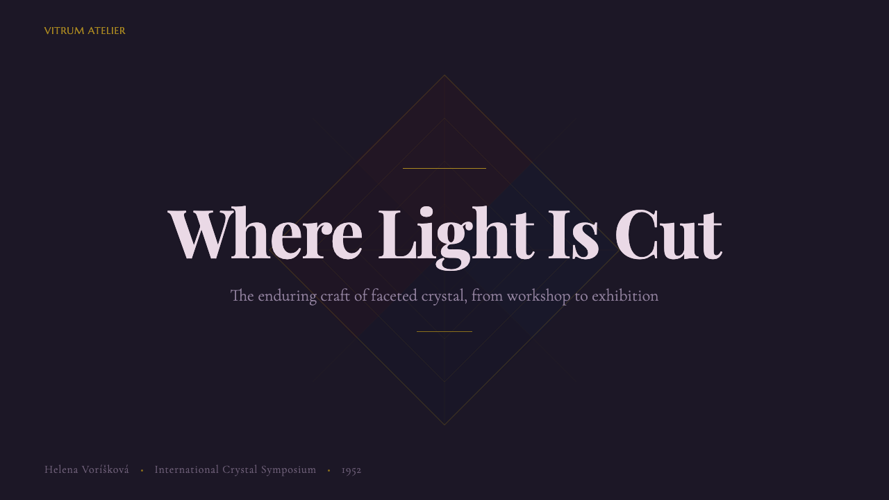
On presentation slides, the style suits a cover or a closing slide more naturally than a dense content slide: a single faceted motif or gilt-rimmed shape, isolated against a near-black field, does the work a whole layout of ornament would otherwise attempt. Content slides should carry the mood through restraint — dark backgrounds, a small number of jewel-toned accent shapes used to mark hierarchy, gilt-toned rules rather than plain lines separating sections. Data slides benefit from treating charts as faceted objects themselves — a single bar or segment picked out in ruby or cobalt against an otherwise dark, quiet field communicates emphasis more effectively than color applied everywhere at once.
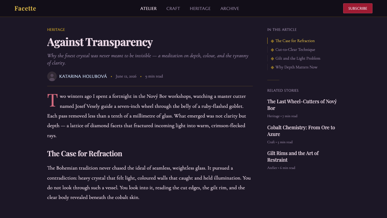
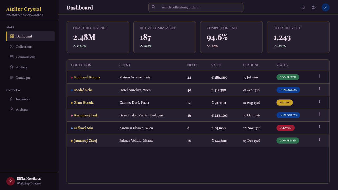
For web interfaces, the style works best on premium or membership-tier product surfaces — a Pro or VIP pricing tier, a curated collection page, an invitation-only dashboard — where the dark ground and faceted highlight can be used sparingly to mark the one thing that matters on the page. Overusing the style across an entire ordinary dashboard exhausts its impact; it reads best when most of the interface stays quiet and dark, and jewel color is reserved for the specific action or tier the design wants to elevate.
In editorial and marketing contexts, the style suits luxury goods, heritage brands, and celebratory or gift-oriented campaigns — anything that wants to borrow the emotional register of unwrapping something precious. A magazine spread or landing page built this way should let a single faceted or gilt-rimmed image carry most of the visual weight, with body text kept plain and quiet so it does not compete with the one ornamental element the layout has chosen to feature.
A common mistake is spreading ruby and cobalt evenly across a layout as if they were an ordinary two-color brand palette. In the source material, color only ever appears as a cased layer over darkness and clear facets — used to mark a specific object or highlight, not to fill a whole interface. Losing that discipline, or lightening the background to a pale neutral for legibility, drains the sparkle the entire style depends on and produces something closer to generic jewel-tone branding than genuine cut-crystal opulence.
Bohemian Cut Crystal — FAQ
What is the difference between ruby-flash glass and glass that is simply colored red all the way through?
Solid-colored glass is red or blue throughout its entire thickness, so cutting into it only reveals more of the same color. Ruby-flash and cobalt-cased glass, by contrast, is clear crystal with a thin colored layer fused over the surface — cutting through that thin layer exposes the clear glass underneath, which is what produces the two-tone faceted look this style is built around. The casing technique is what makes the jewel-and-window effect possible; solid color cannot produce it.
Can this style work on a light background, or does it require darkness?
The style is built around dark staging — that is not an incidental choice but the mechanism that makes faceted glass read as sparkling rather than flat. A light-background adaptation is possible for contexts that require it, but it should keep very high contrast between the jewel color and its immediate surroundings — for instance, a dark card or panel floating on an otherwise light page — rather than attempting to spread ruby and cobalt across a pale field directly, which flattens the sparkle the style depends on.
Is Bohemian Cut Crystal the same as Art Deco glass?
They overlap in period and sometimes in geometric cutting patterns, but the traditions have different centers of gravity. Art Deco glass design, most associated with French and American makers of the 1920s and 1930s, favors stepped, streamlined geometry and often frosted or satin finishes. Bohemian Cut Crystal is older, rooted in a specifically Central European lead-crystal and cased-glass tradition, and its defining feature — color casing cut back to clear crystal — is a technique Art Deco glassmakers did not centrally rely on. Some Bohemian pieces made during the Art Deco years absorbed its geometric patterning, but the underlying material technique is distinct.
Why does gilt trim matter so much to the overall effect?
Faceted cutting produces light in scattered points, and saturated color produces mood, but neither gives an object a clear edge. Gilt trim is the one continuous, unbroken line in the whole composition, and it functions the way a frame functions on a painting — it tells the eye where the object begins and ends, and it adds warmth that keeps a cool-toned cobalt piece or a hot ruby piece from feeling one-note. Removing the gilt line tends to make a design feel unfinished, even if the color and cutting are otherwise correct.
What kinds of products should avoid this style?
Anything that depends on quick scanning, high information density, or an approachable, casual tone will fight against Bohemian Cut Crystal rather than benefit from it. The style is slow by nature — it asks the eye to linger on a small number of jewel points against darkness — so utility tools, data-heavy dashboards meant for rapid scanning, children's products, and budget or entry-level offerings tend to read as mismatched or even ironic when dressed in it. It is best reserved for the specific moments where a product wants to feel expensive and worth pausing over.
Related design styles
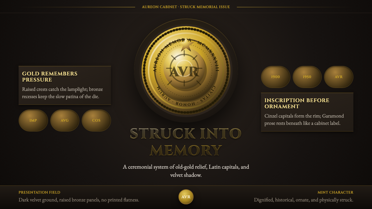 Commemorative CoinAuthority struck in metal. Old-gold relief, denticled rims, and Cinzel capita…
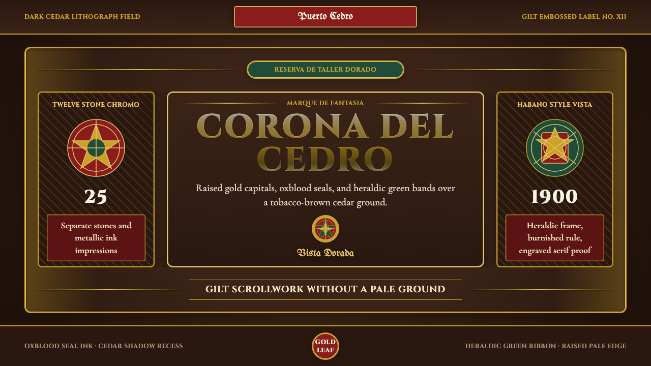 Cigar Box LabelGilt maximalism glows. Gold Cinzel capitals lock into a tobacco-brown framed…
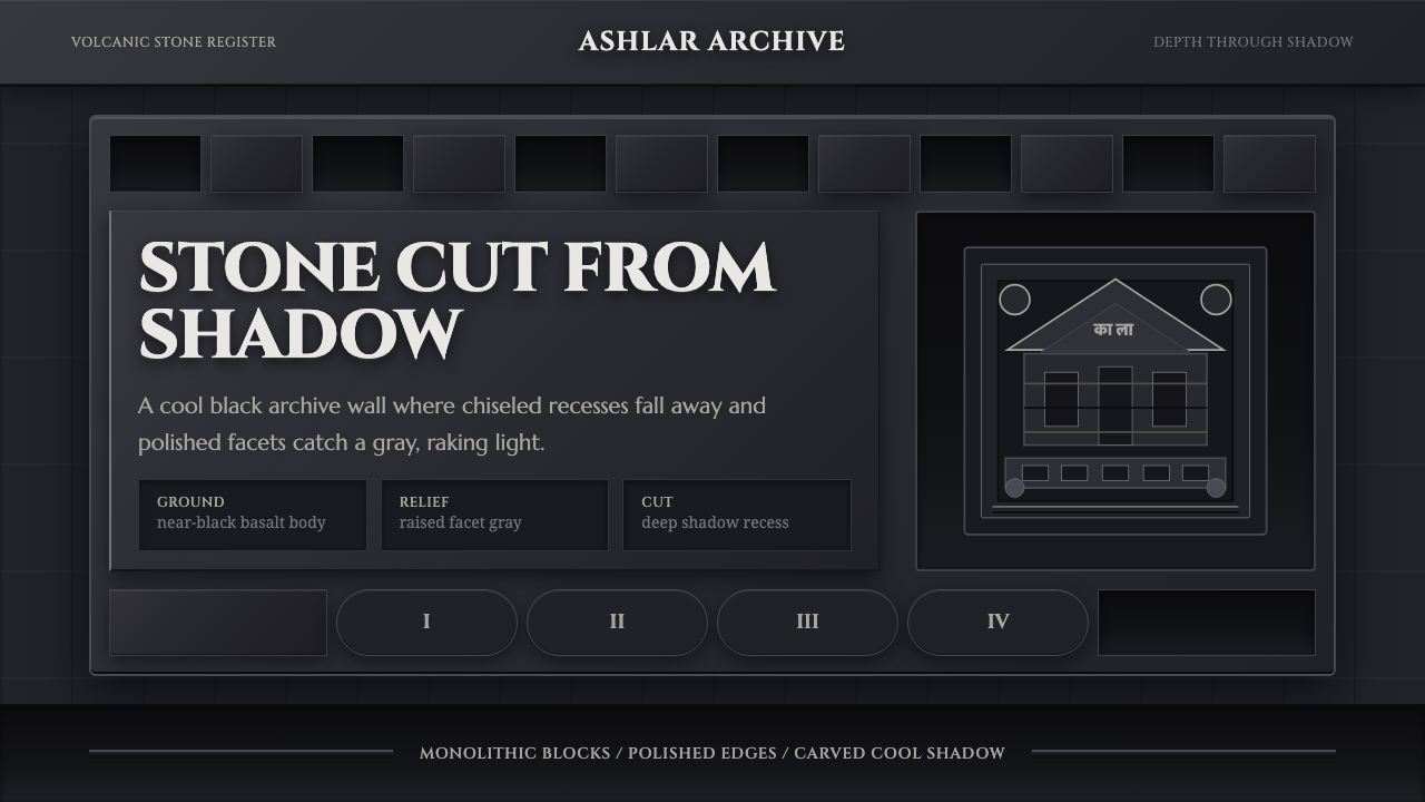 Deccan Basalt TempleMonumental shadow, carved. Near-black basalt, Cinzel capitals, and relief gri…
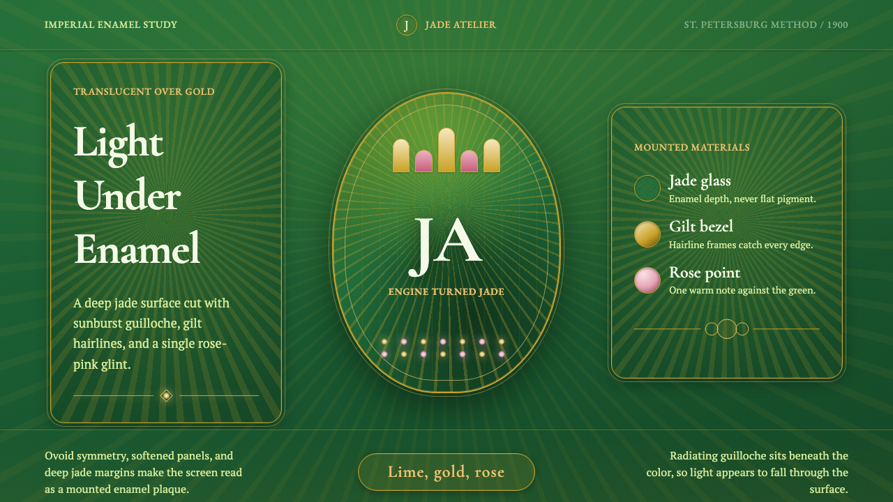 Faberge Guilloche EnamelImperial enamel glows. Jade guilloche, gilt hairlines, rose-pink points.
 Gothic Rose WindowDarkness becomes light. Cobalt glass, ruby foils and black lead form a radial…
 Gucci Double-GOrnament rules here. Bodoni on cream, framed by green-red-green and gold hard…