What is Kaj Franck Teema?
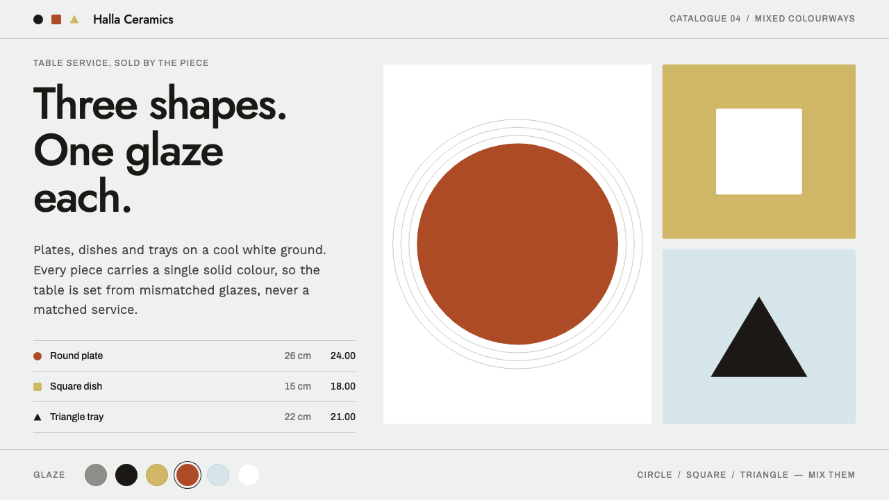
The Kaj Franck Teema style builds a whole visual system from three shapes and a box of glazes: circle, square and triangle, each in one flat colour on a cool white ground.
Kaj Franck Teema in brief
The Kaj Franck Teema style is modelled on a tableware range rather than on any screen convention. Its starting point is a dinner service reduced to three shapes, the circle, the square and the triangle, and to a set of solid glaze colours. Kaj Franck pared the service down in this way at Arabia in 1952, and Iittala relaunched the same geometry under the name Teema in 1981, adding colours over the following four decades. The design system takes that shelf of objects and translates it into an interface.
The visual result is calm, ordered and unusually colourful at the same time. The ground is a cool white, like the glaze of a plate seen in daylight. Silhouettes are hard-edged and simple. Buttons are flat filled shapes, and colour selection is presented as a row of solid glaze discs. There are no patterns, no gradients and no decorative borders. Colour is the only ornament, and each object is allowed exactly one.
A defining principle is that the range only makes sense when it is mixed. A single plate in a single colour is just a plate; a table set with several colours of the same few shapes is the system doing what it was designed to do. The interface follows suit. The neutral ground and the uniform geometry give the palette room, and the relationships between coloured objects carry the personality. It suits home retail, industrial product catalogues and brand sites for companies that value order.

Where does Kaj Franck Teema come from?
The style belongs to the Finnish functionalist and wider Nordic modernist tradition, and to the mid-century world of industrial ceramics, in which everyday objects were designed to be made in quantity, used daily and understood at a glance. Functionalism in this sense is not austerity for its own sake. It is a conviction that a good everyday object takes its form from what it is for, and that decoration should not be added to disguise a lack of purpose. The source brief locates the style in Helsinki, Finland.
The story starts in 1952, when Kaj Franck, working at Arabia, stripped the dinner service down to its geometric basics. The range was called Kilta, and it came in a handful of glaze colours, among them white, yellow, brown, blue, green and black, which could be mixed and matched freely. That idea, that colour is chosen by the user while the shapes stay fixed, is the seed of everything the interface later borrows.
In 1981 Iittala relaunched the same geometry as Teema, and the range kept growing. Grey was added in 1987, and green and yellow followed in 1991, among a long run of additions that took the palette past thirty colours over four decades. The notable thing is what did not change: the shapes. A system whose geometry is fixed can add colour without losing coherence, which is exactly the property a digital design system wants, and it is why Franck's tableware transfers so naturally to an interface.
Three names recur in the source brief: Kaj Franck, Arabia and Iittala. Franck is the designer, Arabia is the manufacturer where the original 1952 service was made, and Iittala is the brand that brought it back as Teema in 1981. The continuity from a single designer through two companies, with one geometry intact, is itself part of the style's meaning, and it is why the interface treats colour as the variable and form as the constant.
What defines the Kaj Franck Teema look?
Three-shape vocabulary
Circle, square and triangle are the whole vocabulary. Every container, icon, tile and marker in the system is a variant of one of the three, drawn as a plain silhouette with hard edges. Because the shapes are so few, each one acquires a meaning through repetition: the circle can become a swatch, the square a button or a card, the triangle a pointer or a marker.
Colour as the only ornament
There are no patterns, no borders for decoration's sake and no texture. Glaze colour does all of the decorative work, and it does it as a flat, even field. This restraint is what makes the colour feel strong: the eye is not asked to read a motif first and a colour second, so the colour arrives at full strength.
Glaze-disc swatches
Colour choice is shown as a row of solid discs, each a single glaze with nothing inside it. They are both the interface for choosing and a portrait of the product range, so the picker and the brand image are the same object. A selected state is a change in how the disc is framed, never an effect applied to the colour itself.
Cool white ground
The ground is a cool white that reads as glaze rather than paper. A cool tone keeps every added colour crisp, where a warm cream would tint them all the same way. The ground is also where the system's calm comes from: everything coloured sits on something neutral, and the neutral never competes.
Flat fills, hard edges
Buttons and panels are flat filled shapes with crisp edges: no gradient to suggest a curved surface, no shadow to suggest lift. The look is of a glazed object photographed head-on, simple enough to be understood in a glance. Interaction states change the fill colour or the framing, so even feedback is expressed through the same flat language.
One object, one colour
Each object carries exactly one colour. A card is yellow or blue, not yellow with a blue stripe; a button is one glaze, not a gradient between two. This rule gives the system its legibility, because a colour can be read as the identity of a thing, whether that is a category, a product variant or a state.
Mix, don't match
The palette is meant to be combined across objects rather than matched within a set, and it has grown by addition over decades without ever invalidating what came before. A layout therefore gets its life from putting several glazes side by side, and the more colours the range has, the more combinations it offers without any new shapes.

Who shaped Kaj Franck Teema?
The designer who, working at Arabia in 1952, reduced the dinner service to a circle, a square and a triangle. His contribution to this style is the principle that colour should be the only ornament and the user should decide how to combine it. Everything the interface does with flat glaze fields and fixed geometry is a translation of that decision.
The manufacturer at which the original service was produced in 1952. The company's role in the story is that of the workshop where a design idea became a mass-produced, everyday object. That makes Arabia the origin of the style's industrial seriousness: these were shapes meant to be made in quantity and used every day, not displayed.
The brand that relaunched the same geometry as Teema in 1981 and kept extending the colour range for four decades. Its stewardship is the reason the style demonstrates how a design system can keep growing without breaking: grey in 1987, green and yellow in 1991, and many more colours afterwards, all on unchanged shapes.
The two names under which the range has been sold: Kilta in 1952 and Teema from 1981. They matter for the style because they show the same system under two companies and two eras. Seen together, they make the argument that good geometry is not tied to a moment, and that a system built on a few shapes can be handed from one era to the next.
How do you use Kaj Franck Teema today?
The Kaj Franck Teema style rewards designers who can resist adding things. It works when form is held constant, colour is the variable and every element is allowed to be exactly one thing. Used that way, it produces pages that feel orderly and cheerful at once, and it is easy to extend as a product line grows.
For presentation slides, a cover can be a cool white field with three shapes set cleanly on it, each filled with a single glaze colour, and a large plain title. Content slides work by assigning each category its own colour and keeping the geometry constant, so a slide with three ideas has a circle, a square and a triangle, each one coloured. Data slides become charts of solid blocks: bars as squares, shares as discs, markers as triangles, with every category carrying one glaze from start to finish.
For web interfaces, the style is a natural fit for home retail, product catalogues, configurators and any page where colour choice is the product. Use glaze-disc swatches for variant selection, flat filled rectangles for buttons and a quiet white ground behind everything. Navigation should stay minimal, and category colours should be applied consistently so that a colour means the same thing on every screen. On dashboards, use the palette sparingly and let colour identify the series rather than decorate the page.
For editorial and marketing work, the style suits catalogue spreads, brand sites, lookbooks and packaging-led campaigns. Compose with shapes first and colour second: lay out a row of coloured objects on a clean ground and let the combinations do the talking. Headlines can be plain and short. The less a layout tries to add on top of the colours, the more convincing the colours become.
The most common mistake is to give one object several colours, whether through a gradient, a stripe or a two-tone treatment. The system depends on each thing owning a single glaze, and the moment objects start wearing two, the palette stops reading as identity. A second mistake is to use only one colour across a page, which wastes the point of the range, since it only makes sense when mixed. A third is to make buttons pop with shadows or gloss; flatness is what links the interface to the object. And the style does poorly where the brand needs ornament, texture or an air of heritage, because it has deliberately none.

Kaj Franck Teema — FAQ
What are the three shapes in the Kaj Franck Teema style?
The circle, the square and the triangle. In the tableware, Franck reduced the dinner service to these three forms in 1952, and in the interface they become the vocabulary of swatches, buttons, cards and markers. Everything is drawn as a simple, hard-edged silhouette, so the shapes stay recognisable at any scale.
Is this the same as Scandinavian minimalism?
It shares roots with Nordic modernism and Finnish functionalism, but it is not minimal in colour. Form is held to three plain shapes and ornament is banned, yet the palette is wide and saturated. The distinguishing feature is that colour is allowed to be the only ornament, and each object takes exactly one. That makes this style cheerful where much Scandinavian minimalism is muted.
Why use so many colours if the style is about restraint?
Because the restraint is in form and in the number of colours per object, not in the size of the palette. Each object takes one flat colour, and the range is meant to be mixed, so a large palette is what gives the system its range of combinations. Restraint here means no pattern, no gradient and no second colour on a single thing.
How should I choose colours for an interface in this style?
Start with the cool white ground and decide what each colour will identify, such as a category, a product variant or a status. Assign one glaze per identity and keep that assignment fixed across screens. Use a few colours at a time rather than the whole range, and let the combinations come from placing different identities side by side, not from mixing colours inside a single element.
Does the style work in dark mode?
It is designed as a light style: the cool white ground is what makes the glaze colours look like glaze. A dark version is possible if you keep the same three shapes, the flat fills and the one-colour-per-object rule, but the character changes, since colours read differently against a dark field. If the brand depends on the glazed-ceramic feel, keep the light ground.
Related design styles
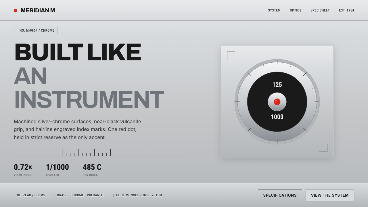 Leica M Silver ChromeBuilt like an instrument. Brushed silver-chrome on near-black vulcanite, one…
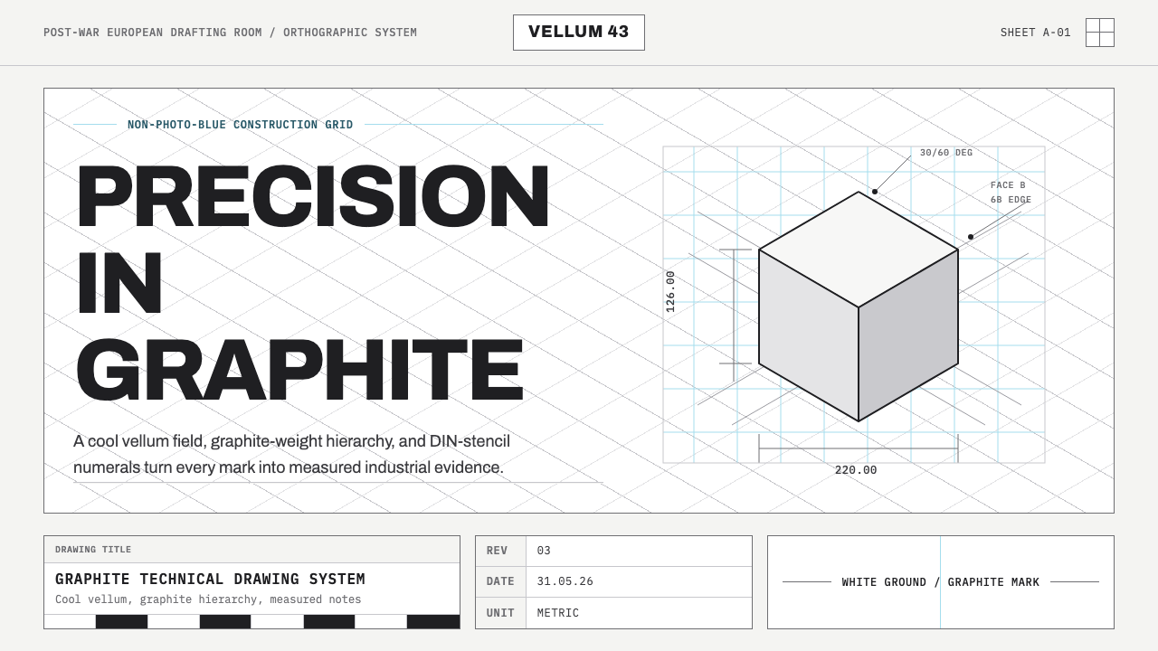 Graphite Technical DrawingDrafting-room precision. Non-photo-blue grid and graphite DIN lettering do th…
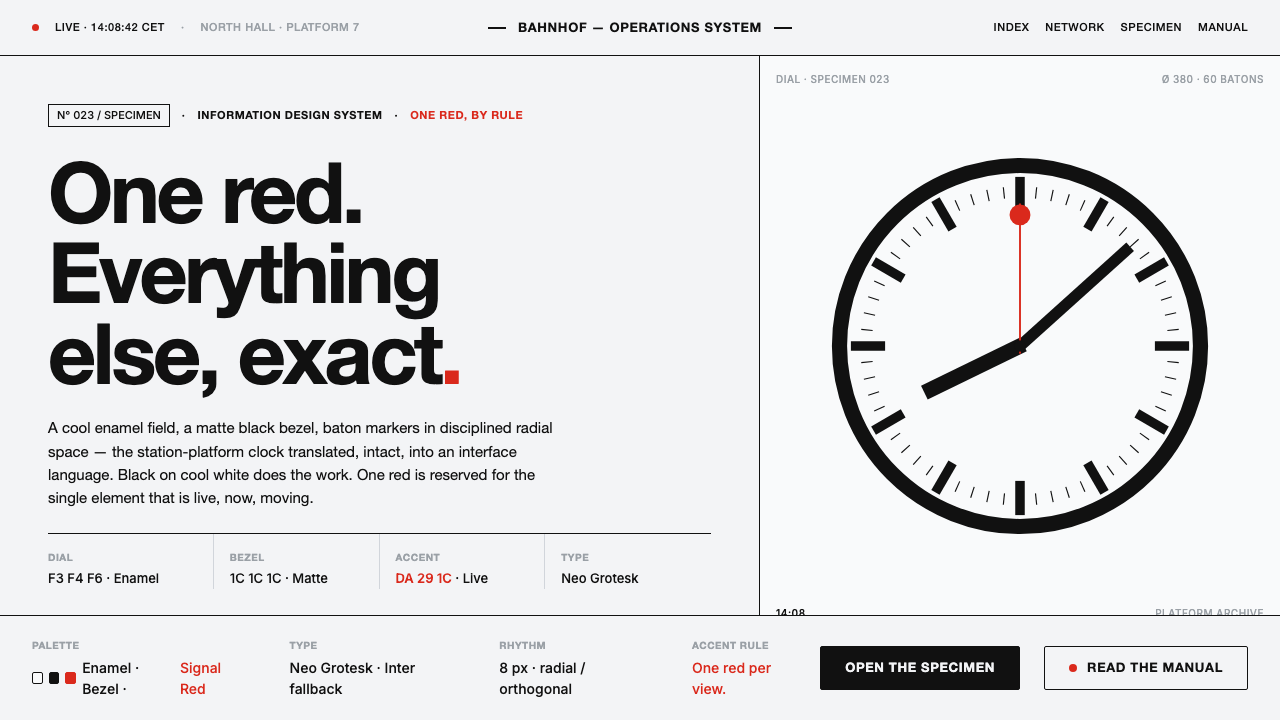 Hilfiker Railway ClockEverything exact, one thing live. Black hands on cool enamel white — one red…
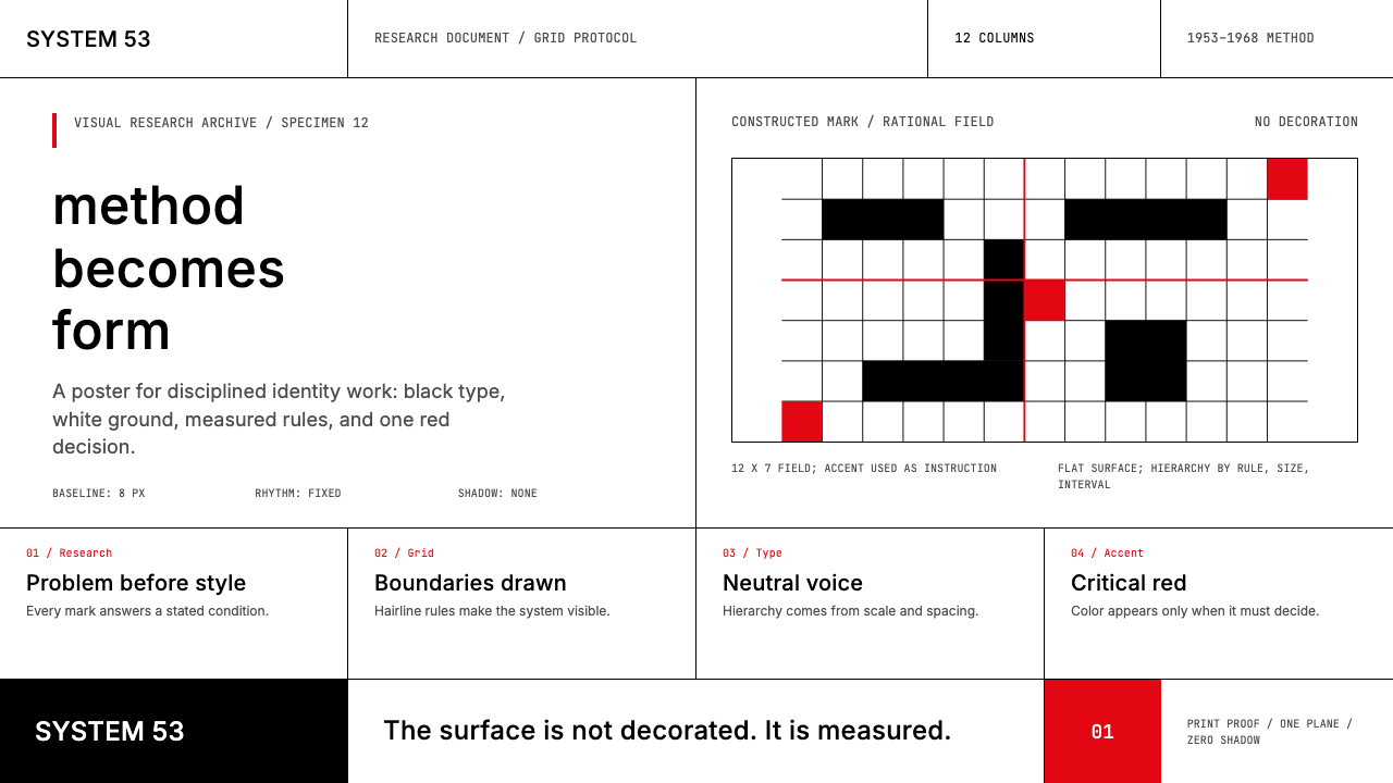 Ulm School (HfG Ulm)Clarity becomes discipline. Black-white grid, Inter grotesk, and one surgical…
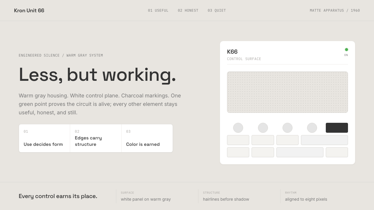 Dieter Rams / BraunQuiet by design. Warm gray, white panels, hairline grids, and one earned gree…
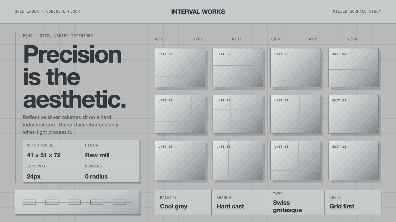 Donald Judd Milled AluminumPrecision made visible. Cool mill-silver boxes repeat on a hard concrete grid.