What is Jin-Roh Kerberos?
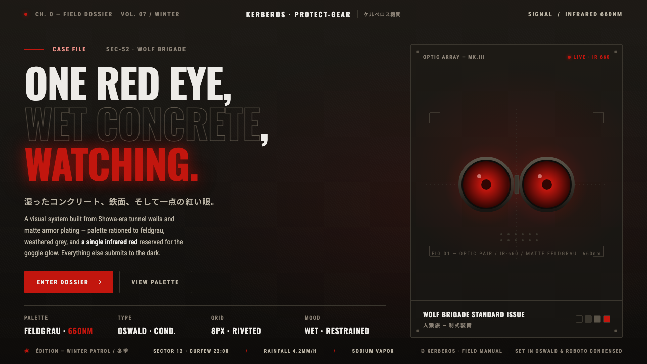
Jin-Roh turns suppression into a visual system: wet near-black concrete, matte feldgrau armor, and a single infrared-red glow breaking through an authoritarian darkness.
Jin-Roh Kerberos in brief
Jin-Roh: The Wolf Brigade is a 1999 animated film written by Mamoru Oshii and directed by Hiroyuki Okiura. Its visual language imagines a fictional alternate Japan of the 1950s and 1960s through wet Showa-era concrete, tunnels, sewers, and militarized protective equipment. The result is not futuristic spectacle but realist adult anime built from pressure, surveillance, and the weight of enclosed urban space.
The defining object is the Kerberos Panzer Cop Protect-Gear: matte armor inspired by WWII German forms, completed by a gas mask and a pair of infrared-red lenses. Against the surrounding brown-grey, black, and damp concrete, the lenses become the only saturated sign in the image. Red is not decoration here. It is a warning, a presence, and a concentrated point of life inside an otherwise desaturated authoritarian world.
As a design style, Jin-Roh Kerberos depends on subtraction. Surfaces are drained of brightness, materials lose their polish, and atmosphere replaces ornament. The eye is guided by weight, enclosure, and contrast rather than by decorative pattern. Its power comes from making restraint feel physical: the page or interface should seem cold, heavy, damp, and difficult to escape.

Where does Jin-Roh Kerberos come from?
Jin-Roh was released in 1999, with Mamoru Oshii as writer and Hiroyuki Okiura as director. Its setting is a fictional alternate Japan situated in the 1950s–60s Showa period, a historical frame translated into an atmosphere of aging infrastructure, wet concrete, and authoritarian control. The film’s visual identity therefore belongs as much to political allegory and world-building as to character design.
The work is associated with realist adult anime, political allegory, and authoritarian world-building. Those movements are visible in the refusal to make repression abstract or ornamental. Instead, the world is communicated through surfaces and equipment: tunnels feel damp, concrete feels nearly black, and protective gear occupies the image with blunt physical authority. The setting is fictional, but its visual logic is deliberately grounded.
Production I.G and Bandai Visual are part of the work’s Japanese production context. Within that context, the film’s most important design decision is its discipline of atmosphere. The palette does not distribute attention evenly. Most of the image remains cold, dark, and desaturated, allowing the red lenses to function as a recurring visual signal rather than a general accent color.
The Kerberos Panzer Cop gives the style its emblematic silhouette. The Protect-Gear joins matte, WWII-German-inspired armor to a gas-mask face whose infrared-red lenses conceal rather than humanize the wearer. That combination turns the figure into a controlled visual block: heavy, anonymous, and difficult to read. Jin-Roh Kerberos emerges from this union of setting, political allegory, and disciplined focal contrast.
What defines the Jin-Roh Kerberos look?
Palette
The palette is built from near-black concrete, cold brown-grey, matte feldgrau, and weakly differentiated dark surfaces. Saturation is withheld almost everywhere. The infrared red of the goggle lenses is the exception, and its rarity gives it authority. Red should feel like a signal cutting through suppression, not like a decorative brand accent distributed across the composition.
Wet Concrete
Concrete is not a neutral background. It carries dampness, enclosure, and institutional age. Use near-black planes with restrained tonal variation rather than clean white space or polished surfaces. The material should suggest water, tunnels, and infrastructure that has absorbed years of pressure. Texture may be present, but it must remain subdued and structural rather than decorative.
Feldgrau Armor
The Protect-Gear is matte, heavy, and deliberately resistant to visual intimacy. Its feldgrau brown-grey surface absorbs attention without sparkling or inviting touch. In an interface or editorial composition, large dark blocks can perform the same role: they establish mass, authority, and anonymity. Edges should feel controlled and functional, with no ornamental gloss.
Infrared Focus
The red goggle glow is the style’s organizing event. It should appear as a concentrated, almost bodily signal inside a field that otherwise suppresses color. Its placement needs surrounding darkness and quiet; if red is repeated everywhere, it loses its role as the exceptional sign. The glow can be intense, but the surrounding composition must remain restrained.
Concealed Identity
The gas mask turns the face into an unreadable instrument. This is a visual principle, not merely a costume detail: identity is replaced by equipment, and expression is replaced by a controlled surface. Cropping, silhouettes, and blocked facial imagery can carry the same tension. The viewer should sense a person beneath the system without receiving easy emotional access.
Suppressed Composition
Composition should feel compressed by walls, darkness, and institutional weight. Leave room for the subject, but do not make the space airy or celebratory. Quiet margins, dense dark fields, and severe alignment create the sense that every element is under control. The style gains force when the composition withholds release and lets the red signal carry the emotional pressure.

Who shaped Jin-Roh Kerberos?
Oshii wrote Jin-Roh and shaped the film’s fictional alternate Japan as a setting for political allegory and authoritarian world-building. His contribution is visible in the way the environment carries meaning: tunnels, sewers, concrete, and protective equipment are not neutral scenery but parts of a system of suppression. For design purposes, his role points toward atmosphere that communicates politics without requiring decorative explanation.
Okiura directed the 1999 film and gave its visual world a grounded, realist weight. Under his direction, the Kerberos figure is not presented as a bright fantasy emblem but as a dense physical presence within wet and nearly black spaces. His role is central to the style’s discipline: the drama comes from material, darkness, and controlled contrast rather than visual excess.
Production I.G belongs to the Japanese production context of Jin-Roh and represents the industrial framework in which the film’s adult, realist animation language was realized. In the style library, that association supports a reading of the work as designed world-building: the armor, concrete, tunnels, and red lenses operate together as a coherent system rather than as isolated images.
How do you use Jin-Roh Kerberos today?
For presentation covers, use a near-black field or a wet concrete atmosphere with a single dominant subject treated as a heavy silhouette. The title should remain controlled and direct, placed with enough darkness around it to preserve tension. Content slides should keep the same restraint: muted surfaces, quiet hierarchy, and red reserved for the decisive term or signal. Data slides can treat charts as institutional instruments, using dark masses for the baseline information and the infrared red only to identify the critical change.
For web dashboards and pricing pages, Jin-Roh Kerberos is suited to products that need to feel operational, guarded, or authoritative. Use feldgrau and brown-grey surfaces to separate panels without making the interface colorful. Reserve red for alerts, active states, or the most consequential price or status signal. Cards should feel like equipment panels rather than soft promotional tiles, while navigation should stay terse and functional.
For editorial and marketing work, the style supports campaigns about security, infrastructure, political tension, systems, and controlled power. A feature page can alternate between dense near-black passages and quieter concrete-toned fields, allowing a single red detail to recur as a narrative marker. Headlines should be firm and economical; imagery should favor armor, masks, enclosed passageways, and material surfaces over cheerful lifestyle scenes.
For posters, reports, and long-form articles, build the page around pressure and withheld information. Let margins feel deliberate, let dark fields carry most of the visual mass, and use the Protect-Gear silhouette as a structural anchor rather than as a decorative illustration. The style works best when the reader discovers the red signal after entering a largely silent composition.
The common mistake is treating Jin-Roh as a generic military aesthetic and adding badges, camouflage, metallic shine, or repeated red accents. That approach loses the source material’s suppression. The essential discipline is scarcity: matte rather than glossy, wet rather than polished, near-black rather than merely dark, and one concentrated red signal rather than a full accent palette. The armor should feel like a consequence of the world, not a costume pasted onto it.

Jin-Roh Kerberos — FAQ
Is Jin-Roh Kerberos simply a military or tactical design style?
No. Military equipment is its most visible vocabulary, but the deeper system is suppression. The style depends on wet near-black infrastructure, desaturated feldgrau surfaces, concealed identity, and a controlled red signal. Remove the concrete, darkness, and political pressure, and the armor becomes a costume. The style is strongest when equipment, environment, and atmosphere all express the same authoritarian world.
Can this style work on a light background?
It can be adapted, but fidelity becomes weaker. The source material depends on near-black wet concrete and a largely desaturated field, so a light ground changes the emotional structure. If a lighter variation is necessary, keep the surfaces dirty, cold, and materially restrained, then preserve the red signal as a rare focal event. A clean white canvas with scattered tactical details will read as a different style.
How should the infrared red be used?
Treat it as a signal, not as a general brand color. It should identify danger, presence, activation, or the most consequential piece of information. Its power comes from the surrounding absence of color. If it appears in every button, border, label, and illustration, it stops behaving like the goggle glow and becomes ordinary decoration. Keep the field quiet so the red can remain psychologically charged.
What makes the Protect-Gear important to the visual language?
The Protect-Gear concentrates the entire system into one figure. Its matte, WWII-German-inspired armor supplies mass and anonymity; the gas mask conceals identity; and the infrared-red lenses create the only saturated focal signal. It is therefore more than a character costume. It is a compact diagram of the world’s values: control, concealment, physical force, and a small but unmistakable sign of life.
Related design styles
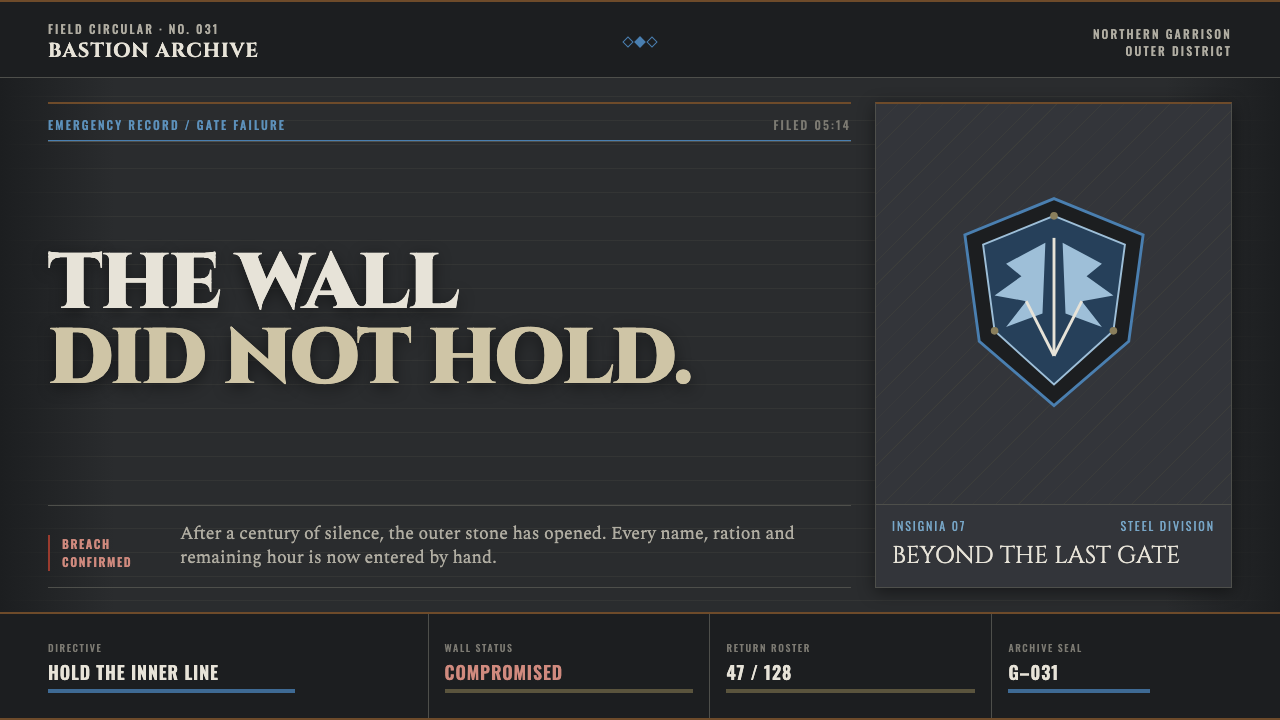 Attack on Titan (2013)Dread becomes duty. Stone-gray bands, engraved caps and one steel-blue crest…
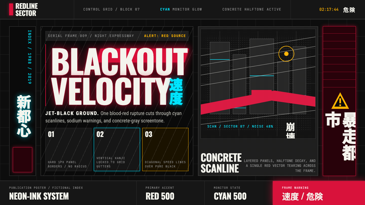 Akira (Otomo)Cyberpunk at impact. Kaneda red, cyan kanji, halftone concrete, and diagonal…
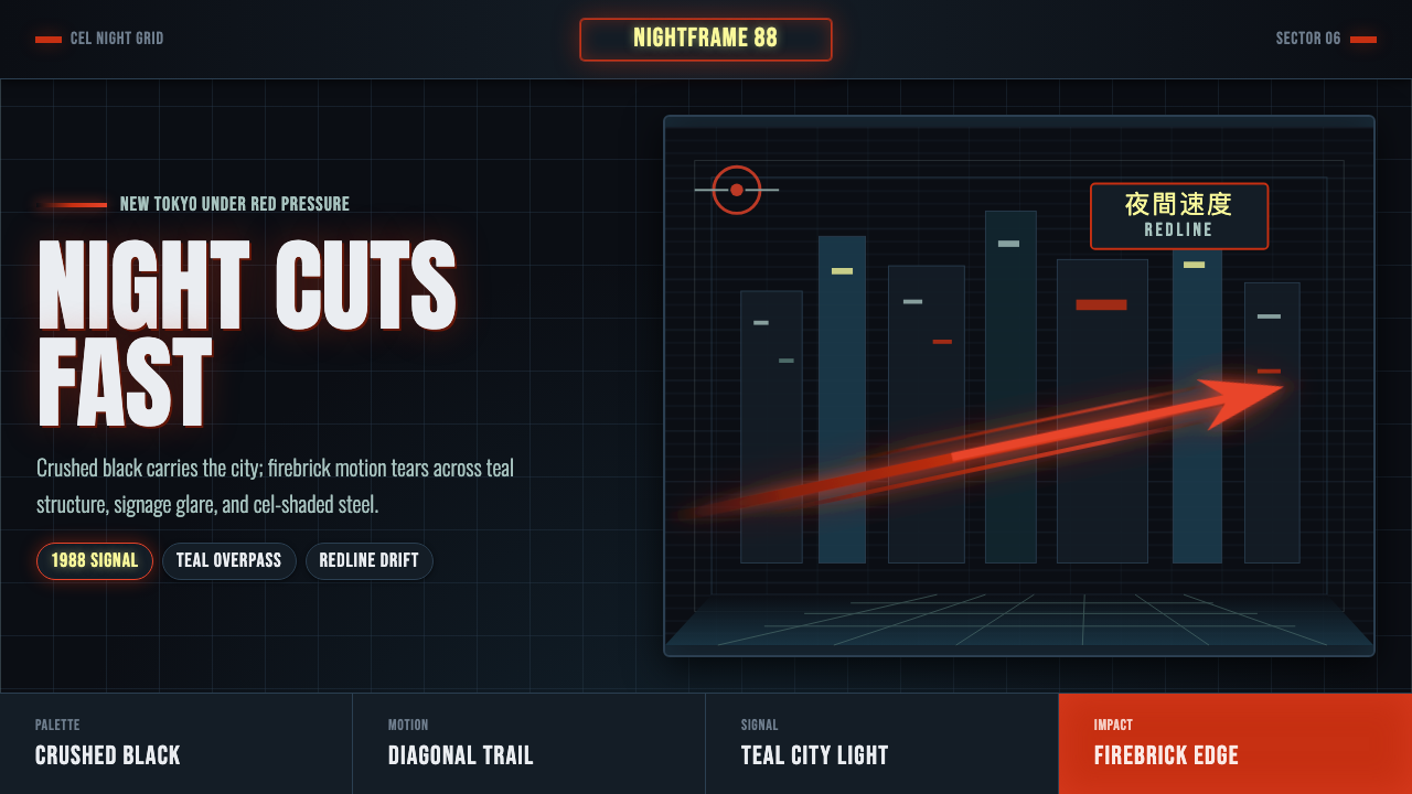 Akira Neo-TokyoNight moves fast. Firebrick trails cut crushed black, teal grids, and condens…
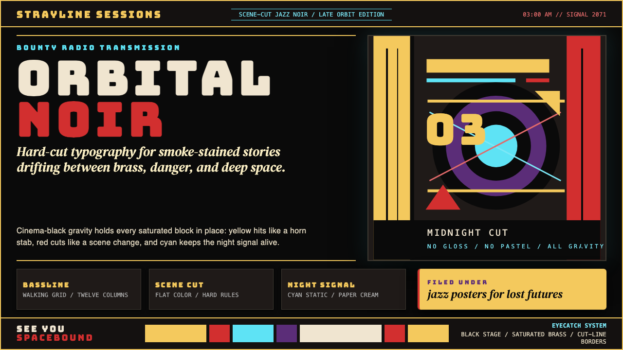 Cowboy Bebop Jazz-NoirCool at 3 AM. Bungee type, jazz yellow, red cuts, and cyan rules hit deep bla…
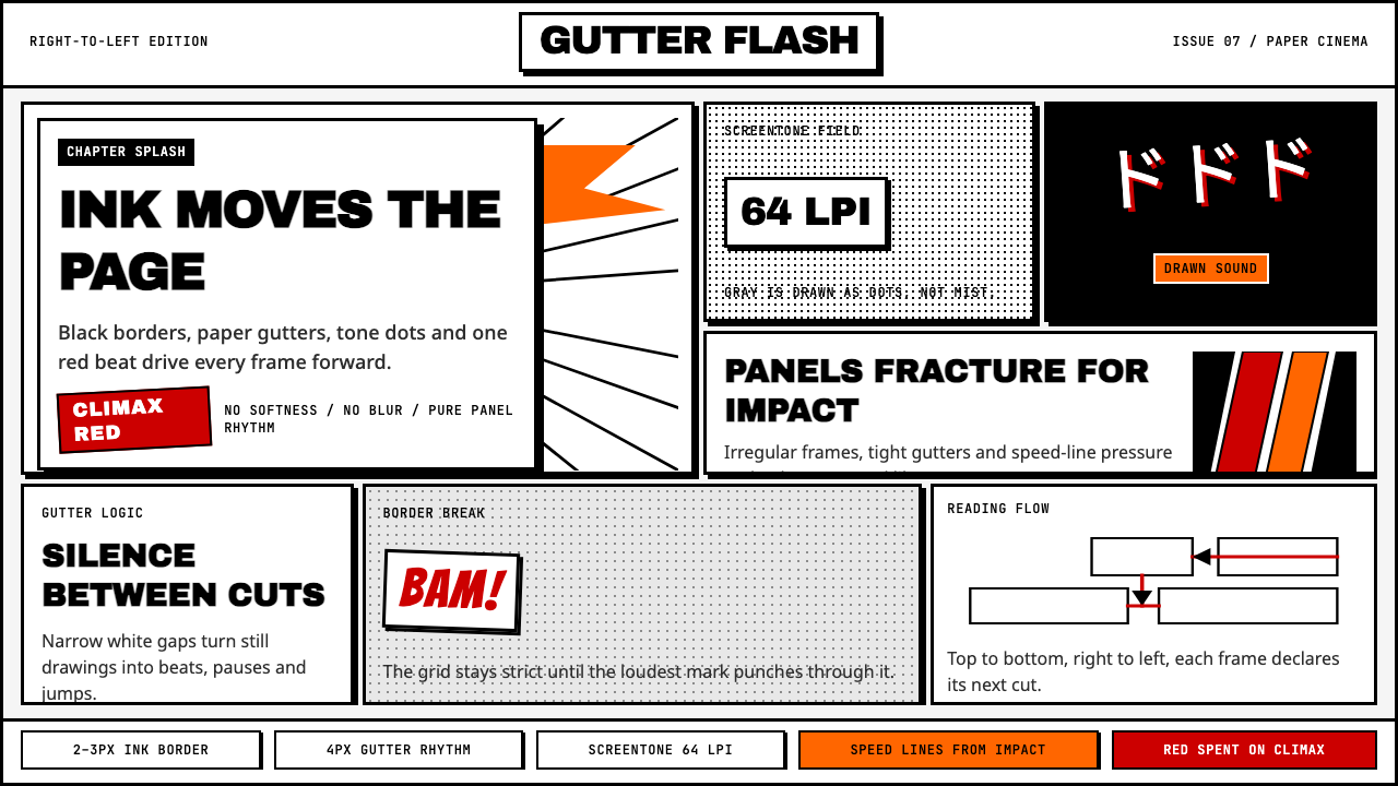 Manga Panel LayoutCinema in ink. Black panels, screentone dots, speed lines, and one red strike.
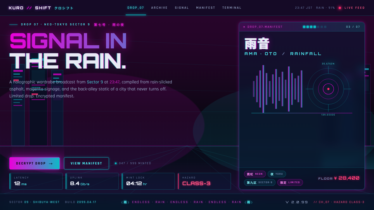 Neo-Tokyo 2099Endless rain, a thousand signs. Magenta vs cyan on near-black asphalt, kana b…