What is Jet Set Radio?
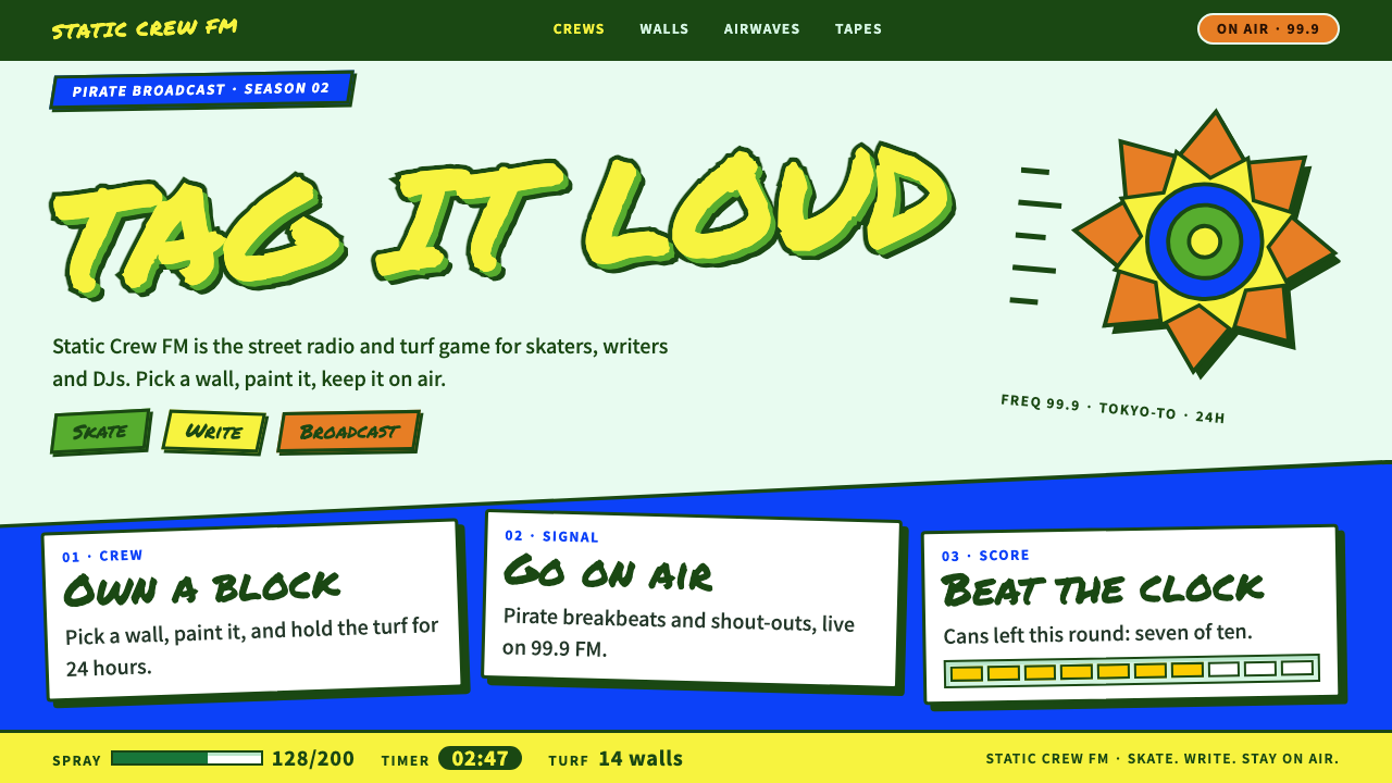
Jet Set Radio turned cel-shaded rendering into a street collage: pale mint ground, thick green outlines, yellow tags, an orange burst and cobalt blocks, everything tilted and stickered as if it were already moving.
Jet Set Radio in brief
Jet Set Radio is a 2000 Dreamcast game from Smilebit, a studio within Sega. Players inline-skate through a fictional Tokyo-to as members of a street crew, tagging walls with spray paint and racing for territory, while a pirate radio DJ called Professor K keeps the broadcast going in the background. The game became famous for its cel-shaded look: flat blocks of colour, thick outlines and hard steps of shadow that make a three-dimensional world look like a moving comic.
The design system described here takes its ground from the game’s box-art collage rather than from the in-game screens. The base is a pale mint. On top of it sits a green-and-yellow tag outlined in deep green, a lemon sticker, an orange burst and a cobalt sky block. Elements are overlapped and tilted, with speed lines and paint drips, and nothing sits level.
It is a playful style, not a menacing one. The game borrows from street and graffiti culture, but the interface language is bright, sticker-like and cheerful. The mood is closer to a pop-music poster from the turn of the millennium than to a gritty documentary about the street.

Where does Jet Set Radio come from?
Jet Set Radio was released in Japan on 29 June 2000 for the Sega Dreamcast, and its sequel, Jet Set Radio Future, followed in 2002. The visual period captured here runs from about 2000 to 2002, the height of what is now remembered as Y2K pop design: glossy, optimistic, a little futuristic and delighted by new technology. The game sits right in that moment and became one of its most recognisable emblems.
The look was a technical and an artistic decision at once. Cel-shaded rendering, the technique of drawing a three-dimensional model so it appears hand-inked, was still unusual in games. Jet Set Radio used it not as a gimmick but as an identity: the world is made of flat colour, outlines and graphic shapes, which is why it still looks fresh decades later while many early polygon games look dated.
Several names are connected to the project. Masayoshi Kikuchi and Ryuta Ueda are listed among its key figures, Hideki Naganuma is the musician whose funky, sample-heavy soundtrack is inseparable from the game’s character, and Eric Haze, a New York designer and graffiti-culture figure, is associated with the game’s lettering and logo. Together they gave the project a graphic voice that feels both Japanese and rooted in the street.
Three currents meet in the result. The first is cel-shaded rendering, the technical look of flat colour and thick outline. The second is Y2K pop design, with its bright colour and playful forms. The third is Japanese street and graffiti culture, the subject matter of the game, filtered through a bright pop sensibility instead of a documentary one.
What defines the Jet Set Radio look?
Color
The ground is a pale mint. On it, bright flat colours are used as blocks: a lemon yellow for stickers and tag fills, a deep green for outlines and lettering, an orange for bursts and warnings, and a cobalt blue for sky-like panels. There are no soft gradients and no mixed tints; every colour is a clean, flat fill, as it would be on a cel.
Outlines and shadow
Thick, confident outlines in deep green wrap almost every shape, and shadows, where they appear, are hard offset steps rather than soft blurs. This is the cel-shaded signature: two or three flat tones per object, never a smooth ramp. Outlines also give each element the look of a sticker cut out and pasted down.
Typography
Headlines look like graffiti tags: bold, hand-drawn, chunky letterforms with a heavy outline and a fill in a contrasting colour. They are tilted and sometimes stacked on top of each other. Supporting text is simple, heavy and legible so the tag lettering can stay expressive without hurting readability.
Composition
Layouts are collage. Panels are tilted, overlapped and stuck down like stickers on a wall, with speed lines and paint drips to suggest motion. The eye is meant to be carried diagonally across the page. Alignment to a strict grid is the opposite of the point: the energy comes from deliberate disorder, kept readable by clear colour blocks.
Shapes and ornament
Starbursts, arrows, speech-bubble-like callouts and spray-paint splatters are the vocabulary. They are flat, outlined and bright, used to mark importance or direction rather than to decorate empty space. Anything that can be a sticker should be a sticker.
Tone and motion
The tone is fast, cheerful and rebellious in a friendly way. Motion is snappy, with elements sliding in at an angle, bouncing slightly and settling with a tilt. It echoes a radio broadcast: jumpy, rhythmic and full of personality, never smooth and corporate.

Who shaped Jet Set Radio?
Kikuchi is listed among the key figures of Jet Set Radio. His name is tied to the vision of a game that fused skating, graffiti and radio into a single bright package, and to the decision to make cel-shading the core of its look.
Ueda is the second developer named in the origin notes. He belongs to the Smilebit team that built the Dreamcast game in 2000, when the studio helped make cel-shaded rendering a mainstream, recognisable visual style.
Naganuma is the musician whose soundtrack defines the game’s radio-broadcast character. His rhythmic, sample-heavy tracks are why the visual style feels in motion even on a still page: the design borrows the beat.
Haze is a New York designer connected to graffiti culture and associated with the game’s lettering and logo. His involvement is why the tag-style type feels rooted in real street lettering rather than imitated from a font menu.
How do you use Jet Set Radio today?
On slides, Jet Set Radio is best used for covers and section openers that need energy: a pale mint ground, one oversized tag-style title outlined in deep green and filled in yellow, a tilted cobalt block and an orange burst. Content slides can keep the tilt in a header strip while the body stays flat and readable. It suits youth culture, music, games, events and creative-agency pitches.
For web interfaces, treat it as a skin for entertainment products: game launchers, fan sites, music players, event pages and youth-oriented apps. Buttons become tilted outlined stickers, headers get a tag-style wordmark, and panels overlap slightly. Keep forms and dense text on flat, level panels so that usability does not suffer from the tilt.
On pricing and sign-up pages, use the style sparingly but with confidence. Plan cards can be tilted by a small degree, with a starburst marking the recommended one. Because the language is cheerful rather than aggressive, it works for products aimed at young audiences who want to feel like part of a crew.
In editorial and marketing work, it shines for posters, social tiles and launch announcements. Layer a big tag headline over a mint ground, add speed lines, and stack a few stickers. A full-bleed collage built from only these few colours reads from across a room and is easy to repeat consistently across a campaign.
The most common mistake is making it dark and grimy. Switching to a black background, adding realistic spray texture or using muddy tones turns a bright pop style into generic street-crime imagery, which is precisely what this system avoids. A second mistake is tilting everything including body text, which makes the page tiring to read. Tilt the shapes, level the paragraphs.

Jet Set Radio — FAQ
What is Jet Set Radio style?
It is the visual language of Smilebit’s 2000 Dreamcast game Jet Set Radio: cel-shaded flat colour, thick outlines, hard shadow steps, graffiti-tag lettering and tilted collage layouts. This system uses the box-art palette of pale mint, green, yellow, orange and cobalt.
What is cel shading?
Cel shading is a rendering technique that makes a three-dimensional model look hand-drawn, with flat colour, visible outlines and shading in a few hard steps instead of a smooth gradient. Jet Set Radio helped make the technique famous, and its design language grows directly out of that look.
Is the style dark and gritty?
No. Although the game’s subject is graffiti and street crews, the design system is bright, sticker-like and cheerful. It leans on pale mint grounds and clean flat colour, and deliberately avoids the gloomy street-crime tone.
How does it relate to Y2K design?
Jet Set Radio belongs to the period around 2000 to 2002 that is now remembered as Y2K pop design, with its glossy optimism, bright colour and playful shapes. The game is one of that period’s most recognisable emblems, and this system keeps its sense of a cheerful, slightly futuristic world.
What should I avoid when using it?
Avoid dark backgrounds, realistic textures and tilted body text. Keep colours flat and outlines thick, tilt shapes but not paragraphs, and keep forms and dense copy on level panels so the page remains easy to use.
Related design styles
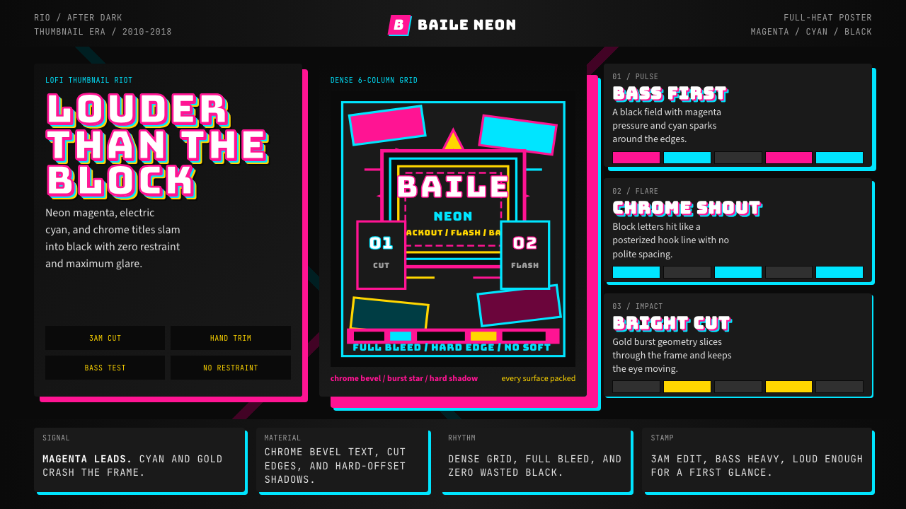 Funk Carioca FavelaMaximalist and unruly. Magenta, cyan, and chrome slam into black at thumbnail…
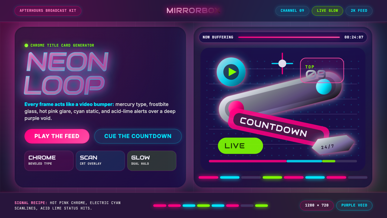 MTV Y2K (2000s)Maximum-volume Y2K. Hot pink chrome, cyan scanlines, and lime hits burn over…
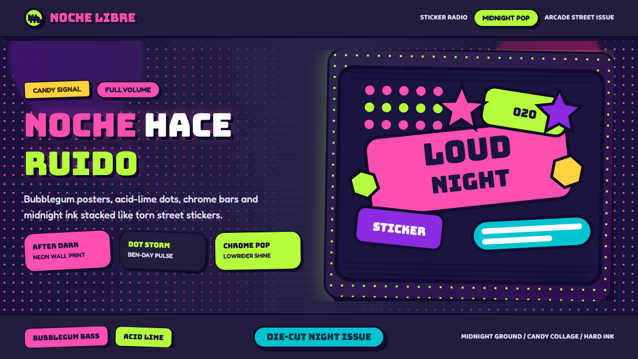 Bad Bunny YHLQMDLGMaximal night-pop collides. Bubblegum pink and acid lime stickers glow on mid…
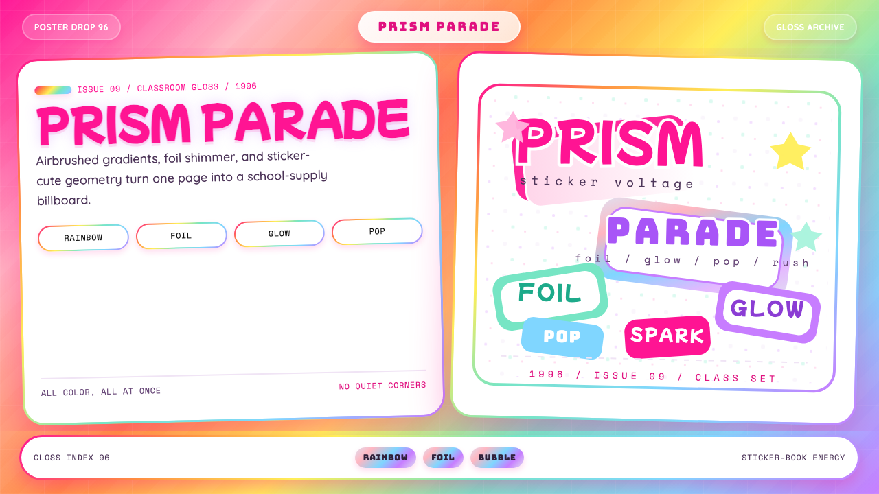 Lisa Frank Rainbow (90s)Pure sticker-saturation. Rainbow gradient, magenta glow, foil shimmer, bubbly…
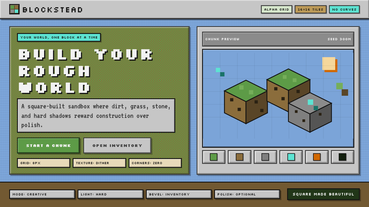 Minecraft VoxelUgly becomes buildable. Grass green, dirt brown, hard bevels, and 16×16 grids…
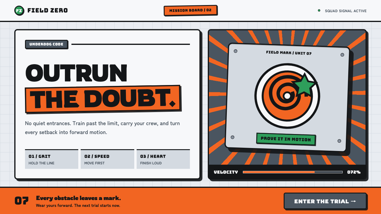 Naruto (2002 anime era)Underdog energy refuses the background. Hazard orange strikes steel-gray grid…