What is Zen Karesansui Garden?
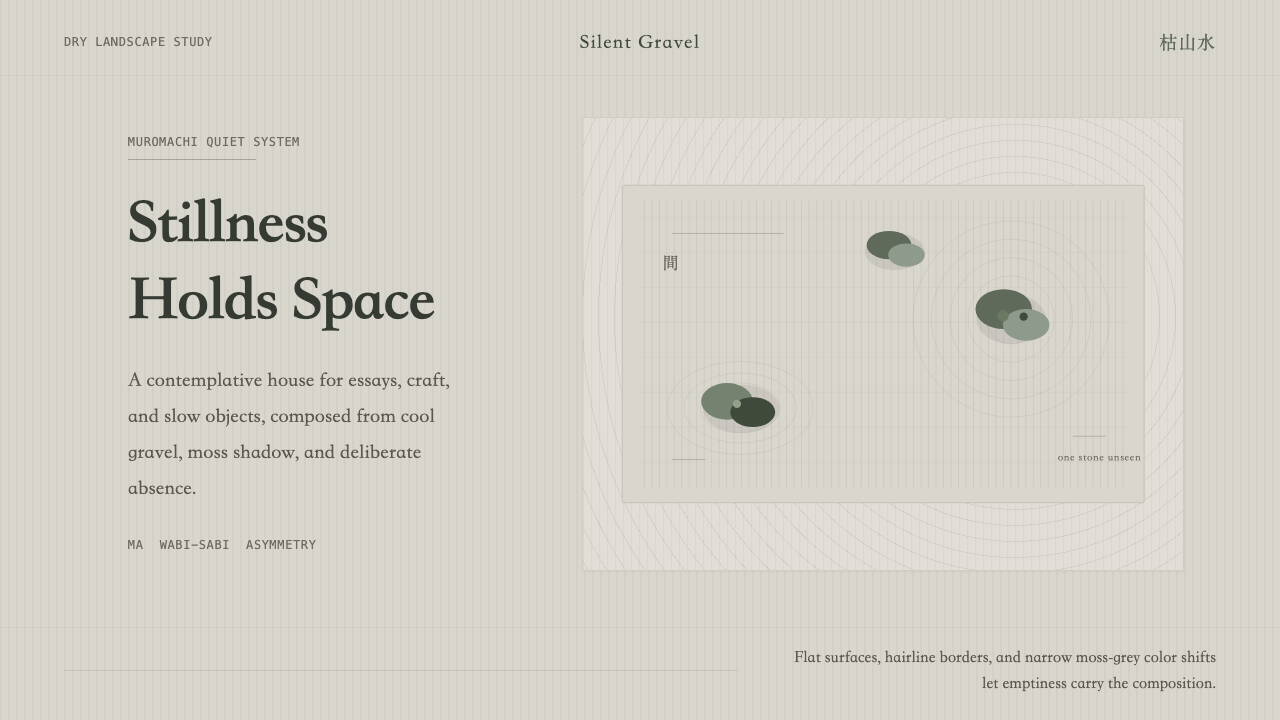
Karesansui — the Zen dry garden — proves that a nearly empty page can carry more weight than a full one, if what remains is placed with total conviction.
Zen Karesansui Garden in brief
Karesansui is a design language derived from the dry rock gardens of Japanese Zen monasteries: raked grey gravel standing in for water, a handful of weathered stones standing in for mountains or islands, and long stretches of intentional nothing standing in for everything else. Translated into a visual system for screens and pages, it becomes a discipline of cool neutral grounds, muted moss-toned accents, asymmetric placement, and calligraphic serif type — with restraint treated not as an aesthetic choice but as the entire point.
The system is built around a single idea: emptiness is not the absence of content, it is content. Every element that survives into the final composition must justify its presence by standing alone, with enough surrounding space that the eye has to travel to find it. Where most design systems fill a canvas and then look for places to cut back, karesansui starts from the empty canvas and asks how little can be added before the composition fails.
Visually, this produces work that reads as quiet rather than plain. The palette rarely leaves a narrow band of stone grey and weathered moss green; ornament is almost entirely absent; and layout favors off-center placements over centered symmetry, echoing the way real karesansui gardens are composed so that no single vantage point ever reveals the whole arrangement at once.
Where does Zen Karesansui Garden come from?
Karesansui — literally 'dry mountain water' — belongs to a tradition of Japanese garden-making that reached its defining form during the Muromachi period, a span running roughly from the fourteenth to the sixteenth century when Zen Buddhism held deep influence over the ruling warrior class and its aesthetic tastes. Unlike the pond-and-stroll gardens that had dominated earlier Japanese landscape design, karesansui gardens use no water at all. Gravel is raked into patterns that suggest ripples and currents; stones stand in for mountains, islands, or, in some readings, tigers crossing a river. The garden is not a miniature of nature so much as a distillation of it — nature reduced to the handful of gestures that still make it legible as nature.
The most studied example, and the one most design systems drawing on karesansui ultimately point back to, is the rock garden at Ryōan-ji in Kyoto. Fifteen moss-covered stones sit in five loose groupings across a rectangle of raked pale chert gravel, viewed from a wooden veranda along one side. The arrangement is precise enough that generations of scholars have proposed mathematical and compositional theories for it, yet its most famous feature is perceptual rather than geometric: from no single point on the veranda can a viewer see all fifteen stones at once. One stone is always hidden behind another, no matter where you sit. Whether this was deliberate design or an accident later mythologized, it has become the garden's defining lesson — completeness is not the same as visibility, and a composition can be whole without ever being fully seen.
The philosophical architecture behind these gardens comes from Zen Buddhist practice, particularly its association with meditation and with the aesthetic sensibility known as wabi-sabi — a comfort with imperfection, impermanence, and the beauty of weathered, incomplete things. Zen monk and garden designer Musō Soseki, active in the fourteenth century, is among the historical figures credited with shaping temple garden design as a form of religious practice rather than mere ornamentation for monastery grounds; in this tradition, arranging stones and raking gravel was itself a contemplative discipline, not a decorative afterthought bolted onto a building.
Central to how these gardens are read — and to how the design system built from them is used — is the concept of ma, often translated as 'negative space' but more precisely meaning the interval or gap between things that is itself alive with meaning. Ma is not empty in the sense of being unused; it is the space that lets the stones, the rake lines, and the moss register as distinct events rather than a continuous field. A karesansui-derived design system imports this directly: the space between elements is treated with the same intentionality as the elements themselves, and removing that space would collapse the composition as surely as removing a stone.
What defines the Zen Karesansui Garden look?
Color
The palette lives almost entirely inside a narrow band of cool stone grey, running from pale chert to a deeper ash, with a single muted moss green reserved for the 'stones' of the composition — the elements meant to anchor attention. Warm hues, saturated color, and anything resembling a brand-bright accent are excluded on principle; color here signals weathering and age, not energy. Where a system needs a secondary tone, it stays inside the same desaturated, overcast family rather than introducing a genuinely new hue.
Typography
Type carries a calligraphic, brush-inflected serif character — letterforms that recall the disciplined stroke-work of East Asian calligraphy rather than the geometric sans-serifs common to most digital interfaces. This is a deliberate departure from the crisp, mechanical type common to minimalist systems: karesansui typography is quiet but not clinical, and its serifs carry a trace of the hand even in a fully digital rendering. Hierarchy is built through generous spacing and scale contrast rather than through weight extremes or color.
Asymmetric Placement
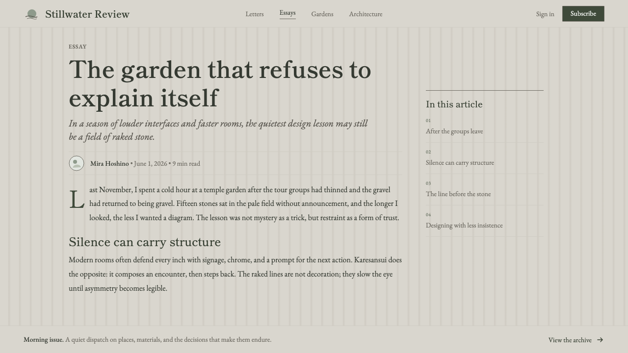
Composition follows the logic of the stone groupings at Ryōan-ji: elements cluster in uneven, off-center arrangements rather than centered or evenly gridded layouts. A page built this way might place its single most important element well off the vertical or horizontal center, letting the surrounding space do the work of drawing the eye toward it. This asymmetry is not randomness — it mirrors the careful, almost mathematical irregularity of the historic garden, where imbalance is calculated rather than accidental.
Negative Space (Ma)
Space is not a gap left over after placing content — it is itself a designed element, following the concept of ma. Margins run long, gaps between sections are generous well past what most layouts would consider comfortable, and single elements are frequently given an entire visual field to themselves. The test for whether a composition has succeeded is not how much fits on the page, but whether every remaining element still reads as singular and deliberate once the space around it is in place.
Texture over Ornament
Where most restrained systems remove texture along with ornament, karesansui keeps a specific kind of texture — the rake-line pattern of gravel, the mottled surface of weathered stone, the uneven creep of moss — while still rejecting decorative flourish entirely. Texture here reads as evidence of time and process, not as surface embellishment; a raked line pattern is functional (it represents raking, an action) rather than applied for visual interest, which is what distinguishes it from ornament in the system's own logic.
Spacing and Rhythm
Rhythm across a page follows the loose, irregular clustering of the garden's stone groupings rather than a strict repeating grid. Sections do not arrive at evenly spaced intervals; instead, groupings of related content sit close together, separated from the next grouping by a noticeably longer gap, echoing the way the fifteen stones at Ryōan-ji fall into five uneven clusters rather than a uniform scatter. This produces a reading rhythm that feels considered rather than mechanical — pause, cluster, long pause, cluster.
Restraint as Discipline
The system's most demanding trait is behavioral rather than visual: every addition must be argued for. Because the palette, the typography, and the spatial logic are all already minimal, the temptation in applying this style is to add 'just one more' accent, icon, or color to relieve the starkness — and doing so breaks the discipline faster than in almost any other restrained system, because karesansui has no ornamental slack built in to absorb the addition.

Who shaped Zen Karesansui Garden?
The rock garden at Ryōan-ji in Kyoto — fifteen moss-covered stones set in raked chert gravel, arranged so no viewpoint reveals all of them at once — is the single most referenced karesansui composition in design history, and its makers remain anonymous. That anonymity is itself instructive: the garden is treated as an artifact of a tradition and a practice rather than the signature work of an individual author, which is part of why karesansui reads as a system of principles rather than a personal style.
A Zen monk, garden designer, and influential teacher active in the fourteenth century, Musō Soseki is among the historical figures most closely tied to establishing temple gardens as sites of religious contemplation rather than decorative landscaping. His approach treated the act of designing and maintaining a garden as inseparable from meditative practice, a framing that still underlies how karesansui-derived design work is meant to be approached: with attention and restraint rather than as a purely decorative exercise.
Karesansui developed within, and remains inseparable from, the broader practice of Zen Buddhism as it took root in medieval Japan. The gardens were built inside monastery walls as aids to meditation and as physical embodiments of Zen teaching, not as public ornament. Understanding this context explains why the style resists anything that could read as performative or attention-seeking — the visual language grew out of a practice whose explicit purpose was quieting the mind, not displaying wealth or status.
How do you use Zen Karesansui Garden today?
Karesansui transfers into contemporary design work as a discipline of subtraction, and it rewards restraint far more than it rewards embellishment. Applying it well means treating every element — a heading, a divider, an icon — as a stone that must justify its placement, and treating the space around it as equally designed. The style's demands are less about what to add and more about what to leave out.
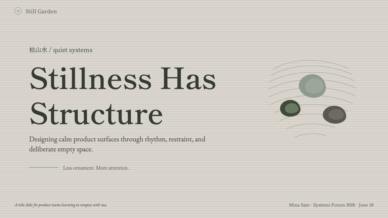
For presentation slides, karesansui suits cover pages that need to convey seriousness and calm rather than energy: a single word or short title placed well off-center, a muted moss accent used once, and a wide field of near-empty stone-grey ground doing the rest of the work. Content and data slides should resist the instinct to fill space — a single chart or a short list, set with generous margins, communicates more authority in this system than a densely packed layout would. Data should be presented with restraint: understated line work rather than saturated chart colors, letting the single moss tone carry emphasis rather than a multi-color legend.
For web interfaces, the style suits dashboards and pricing pages aimed at users who read calm and quiet as a signal of trustworthiness — wellness platforms, contemplative or slow-living products, high-end services that want to differentiate from the visual noise of typical SaaS interfaces. A dashboard built this way keeps data visualization spare and grey-toned, reserves the moss accent for the single most important state or action, and leans on generous whitespace rather than borders or dividers to separate content. Pricing pages benefit from the same asymmetric logic as the garden itself: rather than three evenly weighted tiers in a symmetrical row, one tier can be given more visual space and a slightly off-center position to signal it as the intended choice, without any bright call-out box or badge doing that work instead.
For editorial and marketing work, karesansui suits long-form writing about craft, wellness, travel, or contemplative subject matter, where a wide, quiet margin and a calligraphic serif headline can do more to set tone than any photograph. Marketing pages should resist the instinct toward full-bleed color blocks or bold contrast; instead, a single moss-toned accent appearing once per section, surrounded by generous stone-grey space, reads as more confident than repeated color blocking would.
The most common mistake when applying this style is treating its minimalism as license to add a 'pop' of brighter color or a decorative icon set to keep the page from feeling too sparse. Doing so breaks the system immediately, because karesansui's entire authority comes from the discipline of staying inside its narrow grey-and-moss palette and trusting negative space to carry visual interest on its own — a system built on restraint cannot survive a single ornamental exception without reading as a contradiction.
Zen Karesansui Garden — FAQ
Is karesansui the same thing as Japanese minimalism in general?
They overlap but are not identical. General Japanese minimalism, as it shows up in much contemporary product and interior design, draws on multiple traditions — including Zen aesthetics, but also postwar industrial design and later international minimalist movements. Karesansui is a narrower, specific source: it is minimalism rooted in the dry rock garden tradition specifically, with its own vocabulary of raked-gravel texture, moss-stone color, and calligraphic type. Where broad Japanese minimalism might use crisp geometric neutrality, karesansui carries a warmer, more weathered, more textured quality tied directly to its garden origins.
Can karesansui work with a dark background?
The style is historically and most naturally a light-ground system — the pale gravel and stone surfaces it draws from are inherently light. A dark variant is possible, but it changes the mood substantially: the quiet daylight calm of a gravel courtyard becomes something closer to a moonlit or shadowed garden, which is a legitimate but different feeling. If attempting a dark version, the moss accent should stay muted rather than brightened for contrast, and the grey ground should stay closer to a deep charcoal than to true black, preserving the stone-like, weathered quality rather than sliding into a generic dark-mode interface.
Why does this style rely so heavily on empty space instead of content?
Because the underlying concept, ma, treats the interval between things as an active carrier of meaning rather than unused leftover space. In the historic gardens, the raked gravel between the stones is not filler — it is what allows each stone to register as a distinct, considered presence rather than one item in a cluttered scene. A karesansui-derived design system imports this logic directly: removing the space around an element does not just make a layout look busier, it removes the very thing that let that element read as deliberate in the first place.
Does karesansui suit fast-paced or high-energy products?
Generally not. The style's entire value proposition is calm, restraint, and unhurried attention, which puts it at odds with products meant to feel energetic, urgent, or exciting — flash sales, gaming platforms, or fast-moving social feeds will feel contradicted by a system this quiet. It suits products where the brand promise is trustworthiness, calm, craftsmanship, or considered quality: wellness, high-end services, contemplative tools, editorial content about slow or careful subjects. Applying it to a product whose core promise is speed or excitement tends to read as a mismatch rather than a sophisticated contrast.
What is the biggest risk when a team tries to apply karesansui without deep familiarity with it?
The most common failure is mistaking sparseness for the goal, rather than a byproduct of careful placement. A page that is merely empty — with elements scattered because there weren't many to begin with, rather than deliberately positioned the way stones are positioned in the garden — reads as unfinished, not restrained. The discipline only works if every remaining element is placed with the same intentionality as a stone in a raked garden; sparseness without that intentionality is simply an empty layout, and empty layouts read as neglect rather than calm.
Related design styles
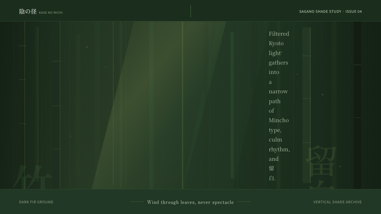 Bamboo GroveQuiet goes vertical. Fir green, Mincho type, and dappled culm rules create de…
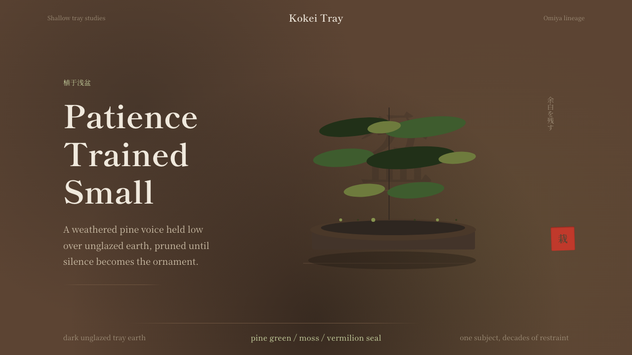 Bonsai CultivationQuiet asymmetry. Pine green rests on dark tray earth, sealed by one vermilion…
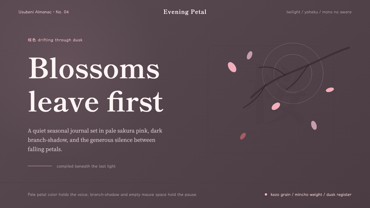 Cherry Blossom HanamiTenderness arrives in dusk. Sakura pink, branch-shadow, and Mincho type leave…
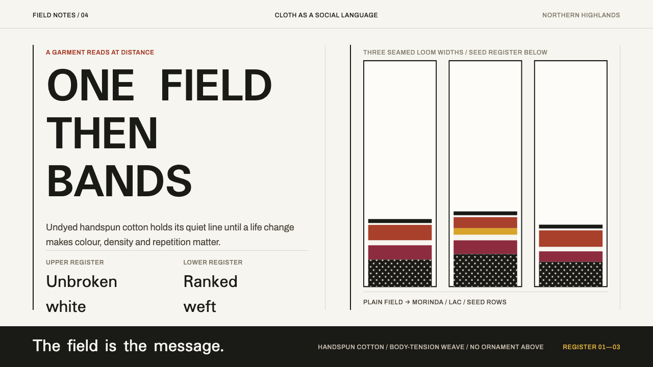 Karen Woven TunicOne field, then bands. Warm cotton white gives way to morinda registers and r…
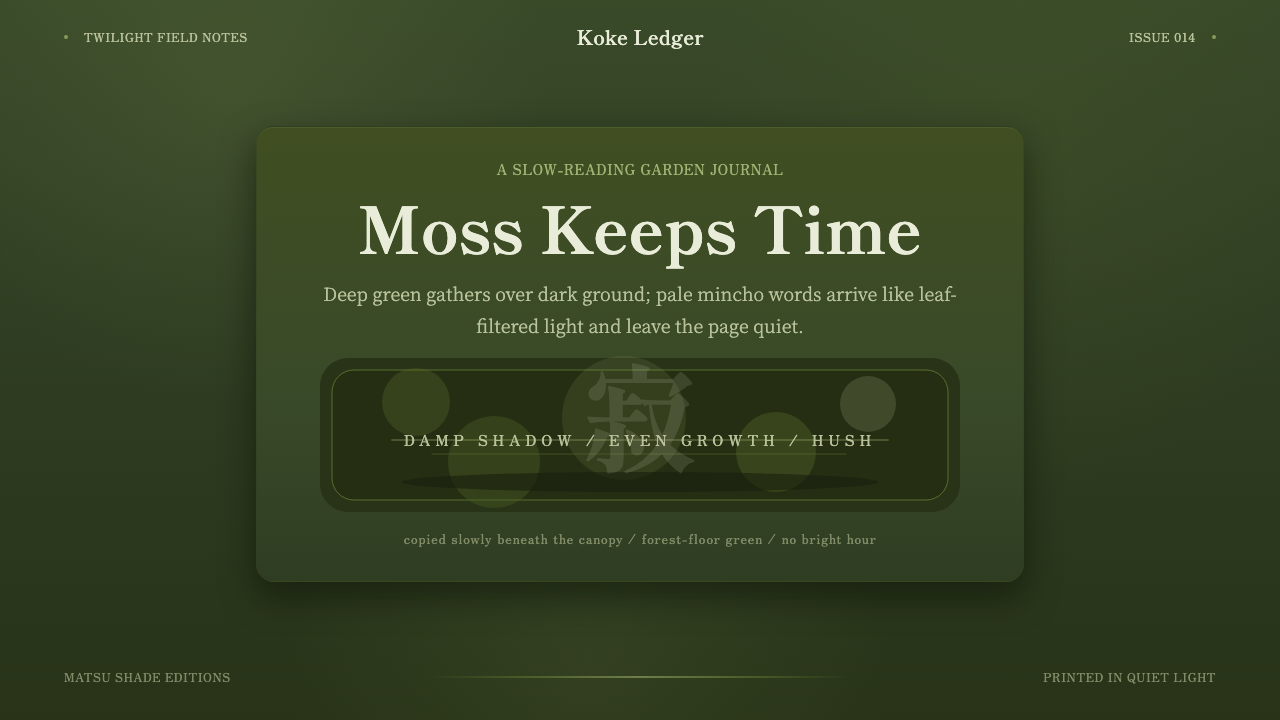 Kyoto Moss GardenStillness grows slowly. Deep moss greens, mincho serif, and dappled dark laye…
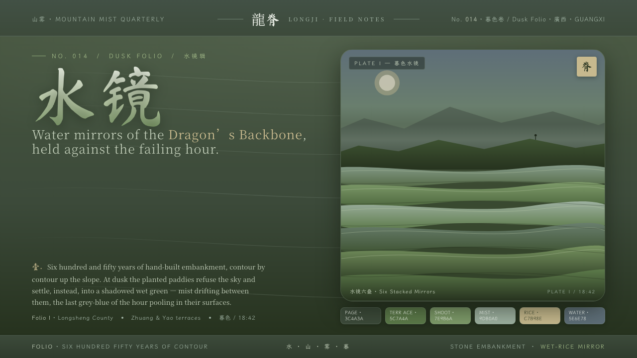 Rice TerraceRefuses the noon sky. Dusk paddy green ground, stacked water mirrors, brush c…