What is International Space Station?
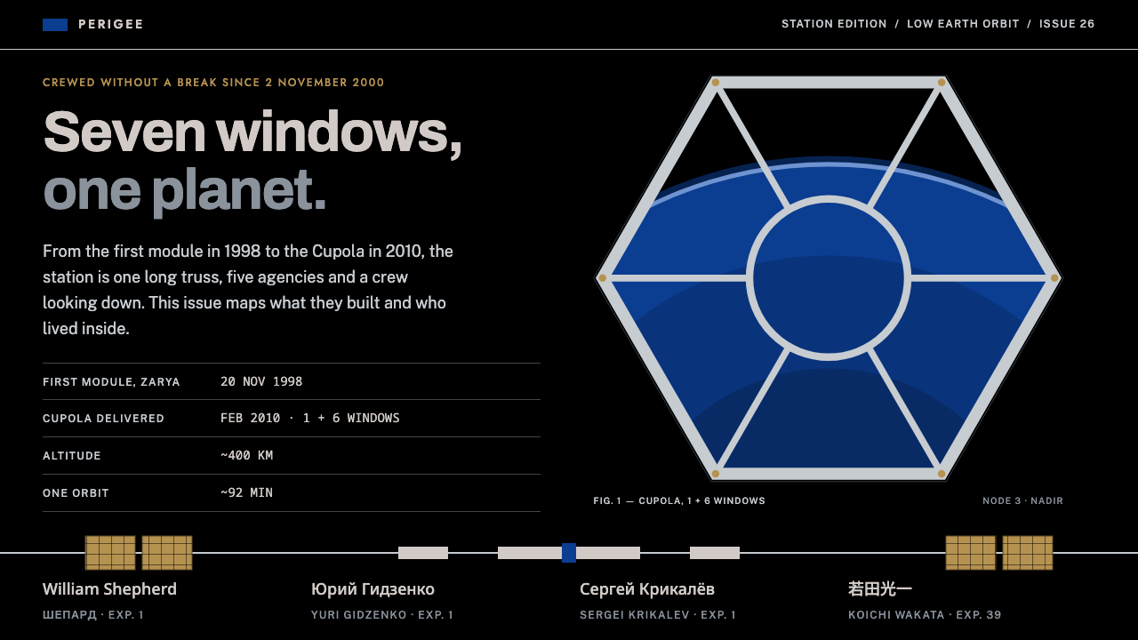
The ISS style looks at Earth through a window: pure black, cobalt blue fields, aluminium-grey engineering lines and one hexagonal Cupola frame holding the planet.
International Space Station in brief
The International Space Station style is a design language drawn from the orbiting laboratory itself: a long aluminium truss crossing the frame, white beta-cloth modules, copper-gold solar wings and nothing behind them but black. NASA blue carries the emblem fields and primary actions, and every other surface is lit like hard sunlight with no atmosphere to soften it.
Its typography combines two sources. Data and body text use a grotesque in the Helvetica lineage, in the spirit of NASA's graphics standards, while expedition titles borrow geometric capitals in the manner of mission patches. Crew names are set in the language they belong to, so Latin, Cyrillic and Japanese sit side by side, a quiet reminder that the station is an international project.
The most recognisable composition is the Cupola: a single round window ringed by six trapezoids, with Earth inside. It gives the system a hexagonal frame that works like a viewport. The style suits spaceflight explainers, scientific institutions, data reports and long-form features that want precision and awe at the same time.

Where does International Space Station come from?
The International Space Station began with the launch of its first module, Zarya, in 1998. Zarya was followed by further modules assembled in orbit, and the station has been continuously crewed since 2000. It is a partnership between the United States, Russia, Europe, Japan and Canada, and it operates in low Earth orbit, which means that its design is shaped by cooperation across space agencies as much as by engineering. The Cupola, the observation module with its famous window, was installed in 2010, and the station has remained in service through the 2020s.
Among the people associated with the station's earliest days are William Shepherd, Yuri Gidzenko and Sergei Krikalev, a crew that represents the American and Russian partnership at the heart of the project. Their presence matters visually as well as historically: the station's interiors, labels and patches mix languages and alphabets, and the design system keeps that character by setting crew names in their native scripts rather than translating them into one.
The style draws on three connected traditions. The first is international human spaceflight, with its emphasis on safety, procedure and shared standards. The second is modular orbital construction, in which a structure grows piece by piece, so that visual systems need to scale and connect like trusses and modules. The third is NASA's graphics standards and the broader mission-patch tradition, which combine strict, neutral typography with bold, symbolic emblems. Together they create a look that is rigorous but humane.
Visually, the station's surroundings are extreme. In orbit, sunlight is unfiltered, so bright surfaces are very bright and shadows are very deep, with no atmospheric haze between them. The design system turns that physical fact into a rule: strong contrast, hard light and black space. The result is an aesthetic that feels like engineering documentation and like a view from a window at once.
What defines the International Space Station look?
Pure Black Space
The background is true black, with no gradient or haze. It represents vacuum, where nothing diffuses light. Because the ground gives no ambient fill, every element placed on it looks isolated and precise, and the lack of atmosphere makes bright shapes feel sharply cut out rather than softly glowing.
NASA Blue Fields
A saturated cobalt blue is used for emblem backgrounds, key bands and primary buttons. It is the only strongly coloured field in an otherwise black, white and metallic scheme, so it works as the brand colour and the signal for action. Used sparingly, it recalls the blue of the agency's own insignia.
Aluminium Hairlines
Thin, light-grey lines divide panels and trace structure like technical drawings. They echo the station's aluminium truss and give layouts an engineered, blueprint-like order. Because the lines are fine, they organise information without adding visual weight, and they stay visible against the black ground.
Hard Sunlight Contrast
Bright surfaces are very bright and shadows are very deep, matching the way sunlight behaves in orbit without atmosphere. White modules, copper-gold solar wings and metallic details are modelled with hard highlights and dark undersides. This keeps imagery dramatic, and it keeps text legible because tones are well separated.
Paired Type Voices
A neutral grotesque in the Helvetica lineage carries data, labels and body copy, while geometric capitals borrowed from expedition patches announce mission titles. The pairing separates information from identity: one voice is for facts and the other for the story. Crew names appear in Latin, Cyrillic and Japanese, so the type system is deliberately multilingual.
The Cupola Frame
The signature container is a round window ringed by six trapezoids, forming a hexagonal viewport with Earth inside. It is used for hero images, portraits and key statistics. The shape gives the system a memorable focal device and also a narrative: whatever sits in the frame is being observed from orbit.

Who shaped International Space Station?
A NASA astronaut associated with the first crew to live aboard the station, whose arrival marked the start of continuous human presence in 2000.
A Russian cosmonaut who served in that early crew, representing the Russian side of the station's founding partnership.
A Russian cosmonaut linked with the station's first years and its assembly, a veteran figure of international spaceflight.
How do you use International Space Station today?
On slides, the style is a natural fit for science communication, research updates, institutional reports and any presentation about exploration. A cover slide can use the black ground, a hexagonal Cupola frame holding a key image and a mission-style capital title in white. Content slides can use hairline dividers and blue fields to separate sections. Data slides benefit from the high contrast: white numbers on black, a single blue highlight for the main finding.
In web interfaces and dashboards, it suits telemetry views, scientific data portals, education sites and technical documentation. A navigation bar in black with thin aluminium rules, blue primary buttons and a hexagonal hero image will feel coherent. Because the contrast is strong, it works well for dense data tables, but spacing must stay generous so that the black ground does not feel oppressive.
For editorial and marketing use, the style gives long-form features, mission recaps, museum exhibitions and event posters a feeling of scale and precision. Pair a dramatic image of Earth inside the Cupola frame with a restrained headline and short factual captions. Crew biographies can display each name in its native script, which adds authenticity and visual interest.
The most common mistake is softening the light. Adding gradients, glows or atmospheric haze to the black space contradicts the idea of an environment with no atmosphere, and it makes the design look like generic sci-fi rather than a documentary system. Keep the black pure, the highlights hard and the shadows deep.
A second mistake is overusing blue. The cobalt is an emblem and action colour, not a wallpaper. If it fills large areas without purpose, the strong contrast between black, white and one signal colour is lost. Use it for the few places where the eye should go, and let neutral aluminium greys do the structural work.

International Space Station — FAQ
What is the ISS design style?
It is a design language drawn from the International Space Station: pure black space, cobalt NASA blue for emblems and actions, aluminium-grey hairlines, hard sunlight contrast, and a hexagonal Cupola frame that holds an image of Earth.
When was the space station built?
Its first module, Zarya, launched in 1998. The station has been continuously crewed since 2000, the Cupola observation module was installed in 2010, and the station has remained in service through the 2020s as a partnership of several space agencies.
What is the Cupola frame?
The Cupola is the station's observation module: a round window surrounded by six trapezoidal windows. In the design system it becomes a hexagonal frame for hero images and key figures, suggesting that everything inside it is being viewed from orbit.
Where does the ISS style work best?
It suits spaceflight explainers, scientific institutions, data dashboards, technical documentation, museum exhibitions and long-form editorial pieces: anything that needs precision and a sense of scale. It is a poor fit for warm, playful or ornamental designs.
Why are crew names set in different scripts?
The station is an international project, so the style sets crew names in their own languages, with Latin, Cyrillic and Japanese side by side. It keeps the international character visible and avoids flattening everyone into a single alphabet.
Related design styles
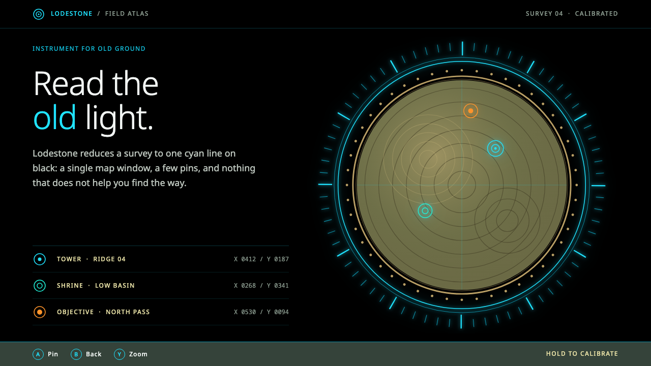 Sheikah SlateCalm light on black. Cyan hairline rings frame one sepia map disc inside a go…
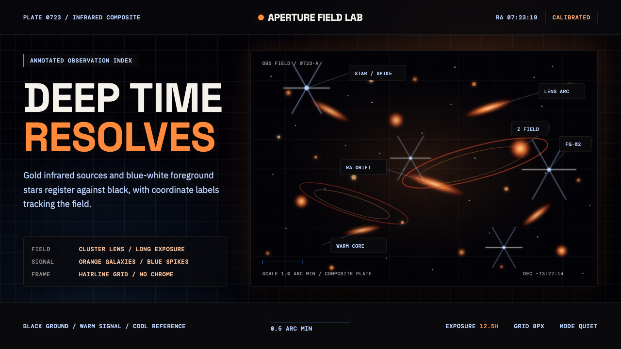 JWST Deep FieldPrecision in deep black. Orange galaxies, blue spikes, and DM Mono callouts m…
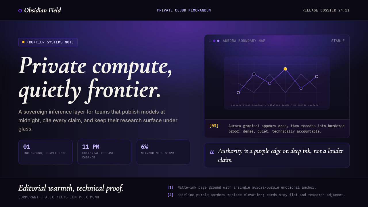 Sky App Private Cloud (2024)Quietly frontier. Aurora purple on matte ink, italic serif meets mono proof.
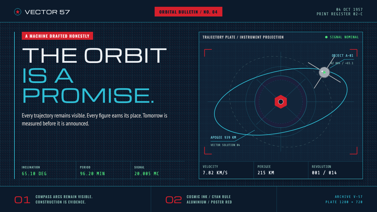 Atompunk Sputnik EraTomorrow, drafted precisely. Cyan orbits cross cosmic ink with red poster blo…
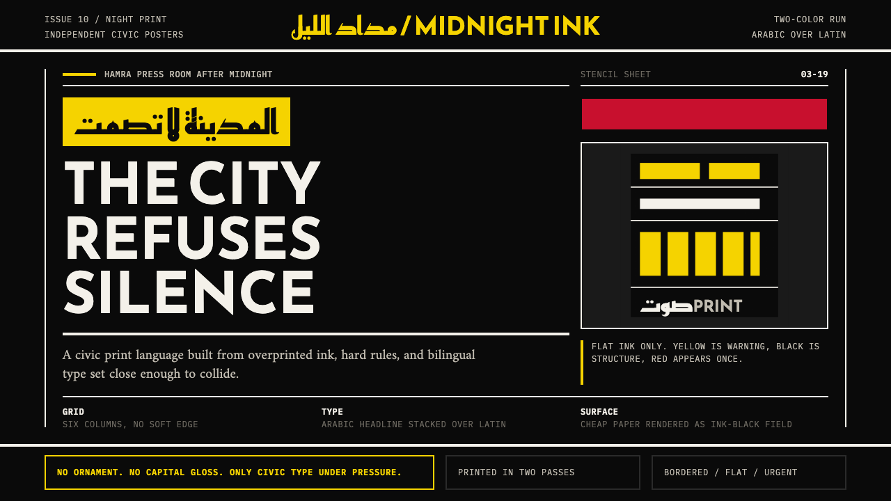 Beirut Indie Graphic DesignCivic type as protest. Sulfur yellow Arabic blocks collide with ink-black pos…
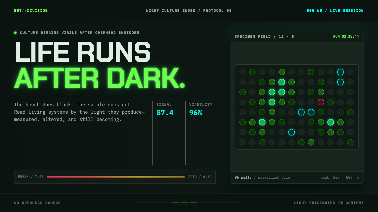 Biopunk WetwareLife emits after dark. GFP green and transilluminator cyan pulse across black…